Sophia and Leon’s Upper West Side Kitchen Renovation – Homeowner Guest Post
No New Yorker wants to leave a rent-stabilized apartment, so when a family of three came to us to help create beautiful space in a bigger place, we had to make sure they got an upgrade that made the move worthwhile. Read on for Sophia’s take on this family’s Upper West Side kitchen renovation, and check back next week to see what they did with their bedrooms and bathrooms!
Guest post by Sophia, Manhattan homeowner
For five years, I had been parked in a 400 square foot rent-stabilized apartment at a great location on the Upper West Side. As a single person, I felt like it was spacious. When my husband moved in three years ago, 400 square feet seemed “cozy,” and once I gave birth to our son, Apollo, the space became woefully inadequate. It just could not contain the mountain of stuff that accompanies caring for a baby.
We entered the Manhattan housing market and had a terrible time for a few months; we made several offers and were outbid on everything. All of the two-bedroom apartments within our price range were such wrecks that with construction costs included, they would have been over budget. Two things we knew for sure: we were determined to stay within our budget and I didn’t want anything that would need the word “gut” in it. For the latter, as the saying goes, “famous last words…”
Just when we were about to give up on our search, I decided to go to one last open house for a unit that had been on the market for months. Unbelievably, it was listed at a price that was within our budget and had three bedrooms, even larger than what we were originally hoping to get. It needed some work, but the maintenance was so low that we were convinced even with renovation costs, it would still be within our monthly budget.
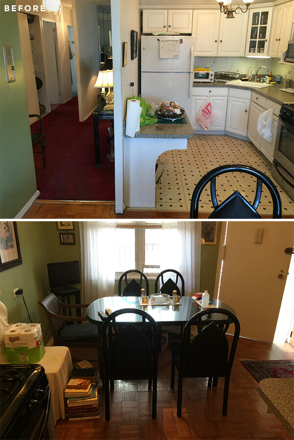
The best part was thanks to an unusual catwalk outside the front door — the apartment actually received three exposures during the day and thus, a ton of light. But inside, it was similar to a “bento box” with lots of walls separating each of the living spaces and blocking all of that great light. The kitchen was dated and the whole thing needed to be gutted.
We posted our project on Sweeten after hearing from friends who had also found a general contractor on the website. We liked the ability to review candidates’ work online and we were extremely drawn to design-build companies for holistic decisions that would be more likely to contain costs. Sweeten introduced us to Sweeten Experts Paulina and Albert and I was hooked on their work. I loved the design of their projects and after speaking with their references, we hired them immediately. We were able to get a running start designing the kitchen with Paulina while we were still in the process of closing. As soon as we closed, Paulina’s group was able to go in and start demolition.
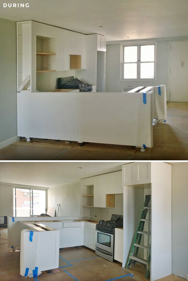
We went to see the apartment on the first day of demolition at the end of the day. As we stood there in the quiet dusk with the post-demolition dust slowly settling all around us, we both looked at each other with our mouths open…and in a moment of panic, I wondered if they could just put it all back the way it had been and pretend like nothing ever happened. Sweeten brings homeowners an exceptional renovation experience by personally matching trusted general contractors to your project, while offering expert guidance and support—at no cost to you. Renovate expertly with Sweeten
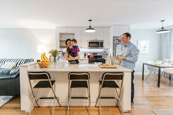
Once the debris cleared and the actual construction began, things were looking up. Bringing the dividing wall down between the kitchen and living room made a tremendous difference. Light poured in through the kitchen and into the hallways.
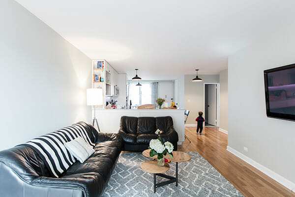
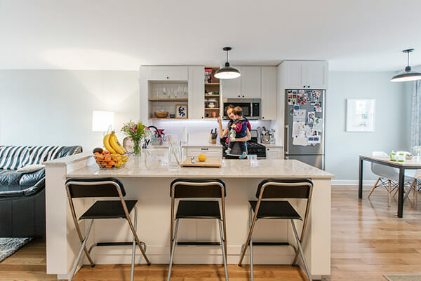
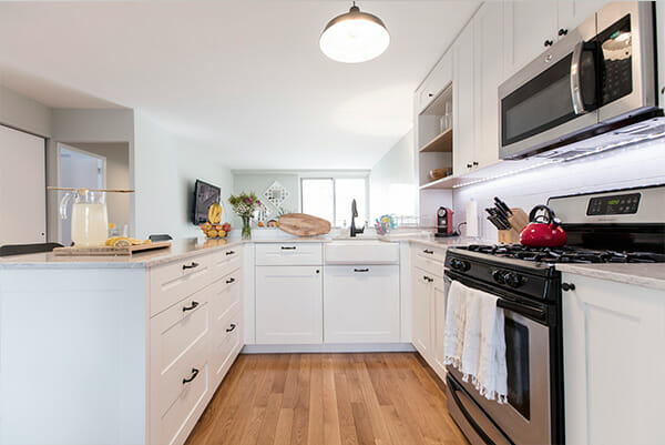
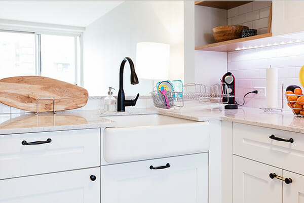
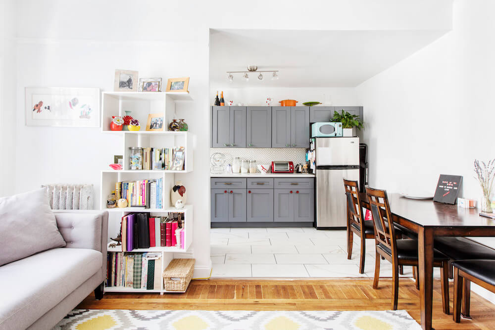
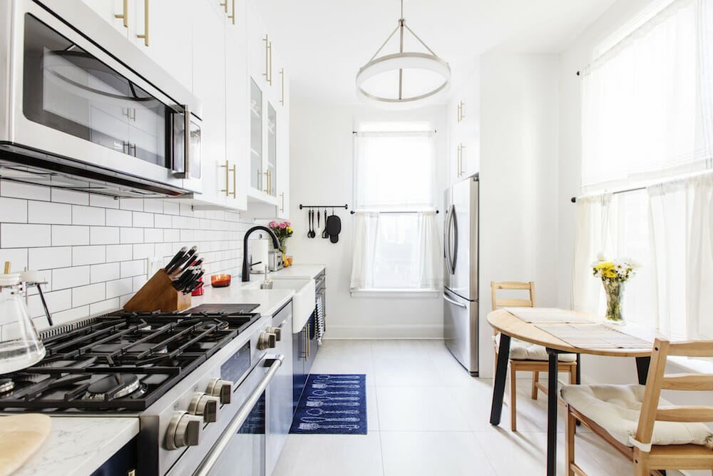
Paulina and Albert custom-built the entire kitchen and it looks absolutely fantastic. We opted for classic white custom cabinets and we absolutely love the open shelving that Paulina incorporated per our request. The bookcase that transitions between the living room and kitchen was designed by her, and we love that it is a more natural ending point to the backsplash. Paulina persuaded us that wood countertops would require significant upkeep, so we opted instead for a simple quartz counter that has been great.
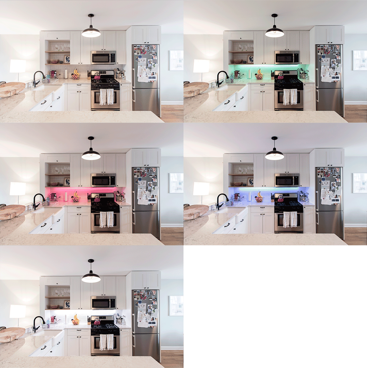
We tried to stay within our budget as much as possible and in doing so, decided to keep the perfectly fine (if dated) stove to hopefully be swapped out at a later date. Leon shopped with Paulina to find a narrower and more modern fridge and a new microwave that would match the width of the stove. Leon did the backlighting himself using an electronic LED strip that he controls through his phone. It can wirelessly connect and change colors to reflect the weather or the changes in the stock market. (Editor’s note — ahem, what?? The stock market!?)
We also went with a slightly more modern version of a rustic farmhouse sink and purchased our simple matte black pulls and handles from Ikea.
Our expert team was always professional during all of our interactions, even the ones when we were definitely playing the demanding and nervous first-time renovator role. I’m not sure we will ever do anything with the word “gut” in it again, but this was a great first-time renovating experience and we are so happy in our new home!
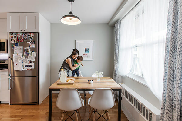
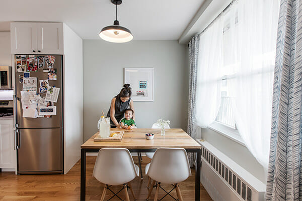
More from Sophia, Leon, and Apollo next week!
Kitchen Selects >> cabinets: custom / countertops: quartz / backsplash tile: Allegro from Home Depot / sink and faucet: Kohler / hardware: IKEA / refrigerator: Blomberg
—
Sweeten handpicks the best general contractors to match each project’s location, budget, scope, and style. Follow the blog for renovation ideas and inspiration and when you’re ready to renovate, start your renovation on Sweeten.
