A Movie Set Comes to Life in a Manhattan Studio Apartment
A first-time homeowner turns a studio apartment into her very own gem with architectural trim, a must-have appliance, and her one “controversial” decision.
Guest post by Nancy in her Upper East Side studio apartment
Nancy’s first New York City apartment was a long time in the making—35 years to be exact. She searched for a dream home in Manhattan where she could apply the movie set design playing in her mind, but none of the spaces felt right.
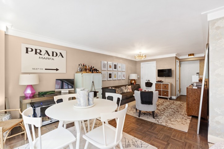
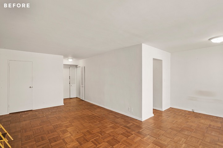
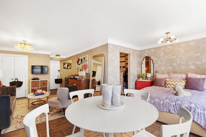
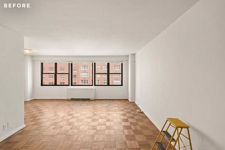
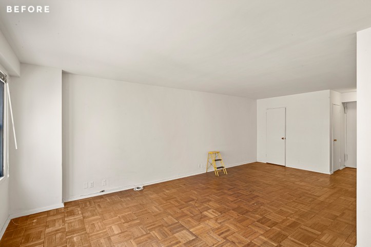
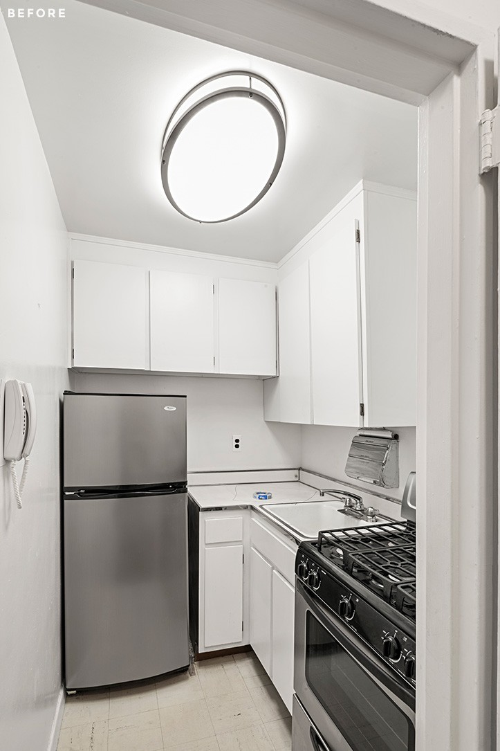
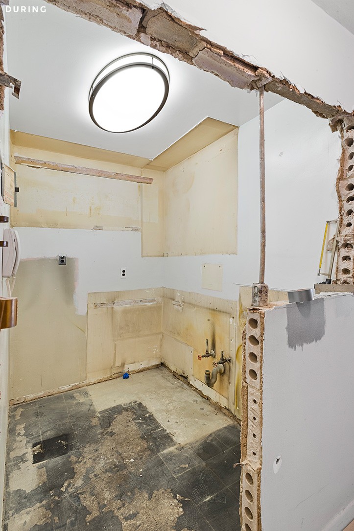
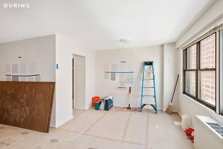
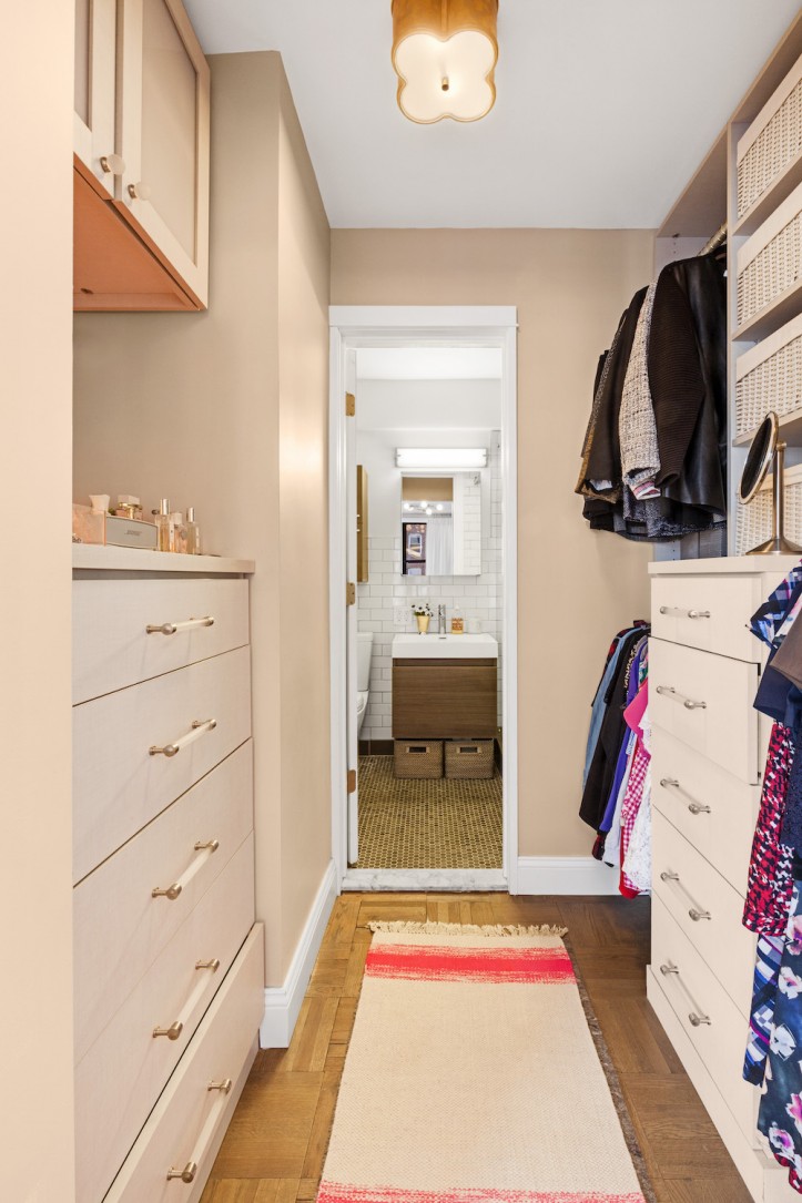
So Nancy, who works in human resources, took matters into her own hands and purchased a 550-square-foot studio apartment on the Upper East Side that hadn’t been touched since the ’60s. Everything required an overhaul! To bring her vision to life, she made smart sacrifices in her narrow 6-foot-wide kitchen, turned a closet into a walk-in dressing room, and used wallpaper to carve out separate areas. You’ll want to read Nancy’s renovation journey.
I’ve lived in the city my whole life and have spent the last 35 years mentally cataloging my favorite buildings, blocks, and parts of the city. When I decided to buy my first place a few years ago, I was living in Chelsea—and loved it—but knew I need to shift my search further uptown to get more for my budget.
I had always gravitated towards the Upper East Side and gone to open houses on and off over the years. If there’s an elevator, doorman building without in-window air conditioning units (my only real deal-breaker) in the East 70s, I’ve probably been there at some point.
The first apartment I saw on my search was in the same line I’m currently living in but on a lower floor. The apartment had been redone in a style that was fine but not my own, and the alcove was turned into a narrow bedroom cut off from heat and air conditioning.
Fast forward a few months and I’d been turned off by so many similar “I could live with it, I guess” renovations that I was determined to buy a place that would require a lot of work, knowing I might need to sacrifice space for the ability to make my place my own. I had loved the location, building, and low maintenance costs of that first place I’d seen months ago and found a studio apartment on StreetEasy that hadn’t been touched since the ’60s, except for some new appliances–score!
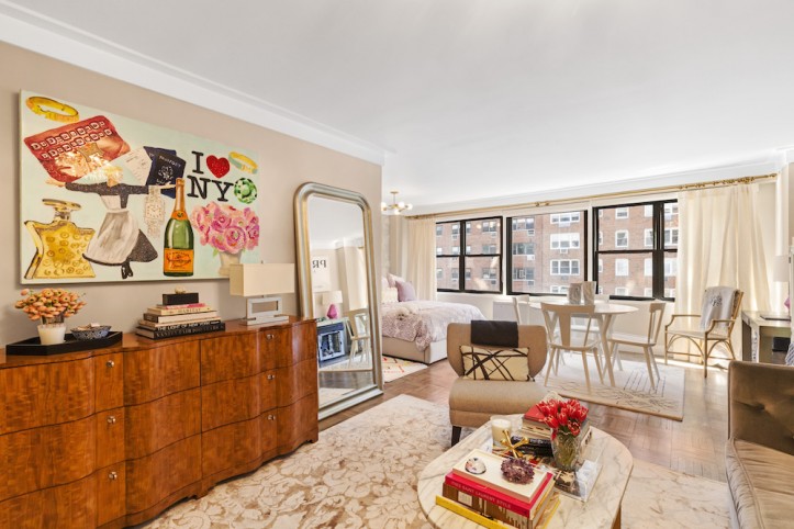
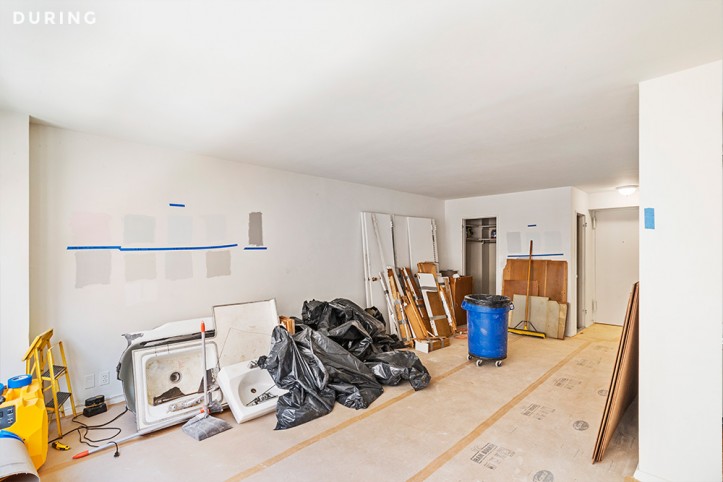
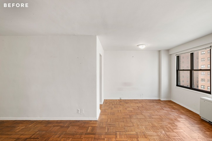
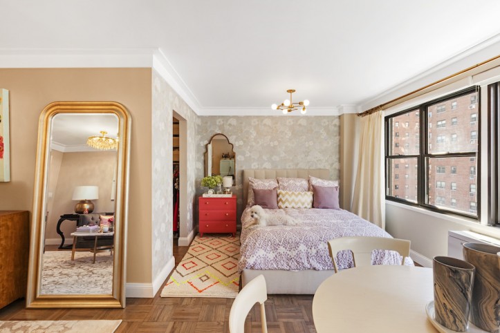
An offer was made, and I set out to renovate before moving in. I was excited that EVERYTHING required a refresh. My apartment is a decent-sized alcove studio—about 550 square feet—in a postwar Upper East Side high-rise. Since moving in, I’ve welcomed a fluffy new roommate named Hudson, who enjoys spending his days on the couch. We’re still working on getting him to embrace his dog bed.
I had heard about Sweeten from a few places—New York magazine, Curbed, and even from a colleague who knew the founder—so it was the first place I turned to when looking for a contractor. I met with a few matches and had a ton of questions.
*What would this cost (or rather, can I do all this with what I want to spend)?
*How long would it take?
*How easy is it to get all my plans approved by my co-op board and the city?
I’d been dreaming of this project since I first discovered HGTV and had a pretty clear vision of what I had in mind: a light and airy space…a dreamy beach house vibe that a character in a Nancy Meyers movie was tragically forced to squeeze into a tiny New York studio apartment (the “It’s Complicated” kitchen will have to wait).
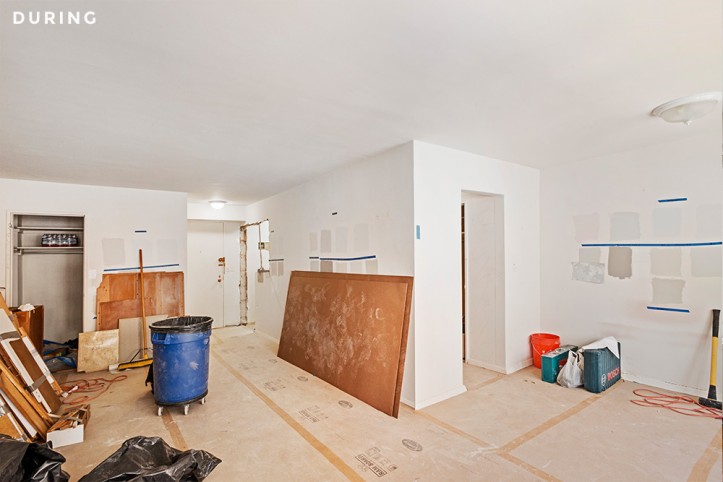
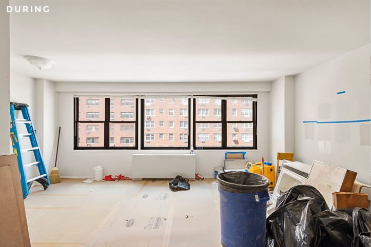
That said, I knew I needed a lot of help executing that vision and managing all of the pieces of a renovation that don’t find their way onto a Pinterest board. My Sweeten contractor was great at figuring out the best way to rewire the space, upgrade the electric panel, add in a ceiling light in the living space, inject new life to the parquet floors, and bring the plumbing up to standard.
My contractor and I spent a ton of time playing with the footprint.
*Should we close off the alcove?
*Turn the small linen closet into a new entrance for a dressing room/bathroom? Sweeten brings homeowners an exceptional renovation experience by personally matching trusted general contractors to your project, while offering expert guidance and support—at no cost to you. Renovate expertly with Sweeten
*Open up the kitchen and wrap the cabinets into the living space?
*Expand both the closets into a small extra room and move the living space to the windows?
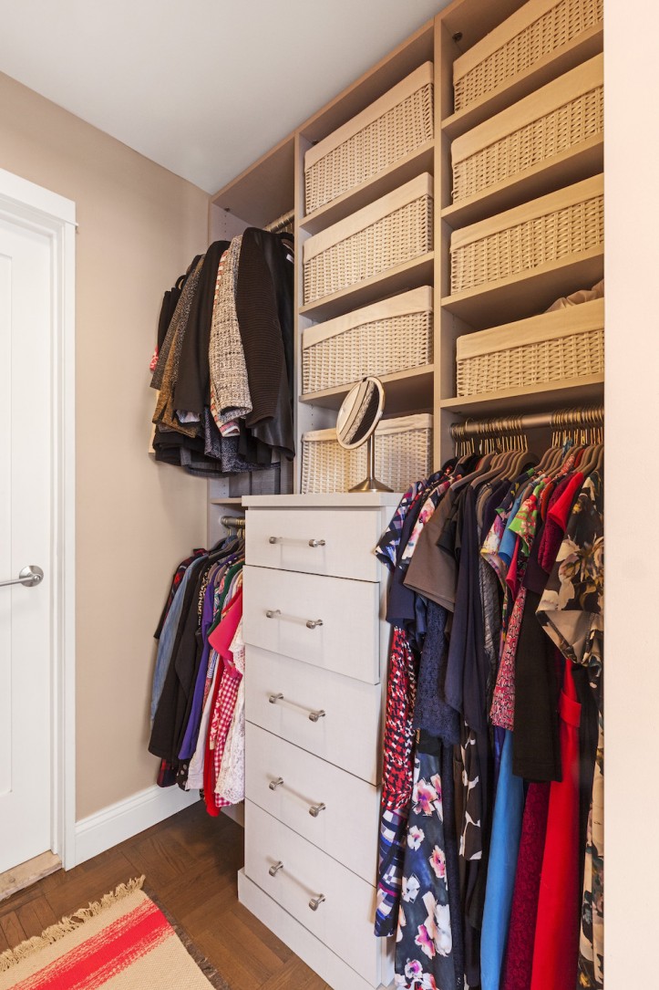
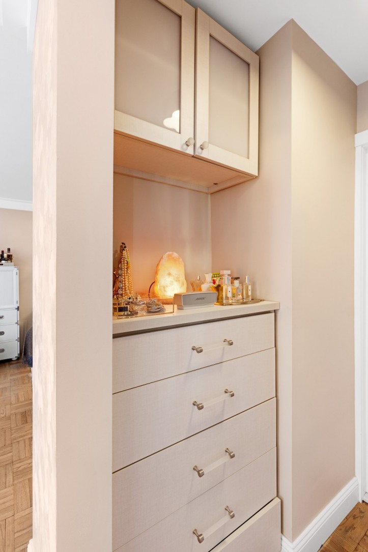
Ultimately, we decided to keep the footprint as-is, but widen the kitchen entrance that led into the living space, reconfigure the walk-in closet to be more user-friendly with french doors, and turn the cramped sleeping area closets into an open dressing room.
I was always excited about the storage in the apartment, but now it’s much more efficient. Everything is put away in its own place and the storage blends into the look of the space.
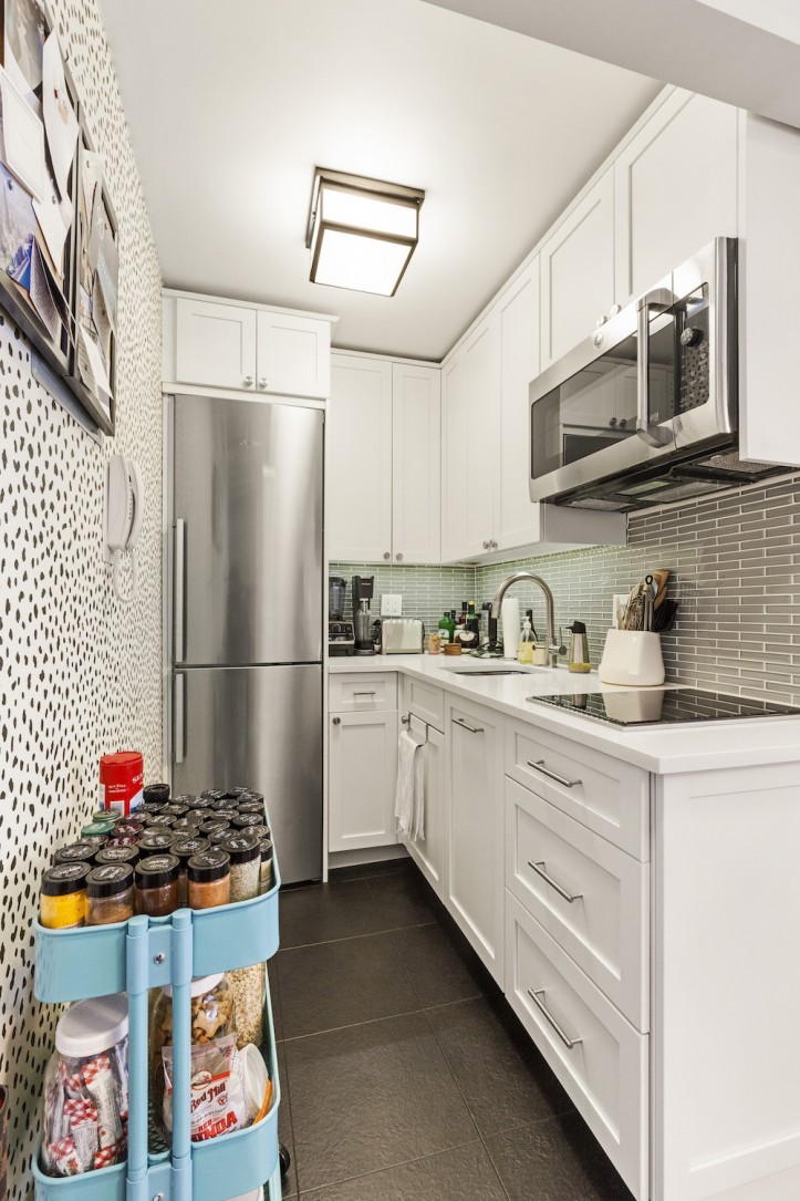
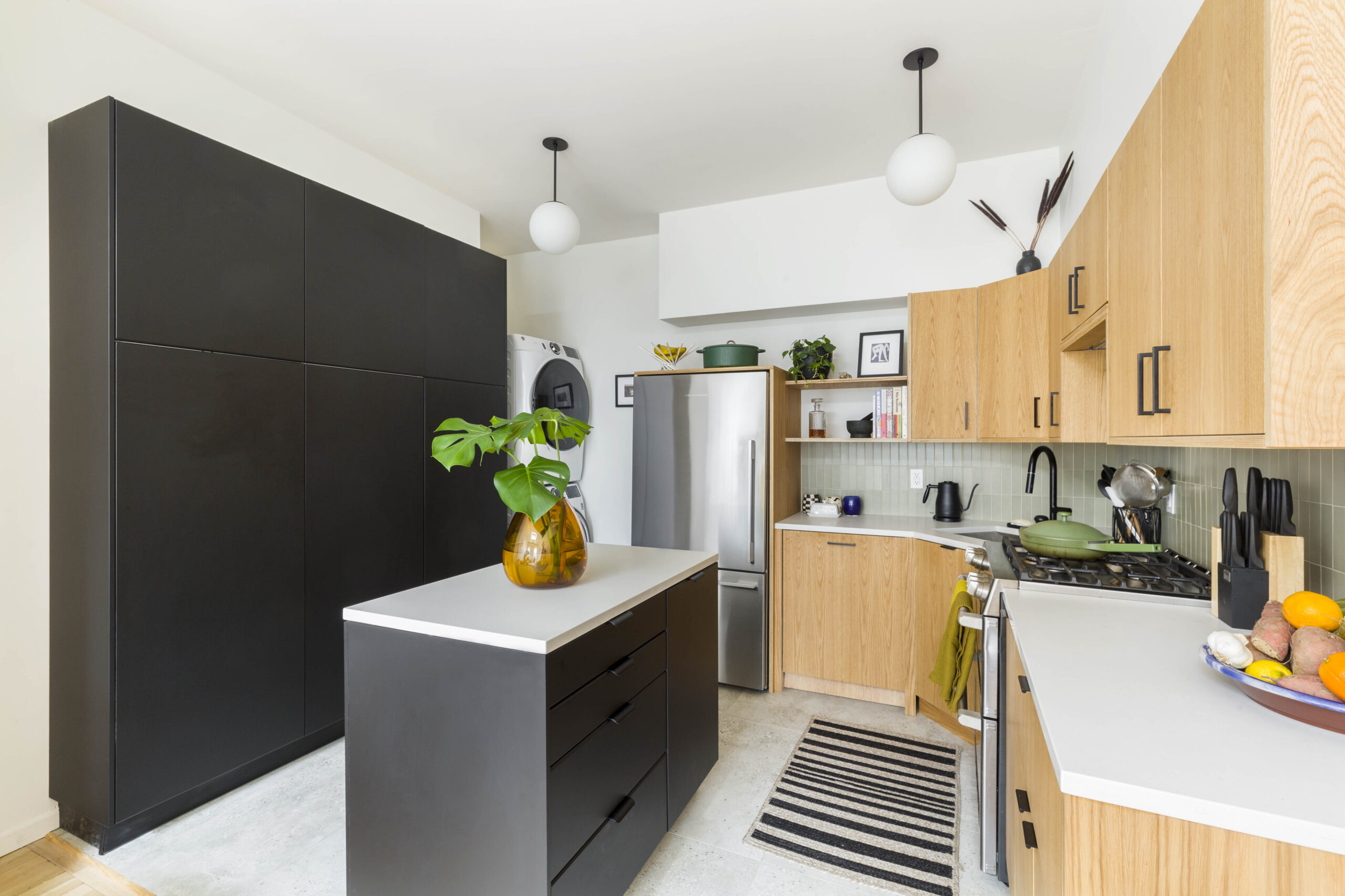
The other big question was the kitchen layout. I dragged my mom—fresh off two of her own major kitchen renovations—to IKEA on multiple occasions to work out a footprint that would achieve two things in the small space: provide as much drawer storage as possible and add a dishwasher. After one particularly insane mock-up where I had almost convinced myself I could turn the 6-foot-wide space into a galley kitchen with a dishwasher drawer stacked over an oven (must have been Swedish meatball-induced temporary insanity), we realized custom cabinets were the way to go.
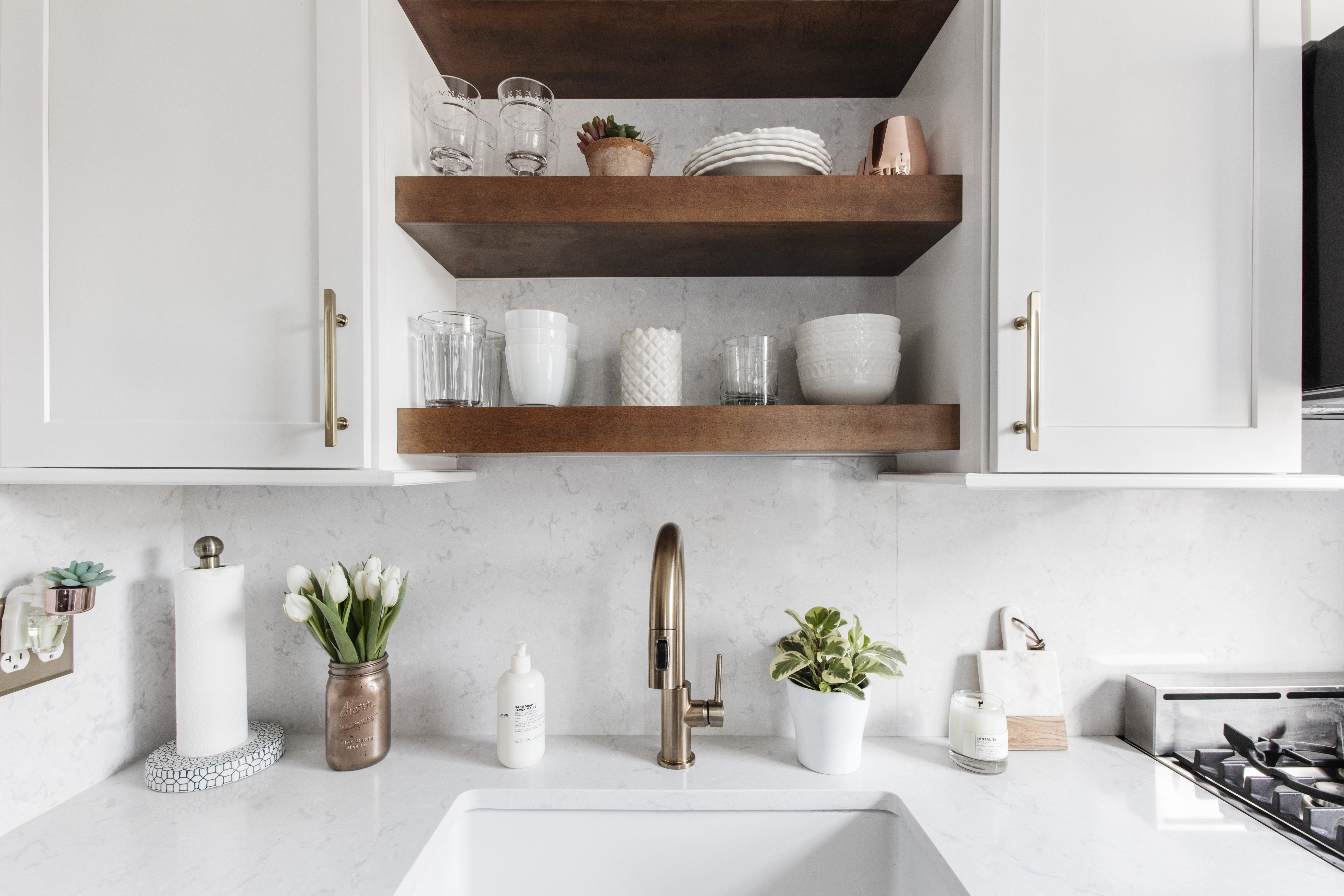
Surprisingly, Home Depot came through with their Innermost collection where each piece could be semi-customized to bring the cabinets to the ceiling and turn a corner into usable space. I love that I was able to fit a shallow utensil drawer below the induction cooktop.
Choosing to forego the standard oven range was probably my most ‘controversial’ decision—I really wanted that dishwasher—but I’ve come to love the induction top that fits into the countertop. The combo microwave/convection oven is perfect for my needs—it cooks just as well as most of the tiny apartment ovens and frees up a ton of space.
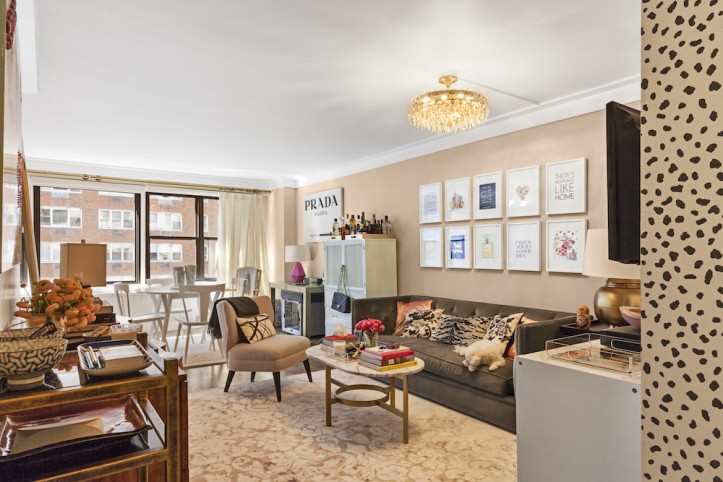
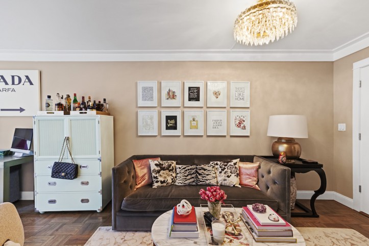
The rest of the decisions were mostly a balance between putting my stamp on the place and keeping resale in mind. I decided to go more traditional with the permanent kitchen and bath fixtures, but have more fun with the wallpaper, fabrics, lighting, and other decorative items.
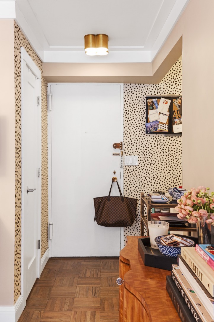
Using the Tanzania wallpaper print in the entryway helped define the space and kept with the black-and-white color palette. When I decided to keep the studio apartment as an open plan, I still wanted to keep the bedroom area defined as its own and the wallpaper from Flat Vernacular—which I’m in love with—does that well. It also keeps with the light feeling of the space. My contractor suggested molding with clean profiles—it’s actually just lumber—that works perfectly with the simple baseboards.
I love the detail on the new doors that have a simple style but give a bit of interest around the casing, which also helps relieve any warping with time. The floors were sanded down and refinished in a matte gray tone.
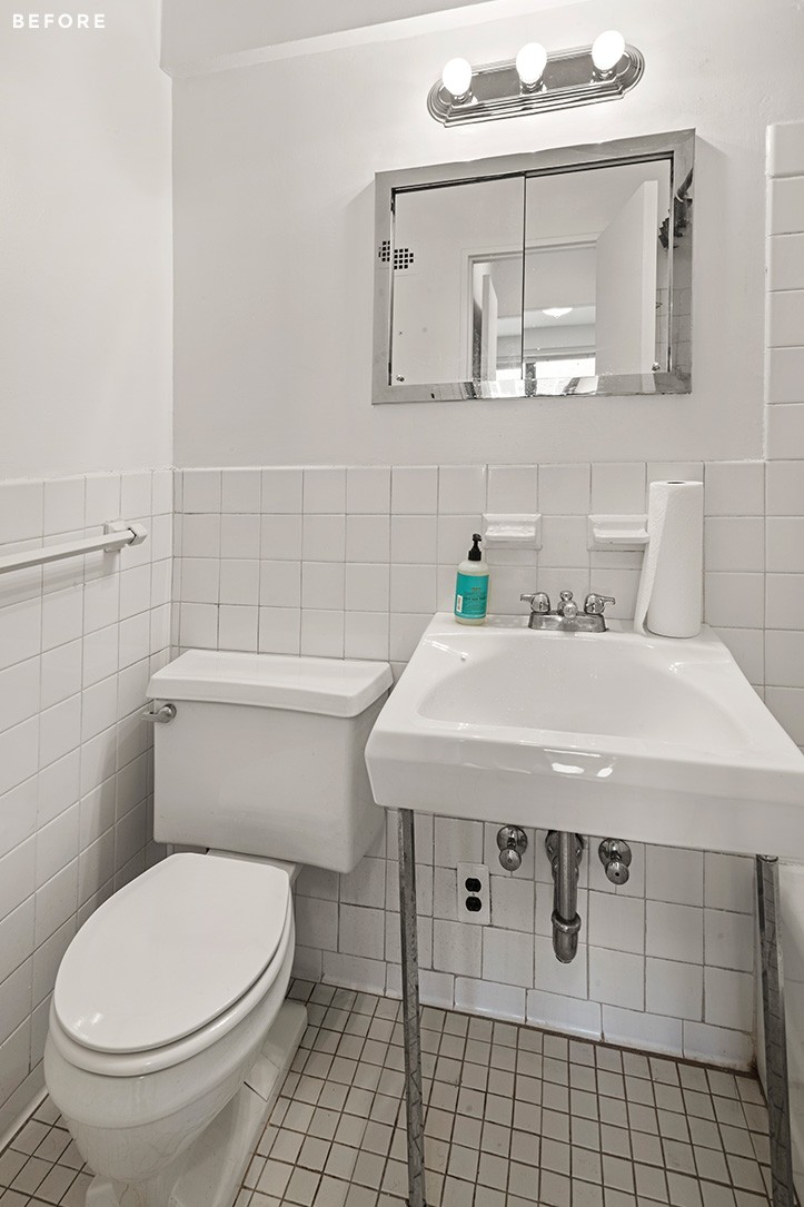
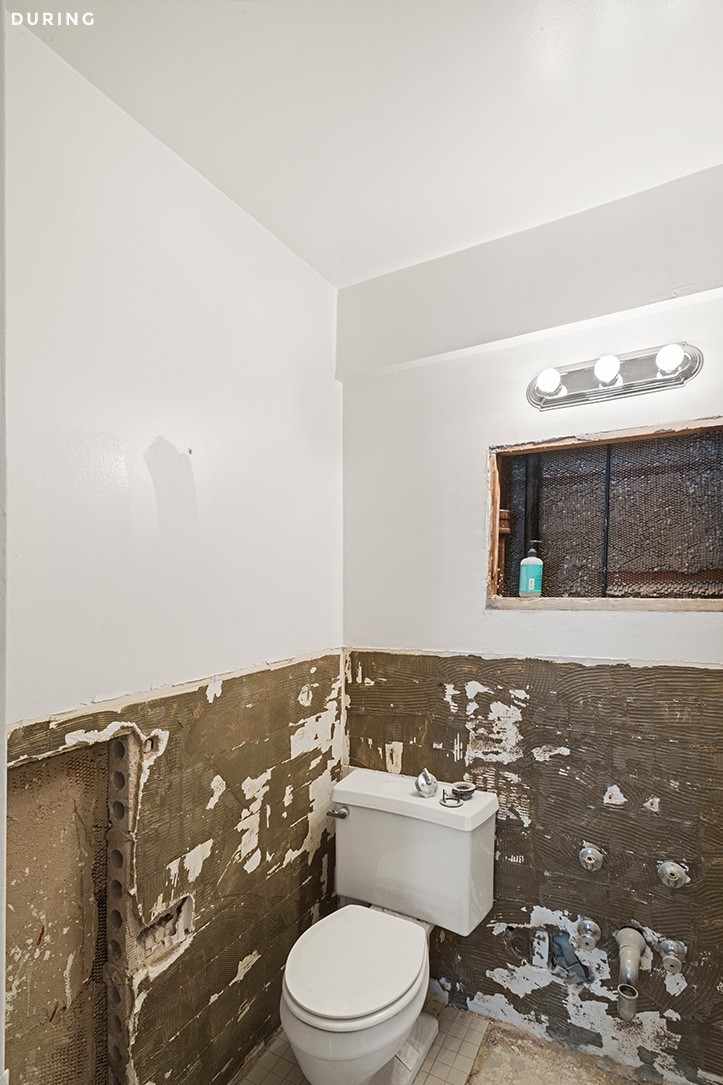
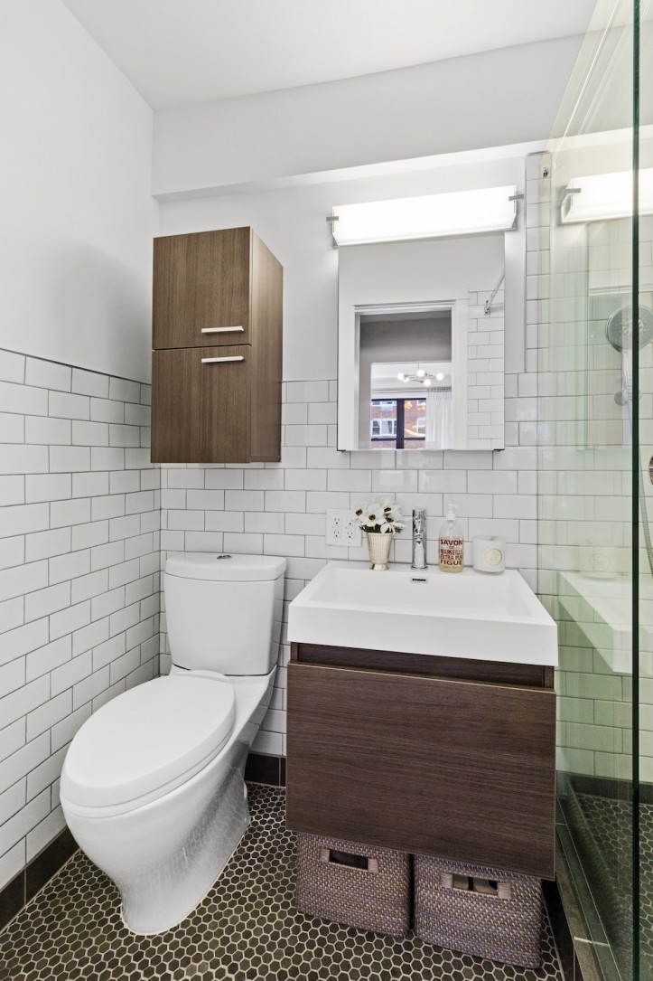
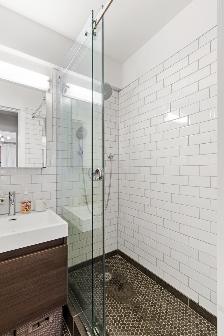
The cramped, shallow bathtub was replaced with a large shower, making the space feel more open and so much more functional—perfect for containing Hudson’s bathtime messes. The deep storage cabinet above the toilet was one of the few things I’d probably do differently as it was a gaffe on my part.
I ordered the cabinet without paying attention to how far out it would protrude—it’s 10-inches deep—and was installed with tile around it before I realized. It’s not the end of the world, but using a shallow medicine cabinet would have been a better choice.
As with any reno, there were some hiccups along the way with permits taking a long time to come through and building regulations stopping work for any and all holidays. The 60-year-old pipes burst downstairs onto some very understanding neighbors, and then from above onto my freshly renovated space about a week after everything was done!
Sweeten was a great partner along the way. Once I posted my project, they helped me figure out what I could do with my budget and asked the right questions so I could evaluate the bids I received. They were a great sounding board when faced with questions during the process, such as delays and increased costs.
I definitely recommend any renovator to use the Sweeten team to understand all the moving pieces throughout the process. Having lived in my space for some time now, I love it, and there isn’t much I would do differently. I am getting the bug to renovate and decorate a new space. So who knows, maybe I’ll be calling Sweeten again soon with a new space to refresh!
Thank you, Nancy, for inviting us into your super chic and beautiful home!
BATH RESOURCES: Basalt 1″ hex floor tile and Kohler white subway wall tile: Bella Tile. Shower fixtures: Grohe. Shower baskets: Kohler. Sink and vanity: Fresca. Toilet: Toto. Light fixtures: Lighting New York. Paint: Benjamin Moore.
KITCHEN RESOURCES: DuraCeramic floor tiles: Congoleum. Innermost kitchen cabinets: Home Depot. Classico countertops in Organic White: Caesarstone. Pewter Grey backsplash tile: Daltile. Refrigerator and panel-ready dishwasher: Bosch. Induction cooktop: Wolf. Advantium convection microwave/oven: GE. Light fixture: Lighting New York. Cabinet hardware: Restoration Hardware. Tanzania wallpaper: Thibaut.
BEDROOM RESOURCES: Wallpaper: Flat Vernacular. Ceiling light fixture: Schoolhouse Electric. Basil flushmount closet chandelier: Visual Comfort. Window treatment and hardware: Restoration Hardware. Closet cabinets: California Closets. Baskets and hangers: Container Store.
LIVING ROOM RESOURCES: Penthouse and Chantilly Lace wall paint: Benjamin Moore. Trillion flush mount ceiling light fixture: Visual Comfort.
—
Lauren’s impossibly charming studio gets a stylish makeover with a new kitchen, bathroom, alcove bedroom, and Pinterest-worthy closet in this Brooklyn Heights renovation.
Sweeten handpicks the best general contractors to match each project’s location, budget, and scope, helping until project completion. Follow the blog for renovation ideas and inspiration and when you’re ready to renovate, start your renovation on Sweeten.
