A Blueprint Comes to Life for a Family Duplex (Part 2)
Planning ahead pushed these bedrooms and master bath renovations to the finish line
Last week in part 1, we visited architect Tina and her husband Fletcher’s duplex in Cobble Hill. She gave us the tour of the kitchen and powder room on the upper parlor level. Now we’re back to view their bedrooms and master bath on the garden level. Here’s how the couple and their contractor transformed a level with lower ceilings and semi-subterranean location into a cozy and very chic space.
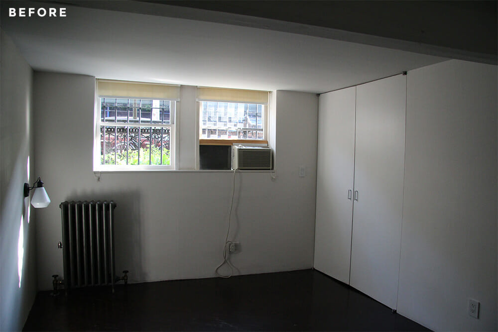
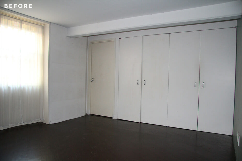
Working with our Sweeten contractor, we decided to refinish the dark wood floors throughout our duplex apartment to brighten the living space. It was especially needed in the bedrooms on the lower level. We ran into our first delay after work began on the floors. Initially, we selected a weathered oak finish, but our mistake was not testing it before moving forward. It wasn’t until after the entire lower level had been sanded and re-stained that we learned the red oak floors didn’t take the color as we had expected. To complicate things, we discovered the wood on the stairs was white oak, while the upper level floor was maple. The renovation timeline was delayed a week as we tested combinations of stains to find a neutralizing color that worked on all three wood types. Fletcher made the ultimate selection of Bona Grey, and we could not be happier with how it turned out!
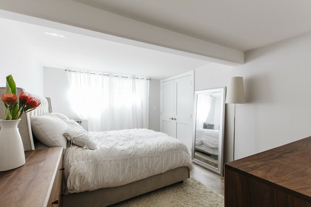
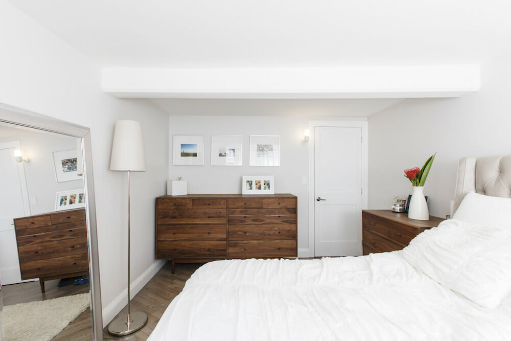
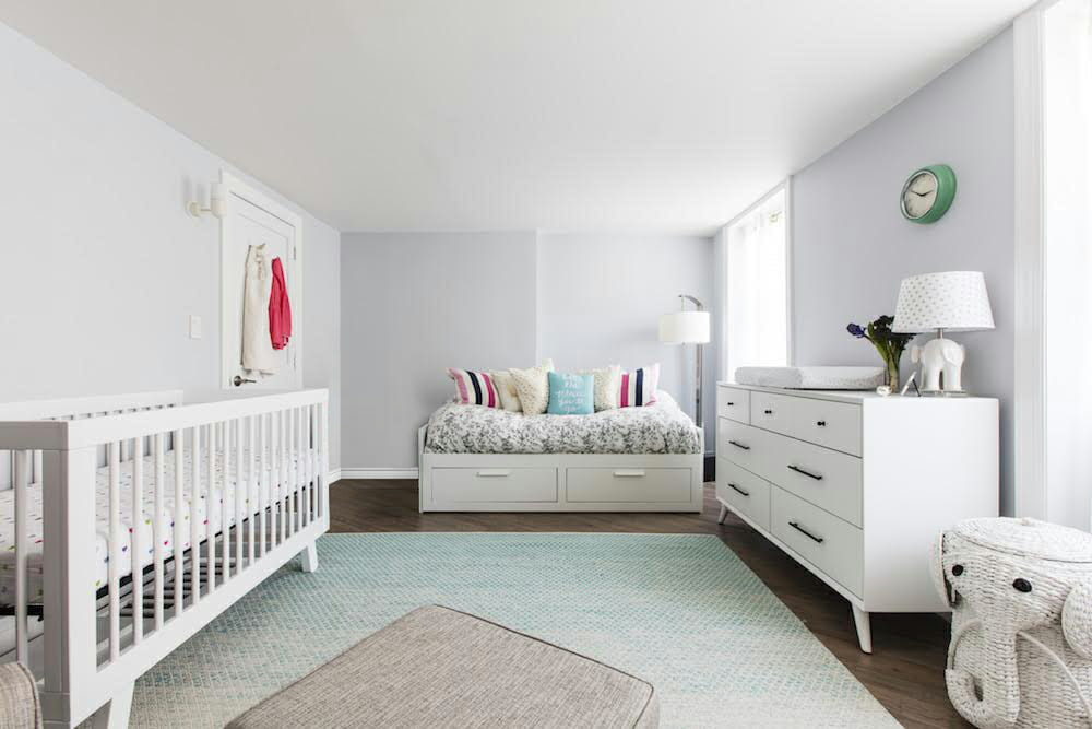
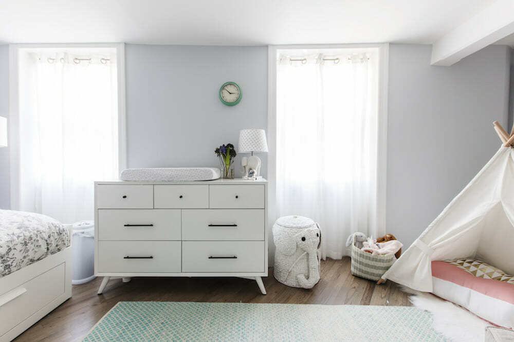
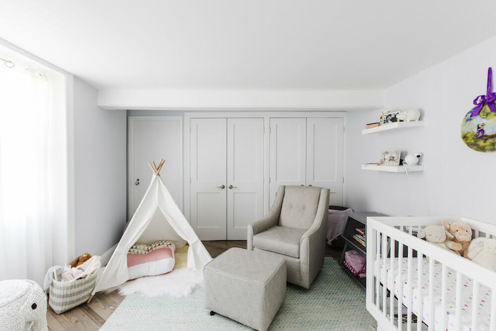
The new floors immediately brightened the lower level of the duplex, which was key in disguising its semi-subterranean status. In addition to a lighter floor stain, we painted the bedroom walls with light colors—a cool gray in the baby’s nursery and a calming off-white in the master bedroom. White bedroom furniture, accents, and linens maintained the bright palette. To give the impression of larger windows, we added floor-to-ceiling sheer curtains.
The lower level had no base molding or traditional casing around the windows, and the interior doors styles were flat with concealed hinges, creating a sterile look. To introduce more character, we added base trim throughout the bedrooms and shaker-style panel doors. Our contractor helped us realize how cost-effective this strategy was. It was a low-cost improvement that made a huge impact. The garden level feels as comfortable and inviting as the upper living area.
Sweeten brings homeowners an exceptional renovation experience by personally matching trusted general contractors to your project, while offering expert guidance and support—at no cost to you. Renovate expertly with Sweeten
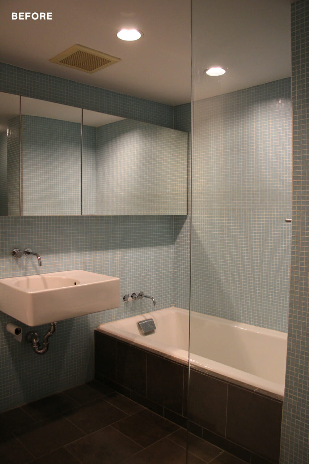
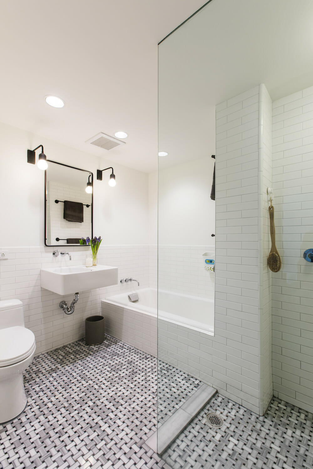
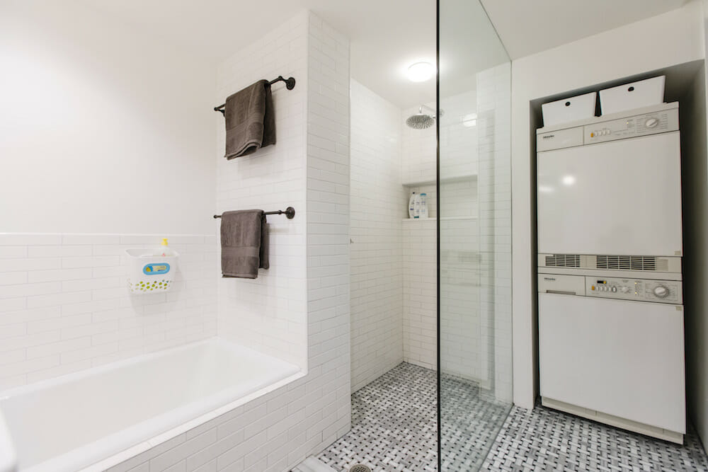
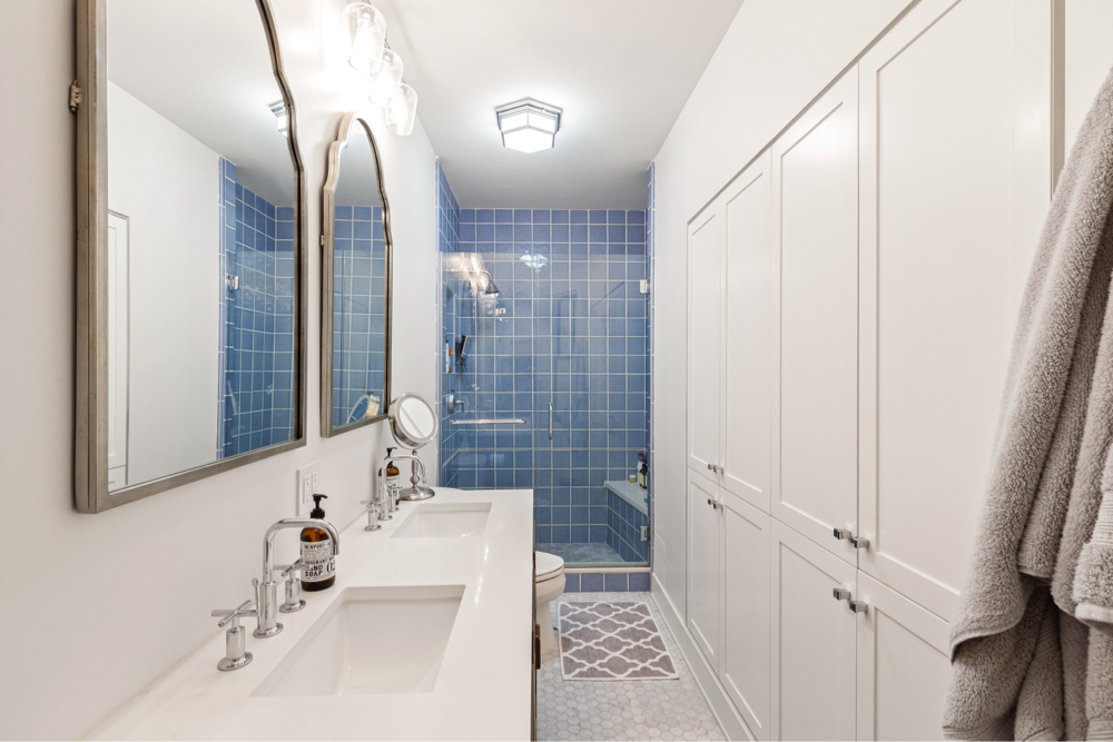
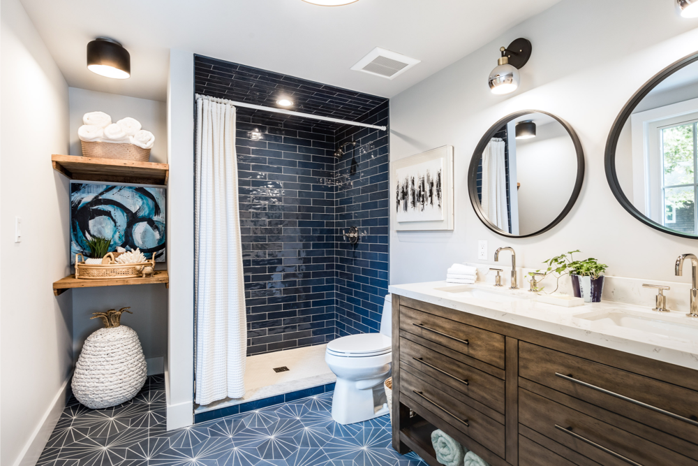
We were already very pleased with the layout of the main bath, and found it was efficiently designed. Within a small space, it contained a tub—essential for our growing family—a large walk-in shower, and even a washing machine and dryer that already existed! It may have been more convenient to have them in a room where we could fold laundry, but we were happy to not give up significant apartment real estate. We just avoid running the ventless dryer while taking a shower. The amount of moisture in the room can become overwhelming!
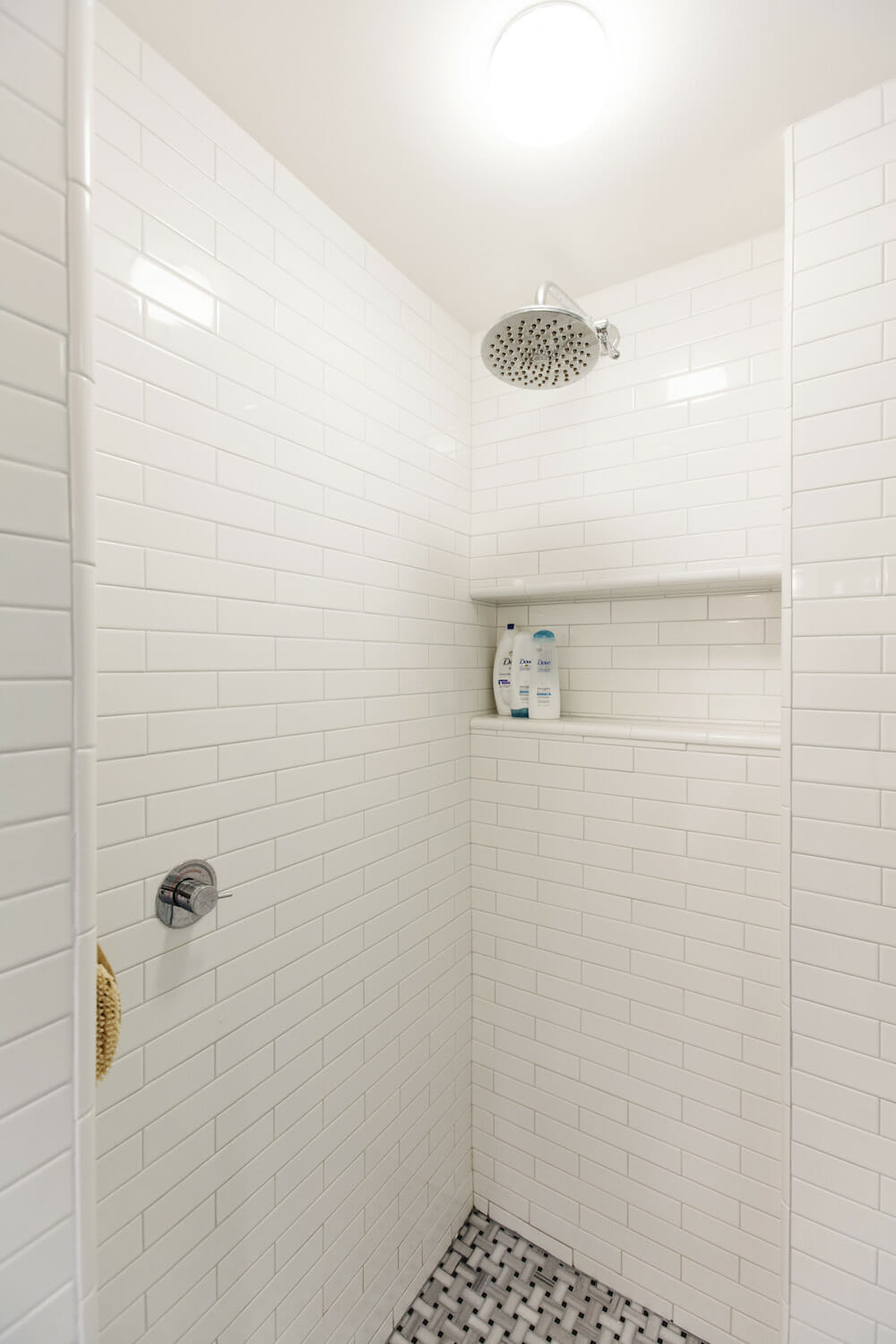
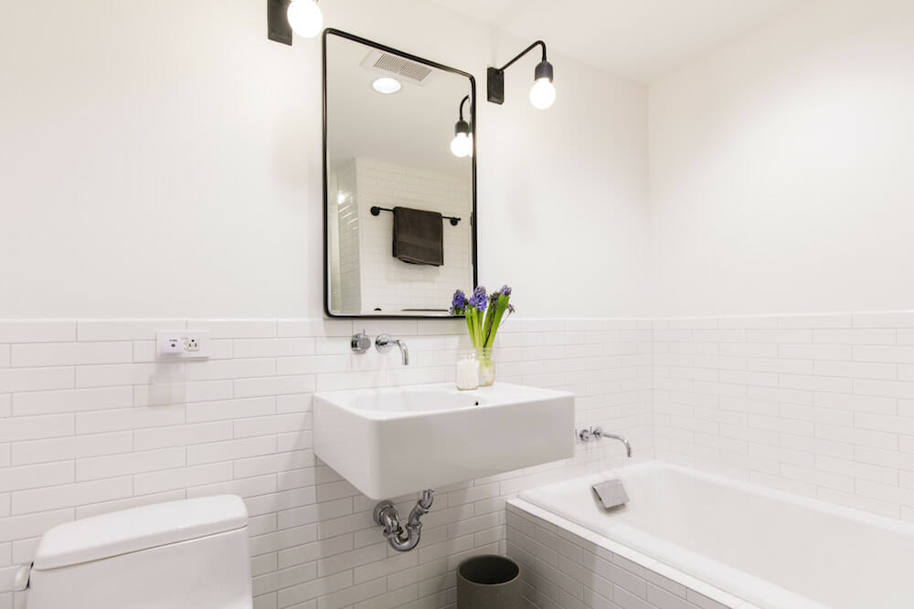
Like the powder room upstairs, we kept the original Duravit fixtures, and were conscious of choosing materials that would make the space feel larger and brighter. This was especially important because we decided to tear out the existing back-lit vanity mirror that spanned the entire length of the main bath wall. And it was actually effective in making the room feel larger but we replaced it with a more traditional vanity mirror and sconce lighting. We continued the marble mosaic into the shower to avoid visually dividing the space, and kept the walls bright with the same Nemo white 2×8 subway tile used for the kitchen backsplash.
Thanks to our Sweeten contractor and his crew, the renovation process was relatively quick and painless. By having the design decisions completed before work began, we eliminated on-the-go decision-making and were able to work with the team and budget effectively. We were happy to have a contractor with a calm disposition, who was extremely sensitive to our schedule and accommodating to hiccups in the process.
Although the work moved quickly, it wasn’t completed on schedule due to minor delays. Working with a tight timeline, there was little room for contingency. Our scheduled move-in landed just a week before our baby’s due date. As luck would have it, I went into labor early, on moving day!
Because our kitchen cabinets had been delayed a few weeks, we returned from the hospital as they were being installed. We introduced our newborn to a home with appliances stacked in the living room and unpacked boxes occupying the rest of the apartment. We camped out as a family in the nursery (equipped with my college dorm mini-fridge) for a week while major work was being completed.
Two weeks after our move and into parenthood, the renovation was 95% complete. We unpacked boxes while the baby slept. Talk about exhausting! Looking back, transitioning was certainly hectic, but we couldn’t be happier with our new home. It is the perfect environment for our growing family.
Thank you, Tina and Fletcher, for sharing your story. We love seeing your personal stamp on the design of your home.
FULL BATH RESOURCES: Fluid Basketweave Mosaic marble floor tile; white gloss subway 2×8 wall tile: Nemo Tile. Sconce: Dot & Bo. Vintage recessed medicine cabinet/mirror: Pottery Barn. Moen S6320 Velocity showerhead: Amazon.com. Washer/dryer: Miele.
MASTER BEDROOM: “Gray” wood floor finish: Bona. Bed: San Francisco Design via Gilt. “Grove” dressers in walnut: Room & Board. Wall paint in “Calm”: Benjamin Moore.
NURSERY: Safavieh “Montauk” rug: Overstock. Wall paint in “Gray Cloud”: Benjamin Moore. Brimnes daybed: IKEA. Langley Street “Parocela” dresser: Wayfair.
—
In Chelsea, a duplex transforms into a bright and modern space, complete with a magical—yet practical—nursery.
Sweeten handpicks the best general contractors to match each project’s location, budget, scope, and style. Follow the blog for renovation ideas and inspiration and when you’re ready to renovate, start your renovation on Sweeten.
