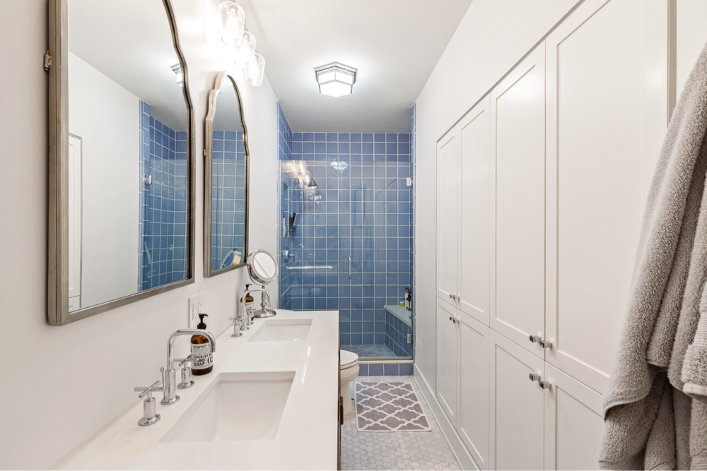
5 Tile Trends for Every Surface
Tile revamps ho-hum walls and floors in an instant—from tile flooring to backsplash tile.
Chances are, your home has tiles somewhere—the bathroom and kitchen, or maybe a foyer or mudroom. While they serve a practical purpose—waterproof, easy to clean, protects surfaces—tiles have now emerged as a pivotal element in taking a space from flat to fabulous! Look to tile as a style and even a fashion choice, as manufacturing advances such as high-definition (HD) printing and slip-resistant finishes help to create a personal statement on floors, as well as walls. Consider these five trends:
Improvements in HD printing have translated to tile with highly realistic interpretations of natural materials like wood and stone, as well as concrete, plaster, and metal. And the options don’t stop there. In addition to the oak or walnut look, these woods are coupled with different finishes and treatments—pickled, distressed, reclaimed (with the faux paint still intact), sustainable alternatives to exotic hardwoods like a mirror-polished cherry or mahogany that you might previously have found only in a palace or a yacht. This tile also lets you take “wood” where you previously might not have…inside a shower, for instance.
As for stone, you can install a luxurious-looking faux marble for your entire bath at a tenth the cost of the real thing, and without the habitual upkeep, such as sealing. No need to worry about scratches or water or wine stains with glazed porcelain. Why not combine a faux-wood and a faux-stone look in a bath? Most tile comes 3/8-inch thick, so it’s easier to combine these looks in tile than to align the differing heights of real wood planks with marble slabs on a floor. Sweeten brings homeowners an exceptional renovation experience by personally matching trusted general contractors to your project, while offering expert guidance and support—at no cost to you. If you want a more industrial look for, say, a loft or home office, check out faux concrete in a super-size, like 24” x 24”—again, without the need to seal and with no risk of cracking, like poured concrete. If you crave color but don’t want those glossy 4” x 4” squares you remember from the school washroom, look for porcelain tiles that mimic encaustic cement tiles, with their luscious hues and patterns.
As described above, faux effects are achieved from highly realistic HD printing. Textures are also now being incorporated during the manufacturing process. Some faux weathered wood porcelain tile includes the dings and saw marks you’d expect to find in reclaimed planks, minus the splinters!
Brick is making a comeback too, and with the introduction of faux brick tile comes a realistic pebbled surface. Consider paving your entryway with this tactile material—a perfect crossover from the outside in. Colored glazes in myriad choices give this brick fresh, contemporary appeal, and can provide a touch of texture to a space where a neutral color dominates like a shower or backsplash.
Also expect to find tile with finishes that resemble fabric, from nubby linen to lace to fine twill. These styles look especially warm underfoot, and bring sophisticated depth when used on walls.
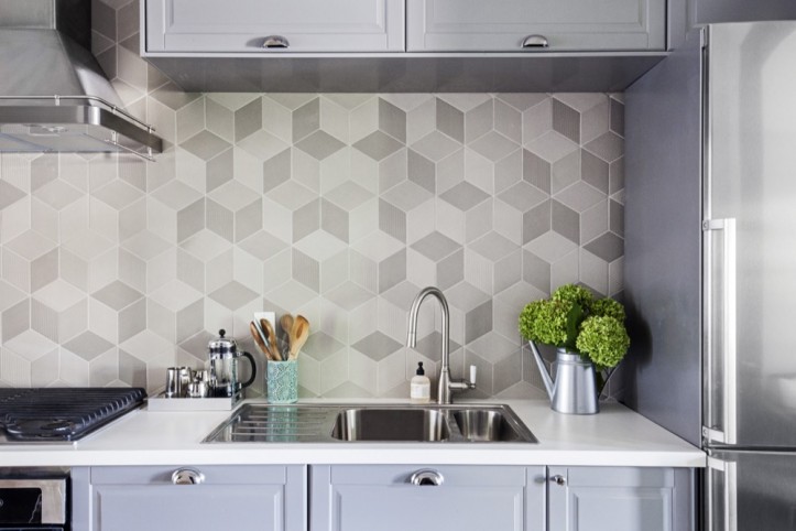
Once upon a time, 3D tile was very popular in those cool mid-century houses that were never renovated. If it was ever on your wishlist, you likely had to pay a lot for something that was hand cast or, alternatively, rough around the edges (literally). However, the demand for 3D has risen among designers for hotels and restaurants, and homeowners are now reaping the results. Manufacturers offer lots of interesting sculptural surfaces, from shallow recesses that resemble waves or indentations worn into stone by water to alternating raised and recessed hexagons to abstract and organic shapes that seem to spring from their surfaces. These tiles are good for feature walls and vertical areas, such as hallways that transition from one room to another.
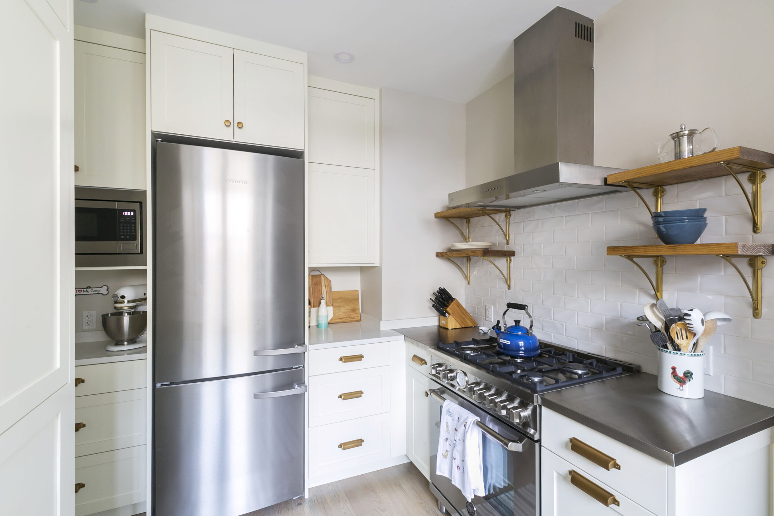
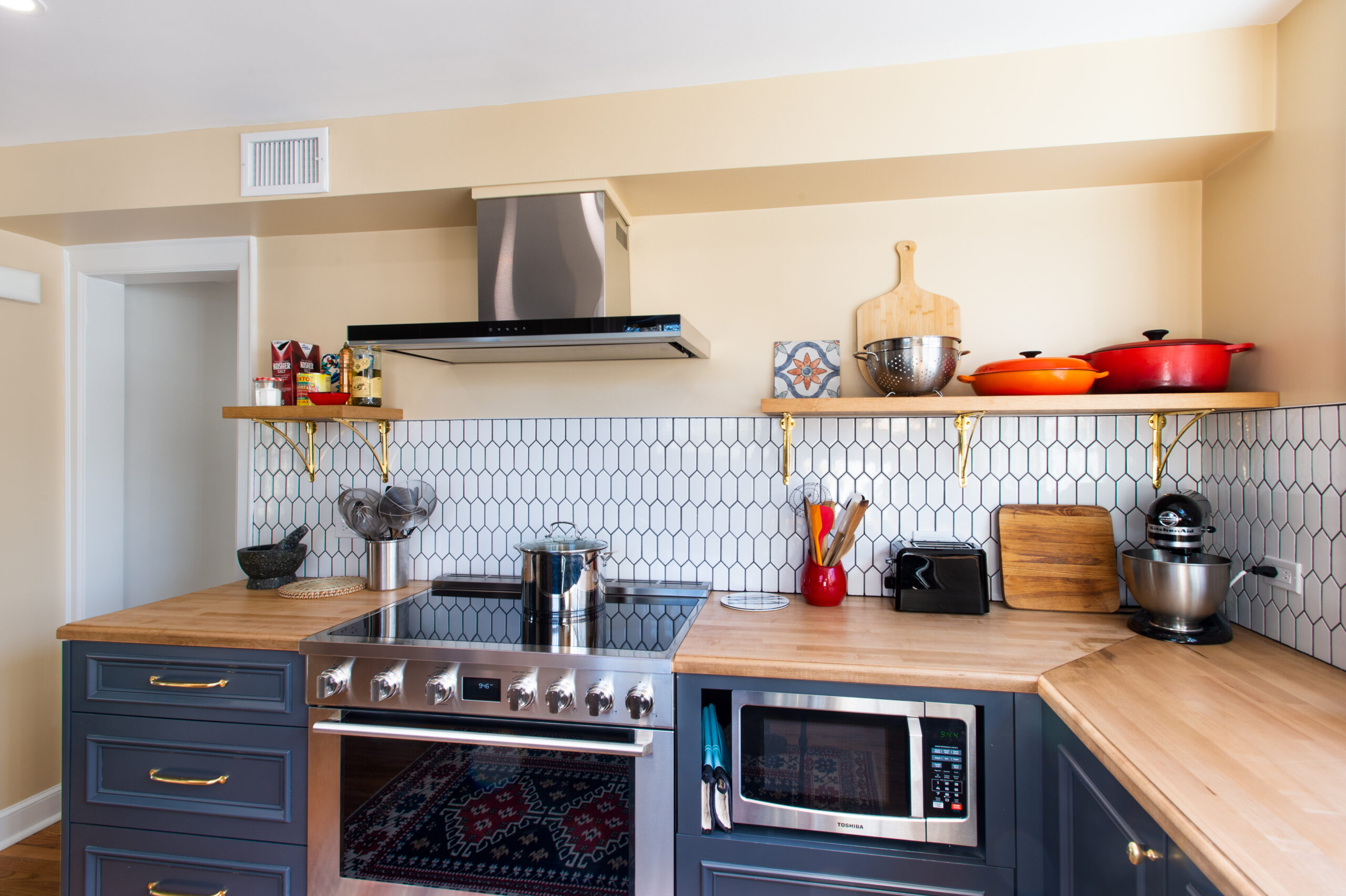
The hexagon is one of the more popular shapes to appear in kitchens and baths; it combines graphic interest with a classic outline, providing a strong motif around which you can play with size and color. One manufacturer created a wall tile with alternating rising and recessed discs. The 3” x 6” subway tile is seeing a renaissance, and reinterpreted in a thinner and longer dimension like 2” x 10” or even 2” x 20”. The rectilinear shapes lend themselves to a lot of different patterns when installed, like herringbone, chevron, and the running bond as an alternative to the traditional stacked. If you’re in the market for something more sensual, consider an arabesque-shape tile. Smaller versions will work on the floor, where the grout lines prevent slipping; it also makes a pretty backsplash or wall behind a vanity in a master bath.
If you’ve visited a tile store lately, you’ve probably noticed tiles are getting, well, bigger. Rectangular shapes can be found twice as wide as you may be accustomed to, such as 12” x 24”. Squares, too, have doubled in size, from 12” x 12” to 24” x 24”. Besides their fashion-forward appearance, there are several additional benefits: these larger sizes or formats actually make a small space, such as a bath, appear larger. There’s also fewer grout lines, which means faster installation and easier upkeep. However, the size trend doesn’t stop there. Designers are mixing sizes to create interesting effects, and you can, too. Combine wide and narrow wood planks, for instance, to achieve a custom effect, or alternate four small squares with one large square in the same size.
A decade or so ago, most tile installations used a white or off-white grout. It was adequate to blend into the tile’s appearance and still show the pattern. Now you can choose from dozens of colors to match your selection. Contrasting grout, however, has caught on, particularly with subway and other rectangular formats, to get a more graphic effect or to emphasize the shape of the tile.
— Sweeten handpicks the best general contractors to match each project’s location, budget, scope, and style. Follow the blog for renovation ideas and inspiration and when you’re ready to renovate, start your renovation on Sweeten.
Faux effects
Renovate expertly with Sweeten
Add various textures
Consider three-dimensional
Beyond basic shapes and patterns
Choose your size
A word about grout
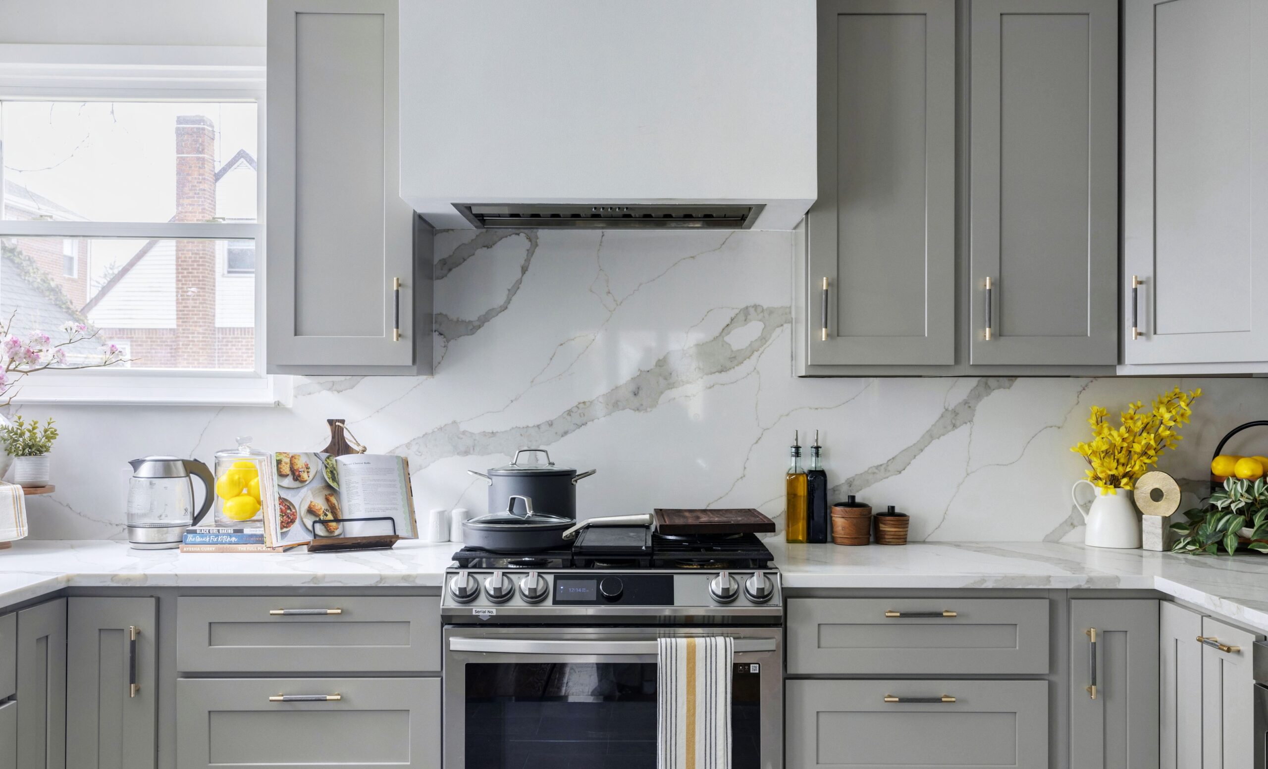
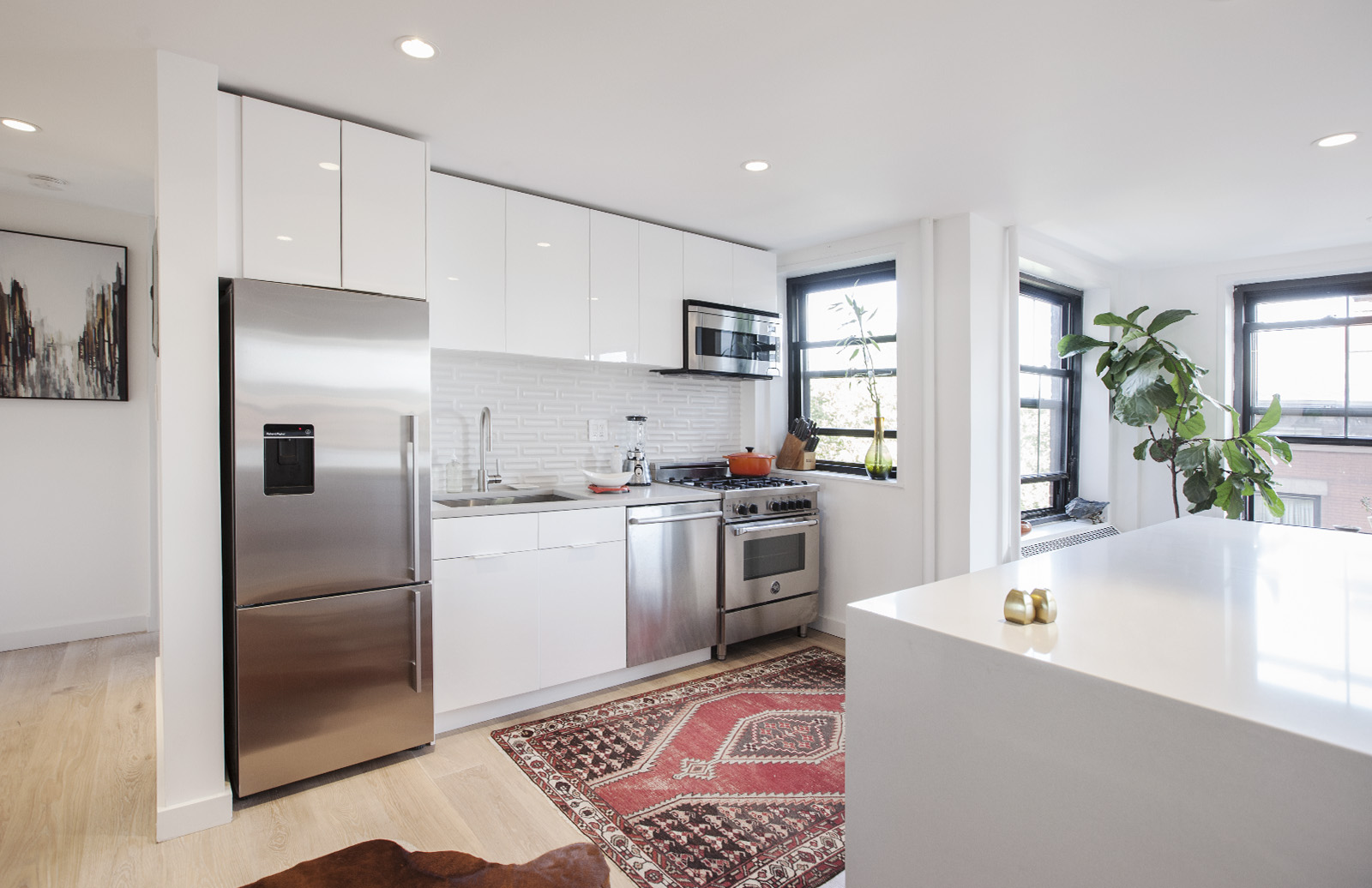
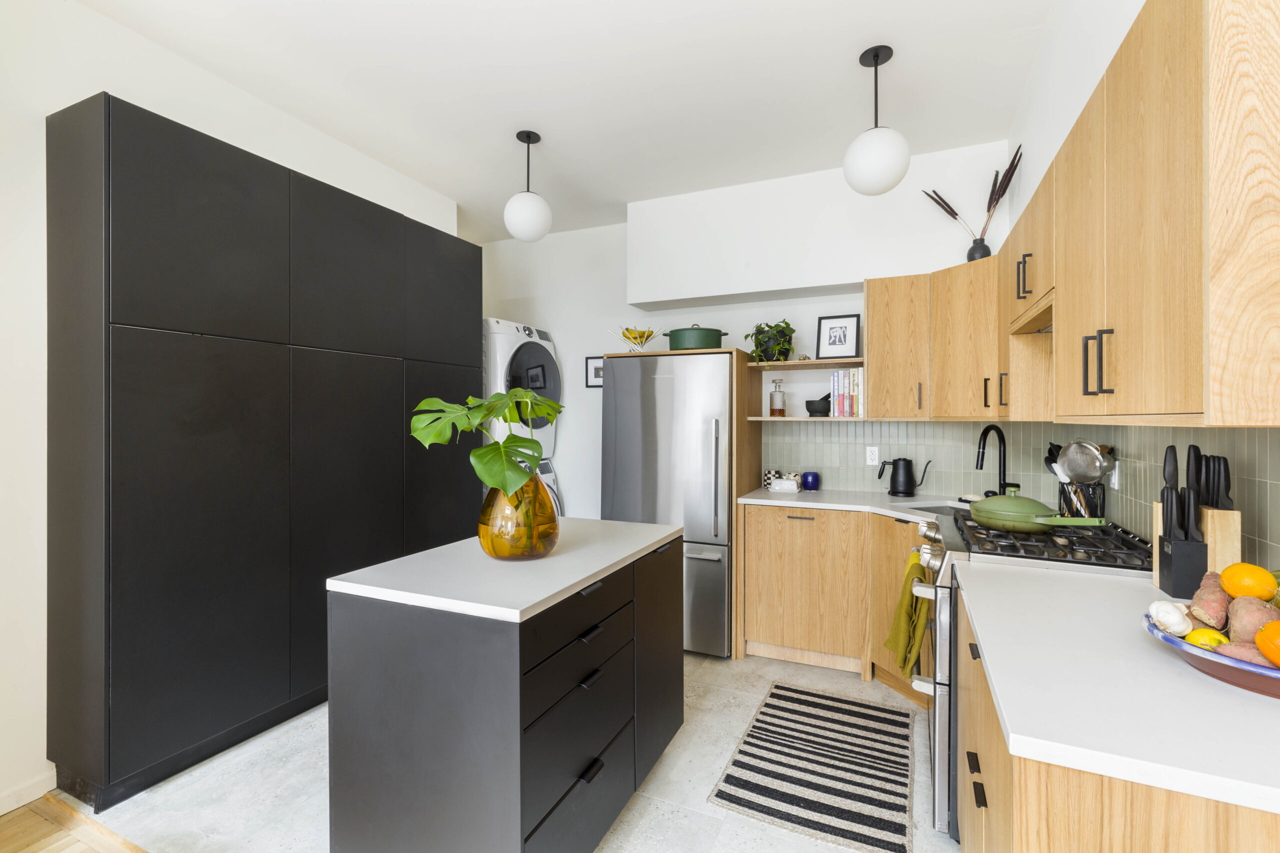
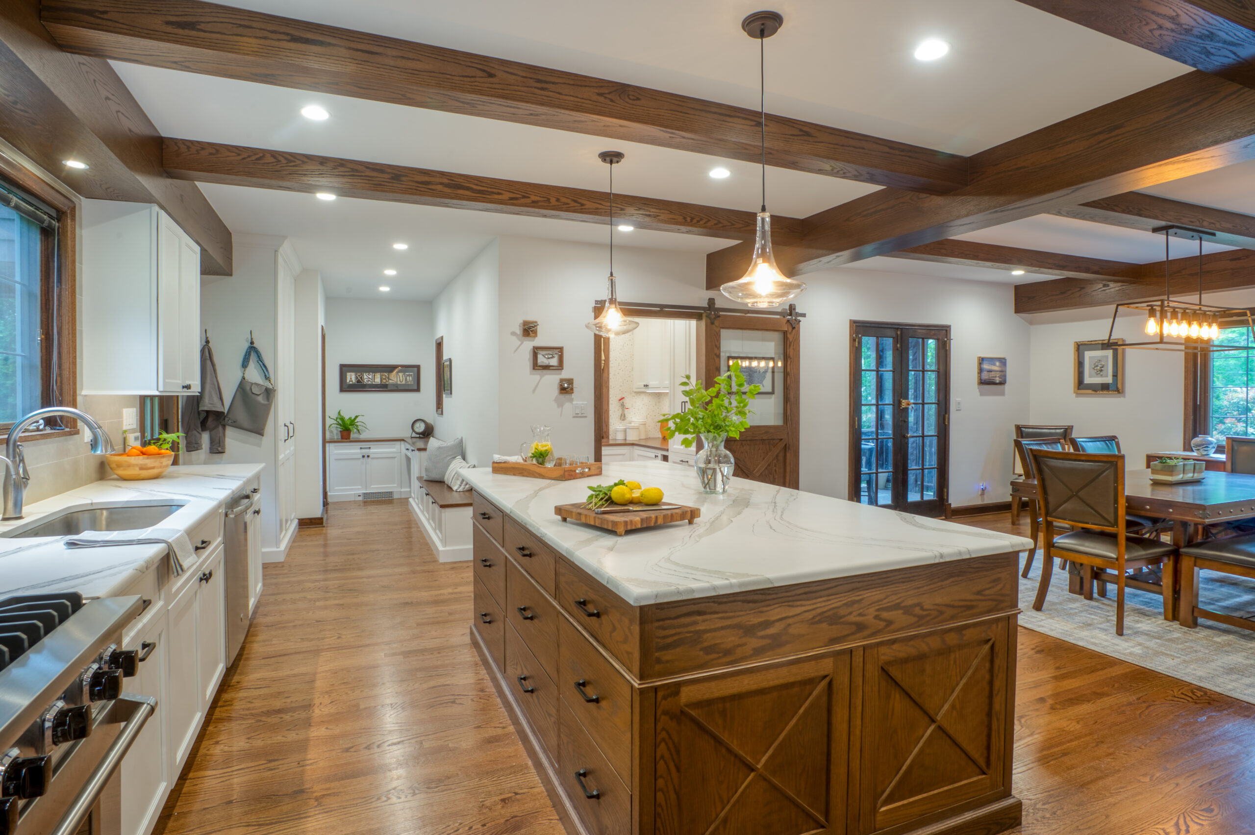
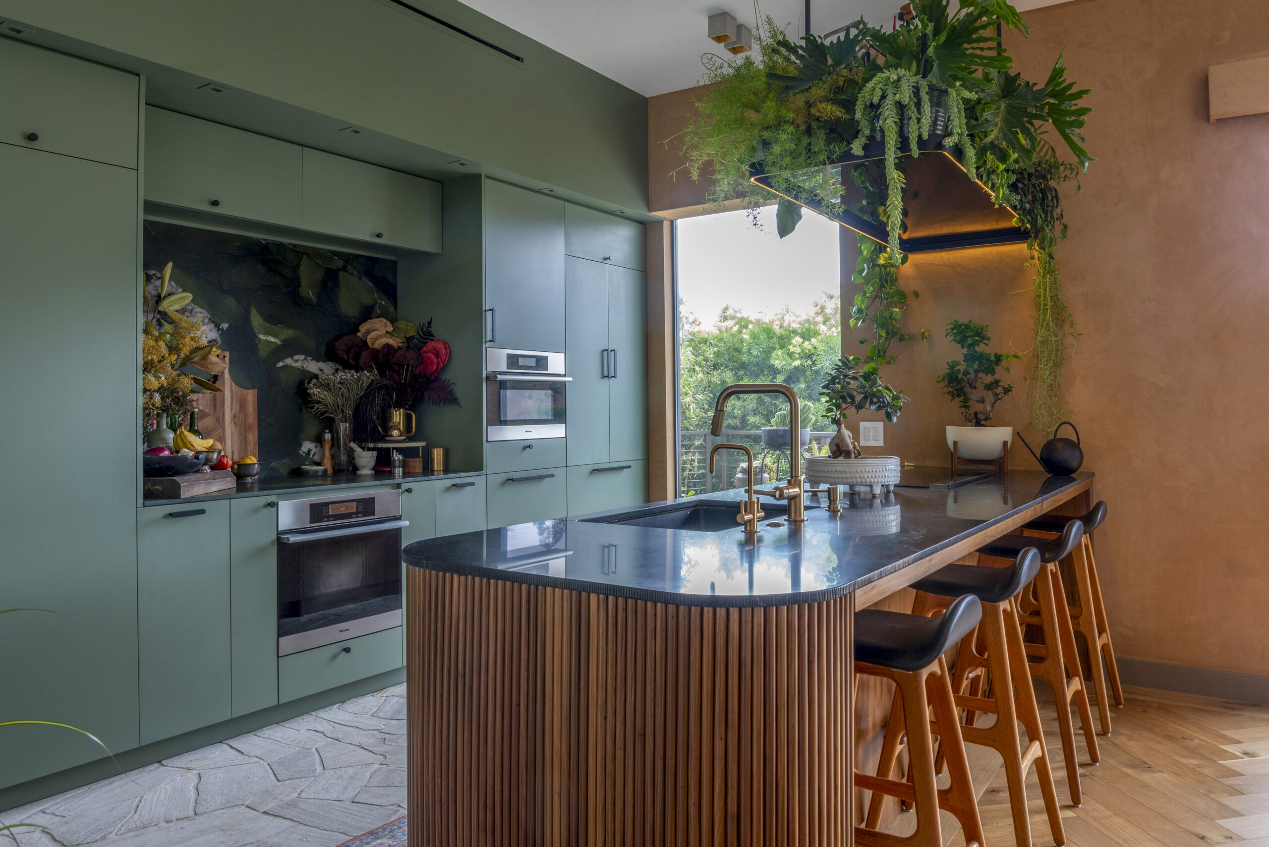
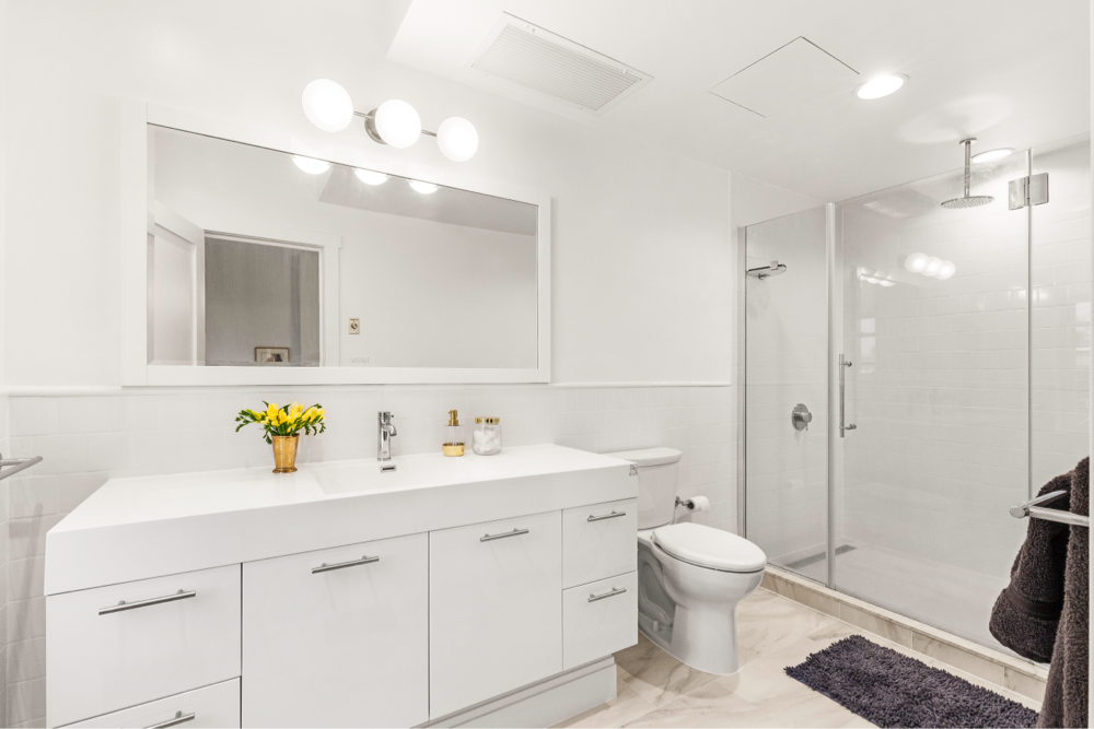
Your choice in tile can influence the entire space it occupies. Here is how Arthur and Kate used stacked patterns in minimalist fashion, while Kelly went bold with cement tile on the floor but subtly glamorous on the wall. Jerry and Janet’s geometric backsplash become the kitchen’s centerpiece, while Erica and Joshua’s subtle 3D tile struck a perfect balance.
