Long-time Renters Shine as Renovating Homeowners
A co-op refresh including an unplanned kitchen remodel
It was something like the seven-year itch that had Jessica and Alex setting off on their own. Having lived in a Manhattan rental for six years, they received a lease renewal from their landlord for the seventh. Jessica a real-estate development executive, and Alex, who works in finance as a strategist, sat down to discuss their New York City future. They decided to sign the lease but make it their last.
After a successful search, Jessica and Alex closed on an 800-square-foot co-op in Chelsea and posted their one-bedroom, one-bathroom project on Sweeten, a free renovation platform connecting homeowners with vetted general contractors. They soon found a design-build firm for their overhaul. Read on to learn how this renovation turned a “fine” apartment to fabulous.
Guest blog post by homeowner Jessica
We purchased the apartment with intentions to renovate. We both love architecture and design, and we wanted a place that we could make our own. The previous apartment, with its sunny balcony and endless closet space, had given us high standards, and working in real estate, I look at beautiful homes all the time. We wanted a home where we could make our mark and add the elements we craved.

We were thrilled when we landed on this one-bedroom apartment, in a 1930s Chelsea co-op. The building had great bones and Art Deco details but the apartment needed work. We’d been following Sweeten, and after closing, when we knew the reno was imminent, we looked to the service for direction. We wanted to create a clean, modern space marrying traditional and contemporary design elements accented with our personal twists. Throughout, we planned to incorporate art and photos from our travels.
Living in the apartment for about half a year and bringing our Sweeten contractor onboard brought the project into focus. We wanted to rethink the closet layouts and planned to update the living room’s custom built-ins. We were also looking for a lighting solution since the courtyard-facing unit didn’t get much natural light.
Last but certainly not least, we planned to improve the kitchen and the bathroom. Additional cosmetic and electrical updates included new doors and hardware and USB outlets throughout the apartment. Our contractor was patient, listening to our thoughts (lots of them), answering questions and—most of all—assuring us that he could get the job done, within our time constraints and with the level of quality we were hoping for.
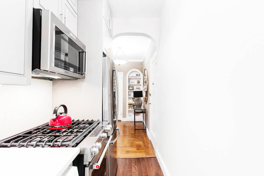
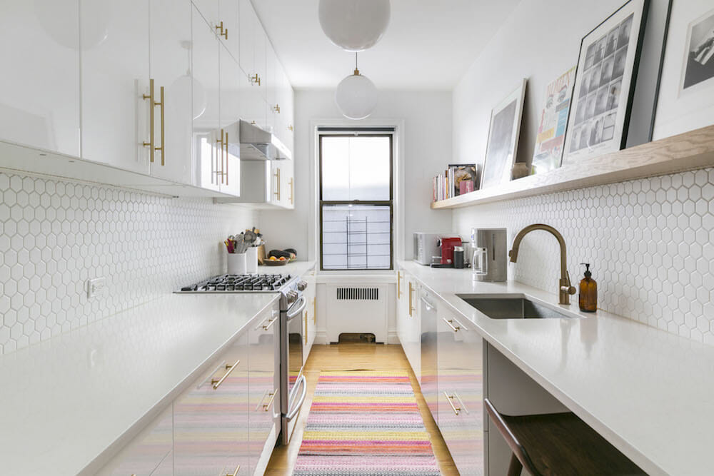
A narrow galley kitchen? Yes. And we love it.
Renovate expertly with Sweeten
Sweeten brings homeowners an exceptional renovation experience by personally matching trusted general contractors to your project, while offering expert guidance and support—at no cost to you.
Start your renovation
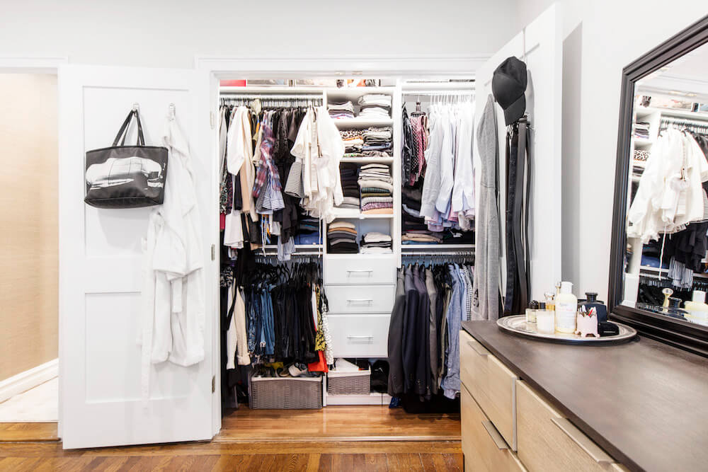
Closets and storage came first. We’d known when we purchased the apartment that we were in for a major storage deficit. With our contractor’s help, we found we could reconfigure the hall and bedroom closets, which backed up to one another. We moved the interior wall, creating a larger bedroom closet with French doors (sliding doors can restrict access). Downsizing the hallway closet felt like a sacrifice, but we outfitted the space for linen-and-shoe storage—useful and enviable extras in NYC.
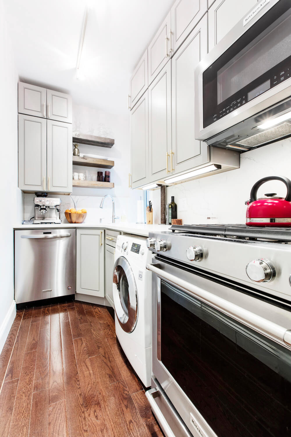
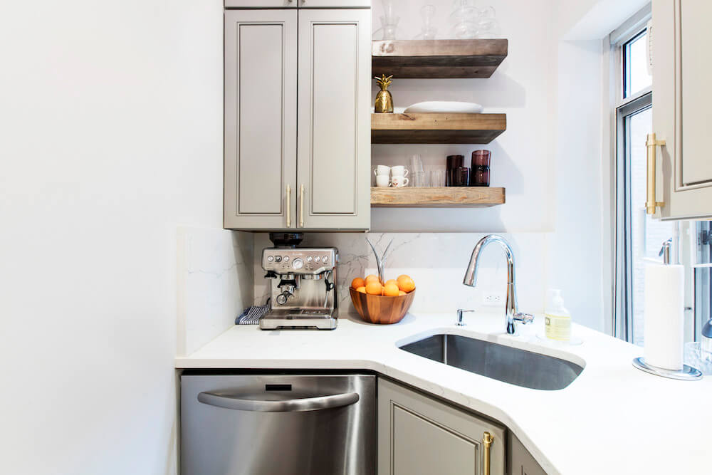
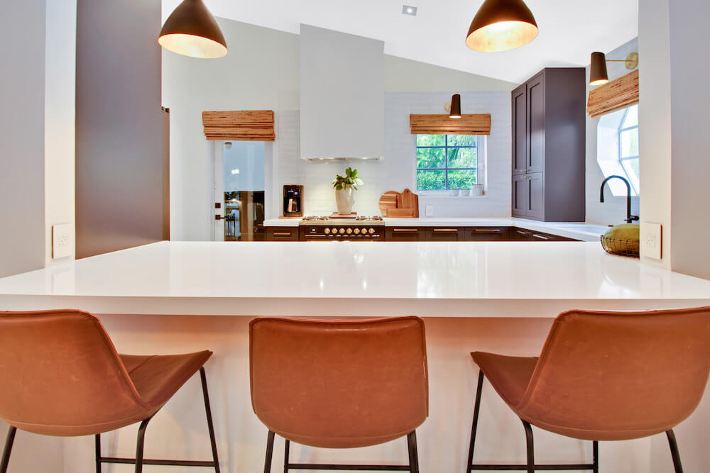
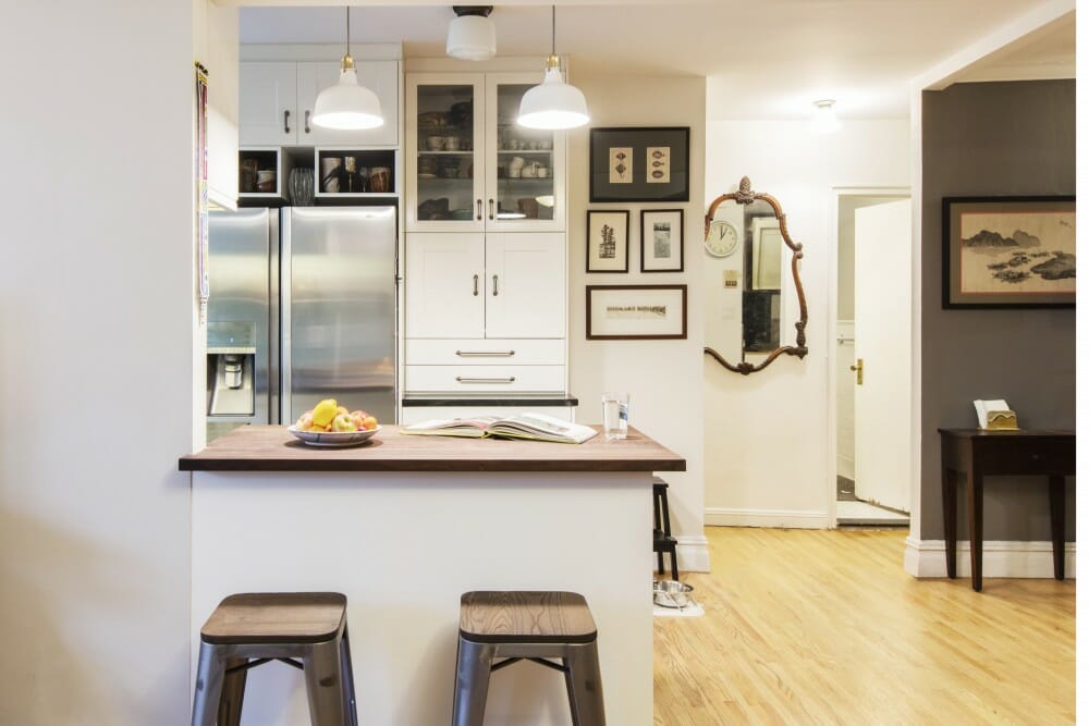
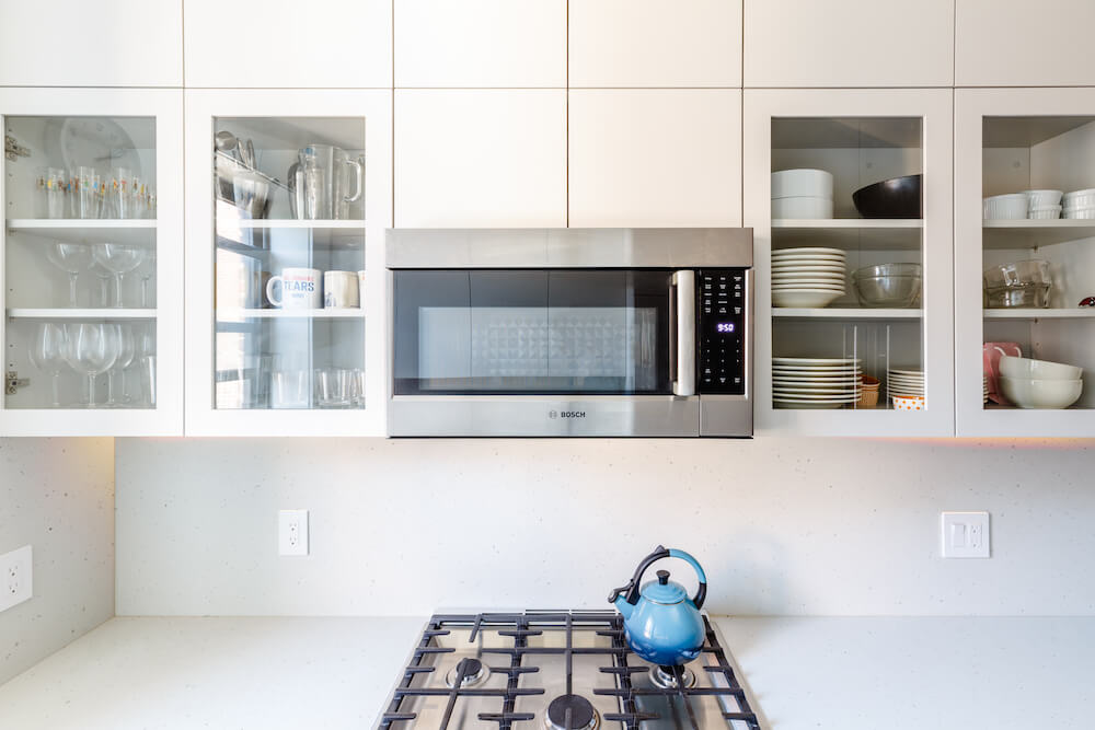
The kitchen was one room where plans changed. It had been renovated and we hadn’t planned on a gut-job. We love to cook and entertain, and didn’t want to forego full-sized appliances, but we wanted more cupboard and counter space. We ultimately did a full rip-and-replace. The cabinets are an off-the-shelf pick that we stacked to the ceiling; it was like putting together a giant puzzle, but was good for our budget and timeline, and gave us a ton of storage.
The cabinet above the dishwasher was a last-minute call to increase pantry space. Quartz countertops and a slab backsplash give us a marble look without the maintenance. A narrow galley kitchen? Yes. And we love it.
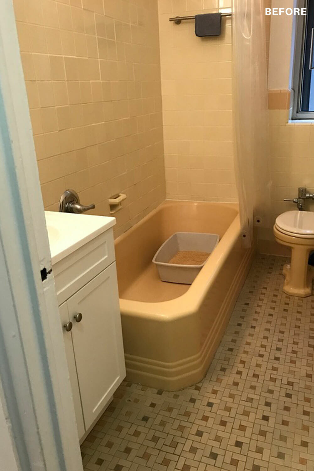
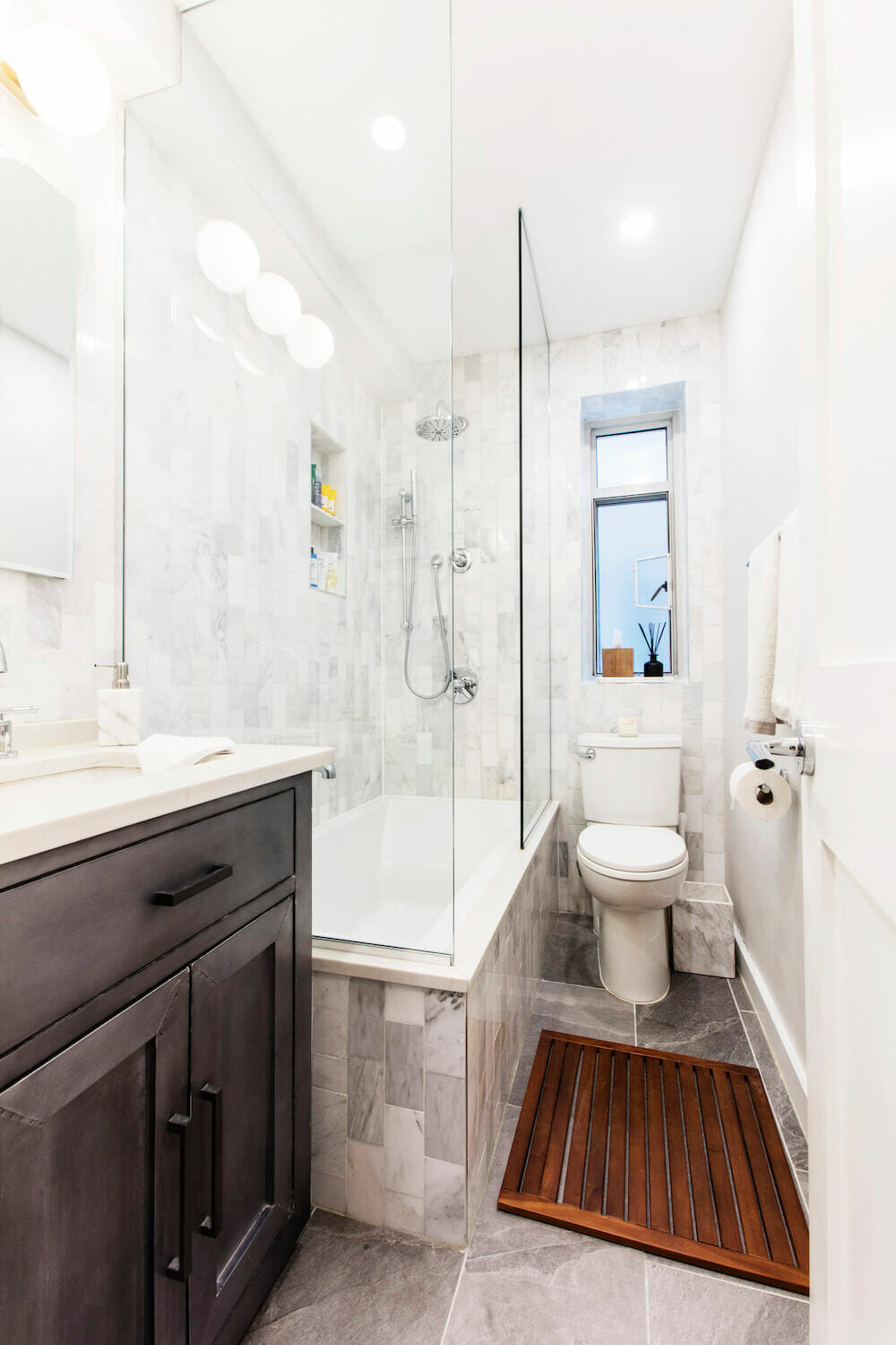
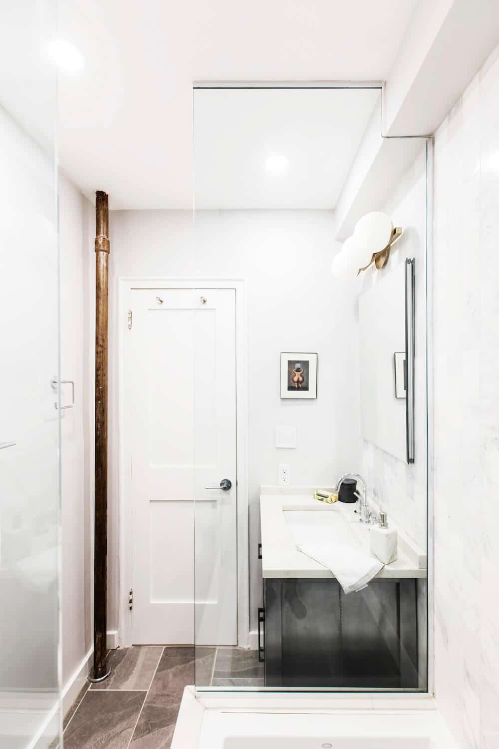
The old ’70s bathroom remained, and it was a full demo and redo. We replaced the peach and yellow bathroom tile, which appeared to be original to the building, with marble subway tile, placed vertically for some spin. We played with metals, choosing an unexpected iron vanity (the countertop is quartz) and chrome hardware. The floor tiles are porcelain, sleek and durable.
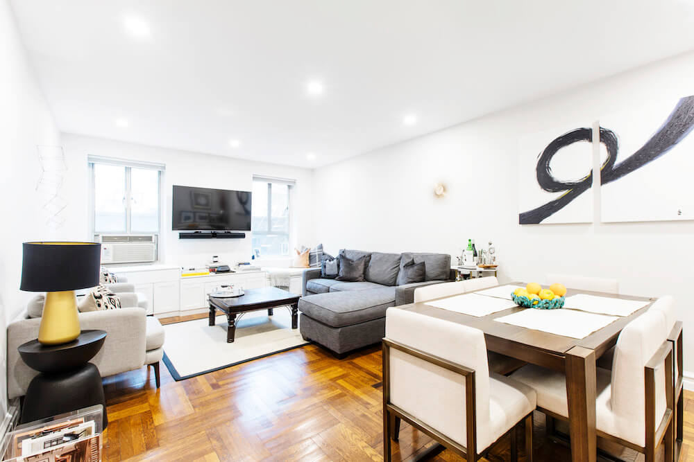
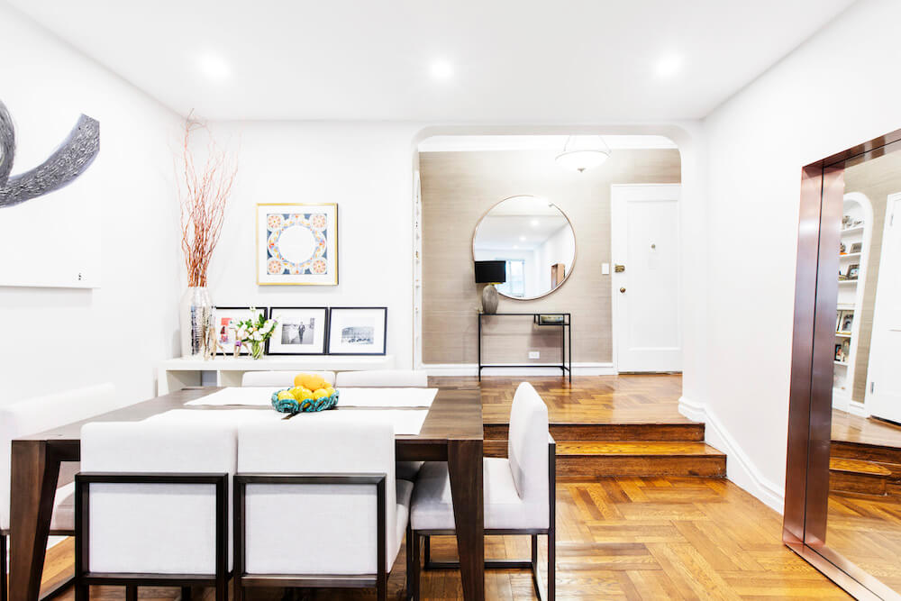
The rear-facing apartment was pin-drop quiet, but dark. The silence was a luxury to us, having endured roaring sunrise garbage pickups and the revelry of late-night barhoppers. But the long living room, which also comprises the dining area, had just two windows and no built-in light fixtures.
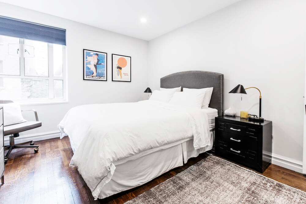
We installed recessed LED lighting in this room and it brightened the area so perfectly that we added it in the bedroom, the bath and, finally, the kitchen.
The existing built-in cabinets spanning the windowed wall in the living room provided additional storage and brightened up the room with a fresh coat of white paint. We removed a floating center unit to accommodate a wall-mount TV.
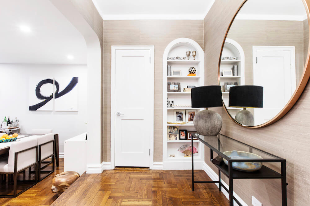
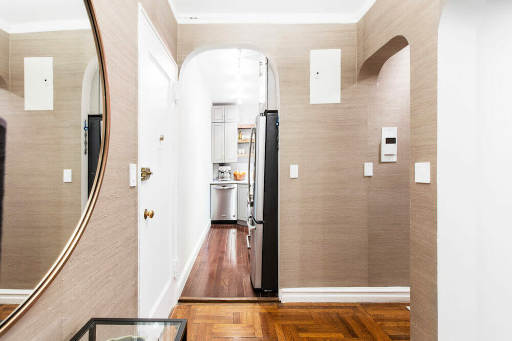
To finish, our Sweeten contractor detailed with all new doors and hardware and added those USB outlets, which become more useful every day. It was our idea to hang wallpaper in the foyer; the subtle raffia gives the walls texture and depth. We chose materials that would stand the test of time from both an aesthetic and durability standpoint.
But it was so helpful to have an expert to guide us. There are a ton of vendors out there and our contractor had relationships with suppliers and experience with almost any material available.
Our advice as first-timers is to do the research and know what you want but keep an open mind! Seeing the work progress day-over-day and week-over-week was amazing, and we’re so thrilled with the outcome! Adding our stamp to this place was fun and fulfilling. What a great feeling!
Thank you, Jessica and Alex, for sharing your story!
BATHROOM RESOURCES: Floor and wall tile: Tiles Unlimited. Shower fixtures: Delta. Sink and vanity: RH.
—
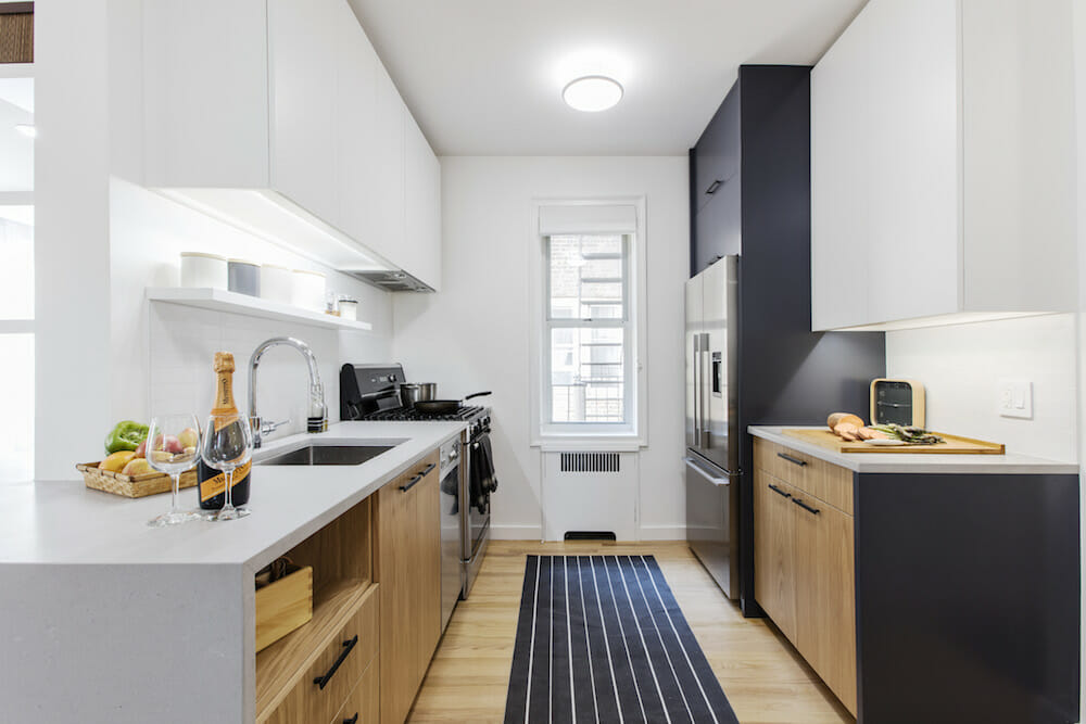
Galley kitchens are more flexible than you may think. Here are some ways to fold them into the living spaces.
Sweeten handpicks the best general contractors to match each project’s location, budget, scope, and style. Follow the blog, Sweeten Stories, for renovation ideas and inspiration and when you’re ready to renovate, start your renovation on Sweeten.
