Three Modern Baths and Two Custom Built-Ins in One, Sweetened Upper East Side Condo
Cramped bathrooms are a common challenge in New York City apartments. But as this Upper East Side condo renovation shows, even small spaces can be transformed into stylish and functional oases. The key is to make smart design choices, like using timeless materials such as Carrera marble hex tiles.
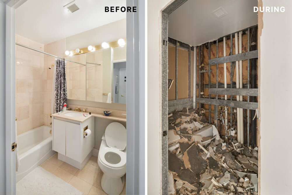
Here, three full baths complete an Upper East Side family’s condo renovation. Scroll down to see how design duo Sweeten Experts Lauren and Adam and Sweeten’s expert general contractor Alan worked together to create modern and simple baths throughout this home, and take a bonus peek at the custom millwork that brought similar form and function elsewhere in this uptown Manhattan renovation.
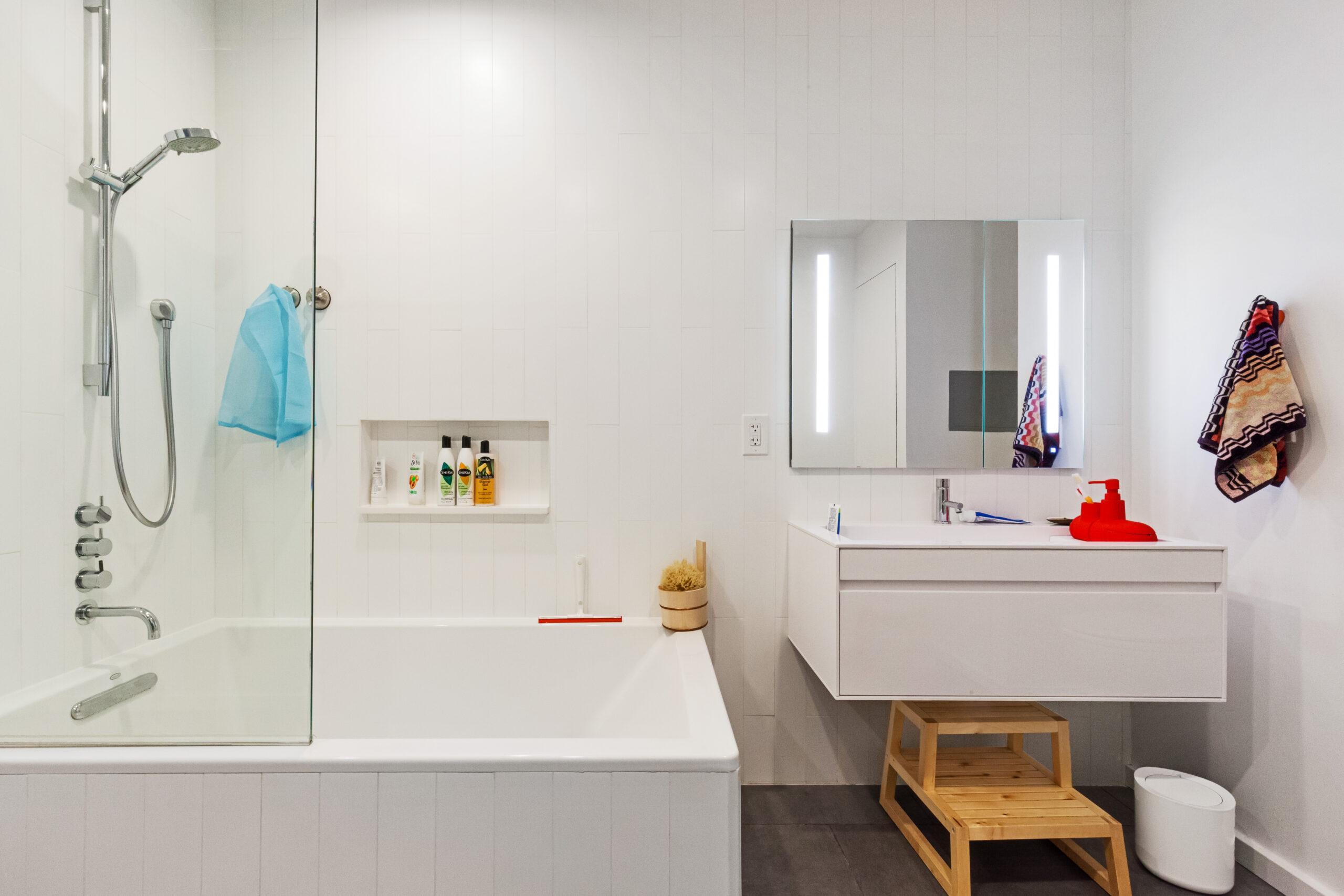
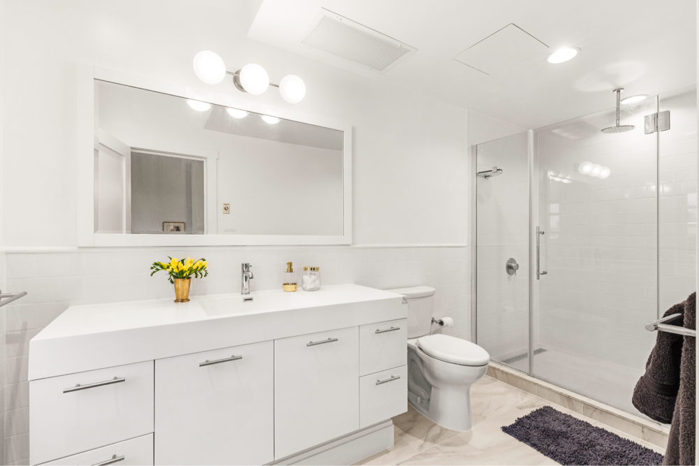
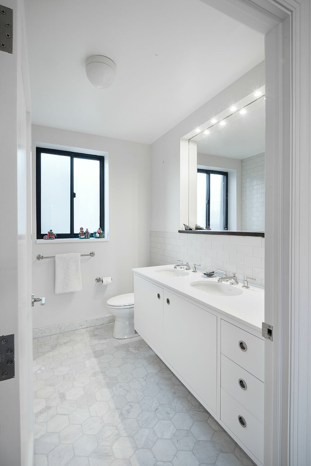
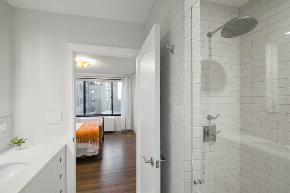
In the master bath, Lauren and Adam worked to balance two competing values: the bath itself is the largest of the three, with plenty of room for his and hers sinks, a sizable window, and a full tub, but the condo’s owners wanted to create a sense of privacy and make room for more storage. To take advantage of the bath’s spacious footprint but minimize sight lines into the master bedroom, the designers left the layout of the room generally intact, swapped in high-end tiles and custom cabinetry, and split the tub into a standing shower with a bench and expanded shelving.
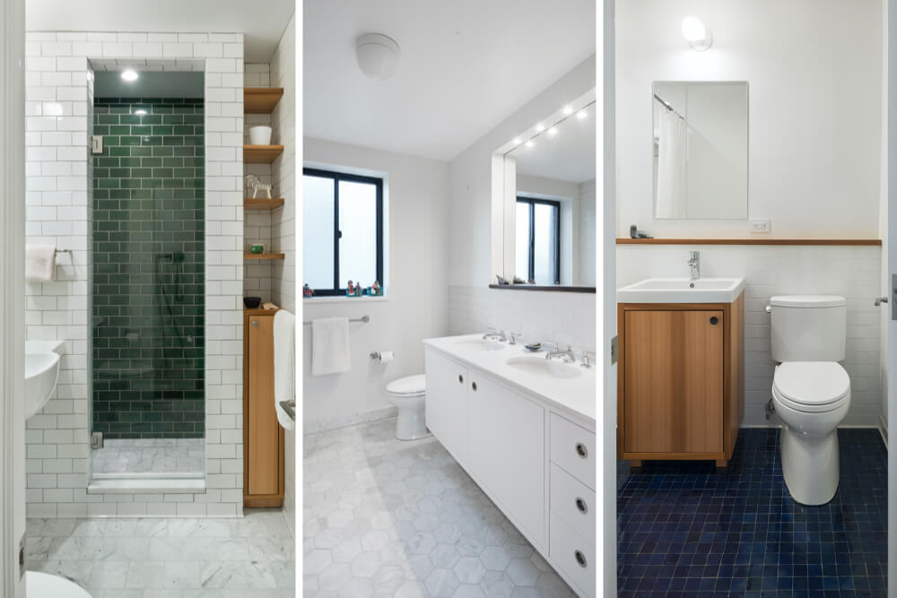
Here, 6″ Carrera marble hex tiles create an understated geometric floor foundation, evoke the feel of a refined version of the identically shaped black asphalt pavers that ring Central Park, and are complemented by simple white subway wall tiles from Heath Ceramics. Alan’s millworkers built the vanity with white-lacquered cabinets and drawers and inverted the medicine cabinet, previously wall-mounted and hanging over the sink counter. This subtle detail really stands out: Lauren and Adam chose a walnut inset ledge to line the vanity mirror, creating a slightly recessed niche and allowing for an additional lighting strip to sit just inside the top line. The Toto toilet, Duravit sink, and Lefroy Brooks sink and shower faucet fixtures complete this clean-lined look.
At Sweeten, we’re experts at all things general contractors — we pre-screen them for our network, carefully select the best ones for your remodeling project, and work closely with hundreds of general contractors every day. So, we’ve tapped our internal expertise to bring you this guide. Sweeten brings homeowners an exceptional renovation experience by personally matching trusted general contractors to your project, while offering expert guidance and support—at no cost to you. Renovate expertly with Sweeten
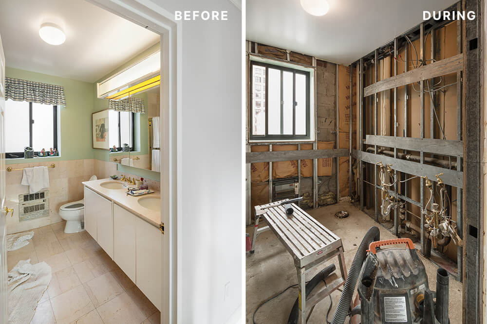
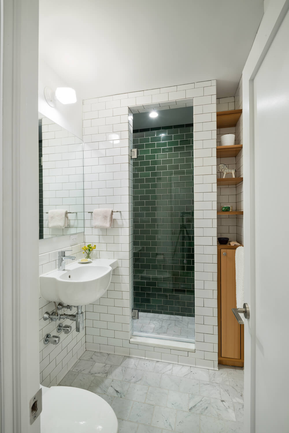
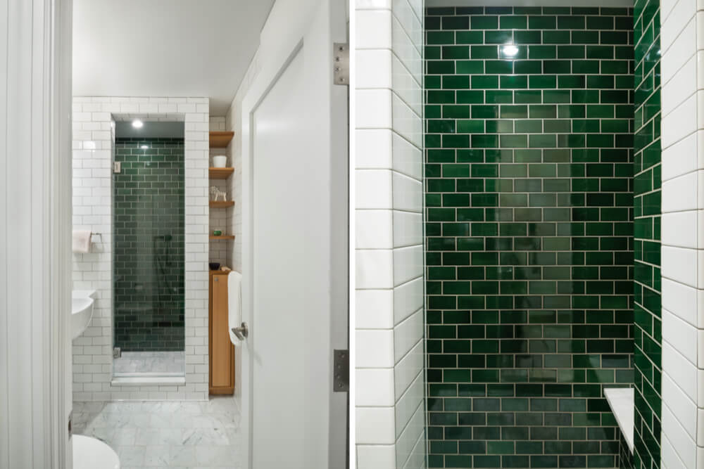
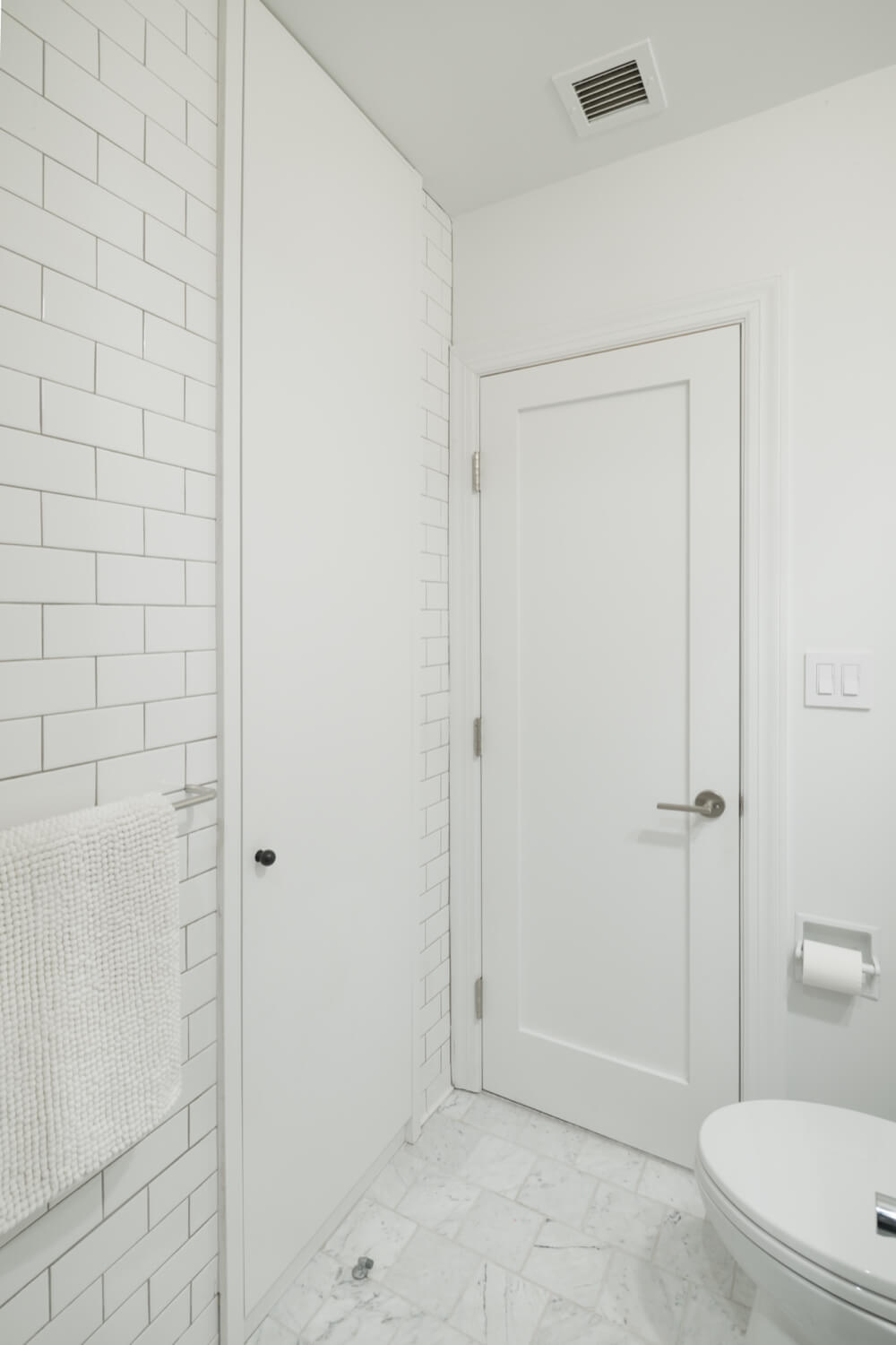
In the second bath, Lauren and Adam found ways to balance continuity with diverse details by using 6″ square Carrera marble floor tiles and by making the shower the centerpiece of this room with luminous green Heath subway tiles on the inner shower walls. White subway tiles from Daltile, lined with neutral gray grout, complete the shower surround. The underlying footprint of this bathroom was altered to meet the owner’s suggestion of relocating the entry door – a move that allowed Lauren and Adam to focus the viewer’s eye on the shower details, add shallow storage shelving behind the newly-converted closet door, and take advantage of the narrow niche next to the shower stall to warm up an impeccably-tiled room with open cedar storage shelves and a compact cabinet. I can not get enough of that tiny oil-rubbed bronze door knob – the owners sourced both the knob and the vanity lighting fixture from Rejuvenation. The bathroom sink, chosen for it’s asymmetrical corner counter, is from Pozzi Ginori, and the plumbing fixtures have been outfitted with Grohe.
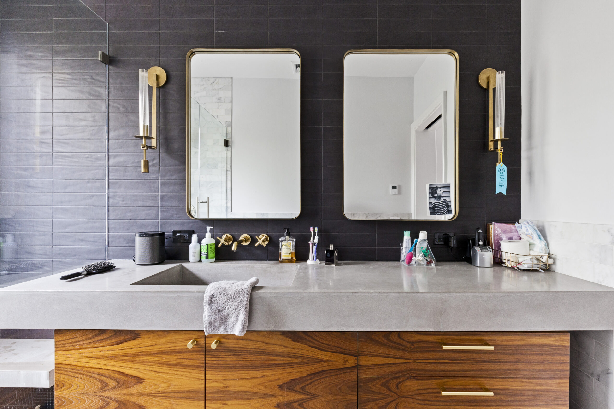
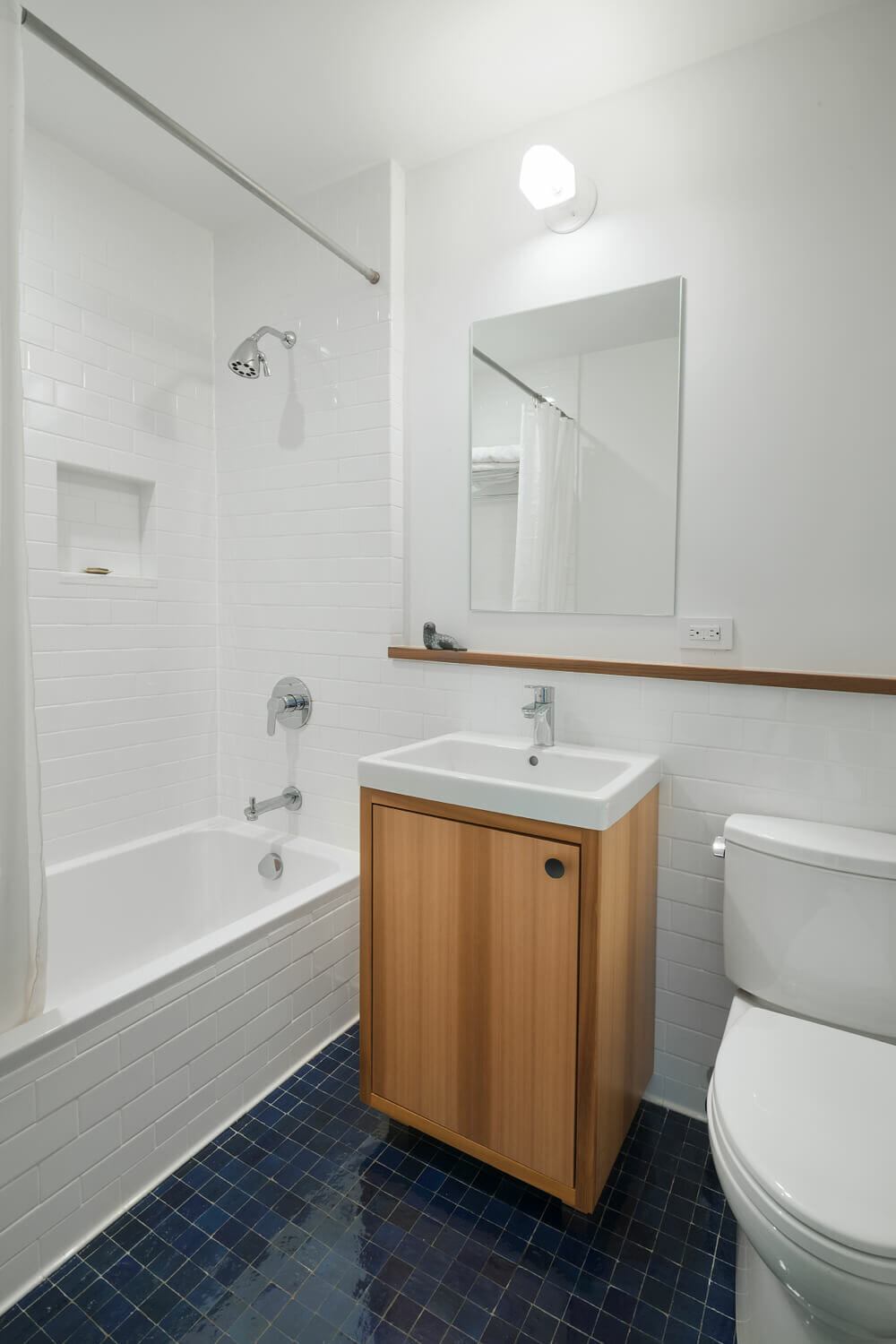
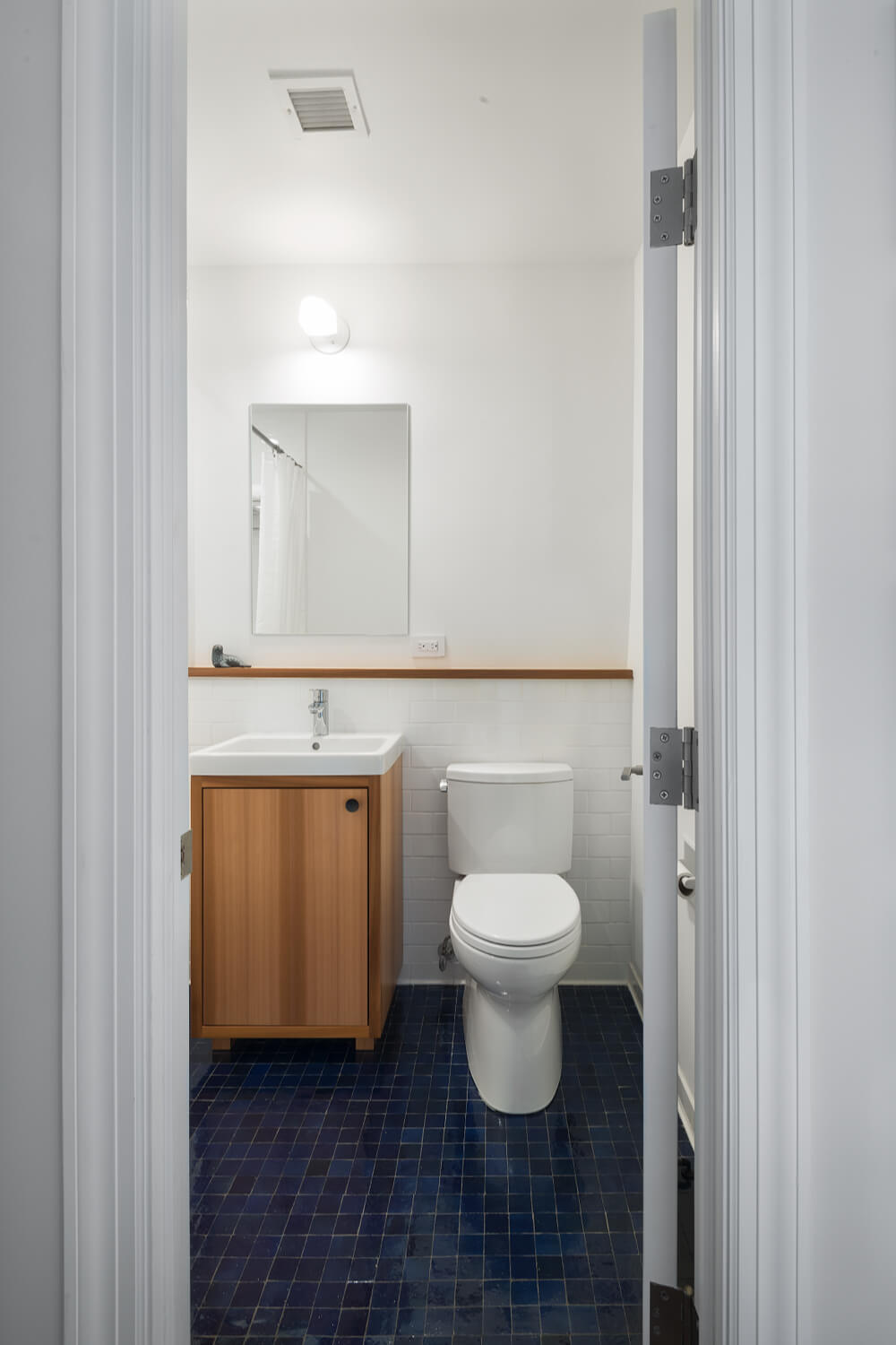
In the third bath, Lauren and Adam continued to rely on subway tile but added variety and character with a cubed navy floor tile from Mosaic House, a red cedar inset vanity ledge and cabinet, a gently-squared Duravit tub and sink set, Grohe plumbing fixtures, and a wall-mounted Rejuvenation vanity sconce, identical to the light selected for the second bath.
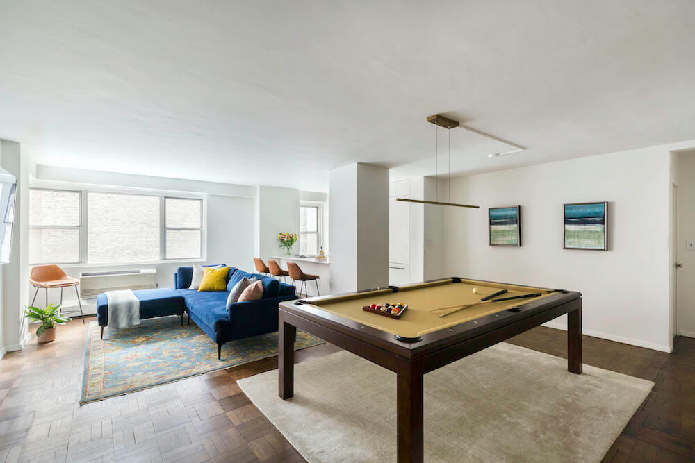
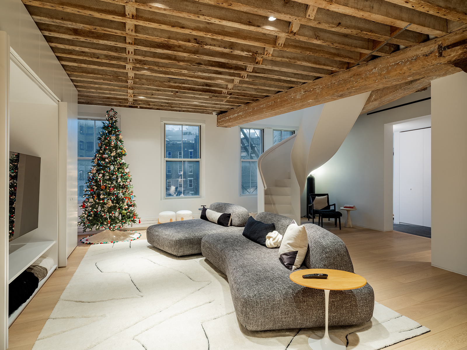
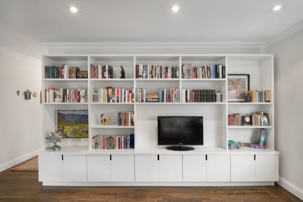
For one final example of the beautiful design and flawless execution that accompanied this project, look no further than the intricate built-ins that now line the master bedroom and the family’s living room. Lauren and Adam worked closely with the condo’s owners to make the most of these wall-to-wall units. The owners came to the table equipped with sketches and inspiring images, and had specific proportion requests in mind for each piece. While they intended to use the living room shelving to house the tv, they were smart to focus on a design that would minimize the appearance of the tv by placing it alongside other interesting items, and by slightly off-setting the tv area so that the tv is not the focal point of that wall. The team played with ideas like incorporating a bar area or bench seating, but ultimately created a piece that houses books and media and art without overtaking the room.
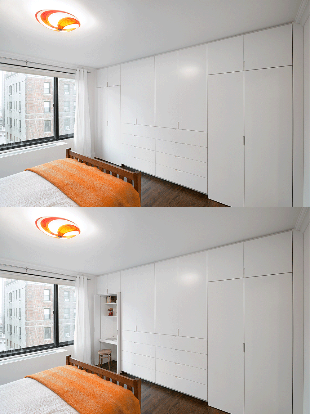
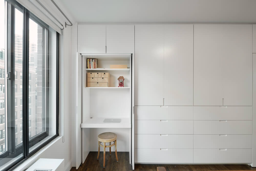
In the master bedroom, Lauren and Adam designed a full-wall custom built-in that is unbelievably functional and simultaneously well-integrated. With no visible pulls or hardware, it is easy to miss all of the elements that the wall now accommodates: a workspace by the window, storage cabinets, deep drawers, and hanging wardrobes — all concealed by lacquered doors and inset handles. The workspace has pocket doors that open and slide back toward the wall, which gives the owners the option to keep the desk open or slightly sectioned off from the rest of the room.
—
Many, many thanks to Sweeten Experts Lauren, Adam, and Alan for this insider’s look at the design and craftsmanship throughout this home. So fun to see a renovation that included everything AND the kitchen sink! We are beyond psyched that we were able to bring this team together.
Ready to renovate? Start here for free!
Here you can learn more about our services and locations. Alternatively, browse more home renovation inspirations, processes, and cost guides.
