A 1950’s Kitchen Remodel Reveals a Chic Before-and-After
The centerpiece of a post-war home gets larger and brighter
Project: Create an open concept for a small 1950’s kitchen remodel
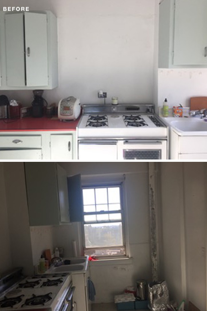
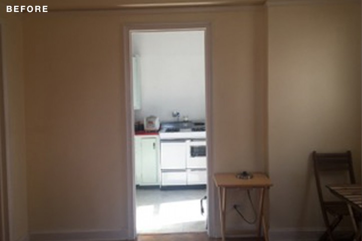
Before: When Jane bought her post-war, one-bedroom apartment in upper Manhattan, the home was in dire need of a kitchen upgrade. The biggest challenge was to open up the small, pokey kitchen to the rest of the living space. The original and inefficient layout had a large foyer space that provided entry to other sections of the apartment—living room, bedroom, and kitchen. The kitchen was mostly walled off except for the entry, and inside were the original ’50s cabinets and vinyl flooring. With the rather decrepit oven abutting the sink, the design had no functional counter space between the two. Jane posted her project and enlisted an architect from Sweeten.
Sweeten matches home renovation projects with vetted general contractors, offering guidance, tools, and support—for free.
Renovate expertly with Sweeten
Sweeten brings homeowners an exceptional renovation experience by personally matching trusted general contractors to your project, while offering expert guidance and support—at no cost to you.
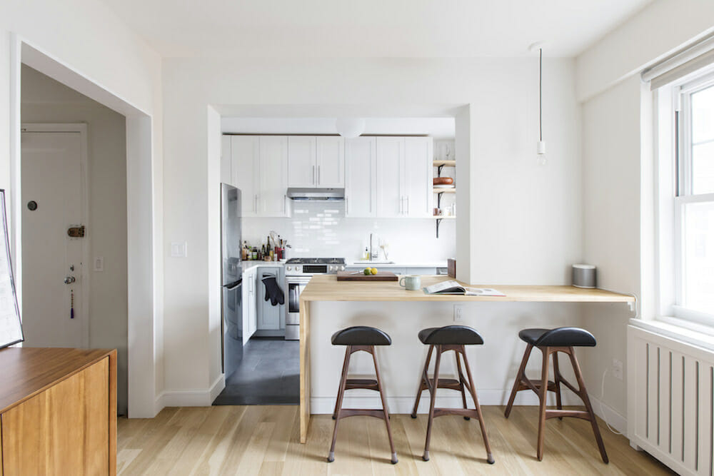
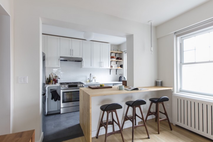
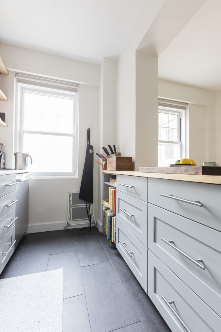
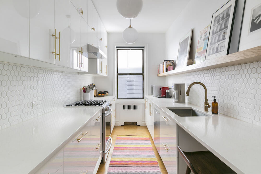
After: Despite the apartment’s critical state, the Sweeten architect Jane chose had plenty of good news for the Washington Heights homeowner. The wasted foyer space meant some wiggle room to expand the kitchen’s size. Here, the architect was able to design more cabinet and counter space and bring the kitchen from 76 square feet to a total of 91.
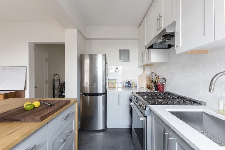
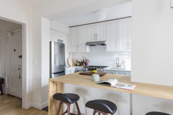
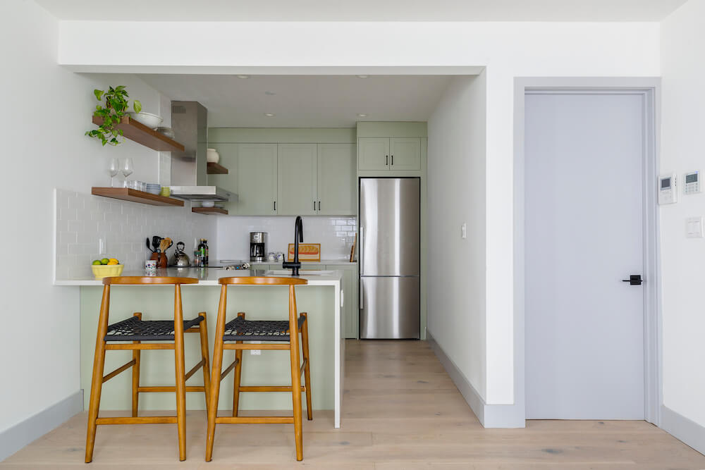
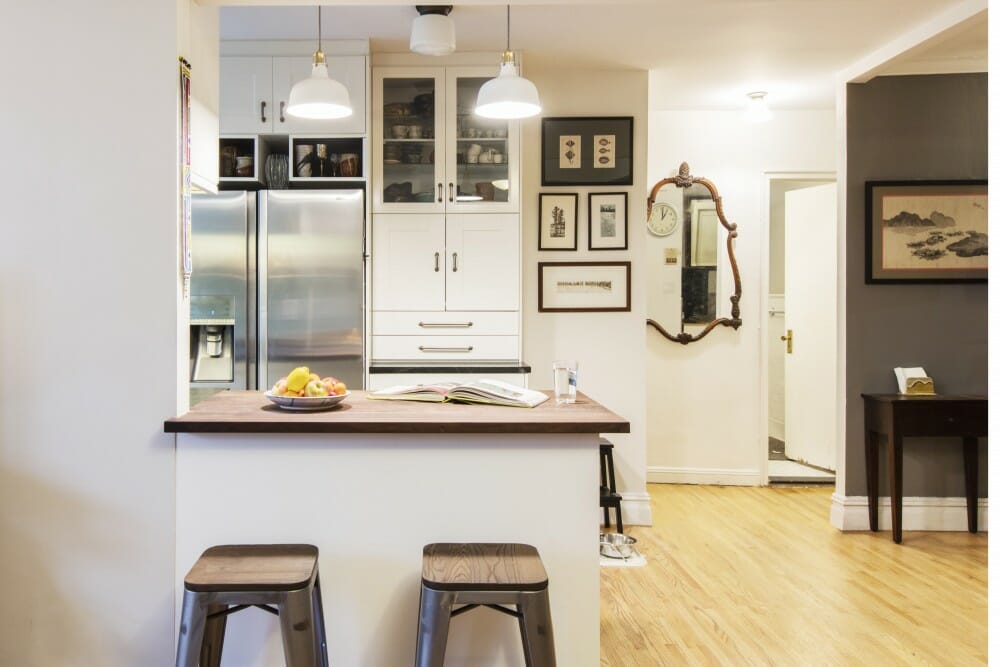
They also scooted the oven over to add about a foot of very useful counter space between sink and oven. The wall separating the kitchen from the foyer wasn’t loadbearing and could be removed. This allowed for a continuous flow into the foyer and living space with a bar, making it a perfect area for breakfast or pre-dinner drinks.
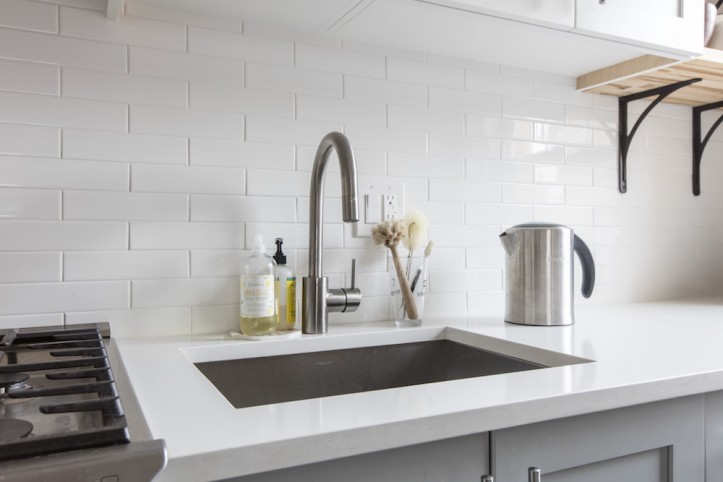
A large kitchen window meant there would always be plenty of light. To capitalize on this, the Sweeten architect used a light color palette. The top cabinets, countertop, and backsplash were a bright white, while a light gray was chosen for the bottom cabinets to make the space feel larger. A butcher’s block material and wooden shelving near the window added some warmth to the overall look. The wood countertop also extended to the window on the barstool-side of the peninsula, but Jane and her architect “thought it would be nice to add a design element [a single light pendant], where it would be easy to forget the corner existed,” says Jane. A streamlined custom radiator cover by the window replaced one that was metal and slightly corroded.
“I’m very pleased with my new kitchen,” Jane says. “I wanted to take advantage of the natural light. The peninsula is great because it allows me to entertain guests in the kitchen and in the living area.” The project was completed within her remodeling budget.
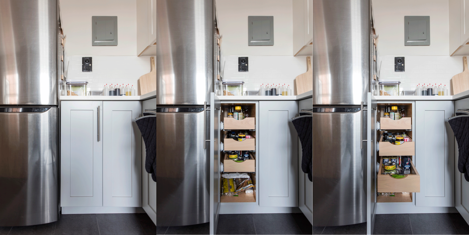
Bonus: Even with more space, the countertops were still rather shallow. The architect used a fridge with a shallow depth dimension so it wouldn’t jut out past the counter.
—
When you’re ready to get started on your kitchen or home remodel, work with Sweeten to renovate with the best contractors.
Sweeten handpicks the best general contractors to match each project’s location, budget, and scope, helping until project completion. Follow the blog for renovation ideas and inspiration and when you’re ready to renovate, start your renovation on Sweeten.
Renovation Materials
- DesignCraft mission flat-front upper cabinets in White Icing and base cabinets in Islander Sheer in the kitchen: Park Slope Kitchen Gallery
- Lansa hardware: Ikea
- Floor tiles and backsplash: Nemo Tile & Stone
- Quartz countertop in Blizzard: Caesarstone
- Faucet: Grohe
- Refrigerator: Summit
- Lighting inside kitchen: Flos
- Single light pendant above peninsula: Schoolhouse Electric
- Wall and ceiling paint color in Cloud Cover: Benjamin Moore
