A Food Writer Uses Hotel-Inspired Style for an Art Deco Apartment
When they began looking for more space, Chelsea residents Lauren and Ross didn’t want to move far from their Manhattan neighborhood. Luckily, they found a new home in Kensington House, an Art Deco co-op building just three blocks from their old place.
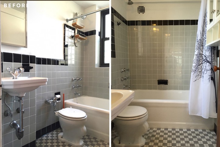
The two-bed, two-bath apartment featured plentiful space for entertaining—a must for Lauren, a food industry professional, as well as the perfect nook for Ross’ piano. The baths in this Emory Roth-designed building were true to their 1930s roots, with out-of-style tiling, industrial flushometer toilets, and exposed radiator pipes that were an unattractive hazard.
The couple tapped the interior design firm White Arrow to create hotel-inspired baths with more storage. Read also about their choice for color and a unique, space-saving pocket door solution.
My husband, Ross, and I purchased a two-bedroom apartment in Chelsea last year. We were already living in a one-bedroom apartment in the same neighborhood and wanted to upgrade to an apartment that had more space. After about three months of looking, we found the perfect apartment, only three blocks from where we were living.
We loved the loft-style layout of the apartment we found, but the bathrooms were in a bit of a sorry state. The tile was outdated and one of the baths had a huge old-school metal tub stopper located next to the toilet.
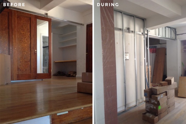
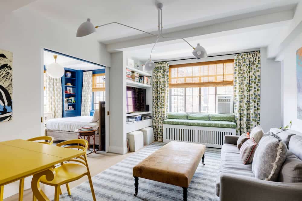
So we planned on gutting the two spaces along with a few extra upgrades, such as replacing the kitchen’s backsplash and lighting, sanding the floors, repainting the apartment, removing a desk in the study to accommodate a piano, and turning a less-than-ideal barn door in the dining foyer into a more discreet pocket door.
We hired White Arrow, a friend’s sister’s design company to assist us with the design process, and they, in turn, posted our project on Sweeten and found our contractor. Our Sweeten contractor was also very helpful throughout the design process and suggested modifications and tweaks to the original design that best fit our needs.
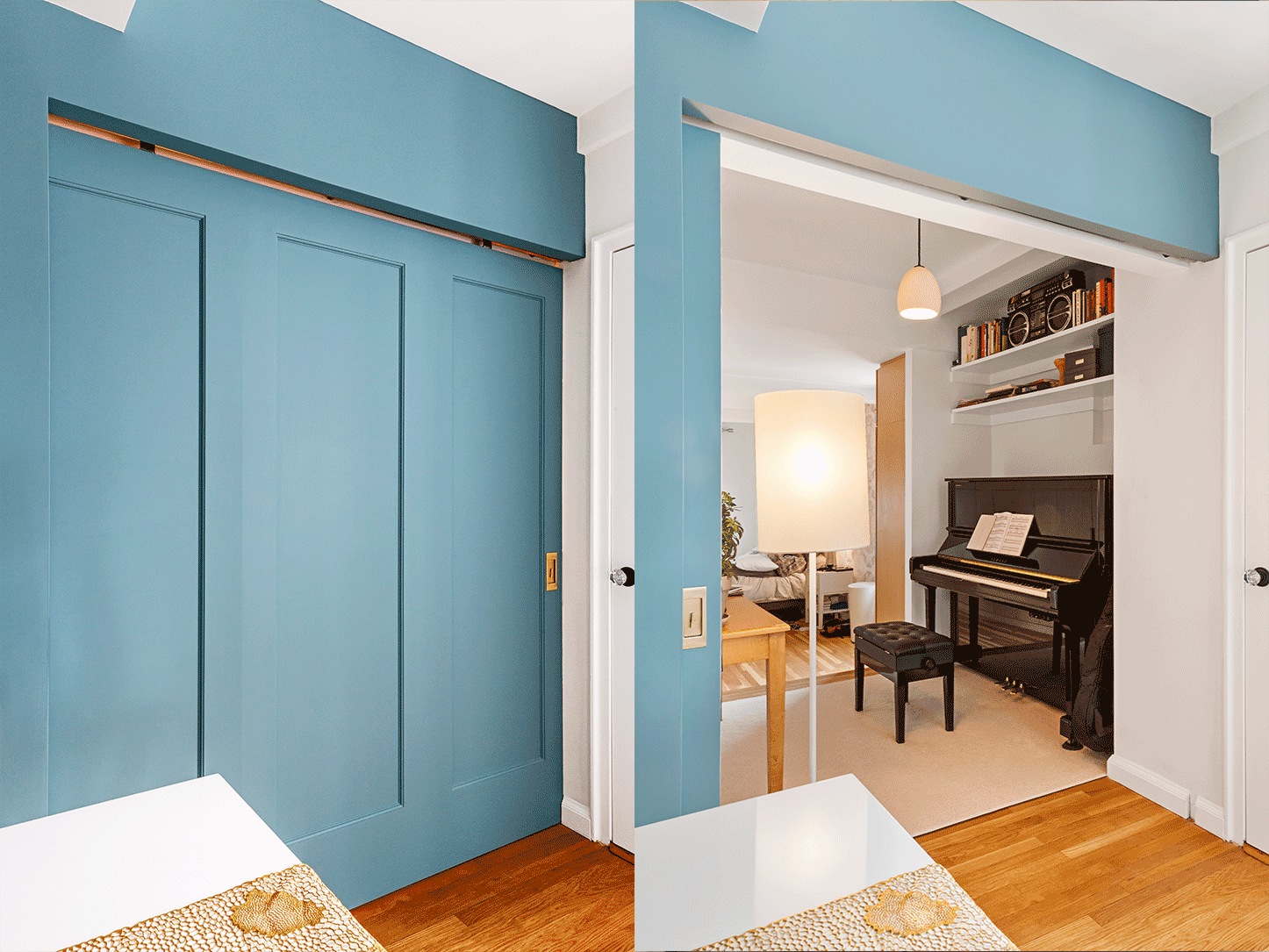
Creating a wide barn pocket door proved to be a challenge but “our contractor suggested we attach three store-bought doors together…”
We initially budgeted two to three months for the renovation process, and typical for New York, ended up taking about four months. The apartment’s previous tenants took all of their light fixtures with them when they moved out, so we purchased new light fixtures for all of the rooms.
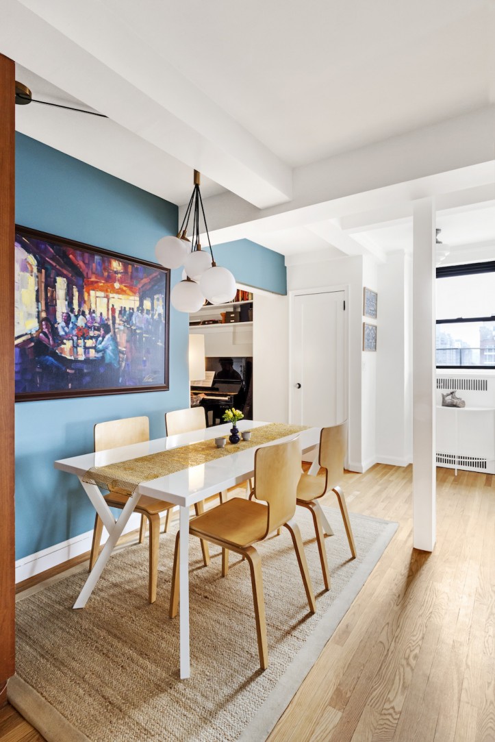
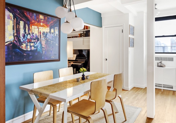
I created a Pinterest board to help refine my ideas. We especially love the distinctive CB2 chandelier which hangs above our dining room table.
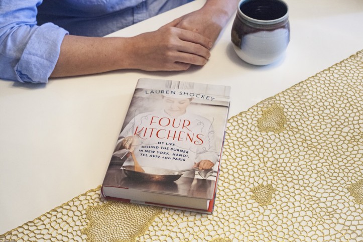
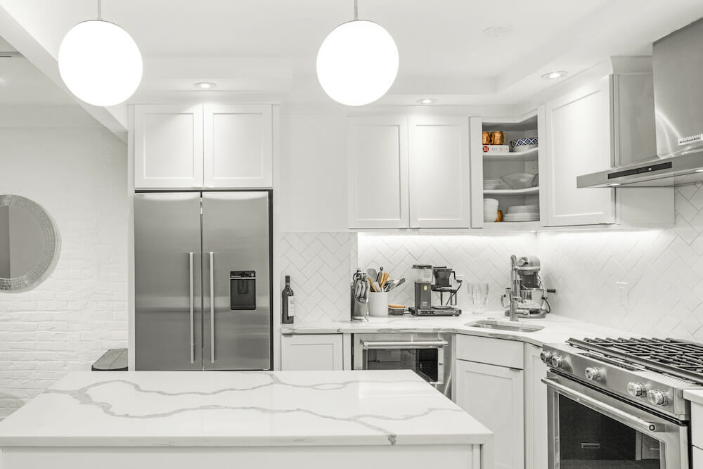
Being a food writer and having written Four Kitchens, a book about working in restaurants around the world, it was important for me to have a clean, streamlined kitchen for cooking and entertaining.
We loved the custom cabinets that were already in place but wanted to update the backsplash by installing white subway tiles to replace the existing small red-and-brown multicolored ones. We also swapped out the sink faucet for a contemporary Grohe fixture. Sweeten brings homeowners an exceptional renovation experience by personally matching trusted general contractors to your project, while offering expert guidance and support—at no cost to you. Renovate expertly with Sweeten
Ross loves playing piano, and with this apartment, we were finally able to accommodate a piano in our space. We removed a wooden plank which the previous owners had used as a desk and created a nook which was a perfect spot for an upright piano.
Creating the pocket door separating the dining area from the bedroom proved a bit of a challenge at first, but our contractor helpfully suggested that we attach three store-bought doors together, and then build a fake wall over what used to be the space for the barn door. This would be a more affordable solution than purchasing a custom wood door, which he noted would be very expensive.
We then painted the door and surrounding walls Hamilton Blue by Benjamin Moore, a color we had in our old apartment, and one that we knew looked good as a backdrop for our artwork. Also in the dining area, we covered a pipe that had previously been exposed. We had initially wanted to get rid of it since it was in the middle of the walkway, but this was not possible.
Our unit was originally two apartments that had been combined at some point in the past, and the pipe had been inside the dividing walls.
The bathrooms probably required the most work. Our designers initially suggested moving around the placement of the sink and toilet to maximize space, but this was going to require additional permits and more time.
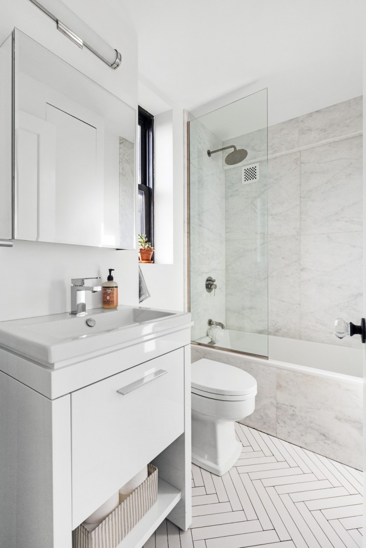
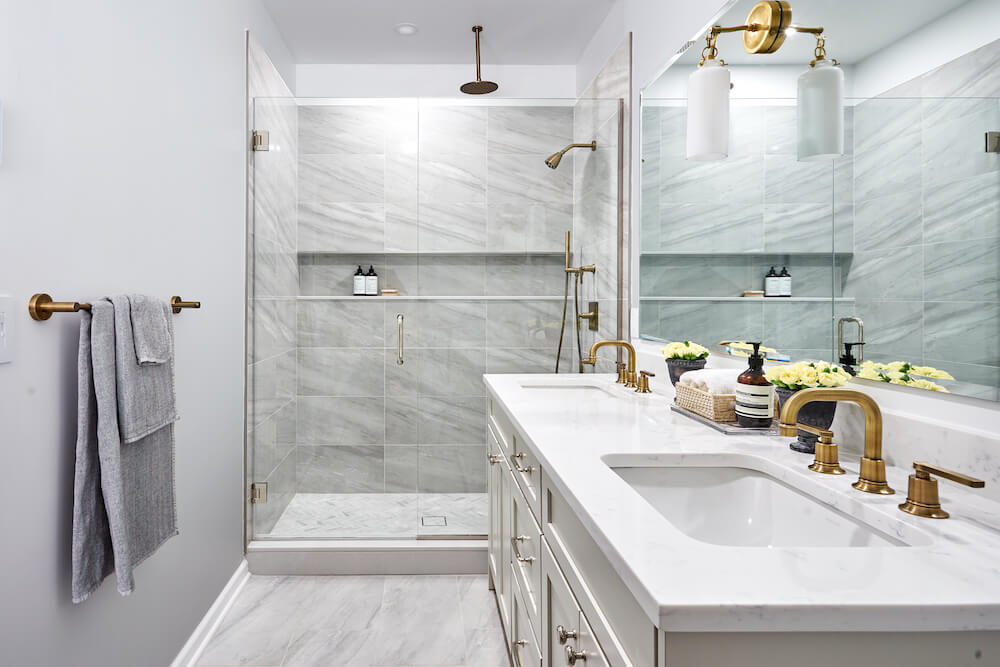
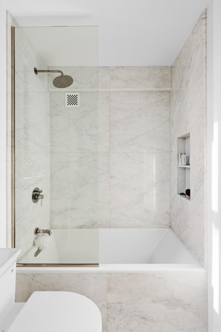
As such, we ended up leaving the tubs, sinks, and toilets in the same places, and just upgraded with new fixtures. I love taking baths so we got deep-soaking tubs for both bathrooms, as well as Toto toilets. For the master bath, I was inspired by the clean, elegant look of hotel bathrooms and wanted marble walls to be a focus of that space.
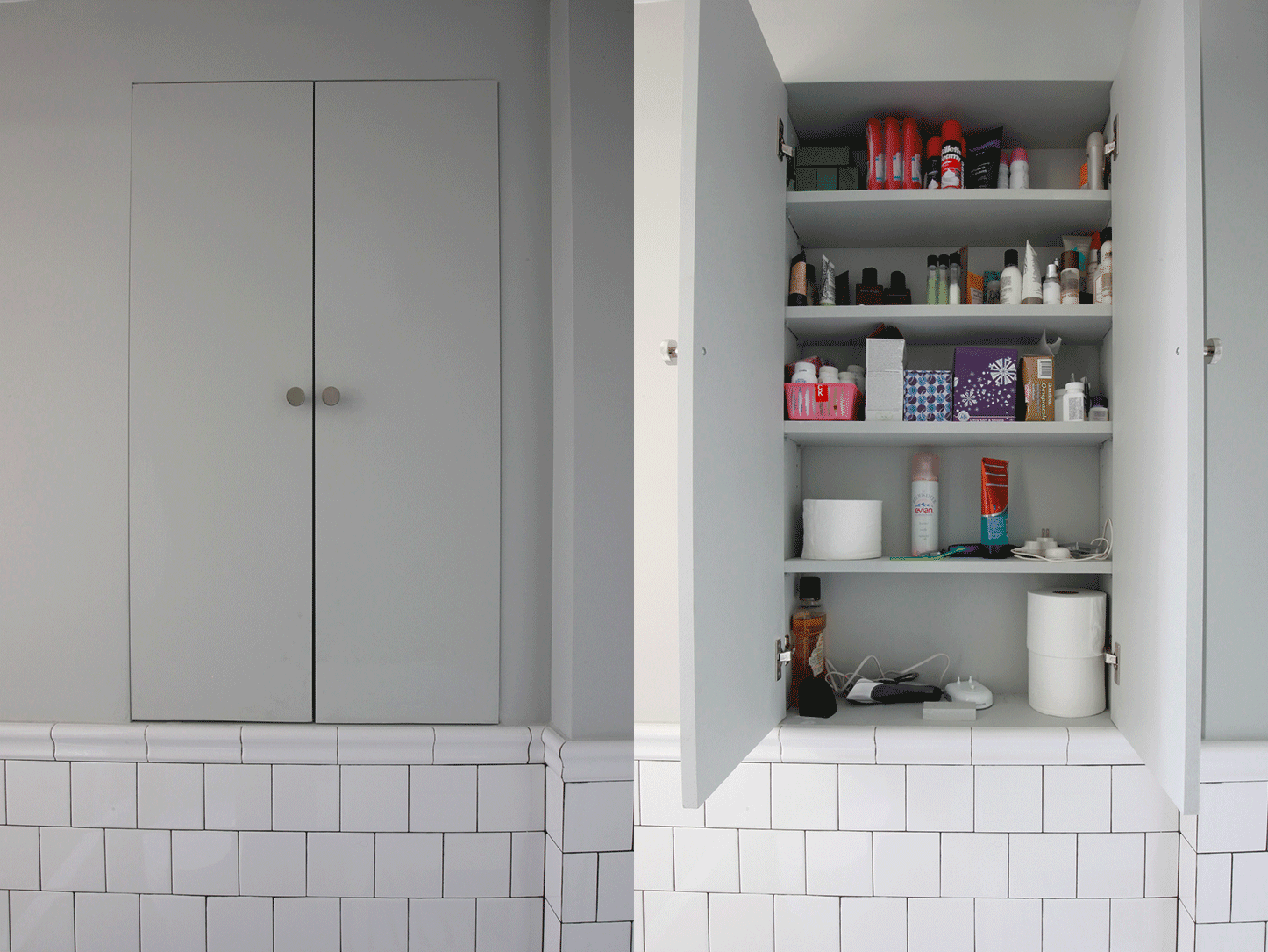
We opted for a glass panel on the tub, which our contractor sourced for us. We also covered unattractive heating pipes with grates from Architectural Grille. Custom shelving was added in the form of a shower niche, as well as a large in-wall cabinet opposite the sink.
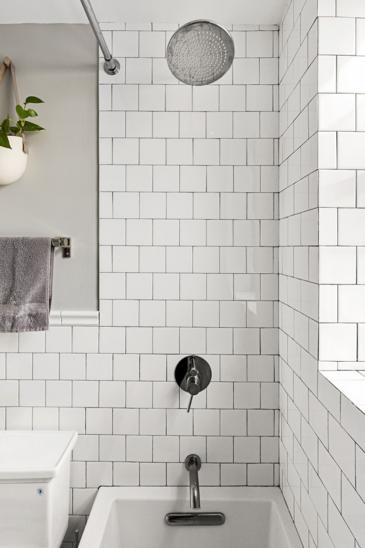
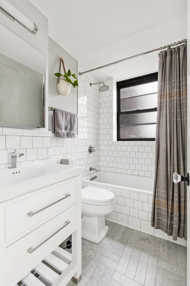
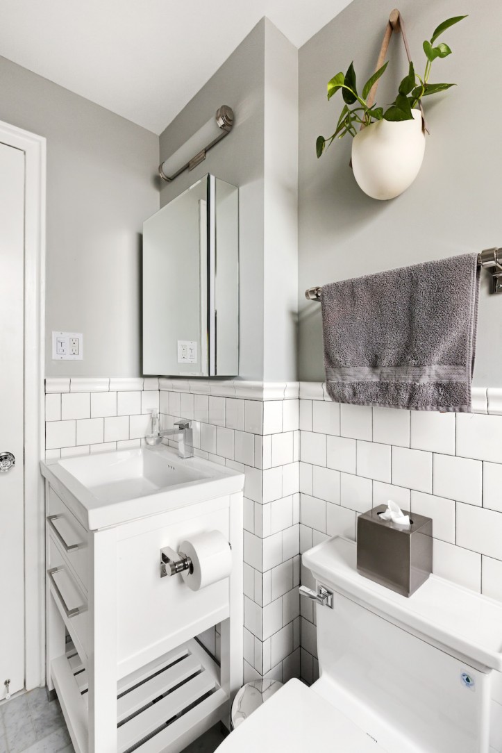
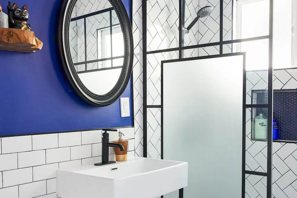
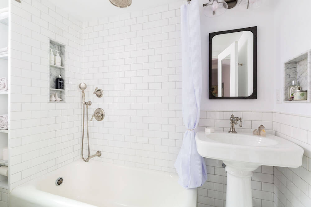
For the guest bath, a simple white tile with black grout was chosen to complement the Coyuchi shower curtain and an Of a Kind planter we had brought from our previous bathroom. We ran into some issues with the tiles purchased by our designers for the guest bath, so our contractor made suggestions that helped the material work in the space.
Contemporary Graff shower fixtures were selected for both showers. As for the color palette, we chose white because it was a neutral color, and it is just very soothing to have a white bathroom. Both looks are timeless, and we figured they would be appealing to us now and hopefully to anyone who bought the apartment later on.
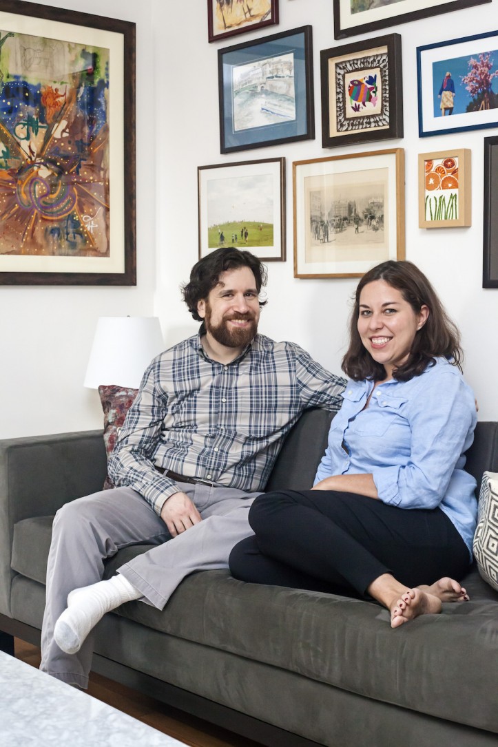
After the four months of work, we were able to move into our new space, which we now love. We tried to create a contemporary space that reflects our personal tastes while adding elements which also capture the Art Deco heritage of our apartment building.
Thanks so much, Lauren, for sharing your story! We hope your stylish new space is filled with music and good food.
MASTER BATH RESOURCES: White herringbone floor tile: Tile Spark. Showerhead: YLiving for Graff. Faucet: Aquabrass. Sink and vanity: Duravit. Toilet: Toto. Lighting, West Slope hardware: Rejuvenation.
GUEST BATH RESOURCES: Parquet marble floor tile: Wayfair. White square subway wall tile: Heritage Tile. Lighting, West Slope hardware: Rejuvenation. Showerhead: YLiving for Graff. Faucet: Aquabrass. Toilet: Toto.
KITCHEN RESOURCES: Faucet: Grohe.
LIVING AREA: SAIC together pendant dining room light: CB2. Hamilton Blue Paint: Benjamin Moore.
—
Need to find clever ways to build in bathroom storage? Ben and Ellen’s shelving solution adds a warm wood tone and does its job well—holding “stuff.”
Sweeten handpicks the best general contractors to match each project’s location, budget, scope, and style. Follow the blog for renovation ideas and inspiration and when you’re ready to renovate, start your renovation on Sweeten.
