A Ground Floor Co-op in Sunnyside Finds Its Light
A native New Yorker and her husband plant new roots
- Homeowners: Tina, a fashion designer, and Andrew, a cybersecurity consultant, posted their project on Sweeten
- Where: Sunnyside, Queens in New York City
- Primary renovation: A full-apartment renovation in a 1930s co-op building
- With: Sweeten general contractor
- Homeowner’s quote: “After interviewing nearly ten lackluster contractors, we discovered Sweeten and signed up immediately. Their contractors were a godsend, very professional, and responsive.”
Guest blog post by homeowners Tina and Andrew. “After” photos by Pixy Interiors.
A home search is serendipitous
We were living in a one-bedroom apartment on the third floor for almost a year when an opportunity came knocking. Tina’s father, who used to be the superintendent in the building, heard about this apartment through the grapevine. The two-bedroom, one-bath with an eat-in kitchen on the ground floor had been occupied by the same owner for decades. The apartment hadn’t yet been listed, so we didn’t know what to expect. As we eagerly walked in, it became clear that it needed a lot of TLC.
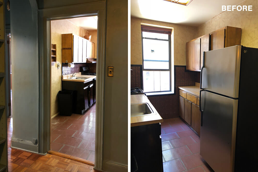
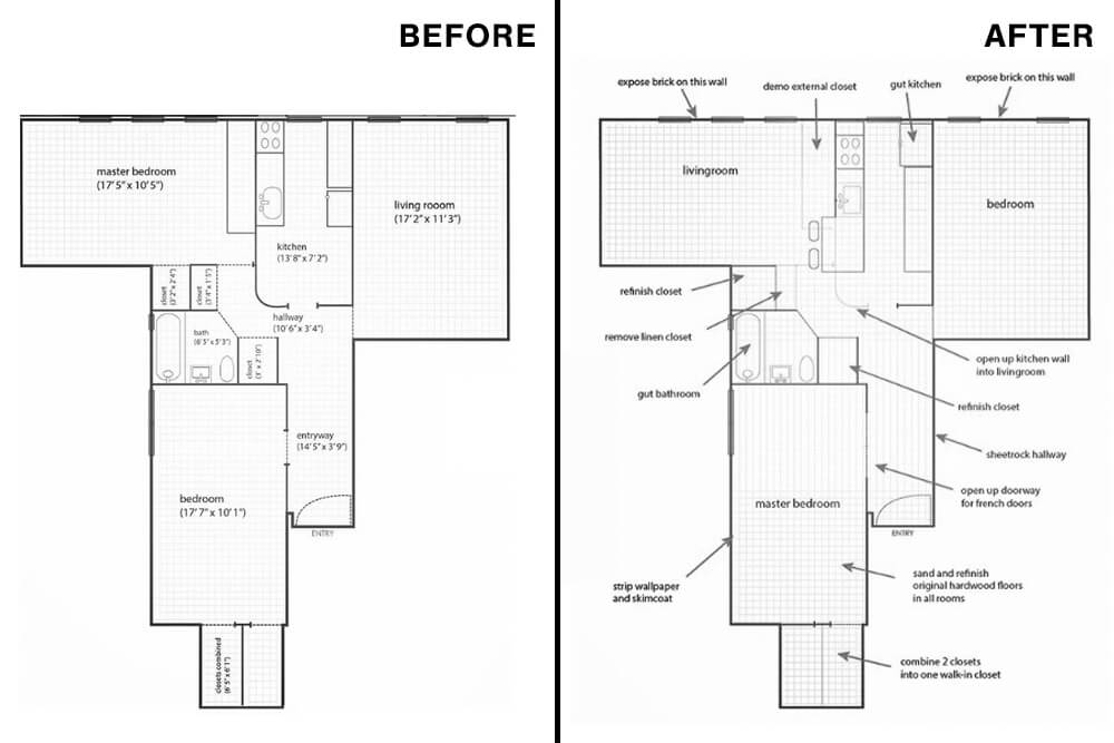
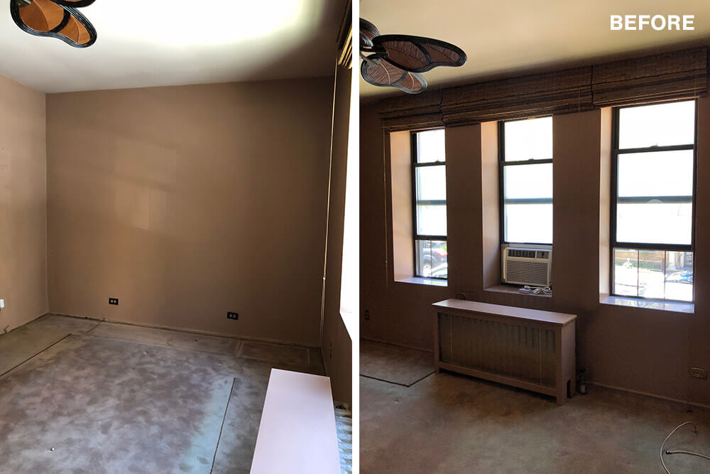
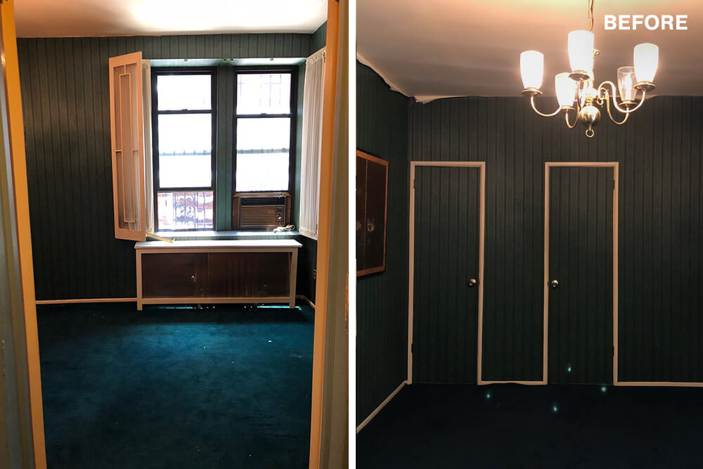
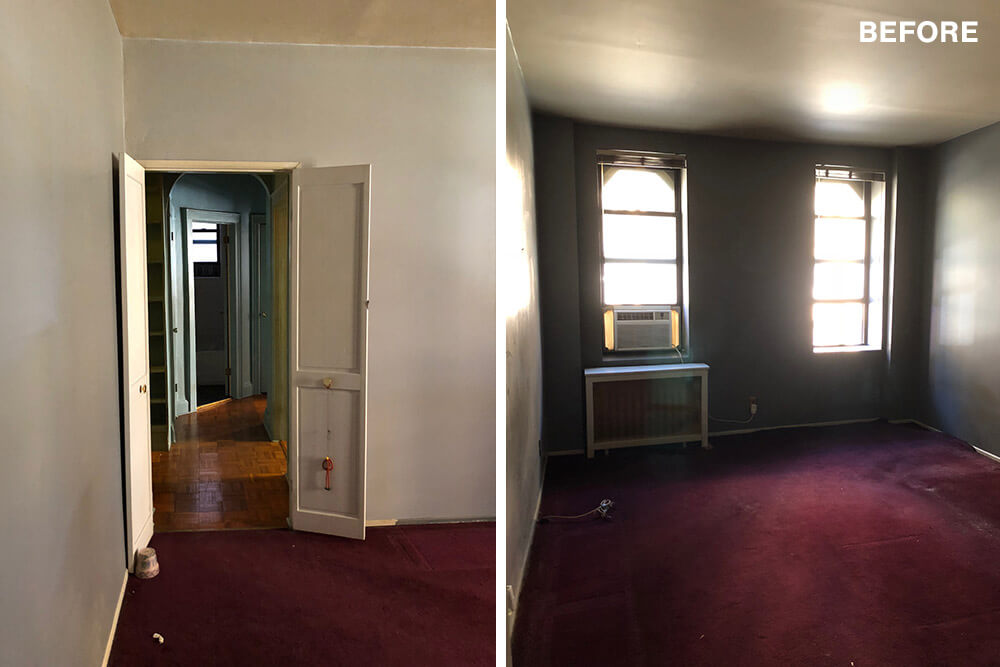
Its dimensions were a little over 900 square feet. We saw plenty of potential, but the original layout was partitioned and closed-off. The dated 1970s finishes and dark saturated colors throughout made the space feel extremely dark and cavernous. It was certainly a fixer-upper, but we agreed it was worth taking on and jumped in feet first.
A successful general contractor match
Living in the same building, we could easily visit the space for measurements, planning, and the actual renovation. Enter Sweeten. After interviewing nearly ten lackluster contractors, we discovered Sweeten and signed up immediately. Their contractors were a godsend, very professional, and responsive. We got an estimate the same day when others would take days or just ghost us completely. And they took the time to answer all our questions and negotiate prices before they were even hired. Choosing a contractor was probably one of the most stressful and time-consuming parts of the renovation process.
Planning a coastal look
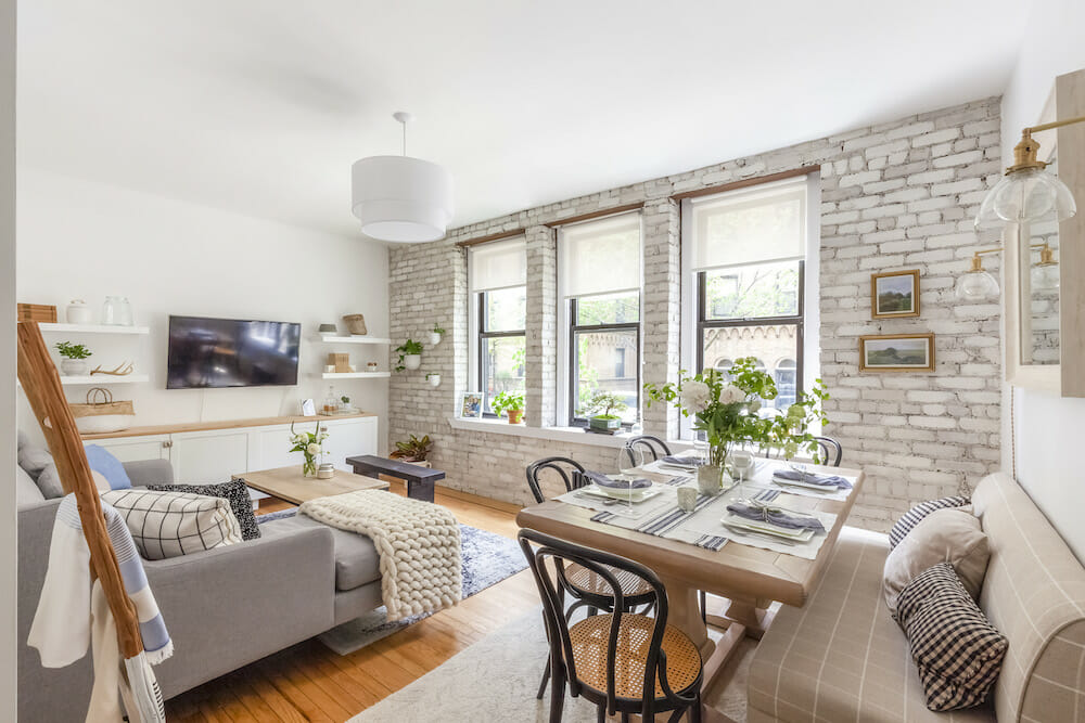
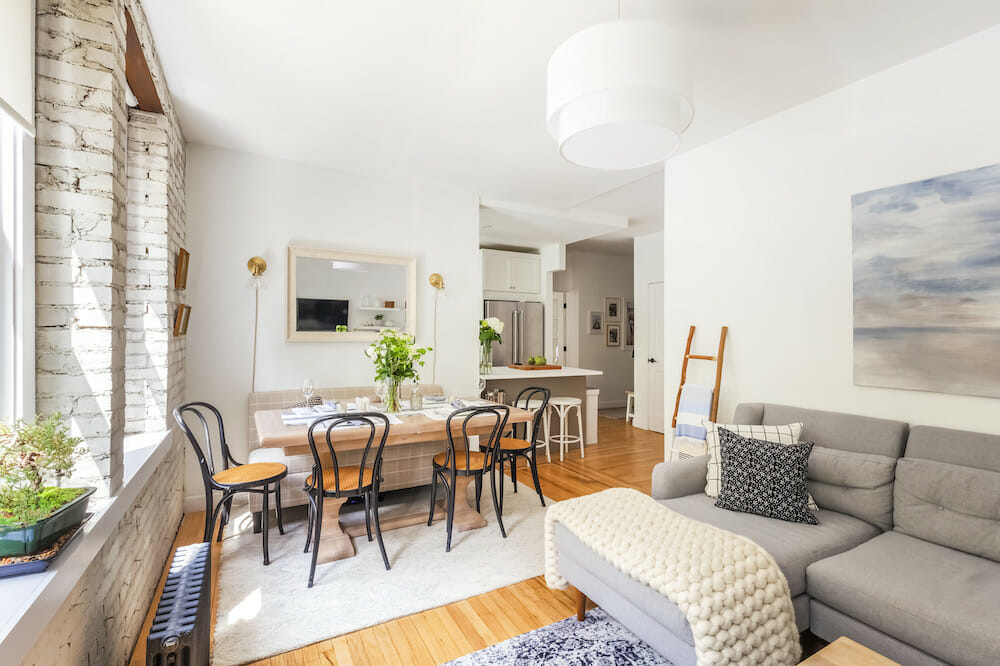
Our vision was to make the space airy, bright, and modern while still complementing the building’s prewar style. Tina, a designer by trade, used her skills to sketch layouts, create mood boards, and research finishes. French bistros, Vermont farmhouses, and Hampton beach bungalows were inspirations. The apartment was grounded in light neutrals with navy blue and oak wood accents for a coastal look. We loved the clean lines and texture of the shiplap, board and batten, and exposed brick. Touches of brass and Carrara marble helped warm up and elevate the space.
More natural light in the living room
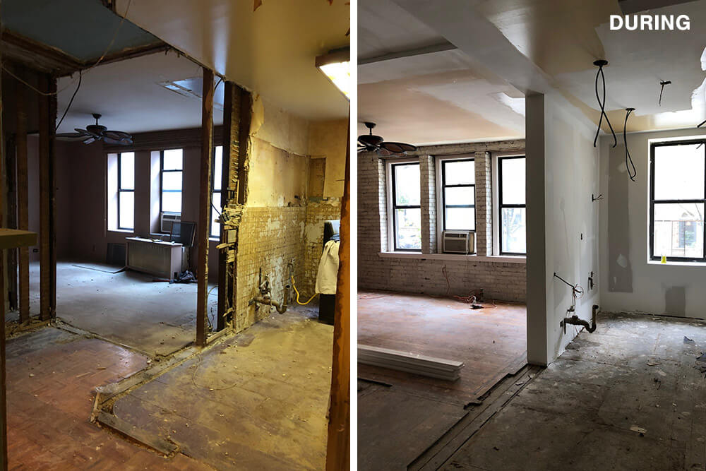
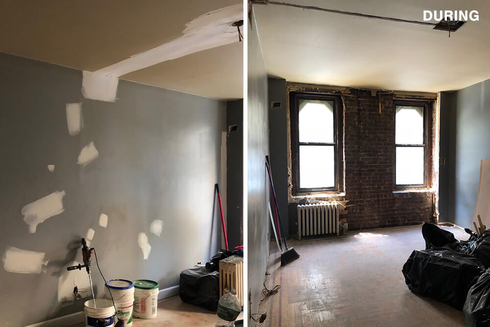
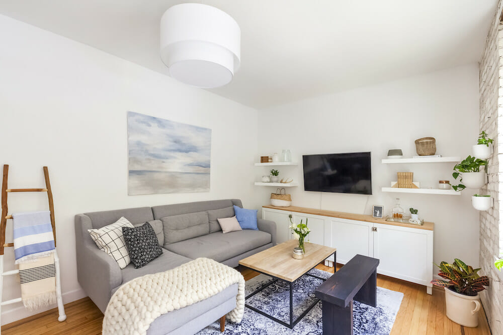
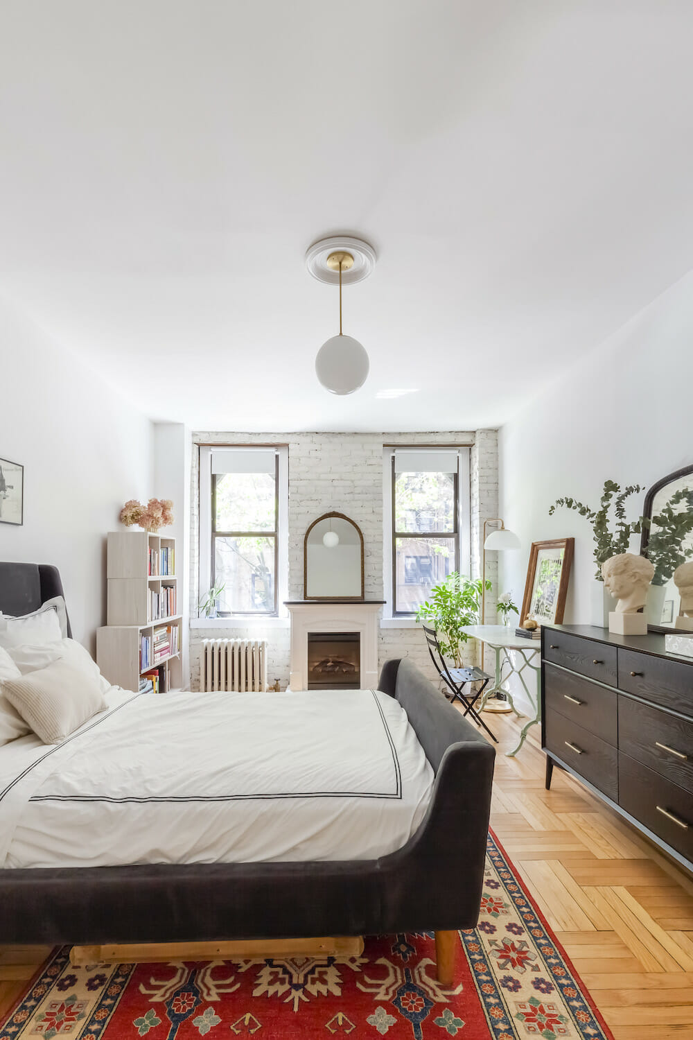
The windows in the living room and spare room were recessed nearly a foot into the wall which blocked a lot of light from coming in. Exposing the brick on these walls would open things up. Our contractor built beautiful custom window frames to finish the windows off. We used a natural limestone paint to whitewash the brick for an aged look.
Bounce your wildest ideas off of the professionals; that is what they are there for.
A kitchen opens up—partially
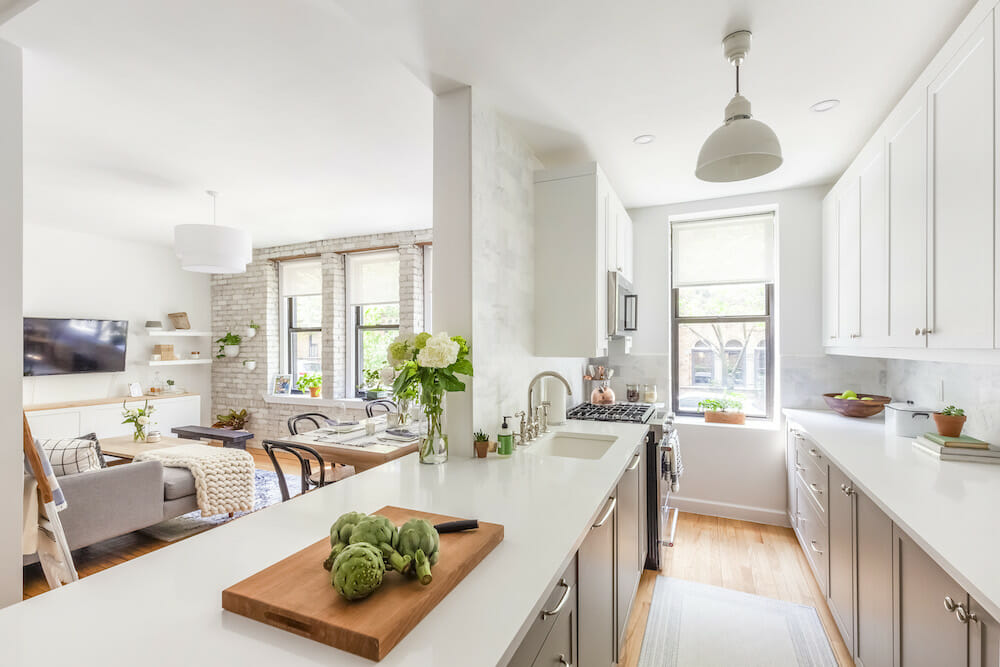
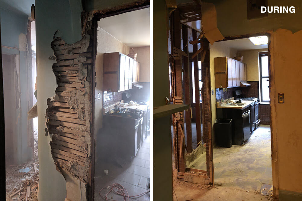
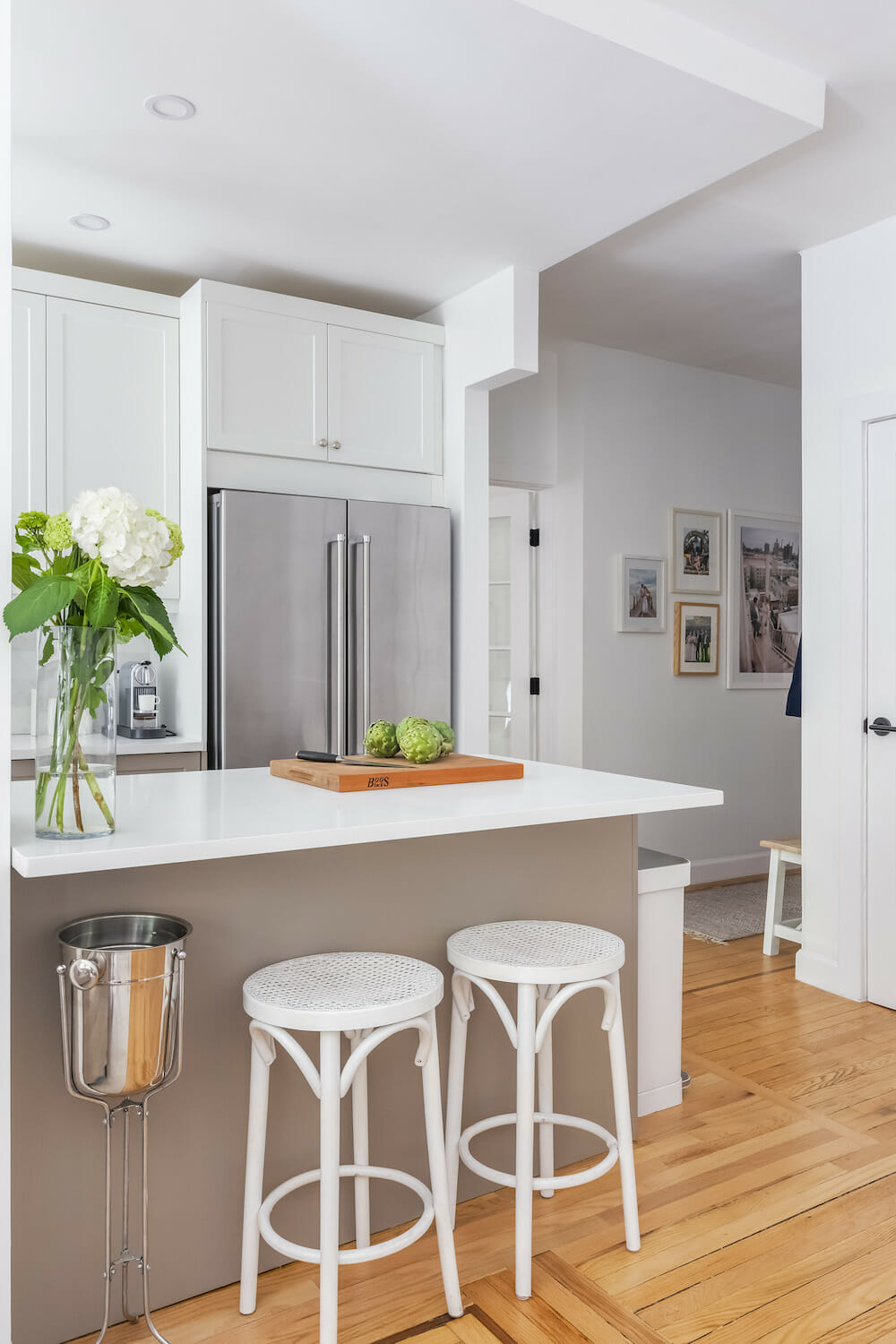
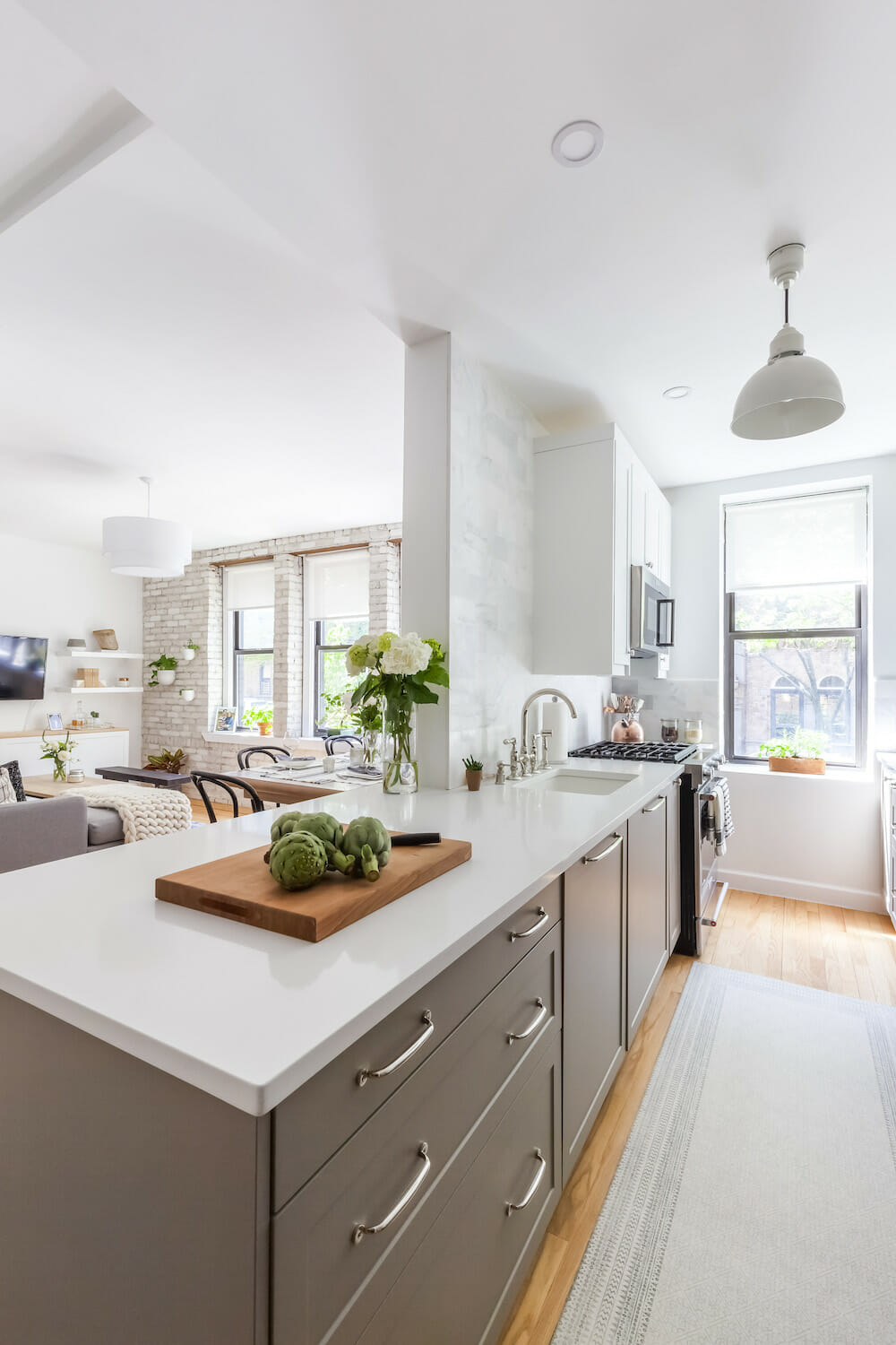
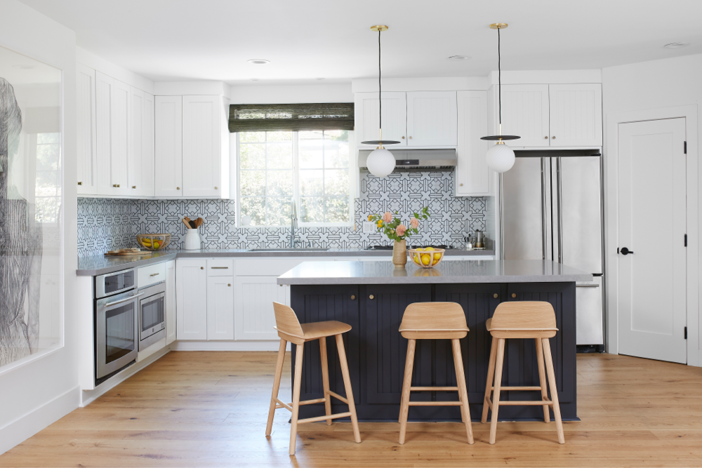
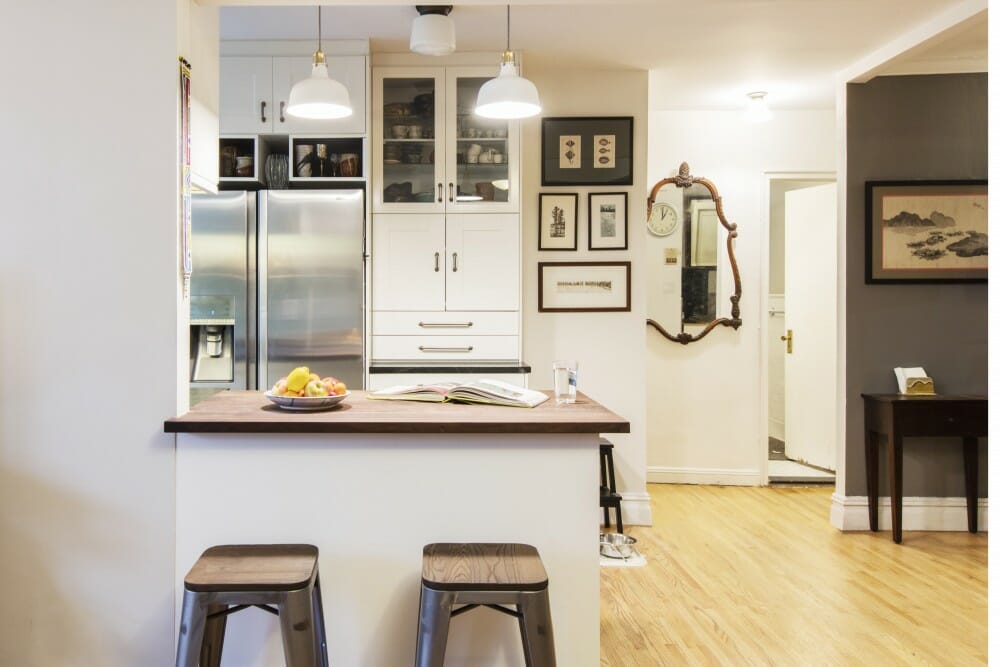
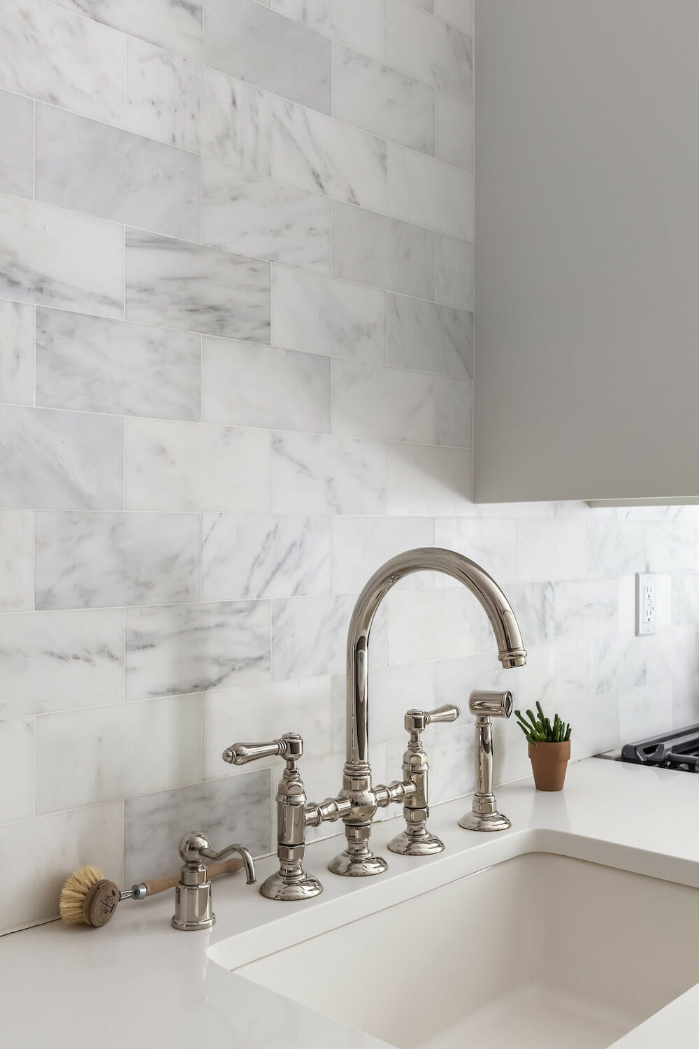
We took the plunge and opened up half the kitchen into what would become the living room—the brightest space in the apartment. It also gave back a nice chunk of square footage previously wasted with an awkwardly-curved wall. A small linen closet was removed to fit a large countertop between the kitchen and living room.
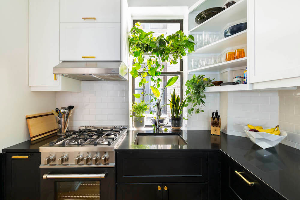
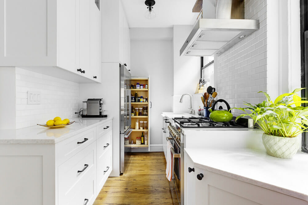
As a family that loves to entertain and cook together, we wanted a functional space with a lot of storage. Because kitchens take up a large portion of a renovation budget, we tried to be clever and save where we could. Instead of custom cabinets, we went with Ikea but purchased the cabinet doors from a company that specializes in stylish and modern cabinetry for Ikea kitchen systems. Sweeten brings homeowners an exceptional renovation experience by personally matching trusted general contractors to your project, while offering expert guidance and support—at no cost to you. Renovate expertly with Sweeten
Details make a difference
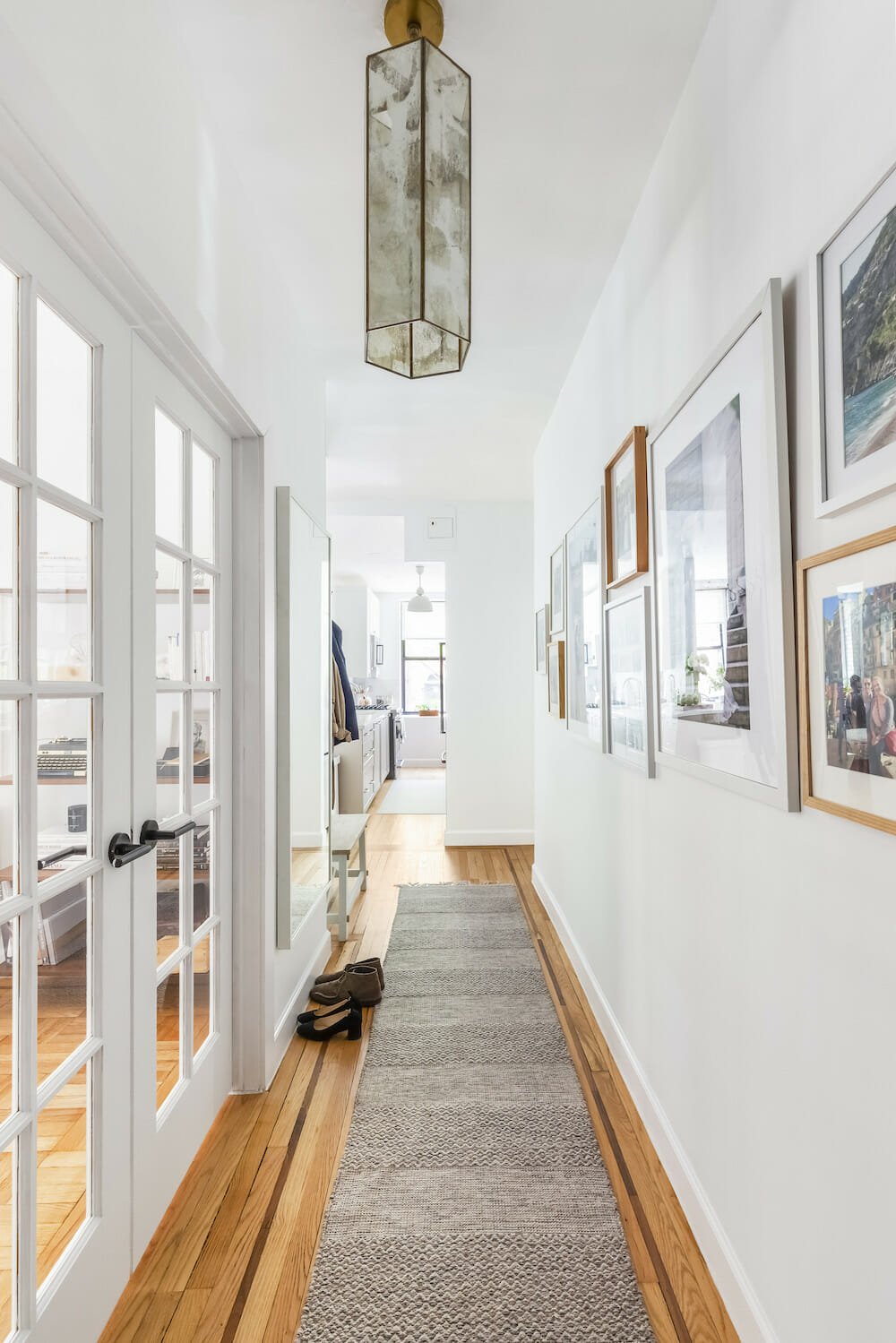
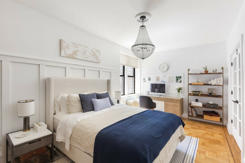
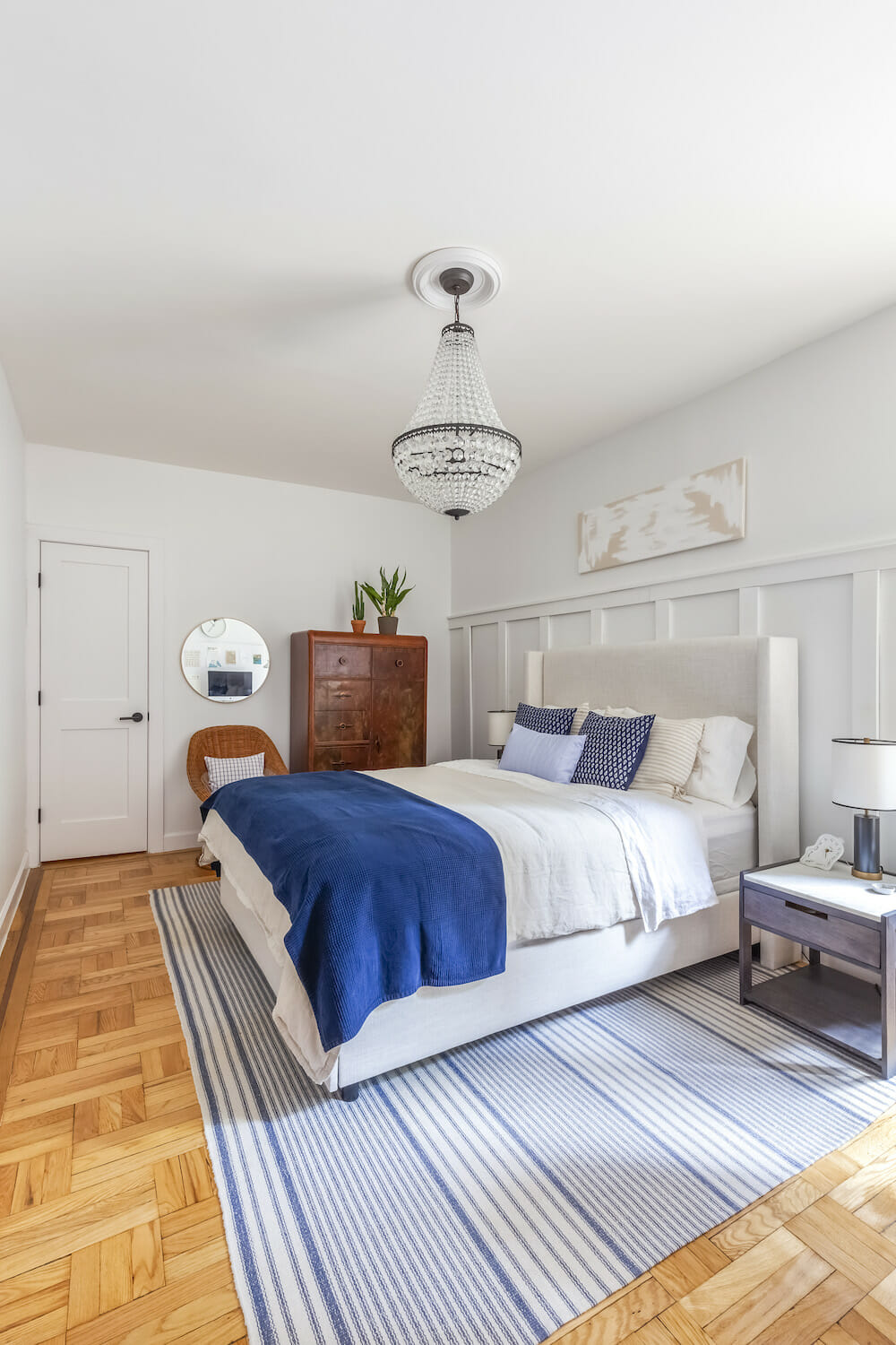
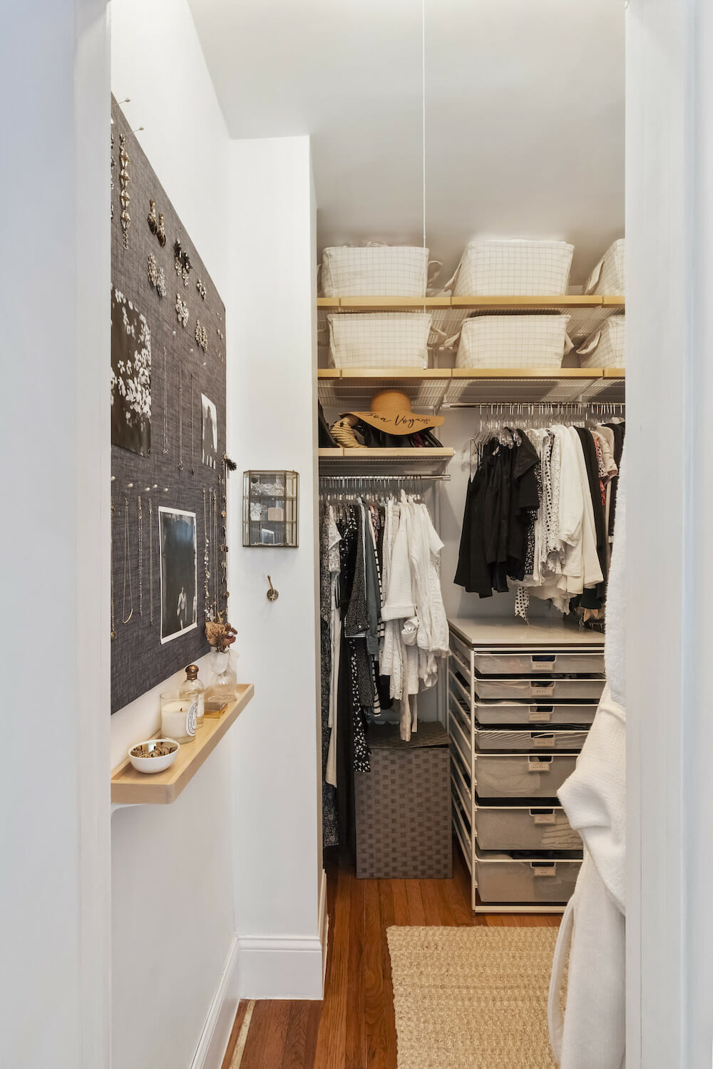
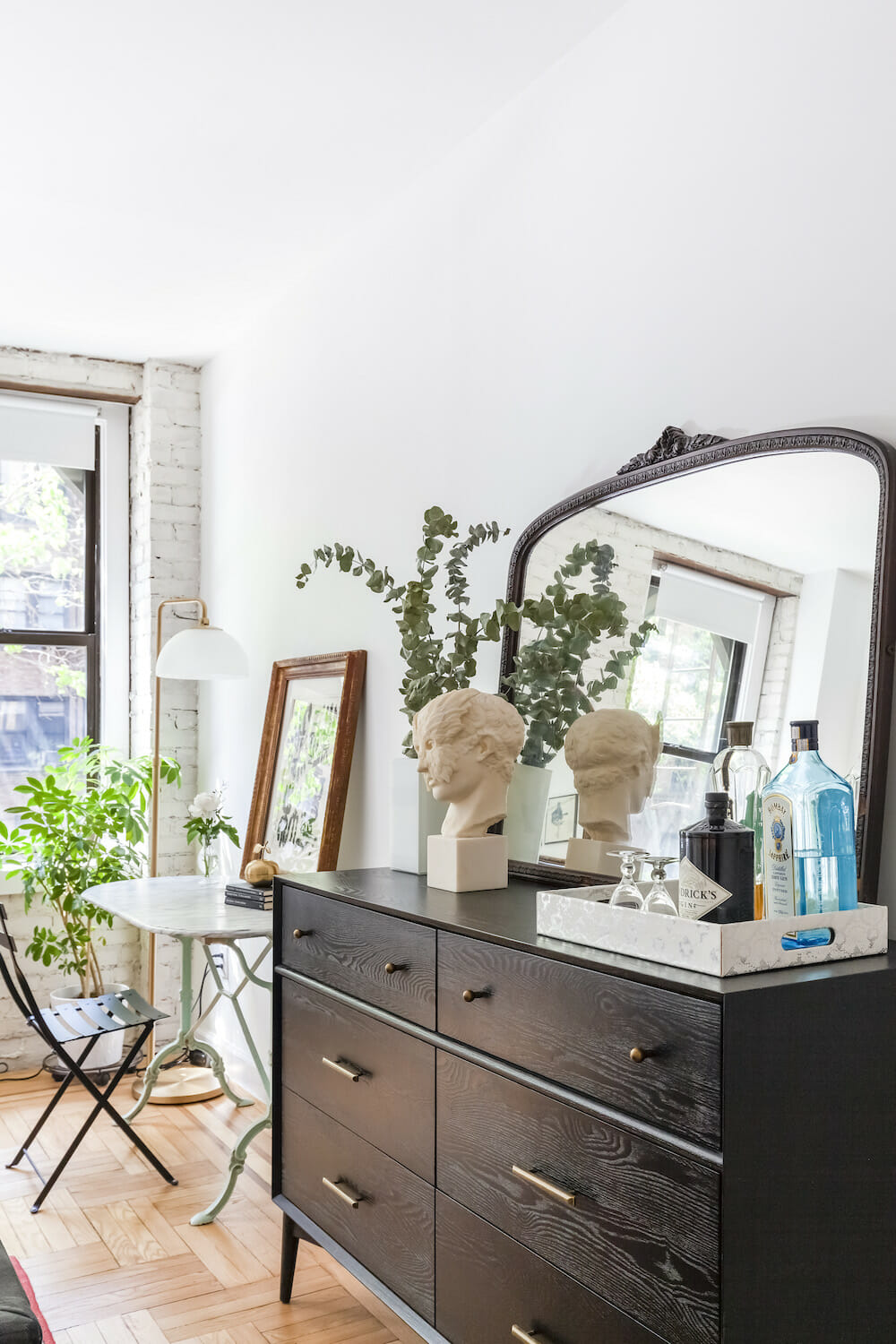
The bedroom with two large closets became the master bedroom. Two closets were combined into one big walk-in closet. We painted the room white and added board and batten paneling on one wall for dimension. The double french doors our contractor installed (also in the spare room) were our favorite part of the room. It gave the space a grand look and let so much natural light come through.
Experiencing the renovation process
Our contractor and his team deserve a lot of credit for their hard work and patience with us. Everybody should know that these jobs are never simple. Scheduling can get tricky.
Being detail-oriented and working with a contractor you can communicate with were really important to us. Our Sweeten contractor had no problem emailing back and forth about even the smallest detail. Bounce your wildest ideas off of the professionals; that is what they are there for.
One thing we would caution is the amount of work, if any, you decide to take on yourself. To keep the budget under control we decided to paint and do some other finishes ourselves. We saved thousands of dollars but doing all that work when we both have full-time jobs was exhausting.
Thank you, Tina and Andrew, for sharing how your new home came together!
Renovation Materials
KITCHEN RESOURCES: Kitchen cabinets: Super matte shaker cabinets in white and light grey: Semihandmade. Massey cabinet pulls: Rejuvenation. Classic 1 ¼” pulls: House of Antique Hardware. Honed quartz in Smithtown: CitiQuartz. Carrara Venato marbled honed subway tiles 4”x8”: The Builder Depot. Rohl C-sput bridge faucet with sidespray in Polished Nickel: Rohl. Fireclay sink: Alfi. KitchenAid refrigerator and stove: KitchenAid. Bosch dishwasher: Bosch. Thomas O’Brien Eugene pendant lighting: Circa Lighting. Bar stools: Vintage.
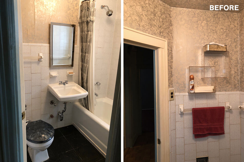
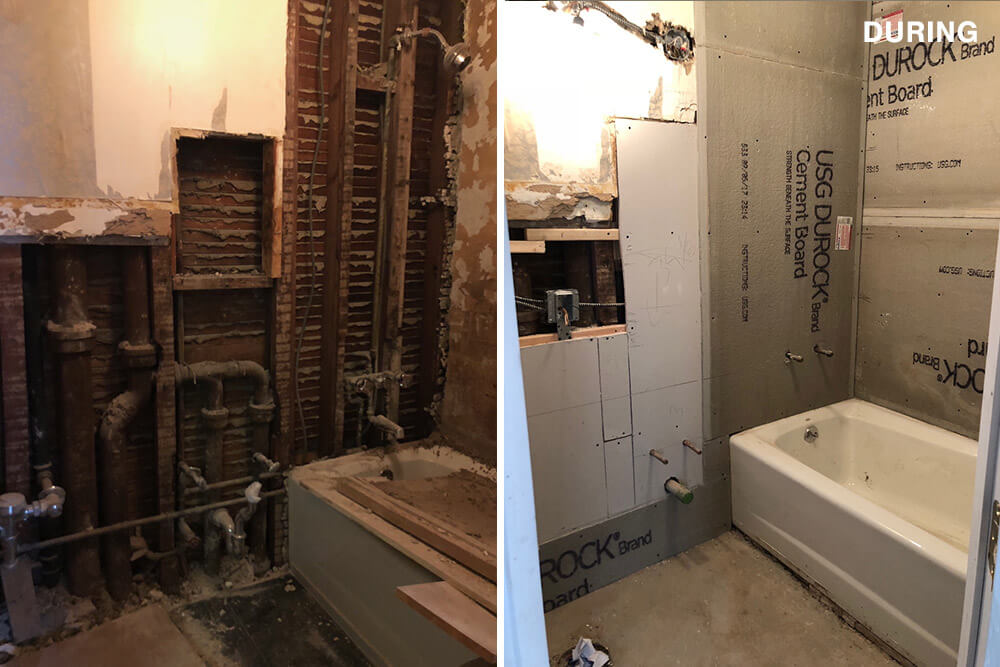
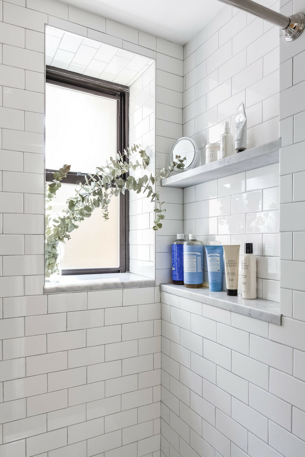
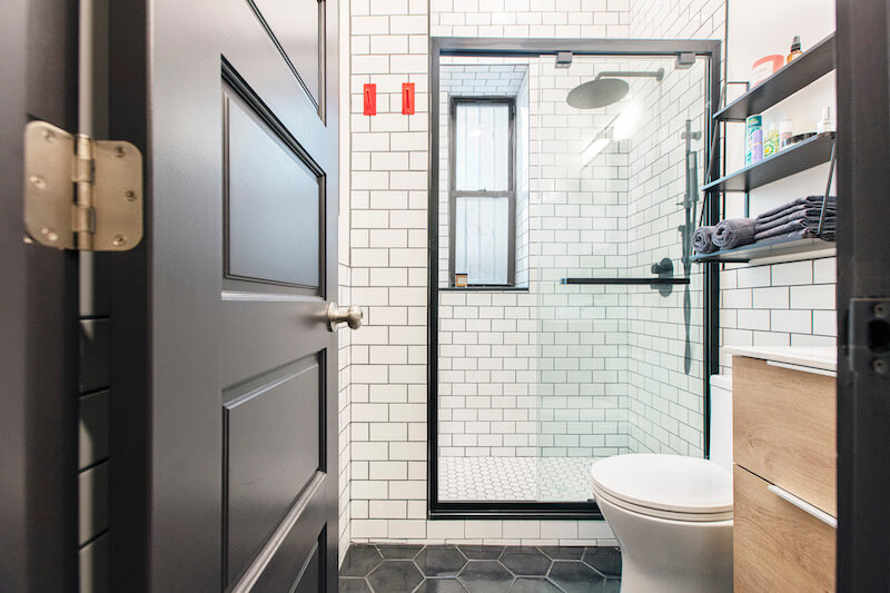
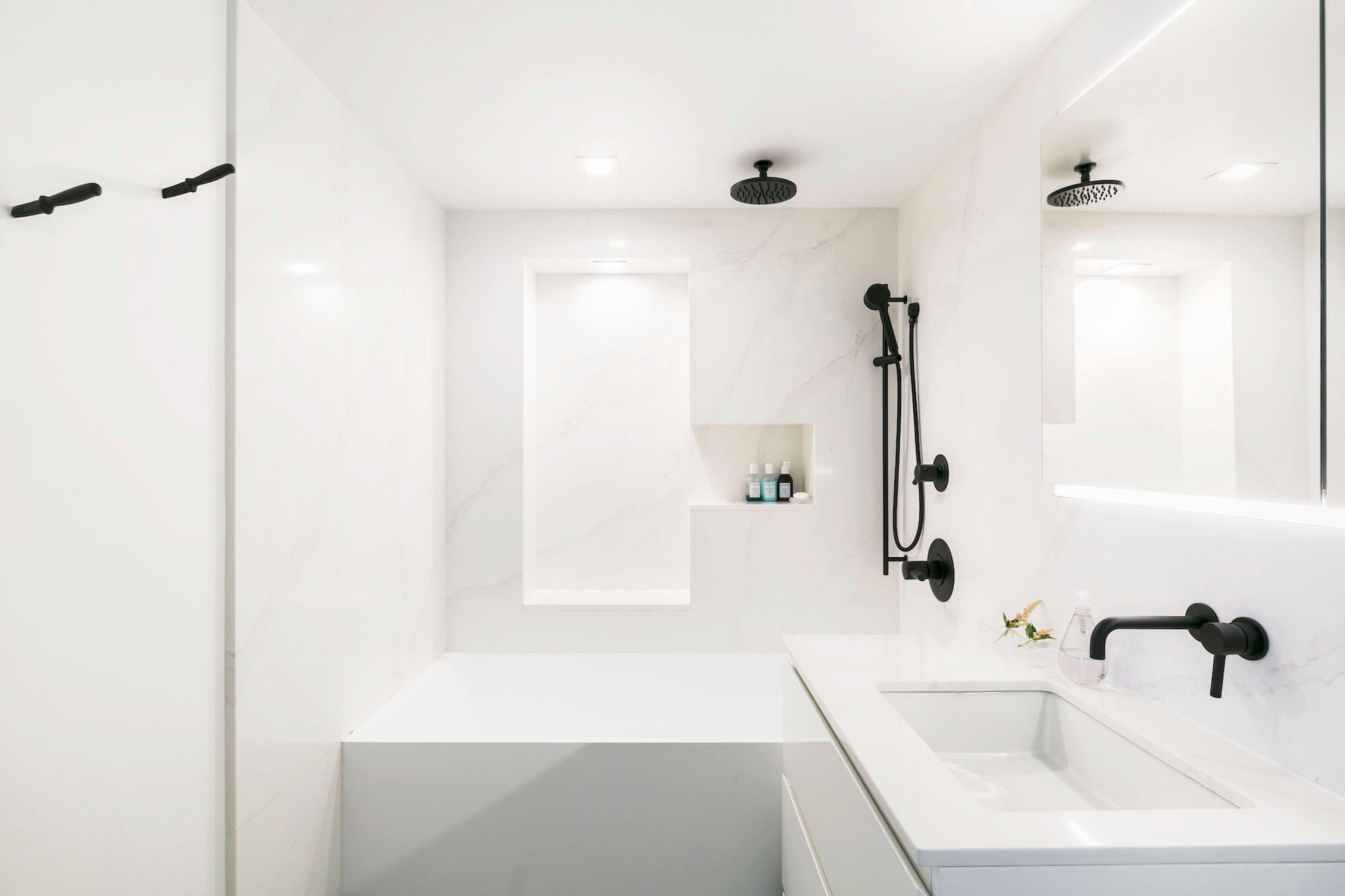
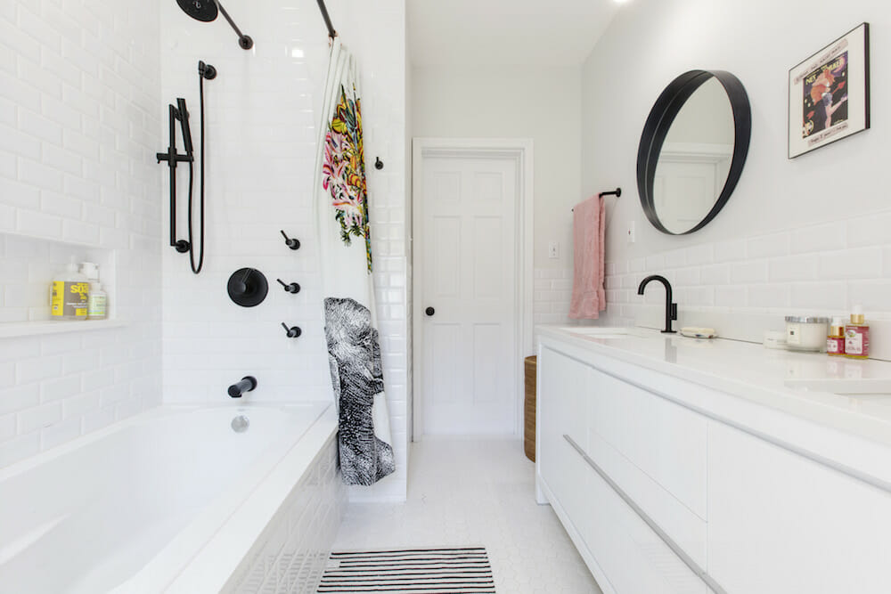
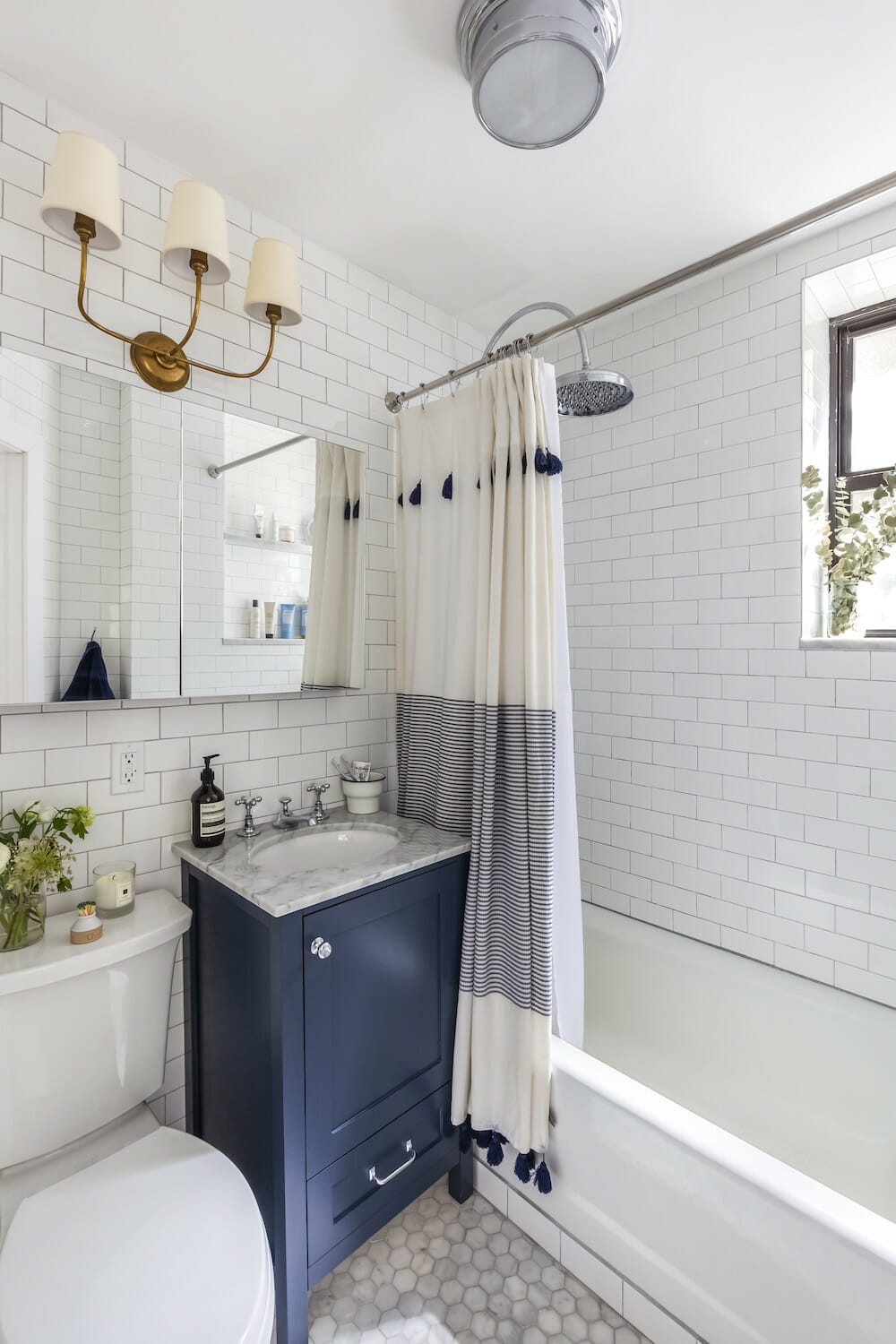
BATHROOM RESOURCES: 3” Carrara hexagon marble floor; 3”x6” subway tile walls: Home Depot. Vanity hardware: Rejuvenation. Oxford thermostatic shower fixtures: Signature Hardware. Vanity/sink: Custom. Vanity paint in Hale Navy #HC-154: Benjamin Moore. Faucet: Barber Wilsons. Kohler Corbelle toilet: Kohler. Thomas O’Brien Vendome triple scone in Antique Brass and Sienna small-flush mount overhead light in Chrome: Circa Lighting. Cerridale medicine cabinet: Wayfair.
LIVING AND DINING ROOM RESOURCES: Leighton pendant light fixture: Room and Board. Wall paint in Chantilly Lace, #OC-65: Benjamin Moore. Brick limewash interior/exterior paint in Avorio White: Romabio. Olde Bricke Lighting glass dome sconces in Matte Brass: Etsy.
MASTER BEDROOM RESOURCES: Mia faceted crystal pendant overhead light: Pottery Barn. Cylinder accent table lamp and Imbrie articulating sconce: Rejuvenation. Wall paint in Chantilly Lace, #OC-65: Benjamin Moore. Shade: The Shade Store. Ceiling light pendant (outside in hallway): West Elm.
SPARE ROOM RESOURCES: Overhead light: Luna pendant rod in Natural Brass: Schoolhouse. Desk light: West Elm. Wall paint in Chantilly Lace, #OC-65: Benjamin Moore. Brick limewash interior/exterior paint in Avorio White: Romabio.
A note on fixture and appliance deliveries: If you’re on a tight timeline, Appliances Connection has over 50,000 items in stock and ready to ship nationally. If you’re in the NY/NJ metro area, in-stock items typically deliver within 2-3 days.
—
Sweeten handpicks the best general contractors to match each project’s location, budget, scope, and style. Follow the blog, Sweeten Stories, for renovation ideas and inspiration and when you’re ready to renovate, start your renovation on Sweeten.
