A Family’s Historic Townhouse Grows in Brooklyn (Part 1)
Diving into a multi-story Brooklyn brownstone renovation, welcoming spaces like the foyer, guest bedroom, and bath get the luxe treatment for friends and family
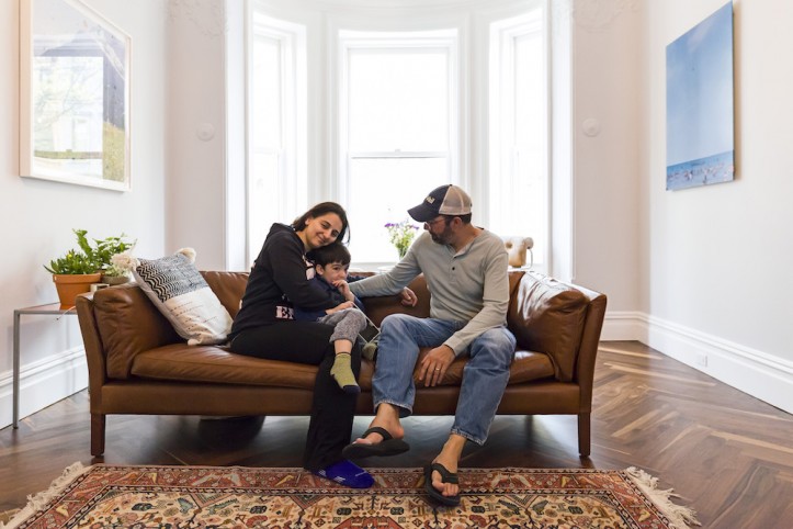
Today’s before and after kicks off a three-part series on a Brooklyn brownstone gut renovation in the Bedford-Stuyvesant neighborhood of Brooklyn. In 2015, Nazli and Larry bought a four-story derelict townhouse and set out to create a home for themselves and their son Nacho. With refreshing honesty on topics ranging from marital disagreement to aging foresight, Nazli shares the behind-the-scenes process of decision-making and what it means to renovate for real life, beyond the photo shoot. The couple—she’s a consultant for government affairs and he is a broker—envisioned the house as an inviting space for their extended community of family and friends—a home away from home. Read on for Nazli’s take on their plans for the new townhouse, and the full reveal of their guest suite on the second floor. Fittingly, for a family that loves to host, it was the first room finished and ready for occupancy!
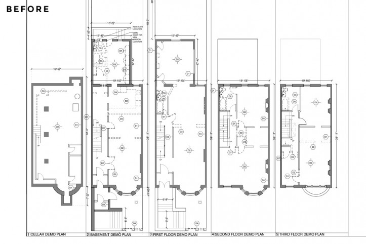
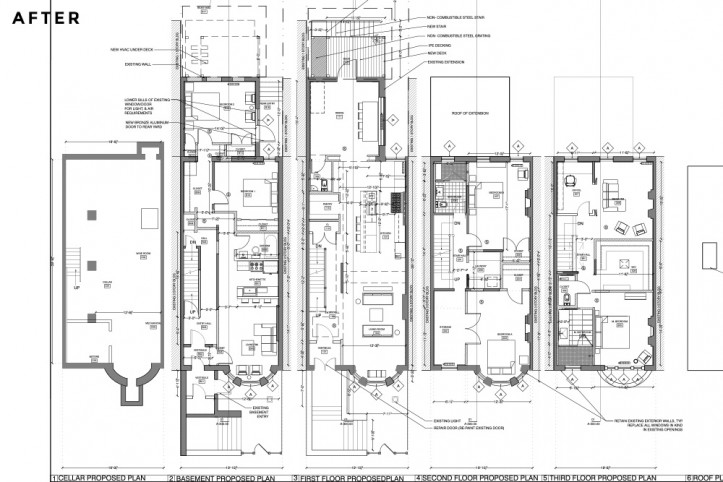
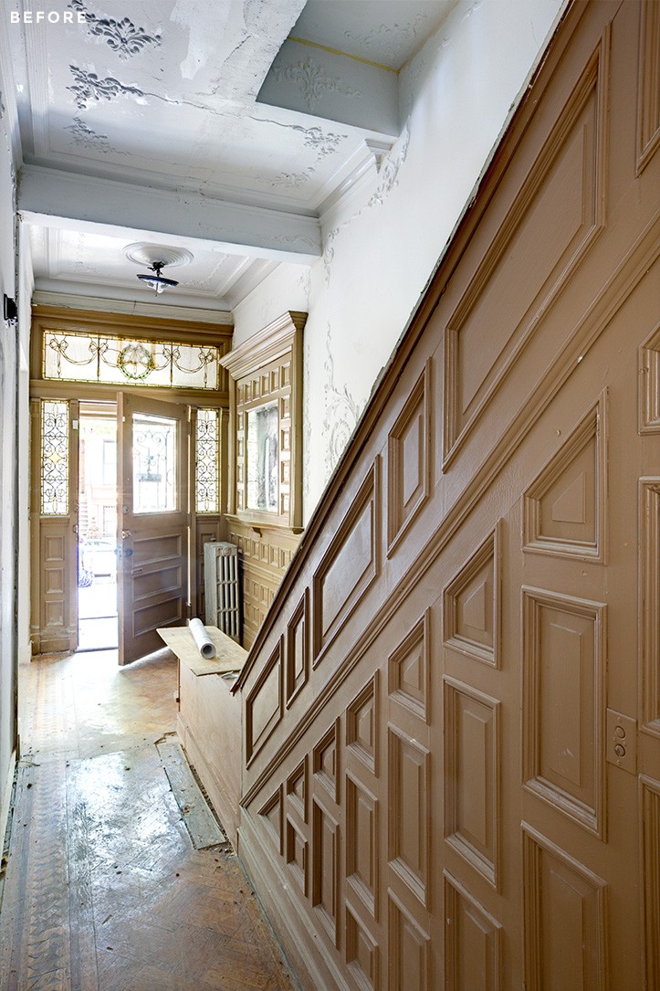
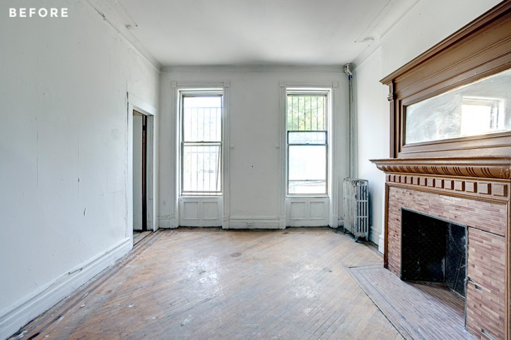
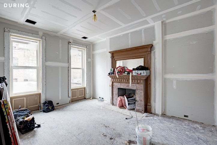
We purchased our home in the newly landmarked Bedford Historic District. It was a single-family brownstone, roughly 4,000 square feet, which we converted into a two-family home with a garden rental and a triplex for ourselves. The home was built in 1890 by Bedford-Stuyvesant architect Montrose Morris, who also built the nearby Kelly Mansion. He built many of the premier properties for wealthy families of the time, though the four townhouses he built on our street were apparently more of an exercise in creating middle-class lodging. Our home was uninhabitable at the time of purchase, truly—no heat, no working bathrooms or kitchen, and just…not in good shape. There were original but defunct fireplaces, beautifully preserved paneling and plaster work on the walls, as well as some stained-glass windows (a happy surprise)—but no other details remained.
We certainly did not go into our renovation thinking that it would be a gut—we couldn’t afford it and we didn’t think it would be necessary. But while attempting to figure out the mechanicals and ductwork, it quickly became apparent that it would be more efficient to take down all the crumbling walls and start from scratch. It wouldn’t be so much more expensive since the electrical, plumbing and HVAC systems could be done anew, rather than trying to trace them up 130-year-old walls. There was also so much water damage throughout the house that none of the original flooring could be preserved. The house was a mess.
Our goals were to meet the basic needs of our family, and tick items off our dream list. My basic vision of a home is a giant kitchen with some other rooms arranged nearby for whatever it is people do outside of a kitchen. Larry was really looking forward to having his own private office, which would allow him to work from home more often and spend more time with our son, Nacho. Our child only cares about fans, so we made sure we had a ceiling fan for him to play with (kidding). Collectively, we love to entertain, so we wanted to make sure we had plenty of space for guests and could host for a while without it feeling like a strain. We also knew that as we and our families aged, our needs would be different, and wanted flexibility in how our spaces were configured to allow for changing needs.
My husband and I disagreed on most decisions (seriously, renovation is not for the faint-hearted), but there was also a really nice division of labor around what our priorities were. I could care less about the bells and whistles of a “smart” home, but my husband spent a lot of time and effort getting the house wired up on Nest thermostats, security systems, and a Sonos sound system, etc. It’s totally amazing to be able to hear music throughout the house, or turn the heat on remotely and come home to a warm home after a few days away. On the other hand, I really care about the flow of space and a house design that makes it easy to clean and maintain. I thought a lot about our storage options and made a million mock-ups of the kitchen and what each cabinet should be used for.
Sweeten brings homeowners an exceptional renovation experience by personally matching trusted general contractors to your project, while offering expert guidance and support—at no cost to you. Renovate expertly with Sweeten
In terms of how we imagined the home, I definitely pictured a more modern space than what we have, but we realized pretty quickly that the house, even with the few remaining details, called for a different type of treatment. Townhouses are tough: they are long and narrow and lighting is always tricky, and I think we both realized if we wanted an ultra-modern design we should have looked at a different type of property. We wanted to honor the feel of this Brooklyn brownstone and preserve as much of the plasterwork and recreate as much of the molding without feeling closed in—the way that many of the more traditional townhouses made us feel. Certainly, we wanted a design that felt as open as possible, but I’m a stickler for storage and we are not minimalists, so real-life storage solutions were key. This meant large closets in every room and built-ins where possible.
We were lucky enough to find our architect through Sweeten and we really wanted her to come on to do drawings and filings because our contractor, who was also my husband’s best friend, really wanted design as he went along. The goal was to create a beautiful space that was flexible to changing tastes. I view the house, beyond some very bold choices in some of the rooms, as a really great blank canvas for great furniture and our art collection. I didn’t want too much millwork or details that would keep the house stuck in one genre forever. Both for ourselves and our changing needs and tastes and for future owners of the home, it’s nice to be able to create a totally different look and feel in the future without having to do major construction.
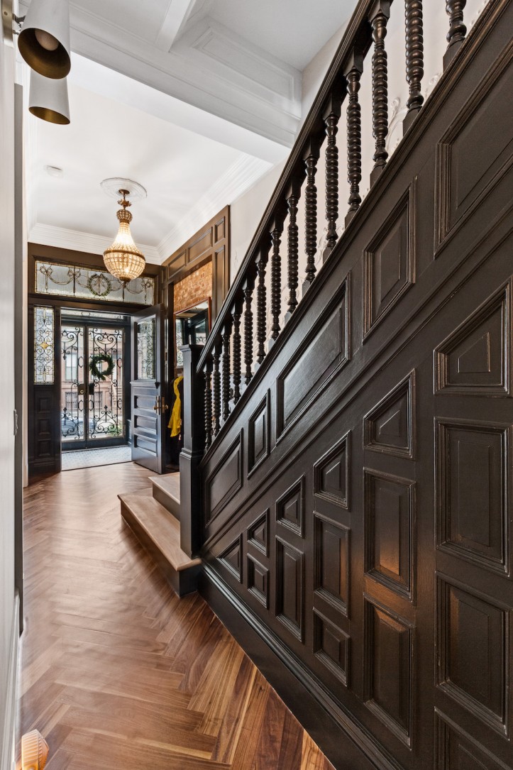
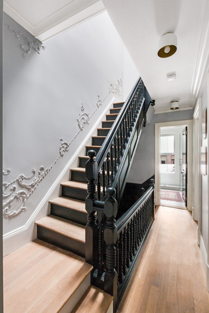
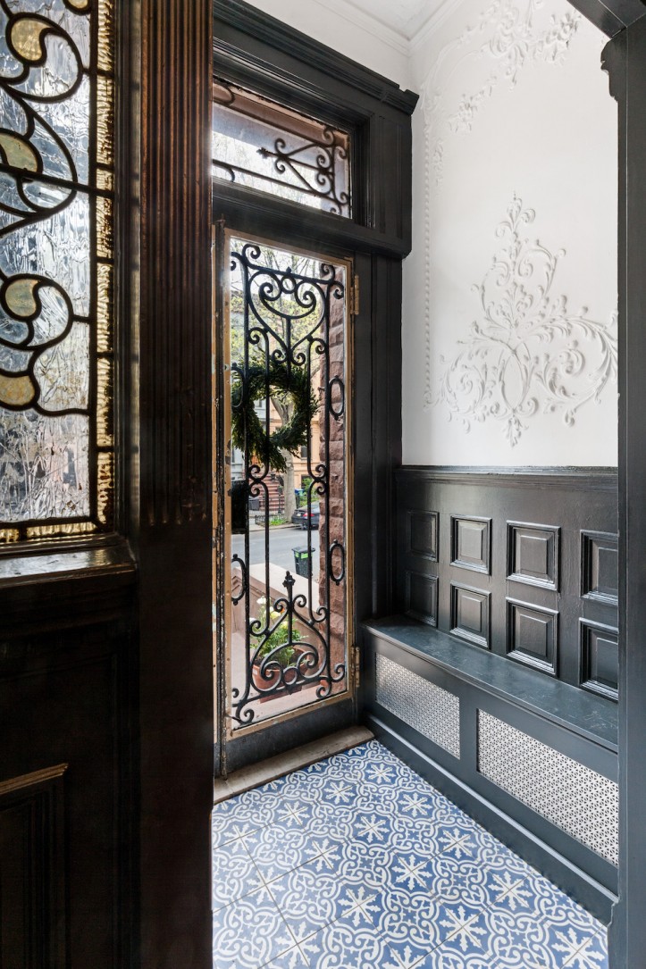
Let’s start with the foyer, which is a work in process. I love that when you enter the home, you see the entire floor. The staircase looks so lovely and grand, especially with the black paint and the landing at the bottom of the stairs to emphasize the grandeur of the steps. There was a crazy wood panel fracture with a mirror at the bottom of the stairs but we all thought it was bulky and awkward and it didn’t seem to be original to the rest of the stairwell. Our architect convinced us (Larry) to get rid of it and our contractor convinced us to rip up that whole wall and expose the brick. I love the sneak peek into the original brick, and how it grounds the space from the frou-frou antique-looking chandelier and the stained glass. I loved using the same ceramic tile from the dining room in the entry vestibule and again—it was all brought together so beautifully by painting all of it black.
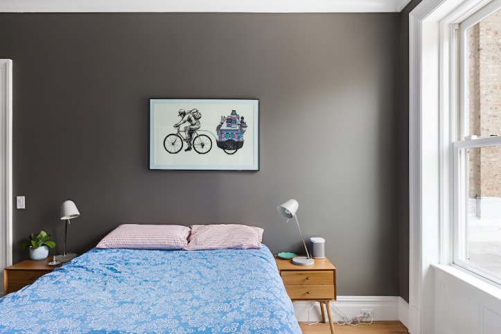
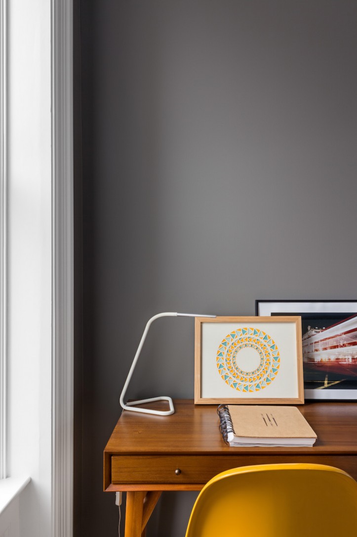
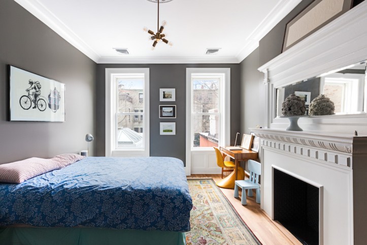
Like all good Iranians, I made sure the guest room was the first one in the house that was set up, furnished, and made available for use. Guests are sacred in our culture and we started having house guests after the first night in our house, and for about three months straight afterward. I think Larry takes more of an American’s tact towards house guests…like fish, they start to stink after three days. But having them on their own floor with their own bathroom certainly makes it easy to have folks around. Oh, how I love having a guest room. Basically, if you paint any room Benjamin Moore Chelsea Gray, it will be close to perfect. I had a different idea about how this room would look but then I inherited this terrible rug from my father’s house in Tehran and had to redo all the bedding to go with the odd mix of muted colors. I love Persian rugs, don’t get me wrong—walking on bare floors isn’t my taste. But we followed the rules for a perfect guest room: make sure the bed is comfy, that the closets are empty so guests can use them for their own stuff, and provide a work desk (so you can hold your best friends hostage for weeks at a time in your home, even if they insist they have to go back to LA to “work”).
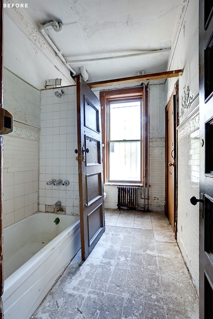
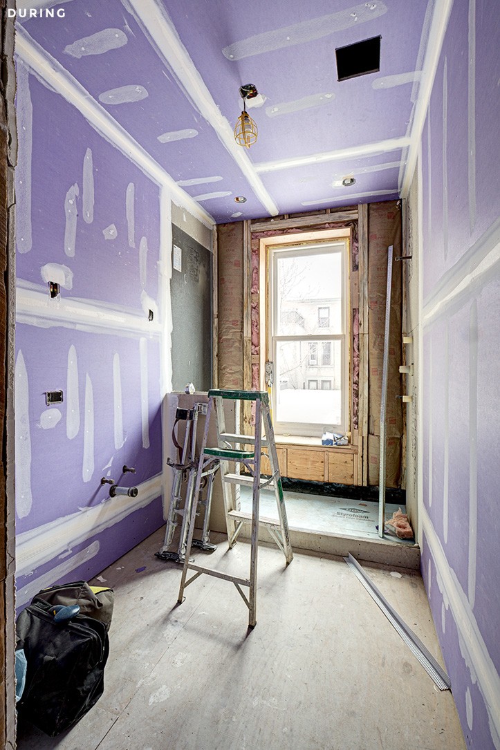
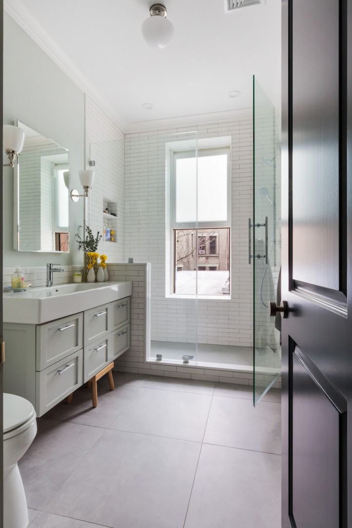
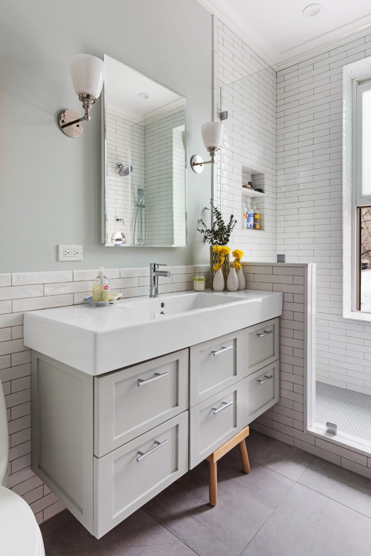
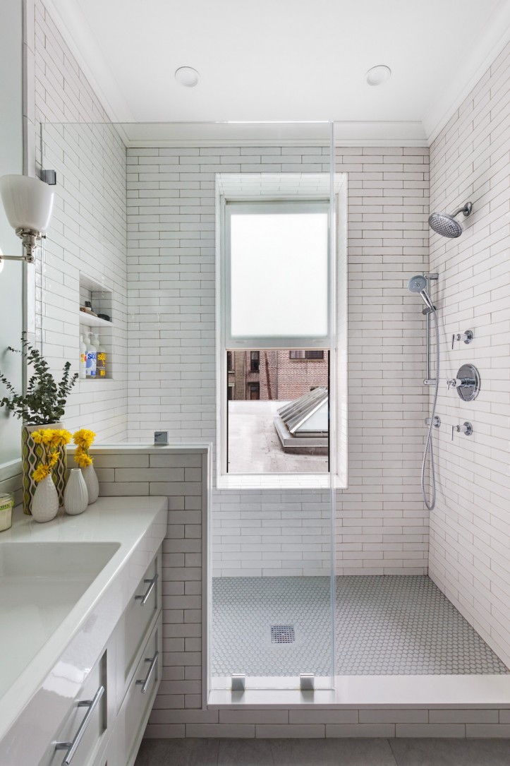
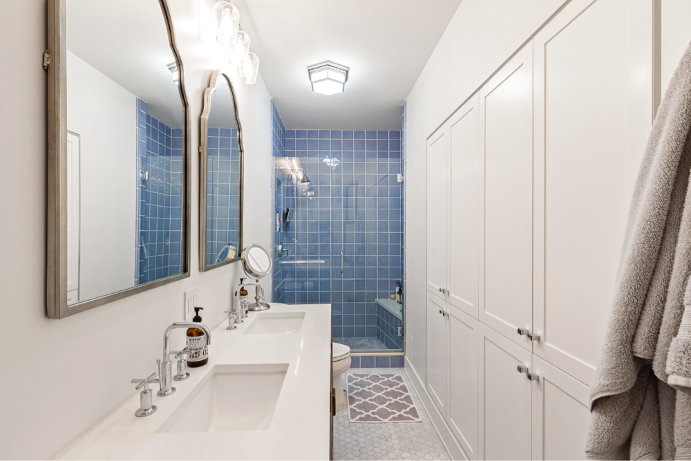
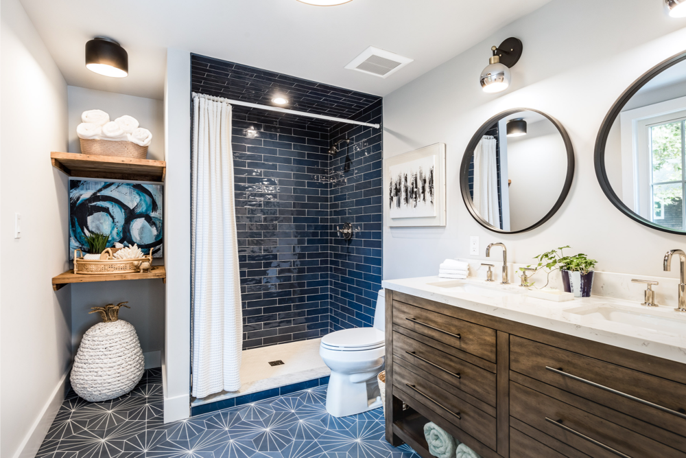
This guest bathroom is so delightfully boring that I fall asleep looking at its soothing tones. I wish I pushed harder for Moroccan tiles in here. I think the floors we used, which basically mimic the look and feel of concrete, wash the whole room out. Our architect used these floors in a hotel project and I really dug them; they were cheap and cool, but always remember the scale of a home project versus a commercial project. What may look like a great feature in a larger space may not work in a smaller venue. I usually have a Persian rug down on this floor which gives the room some warmth and life. If you are ever unhappy with the flooring, put a rug on it! I can’t say enough about how much I love these subway tiles though—they are just varied enough to give them a real handmade look rather than the flat subway tiles we usually see. They come in a gorgeous gray and black as well—I failed in not using them in more spots throughout the house; that may be a future project. I love the shower as well, we made it nice and big so that Nacho could have fun in there. We also built a large bench along it with a grip bar.
Our moms visit often, and I find bathtubs to be really dangerous for the senior citizen crowd. We felt good about having a step-in shower and adding features that would make it safe for both Nacho and the grandmas. It’s lovely having the windows in the bathrooms after years of using interior bathrooms with poor ventilation, though we haven’t figured out a good solution for the wood window trim, which is constantly getting wet and will probably crack or mold in the future. I also highly recommend an integrated sink when you have filthy toddlers—makes clean-up so much easier. This was the top half of a vanity and sink combo I bought. We ended up hating the vanity, so I just had our contractor make us a custom cabinet, which is lovely.
Thanks for introducing us to your Brooklyn brownstone project and sharing your guest suite, Nazli! Click here to read Part II (all about the first floor) and Part III (the bedrooms).
GUEST ROOM RESOURCES: Chelsea Gray paint color: Benjamin Moore. Lighting: West Elm.
GUEST BATH RESOURCES: Subway wall tile: Nemo Tile. Sink: Duravit. Vanity: custom. Faucet: Grohe. Shower Fixtures: Grohe. Mirror and Lighting: Restoration Hardware.
FOYER RESOURCES: Sound system: Sonos. Thermostats and security system: Nest. Chandelier: Restoration Hardware.
—
Architect Tina and husband Fletcher renovated their garden duplex in a Cobble Hill brownstone just in time for the birth their first child. Read Part I and Part II of their renovation journey.
Sweeten handpicks the best general contractors to match each project’s location, budget, and scope, helping until project completion. Follow the blog for renovation ideas and inspiration and when you’re ready to renovate, start your renovation on Sweeten.
