This Couple’s Built-ins Just Keep on Giving
Tired of feeling like your home is constantly overflowing with stuff? Wish you could magically create more storage space? This couple found the answer in the power of built-ins! Their entire home renovation revolves around clever, space-saving built-ins that not only add a touch of sleek design, but also provide a hidden haven for all their belongings. From media walls that disappear into the living room to hidden nooks in the bedroom, this renovation is a masterclass in maximizing functionality. Dive in and discover how built-ins can transform your home from cluttered chaos to an organized oasis!
As a longtime renter on the Upper West Side, Melissa was intent on staying in the neighborhood when she began her search for a home to buy. She spent several years, on and off, going to open houses and scrolling through endless listings. When she came across this apartment in a prewar co-op building on West End Avenue, with beautiful light from a southern exposure and the right amount of space, she knew it was the one. It was a one-bed, one-bath and measured about 500 square feet. More happy changes were in store for Melissa, however. Between the time that her offer was accepted and the final approval from the board, her boyfriend proposed! They now had to ensure that the apartment could accommodate both of them and their belongings.
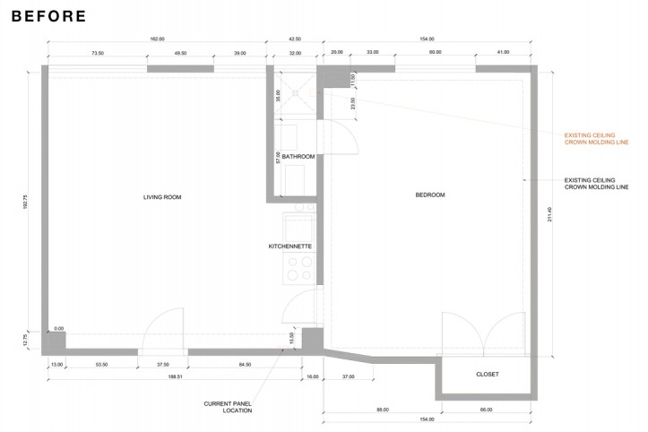
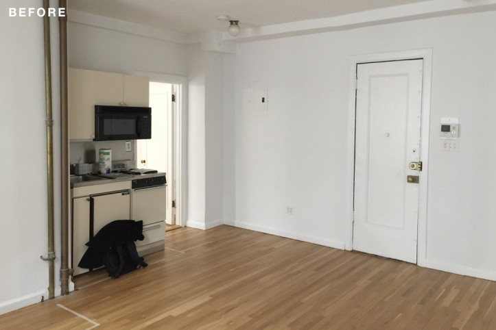
Given the challenge of creating a functional layout and enough storage for two people, Melissa turned to Sweeten to find an architect who would help them “use every inch of space in the best possible way.” They chose to go with a Sweeten contractor with architectural services to transform the space. Originally, the apartment had what was likely the world’s smallest kitchen—so tiny it could have easily fit into a coat closet. Its appliances were typical of those found in dorm rooms: a mini-fridge, a compact range, and an unsightly microwave mounted to the underside of one of two sets of upper cabinets. The bathroom was also too small, with a sink that you could barely wash your hands in and no space to turn around. To top it off, the apartment had just one closet.
At Sweeten, we’re experts at all things general contractors — we pre-screen them for our network, carefully select the best ones for your remodeling project, and work closely with hundreds of general contractors every day. So, we’ve tapped our internal expertise to bring you this guide.
Sweeten brings homeowners an exceptional renovation experience by personally matching trusted general contractors to your project, while offering expert guidance and support—at no cost to you. Renovate expertly with Sweeten
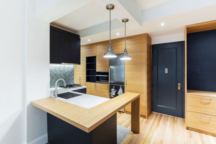
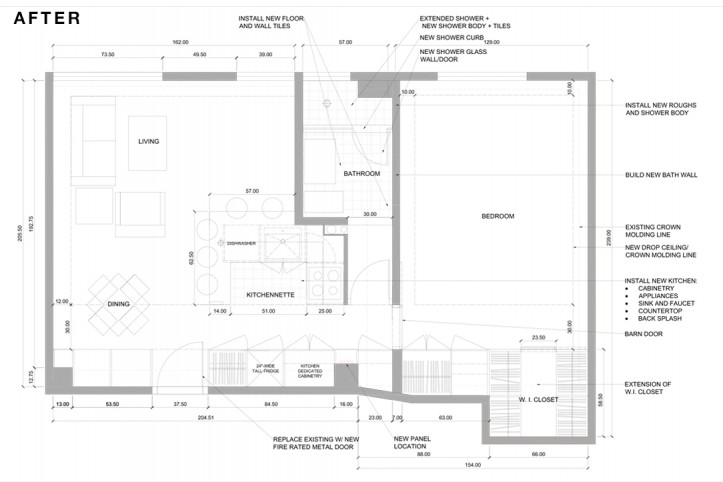
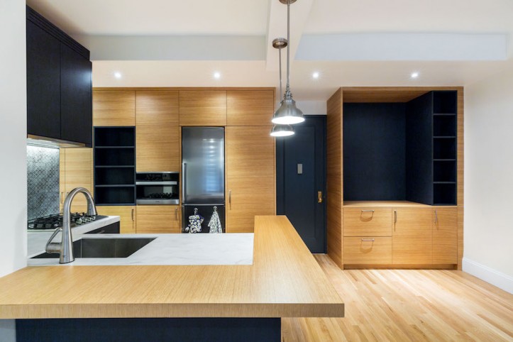
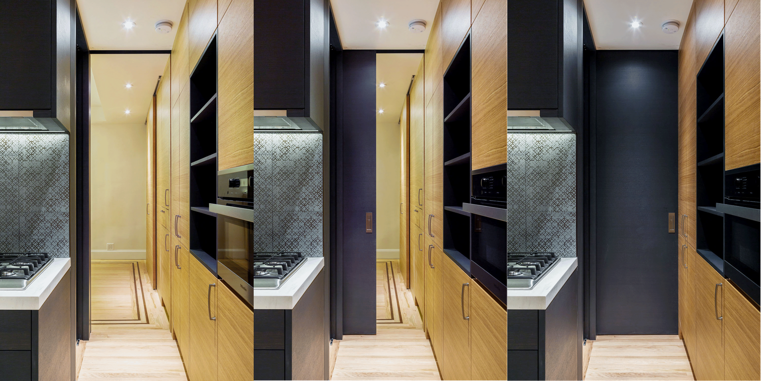
Having identified the problems that they needed to solve, Melissa worked with her architect and contractor (whom she hired separately) to achieve her goals: a kitchen that could hold full-sized appliances, plenty of closet space, as well as a larger bathroom. Fortunately, there was space to be taken from the large bedroom to create a more spacious bathroom. Her Sweeten architect also designed a full wall of storage space, faced with simple oak slab fronts in each the kitchen and the bedroom. By establishing aesthetic continuity throughout the kitchen and the storage wall, the architect was able to make all the additions Melissa and her fiancé needed without making the apartment feel cramped.
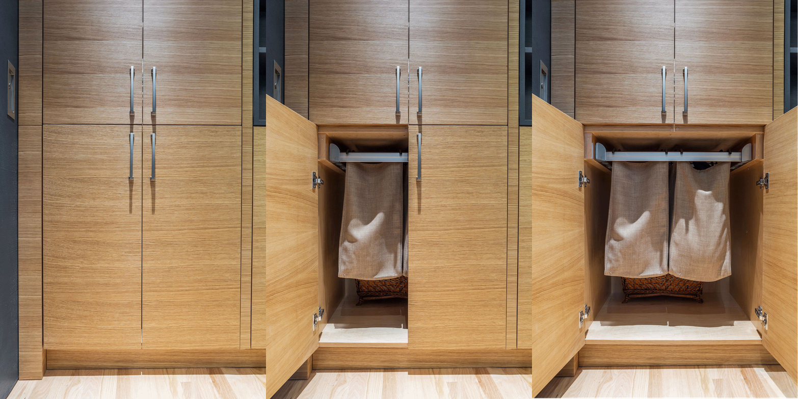
The cabinetry directly across from the bathroom door opened to reveal built-in hampers.
(Above) Looking from the kitchen toward the bedroom
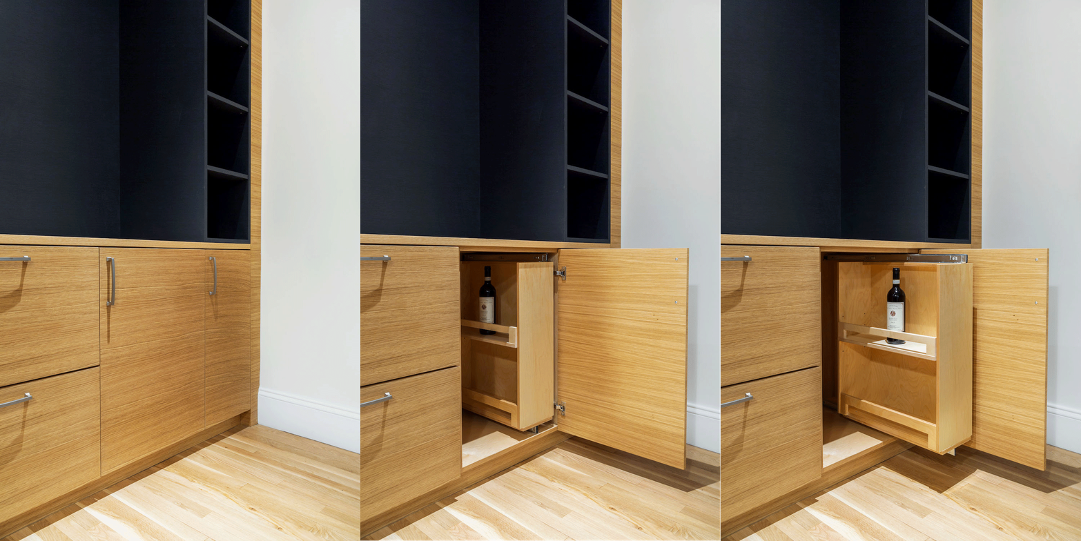
In the far corner of the living room, the storage wall included open shelving as well as hidden storage for a bar and a wine fridge underneath. As the wall progressed into the kitchen area, the wall accommodated a counter-depth refrigerator directly across from the sink and stove area to create a kitchen nook.
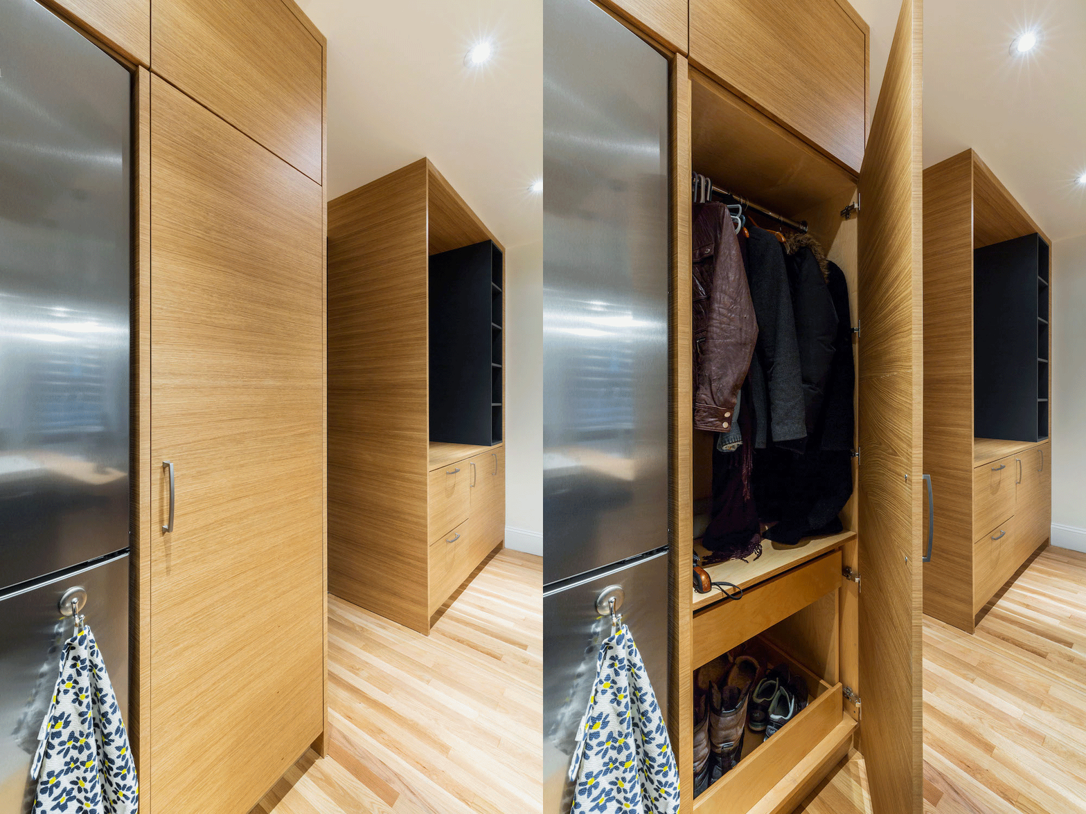
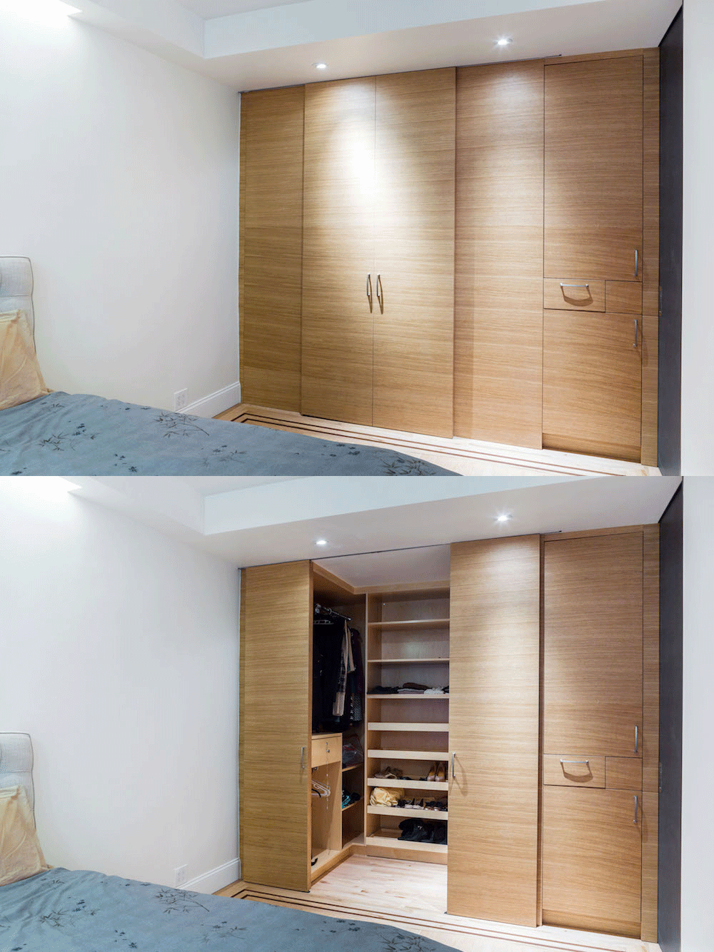
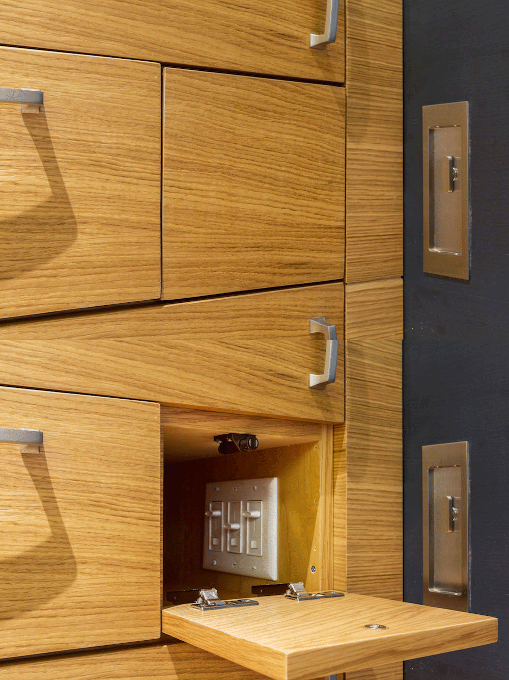
(From top) Hampers across from bathroom; closet in the bedroom; light switches in the bedroom
As the wall continued past the kitchen, the cabinetry directly across from the bathroom door opened to reveal built-in hampers. Immediately beyond a blackened-oak pocket door was the bedroom. The storage wall continued here, concealing various more drawers as well as a full walk-in closet that was customized to the homeowners’ needs. Some utilitarian details got swept up in the design. “We didn’t have space to move the switches, so we left them as is and then just added the small compartment,” Melissa said.
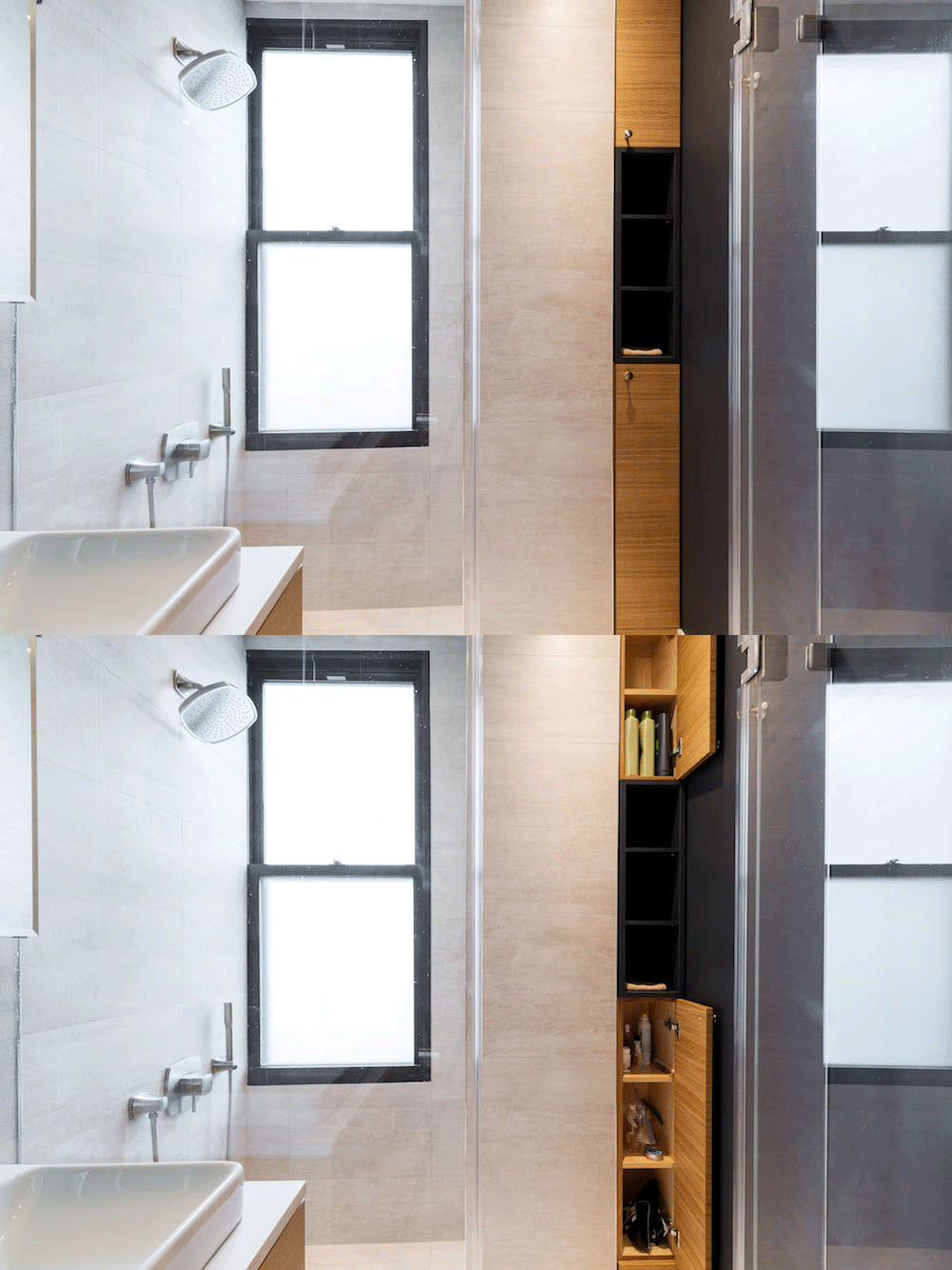
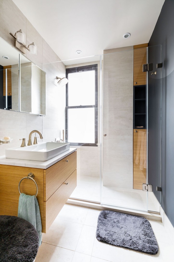
The aesthetic carried through to the now-enlarged bathroom, which incorporated a larger shower area and yet more storage—artfully tucked between an immovable beam and the far wall of the shower.
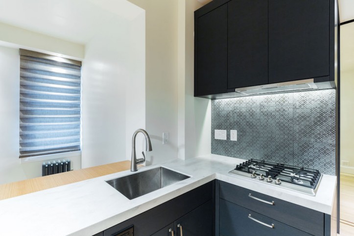
Now that the renovation is complete, Melissa shares that the biggest challenge was the time it took to get approvals from the DOB (Dept. of Buildings). On the final design, Melissa tells us, “All the materials were chosen with the idea of making the space feel larger, which seems to be driven by a more modern look. However, my fiancé and I are more traditional, so our architect looked for transitional pieces. The woodwork has modern lines, but the hanging light fixtures in the kitchen are more traditional. We were looking for a unique backsplash in the kitchen and ended up picking something that’s reminiscent of a tin roof in many original NYC ceilings. I love the feeling of a spa, so we chose bathroom tiles that appeared like stones.” Mixing styles to bring function and design together has helped make the couple’s apartment exactly what they needed.
Thank you, Melissa! We hope you love the new home with your fiancé.
KITCHEN RESOURCES: Custom cabinets with wood veneer, stained in clear and dark charcoal, coated in acrylic: designed by Sweeten architect. Refrigerator, cooktop, and dishwasher: Bosch. Hood and speed oven: Miele. 24″ x 24″ Etro Metal Grey porcelain backsplash tile: AKDO. Custom DuPont Corian and wood veneer (coated in acrylic) countertops: designed by Sweeten architect. Imperial Silver Quoizel Emery 1 Light 8″ Wide Pendant, #ER1508BN: Build.com.
BATHROOM RESOURCES: Custom cabinets with wood veneer, stained in clear and dark charcoal, coated in acrylic: designed by Sweeten architect. 12″ x 24″ Mark Gypsum porcelain tile (matte): AKDO. Vox Rectangle white vessel sink, #K-2660-1: Kohler. Grohe brushed nickel Grandera faucet, #20418ENA: Build.com. Kohler silver aluminum double door reversible hinge frameless mirrored medicine cabinet, #K-CB-CLC3026FS: Build.com.
Ready To Get Started?
Post your project on Sweeten for free and make your dream home a reality. Sweeten puts you in control of your renovation, from finding the perfect contractor and gathering design inspiration, to using cost guides to plan your budget wisely.
