A Designing Duo Renews Their Own Home
Maggie and Adam gut renovate their Kips Bay co-op
Can two strong-minded designers find compromise on a gut reno of their new home? Maggie, an interior designer, and Adam, a former architect, were willing to try.
After three years of renting together, they bought an 800 square-foot co-op that needed to be completely reimagined in order to give them adequate light and storage—and to meet their exacting design standards.
Not ones to duck a challenge, they lived in the space for the final month of construction, while simultaneously planning their wedding and honeymoon! They chose Sweeten to bring order to the chaos, and to deliver the home they’d both love.
Sweeten matches home renovation projects with vetted general contractors, offering guidance, tools, and support—for free..
Guest post by Sweeten homeowner Adam
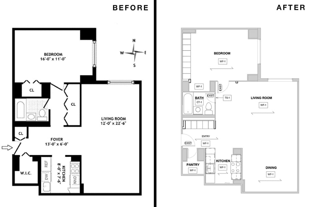
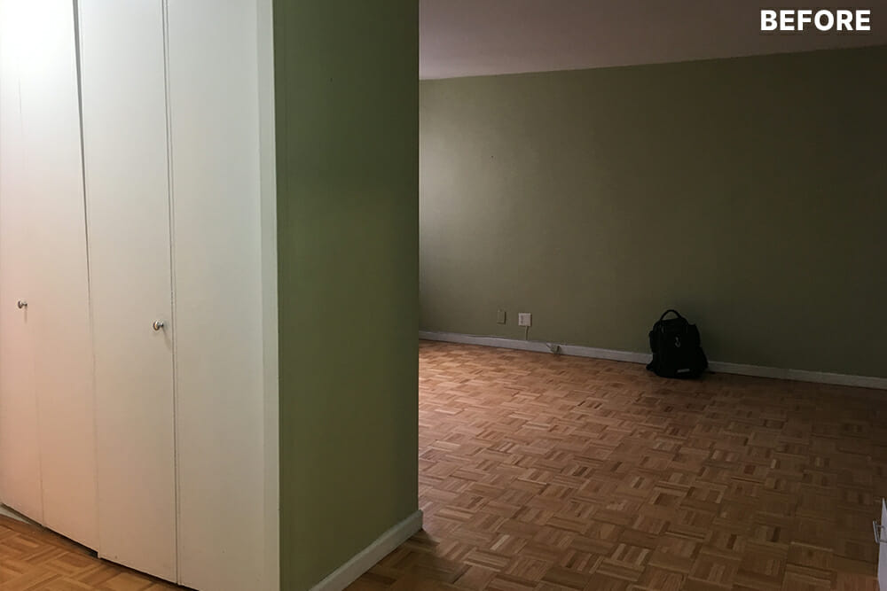
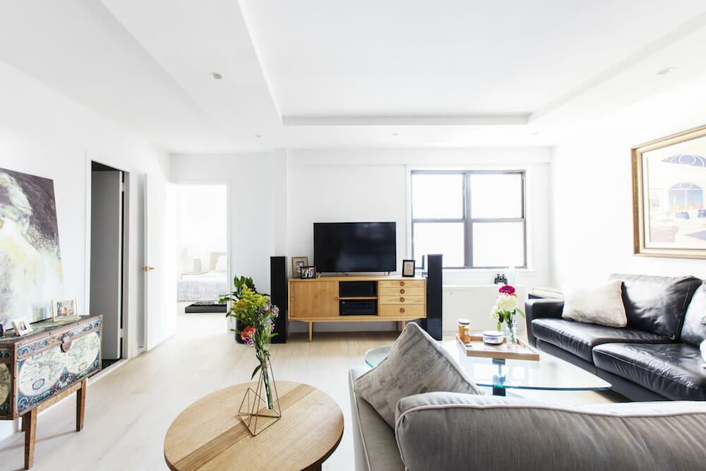
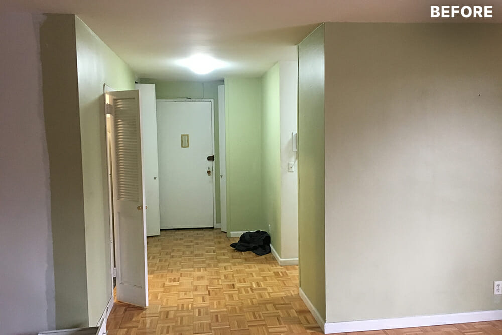
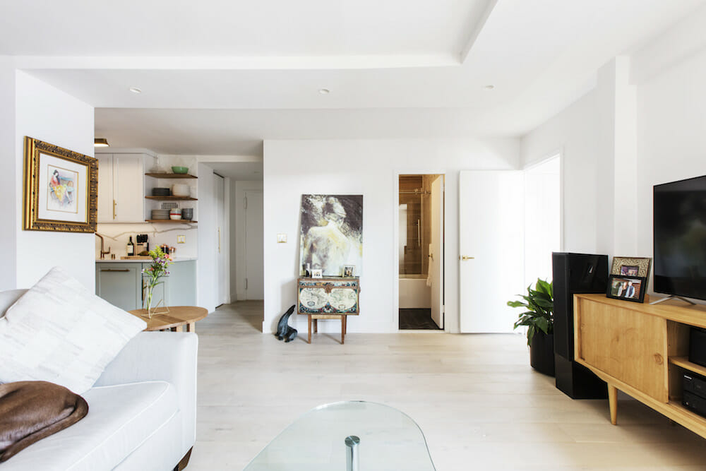
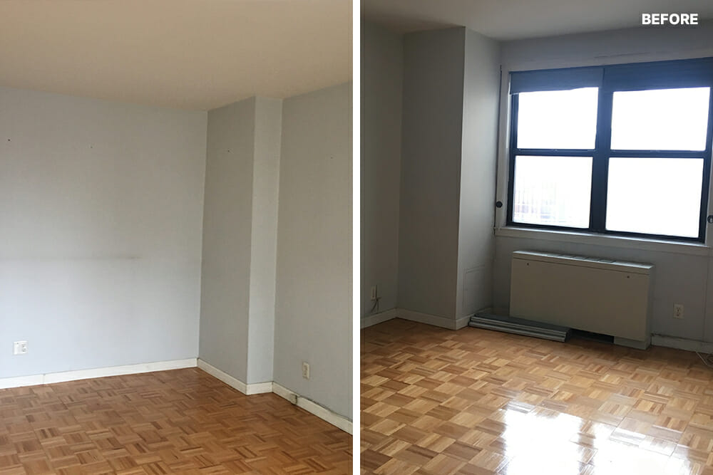
Our unit’s existing layout probably had not been renovated for 30 or 40 years. It still reflected an old style, but we recognized that demolishing a large closet that created a corridor between the living room and the bathroom would transform and open up the space. That was our main vision.
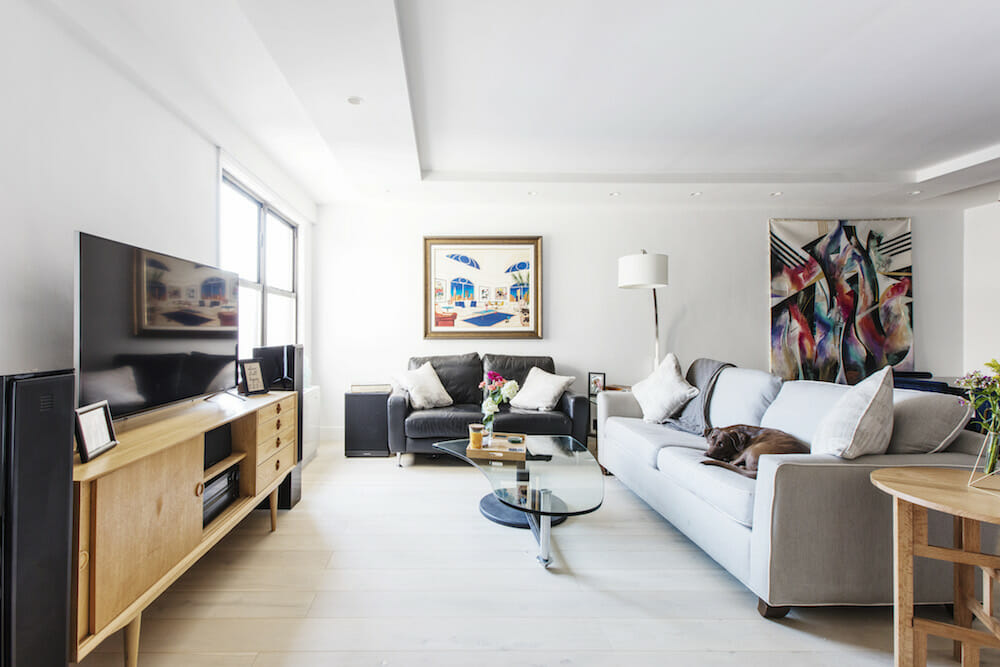
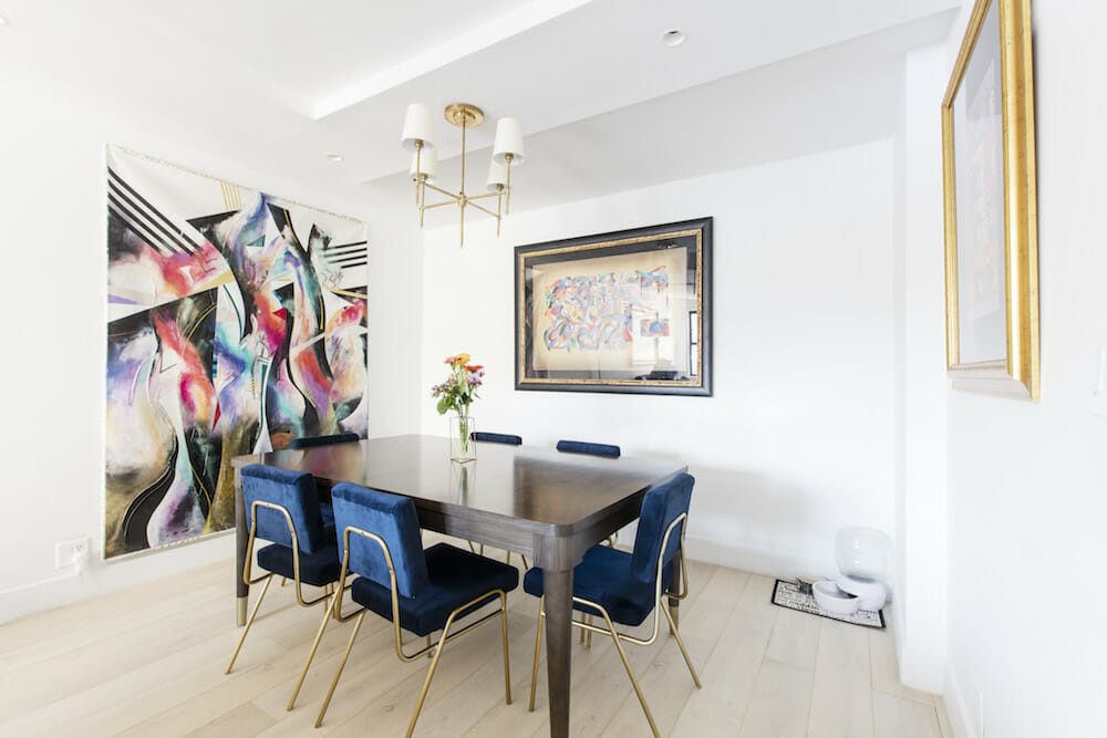
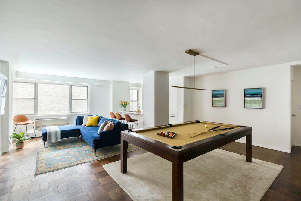
We also wanted to create a functional home with more than enough storage throughout. The scope of work included removing and replacing all existing flooring, tile, fixtures, and appliances as well as opening up the living room and segmenting out an area for a dining room—which might one day be walled off as a nursery. We saw it as a good flex space.
After we posted our renovation on Sweeten, we were stuck trying to choose between two qualified Sweeten contractors. We had a conference call with Sweeten to discuss the pros and cons of each contractor. The contractor we thought would be the best fit for the project was also the one we felt understood the plans the least—at first.
Sweeten encouraged us to meet with him and fully explain the scope of work. That ended up being a great recommendation, as we did choose that contractor and were able to work very closely with him and his team. If you are strong-willed about your design ideas, you will be better off with a contractor who reaches out to you for instruction.
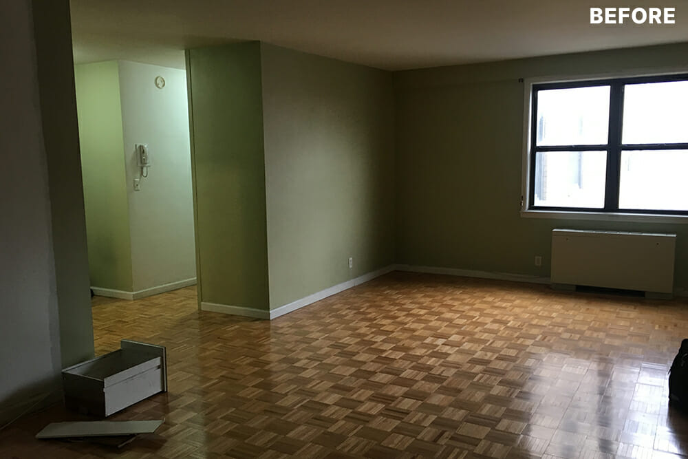
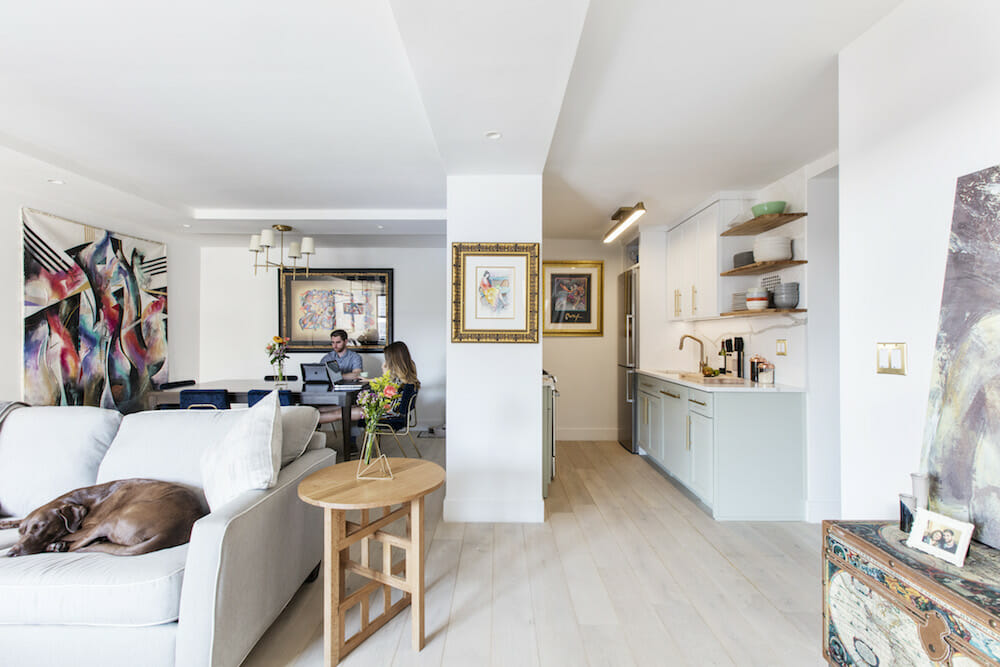
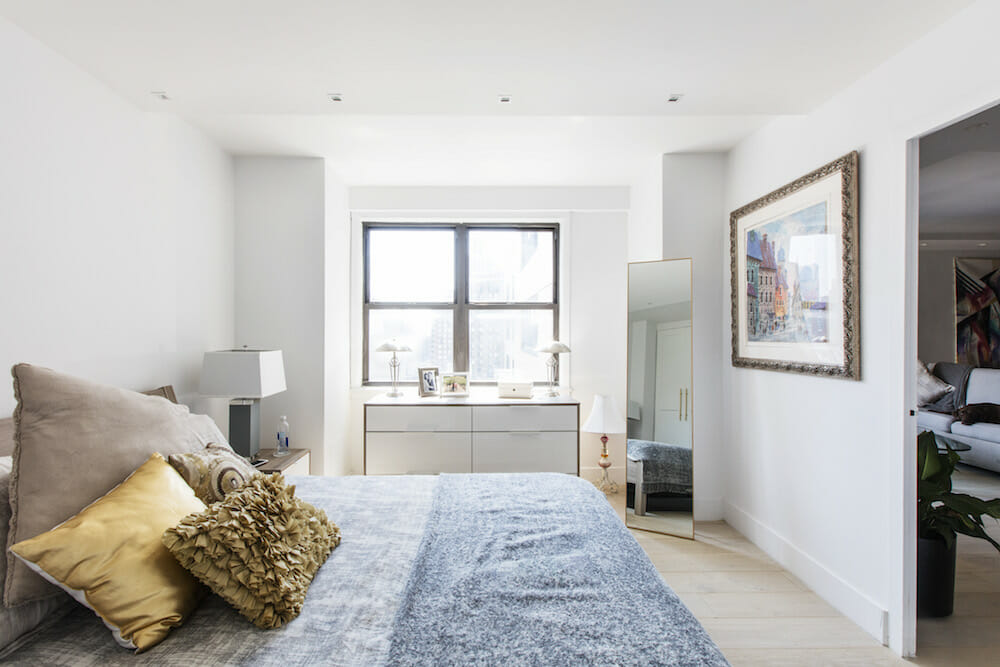
The home has very low ceilings—a little over eight feet. We strategically laid out the ceiling plan in each of the rooms to not only allow for proper lighting but to create the illusion of taller ceiling heights. For example, we asked for a lower ceiling in the entry foyer because that changes your perspective of the heights throughout the home. Adding to this effect were the narrow doors of the floor-to-ceiling, built-in Ikea wardrobes in the foyer that Maggie and I assembled ourselves. We selected 7-inch-wide engineered hickory flooring and kept the walls white to work with our colorful art collection. Sweeten brings homeowners an exceptional renovation experience by personally matching trusted general contractors to your project, while offering expert guidance and support—at no cost to you. Renovate expertly with Sweeten
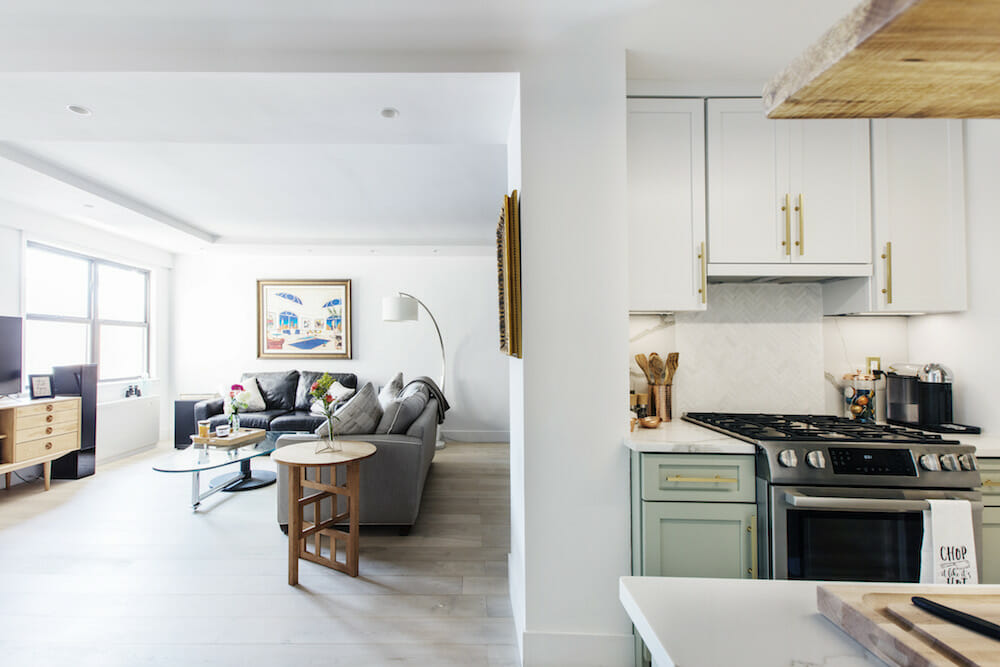
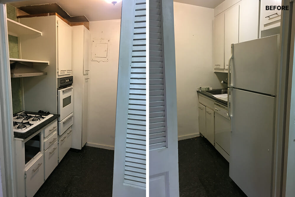
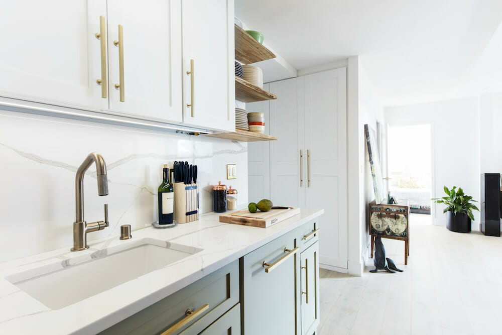
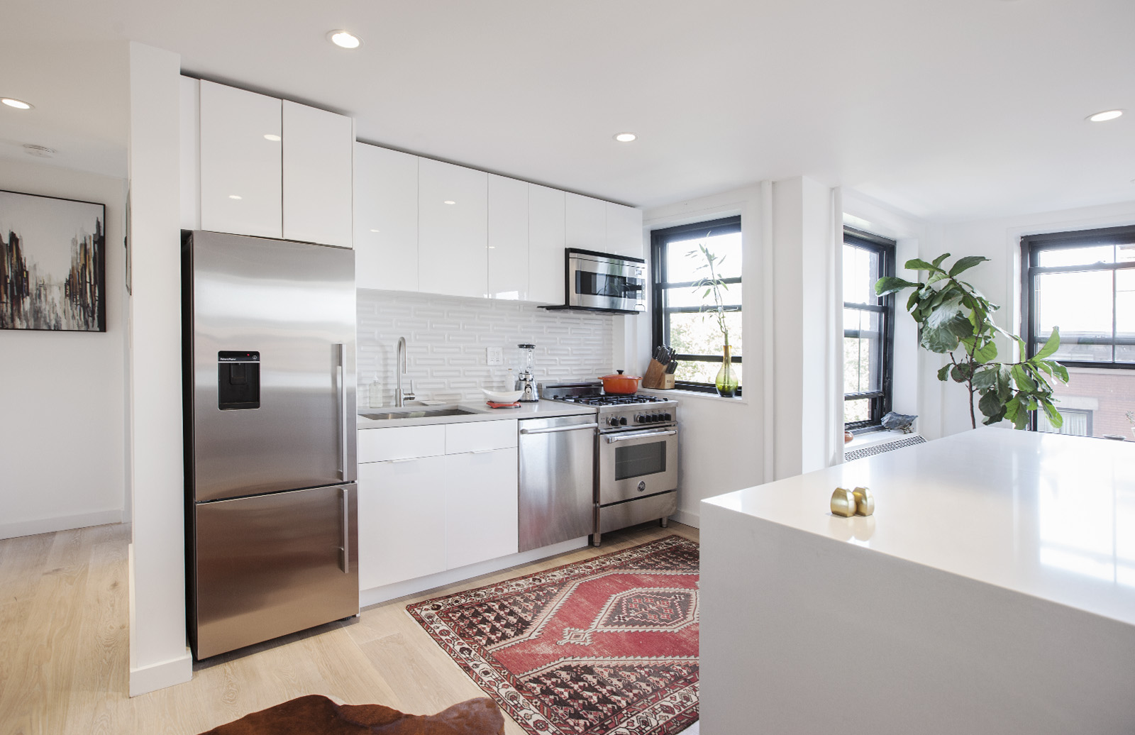
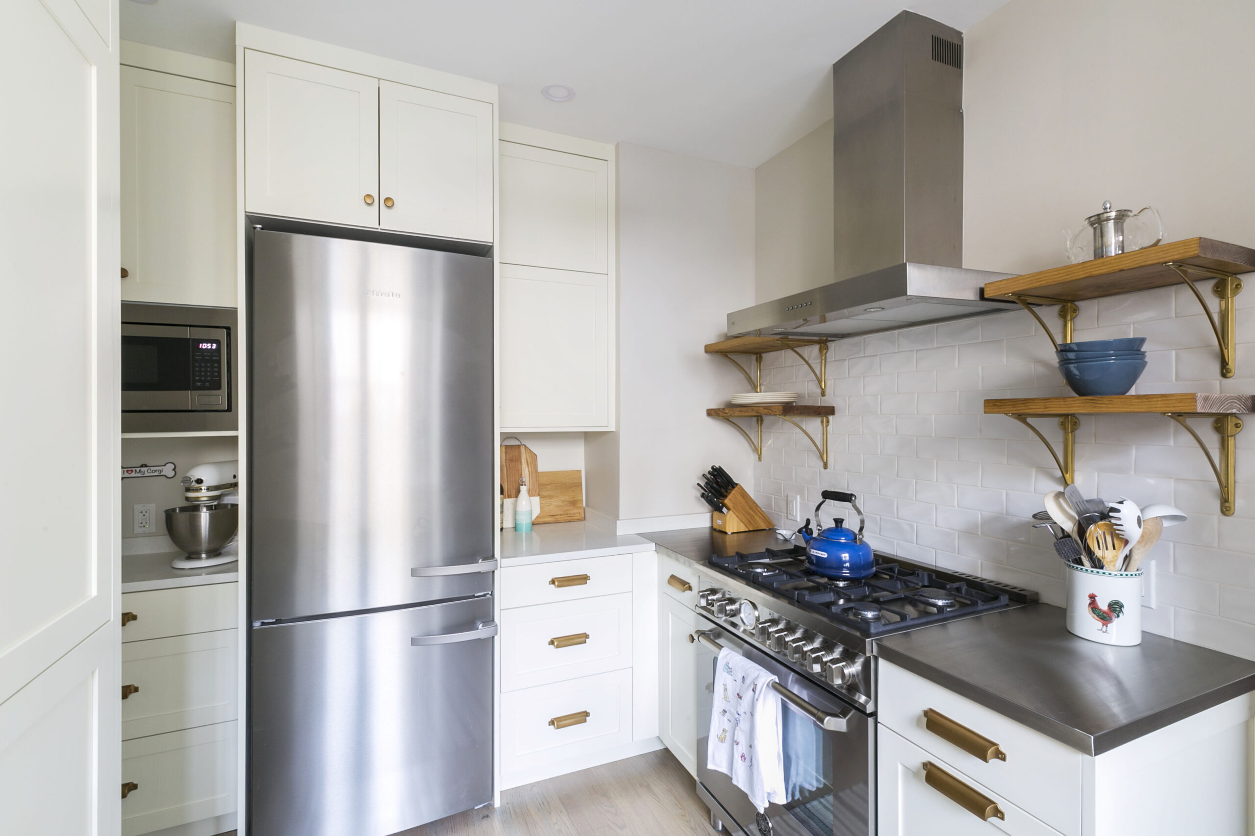
We were able to make the kitchen area seem much larger by tearing out the double doors and surrounding walls to the entry side of the room. We flipped the existing location of the refrigerator to the kitchen’s far wall and added open shelves instead of a bulky upper cabinet. That established the open plan design of the home and allowed natural light to penetrate further into the apartment.
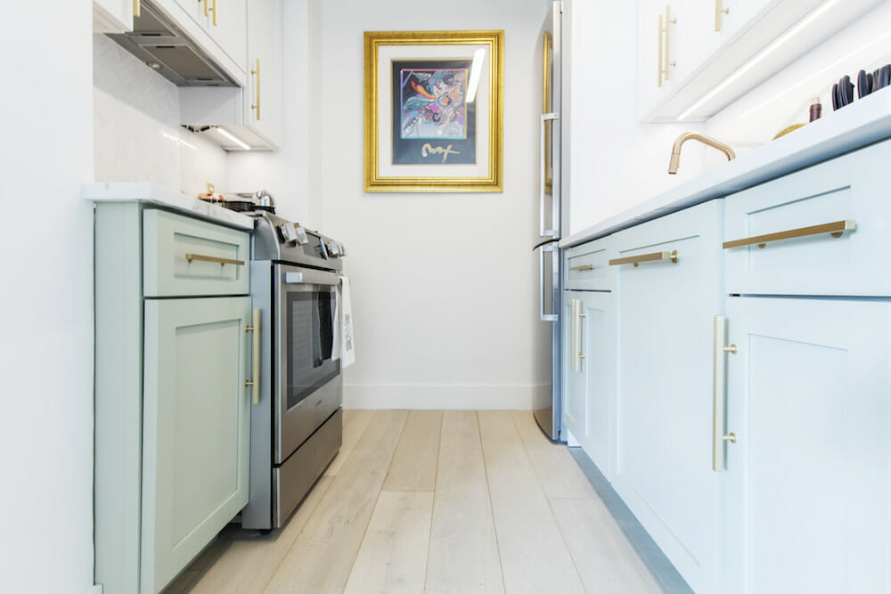
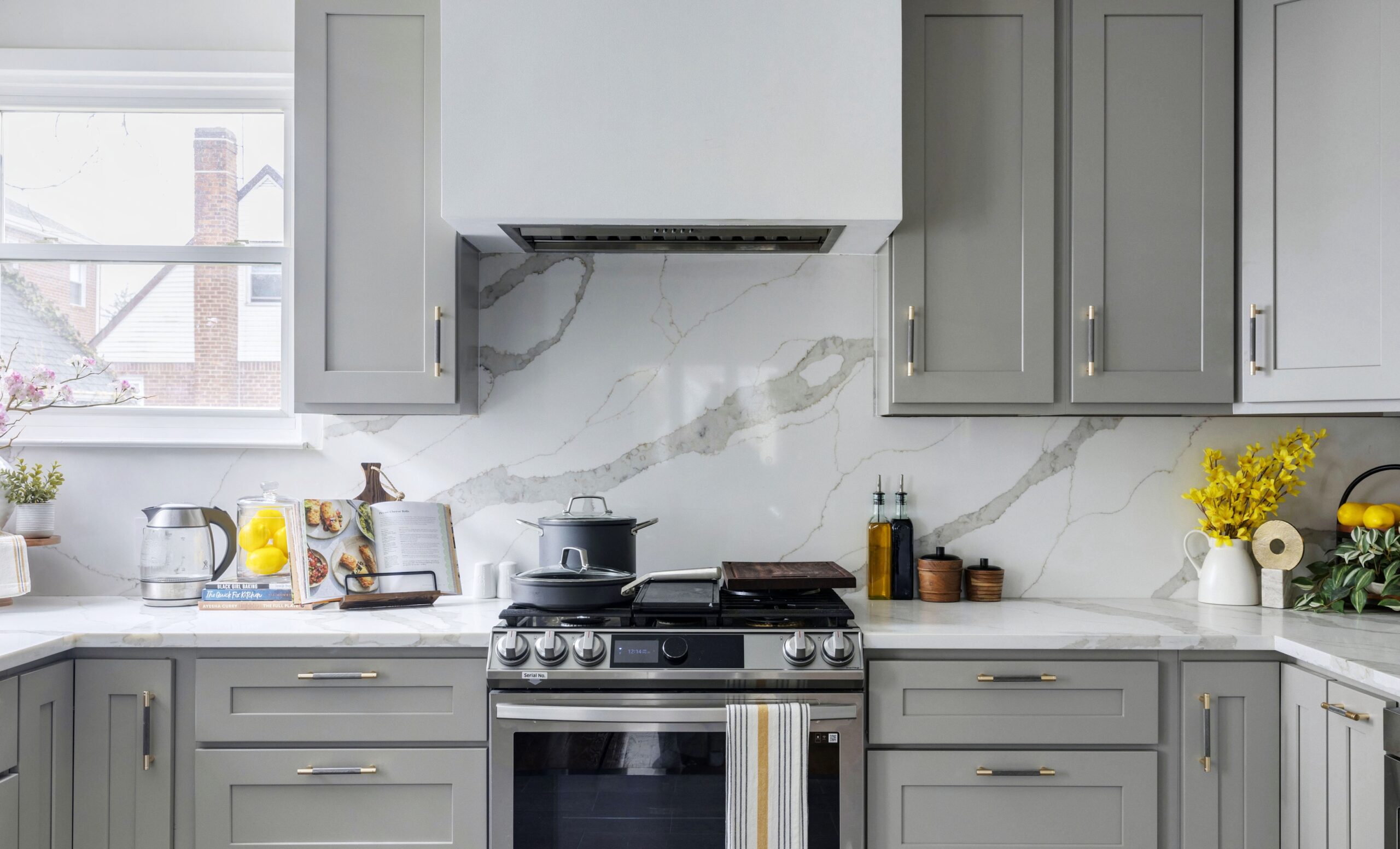
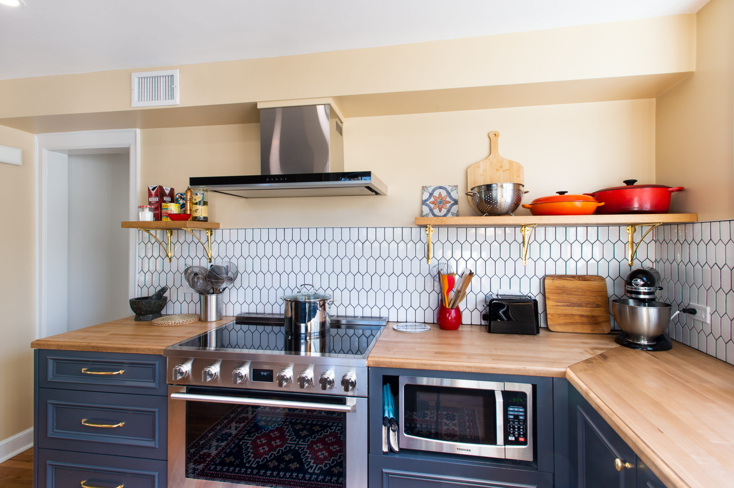
The kitchen shows the full-scale of compromise between our distinct design ideas. The light green lower cabinets add the layer of color that fit her style, but have a gray tone that doesn’t stray from my own style. We also purchased the hardwood open shelves as raw material from a lumberyard, sanded them down, cut, drilled, and stained them ourselves. This added a personal touch, warmth, and texture to the kitchen, but didn’t make us go in over our heads with custom design ideas.
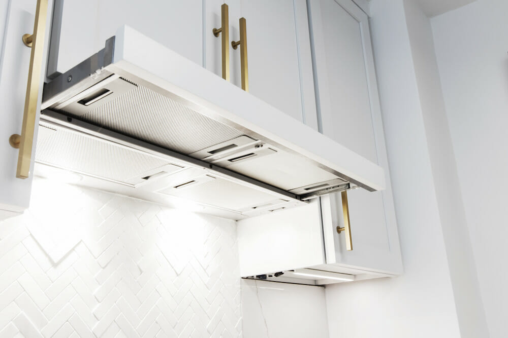
We found a great Bosch hood vent that fits within the depth of the upper cabinets. It is completely concealed for a very clean look. When we want to use it, we just slide the vent out and it extends over the whole range to catch all the oil and fumes.
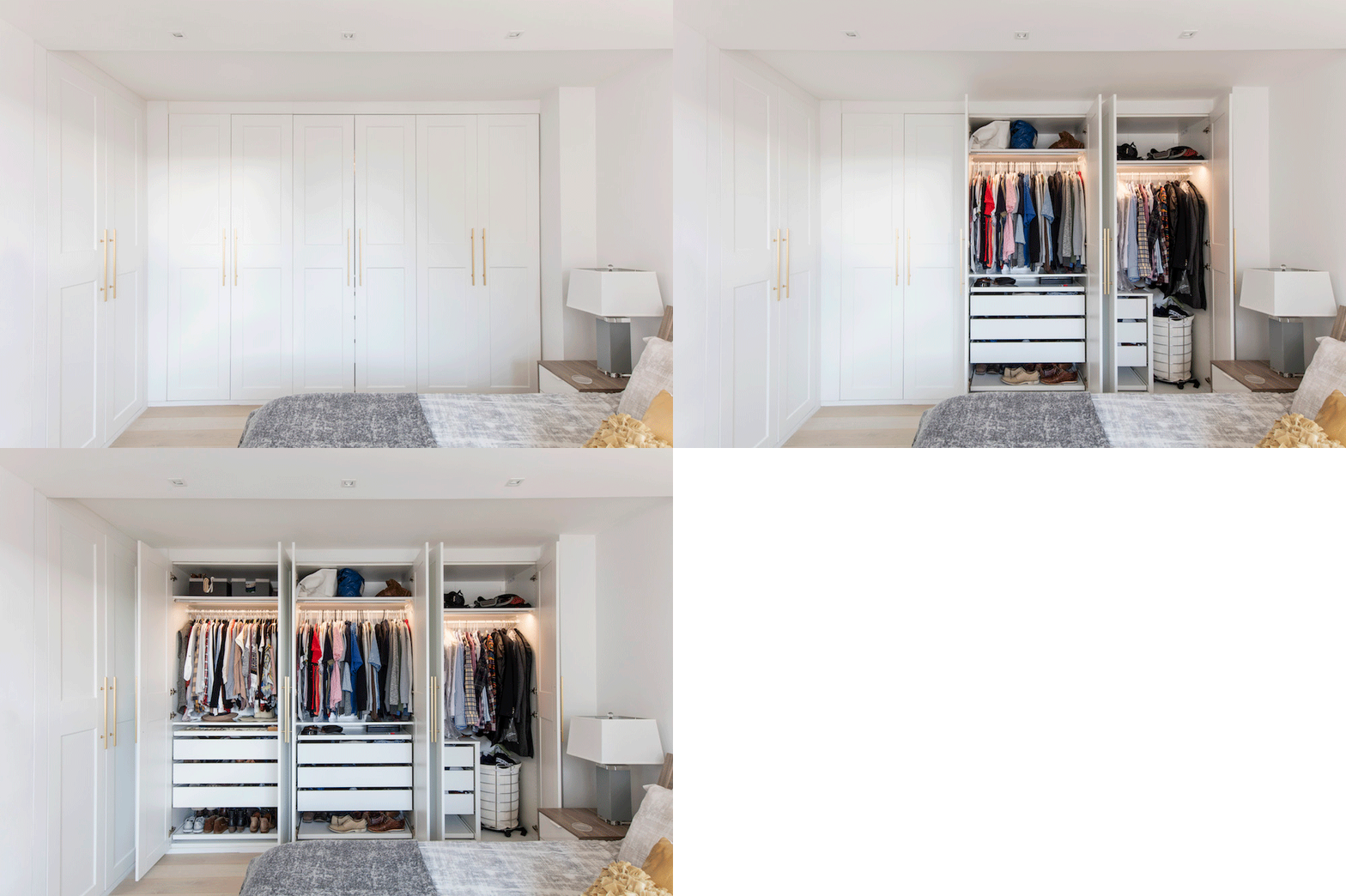
In the bedroom, we added a series of wardrobes that Maggie and I built from Ikea. We had the contractor frame them so they’d look like built-in millwork. We installed linear LED lighting with motion sensors in each closet, so they automatically turn on when you open the doors. The satin brass hardware gives them a clean, refined look and matches the hardware elsewhere in the home. Full-height doors also allowed us to maximize storage and make the room look taller.
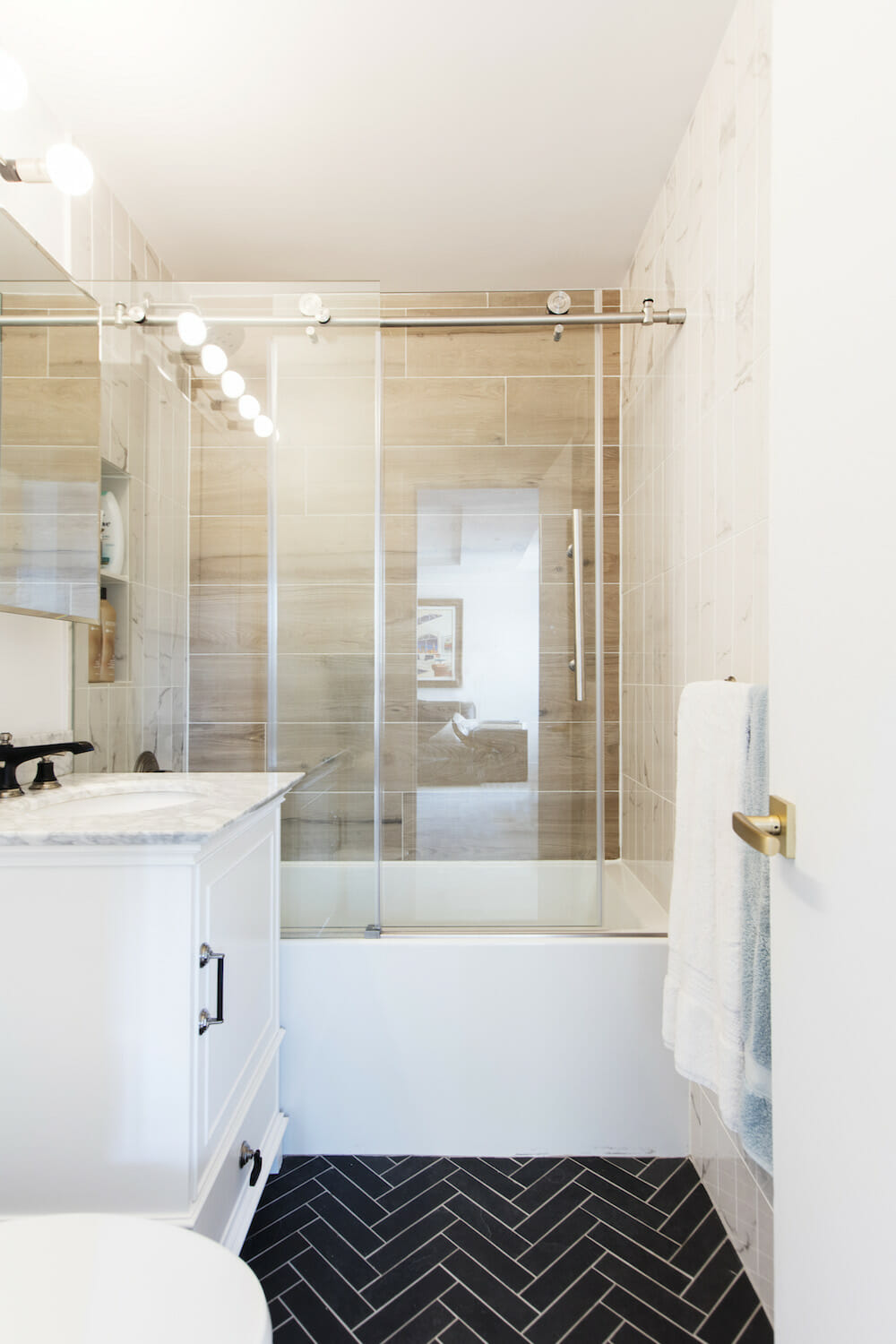
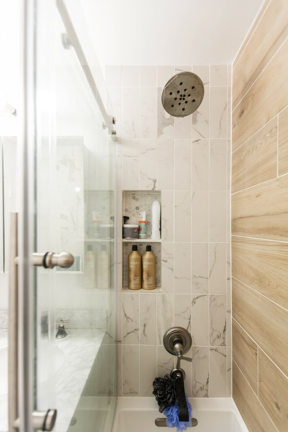
We gutted the entire bathroom and replaced everything including the bathtub. We used horizontal wood-look ceramic tile on the back wall of the shower for a spa-like feel and coupled it with the marble-style ceramic tile on the walls.
Our Sweeten contractor was a great problem-solver and set up a very aggressive six-week timeline, but it was understood that we would be moving in during the renovation by that point. The contractors finished the bedroom in such a narrow window before the movers arrived that the baseboards were still wet. About a week and a half later, they had completed the bathroom and the flooring in the living room so that we could move in.
We lived in construction for about another month before the project was completely done. This put some stress on everyone, including our dog Ellie, but it was quickly relieved once we were living in the finished product. Now we can come home to a well-lit, functional space that’s comfy, sophisticated, and fits our needs exactly.
We loved reading real reviews from real people and seeing photos from actual projects on Sweeten’s site. At the end of the day, we could rest assured that our contractor would finish the job and maintain a good relationship because he knew our review would reflect his work and dedication to our project. Our contractor got five stars for doing just that.
Thank you, Maggie and Adam, for sharing your home collaboration with us!
KITCHEN RESOURCES: Cabinets: Kingswood. Lower cabinet paint in Tree Moss: Benjamin Moore. Upper cabinet paint in Bright White: Sherwin Williams. Cabinet hardware: Lewis Dolin. Countertops and backsplash in Calacatta Borgnini: Quartz Masters. TruGranite sink: MR Direct. 800 Series B11CB81SSS 24” refrigerator, 800 Series 30″ Slide-in gas range, 800 Series 24″ dishwasher, retractable hood: Bosch. Overhead lighting: Zhane Linear Suspension. Under-cabinet lighting: Luminii.
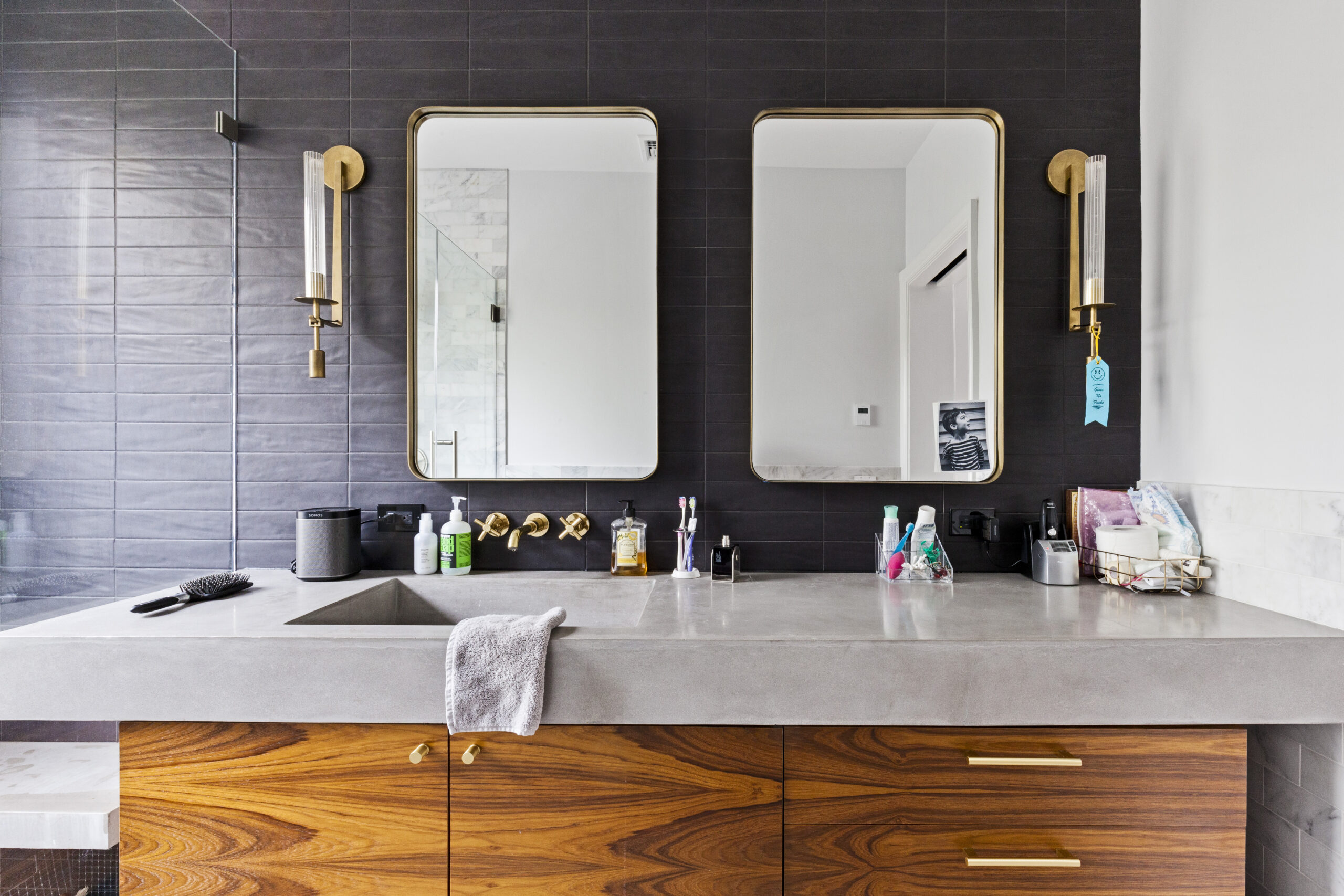
BATHROOM RESOURCES: Alaplana light brown wood shower wall tile, 2×8 slate herringbone floor tile, ceramic marble shower tile: Quality Tile. Rook hardware and shower fixtures in black nickel: Brizo. Bathtub: Kohler. Corbelle toilet: Kohler. Jensen Horizon medicine cabinet: Amazon. Bathtub door: Dreamline.
LIVING ROOM/DINING ROOM: Recessed lighting: Lucifer. Light fixture: Shades of Light. Cabinet wardrobes: Ikea.
BEDROOM: 1”-square LED downlight: Juno. Pax closets: Ikea. Under cabinet lighting: Feelux.
—
Two designers, one in web design and the other in clothing, renovated their home in Ridgewood, Queens.
Refer your renovating friends to Sweeten and you’ll both receive a $250 Visa gift card when they sign a contract with a Sweeten general contractor.
Sweeten handpicks the best general contractors to match each project’s location, budget, and scope, helping until project completion. Follow the blog for renovation ideas and inspiration and when you’re ready to renovate, start your renovation on Sweeten.
