A Long Townhouse Sets the Right Flow for Modern Living (Part 2)
While renovating their Brooklyn brownstone, Nazli and Larry discovered the merits of a dark, painted pantry and that heated floors were indeed worth fighting for
We’re back again this week with Part 2 of Nazli and Larry’s historic Brooklyn brownstone renovation in Bedford-Stuyvesant. If you missed it—check out Part I where Nazli walked us through their planning process and showed off the foyer and guest suite. Here, she shows off the rest of the parlor floor, including the kitchen, the dining room, and the powder room.
Nazli explains the challenge of merging modern and traditional within the confines of a townhouse’s long and narrow configuration. Read on for her thoughts on powder rooms (wackiness is key), decorative mantels (rather pointless), and coming to terms with the budget required to achieve the renovation you want (very tough).
I think the biggest challenge to any renovation is…the renovators obviously. There will always be a push and pull between the architect, the contractor, and the owners. And most of the time, that will yield a better product than any single entity could have envisioned (but not always).
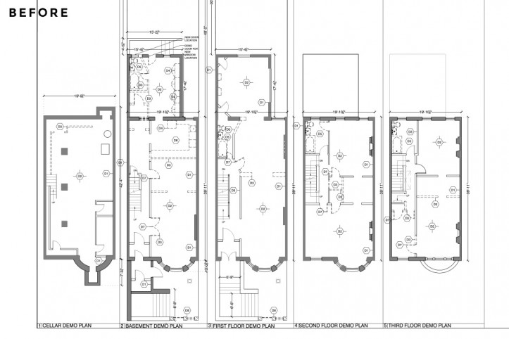
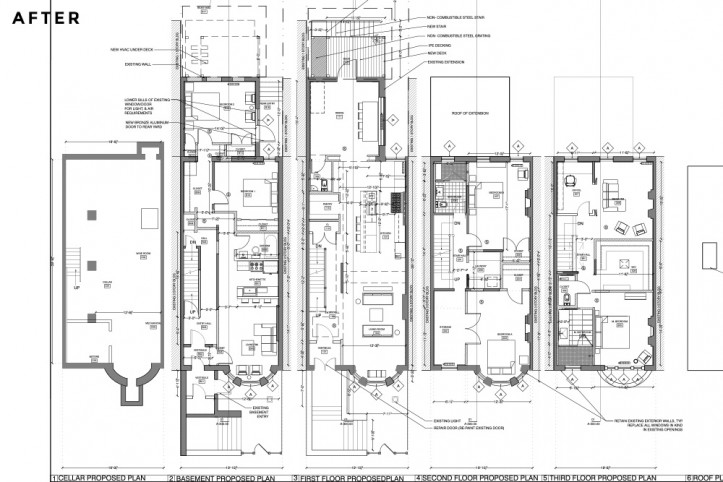
I think our Sweeten architect was fantastic in coming up with some great solutions to space challenges–especially on the parlor floor, where I insisted we needed a half-bath that was nowhere near the kitchen (because, gross), a hall closet, and a kitchen pantry. She really provided a lot of help in making sure the house was up to code and that the spaces flowed.
Our contractor (and my husband’s best friend), did an awesome job of value engineering so we could get the most bang for our buck. The decorating of the spaces was left mostly to me and it was interesting trying to figure out my own taste.
We, like all imperfect clients, wanted this Brooklyn brownstone renovated on a contractor’s-grade budget. Obviously, we were being silly and went way over budget (and right at what our contractor told us it would cost; we were just deeply in denial about the cost of construction in NYC).
The mechanicals in a home are so expensive that basically most of the money was gone before we made a single design choice. And for me, I care deeply about the fixtures, finishes, and materials and I wasn’t about to cheap out on the things we had to see and use every day.
So just be honest with yourself about what you want and what you’re willing to pay or give up for it.
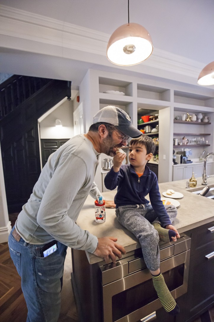
I was most excited about the kitchen—if that hasn’t already been made clear. I love throwing huge parties and dinners, and I like to spend my alone time cooking. It’s also a natural gathering spot, so it was exciting to think about getting the most out of the space.
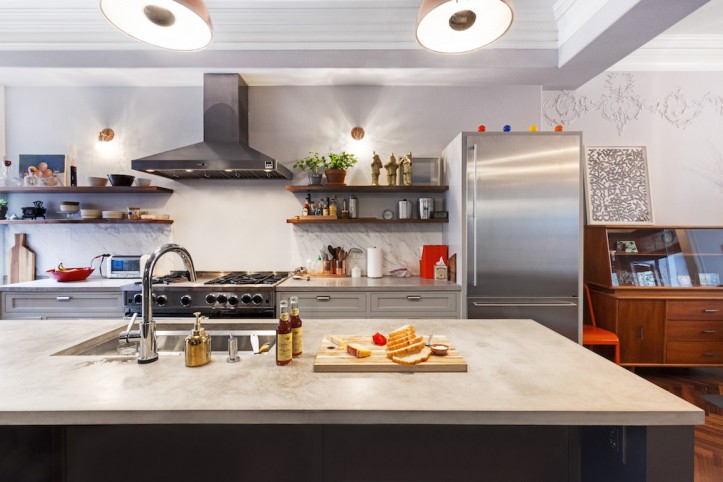
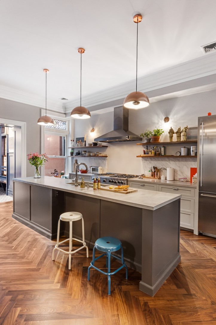
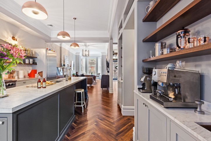
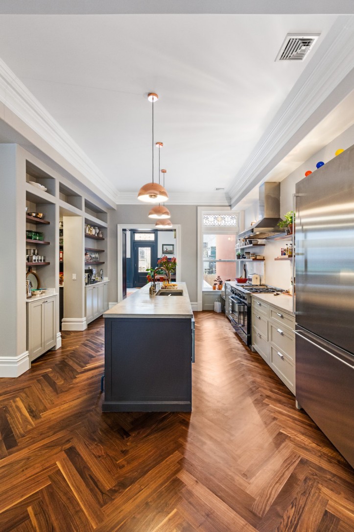
Turns out the space configuration of a Brooklyn brownstone made it hard to do that, but it still served us well—I am super happy with a long island (11 feet long!), a BlueStar stove, and the different stations for cooking, eating, making coffee, or baking.
The kitchen is my happy spot and I’ve spent years thinking about what makes a good kitchen. Is this ideal space planning? Nope. Is this my idea of a good time? For sure.
The challenge was how to devise an open-plan area that was going to take up so much of the parlor floor without making it feel like a separate room. My solution was to forgo upper cabinets so there’s a clear line of vision from the front of the room all the way to the dining room.
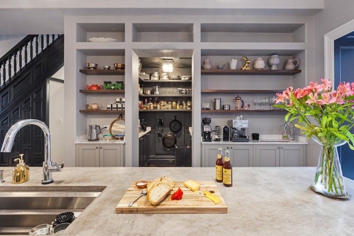
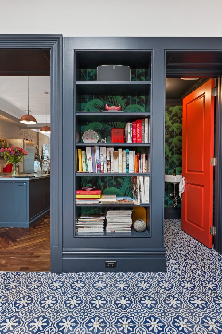
This created a storage challenge for me, of course, which we solved with a kitchen pantry. I wanted the pantry to be open so that I could see and access all my ingredients easily, but I also didn’t want a lot of visual clutter. I painted the cabinets and shelves a deep gray (same color as the island cabinets), which makes the whole space disappear once I turn out the light.
I found a piece of scrap marble at the stone yard which I used for the kitchen backsplash and the countertops along the back wall closest to the pantry. Marble is expensive and hard to maintain, so my thought was to use it in low-use areas to give the look and feel of the material throughout the kitchen without spending that much.
For the island and other countertops, I used poured concrete, which is a material I love. Surprisingly, it’s also pretty delicate, but it’s subtle and earthy and I like how it ages. The kitchen is, again, more traditional than I would have preferred, but I think the concrete and the open shelving give it a more modern touch. Sweeten brings homeowners an exceptional renovation experience by personally matching trusted general contractors to your project, while offering expert guidance and support—at no cost to you. Renovate expertly with Sweeten
Also, I fought to get a second sink in the kitchen and am so happy I won that battle. It’s handy to set up a water station so people can grab water or rinse out cups without interrupting my cooking space.
I can’t say enough about how much I love these herringbone walnut floors. We splurged on these floors and went with the less costly white oak for the upstairs floors because…well, just look at them. My original vision was to have the tile floor in the kitchen, but it made more sense to continue the wood on the whole parlor floor and save the tile for the back extension.
We mocked up the island with plywood and adjusted it until I was happy with the dimensions—how it felt to go from sink to stove, or how easy it was to take food out of the fridge and place it on the counter. That kind of stuff is important to me, and this was the first time I really got to design my own kitchen for myself. Everything is a bit taller and it suits me just great.
A note on accessibility: I’ve had friends and families with different mobility and impairment issues—whether wheelchair-bound, deaf, or arthritic—and time spent with them has made me very conscious of what it means to design well for many. A landmarked Brooklyn brownstone is a nightmare for anyone with a wheelchair, a walker, or a stroller, and I also saw firsthand some of the challenges that my design choices presented.
The first set of cabinet pulls in the kitchen were a lovely set of straight, minimalist tab pulls. I loved that they gave the kitchen a more modern look. Cue my mother and mother-in-law coming over all the time and struggling with the pulls. They couldn’t grasp the straight pull with their arthritic fingers.
I switched them out right away for pulls with a fully curved handle. Now they can just stick their finger under the pull, and a small motion opens the drawers. People keep talking about their “forever homes,” but really think about how you, your guests, and your children will have to adapt to the spaces as everyone starts to get older.
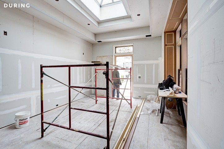
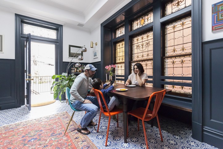
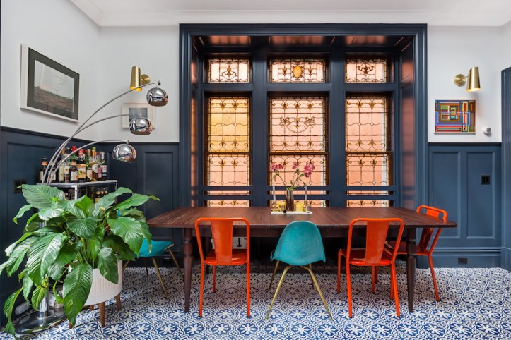
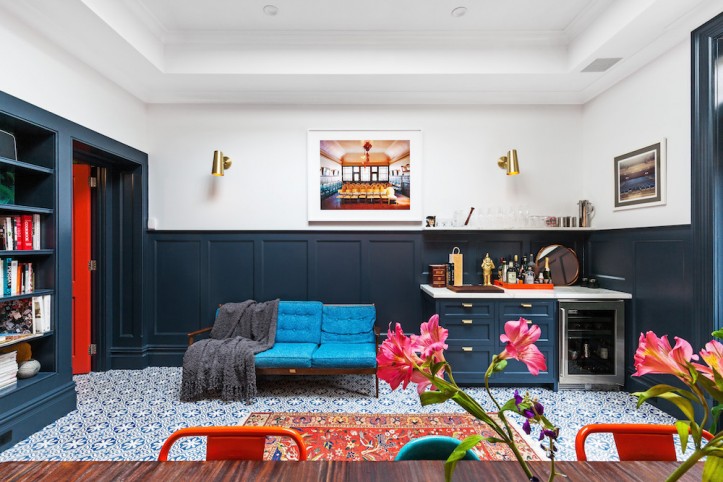
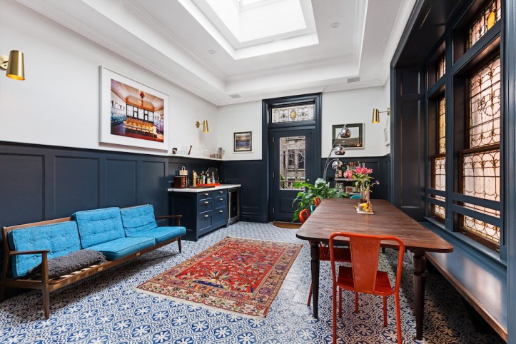
On the other end of our Brooklyn brownstone, and connected to the kitchen, is the dining room and bar. We love this room. We really felt like this room, a back extension added in the 1910s, was the reason we bought this place. Then we sadly rebuilt the entire room, but somehow, it’s still our favorite space in the house.
So that was a great surprise—buying a house because of one room and then recreating it and still having that be the best spot in the house. It’s our dining room and bar, but we also have space under the dining bench to store all of Nacho’s gear so that he can draw and play at the table while I am cooking.
From being in other friends’ homes, I knew that extensions were always freezing cold and hard to heat. All I wanted was Moroccan tile for this room (in fact, for the whole house, but we just didn’t have the budget for that).
Everyone fought me on adding radiant heating to the subfloor, but it’s by far the warmest room during the winter. Larry and I often come home and lie down on the floor and accidentally fall asleep! During the summer, this is the room we hang out in while kids run in and out of the house to the backyard.
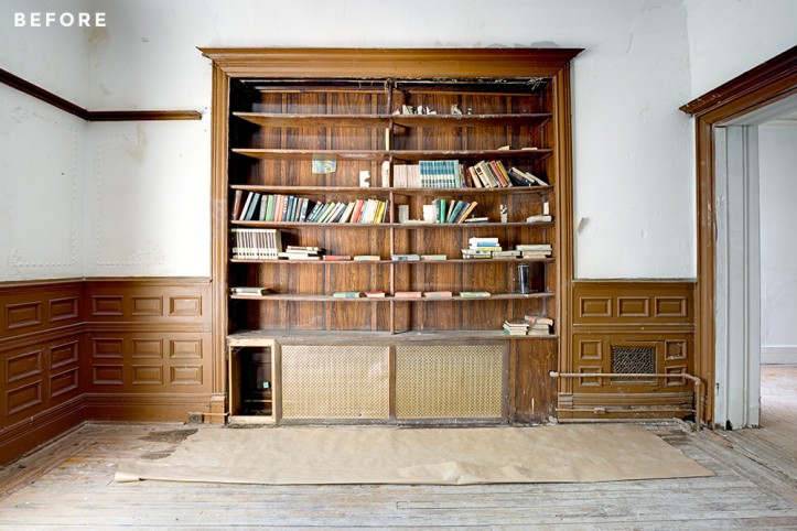
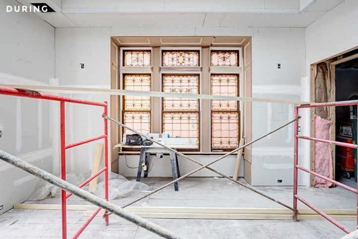
The best surprise? That giant Tiffany stained-glass window, which was hidden by a crappy 1970’s bookcase on the inside and vinyl siding on the outside. As soon as we bought the house, we ripped down the bookcase hoping we’d find a window, and lo and behold, we did.
It was in near perfect condition. We completely sealed it with clear glass on the outside to avoid damage and heat loss, as we did with all the other stained glass details around the parlor floor.
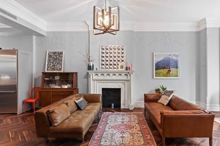
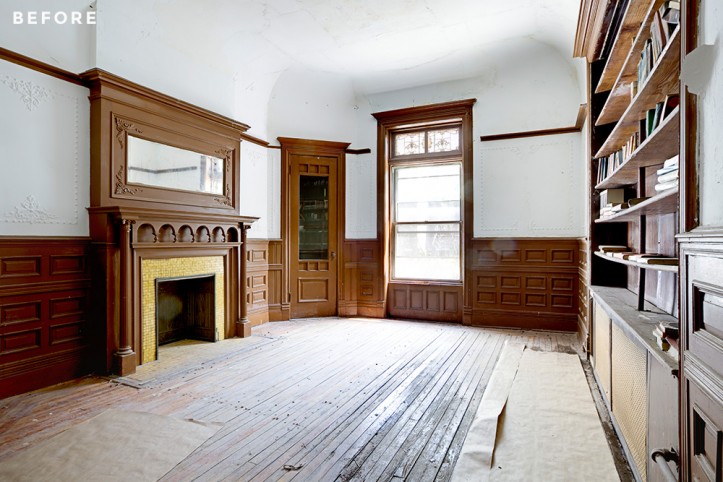
There was a large fireplace in this room, but I couldn’t figure out how to fit the mantel and Larry’s bar, and after much cajoling, I finally convinced Larry to agree to rip out the fireplace. The mantel has a new home in the living room, where the original had been removed previously.
I will say, to the horror of preservationists everywhere, that I wish we didn’t have our mantels—they don’t work, they take up too much space, and they create artificial focal points in every room. Maybe if they were marble, I’d appreciate them more. It’s form without function, which I have no love for.
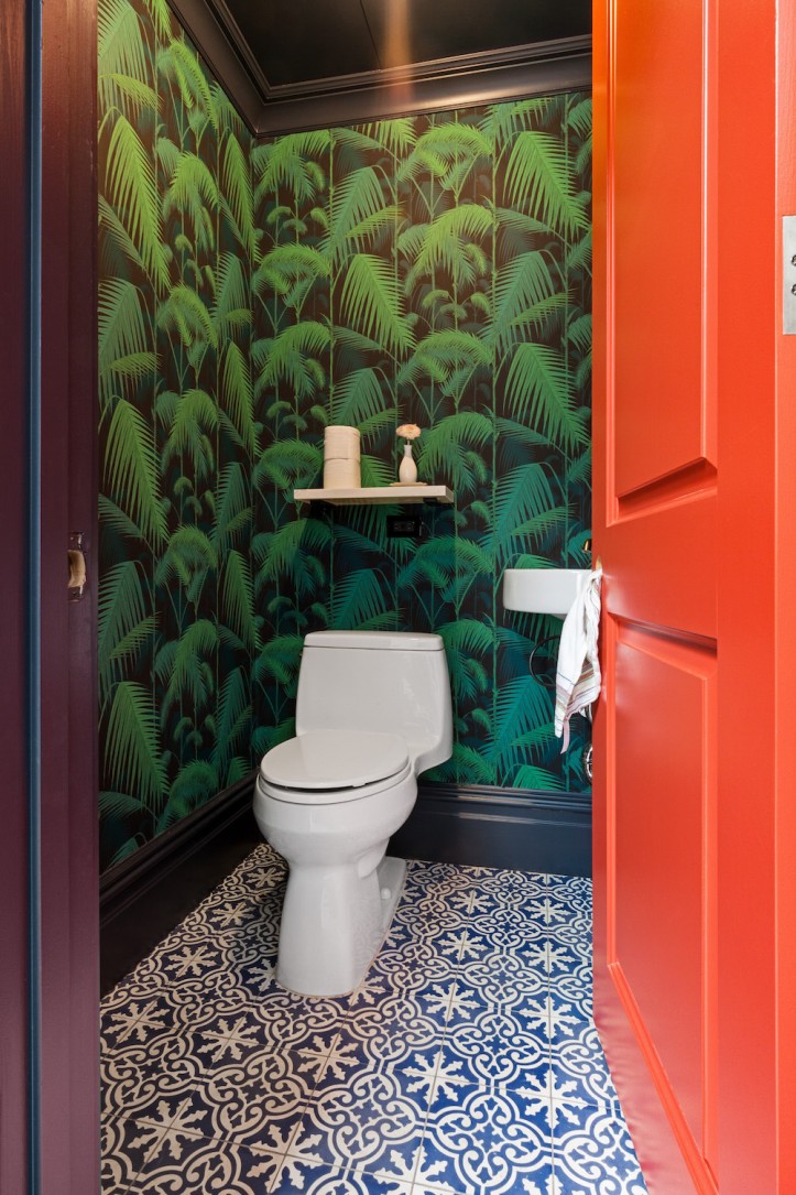
The powder room was a tough one to figure out. I hate the idea of guests having to go upstairs to use the bathroom, and with a small child, it’s great to have a bathroom on every floor. I think powder rooms should be wacky. This one is tiny, so doing a fun wallpaper or paint color was relatively cheap.
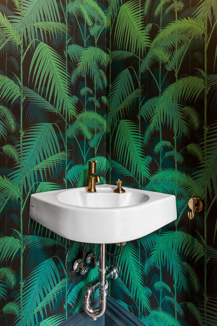
I love the electric Cole & Sons Palms wallpaper—it adds a touch of fun to an otherwise formal dining room. I also love the pop of color from the door to the powder room. We hated having the stained glass window facing a dull orange wall because it cast a weird orangey glow into the room.
Rather than fight it, though, we decided to paint the door an amped-up version of that wall to tie the colors together in a fun way.
Thanks so much for sharing your gorgeous parlor floor spaces with us, Nazli and Larry! Click here for installments Part I and Part III.
KITCHEN RESOURCES: Cabinets: custom. Cabinet pulls: Rejuvenation. Knobs: myknobs.com. Sink: Kohler. Fridge: Gaggenau. Range: BlueStar. Dishwasher: Bosch. Poured concrete countertops: Oso Industries. Marble countertops: PR Stone. Chelsea Gray paint color: Benjamin Moore.
DINING ROOM/BAR RESOURCES: Tiles: Cle Tile. Sconces: Rejuvenation. Abyss trim color: Benjamin Moore.
POWDER ROOM RESOURCES: Sink: Duravit. Faucet, toilet paper holder, hooks, and soap dispenser: Grohe. Wallpaper: Cole & Sons.
—
Jerry and Janet gut renovated a historic Brooklyn brownstone with an exterior that was in desperate need of a facelift and a virtually unsalvageable interior. The results are a perfect marriage of modern and traditional.
Sweeten handpicks the best general contractors to match each project’s location, budget, and scope, helping until project completion. Follow the blog for renovation ideas and inspiration and when you’re ready to renovate, start your renovation on Sweeten.
