A Mid-Century Twist on Modern Living
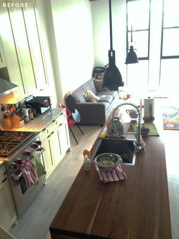
When a Brooklyn family moved into their new Prospect Heights home, the large living space presented an intriguing but daunting challenge. The condo had been meticulously renovated, so design decisions and new ideas for carving out additional storage were a bit fraught. The new owners loved Mid-Century modern design, but weren’t looking to create a home that felt like a lost episode of Mad Men. With dreams of built-ins and sophisticated furniture (that would still work for kids on the move), they posted their project on Sweeten and met Sweeten Expert Susan, a Manhattan designer.
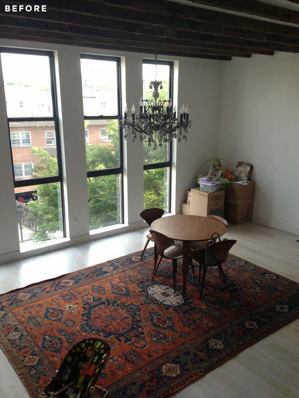
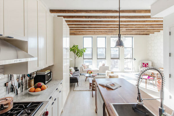
The building had recently been renovated to show off its beautiful bones and over-sized windows: a blank slate but also a tall order. Susan set out to blend the family’s existing pieces with organic materials and lighter lines along with some cost-effective construction decisions. The expansive living room and open kitchen offered plenty of space to work with, but also required thoughtful planning to create more distinct and functional spots for eating and entertaining. Setting out to create a stylish and functional space, Susan focused on achieving that style along with serious comfort and practicality.
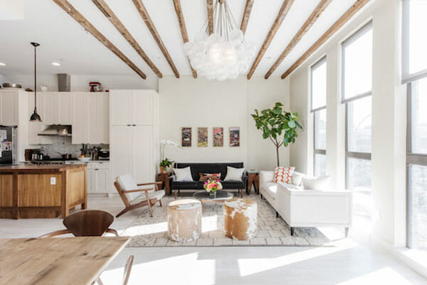
Susan decided to break up the spacious living room with several areas designed for hanging out. “My goal was to make the space as multi-functional as possible so the room would work for the family in as many ways as possible,” she said. After presenting the family with a few layout options, they settled on a floorplan with three zones: a relaxed living space, a dining area destined for lingering over meals, and a reading nook.
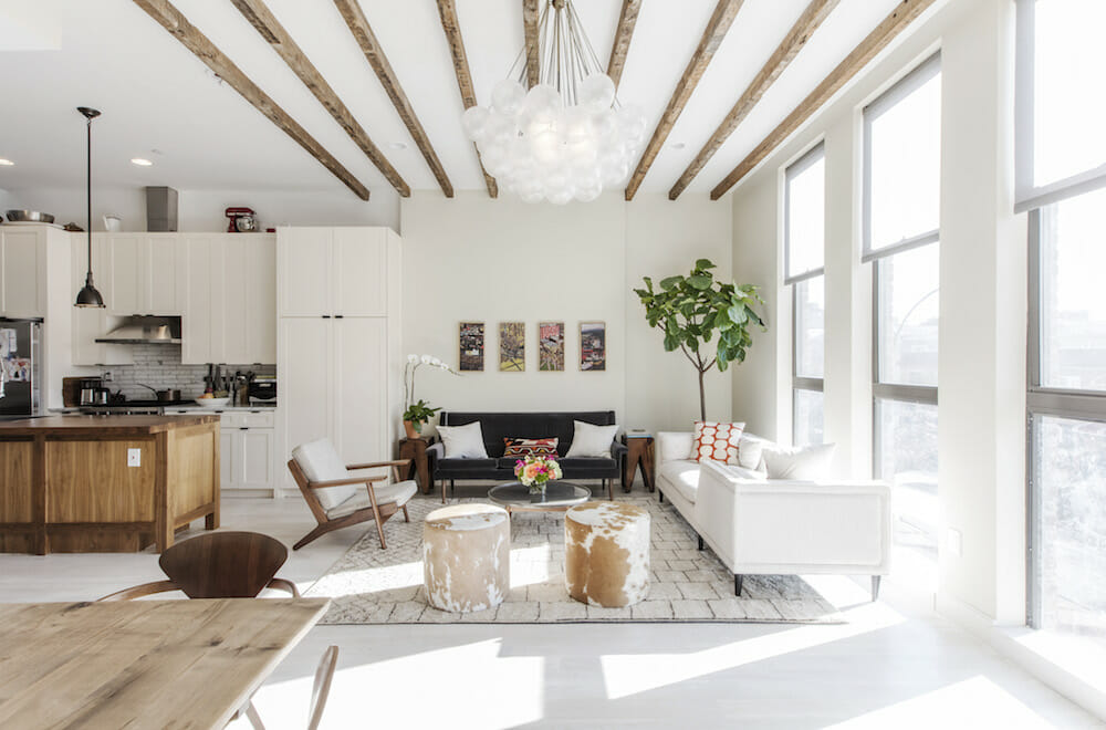
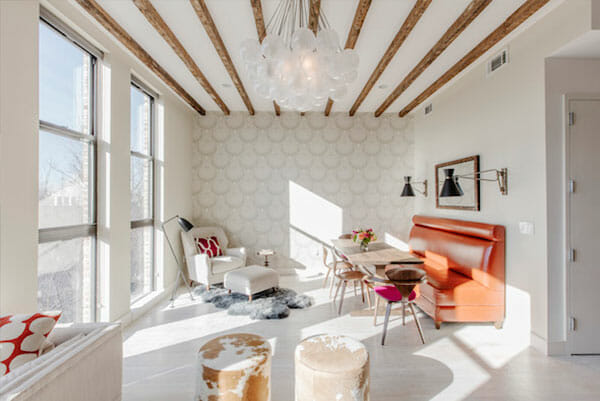
Instead of letting proximity to the kitchen dictate the dining room’s location, Susan established the room’s focal point with a central statement-making chandelier from Apparatus Studio. The fixture’s diffused orbs draw the eye up to the rustic beams and enviable ceiling height. “It has a lot of volume so it helped enhance the room’s openness,” she said.
Sweeten brings homeowners an exceptional renovation experience by personally matching trusted general contractors to your project, while offering expert guidance and support—at no cost to you. Renovate expertly with Sweeten
While the couple originally envisioned a set of new custom bookshelves on the large wall, which would have been very costly, Susan wanted to preserve the room’s uncrowded feel. “I felt like there was something so beautiful and spacious about the room,” Susan said. As an alternative, storage was moved upstairs, making room for a subtle, monochromatic accent wall. Susan chose a classical lotus pattern that nearly recedes from afar. “It’s such a large area that I wanted a pattern that read as a pattern, but wouldn’t be jarring or too highly contrasted,” she said. The neutral cream-on-beige tones leave open the possibility of future additions such as shelves or artwork down the road.
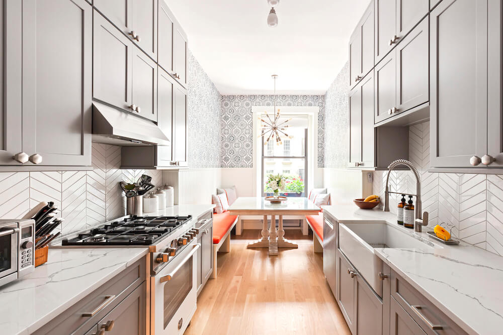
Next, Susan carved out a dining space with a custom-made banquette. In bright orange, the leather upholstery is incredibly durable and, like a fine wine, will improve with age. “Banquettes are great with kids because they can kind of pile in there and be comfortable,” Susan said. The couple’s existing Cherner chairs were paired with two upholstered counterparts on either end of a sprawling dining table to make good use of the elongated space. The Mid-Century Modern crush continued with overscale swing-arm sconces to bookend the dining space and throw light on the table. A “puzzle” mirror made from individual salvaged wood pieces brings in an organic element to match the ceiling beams and bounce light from the windows and a nearby reading nook provides the perfect place to relax post-dessert.
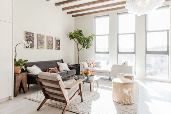
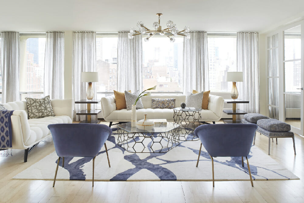
On the opposite side of the room a Moroccan rug anchors the seating area, while a dual-sided daybed lets guests cozy up for conversation or gaze out the window. A round marble-topped coffee table borrows that ‘60s vibe and breaks up the rectilinear room. The child-friendly cowhide ottomans were inspired by the couple’s first visit to Susan’s design studio; her workspace features the exact same ottomans and the family was smitten. “The ottomans are great because they’re so transportable, and I love that they introduce a unique texture and pattern,” Susan said.
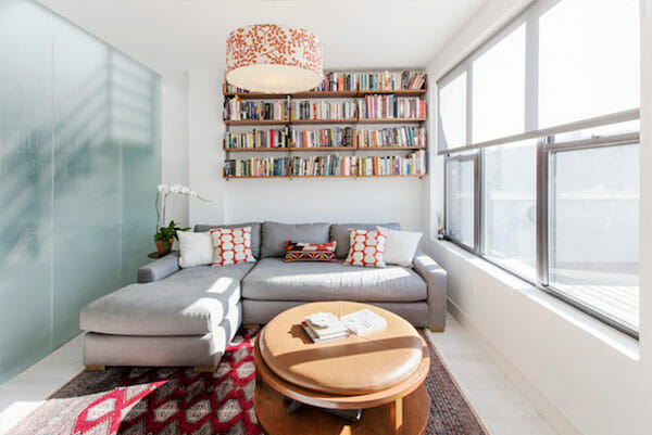
To give the family the storage they desired, built-in shelving from Atlas Industries was installed in the den upstairs as a more affordable and flexible alternative. “It was an easier spot to tackle because the space between the column and window wall formed a kind of natural niche,” Susan said. With tons of reading material at their fingertips (and a TV for less scholarly pursuits), the area is set for maxing and relaxing. The L-shaped sofa is roomy but still cozy, and the coffee table has a removable leather top to conceal extra storage underneath.
All in all, the project took about six months from initial meetings to installation. Susan credits the project’s success to the family’s combination of clear vision and openness to new ideas. Her best advice for getting your own high marks when working with a designer is to come to the table with as many inspiration images as possible and with priorities of how you want to use the space—and spend your money. “There’s such a range out there between readily available pieces, high-end custom, and everything in between,” Susan said. “Make a list of top priorities of how you want the space to function so you can work through your budget.”
Dining Area Selects >> Chandelier: Cloud from Apparatus / upholstered bench: custom from GBC Upholstery / ottoman cowhide: Edelman’s Cavallini / mirror: Puzzle mirror from UHURU / sconces: Bergamo Sconce from Mr. Brown London / dining table: custom / dining chairs: Cherner from Design Within Reach / dining chair upholstery: Knoll Textiles / wallpaper: Lotus from Farrow & Ball / lamp: Grasshopper Lamp from Design Within Reach / upholstered chair: Dwell Studio / sheepskin rug: Room & Board / embroidered pillow: Judy Ross Textiles
Seating Area Selects >> Moroccan rug and cowhide ottomans: custom from Studio Four NYC / mid-century chair: Organic Modernism / chair upholstery: Rogers & Goffigon / daybed: Arden Tête-à-Tête from Jonathan Adler / coffee table: Bethan Gray / embroidered pillows: Judy Ross Textiles / lumbar pillow: custom / settee: Darren Sofa from Room / settee upholstery: Creations Metaphores
Upstairs Reading Room Selects >> built-in walnut shelves: custom from Atlas Industries / coffee table: custom from GBC Upholstery / sofa: Maxwell from Restoration Hardware / light fixture: Galbraith & Paul Smokebush Pendants from Room & Board
—
Sweeten handpicks contractors to match each project’s location, budget, scope, and style. Follow the blog for renovation ideas and inspiration and when you’re ready to renovate, start your project on Sweeten.
