Why This Renovating Couple Stayed Open and Flexible
Their Washington Heights fixer-upper got a look they didn’t plan for
A chance discovery of a larger apartment due north of Midtown West in Manhattan led a family of four to a new home. Ylia, a strategy and retail planner, and André, in wealth management, found more space in Washington Heights for their two boys, ages two and three. But this 1,600-square-foot fixer-upper with two bedrooms and two baths would need a revamp. The couple posted their project on Sweeten, a free service matching renovators with trained professionals. They found a Sweeten architect to help them with the redesign they were seeking, including—by happy accident—giving the co-op a loft-like vibe.
My husband and I were renting a two-bedroom in Hell’s Kitchen, where I was born and raised. My husband had moved in about 15 years ago. It was the perfect amount of space for us in a great neighborhood before the kids came along. We quickly outgrew the apartment, especially after our second son, leaving us with the desire for more square footage. We searched for quite a while with no luck. We had given up the search and decided to make due for as long as we could.
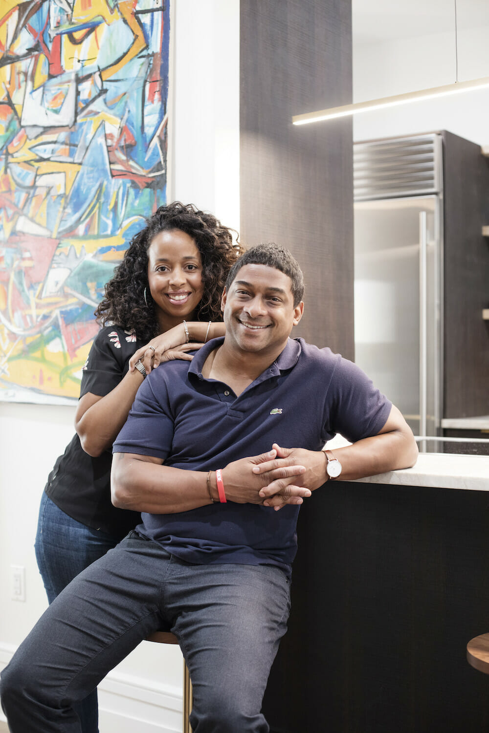
Then one day on a whim André went to see an apartment in Washington Heights. It was in bad shape, but it was larger than any listing we had looked at prior and we could personalize the fixer-upper the way we wanted.
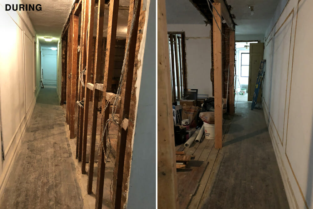
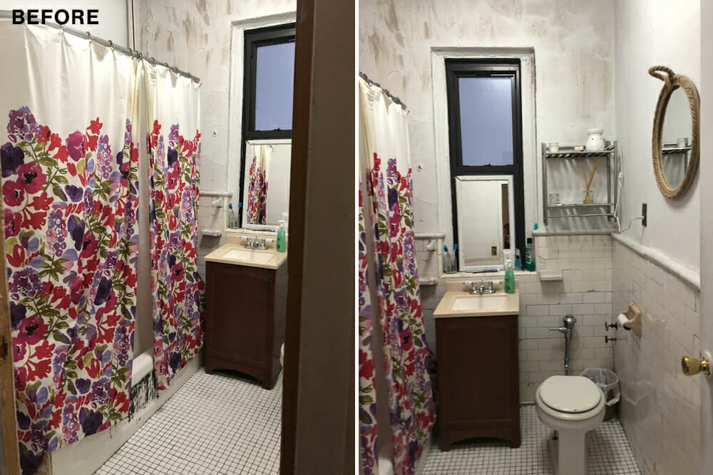
Since this was a co-op built in 1914, we knew we had our work cut out for us. Between the outdated electrical, plumbing, creaky floors, and cracked walls, we knew it would require serious professional help. We reached out to Sweeten, and they linked us up with several architects to choose from who’d help us with the design. We also decided we’d continue renting during the renovation.
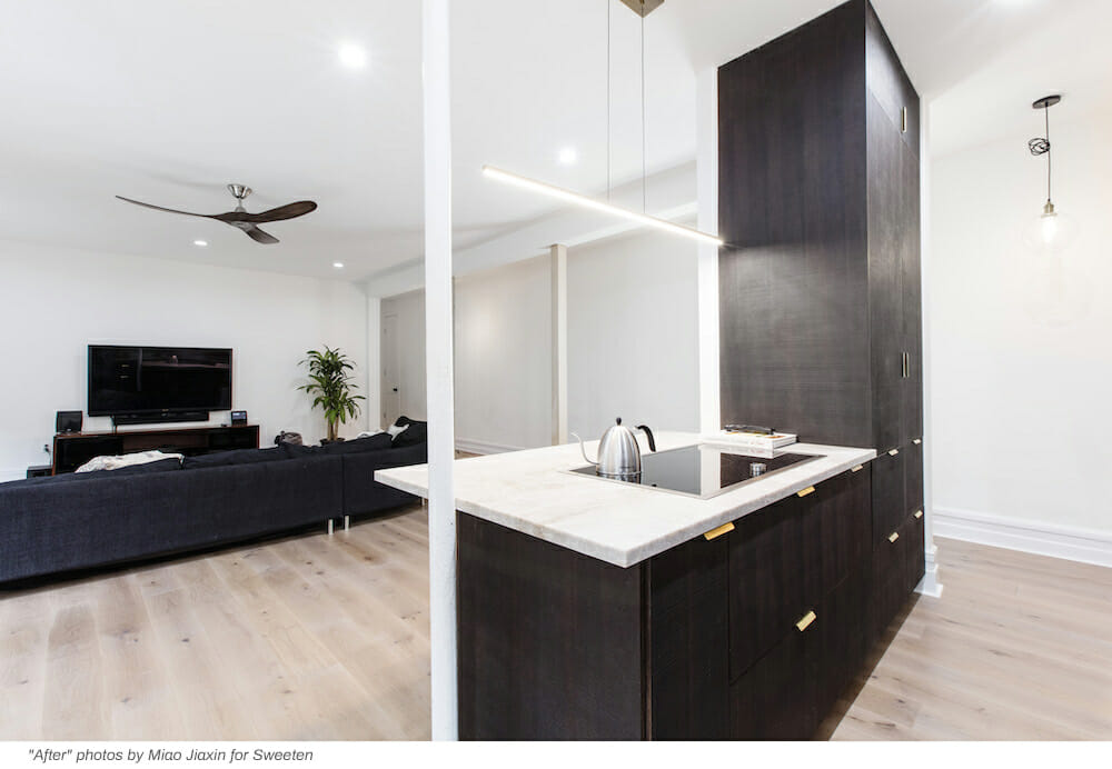
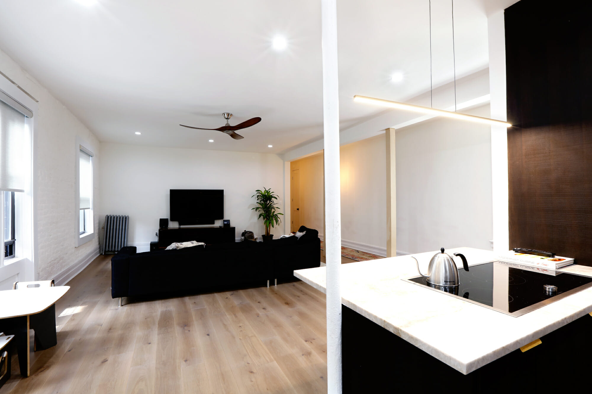
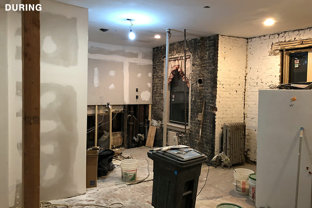
Our initial conception of the space started in a much different place than where it ended! The apartment was generous in size but it was compartmentalized. We decided to raze three walls to provide a more open layout between the kitchen and the main living space.
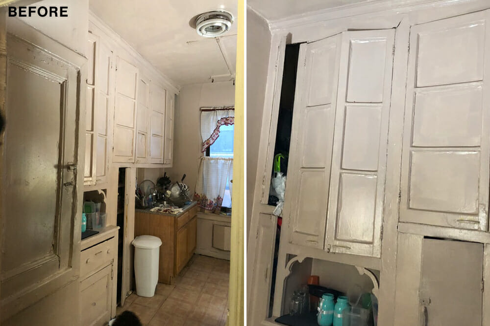
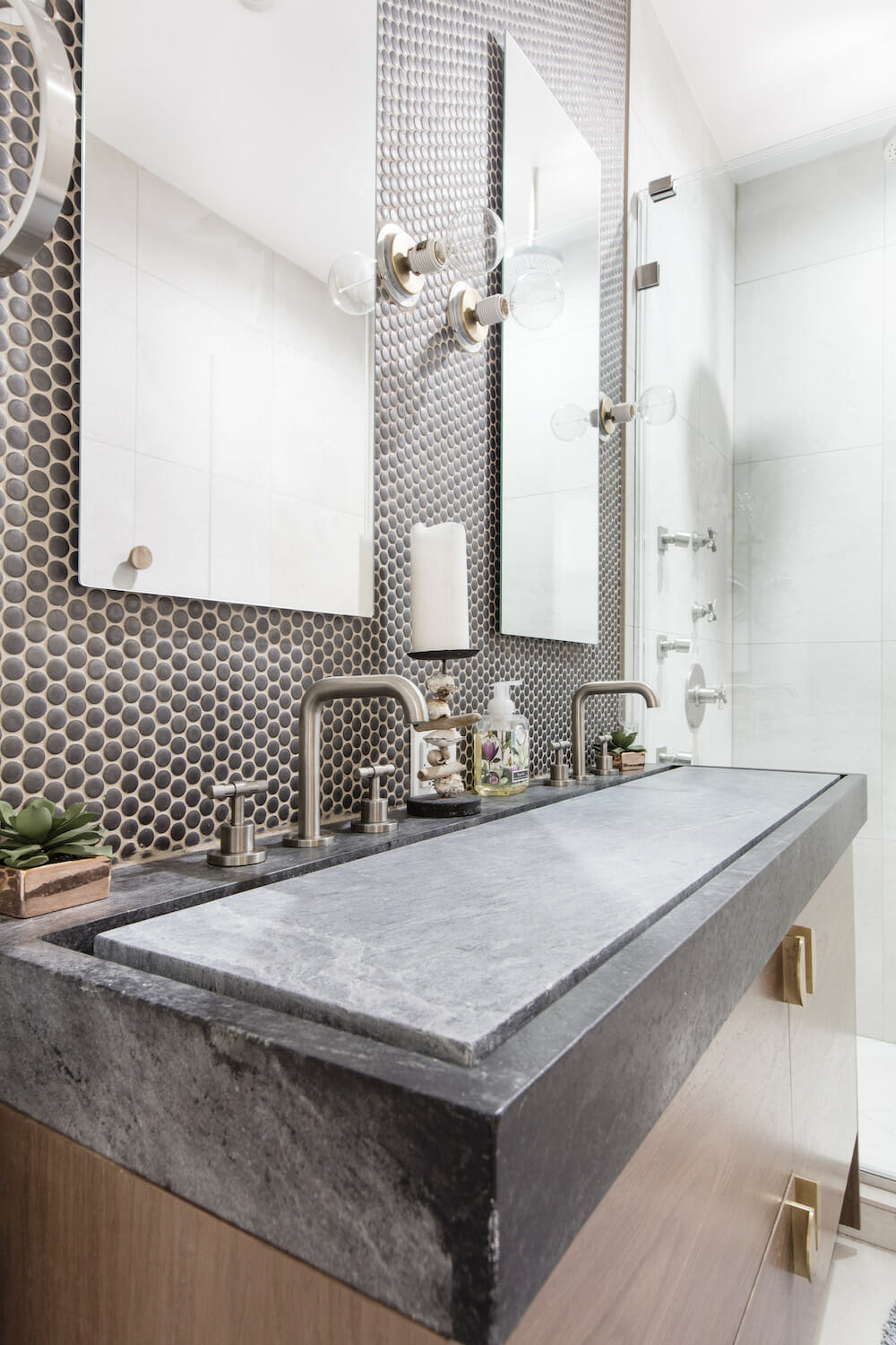
Our architect came up with the idea of an infinity soapstone dual sink that I absolutely loved when I saw the drawing.
Because we took down several walls, a support shaft was added and on our architect’s recommendation, we brought in two wooden columns to support the beam. Not only was it practical, but it gave the apartment a loft-like feel—a pleasant and unintentional consequence.
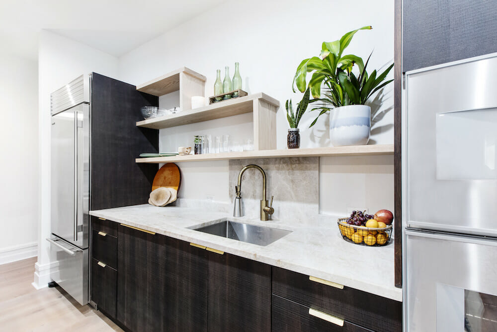
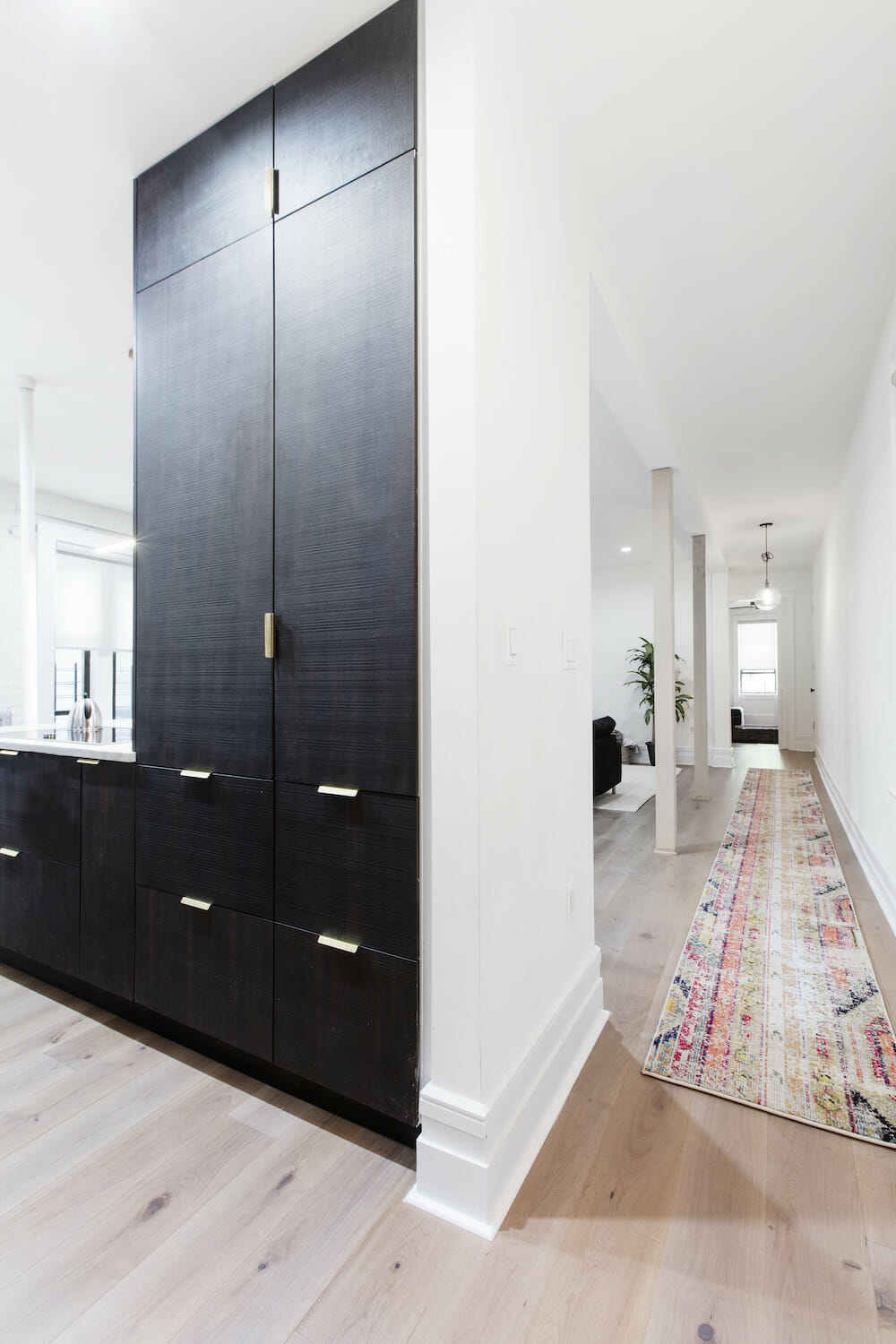
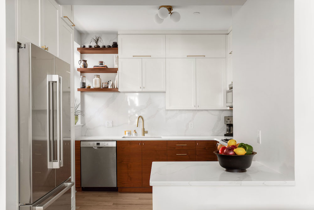
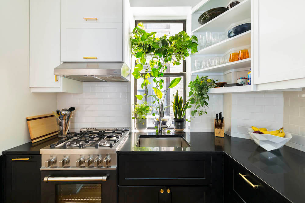
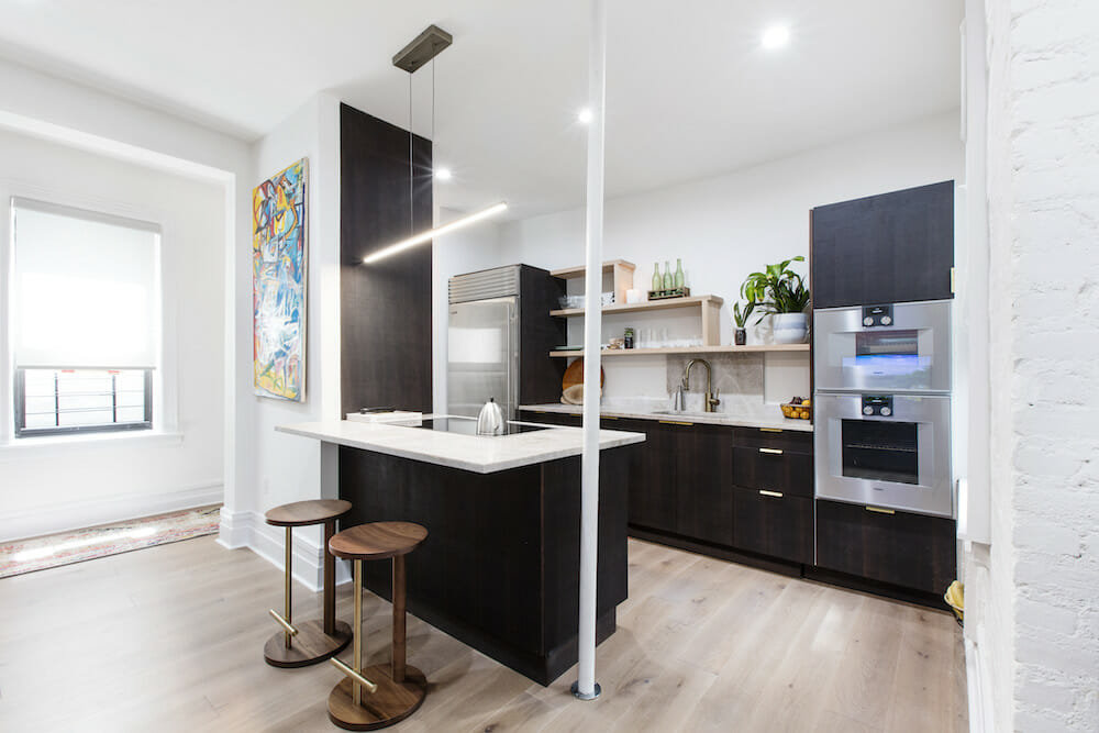
In the beginning, we thought we would have a white kitchen with shaker cabinets and a subway tile backsplash, but as we got deeper into the process, we were drawn to Scandinavian minimalism. The vendors we used for the kitchen cabinets and floors both sourced their wood from Sweden, so it helped in accomplishing that aesthetic. Function was also a winner: we love our garbage disposal in the sink. Sweeten brings homeowners an exceptional renovation experience by personally matching trusted general contractors to your project, while offering expert guidance and support—at no cost to you. Renovate expertly with Sweeten
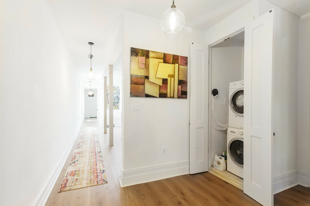
We moved the laundry room walls three times before we settled on its permanent home in a newly-built closet in the hallway! It turned out to be an excellent location for the washer and dryer.
WATCH VIDEO:
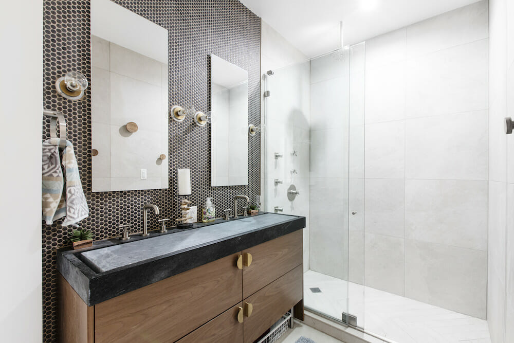
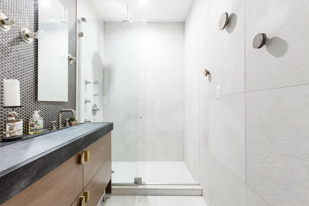
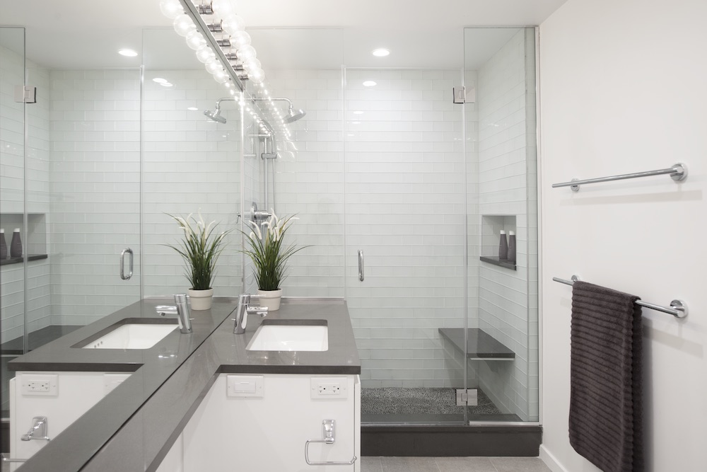
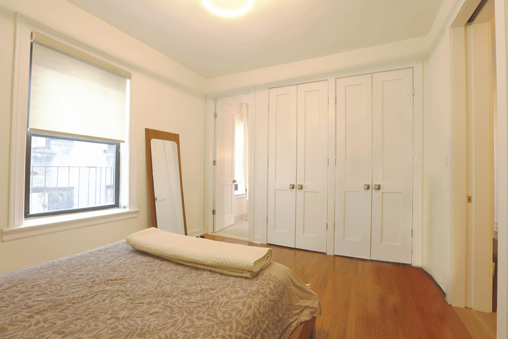
A fourth wall—dividing a room formerly used as a housekeeper’s quarters and the master—was knocked down to create a larger master bedroom. Our Sweeten architect drew up an efficient layout that allowed for ample closet space and a larger master bathroom that was pieced together to the last inch.
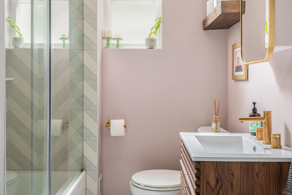
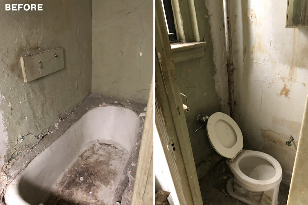
The bathrooms proved to be the most difficult with so many options and micro-decisions like the type of doorknobs and the number of lights! The housekeeper’s quarters was used as a storage space and needed a big overhaul to be brought up to speed. After much back and forth, we finally settled on finishes we felt would be unique, efficient, and spa-like. We also decided against having a bathtub in either bathroom and have not regretted that decision one bit. Our boys love taking showers!
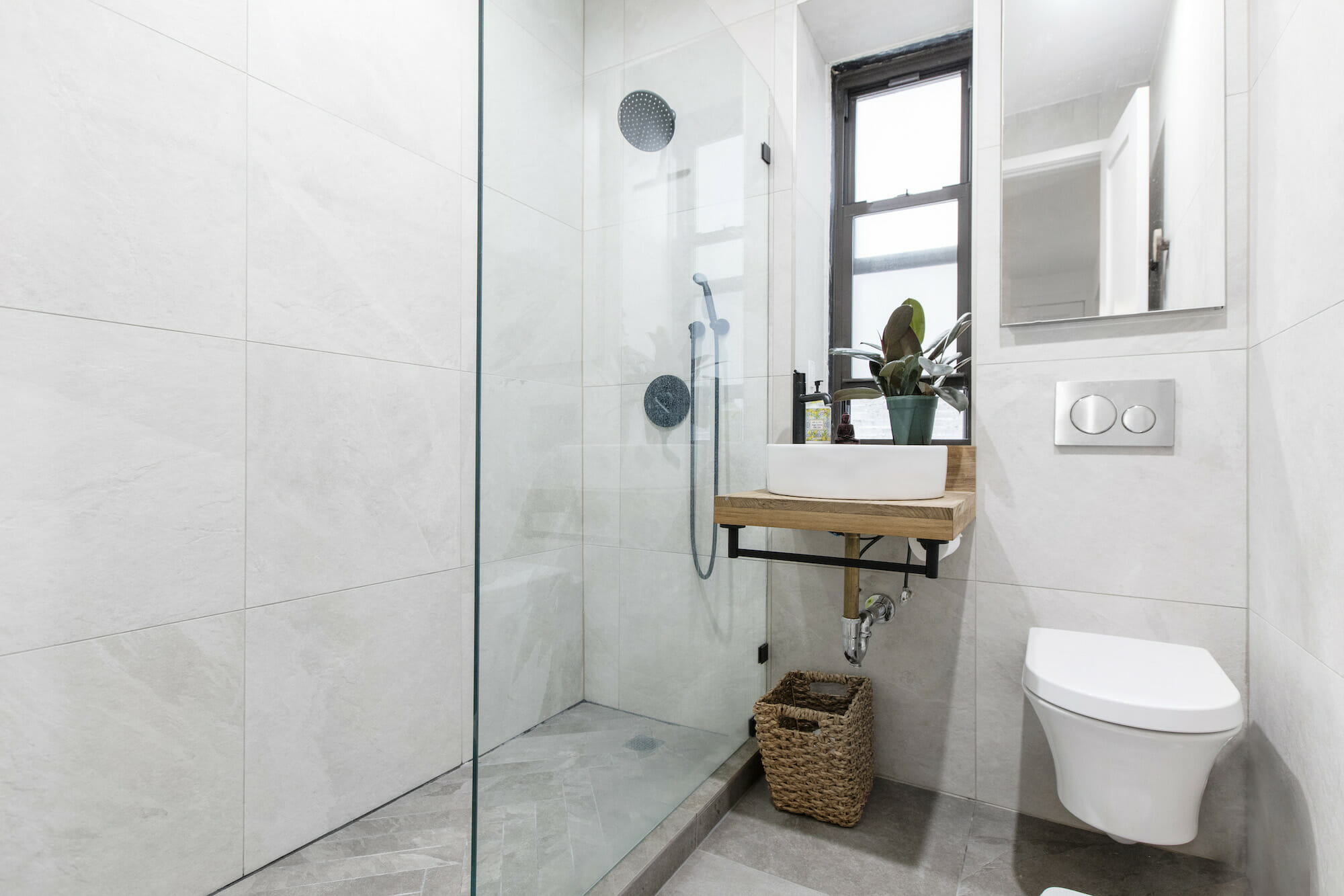
Chevron designs on the bathroom shower floors and the glass panels were custom made for each since we had different needs in each one. Our architect came up with the idea of an infinity soapstone dual sink in the master that I absolutely loved when I saw the drawing.
Being first-time renovators and homeowners, we found the experience all-consuming but deeply rewarding. We had no qualms about undertaking such a project and would certainly do it again. One takeaway for us was to stay fluid and flexible. We thought we wanted a certain look, but when we found an alternative that we liked, we took the chance and rolled with it. The process was intense at times, but our team kept things chill and on track. We feel great about the space and the experience, and we couldn’t be happier with the support that Sweeten provided.
Thank you, Ylia and André, for sharing your fixer-upper transformation!
LIVING AREA RESOURCE: European wood oak flooring: Madera.
LIVING ROOM RESOURCES: Maverick fan with Koa blades: Monte Carlo.
KITCHEN RESOURCE: Surface cabinets by Norm Architects in sawn Smoked Oak; cabinet hardware: Reform. Oak shelving: Custom by general contractor. Sub-Zero refrigerator, Bosch dishwasher: Gringers. Gaggenau ovens and induction cooktop: Gaggenau. Honed Perla Santa Quartzite countertop: HG Stones. Essence Linear Suspension light fixture: LBL. Prep pulldown faucet: Waterstone. Herman Miller bar stools: Design Within Reach.
MASTER BATHROOM RESOURCES: California Faucets Descano Knurled faucet; Descanso Thermostatic Knurled shower fixtures and jets in satin nickel, Duravit wall-hung toilet: Ferguson. Infinity soapstone sink in Stormy Black: M. Teixeira Soapstone. Vanity cabinet doors; cabinet pull: Semihandmade. Classic Rounds Titanium backsplash; Delegate off-white 24 x 24 wall and floor porcelain tiles: Artistic Tile. Light fixtures and towel hooks: Schoolhouse. Gerber flush Plate: Decor Planet. Shower panel: Bravura Glass.
GUEST BATHROOM RESOURCES: Tamalpais faucet in matte black; shower fixtures in matte black: California Faucets. Teak sink shelf counter: Built by general contractor. Delegate light grey 24×24 wall and floor porcelain tiles: Artistic Tile. Duravit wall-hung toilets: Ferguson. Gerber flush plate, Krauss white ceramic sink: Decor Planet. Shower panel: Bravura Glass. Baldwin doorknobs, #PSCONCSR112 in Venetian Bronze: Baldwin.
HALLWAY RESOURCE: Sconces and lighting: Restoration Hardware. Bosch washer and dryer: Bosch.
—
Set your calendar. Here’s a guide on how long it will take for an apartment renovation.
Sweeten handpicks the best general contractors to match each project’s location, budget, scope, and style. Follow the blog, Sweeten Stories, for renovation ideas and inspiration and when you’re ready to renovate, start your renovation on Sweeten.
