A Retro-Modern Update for a Brooklyn Duplex
Big personality comes home with a trough sink and a wine fridge—under the stairs
After Roxy, a rescued Rhodesian ridgeback, joined their household, Alicia and Ed realized “a little more space in a laid-back neighborhood” would be a better fit for the family of three than Manhattan, where they were currently living. They set their sights on a 1,400-square-foot garden duplex in a Park Slope brownstone.
They fell in love with the building, which had been converted to condos by a developer about a decade ago. Despite the high-end finishes that were chosen at that time, there were issues that had developed in the interim. The couple also wanted to bring the renovations in line with their tastes, and in a style more befitting a building dating from the turn of the last century.
As Alicia put it, “We really just wanted to make the place something we loved coming home to at the end of each day. What we had wasn’t awful, but it wasn’t terribly practical either—we had mismatched countertops, cracked tiles in the bathroom, a lack of counter space in the master bath, and most importantly, no space in the fridge to store our wine.
The place just lacked the ‘wow’ you would expect from a building this pretty.”
They reached out to Sweeten—a free service matching renovating homeowners with vetted general contractors—for their contractor. For the couple’s custom kitchen renovation, Christina, their Sweeten Planner, was present at regular site visits and contractor meetings, providing detailed progress reports.
Initially, the couple intended to focus their time and money on the kitchen. Instead, they also updated the guest and master bathrooms executing an overall vision—“a muted, classic design with a modern twist.”
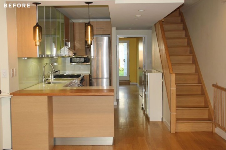
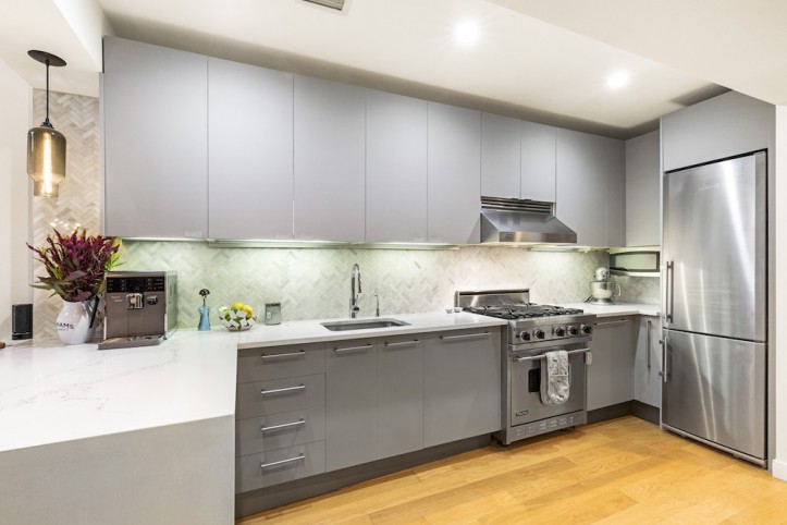
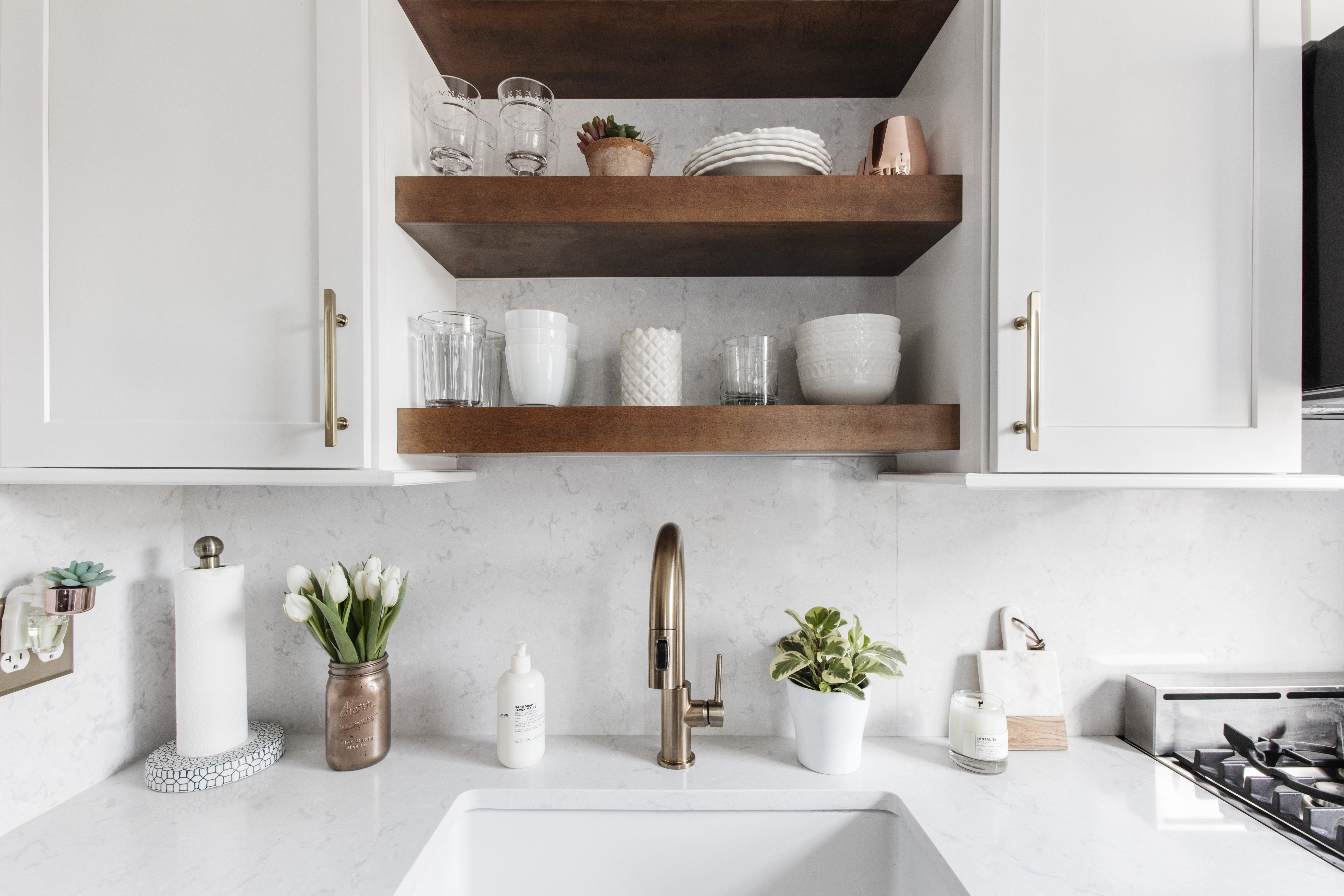
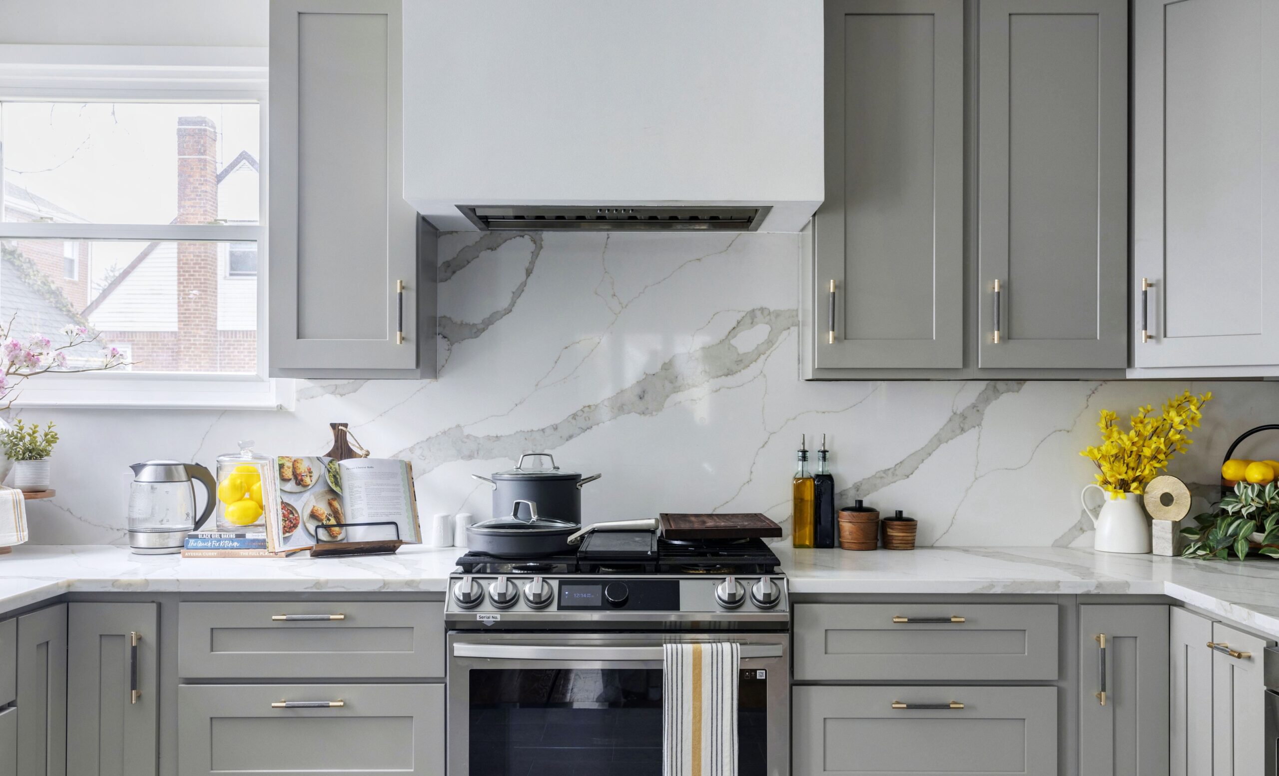
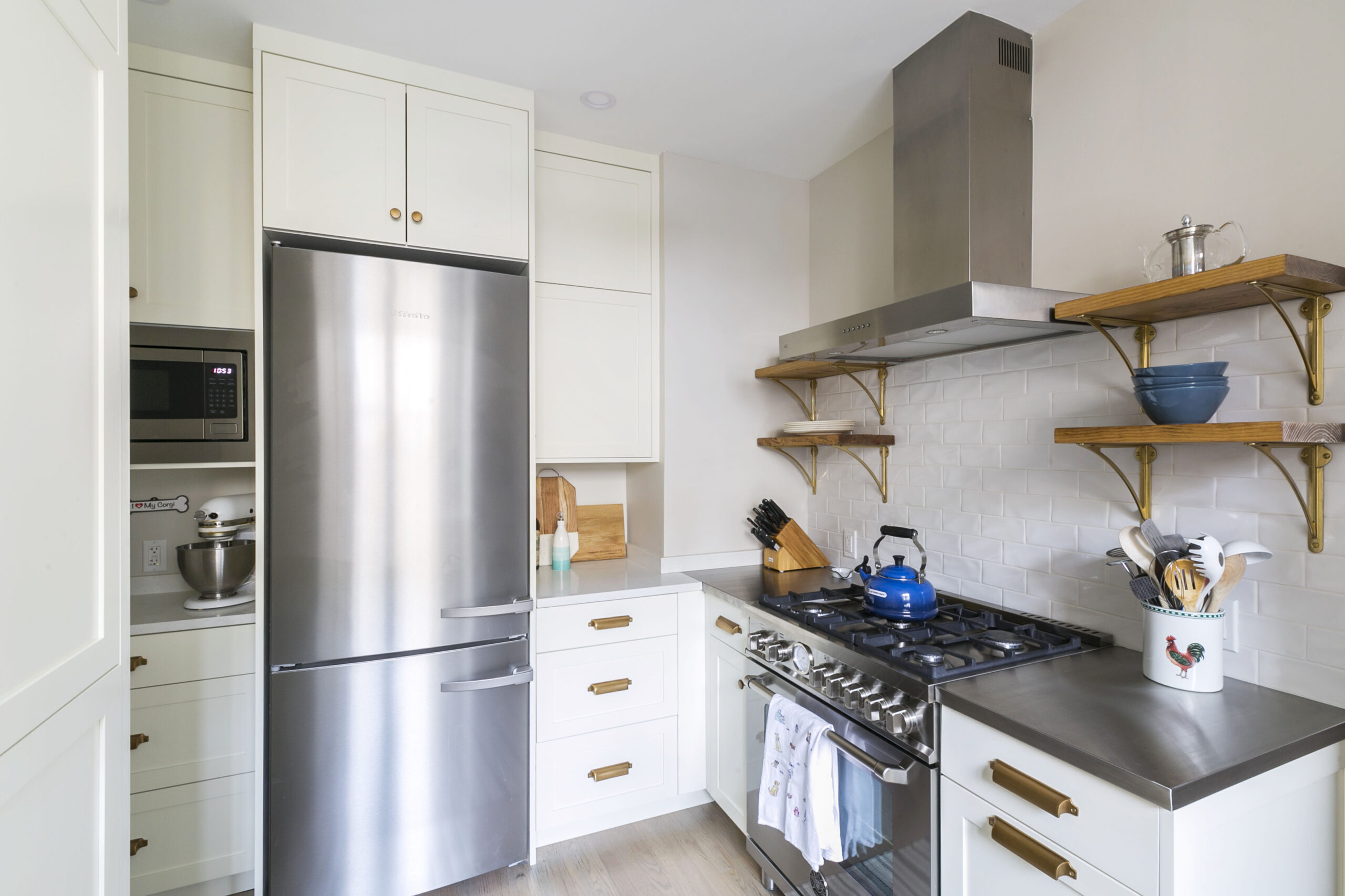
In the kitchen, this meant replacing the mismatched countertops as well as the cabinet fronts, and creatively finding space for a built-in wine fridge. Ed and Alicia knew that when the kitchen was renovated a decade ago the developer had used top-of-the-line materials, from custom Italian cabinetry to Viking, Miele, and Liebherr appliances; the space didn’t need a gut, simply a refresh.
The downside of the custom Italian kitchen, however, was that none of the cabinetry was standard-sized. Refacing was a custom job, pushing out timelines, but it meant they could keep all the existing built-in shelving and customized organization that would have been extremely expensive to replace.
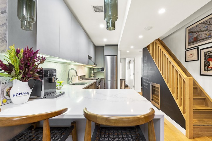
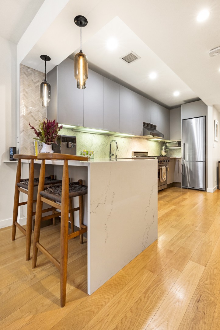
Countertops resembling marble from Caesarstone unified the space and were chosen for their hardiness and durability. Ed had always wanted waterfall-edge countertops, which completed the look perfectly.
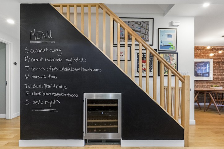
They had hoped to replace a smaller-than-usual refrigerator, as well as add a wine fridge. But the floor plan wouldn’t afford them the space for a larger unit, so they focused on adding a wine fridge instead. Working with their Sweeten contractor, Ed and Alicia poked exploratory holes in the drywall underneath their stairs.
Happily, they discovered that a 36-bottle dual zone wine fridge would fit in the space without making any structural changes. “It’s a luxury you would never think you could have in New York. We painted the surrounding wall with chalkboard paint—it’s a great way to leave notes for each other, plan out our grocery list, and try out some amateur artwork,” they said.
“As a bonus, we found the current kitchen fridge is more than large enough for our needs.”
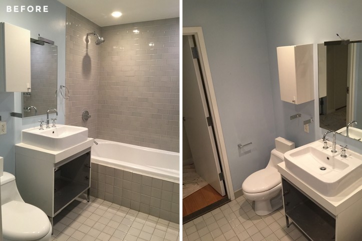
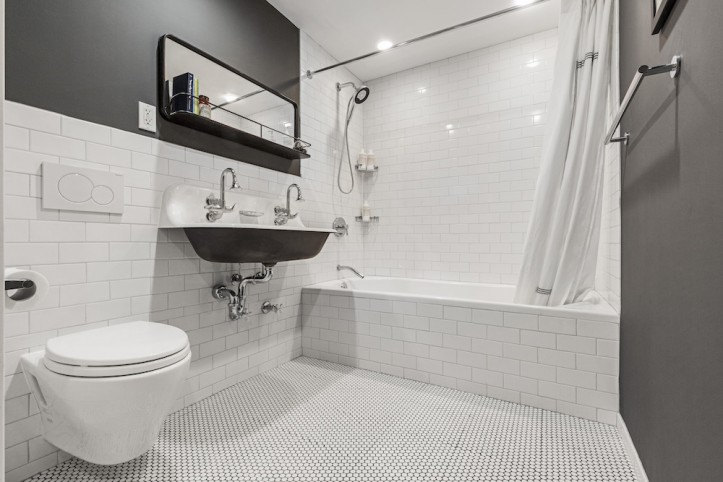
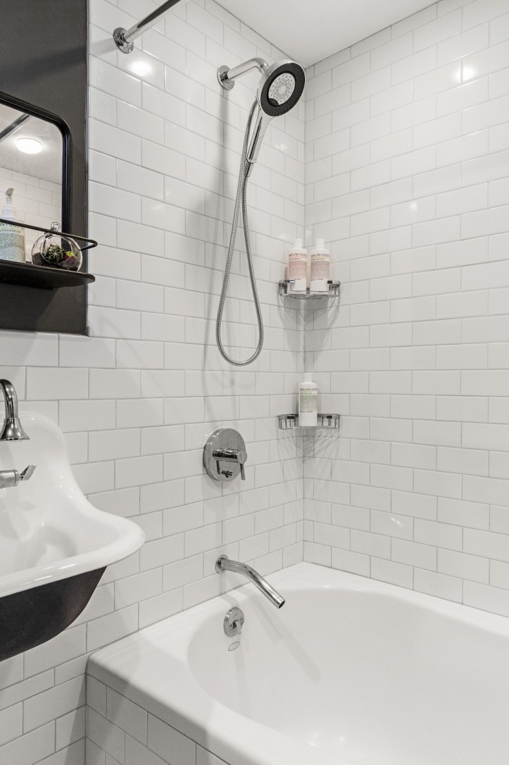
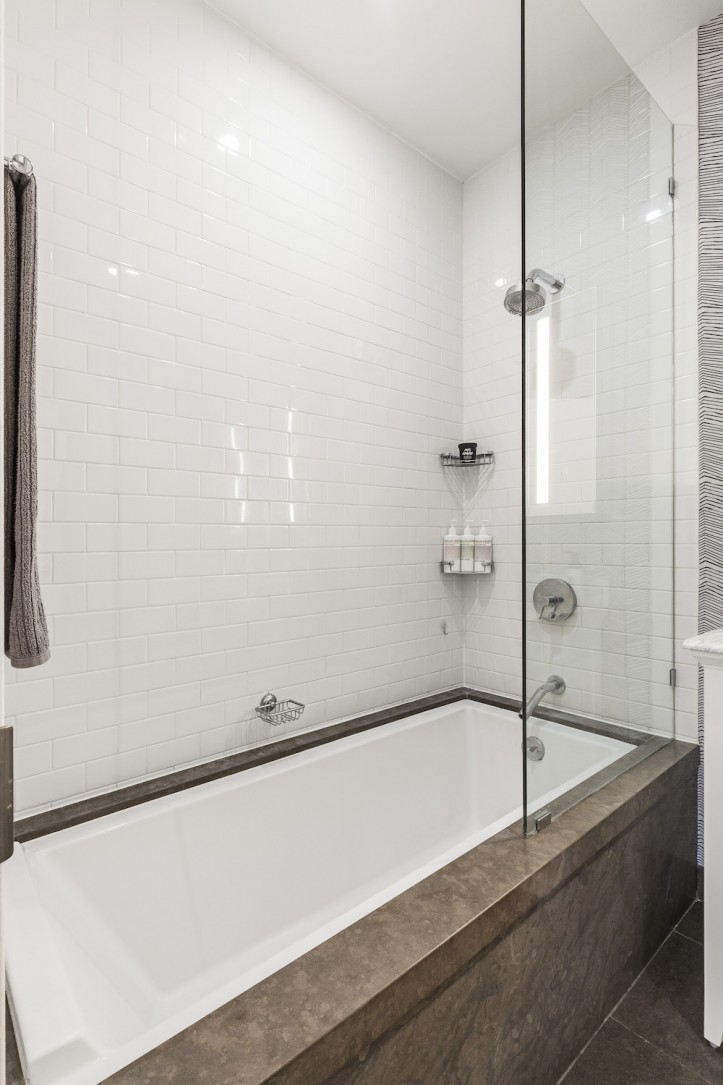
The downstairs bathroom was next on the list—it already had a great soaking tub, but the vanity and medicine cabinet were outdated. The tiles, too, were showing their age. Alicia had always loved the feel of a traditional New York City bathroom—penny tile floors, subway tile, and a classic black-and-white color palette. Sweeten brings homeowners an exceptional renovation experience by personally matching trusted general contractors to your project, while offering expert guidance and support—at no cost to you. Renovate expertly with Sweeten
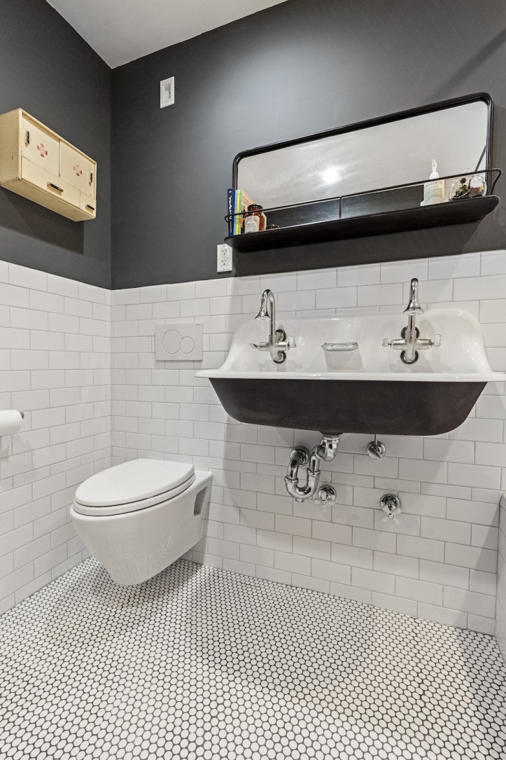
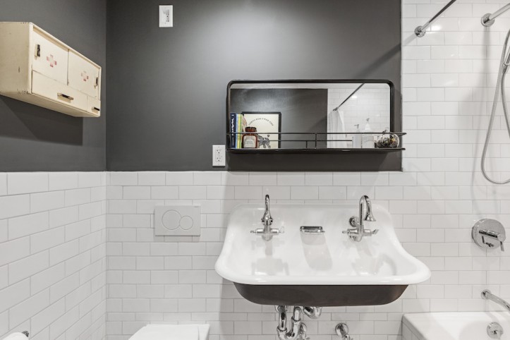
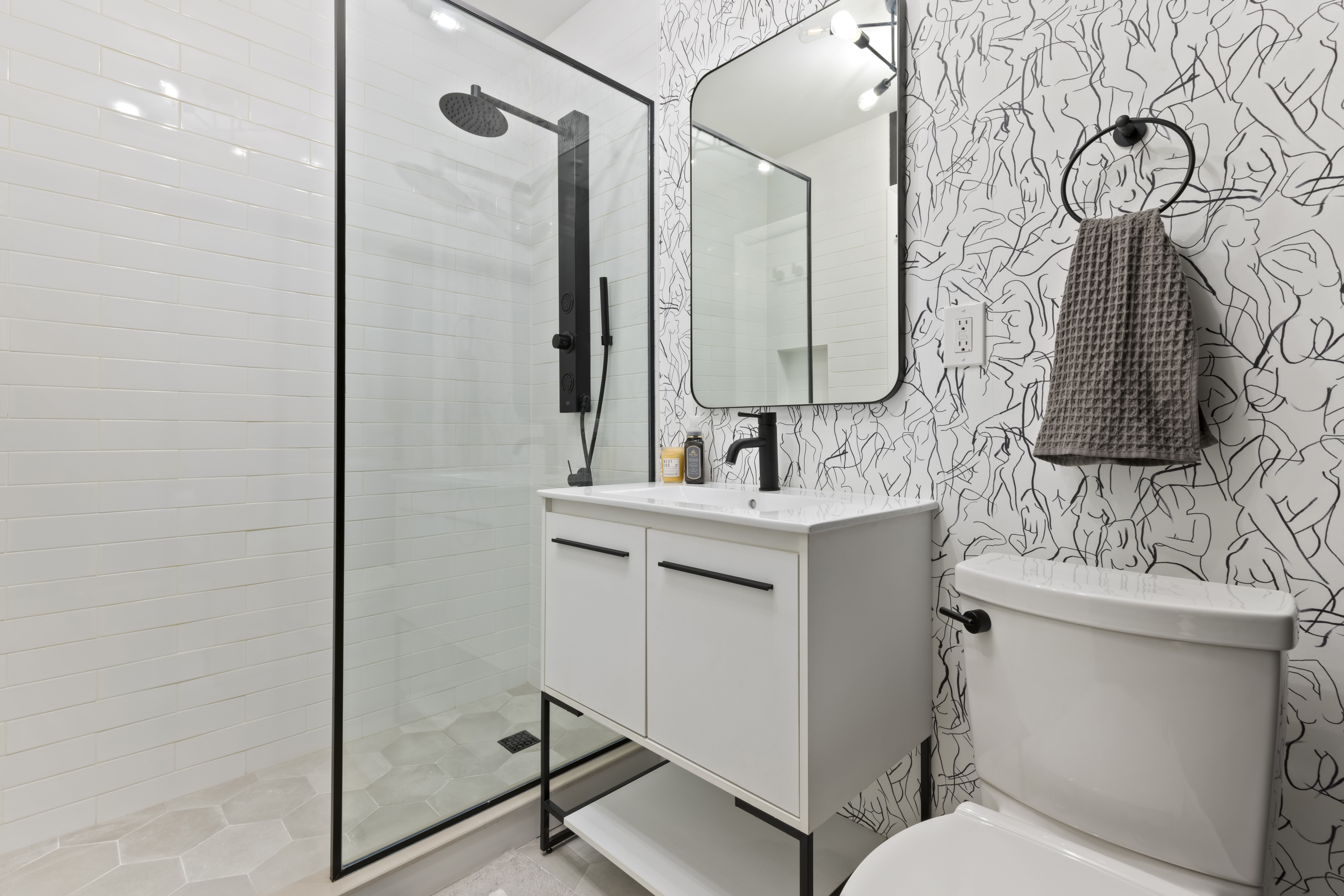
They replaced the sink with a trough style: “There was debate whether the sink would be too large, but after lots of measuring and imagining how close it would be to someone using the shower or toilet, we decided to do it. We are so glad we did. It is a perfect fit.
We also went for the matching faucets and soap dish.” Having forgone storage under the new sink, they added a small shelf and a 1940s American Red Cross medicine cabinet (found online in Bulgaria!). The large closet just outside of the bathroom made up for the limited storage.
Lastly, a wall-hung toilet was a lot of trouble to install, but ultimately worth the effort, since it’s incredibly easy to keep clean and makes the room feel larger.
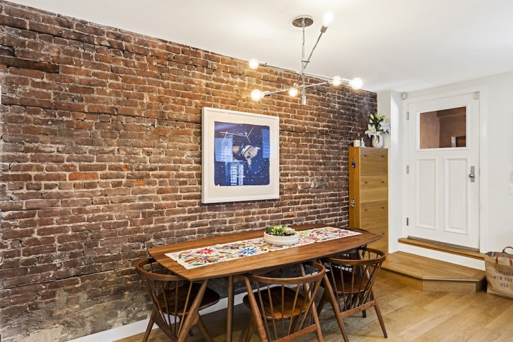
During the renovation of the downstairs bath, the contractor discovered that there was preserved exposed brick along one wall. They hoped that the brick was in the same condition a few feet away in the living room, and asked the contractor to rip down the sheetrock where their dining table would sit.
“It turns out we were in luck. The brick looked wonderful, and though we had to unexpectedly reroute some electrical cables and find matching oak to patch up the flooring, it was worth all of the expense and impact on the timeline.”
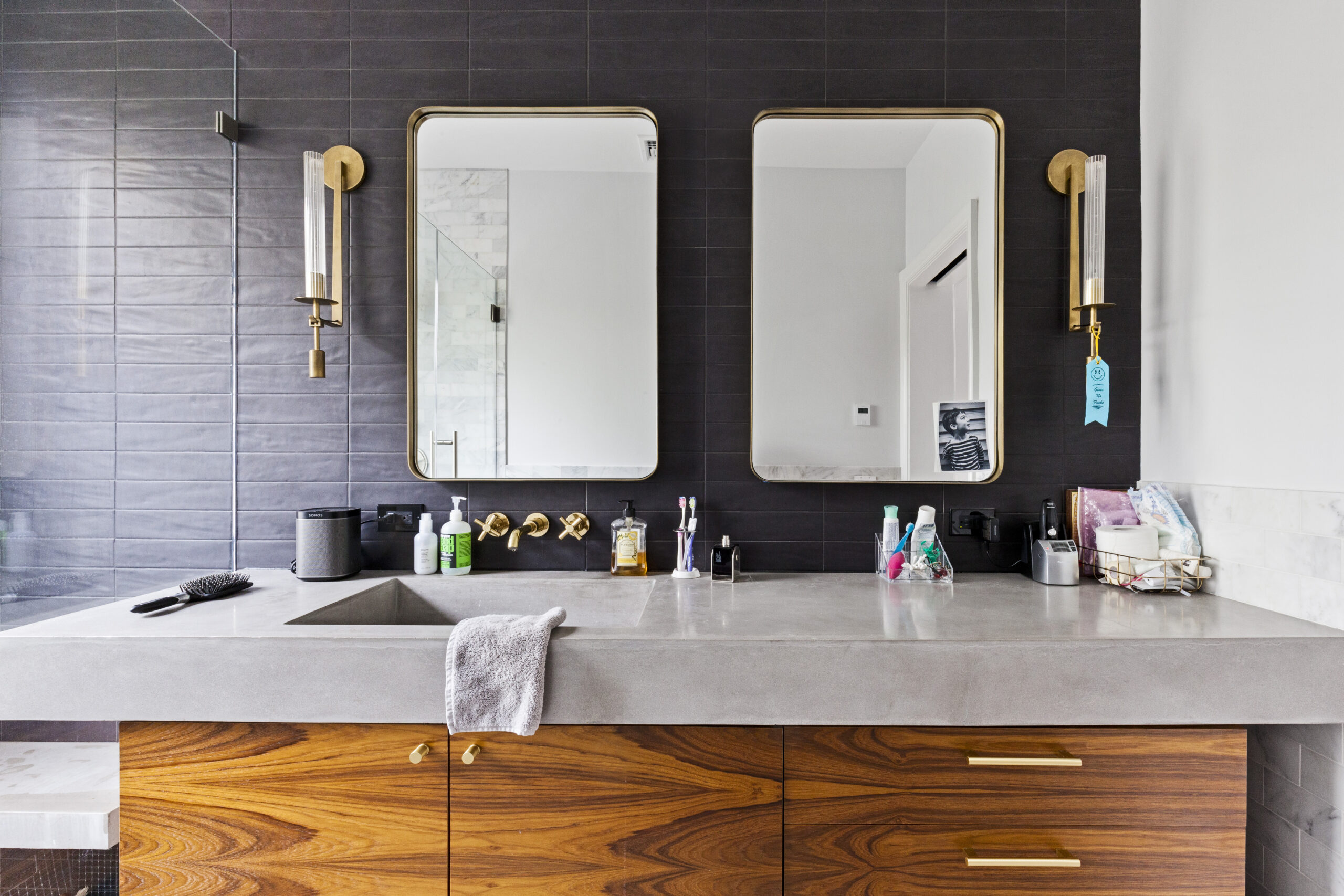
Finally, the couple also decided to renovate the master bathroom upstairs. (One of the pluses of living through your renovation is that you can figure out what else needs work while the contractor is on-site!) Since Alicia and Ed moved in while the renovation was still ongoing, they lived with the space for a while and found the bath to be unsuitable in many ways. “The overhead lighting was terrible, and the illuminated mirror died the day after we closed on the apartment.
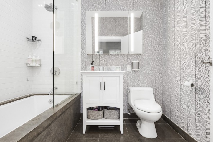
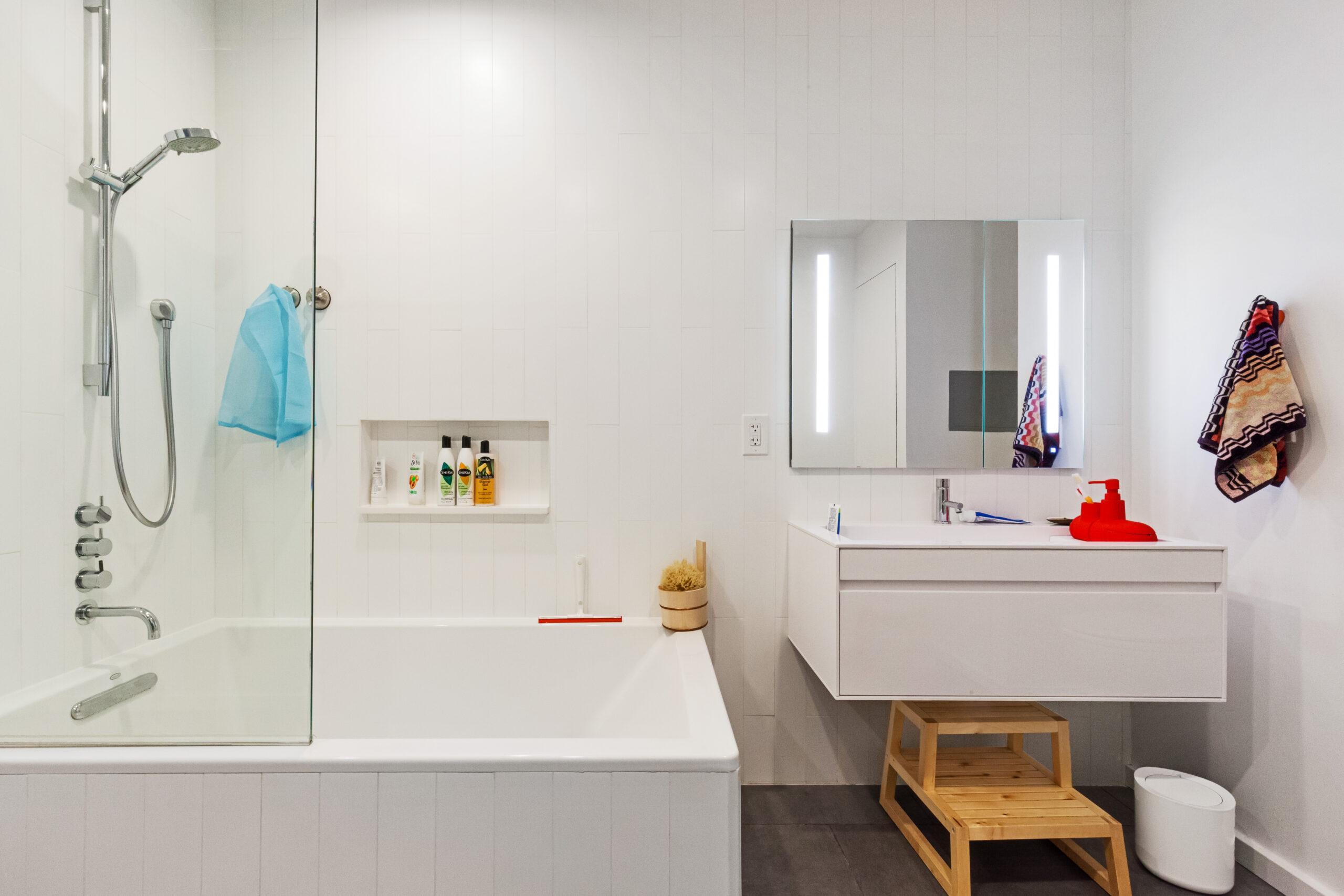
There was the complete lack of shelf space for us to set things down while getting ready, and the leaking pipework rendered the vanity useless for storage. The space really felt unloved.” To give the room a facelift without breaking the budget, they kept the large soaking tub (same as the one downstairs), the flooring, and toilet.
A new white shaker vanity with a marble countertop provided ample storage while an illuminated medicine cabinet and built-in LED lights lit up the room. Adding a glass panel in place of the old shower curtain opened the space up. Lastly, a herringbone wallpaper from Ferm Living took the master bath to the next level.
They made the home “smarter,” by adding outlets in convenient locations for their Sonos sound system, converting regular to USB outlets where appropriate, adding a video intercom, and installing a full Nest thermostat and smoke detector system.
Now, they can control the temperature via Amazon Echo (thanks, Alexa!) and ensure that the apartment is a comfortable temperature for Roxy while they are away.
Although they’d hoped to finish the renovations prior to their move-in date, they ended up living through the entire renovation, which lasted four weeks from beginning to end. The toughest part, according to Alicia and Ed, was keeping Roxy out of trouble. (See above.)
Their advice to future renovators? “Find a contractor you trust, and take their advice on what things would work well and what to avoid. We used tools like Pinterest, the Sweeten blog, and other online tools to get ideas. Also, if you have space, try to keep some spare materials once you have completed your renovation.
We spent a long time trying to find a flooring that matched our current style to patch in around the exposed brick wall. We decided to buy an extra pack this time and store it in our basement in case of emergency. The same thing with all the tile. You never know what could happen in the future—for a few hundred dollars, it is worth the investment and peace of mind!”
Thanks, Alicia and Ed, for sharing your gorgeous new garden duplex apartment! We hope you and Roxy enjoying living there for many years to come.
KITCHEN RESOURCES: Flooring: original. Cabinet fronts: custom. Statuario Nuvo Countertops: Caesarstone. Marble herringbone backsplash tile: Home Depot. Art: Ryan Duggan.
GUEST BATH RESOURCES: Glossy white penny tile flooring: Home Depot. White subway wall tile: Home Depot. Shower fixtures: Kohler. Brockway sink/vanity: Kohler. Cannock faucet: Kohler. Wall-hung toilet: Toto. WWII Red Cross cabinet: Etsy. Mirror: Houzz. Art: Ryan Duggan. Shower curtain: Pottery Barn.
MASTER BATH RESOURCES: Vanity: Home Depot. Verdana lighted medicine cabinet: Kohler. Glass panel: Houzz. Herringbone wallpaper: Ferm Living.
—
Tina, an architect, drew up plans to renovate a Cobble Hill garden duplex for her family—focusing on each and every room from the kitchen to the bedrooms.
Sweeten handpicks the best general contractors to match each project’s location, budget, and scope, helping until project completion. Follow the blog for renovation ideas and inspiration and when you’re ready to renovate, start your renovation on Sweeten.
