The Kitchen Peninsula, 5 Ways
From homework HQ to a prep and serving station at your next get-together, the kitchen peninsula proves its versatility
Unlike a kitchen island, which has clearance on all sides, a peninsula is joined to the rest of the kitchen, often meeting with a nearby counter or wall to transform an L-shape layout into a much more functional U-shape. It’s a popular choice among homeowners who don’t have enough space for an island—three feet all around is normally required for comfortable clearance—or prefer to have a more cohesive kitchen layout. It’s also a great way to create visual separation between two spaces in an open plan apartment. You can take the delineation one step further by defining different functions for each side of the peninsula—storage and prep space on one side and seating on the other. Below, a look at five homeowners, each with a one-of-a-kind kitchen peninsula.
Erica and Joshua’s kitchen in Clinton Hill, Brooklyn
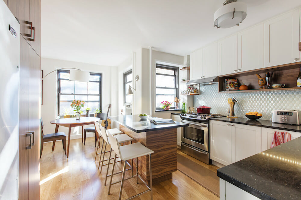
Removing the wall between the kitchen and dining room in Erica and Joshua’s apartment greatly improved the usability of the space. In order to find a compromise between Joshua’s preference for an open plan layout and Erica’s desire to maintain some visual privacy between rooms, a peninsula was built in the kitchen to divide it from the dining area. It was designed with generous storage on both sides in the form of drawers and a cabinet on one end. With bar seating for three, and a gooseneck sconce illuminating one end, the peninsula is the perfect spot to dine or sit down with a laptop. It’s also a good size with plenty of surface space, allowing the couple to use it at the same time—cooking and working face-to-face. Sweeten brings homeowners an exceptional renovation experience by personally matching trusted general contractors to your project, while offering expert guidance and support—at no cost to you. Renovate expertly with Sweeten
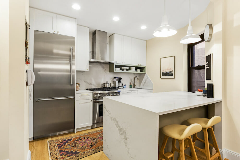
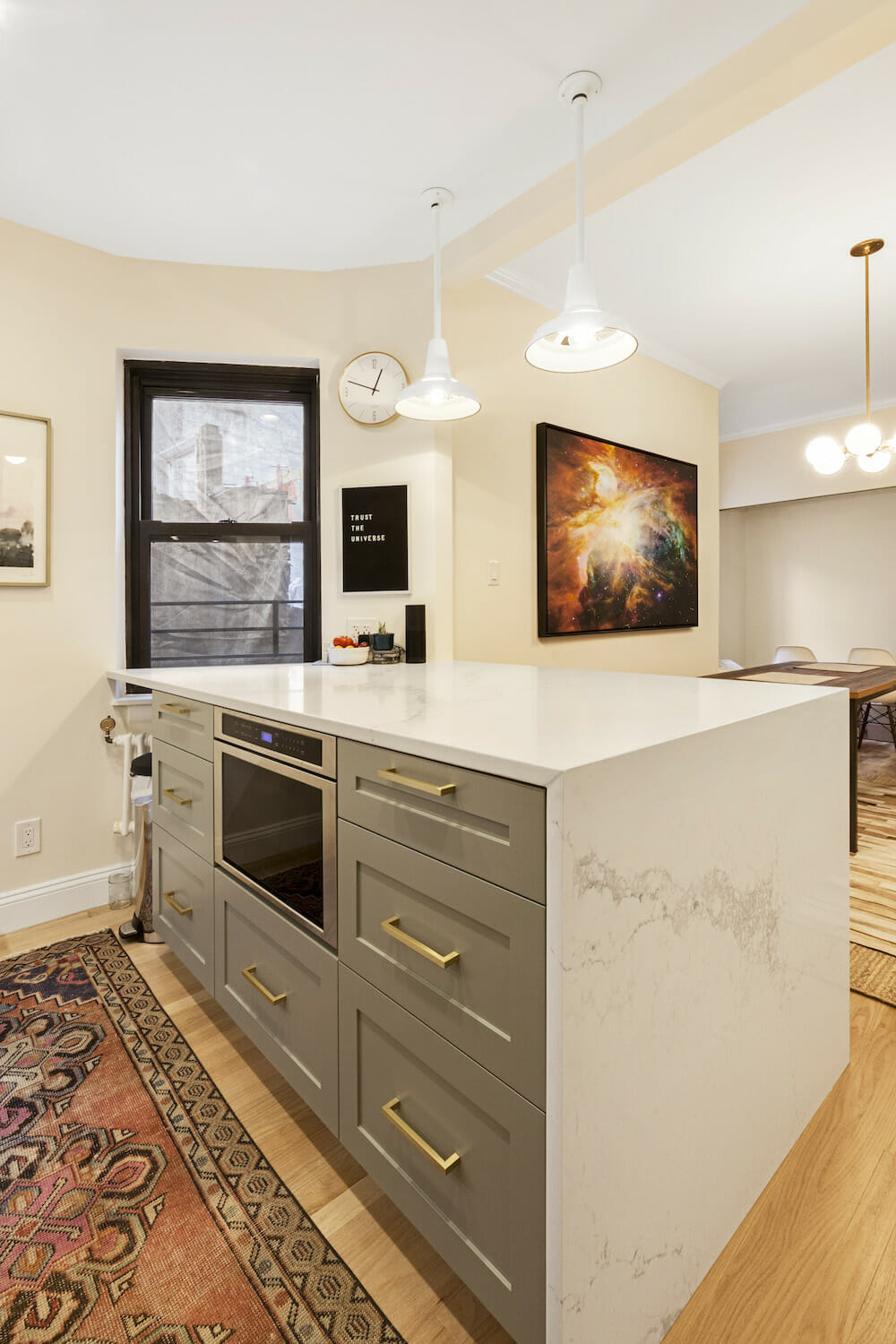
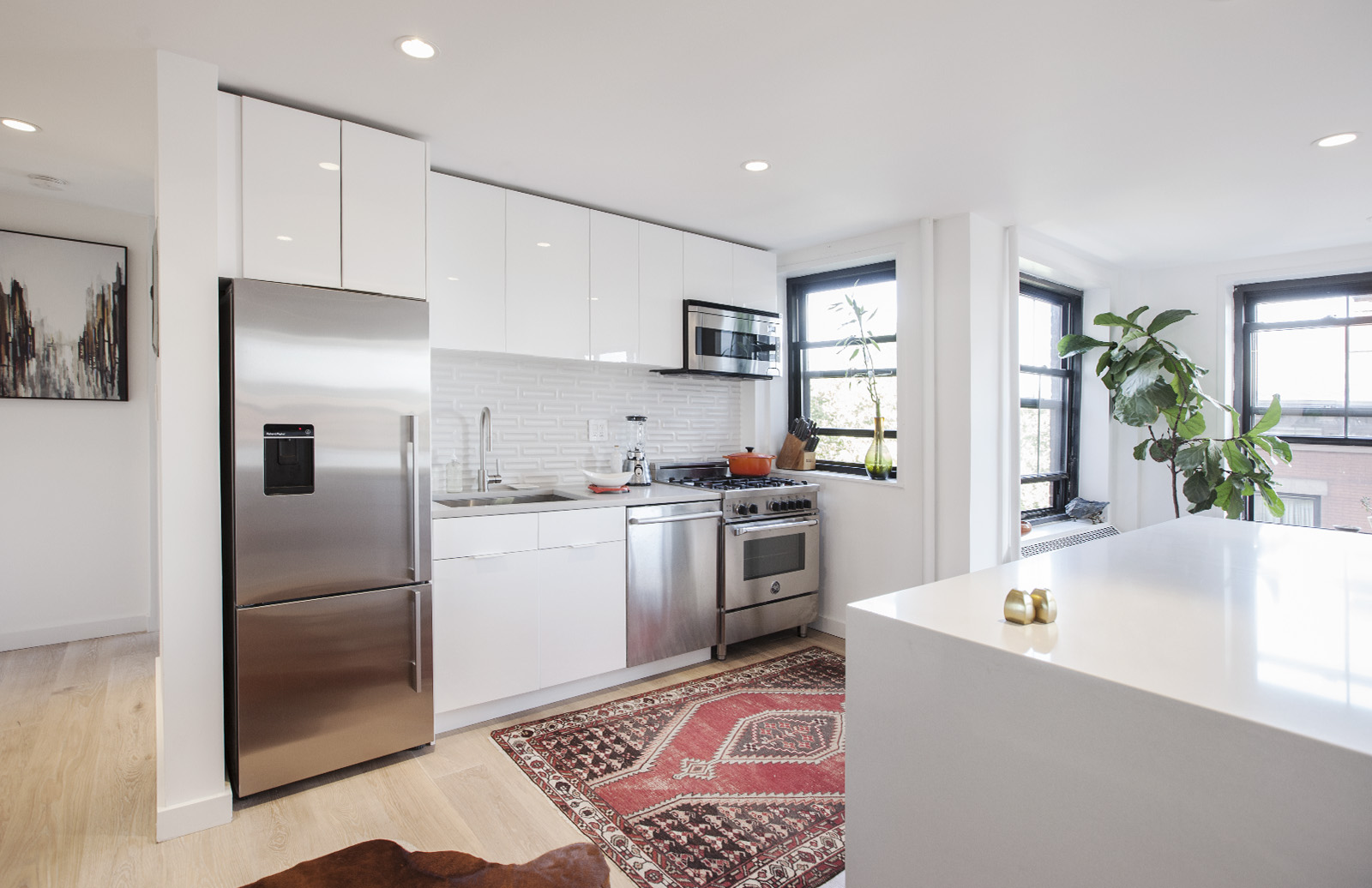
Looking to swap out the awkwardly placed island in their small kitchen, Meredith and Jason’s Sweeten general contractor suggested that they go with a wide peninsula. “As soon as I saw the drawing, I was on board with it,” said Meredith. The new kitchen peninsula doubles counter space while providing a spot for the microwave—tucking it out of sight—and plenty of deep drawers for storage. Plus, bar seating on the side facing the dining room allows Meredith to do some work and keep Jason company while he cooks. The white waterfall counter makes it an attractive statement piece as you walk in the front door.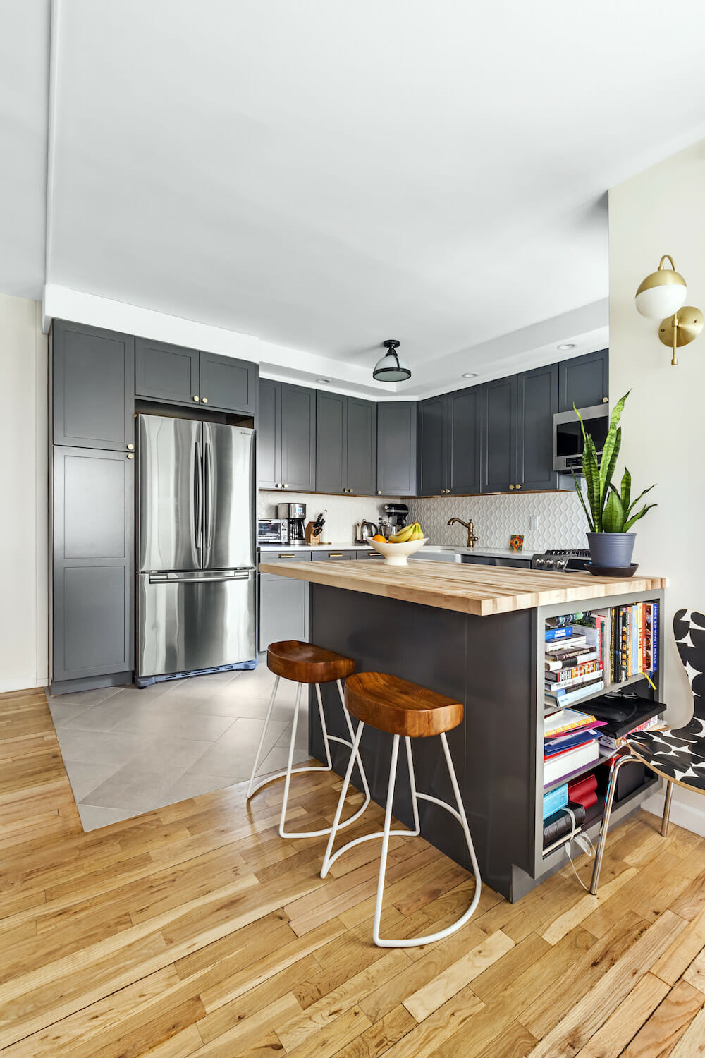
Sam and Sean wanted to make their kitchen feel as large as possible, so a big island was out of the question. Instead, a small peninsula was installed to provide additional prep space and storage while adding some separation between the kitchen and main living area. The custom area was topped with butcher block to create contrast with the white Caesarstone counters used in the rest of the kitchen. Designed with three sides and three distinct purposes in mind, the kitchen peninsula is well-equipped with drawers on one side, bar seating for two on the other, and shelving for storing books on the end.
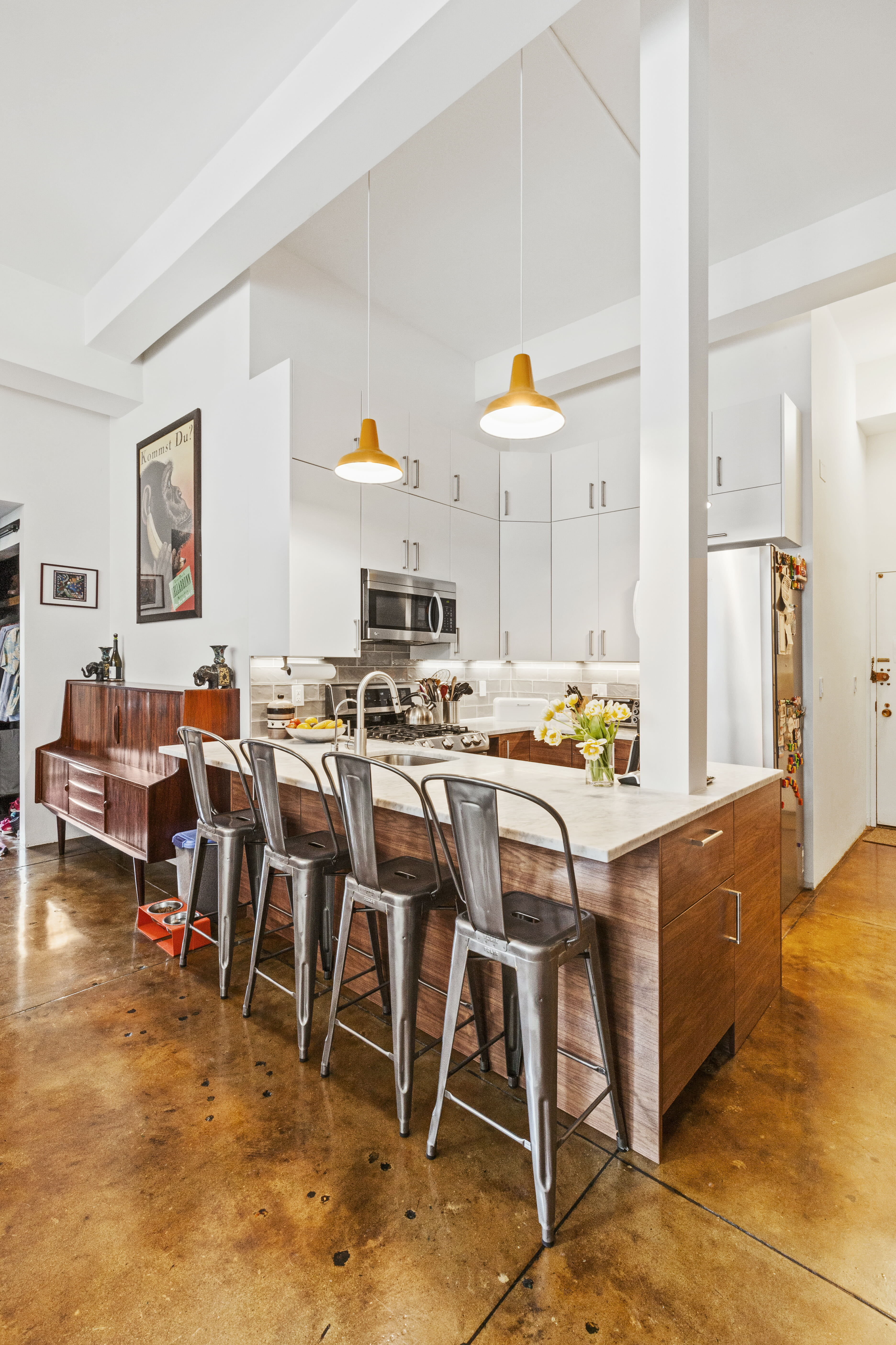
Opening up Emily and Trey’s cramped kitchen by taking down walls and removing the loft storage above it gave the couple plenty of room to work with. To make the most of the newly opened space, a wide L-shaped peninsula with a Carrara marble countertop was installed with bar seating along one side—quickly becoming a popular spot for Emily’s two kids to hang out while she cooks. Placing the kitchen sink in the peninsula was an ideal location since it faced the windows with lots of natural light and allowed ease of conversation with the family in the living area. The white column holding the intercom could not be moved, so the Sweeten contractor integrated it into the structure, transforming it into a cool architectural element.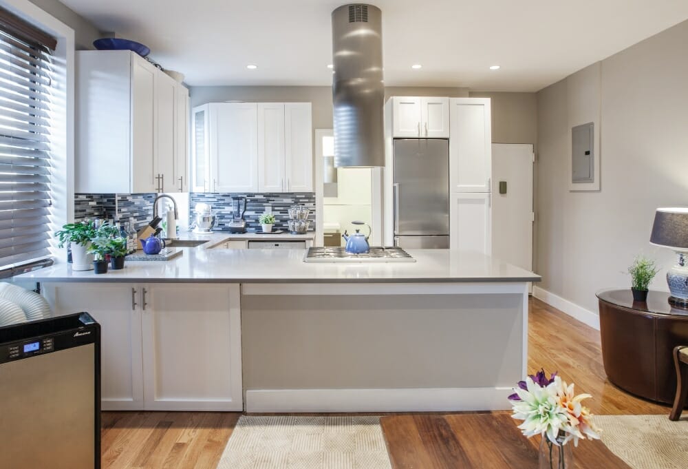
Henry saw the potential to connect his kitchen and living room and took advantage of it, taking down a wall between the rooms and replacing it with a peninsula. Adding this structure extended his kitchen’s L-shape into a more functional and versatile U-shape. Beyond expanding storage and prep space, the main attraction is the range, placed in the center, and hood overhead, making it a more sociable spot from which to cook. As a bonus, Henry tucked a front-loading washer and dryer underneath the peninsula, making them both easily accessible from the living room. That’s one hard-working peninsula!
—
If you have the clearance for a kitchen island—or simply prefer it—check out these 5 custom kitchen islands in Sweeten homes for some enviable inspiration.
Sweeten handpicks the best general contractors to match each project’s location, budget, and scope, helping until project completion. Follow the blog for renovation ideas and inspiration and when you’re ready to renovate, start your renovation on Sweeten.
