A Washington Heights Co-op Remodel Gives A New Look & Layout
A tasteful and timely makeover for an 875-square-foot coop
When a job necessitated a move from a Westchester suburb to New York City, Jessica and her husband, David, hoped for a move-in-ready apartment. Relocating is never simple, and undertaking a renovation was not in the plan.
But when the search turned up an outdated (but otherwise perfect) Hudson Heights apartment with a show-stopping view of the George Washington Bridge, they knew it was time to find a contractor. See how the couple used artful ideas to maximize storage space, make room for guests, and enlarge a common living area.
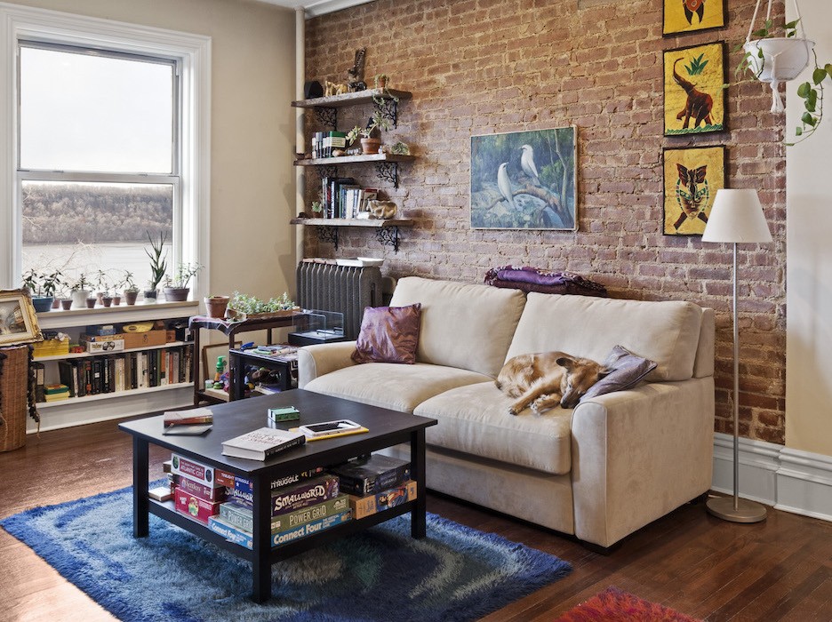
Despite the beautiful bridge view, a renovation was in order: the 875-square-foot apartment was in a co-op building that had been built in 1917, and while parts of the unit had been updated since, Jessica and David had very specific ideas about how to make it work for their family. Some friends, wishing they had used Sweeten themselves, suggested that the duo try out the service.
After consulting Sweeten’s Renovation 101 series and perusing the Before & Afters to get a sense of the possibilities, Jessica posted their project while the property went into contract. The plans called for the conversion of the dining room into a second bedroom, a completely reworked kitchen, refinished floors and moldings, as well as minor updates in the bathroom.
Jessica set up site visits with her Sweeten matches, and ultimately decided on this general contractor, who, coincidentally, lived in the sister building next door. (Apparently, his own floor plan was so similar to Jessica and David’s, he told them that working on their place was “like what he always wanted to do to his own apartment!”) They liked that his was a design-build firm, which provides both interior design and general contracting services.
As a “design-conscious builder,” he could assist them in making design decisions to achieve the bright and modern look they imagined.
First, they worked together to address the issues in the kitchen. Since the room faced another part of their building, it did not receive much natural light. An earlier attempt (by previous owners) at brightening the space had resulted in an “awful fluorescent yellow” paint on the walls, which clashed with the light tone of the existing wood cabinets and the orange tile on the floor.
Aesthetics aside, the kitchen also did not provide enough functional storage: the only wall of cabinets also housed all the appliances. Inside one cabinet, an unmovable gas meter obstructed any usable space, and a steam riser in a corner wasted valuable square footage. The placement of the extra-wide doorway between the kitchen and the old dining room prevented the addition of a parallel wall of cabinets on the other side.
And although the existing stove was in good shape, Jessica and David wanted to switch out the other appliances for energy-efficient alternatives.
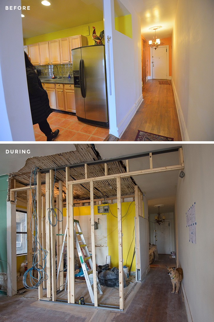
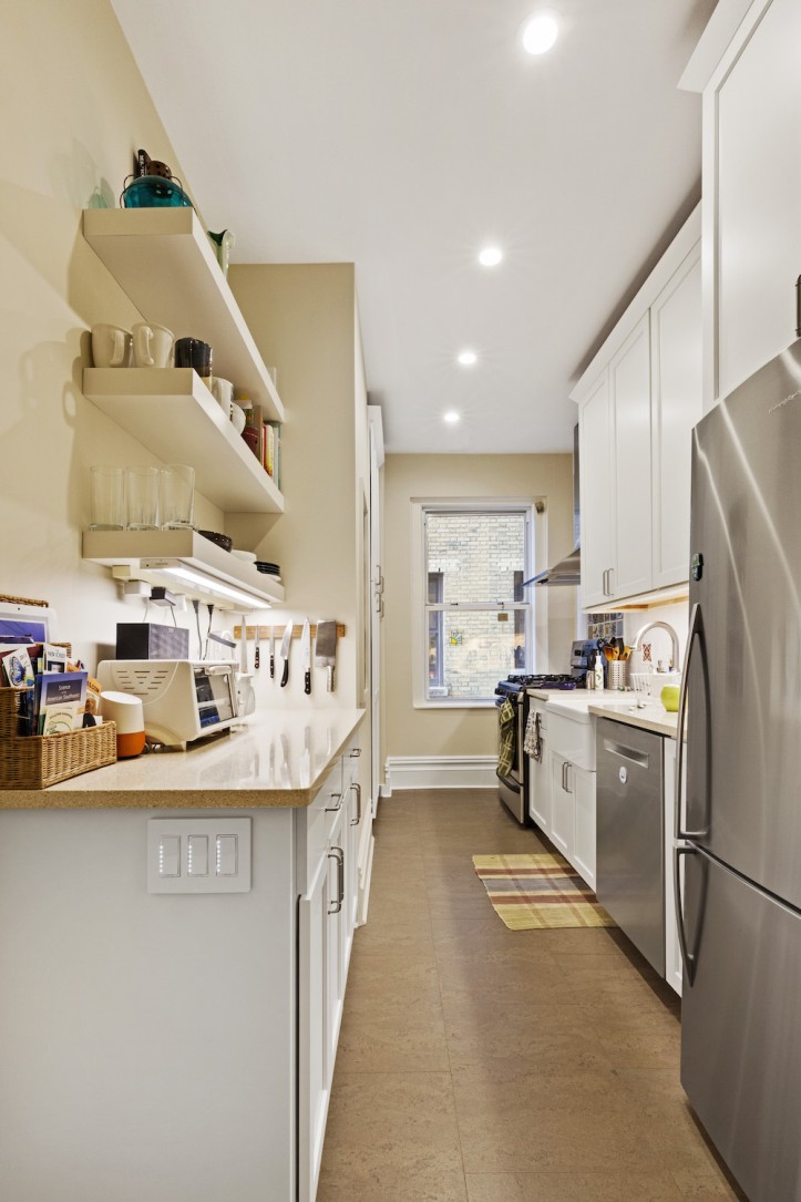
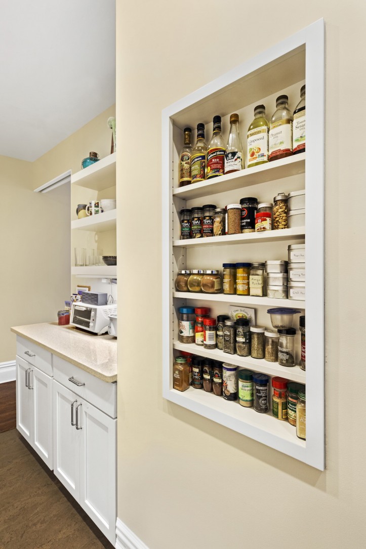
To create better flow and maximize function, the doorway to the living area was narrowed and moved to the side, making way for a full galley kitchen. A dropped ceiling was also raised to maximize vertical storage. All the appliances remained on the original bank of cabinets, so the (newly built) opposite side could be dedicated entirely to storage in the form of drawers, open shelving, a custom niche for spices, as well as a full-height pantry.
In the corner where the steam riser stood, the contractor fabricated cabinet panels with a perforated insert to create a more uniform look. Now, the riser is hidden from view, but the narrow vertical space also serves as extra storage for cleaning supplies. Their Sweeten contractor created a similar solution for the gas meter, wrapping custom shelves around the meter so that the inside of the cabinet was not completely wasted.
The couple’s desire for a “bright, clean look” was achieved with pure white shaker cabinets, recycled glass countertops in a light beige, and a white farmhouse sink. Jessica was especially excited about adding a scatter of color in the backsplash with Mexican tiles she sourced from Etsy. For the floor, cork tiles were chosen as a sustainable and renewable material that’s both soundproof and mildew-proof.
Sweeten brings homeowners an exceptional renovation experience by personally matching trusted general contractors to your project, while offering expert guidance and support—at no cost to you. Renovate expertly with Sweeten
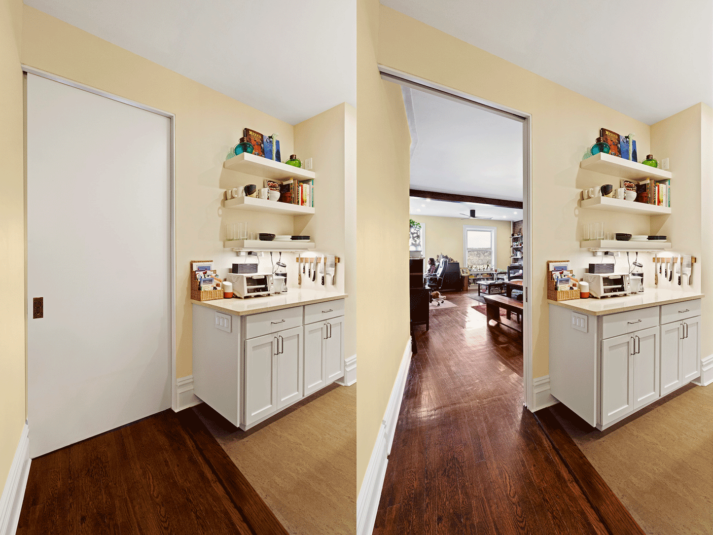
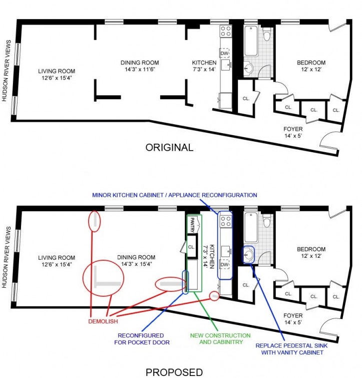
Next, there came a change in plans. Although the intention was to create a guest bedroom out of the original dining room, Jessica and David quickly realized that they preferred to keep the space open for their own daily use. As a compromise, they built a closet against the new wall separating the dining room and kitchen.
This way, a bedroom could be added down the line and it would already have its own closet. For now, they came up with a simple but genius solution for a flexible guest room: their contractor installed a pocket door between the living area and the kitchen, allowing visitors the option of transforming the entire living/dining room into a private suite.

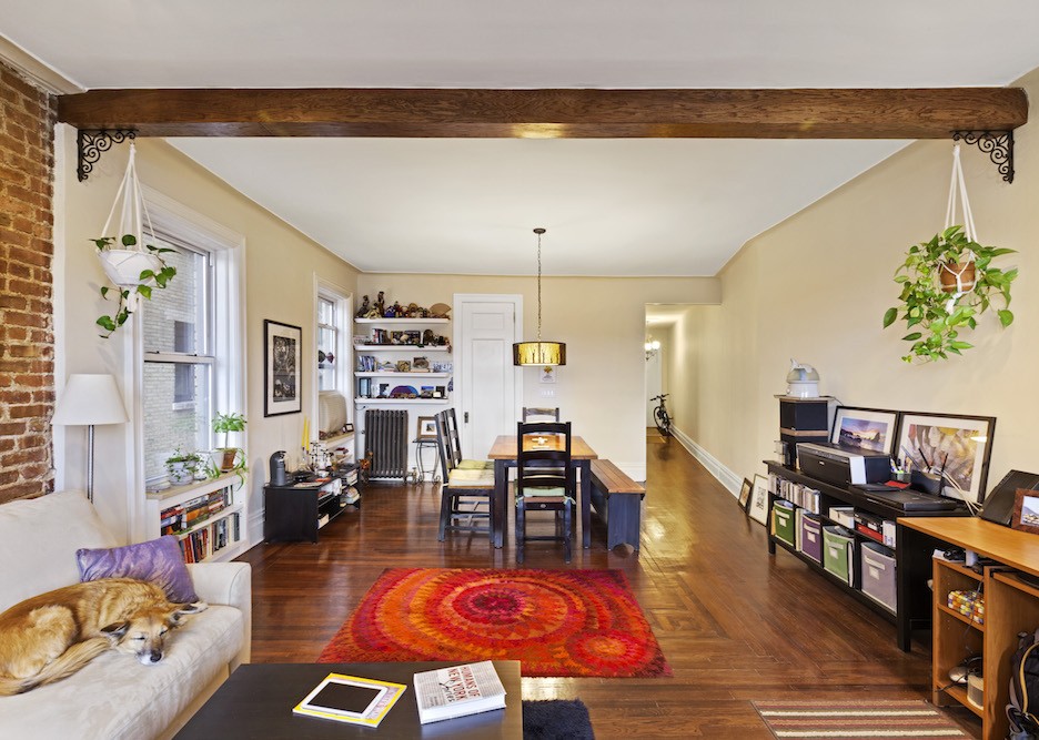
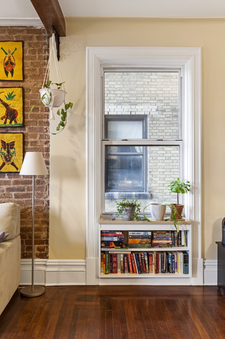
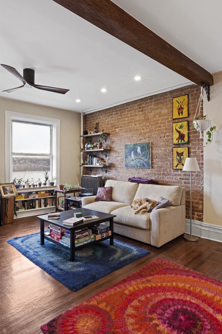
Their general contractor went to work replacing the crumbly moldings and refinishing the worn floors in the new living area, made newly spacious by the removal of original walls that bracketed the formal dining room. Door moldings in the dining room were salvaged as replacement window trim for the living area. While making these repairs, he realized that there was empty space under each window ledge, which could be repurposed as built-in shelving.
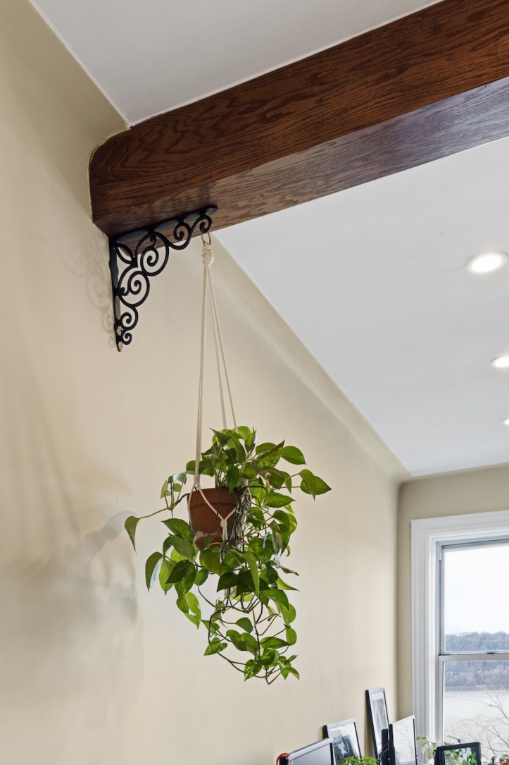
He also suggested painting the black window frames white to further brighten the space–a suggestion that Jessica loved. In addition, the couple requested new wooden beams on the ceiling for character—but it turns out they serve a dual purpose. There was a “step” in the ceiling, and the beams placed there helped to conceal the awkward transition where one part of the ceiling was higher than the other.
Interestingly, numerous pieces of plywood were joined to fabricate the beam, which is actually hollow. This was both a greener and more affordable solution than procuring a solid piece of wood.

Although the renovation went smoothly for the most part, Jessica and David did run into a few challenges. First—and this is something we at Team Sweeten hear time and time again—they were held up by permits and approvals. To remove the dining room walls, they needed co-op board approval, which took about a month longer than they had anticipated.
On another occasion, they were ordered to stop work for a day because of a misunderstanding about some wiring. The super had given the okay to cut old fabric-wrapped wires that were part of an obsolete intercom system, but it turned out that they connected a neighbor’s functioning phone lines! Thankfully, they were able to repair the lines and continue working the next day.
Jessica and David had never renovated in New York City before, and had dozens of questions when they started out. Now that they’ve lived to tell the tale, they have a couple pieces of advice to share with aspiring renovators: “Build in some extra time—everything takes longer than it should!” (That’s why renovators should always build in at least two to six months for permits and approvals.)
Despite the lengthier-than-anticipated renovation, they are so happy to have a custom-built home that not only suits their every need, but is environmentally friendly and energy efficient to boot!
Thanks so much, Jessica and David, for sharing your beautiful new apartment with us!
KITCHEN RESOURCES: Kitchen cabinets: custom. Cabinet hardware, #P3380-SS: Build.com. Eco by Cosentino Countertops: Silestone. Baldwin Fireclay Farmhouse Sink: Signature Hardware. Hansgrohe faucet, #04215800: Hansgrohe. Backsplash: Cera Tile Chelsea Craquelle White, Mexican tile: Etsy. Fisher & Paykel Refrigerator: Amazon. Bosch dishwasher, #SHP68TL5UC: AJ Madison. AFX Lighting, #NLLP32: AFX. Azores cork floor tiles, #30621: Green Building Supply.
LIVING ROOM RESOURCES: Live edge walnut shelves: custom. Brackets: House of Antique Hardware. Dining room light: Pier 1. Living room fan, #IR3H-BK-WA-52: Build.com.
—
Do disaster-to-dream-home transformations energize you for your own renovation? Then check out Henry’s story to tip the scale.
Sweeten handpicks the best general contractors to match each project’s location, budget, scope, and style. Follow the blog for renovation ideas and inspiration and when you’re ready to renovate, start your renovation on Sweeten.
