Renovating to Stay in a Well-loved Neighborhood
In 2006, Kim and Igor Solop bought a condo in the Brooklyn neighborhood of Carroll Gardens. After many years, the couple pondered a change and began searching for a new family home.
Realizing they didn’t want to leave their neighborhood, but couldn’t find what they were looking for within their budget there, Kim turned to Sweeten to re-imagine their current apartment to suit their needs. A kitchen and bath update featuring an expanded pantry, a wine fridge, and a deep soaking tub took their space to the next level!
Guest post by Carroll Gardens homeowner Kim Solop
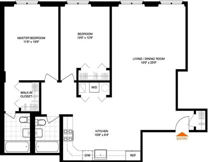
After ten years of living in our Carroll Gardens condo, we really needed a change. We contemplated a move to the suburbs or upgrading to a bigger place in a less popular Brooklyn neighborhood. After almost a year of looking and being priced out in our current neighborhood, we decided to renovate our current place, a two-bed, two-bath, 1,200 square-foot condo that we bought in 2006.
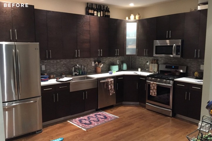
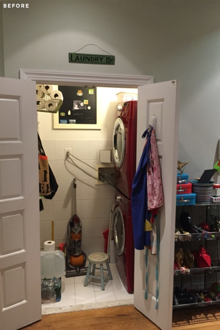
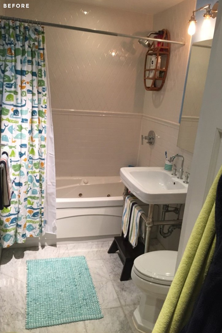
We loved our current neighborhood with its proximity to our workplaces, lots of cute restaurants, shops, and our two sons’ schools. The problems were in the apartment itself: I was unhappy with the dark kitchen—I always had been. I love taking baths but hated the jet tub that was installed over a decade ago. Lastly, our laundry closet had a lot of wasted space and I wanted to add a walk-in pantry!
As a big fan of home decor blogs, I had been stalking the Sweeten site for a while, and really loved seeing the transformations that the contractors could do with space. I was excited for the chance to post our renovation. I met with a couple of them, and decided on this Sweeten contractor. I really clicked with the project managers and could see that we would have a good partnership.
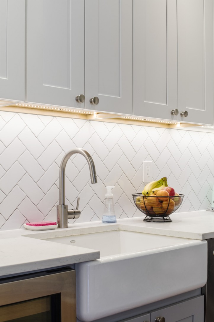
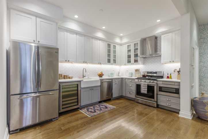
My main objective for the kitchen was to brighten it up and eliminate the space between the cabinets and the ceiling. I hated how this wasted space looked and the amount of dust it collected. After a few weeks of sourcing materials, we were ready to go!
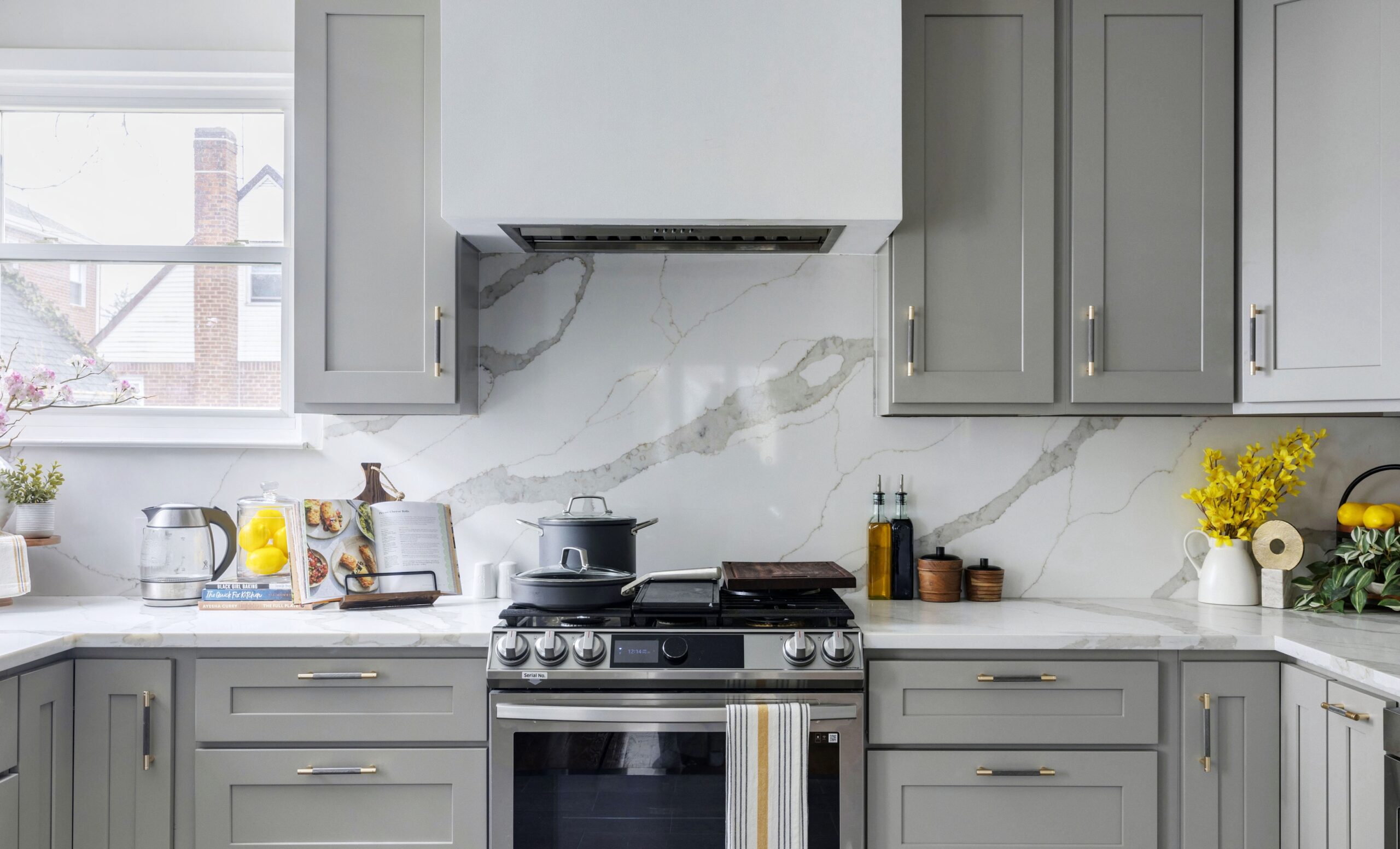
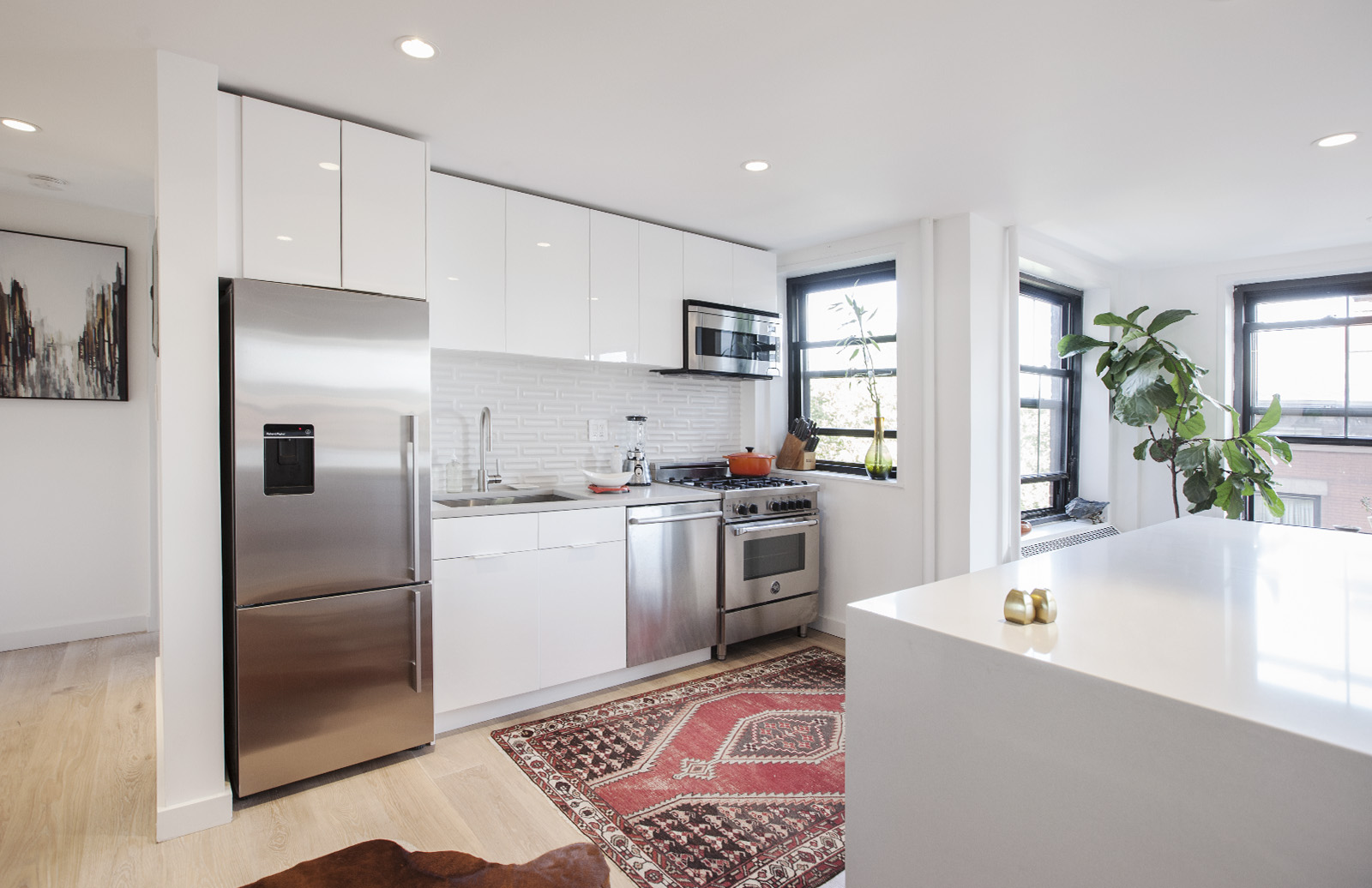
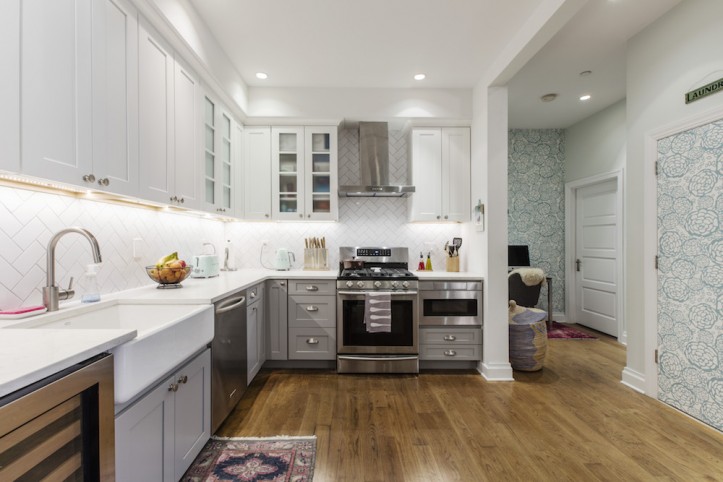
I knew from the get-go that I wanted a white kitchen, as well as shaker-style cabinets with quartz countertops that were marble look-alikes. Other than that, I was pretty open to ideas. Our contractor came over with a wealth of ideas for how we could open the kitchen up to maximize light. (Unfortunately, there are no windows in the kitchen, so there was only so much we could do.) I debated another set of cabinets on top of the current ones, but eventually decided against it.
I switched gears a bit on the white color palette, choosing instead a dual-tone kitchen with white uppers and gray lower cabinets. After living with long pulls, I decided to go with smaller handles on all the cabinetry. Quartz countertops were also a must, for the durability factor!
With two kids and a husband who are not always the neatest, I knew that we needed a tough work surface. I was adamant about getting a wine fridge. As members of a few wine clubs, we struggled to find space to keep our wine at the right temperatures. Sweeten brings homeowners an exceptional renovation experience by personally matching trusted general contractors to your project, while offering expert guidance and support—at no cost to you. Renovate expertly with Sweeten
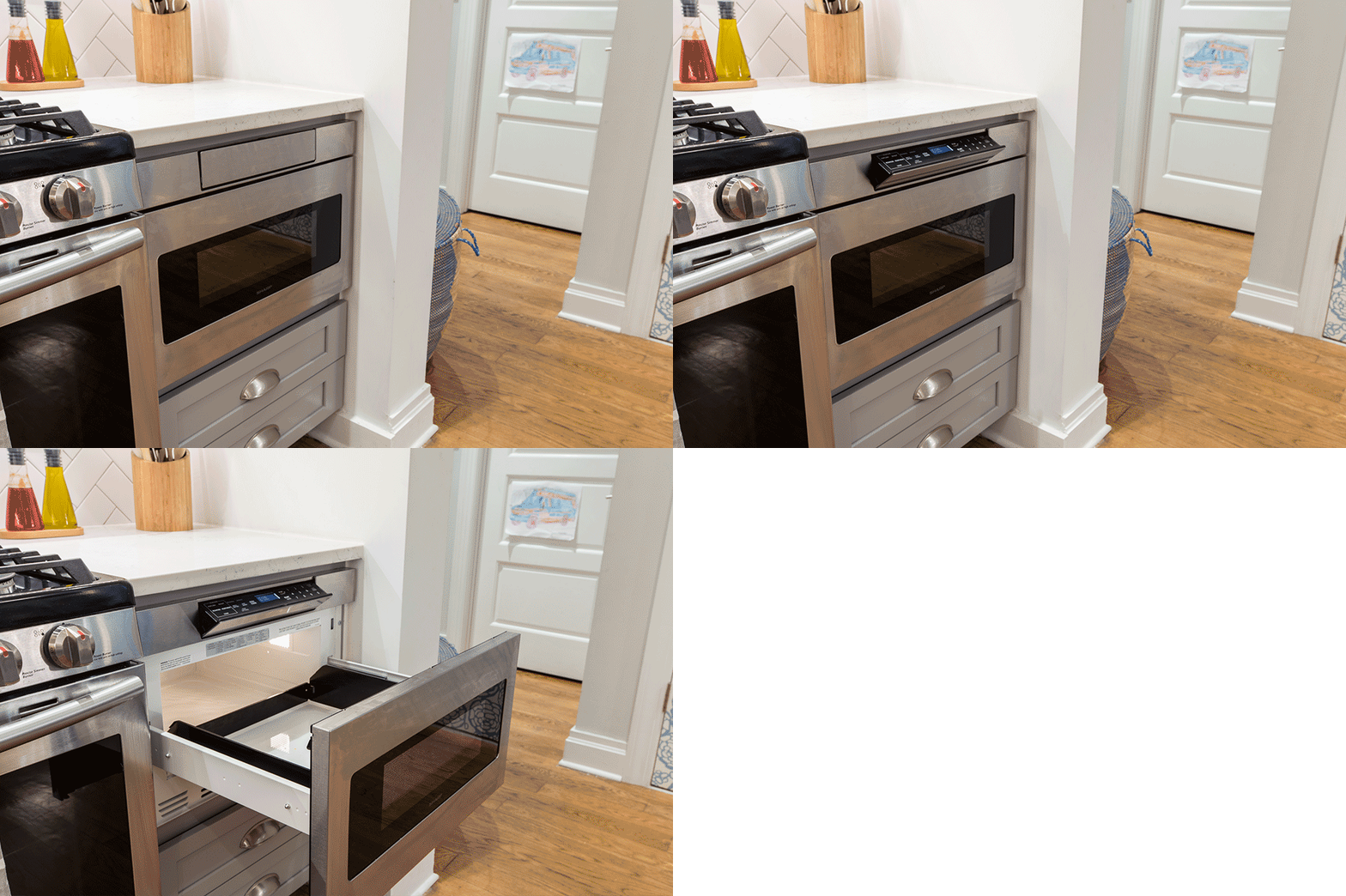
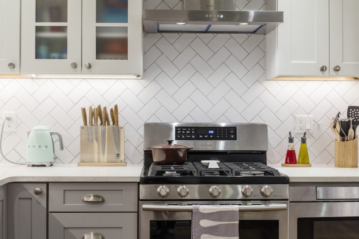
Our microwave above the range was replaced with a microwave drawer, and a hood was installed above the stovetop instead. With the new wine fridge taking up precious cabinet space, I did lose a place for pots and pans. Our contractor was able to give me deep drawers in the pantry to make up for this lost storage.
My other kitchen must-haves were a deep, white porcelain sink, and an under-counter pull-out garbage can.
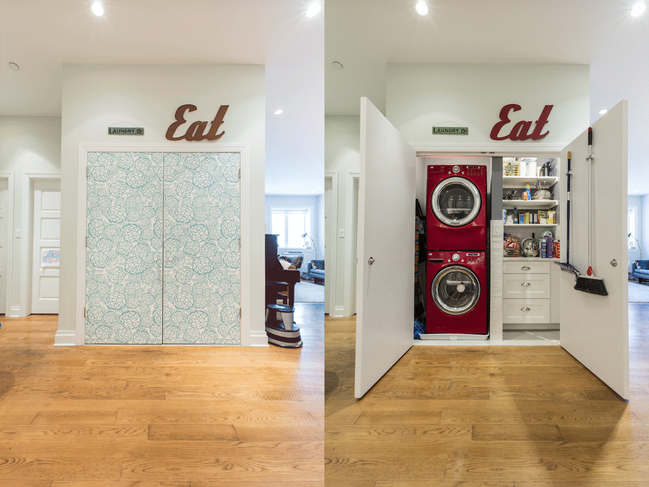
Across the kitchen was a room that held just the washer and dryer with inaccessible space that was wasted. When we extended the wall, there was room for a customized pantry with countertops, shelving, and cabinetry that matched the kitchen. After not having a pantry for so long, it’s amazing to have one, and the additional space has really been a lifesaver. I had envisioned barn doors, but there was not enough wall space for it.
The double doors we ended up hanging looked so plain and boring. I had some wallpaper left over from the hallway–so I went for it and covered the doors too. I think it turned out nicely.
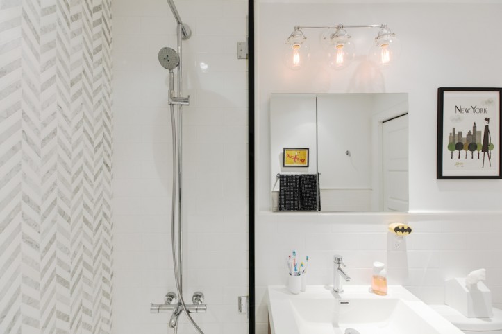
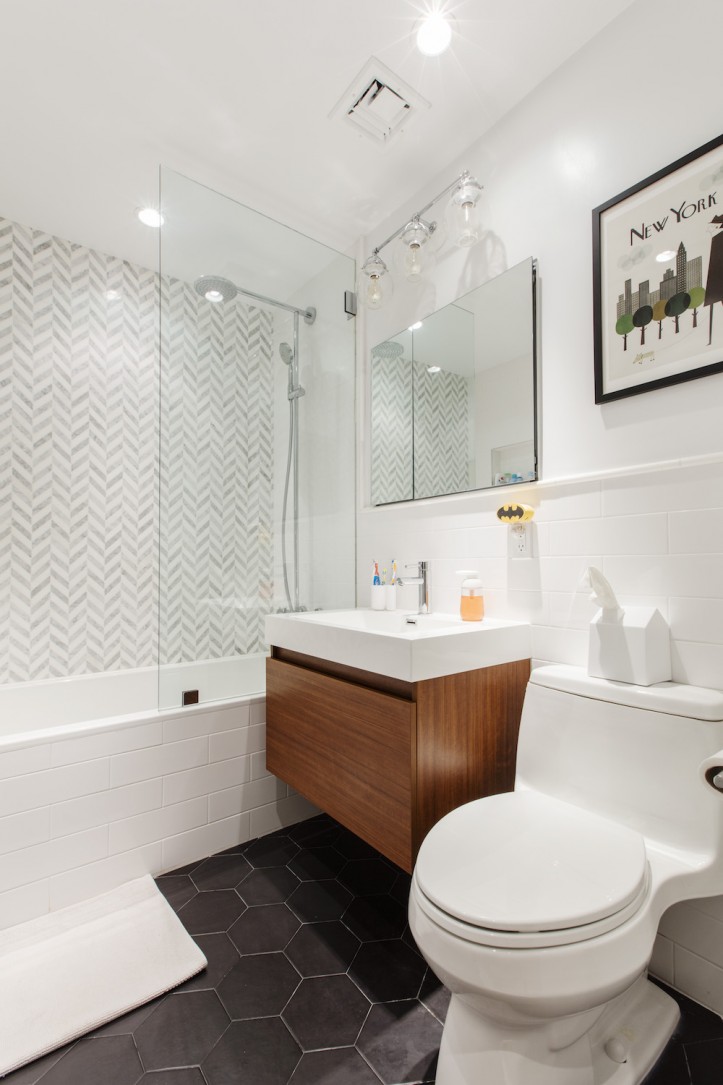
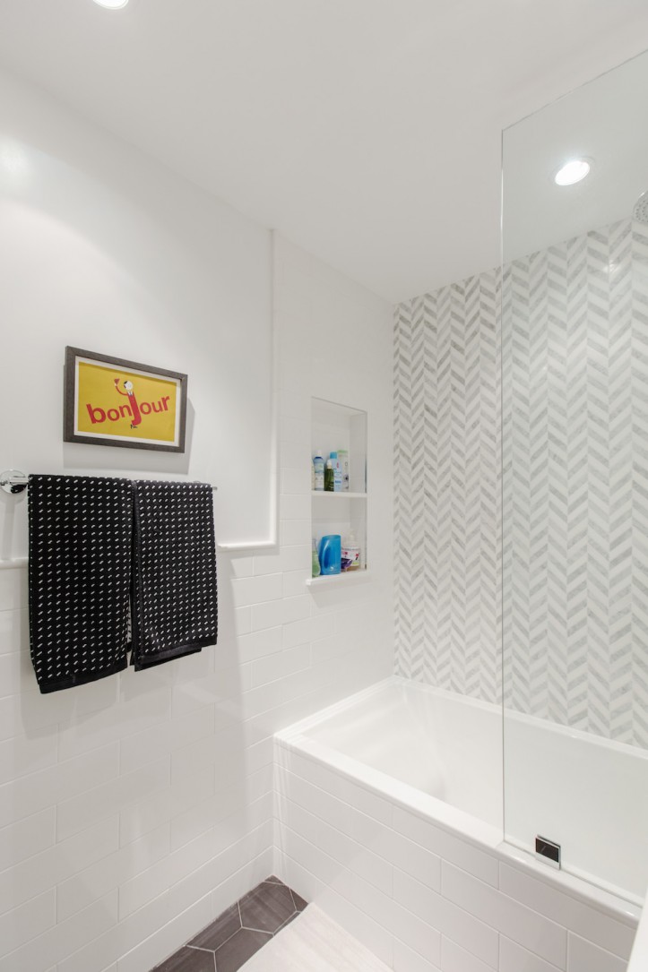
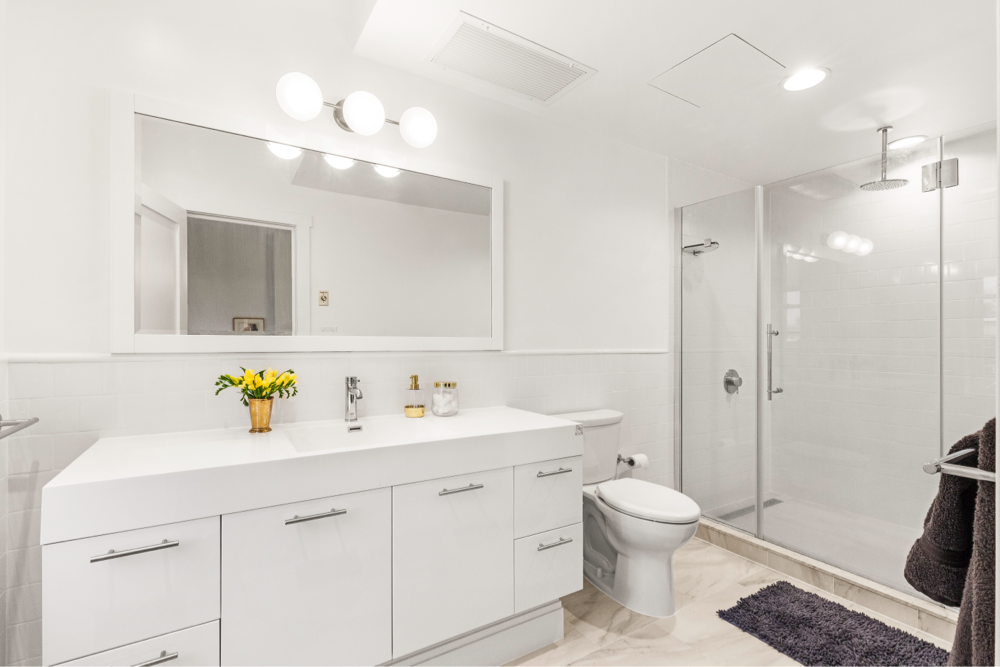
For the bathroom, I wanted a totally new look that was modern and clean. We went with dark floors, a deep soaking tub, and a floating vanity. Our contractor showed me a picture of another bathroom he did, and I loved it so much, we copied it almost exactly. It came out perfectly and I am fighting my older son almost daily for baths! The tub is divine.
We actually lived in the space during the whole renovation, which lasted about seven weeks. It was definitely challenging and required a lot of patience. The contractor and his crew were great about cleaning up, however, and we made the best of it with lots of takeout dinners.

After reading the Sweeten blog for so many years, it was exciting to embark on my own renovation. I realized that renovating is messy and dirty, and almost always takes longer than you had originally anticipated. You learn to roll with the punches, and realize that things happen. We had a few hiccups along the way, such as wanting the barn door on the pantry that wasn’t going to work, so I learned to compromise.
I enjoyed working with our Sweeten contractor, who made himself available at all hours. He was in constant communication and has remained a friend to this day. We love our new kitchen and other improvements, and are planning on staying to enjoy them for many years to come!
KITCHEN RESOURCES: Grey and white shaker cabinets: Waypoint. Knobs and pulls hardware: Hickory Hardware and Berenson Pulls. Quartz countertops: Silestone. White subway tile backsplash: Wayfair. White porcelain deep farm sink: Kohler. Faucet: Grohe. Refrigerator: GE Monogram. Microwave: Sharp. Wine fridge: U-line. Range: Samsung (original). Range hood: Faber.
BATHROOM RESOURCES. Black hex floor tile: Wayfair. White subway wall tile: Wayfair. Herringbone marble mosaic wall tile: Builder Depot. Sink fixture: Grohe. Rain shower fixture: Hansgrohe. Sink/vanity: Fresca. Toilet: Kohler. White Underscore tub: Kohler. Medicine cabinet: Fresca. Lighting: Rejuvenation.
LAUNDRY RESOURCES. Washer/dryer: LG. Cabinets: Waypoint. Petal Pusher wallpaper: Hygge & West.
—
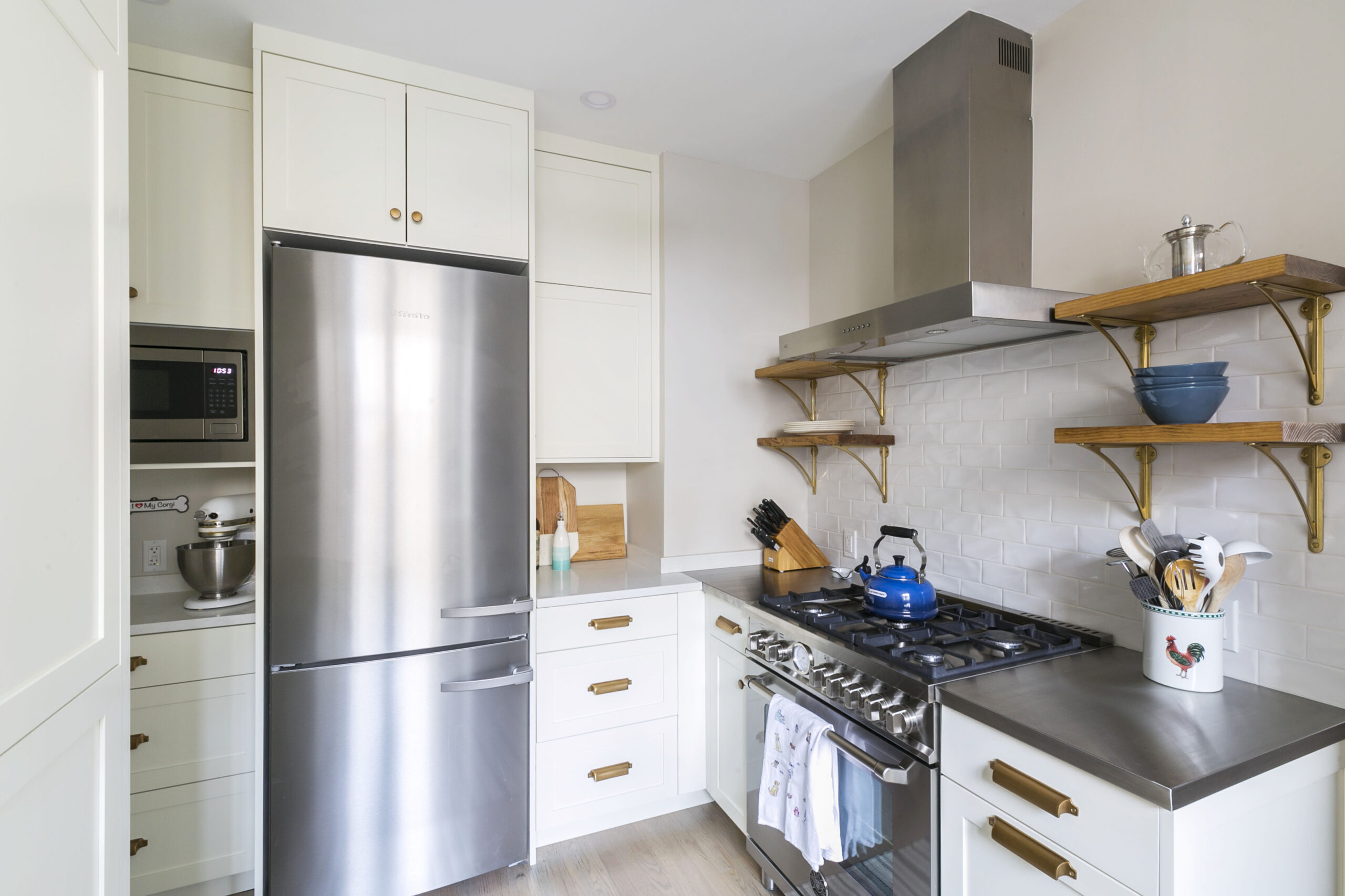
If you want to add pantry space to your kitchen but don’t have a closet that can be repurposed, go for a custom built-in that frames your fridge like this one in Fabio and Melina’s kitchen.
Sweeten handpicks the best general contractors to match each project’s location, budget, scope, and style. Follow the blog for renovation ideas and inspiration and when you’re ready to renovate, start your renovation on Sweeten.
