Home / Blog / Before & After / Entire Homes
A Work-Friendly Studio Renovation for a Restored Apartment
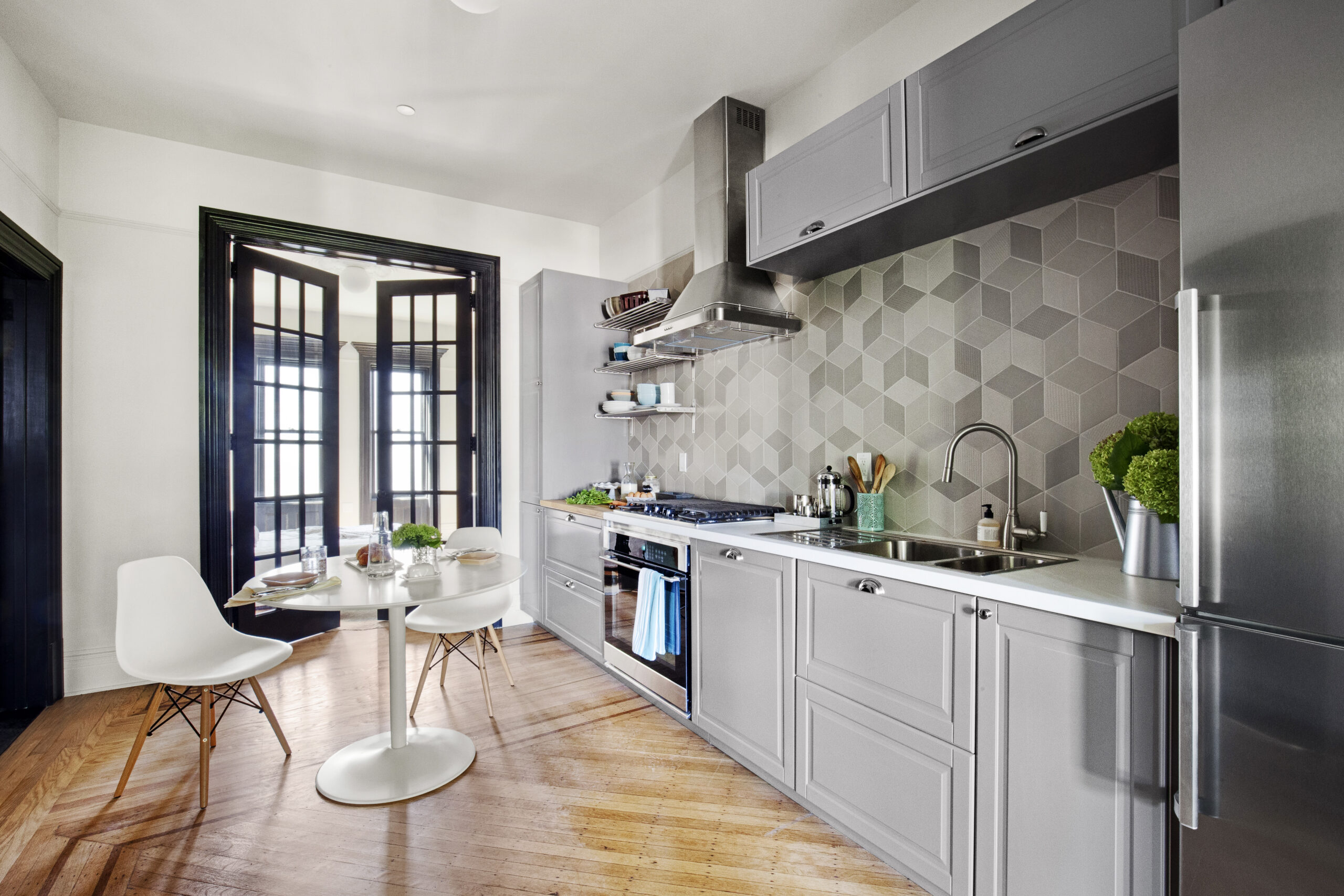
By carving a pass-through into the galley kitchen and adding a breakfast perch, this work-friendly studio renovation made the studio feel more open while bringing back elegance with wall paneling and crown molding.
- Homeowners: Emily, a New York City homeowner drawn to prewar details, and her dad, John, who helped plan the project, posted their studio renovation on Sweeten.
- Where: Upper West Side, Manhattan, New York City
- Primary renovation: A work-friendly studio restoration that opened the galley kitchen, added a built-in office nook, refreshed bath finishes, and brought back classic details with paneling, crown molding, and updated trim.
- Homeowner’s quote: “There is a lot that can go wrong when you’re renovating, but it helps to start with a good idea of what you want. And if you source the materials yourself, you can cut down on some of the variables that might delay the project.”
Finding a warm, old-world feel in an old NYC apartment
When Emily moved to New York City last year, she went in search of an apartment with a warm, old-world feel. Although originally from California, she had recently spent two years living and studying in Normandy, France, where she developed an appreciation for beautiful prewar buildings that wore their age gracefully.
Emily loved that the apartments she came across there—no matter how small or simple—always had ornamental features that elevated the space. Paneling, vintage doorknobs, and other small details contributed to an overall elegance, and she wanted the same for her new apartment in New York.
We can help plan your renovation
Find endless home renovation inspiration, detailed guides, and practical cost breakdowns from our blogs. You can also post your project on Sweeten today and get matched with our vetted general contractors and get estimates for free!
A pre-war studio with separate spaces and dated finishes


A six-month-long search resulted in the purchase of a 435-square-foot studio apartment in an understated 1940s building on the Upper West Side. It was a prewar apartment but also a condo, a rare combination that suited Emily’s criteria. Although it was a studio, it had distinctly separate spaces: an entryway, dressing area, kitchen, bath, and main living space, which Emily liked.
Unfortunately, having been used as a longtime rental property, the apartment had been stripped of most of its original ornamentation. Instead, there was paint a dozen layers thick and worn flooring throughout the studio.
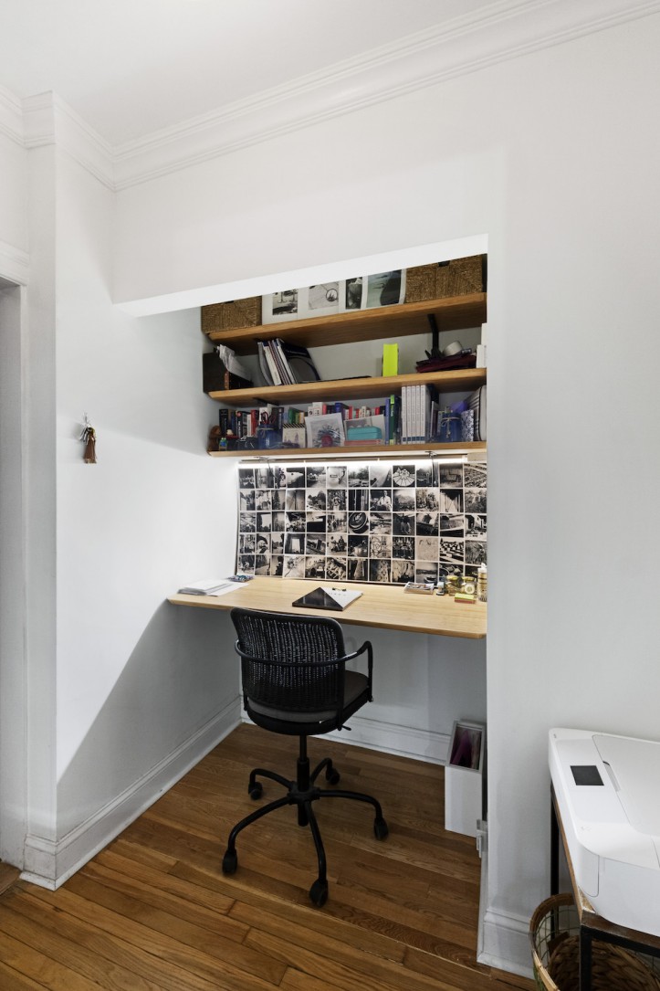
In the narrow galley kitchen, there were sticky off-white cabinets, peeling vinyl floors, and almost no counter space at all. The very peachy-yellow bathroom sported tiles that didn’t match in spots where they had once been replaced, and a tank-less, industrial toilet gave the small space an unpleasantly institutional vibe. To the left of the front door, two shallow closets took up valuable floor space, which Emily felt would be better utilized as an office nook.
A clear plan for vintage details and an open kitchen
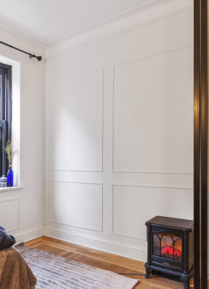
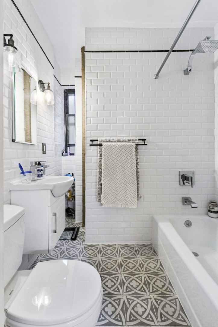
Emily envisioned a restoration of sorts: she wanted to add paneling and crown molding to the walls of the main living space, and to create a simple bath with a vintage black-and-white theme. The kitchen renovation would be modern but befitting the age of the building.
And although the discrete spaces of the apartment were a major selling point, Emily felt that the narrow kitchen would be much improved if it could be opened up to the main living area. Pinterest provided ample inspiration, and she set out to source the materials herself, relying heavily on Wayfair and other online stores.
Having developed a concrete plan for the renovation, Emily and her dad, John, posted the project to Sweeten. John had had substantial experience with construction and renovation in the past, and with his input, Emily settled on a Sweeten contractor. Sweeten brings homeowners an exceptional renovation experience by personally matching trusted general contractors to your project, while offering expert guidance and support—at no cost to you. Renovate expertly with Sweeten
A kitchen pass-through with airy shelving and vintage style
The crew quickly went to work realizing Emily’s vision, and also provided helpful suggestions and additions along the way. For example, unprompted, the contractor stripped a half-century of paint from the front door, revealing the beautiful metal patina underneath.
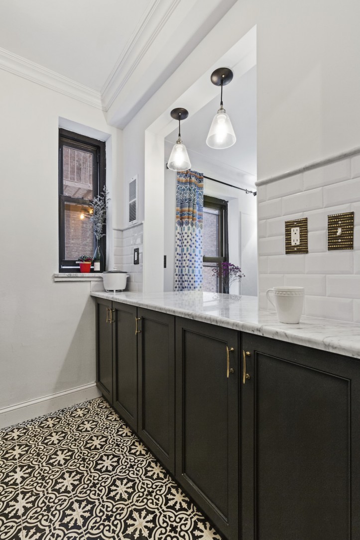
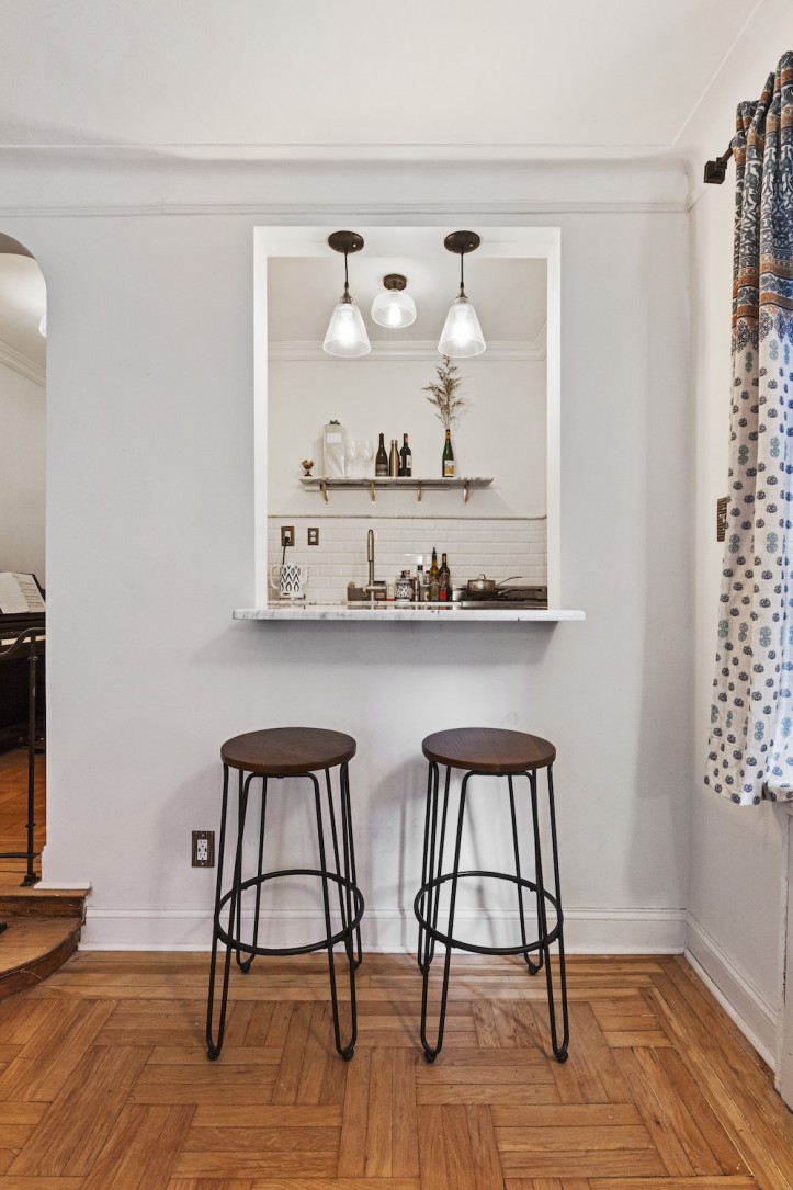
Based on Emily’s direction, he created a pass-through from the galley kitchen to the living area, extending the counter through the opening to create a breakfast perch with stools. Open shelving made of marble and brass took the place of the upper kitchen cabinets, creating more room to breathe in the narrow space.
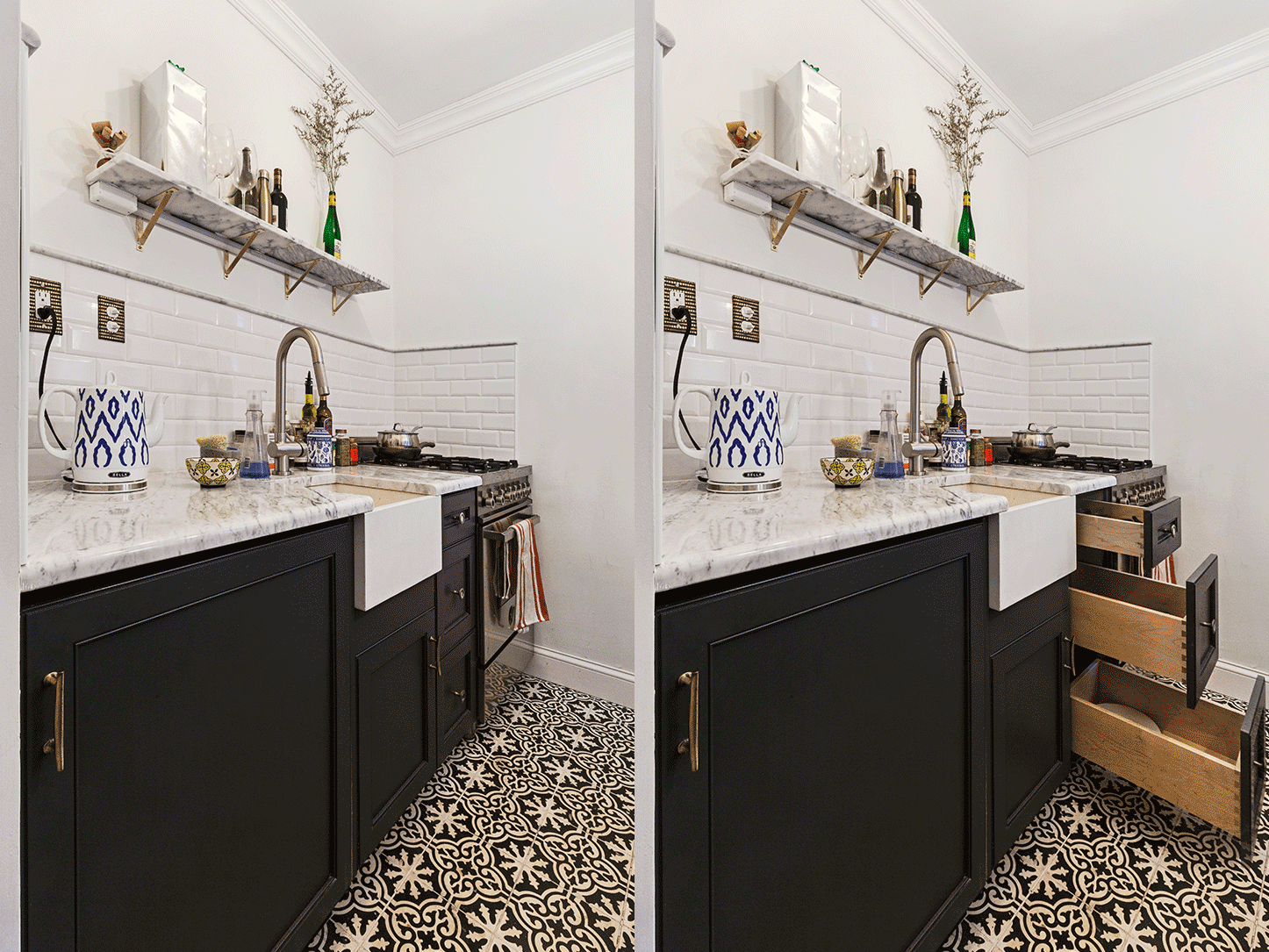
The appliances and sink were lined up on the left, given that the counters and base cabinets on the right were a mere nine inches deep. (The entire kitchen was just about six feet wide!) An under-counter refrigerator, paneled to blend in with the cabinets, preserved the new airiness of the space.
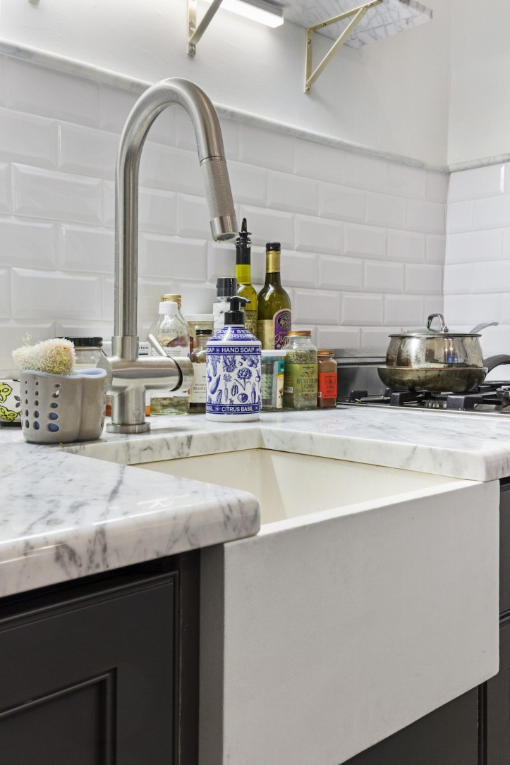
Sadly, there was no room for a dishwasher, but a 24-inch gas range fit perfectly at the end of the counter. Finishes were consistent with those found in older buildings, featuring white subway tile, marble counters, brass detailing, charcoal gray lower cabinets, and blackened metal light fixtures with a retro feel. For the floor, Emily chose a fun Spanish tile in black and white.
A home office nook, elevated trim, and a classic bath
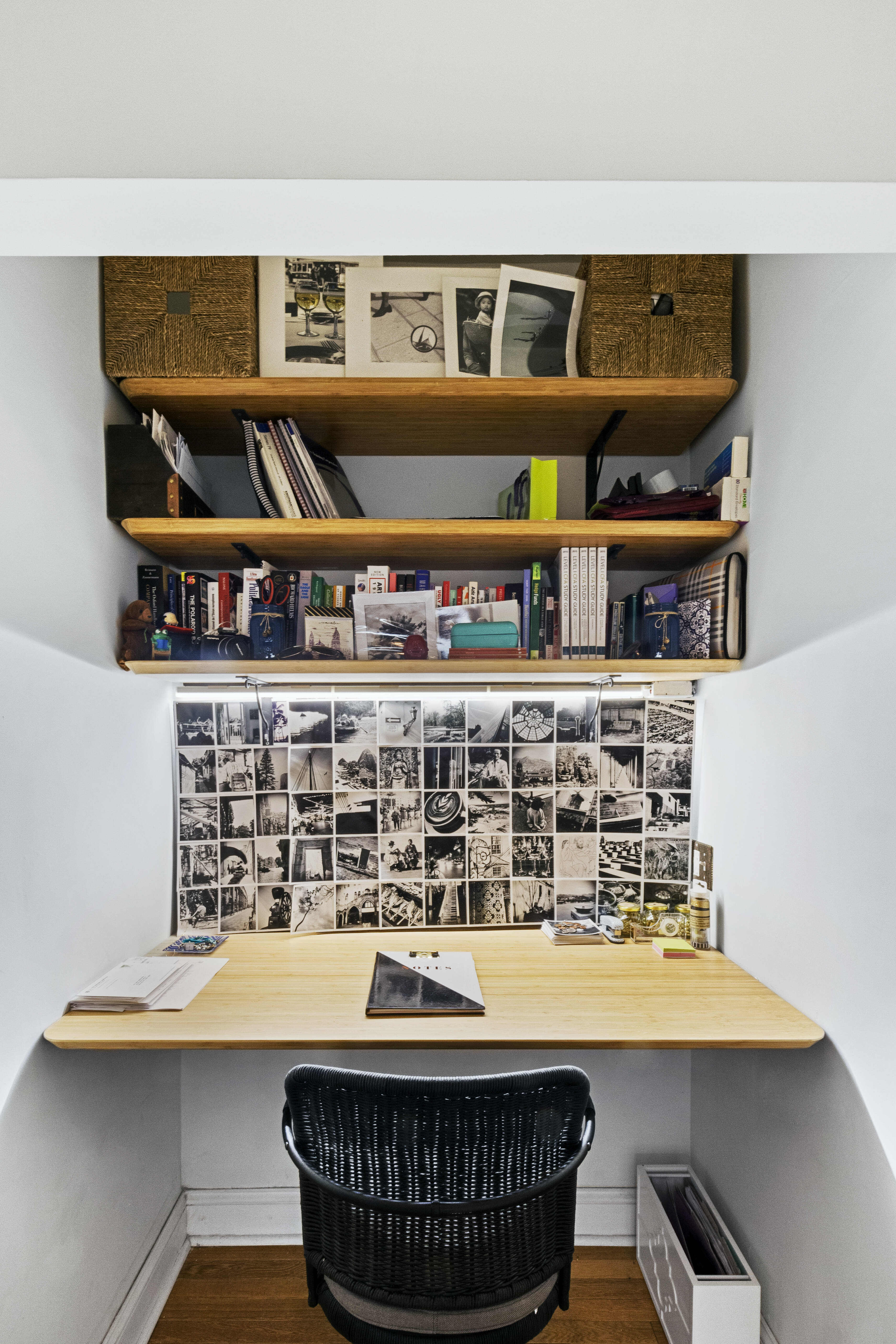
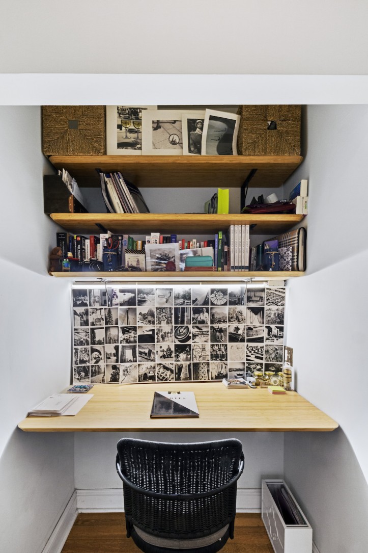
In the original dressing area, the floor space was expanded once the closets were removed. Custom shelving and a desk were cut to fit inside the nook perfectly, creating a cozy home office away from the main sleeping area.
In the main room of the studio, her Sweeten contractor added small details that restored elegance to the apartment. Marble ledges on the windows, as well as wall paneling, crown molding, and new baseboards transformed the space in subtle but distinct ways.
The remodeled bathroom received a similarly unpretentious and classic treatment: white subway tile with a beveled edge and black trim, matched to a matte black towel rack. To prevent an accidental burn and to disguise an unsightly floor-to-ceiling radiator pipe, he suggested that they wrap it with rope.
Managing the renovation from afar with regular check-ins
Interestingly, unlike many of Sweeten’s renovating homeowners, Emily and John managed the project from afar—they were in California while her contractor and his team worked on her apartment. They arranged for check-ins via FaceTime or Skype, and he provided photos and updates on the work on a regular basis.
Despite the 2,500 miles between them, there were remarkably few hiccups on this Sweeten project. Emily and John attributed this to good communication with the contractor and his team, but also to the fact that they went into the process with a firm plan, and sourced the materials for arrival prior to the start of the job.
Emily’s advice to future renovators: “There is a lot that can go wrong when you’re renovating, but it helps to start with a good idea of what you want. And if you source the materials yourself, you can cut down on some of the variables that might delay the project.”
Thanks so much, Emily, and we hope you’re enjoying your lovely new-old studio!
Resource materials
KITCHEN RESOURCES:
- Floors: Express Brooklyn Tile.
- Charcoal Gray Somerset cabinets: Hanssem.
- Cabinet pulls: Cynthia Rowley.
- Cabinet knobs: Anthropologie.
- U-Line 24″ undercounter refrigerator: U-Line.
- Bertazzoni 24″ gas range: Bertazzoni.
- Ventana 15″ stone bar prep sink by Native Trails sink: Wayfair.
- Countertops: white Carrara marble countertop and backsplash tile: Express Brooklyn Tile.
BATHROOM RESOURCES:
- Floor tile: Express Brooklyn Tile.
- Toto Drake toilet: Toto.
- Delta Arzo faucet and showerhead: Wayfair.
- Wall tile: Express Brooklyn Tile.
Planning to renovate? Get free cost estimates from our partner GCs!
Get matched with our vetted general contractors and receive at least 3 quotations for free! You can also find endless home renovation inspiration, detailed guides, and practical cost breakdowns from our blogs.
