A Grandparent Renovation Story: Coming Home to Stay in Brooklyn
For two Brooklyn grandparents with aging-in-place plans, a layout change turns their co-op into an oasis
Marie and John are both NYC natives who had lived in the suburbs of Washington, D.C. for many years. When their first grandchild was born in Brooklyn in 2014, they began plotting the move back to their hometown. After John retired in 2017, the couple decided to buy a home that would accommodate large gatherings with their friends, five children, and the growing number of grandkids.

After a four-month search with unsuccessful bids on two other properties, Marie and John visited an open house in the Kensington neighborhood of Brooklyn. “Even though it was a very wet, snowy day in early 2017, there were many potential buyers,” Marie said. “We both liked the size and layout and could see great potential in the space. There were 12 large windows with three exposures, which won us over. We ended up paying over asking price, but were satisfied with the deal.” The 3-bed, 1.5-bath co-op boasted about 1,300 square feet of living space and was close to Prospect Park as well as their children. The closing occurred in May; the couple turned to Sweeten and to find an architect and general contractor to help with a thorough renovation.
Although serviceable, the apartment needed some TLC in terms of remodeling the kitchen, bathroom, and converting an existing half-bath into a master bath with a shower. They also wanted to open up the space so that the three exposures could bring light into every corner of the apartment. The conversation with their Sweeten architect resulted in architectural renderings, which planned the space as an “age-in-place oasis” for the active couple who wanted the convenience and amenities of city living while also being able to host a large extended family.
To accommodate the couple’s desire to age in place and ultimately remain in the apartment as long as possible, their architect added accessible design features in the bathrooms. Materials and design were also implemented for easy maintenance, such as closets to keep spaces clutter-free, large-scale bath ceramic tile that required less grout, and moisture- and heat-resistant Caesarstone kitchen countertops.
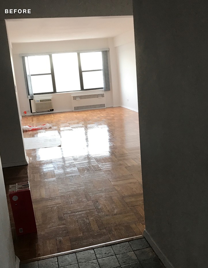
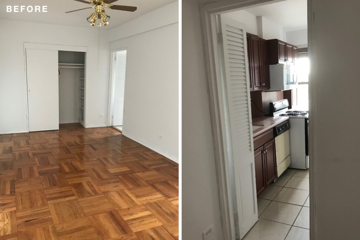
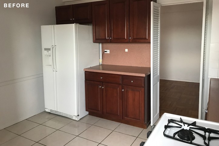
(Befores above) Dining room cabinets replaced the closets (l.); kitchen entry located to the right. The wall was removed.
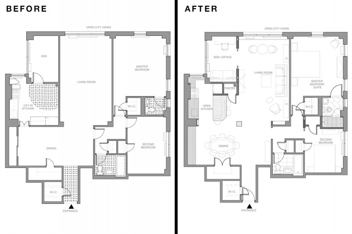
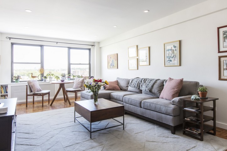
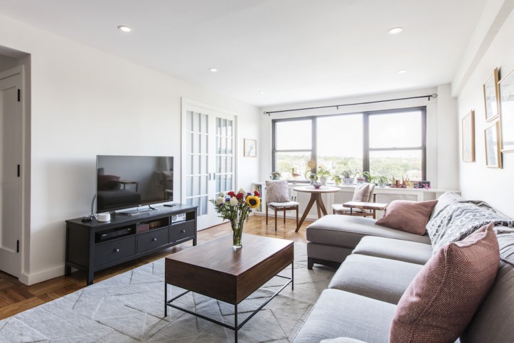
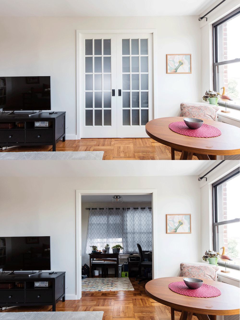
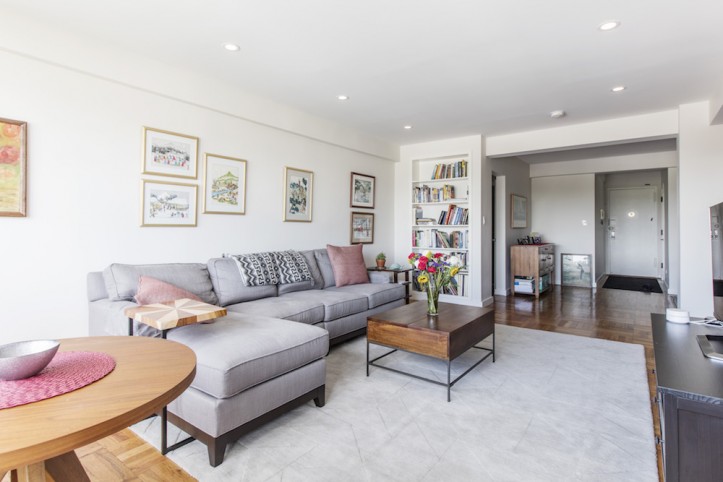
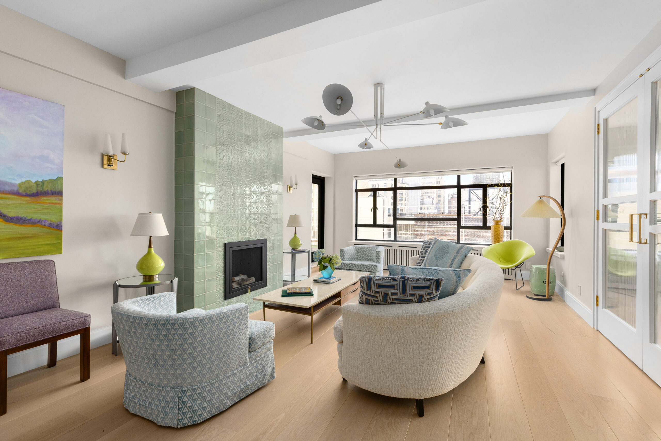
In the common spaces, a reconfigured layout maximized the open space for entertaining and cooking. A windowed den was previously accessible through the kitchen, but a reorientation connected it to the living room, which made more sense. The den could double as a guest room when necessary but would serve as a corner office on a daily basis. The pocket doors, which created an opening of six feet, could be left open so that more natural light entered the living room.
Sweeten brings homeowners an exceptional renovation experience by personally matching trusted general contractors to your project, while offering expert guidance and support—at no cost to you.
Renovate expertly with Sweeten
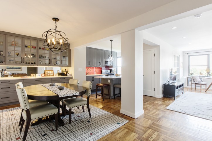
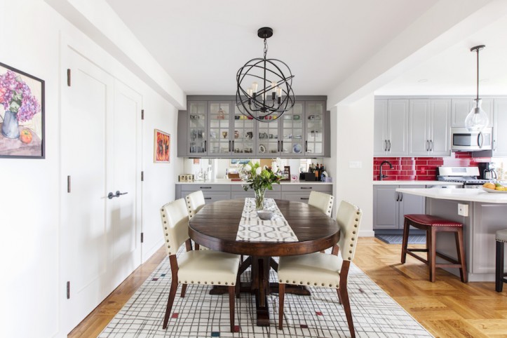
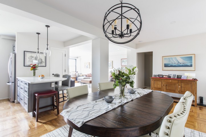
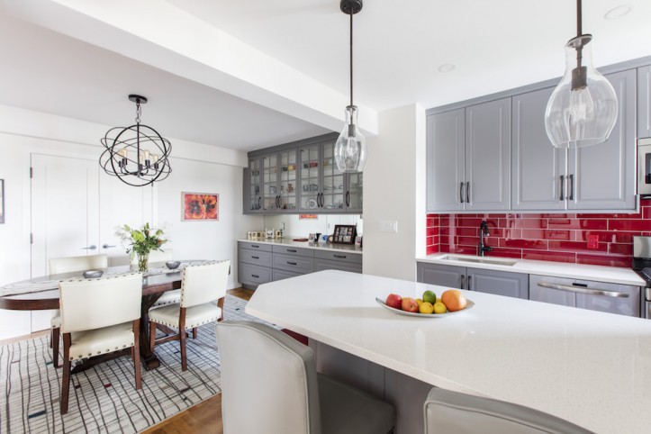
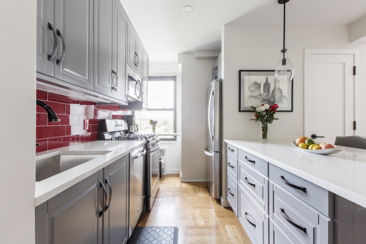
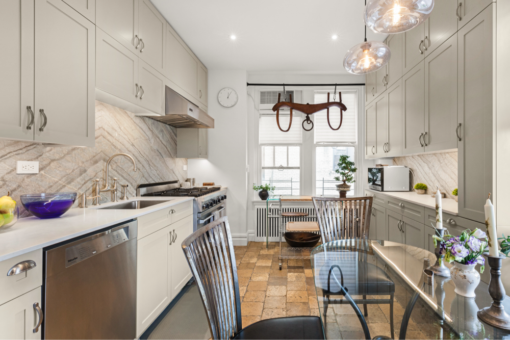
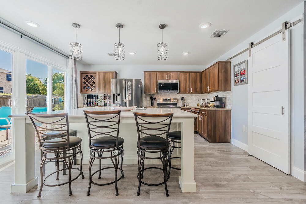
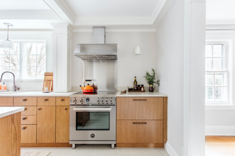
The kitchen, which previously had a tile floor, was re-laid with hardwood to match that in the living room. The new continuous flooring helped unify the now open-plan living area. “Our new kitchen was outfitted with gray IKEA Bodbyn cabinets and glossy deep crimson glass tiles for the backsplash. It’s the extra special spark to our gray kitchen,” Marie said. The tall upper cabinets take advantage of the high ceiling and provide extra storage space. “Based on our own past experience, we chose quartz countertops,” she added. “The fact that it is practically indestructible met our desire for a low-maintenance lifestyle.”
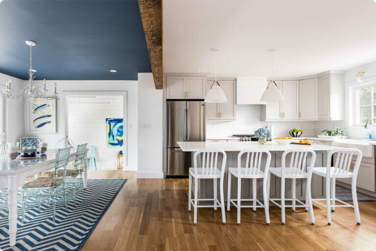
The demolition of a wall between the kitchen and the dining alcove transformed the previously dark space into a brightly lit and well-integrated dining area. Their Sweeten architect also replaced the existing closets at the back of the dining space with additional cabinetry that matched the kitchen. Upper cabinets were faced with glass and a mirrored backsplash which the homeowners loved. A spherical chandelier in bronze was hung above the dining table as a statement piece.
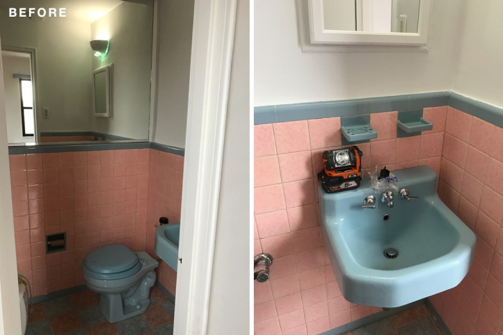
The next major transformation was in the master bath, which was originally a powder room (they planned to borrowed square footage from a second bedroom). The tiny space had no room for a shower, which the homeowners wanted, so the architect embarked on an arduous process of convincing the co-op board that increasing the footprint of the bathroom, which involved creating wet-over-dry conditions (something that’s usually a no-no for co-ops), would not be a problem.
In order to allay the concerns of the board, the architect met with the board and building engineer to go over all of the precautions that would be taken as well as the materials that were chosen and installation methods. The result of their architect’s perseverance: excellent water- and sound-proofing so that neighboring apartments would not be affected.
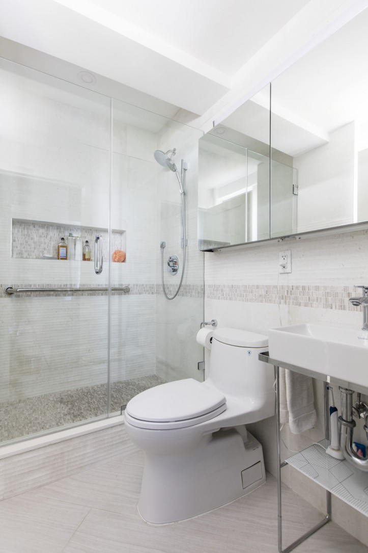
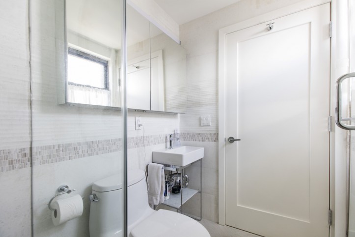
They chose light-colored tile for the floors and walls, with accent tiles for the shower floor and niche. The design included a long safety bar inside the shower for more stability when showering—one of the features that would accommodate Marie and John as they age. A large square sink from Duravit sits on a stand with modern lines and one shelf below.
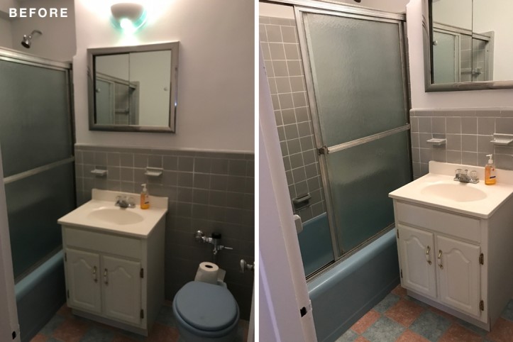
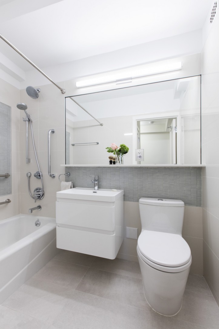
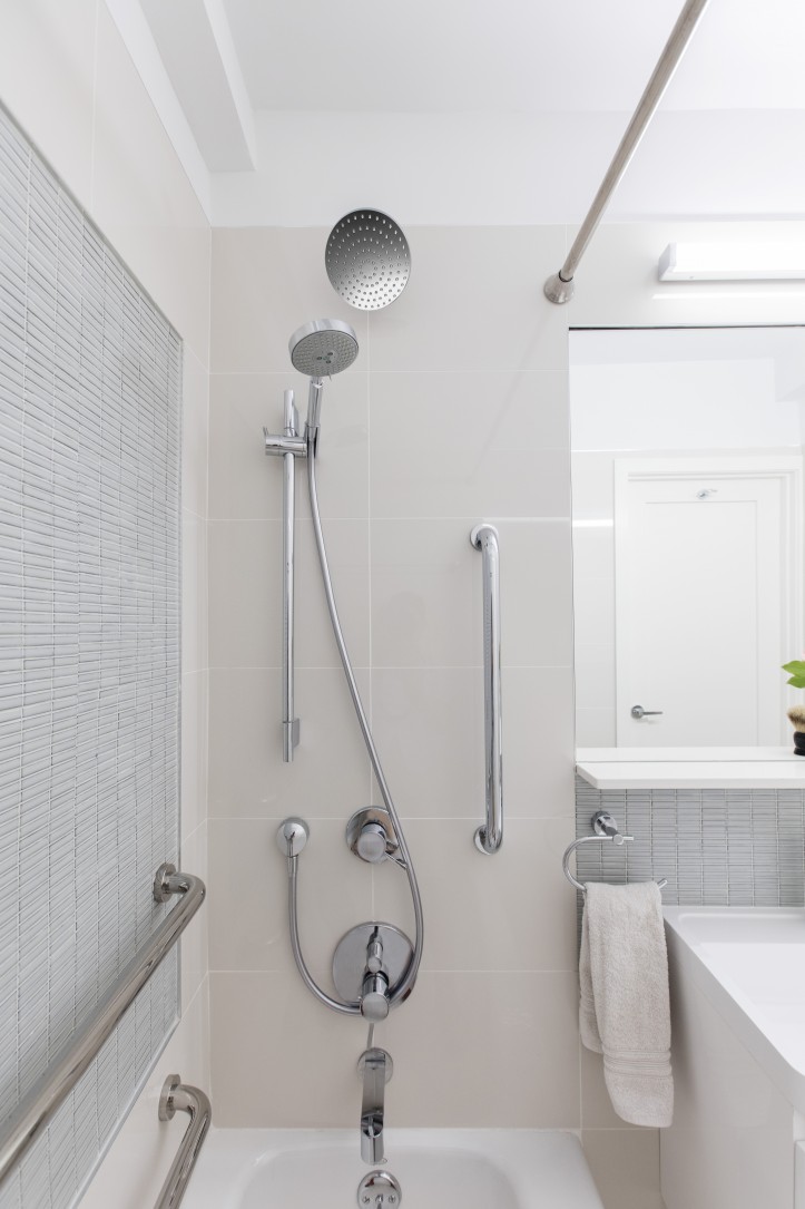
The guest bath featured a large mirror with a stone shelf beneath and lighter colors. Safety handlebars were also added to the inside of the bathtub wall. For easy cleaning and to free up the floor space, wall-hung sinks were installed. “This bathroom has no window, but looks bright, large, and attractive,” Marie said.
The renovation was a true collaboration between the homeowners and the architect. Marie explained, “Our Sweeten architect was extremely helpful, making suggestions, listening to our opinions and helping us decide. She seemed to be totally invested while following our tastes and budget.”
How do they feel about their new home? “Our new space feels comfortable and cozy,” Marie said. “The natural light combined with our light fixtures make it a happy place to live. We feel very much at home…like we have been here for a long time.”
Thank you, Marie and John. We hope you’ll have many happy family gatherings in your new home!
Get even more advice on renovating a home for aging-in-place with Sweeten’s cost guides:
Costs & Tips to Improve Home Accessibility
Kitchen Remodeling Cost Guide
Bathroom Remodeling Cost Guide
KITCHEN/DINING ROOM RESOURCES: Bodbyn cabinets: IKEA. Quartz countertops: Caesarstone. Loft Cherry Red polished glass subway tile backsplash: TileBar. Franklin Iron Works Ellery bronze sphere dining room pendant: Amazon.
MASTER BATH: Volcano Bianco floor tile, ivory matte wall tile, No. 12 porcelain wall tile in Super White: Nemo. Duravit DuraSquare Sink: YLiving. Wall-mounted polished chrome console: Quality Bath.
GUEST BATH: 24” Happy D.2 wall-mounted sink: YLiving. Haisa Picollo shower floor tile, Tread neutral floor tile, Stacked Dove trim tile: Nemo.
—
Native New Yorkers Margery and Jim Fields decided to return to the city when their kids grew up. See their renovation in the Clinton Hill Co-0ps.
Sweeten handpicks the best general contractors to match each project’s location, budget, and scope, helping until project completion. Follow the blog for renovation ideas and inspiration and when you’re ready to renovate, start your renovation on Sweeten.
