This 44-Square-Foot Clinton Hill Kitchen is Simply Grand
Marie Kondo inspires Japanese-style storage in one of Sweeten’s smallest kitchen renovations
- Homeowners: Architect Brett Masterson posted Sunghee and Joseph’s project on Sweeten
- Where: Clinton Hill, Brooklyn, New York
- Primary renovation: Integrating a kitchen and entryway for more storage with a modern Japanese aesthetic
- Sweeten’s role: Sweeten matches home renovators with vetted general contractors, offering advice, support, and up to $50,000 in financial protection—for free
Guest blog post by architect Brett Masterson
Storage space with a Japanese vibe
Joseph, an immigration lawyer and painter, and Sunghee, a curator and former director of Art Space Pool, a non-profit art space in South Korea, rented their mid-century Clinton Hill co-op in Brooklyn for several years before purchasing it from the owner. They were lucky the 606-square-foot apartment had been modernized before they moved in with new white oak floors, kitchen upgrades, and bath updates with Ikea products. When it became their own, they wanted the home to reflect their modern Japanese aesthetic and to have additional storage space.
They turned to architect Brett Masterson of Masterson Architecture & Design Co., who had renovated his own one-bedroom in their building. They were impressed by how he had maximized his even smaller space and created custom storage solutions that disappeared when not in use.
Integrating lifestyle and function
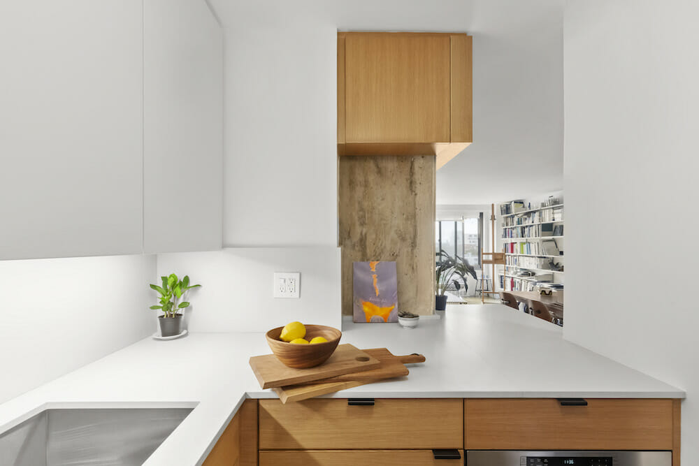
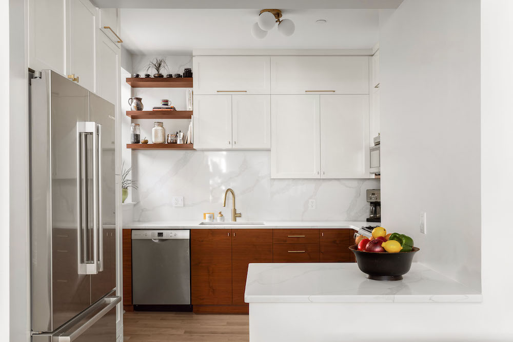
The couple’s main objective for the 44-square-foot area was to open up the closed-off kitchen to the rest of the apartment and, ideally, double their storage space. The marriage of the Japanese aesthetic—minimal hardware, natural and warm materials—with clever organizational solutions drove their vision. “The project was like a renovation version of author Marie Kondo’s KonMari Method™ for tidying up,” the architect said.
Brett spent a lot of time understanding how the couple used the space: their lifestyle patterns, what they had for breakfast, and how they spent their evenings. He wanted the renovation to adapt to Sunghee and Joseph’s routines, while also streamlining their day-to-day through purposeful design and space planning.
Built-ins and organizational systems
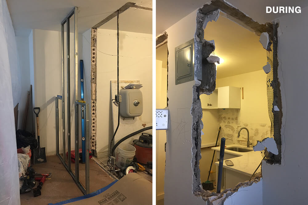
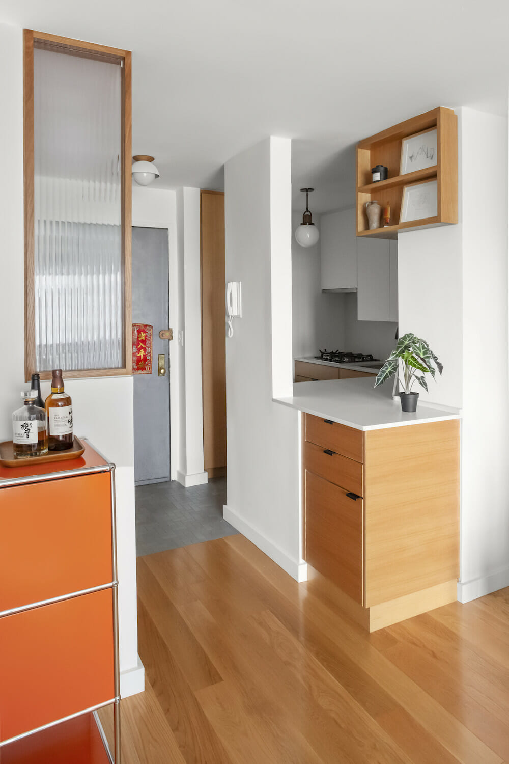
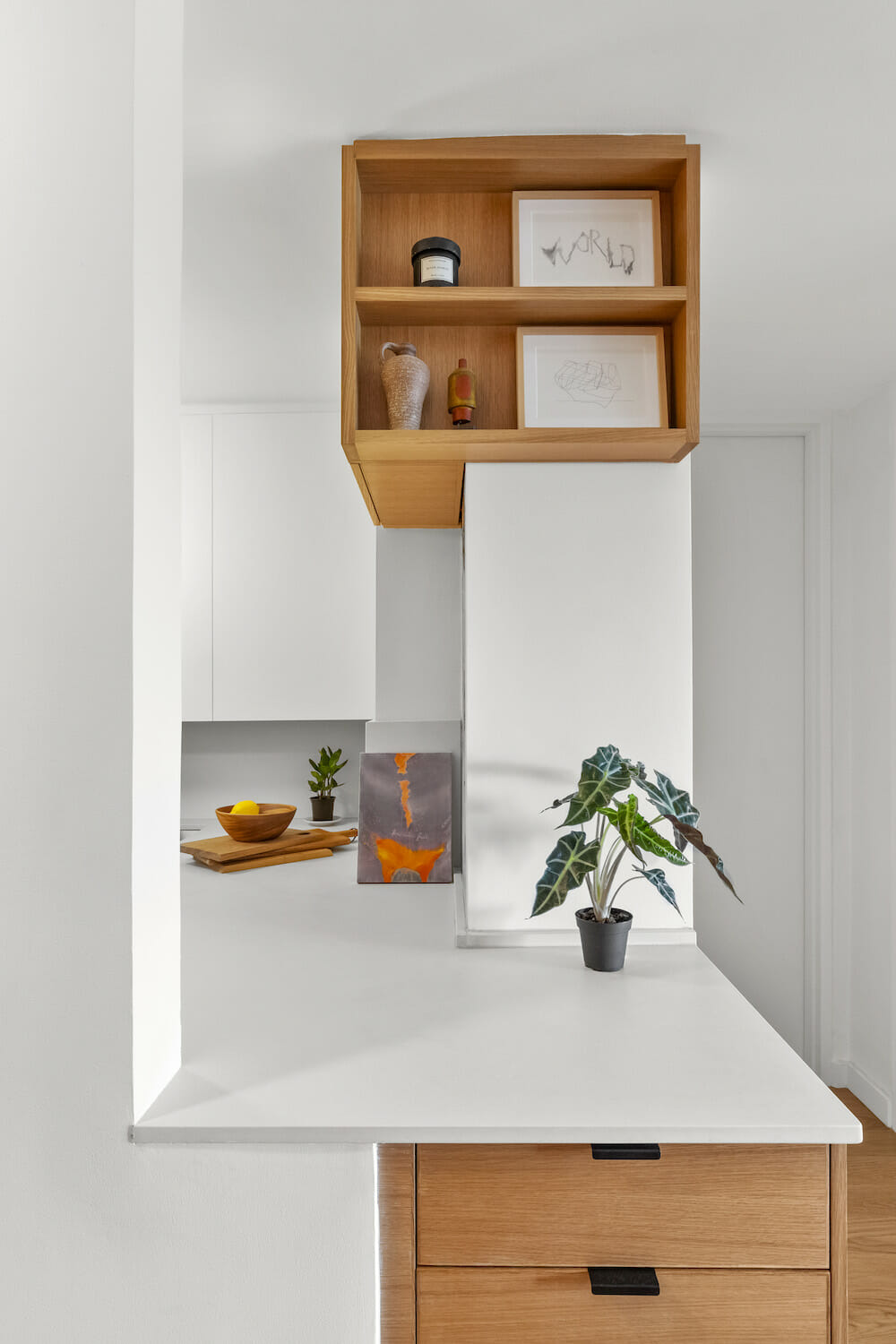
They faced challenges right away: First, it took a long time for the co-op board to approve the project. Then, the co-op board wouldn’t allow the wall where the electrical panel and intercom were located to be removed. That limited how open they could make the kitchen on one side. They still were able to open the wall that faced the large living room windows, which meant they could have a direct sightline to the outdoors and add to the open feel. They also flipped the electrical panel to the inside of the kitchen so it wasn’t as visible. A base cabinet at the wall’s cut-out that Brett calls “the landing strip” is a place to kick off shoes, store keys, wallets, etc.
Renovate expertly with Sweeten
Sweeten brings homeowners an exceptional renovation experience by personally matching trusted general contractors to your project, while offering expert guidance and support—at no cost to you.
The small kitchen didn’t have enough working space for two people to comfortably prepare a meal together. The compact fridge took up a quarter of the kitchen, so they relocated it to a new adjacent storage wall across the entry hallway. That was a game-changer since it increased the amount of prep space by 200 percent.
The existing storage situation also made the room feel cluttered as well. The couple was storing things in the space between the tops of the cabinets and the ceiling and were keeping things out on the counter.
Utilitarian needs and modern looks
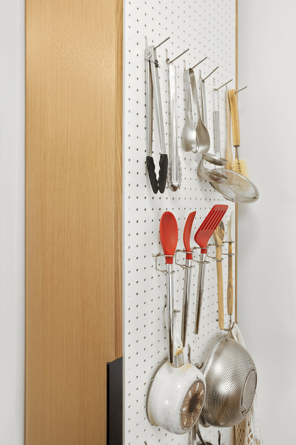
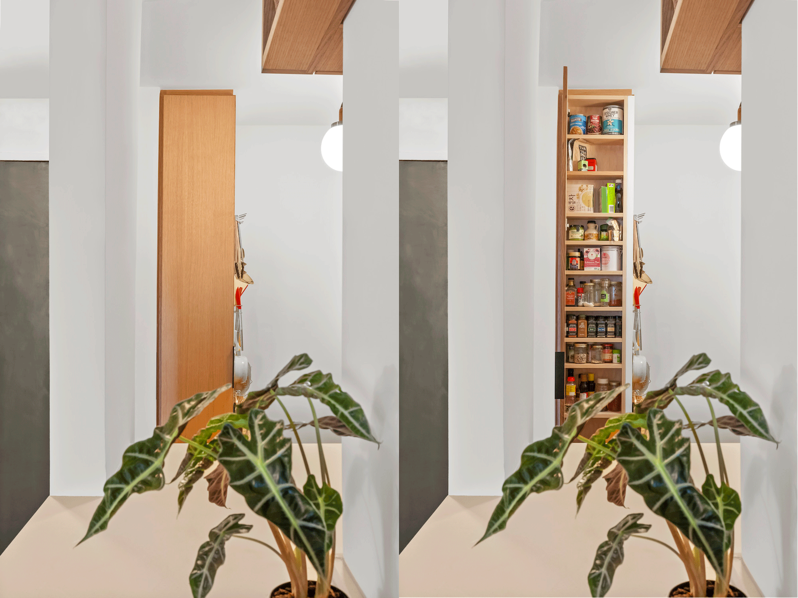
The architect placed a pegboard panel on the outside face of a six-inch deep cabinet (used as a pantry to hold mason jars and cooking ingredients). The board, which holds regularly used items such as a knife block, cooking utensils, a basket of onions, cast iron pans, is only visible when someone is standing by the stove. After things are washed, items can be hung to dry, which skips a stop at the drying rack and helps eliminate clutter. They also separated the cooktop and oven so cooking and baking could be done at the same time—a benefit they were not expecting.
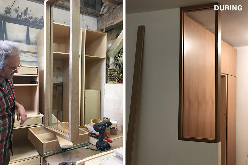
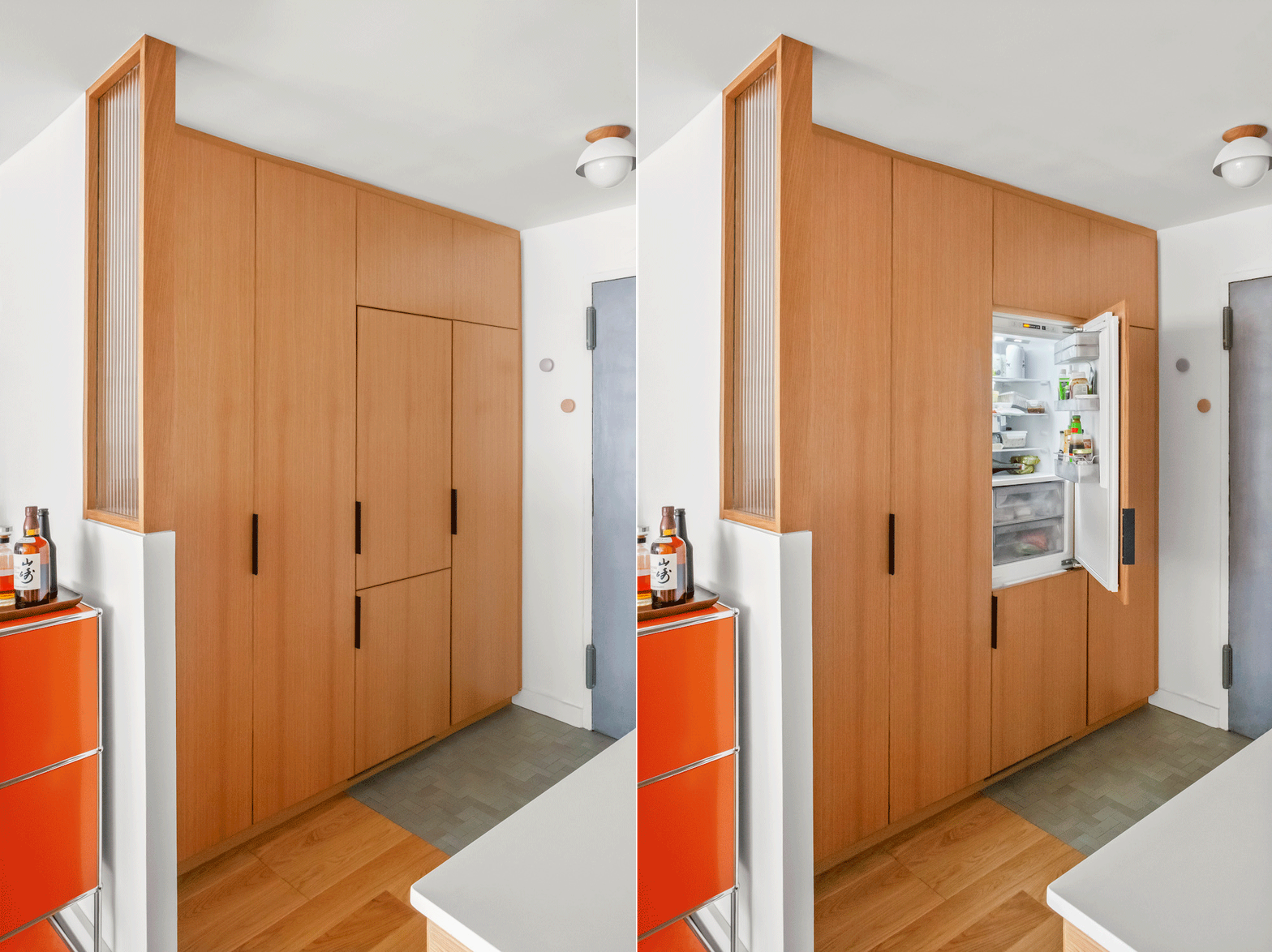
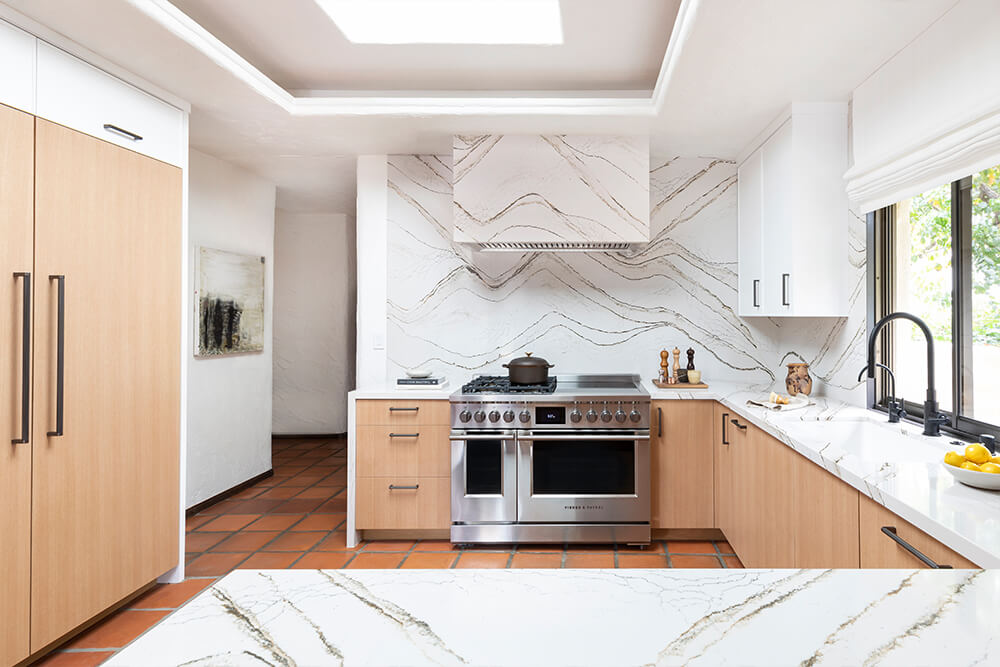
The most important part of the storage solution design was the wall of book-matched white oak cabinets in the entryway. The cabinets look the same from the outside, but each was designed for a specific need: Cabinet one is an entry storage wall with space for shoes, vacuum, dustbin, and microwave; Cabinet two is a panel-ready refrigerator; Cabinets three and four are a double-door unit that houses a modular ELFA shelving system that Joseph and Sunghee already owned.
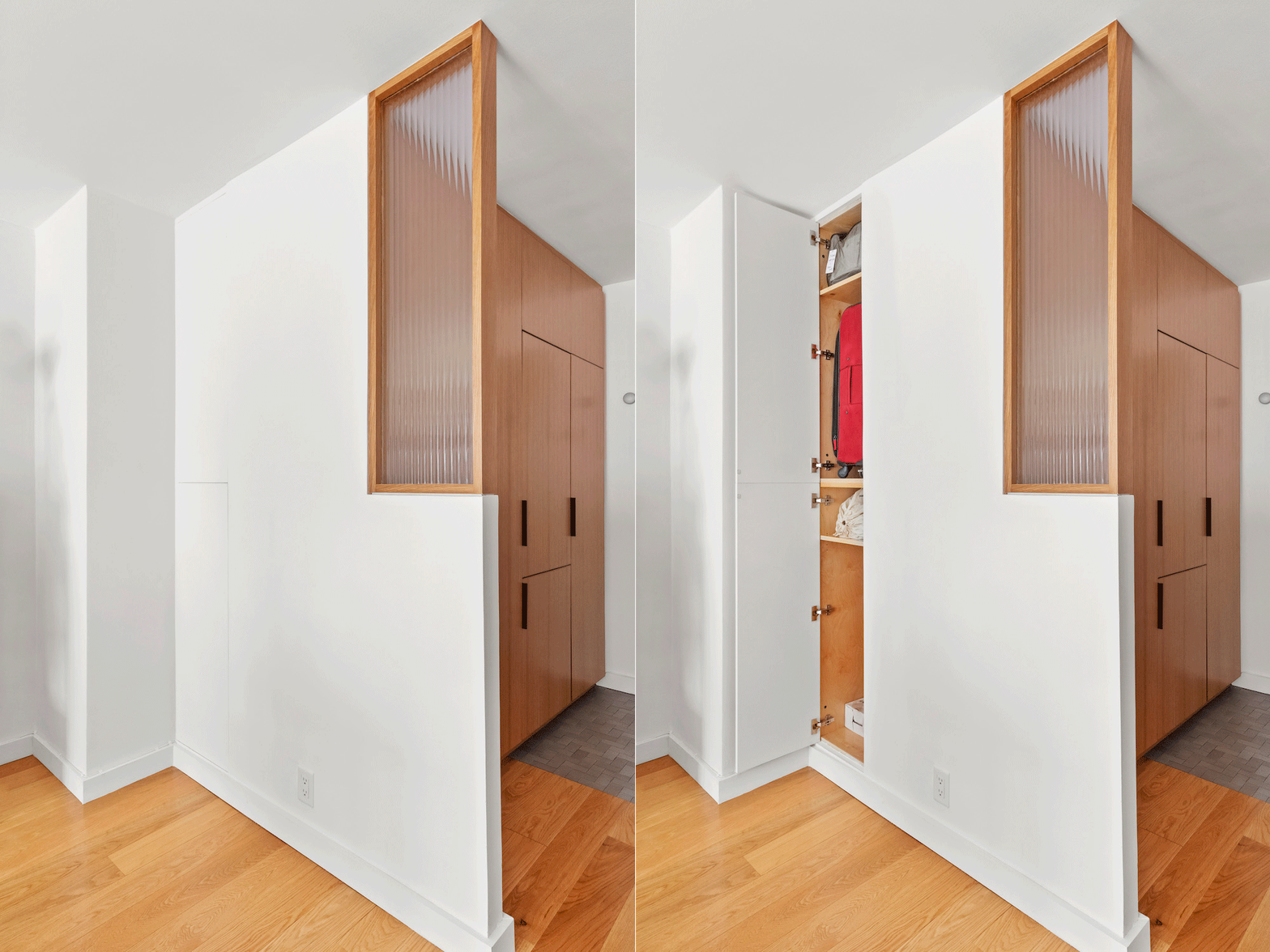
Brett also discovered an unused pocket behind the cabinet wall where they were able to hide a cabinet that is flush with (and blends into) the sheetrock wall. The cabinet opens on the living room side and houses the couple’s luggage for easy access since Sunghee travels to Korea regularly.
A limited and complementary palette
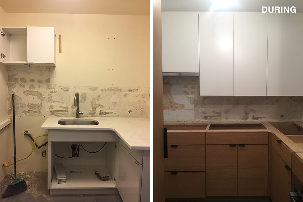
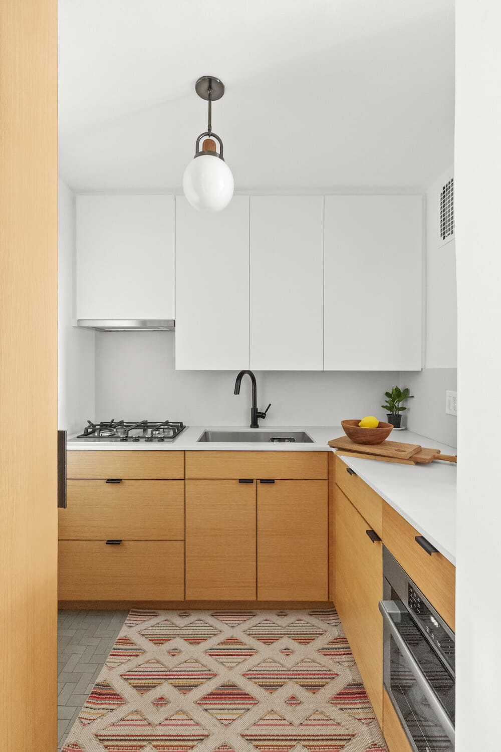
A limited materials palette helped unify the renovated kitchen with the rest of the apartment and complemented the couple’s furniture and art collection. They primarily used rift-cut white oak for the cabinets and shelving because the flooring, dining table, and bench were white oak. They also chose to paint all the upper cabinets white to lighten the mass of storage cabinets above the sink and blend into the wall.
(Above) Sweeten homeowner, Joseph
Brett, Sunghee, and Joseph are all pleased with the way things turned out. The architect had shown the couple plans in 3D to help them visualize how their kitchen would meet their needs and look the way they wanted it to. Ultimately they created “a spot for everything they needed and nothing they didn’t,” he said.
They enjoyed selecting lighting and tiles, and Sunghee, in particular, loved seeing the contractor work. (She felt like she was apprenticing at times because she spent so much time watching the construction team.) The architect says that he was excited to try some new, well-made high-end materials, such as Heath ceramic handmade floor tiles (set in a herringbone pattern) and custom lighting.
Architectural experience
While this project was a first for Sunghee and Joseph, Brett has renovated more than 20 homes (three of them his own). He offers this advice: “Be prepared to spend 20 percent more and for projects to take 20 percent longer, and don’t live in the space while work is being done.” But it’s not all cautionary. “You can splurge on nice things in small spaces without too much of a financial impact on the project.”
Thank you, Sunghee, Joseph, and Brett for sharing this beautiful—and smart—space!
Renovation materials
KITCHEN RESOURCES: 2″ x 4″ floor tile in Fog: Heath Ceramics. Custom rift-cut white oak cabinets: Custom by general contractor. Hardware: Top Knob. 3/4″ countertops and backsplash in Fresh Concrete: Caesarstone. Pax Series sink: Kraus. Faucet: Brizo. Smeg refrigerator: Smeg. Bosch stove, gas range, and hood: Bosch. Lighting: Allied Maker.
–
Need to make the most of a small kitchen? Check out these space-savvy ideas.
Sweeten handpicks the best general contractors to match each project’s location, budget, and scope, helping until project completion. Follow the blog for renovation ideas and inspiration and when you’re ready to renovate, start your renovation on Sweeten.
