Home / Blog / Before & After / Entire Homes
A Historic Brownstone Renovation in Crown Heights
Looking for a “bring your architect” wreck, Jerry and Janet fell for a brownstone with a stately presence and a virtually unsalvageable interior. The couple posted their historic brownstone renovation project and found a Sweeten architect and a Sweeten general contractor to restore the once-glorious home. Read on down to see how this couple honored the building’s original architecture and also made room for modern conveniences and an almost-all-IKEA kitchen!
- Homeowners: Jerry and Janet, Crown Heights homeowners, with Janet running the New York School of Design, posted their brownstone project on Sweeten.
- Where: Crown Heights, Brooklyn, New York
- Primary renovation: A two-phase renovation of a four-family brownstone that reworked apartment layouts into larger one-bedroom units, updated kitchens, and bathrooms. It also opened up the main living areas for more light and flow.
- Homeowner’s quote: “During the build-out phase, we had weekly walk-throughs with our architect and contractor. I realized that this was very important and ensured that the project progressed smoothly.”
Crown Heights criteria for a historic brownstone renovation


Historic brownstone, close to trains, and a (relatively) affordable neighborhood. These were our criteria when we selected Crown Heights as our new home.
A few years ago, we had moved out of the city to Long Island, but immediately missed our friends and the shorter commute. Janet, who runs the New York School of Design, a fashion design school, wanted to have input on the layout and fittings of our new home.
So we decided to limit our search to townhouses that needed a gut renovation. We only looked at listings which included the term “bring your architect”—you know the type.
We can help plan your renovation
Find endless home renovation inspiration, detailed guides, and practical cost breakdowns from our blogs. You can also post your project on Sweeten today and get matched with our vetted general contractors and get estimates for free!
From bidding war to historic brownstone renovation plan
After many open houses and a fierce bidding war, we were given the keys to a four-family brownstone that “had good bones” but needed a little TLC. During our initial walk-through as new homeowners, it suddenly hit us—the prospect of such a big renovation was really daunting!
We used Sweeten, a free service that matched us to our architects. Sweeten also suggested three different contractors who each made proposals. We chose our general contractor and together, we got started.
The goal of our townhouse renovation was to create the perfect mix of old and new. We loved pre-war architecture and wanted to preserve as much of the original detail as possible.
During this process, we worked with our architect to think of ways to match the original detail with newer materials. We wanted to rethink the apartment layouts and convert the two-bedroom units to large one bedrooms. In addition to updating the kitchens and baths, we hoped that an open layout would feel brighter and more spacious.
Due to budget and timing, we decided to renovate the four apartments in two phases. At the time of this blog post, two apartments are finished. We are currently living in one of them and preparing to rent it out after the other units are complete.
During the demo phase, a lot of time was spent assessing what could be restored and what needed to go. The contractor tried to salvage the original ceiling medallions, but they crumbled once the nearby popcorn ceilings were removed.
In the kitchen, it was a pleasant surprise when we found excellent condition hardwood floor underneath the linoleum. We were elated when we discovered that the stairways were in great condition and could be refinished (apparently, new stairs are very expensive).
It was a rough day when we found out that the main supporting beam for the building (wooden and over 100 years old) needed to be replaced with a steel beam—a big unforeseen expense. But we were thankful that the general contractor was meticulous and didn’t take any shortcuts in safety.
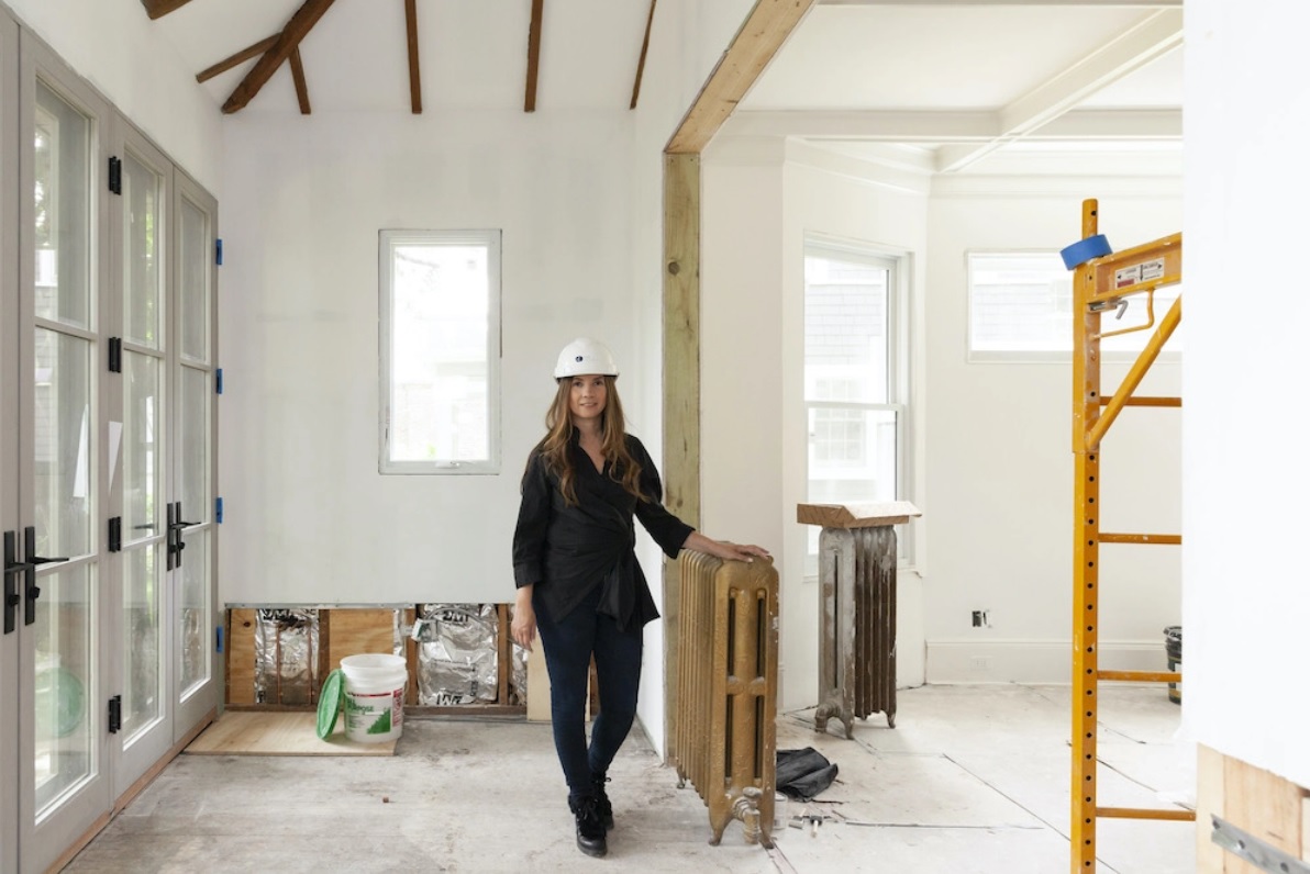
After demo, we then installed new electrical, plumbing, and gas heating. Next came the framing of the walls to create the new floor plan. The layout is what really makes the apartment special.
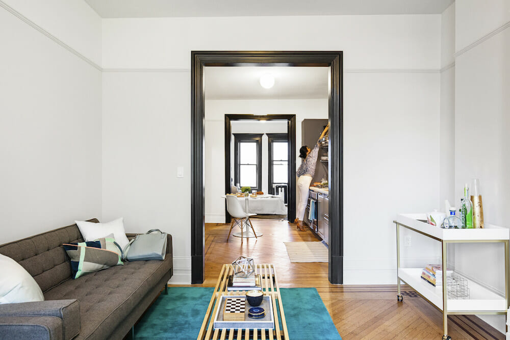
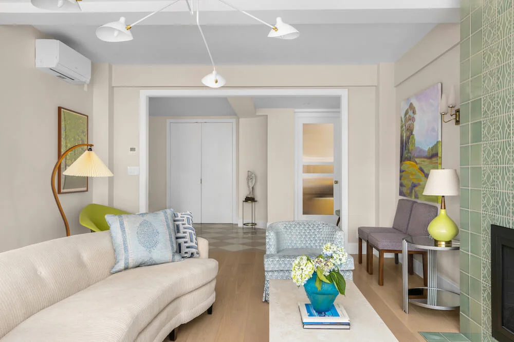
We joined the living room and an adjacent closet so that the entire area is larger. This created a small alcove, which is now a quiet sitting area bathed in natural light. The living room then flows into the kitchen and dining area.
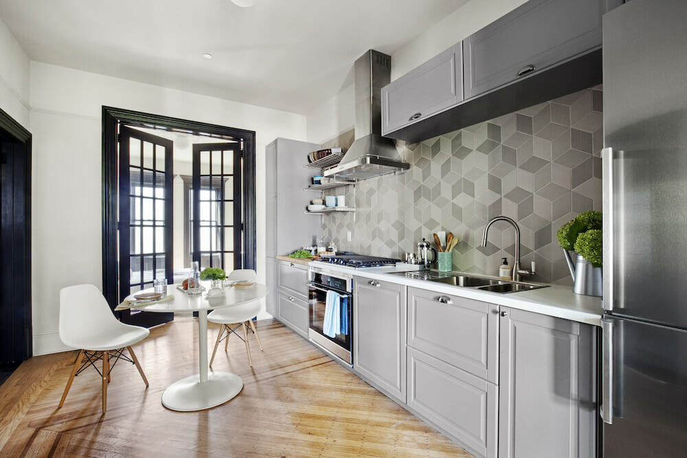
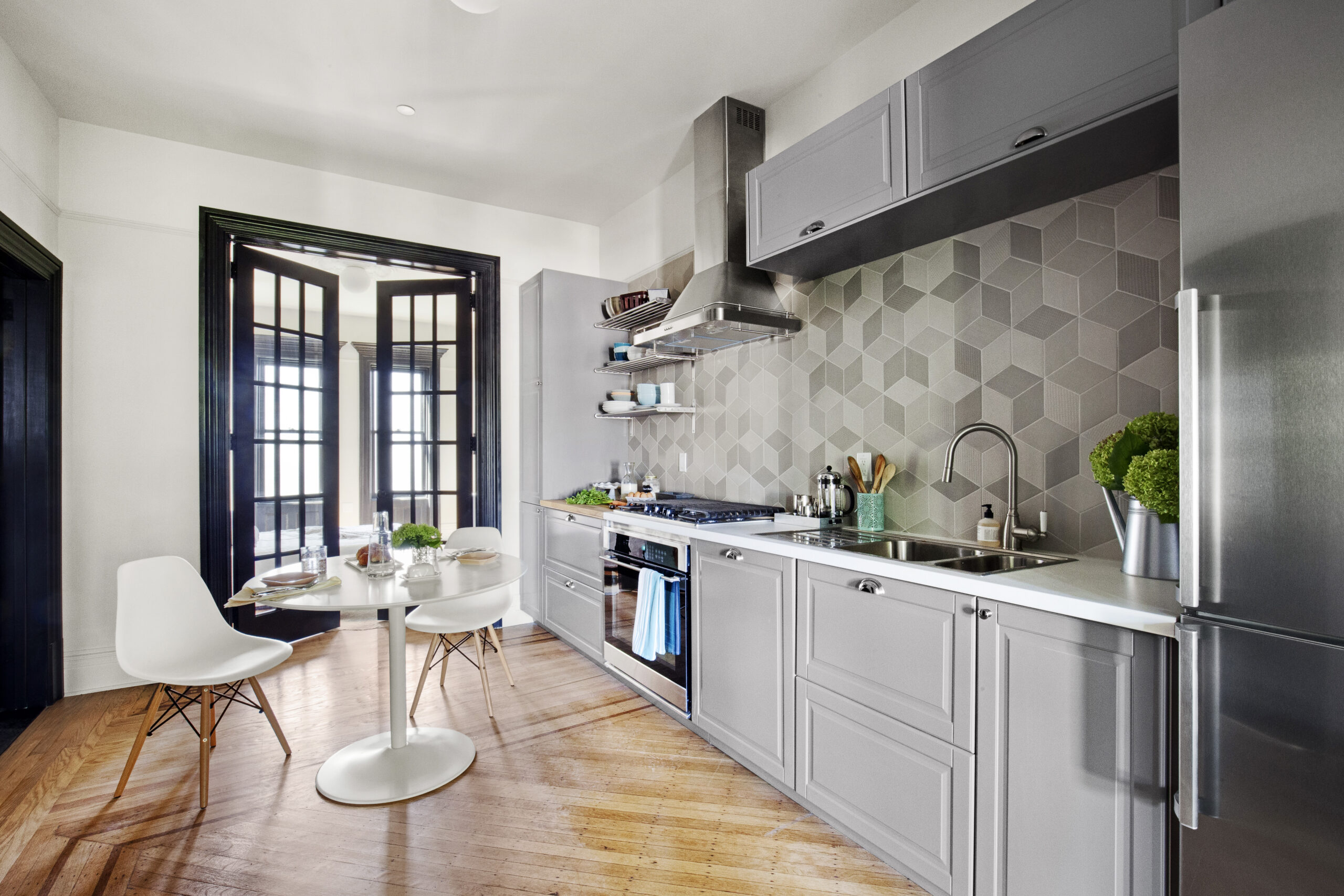
Eight-foot French doors separate the kitchen from the bedroom. The doors, even when closed, allow more light to flow into the apartment. Sweeten brings homeowners an exceptional renovation experience by personally matching trusted general contractors to your project, while offering expert guidance and support—at no cost to you. Renovate expertly with Sweeten
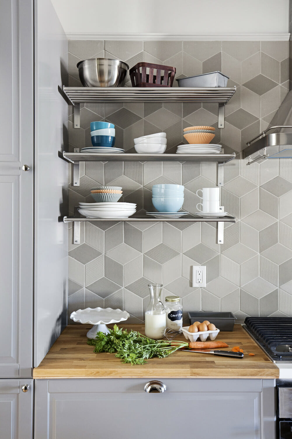
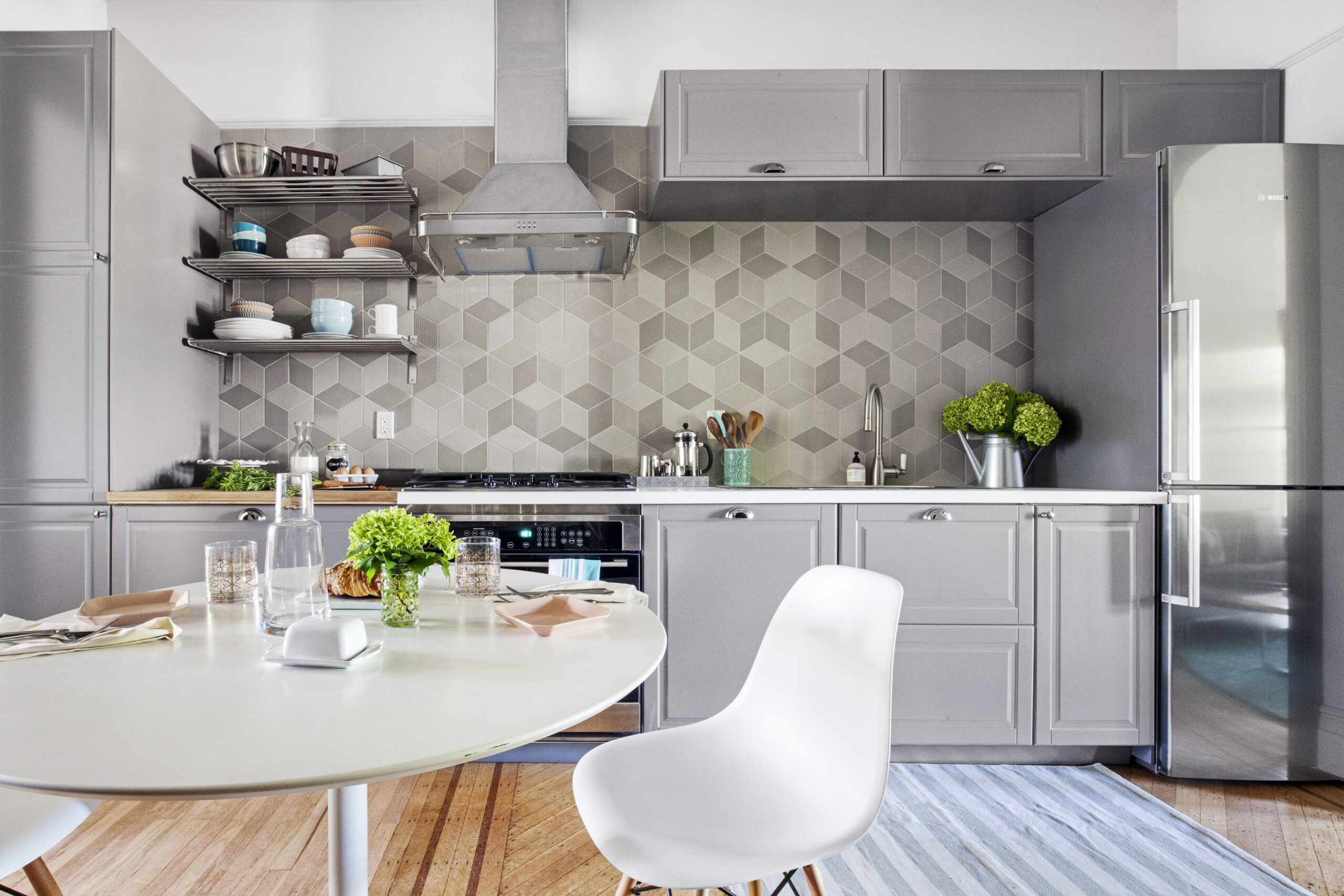
The kitchen was very important to us. We like to cook, so we really wanted extra counter space and built-in butcher block.
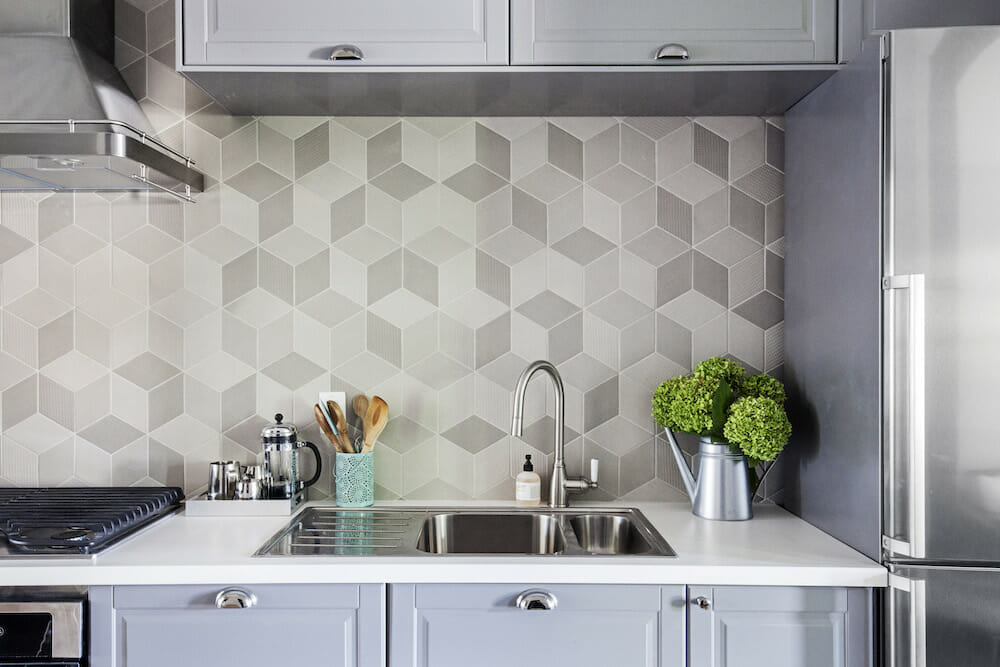
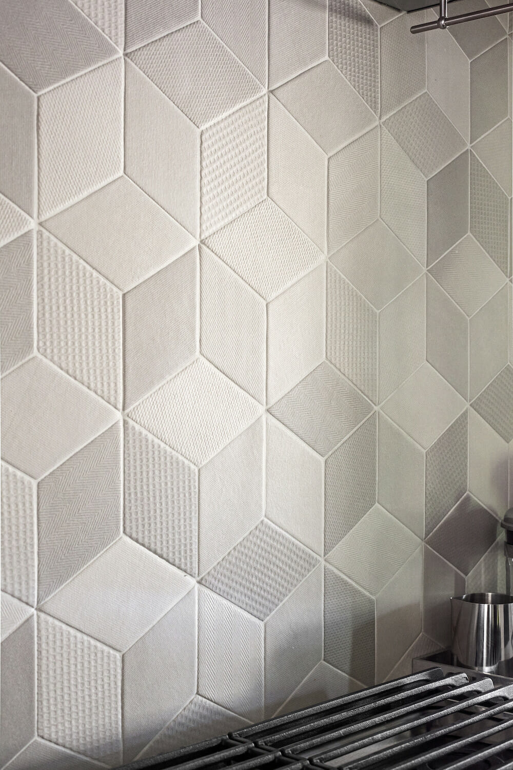
Gray cabinetry and shelving were arranged to maximize storage space, and we incorporated mixed-material countertops, as well as a sink, fridge, and dishwasher—all from IKEA. We chose a counter-depth refrigerator, which fit perfectly into the space. A geometric tile backsplash brings it all together.
Dressing room upgrade with restored original details
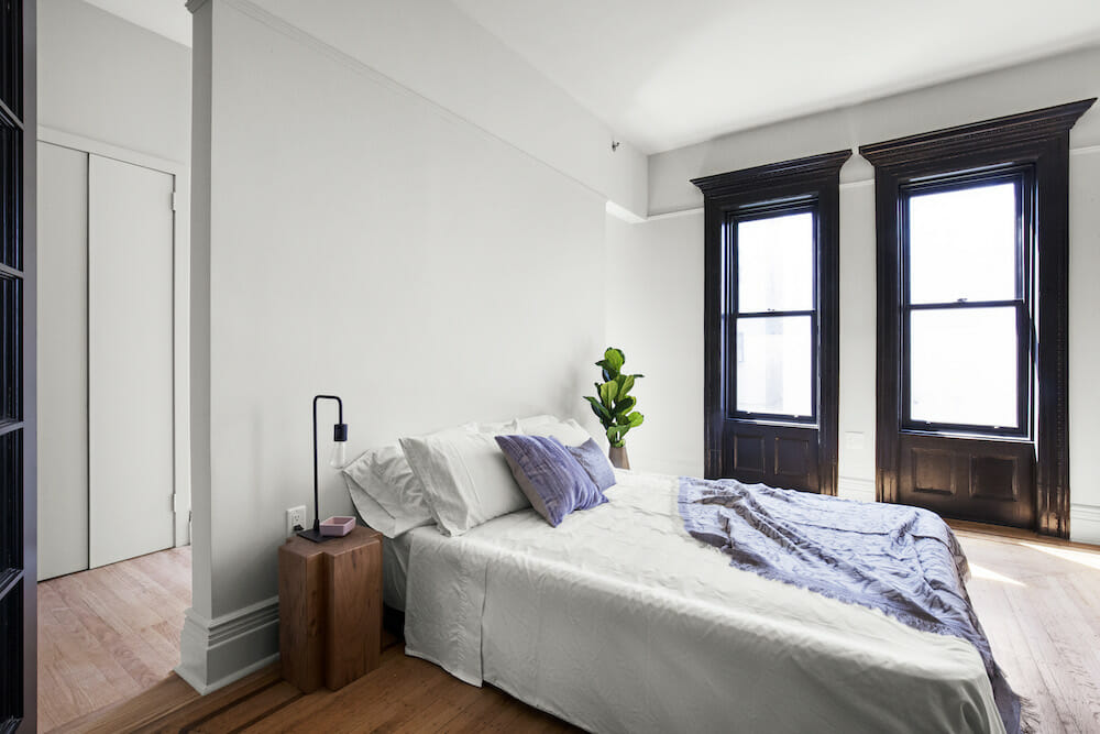
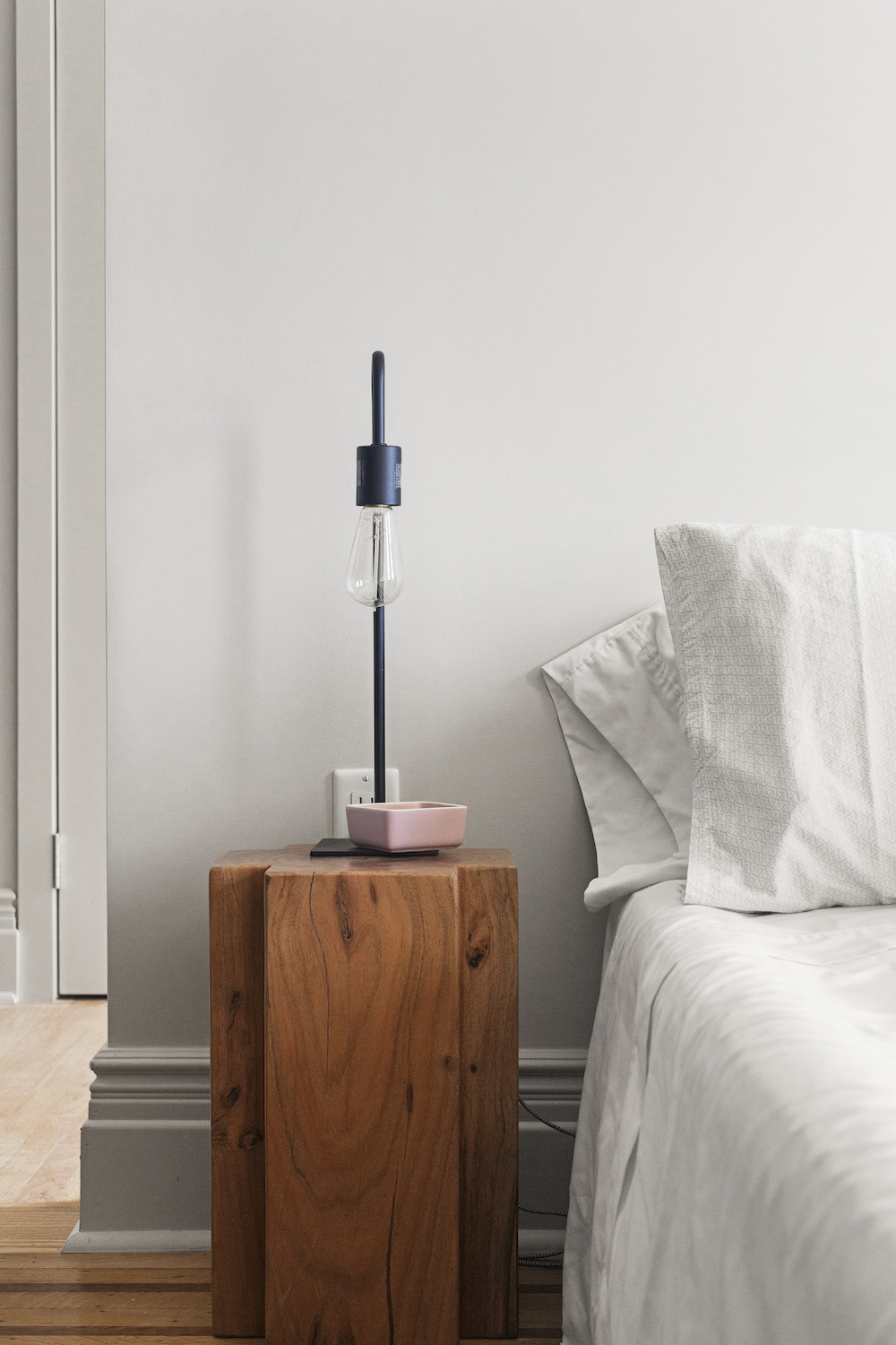
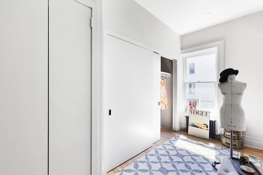
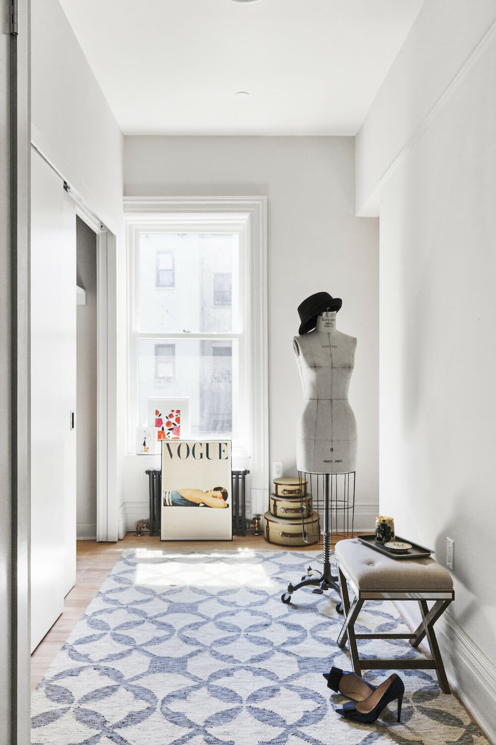
The bedroom is large enough for a king-size bed. We kept the existing wall between the kitchen and bedroom but converted the old kitchen into a dressing room.
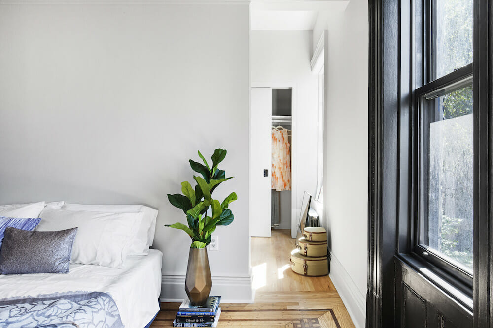
The dressing room is Janet’s favorite space. It has a huge closet, room for seating, and a full-sized washer and dryer. The bathroom has two entrances—one from the kitchen/dining area and a pocket door from the dressing room.
The window moldings and crowns are all original. We decided to paint them black to contrast with the lighter wall colors. All the doors are original and were reconditioned and adjusted to fit properly. We chose egg-shaped door knobs.
Picture rail moldings and new ceiling medallions were added. In the hallways, we restored the original wainscoting and created new panels to fill in missing or damaged areas.
Bathroom refresh and exterior facade updates
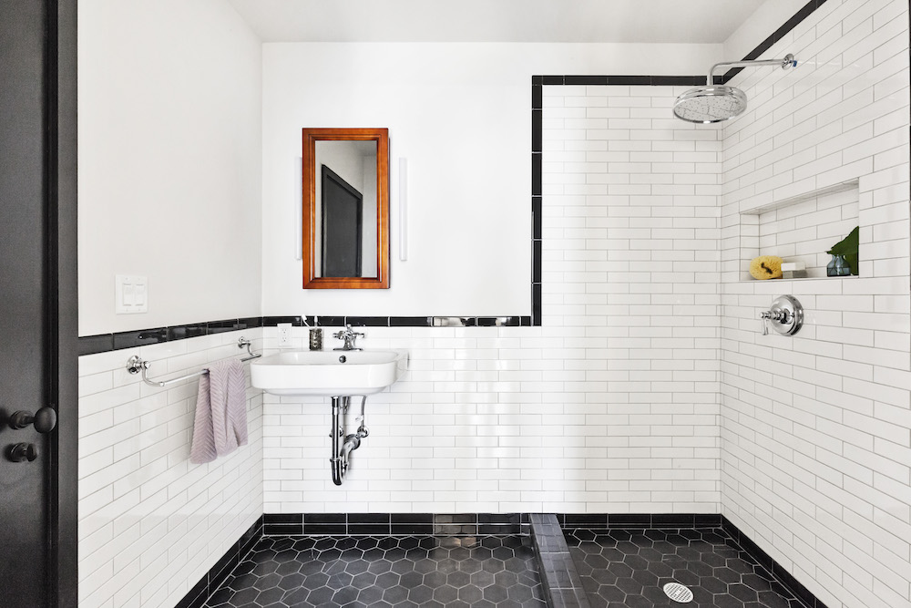
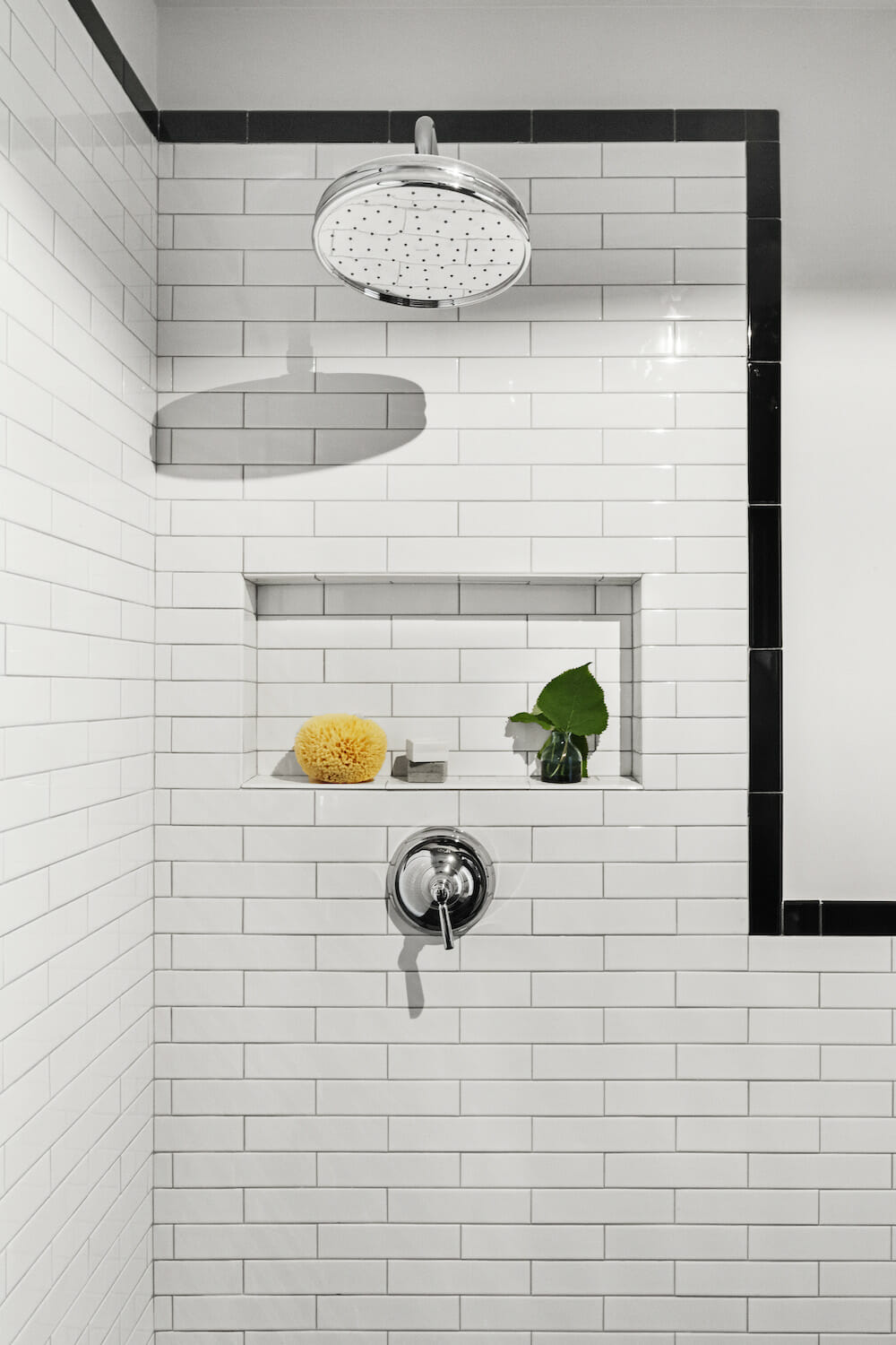
The bathroom was also designed to mix old and new. We chose a sink and toilet that would go well with the traditional fixtures. For added towel storage, we installed a separate rack. We chose to use elongated tiles, a twist on the traditional subway tiles. The matte texture of the hexagon floor tiles feels amazing on bare feet!
The building exterior also underwent a facelift. We first removed the ’70s screen door and awning. The exterior cornice was repainted black, allowing its architectural detail to shine. We chose a color called “Velvet Plum” for the main exterior.
We splurged and replaced the front door with historically-accurate mahogany double doors. While this was not cheap, it’s one of our favorite things about the building.
Weekly walk throughs kept the brownstone renovation on track
All this sounds like a lot of work and it truly was. During the build-out phase, we had weekly walk-throughs with our architect and contractor. I realized that this was very important and ensured that the project progressed smoothly.
Even though there were detailed architectural plans and specifications, there were often unforeseen circumstances that would require a quick decision. These meetings and open communication with the contractor helped avoid delays and insured that the build-out was to our liking. Because we watched as things were being done, we often gave last-minute input and even changed our minds about things a few times.
For those of you out there who are planning to do a similar project, I highly recommend that you be involved. I know it’s tempting to think, “Hey, I’m paying these people A LOT to do this for me and I just want to see the final result.”
That’s understandable. But, although it’s time-consuming and a bit of a pain, I guarantee that you’ll get a better end result if you are involved in the process like we were. In addition, your choice of general contractor is extremely important.
Since this was our first renovation, we had put a lot of trust in our team. We feel really fortunate that our contractor was honest and didn’t try to nickel and dime us on every little thing.
Looking back, we really didn’t know what we were getting into with such a big project (we blame cable TV renovation shows for misleading us). But, fortunately, with guidance from our architect and general contractor, the process ended up to be very positive. We absolutely love our new home!
Ready to renovate? Start here for free!
Here you can learn more about our services and locations. Alternatively, browse more home renovation inspirations, processes, and cost guides.
Renovation materials
EXTERIOR RESOURCES
- Facade paint in Velvet Plum, #CSP-420: Benjamin Moore
KITCHEN AND LIVING AREA RESOURCES
- Cabinets: IKEA
- Counters: IKEA
- Oven range: IKEA
- Sink: IKEA
- Refrigerator: Bosch
- Tex backsplash: Mutina
- Wall paint in Balboa Mist and Classic Gray, #OC-27 and #OC-23: Benjamin Moore
- Trim and molding paint in Universal Black, #2118-10: Benjamin Moore
BATHROOM RESOURCES
- Hexagon Floors: Nemo Tile
- Sink and toilet: Duravit
- Faucet and shower fixtures: Kohler
- Lugarno Trank Rack wall racks: Restoration Hardware
- Lighting: Schoolhouse Electric
- Wall paint in Intense White, #OC-51: Benjamin Moore
OTHER RESOURCES
- Doorknobs: Omnia
- Washer and dryer: LG
Frequently asked questions
A historic brownstone is a typically older townhouse or multi-family building known for its brownstone facade and classic architectural details. Many have original features like moldings, stairs, and millwork that homeowners often aim to preserve during updates.
No, it’s not hard to renovate an old brownstone building compared to building from scratch, so long as you work with an experienced contractor. An apartment renovation often brings tighter building rules and coordination with a board, and tearing down to rebuild triggers deeper permitting and structural scope.
Yes, Sweeten has contractors experienced in brownstone renovations. Working with a team that knows landmark rules, structural surprises, and tight city logistics helps protect your budget and timeline from the start.
