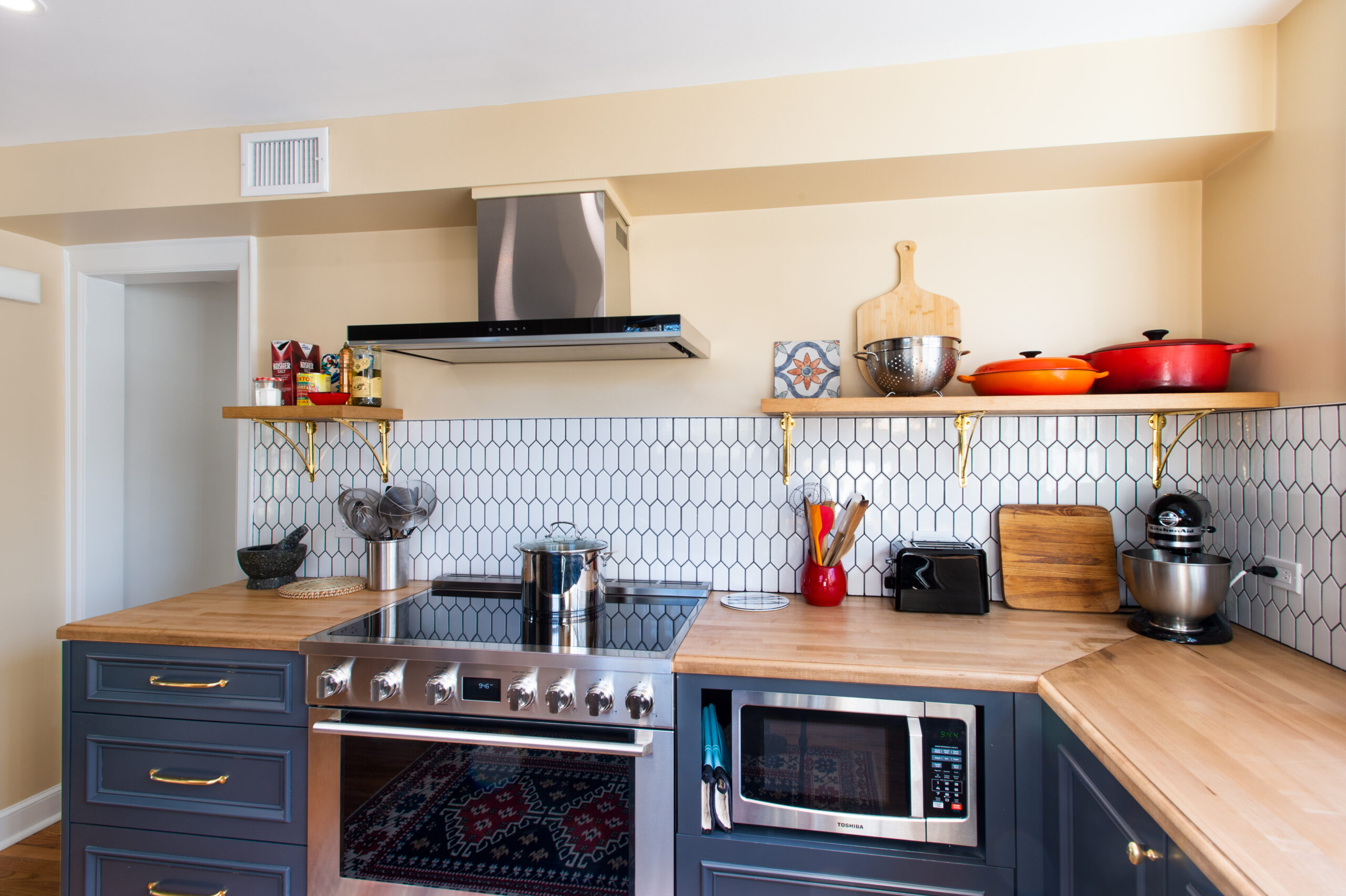
A Rental in a Brownstone Gets Fashionable
A Brooklyn couple renovate a rental unit for a warm welcome
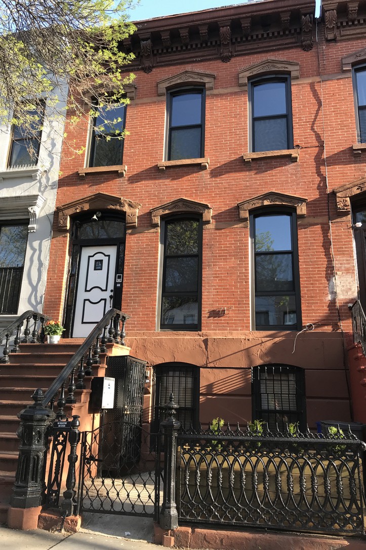
Bellamy, an executive at The GAP, and Zak, a senior environmental scientist, took their 119-year old Bed-Stuy brownstone and turned it on its head by flipping the way it was previously used. The new configuration puts the couple at the top of the building in a cozy duplex with a single-story rental on the garden level. To achieve this, they carefully planned their renovation budget to be allocated between the two living spaces. (See how they transformed the two floors of their own home here.) They came to Sweeten, a free service matching homeowners with vetted general contractors, to update the bathroom, add sliding doors, and create a new entrance for a private, light-filled rental unit.
Guest post by Bed-Stuy homeowner Bellamy
I owned a one-bedroom condo in Bedford-Stuyvesant, but when Zak and I moved in together we wanted a larger space for ourselves. So we moved out and rented for two years, which gave us the flexibility to take our time buying and not rush the search process. It worked in our favor since it took us almost eight months to find and purchase a home. We were specifically looking for a two-family house where we would be able to rent out a portion of the house to supplement the mortgage.
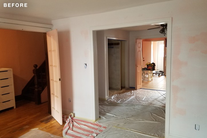
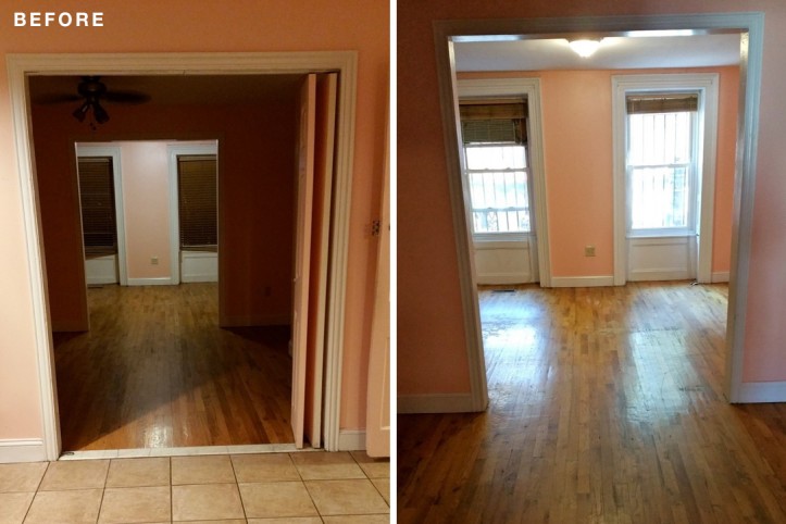
(Above) Before shot standing in the living room looking toward the kitchen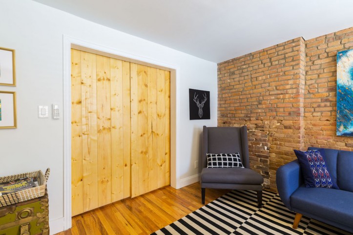
We found this perfect three-story brownstone in Bed-Stuy—2,400 square feet, about 800 per floor. It was built in 1899, and when we found it, there was a lower duplex and a top floor rental. We wanted to flip that scenario and posted our project on Sweeten. With help from our Sweeten contractor, we renovated the top two floors for ourselves and gave the rental a facelift.
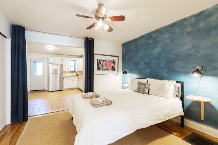
We were much tighter on our budget in the rental since we had spent the bulk of our money on our personal living space. The mantra was, “Make it simple, functional, and durable.” I wanted to add natural light and brighten the space and make sure there was complete privacy between our living space and the rental unit. A separate stairwell would have had to be created if the rental stayed on the third floor, and we’d lose a lot of existing footprint. By making our home on the top two floors and relocating the rental to the garden-level, we not only kept the square footage but it turned out to be the easiest and least expensive option.
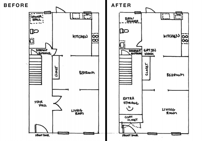
The first thing we did was close off access—which was a set of French doors—to the stairway going from the first floor and on up to our living space. This gave us an open area to create a coat closet when you walk into the rental unit. I loved that my contractor suggested pushing the coat closet as far back as we could which would otherwise have been wasted space inside the rental. Instead, the entire hallway now serves as storage space for Zak and I and a way to our basement that only we can access. Sweeten brings homeowners an exceptional renovation experience by personally matching trusted general contractors to your project, while offering expert guidance and support—at no cost to you. Renovate expertly with Sweeten
We did spend the majority of our budget in our living space. But I am happy with the areas we chose to upgrade in the rental.
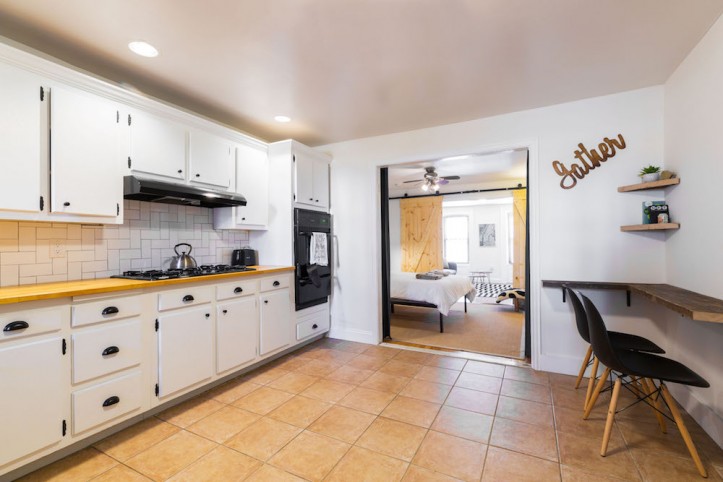
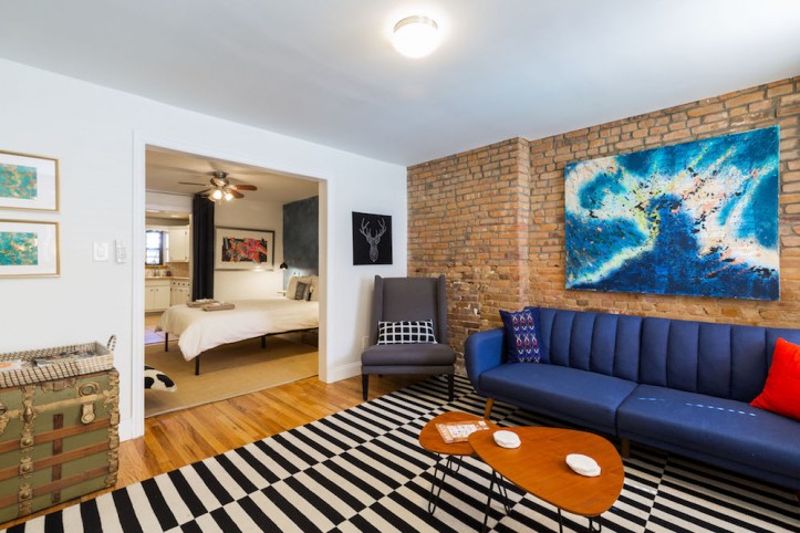
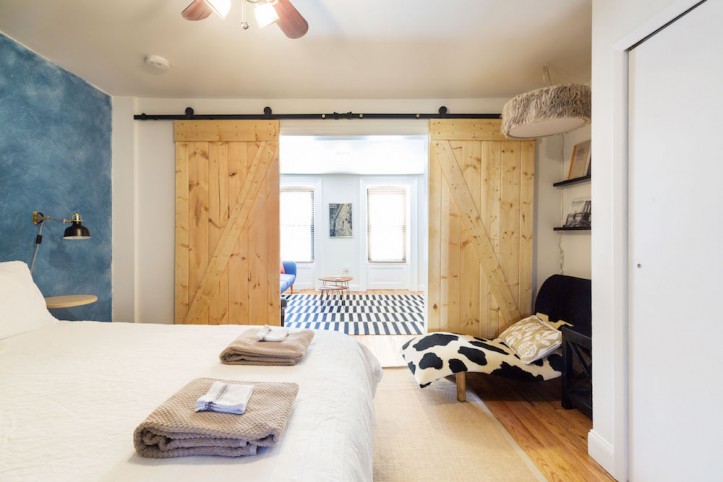
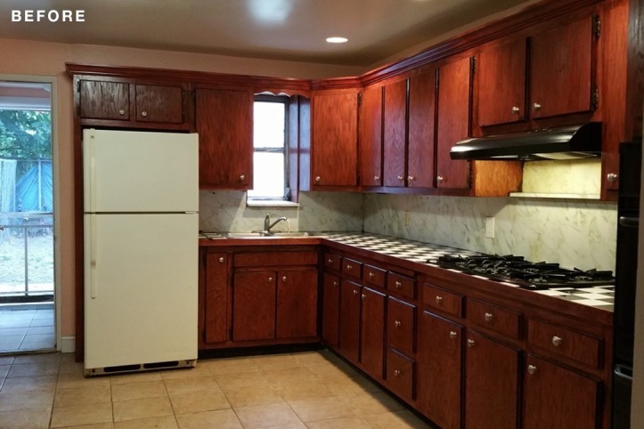
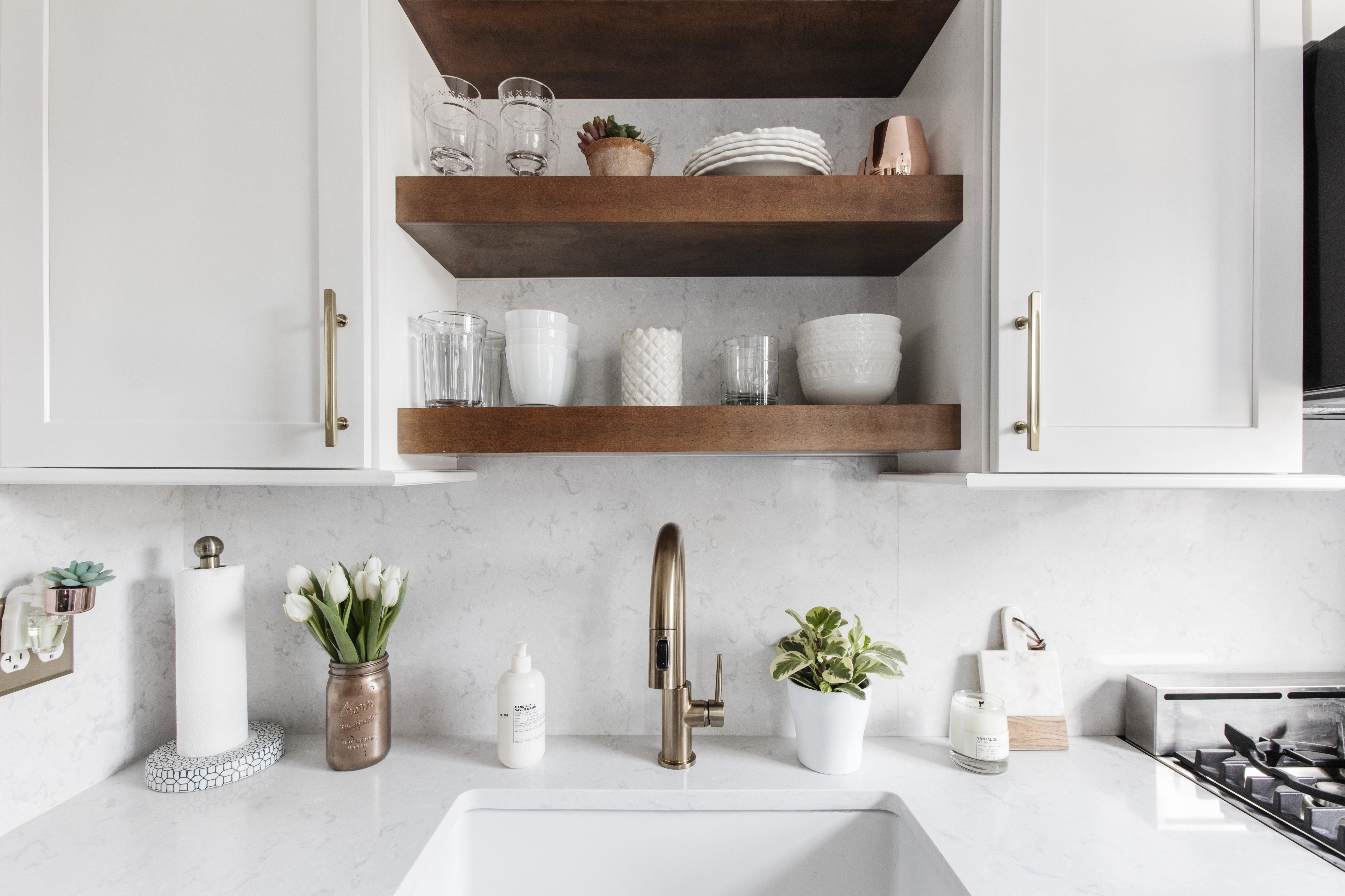
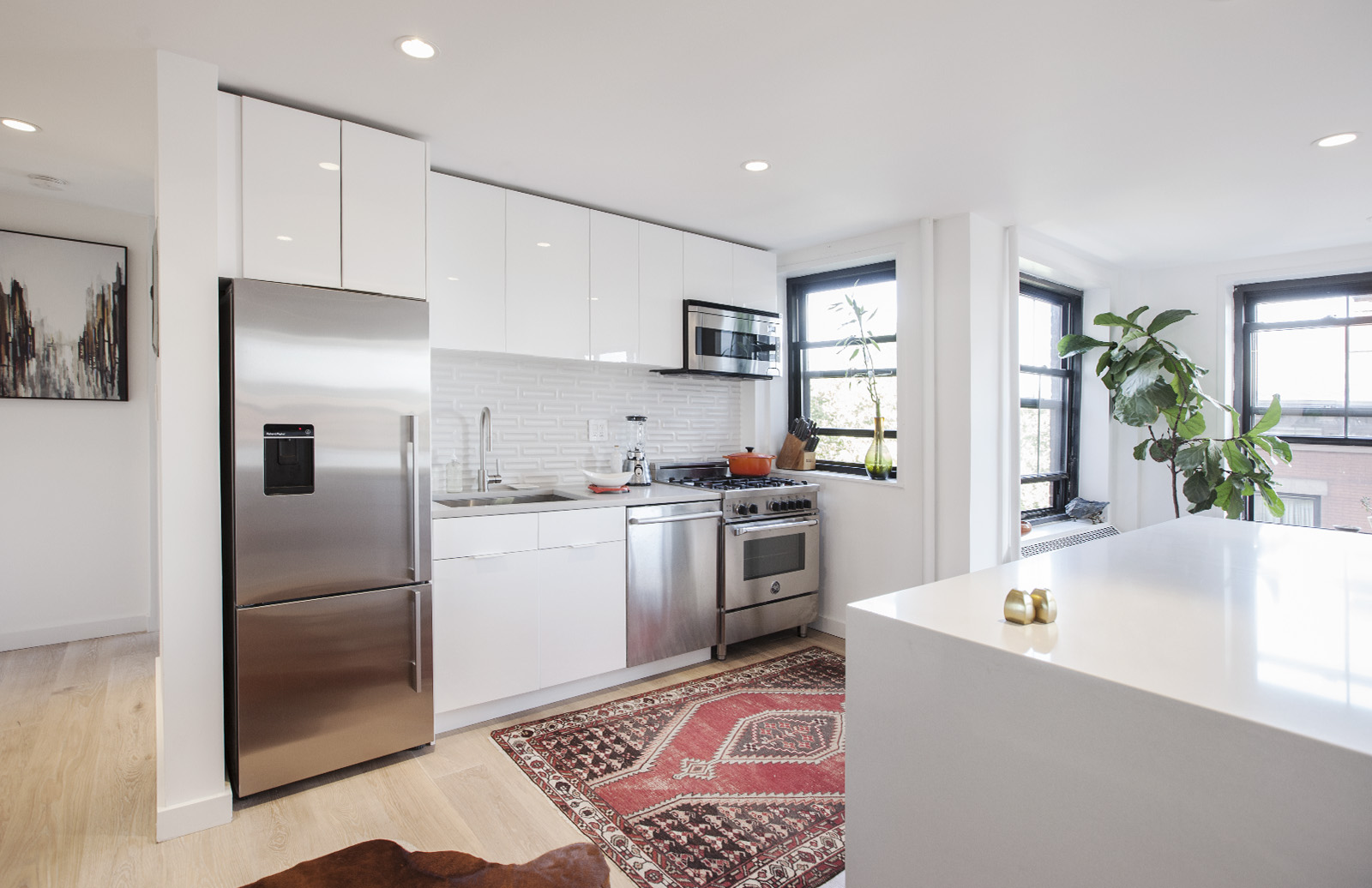
Once our contractor realized that Zak and I were quite handy, we were able to figure out what we could do versus what we should leave to the professionals. Overall, it was all about repurposing what we had. I did a fun tie-dye paint effect over the bed. I’d read online about how to transform a large wall with little cost using a sample can of Behr interior acrylic eggshell paint; it cost about $3. I diluted the paint with water until it was the consistency I wanted and then crisscrossed it over the wall until it was the desired effect. Zak and I did the kitchen ourselves, painting the cabinets, tiling the backsplash, grouting, and putting in new countertops. We also installed the sliding barn doors. The bathroom was left to the professionals!
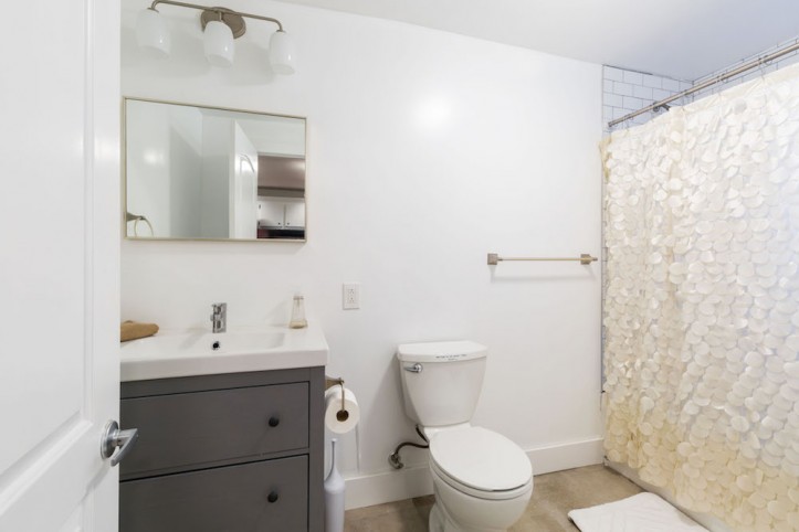
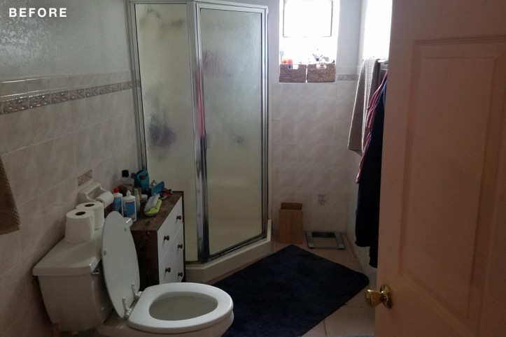
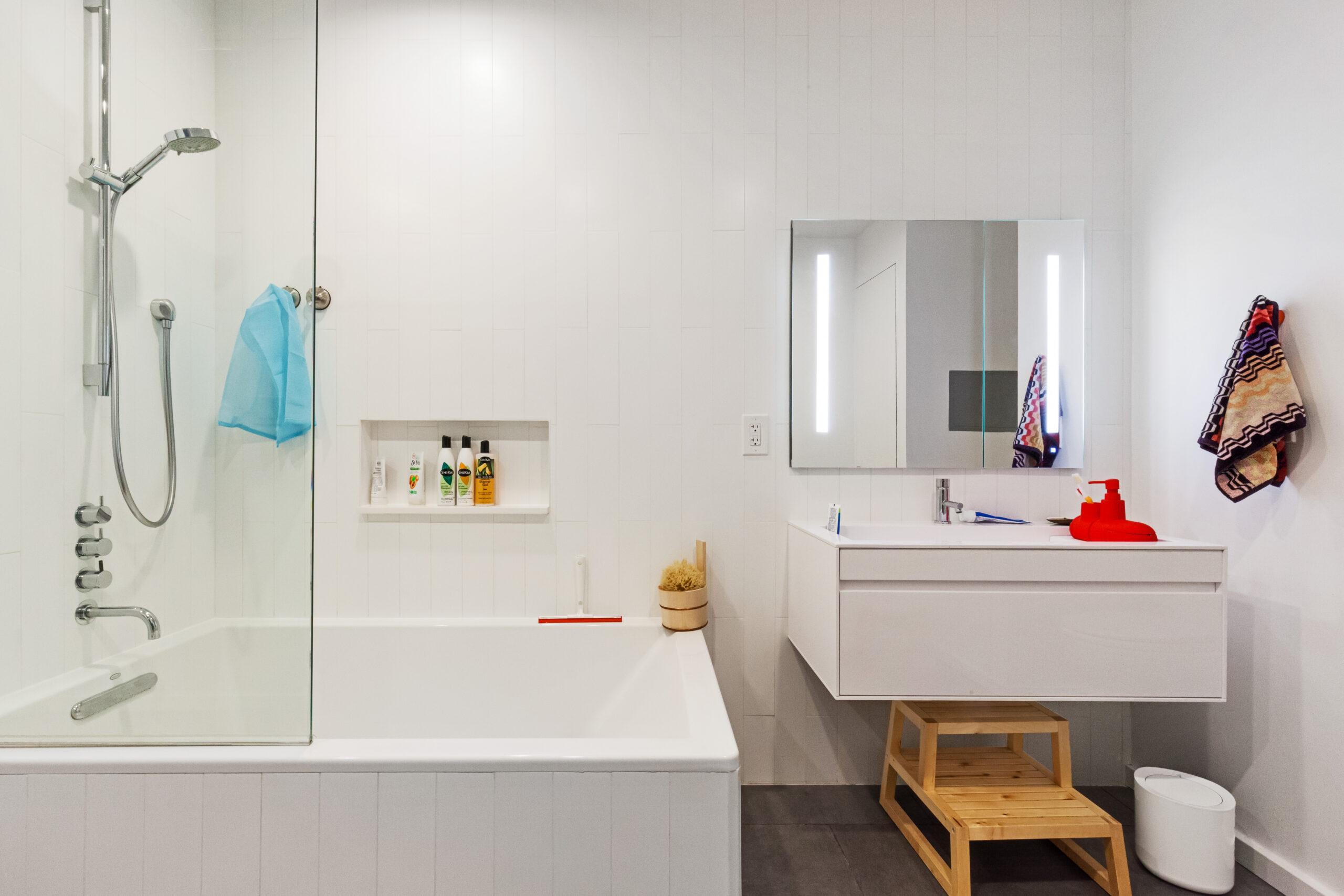
In closing off the basement, we had to relocate the bathroom entrance and seal off a doorway in the kitchen. With the added wall space, we fit a small eat-in nook in the kitchen. The other thing that needed attention in the rental was an awful bathroom. We replaced everything in there. It completely changed the space and made it feel more modern and updated.
Since the house was built in 1899, we thought we might find some interesting details, but, unfortunately, all the character was stripped prior to us buying the house. Everything had probably been replaced in the past 15 years. Because we were adding walls, it was hard to stay consistent with the original molding, so to stay on budget, we opted for the least expensive four-inch base molding.
It was absolutely worth renovating. We did spend the majority of our budget in our own living space, but I am happy with the areas we chose to upgrade in the rental. The new flow gives us both privacy, we all gained extra storage space, and we’ve received great feedback on what we’ve put together.
Thank you, Bellamy and Zak, for sharing how you made your rental work for you. (Click here for their Airbnb listing.)
KITCHEN RESOURCES: Countertops, sink, and faucet: Ikea. Hardware: original. Wall tile: Home Depot.
BATHROOM RESOURCES: Floor tile: contractor sourced. Wall and shower tile and mirror: Home Depot. Hardware: Home Depot. Sink, vanity, and lighting: Ikea. Toilet: contractor sourced.
PAINT: Paint color throughout in Ultra Pure White: Behr.
—
Renovating a rental property? Check out our guide on remodeling costs per square foot.
Refer your renovating friends to Sweeten and you’ll both receive a $250 Visa gift card when they sign a contract with a Sweeten general contractor.
Sweeten handpicks the best general contractors to match each project’s location, budget, and scope, helping until project completion. Follow the blog for renovation ideas and inspiration and when you’re ready to renovate, start your renovation on Sweeten.
