Home / Blog / Before & After / Entire Homes
Tudor Home Renovation: An Old House Gets a Modern Refresh
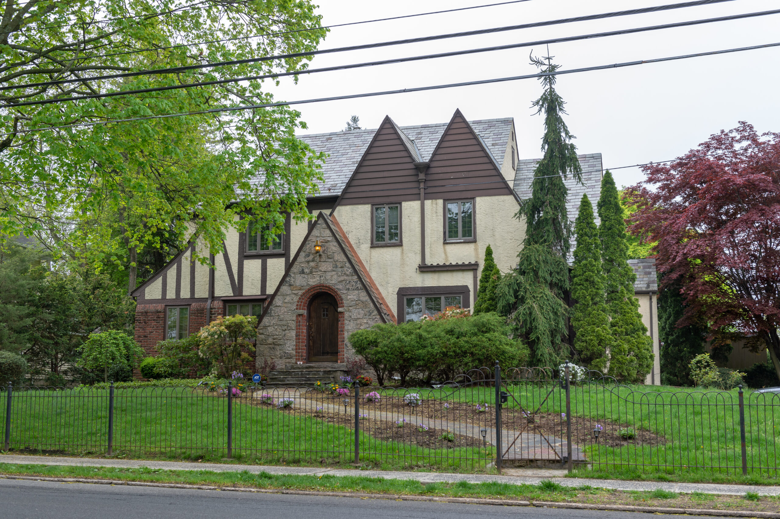
Inspired by years of HGTV viewing, Sara and Mike embarked on a comprehensive Tudor home renovation of their nearly 100-year-old English house in Bronxville, New York. What began as a choppy, awkward layout evolved into a modern, family-centric haven, complete with an open-concept kitchen, custom mudroom, and thoughtfully updated bathrooms. Battling the quirks of an aged home, the couple transformed their space, proving that with vision and the right team, even the most classic of homes can be reimagined for contemporary living.
- Homeowners: Sara and Mike posted their almost 100-year-old home remodel on Sweeten
- Where: Bronxville, New York
- Primary renovation: Adjusting the layout and updating the kitchen and bathrooms
- Homeowner’s quote: “As we were looking through other services, there were tons of reviews, but not really that curation factor to help us find what we need. The contractors we got from Sweeten really blew the rest away. Their portfolio was amazing, the scope of work that they were offering was incredible, and their bids were pretty much in line with the others, so we were really excited to go with them.”
Fixing up a new family home
When Sara and Mike first came across the English Tudor, they knew it had the potential to become the perfect Westchester family home for them, their son Hudson, and their cat, Domino. Located in the Gifford Park section of Bronxville, it was an amenity-filled town with good schools. It was a great investment and had a most coveted feature—a big, flat, private yard.
Although it had been well-maintained by the previous owners, it had a choppy main floor, awkward layouts, and a kitchen and baths that had outlived their usefulness. They needed help executing their vision for the space. At the suggestion of Sara’s co-worker, they found Sweeten to hire a general contractor.
Plans for the renovation
The scope of work included creating an open layout on the first floor by eliminating the wall between the dining room and kitchen. This changed the path to the only bathroom on that level (you had to go through a bedroom to access it).
There were also plans for a baking pantry (Sara’s passionate about baking), a mudroom, and a new powder room in place of the old full bath. Upstairs, Sara and Mike intended to update two full bathrooms and turn two small hallway closets into a laundry room.
Sara explains, “We purchased the house with the intention to immediately renovate as much as possible before we moved in. We found out we were expecting again the week before we closed!” The Sweeten design-build team they chose demolished several walls on the first floor to open up the space. The 2,500-square-foot, single-family home had felt smaller because of the layout. The couple’s vision? “We wanted to keep the feel of the classic Tudor but hide the modernization away.”
Planning to renovate? Get free cost estimates from our partner GCs!
Get matched with our vetted general contractors and receive at least 3 quotations for free! You can also find endless home renovation inspiration, detailed guides, and practical cost breakdowns from our blogs.
Opening up the kitchen
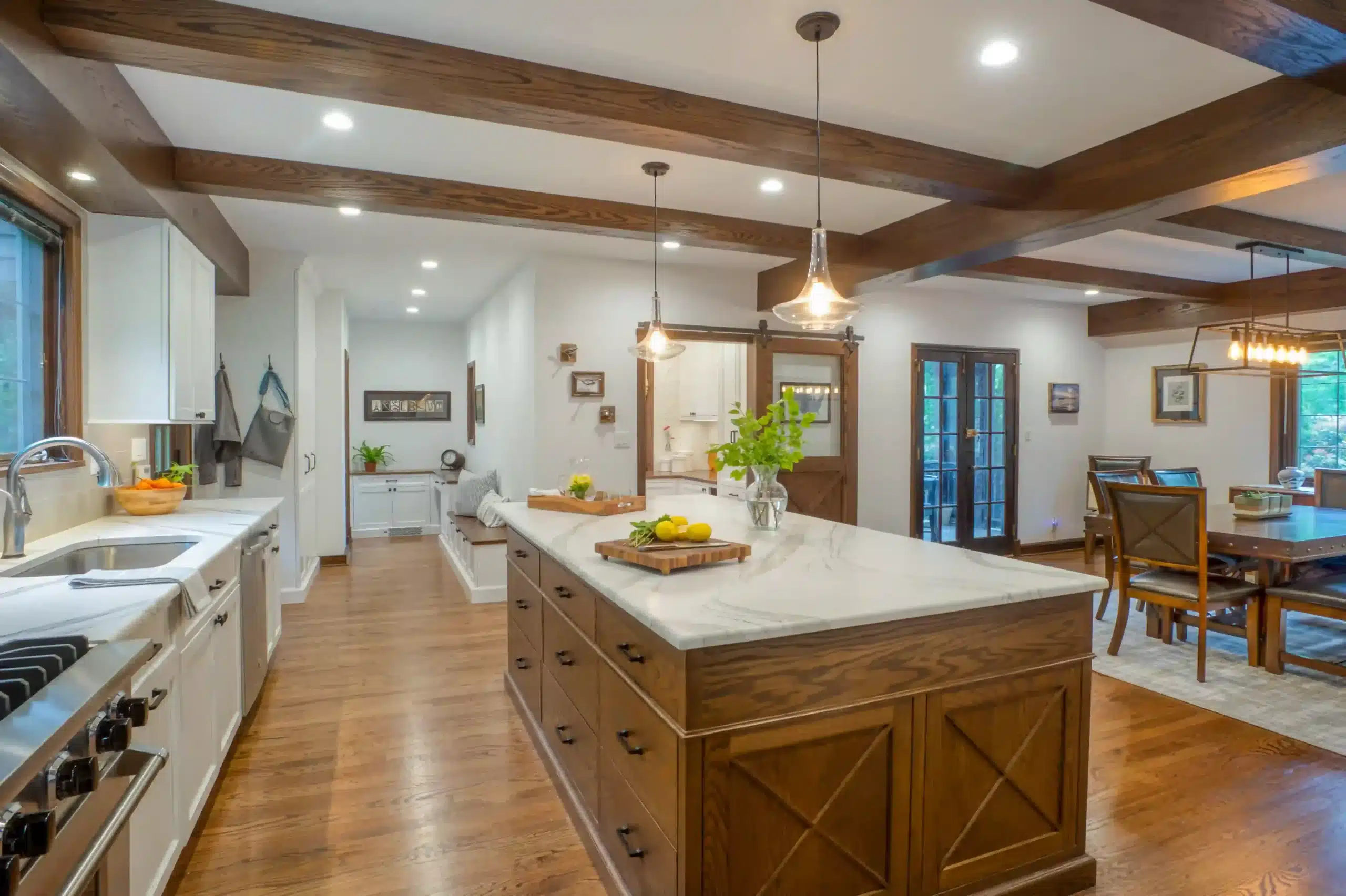
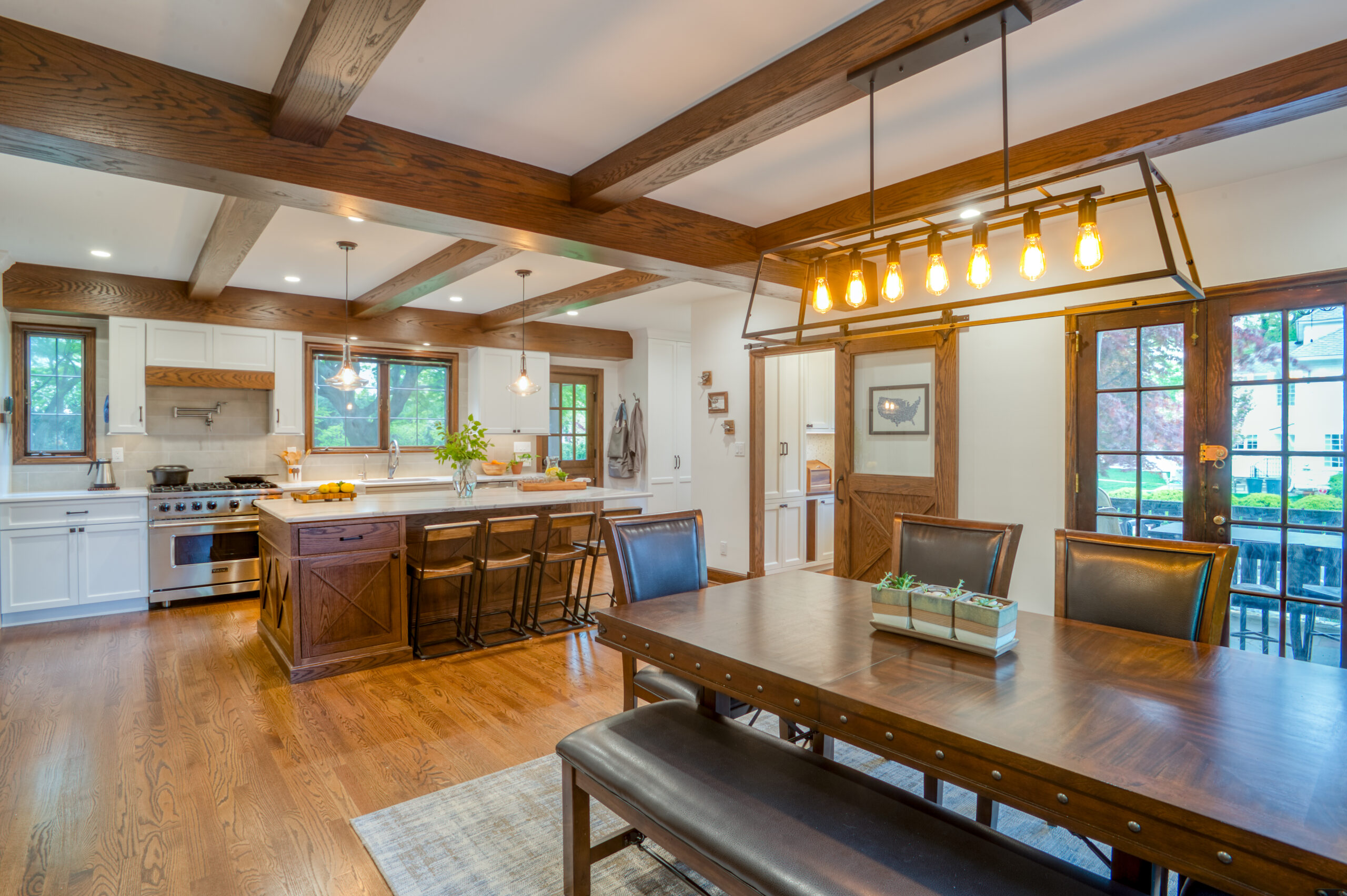
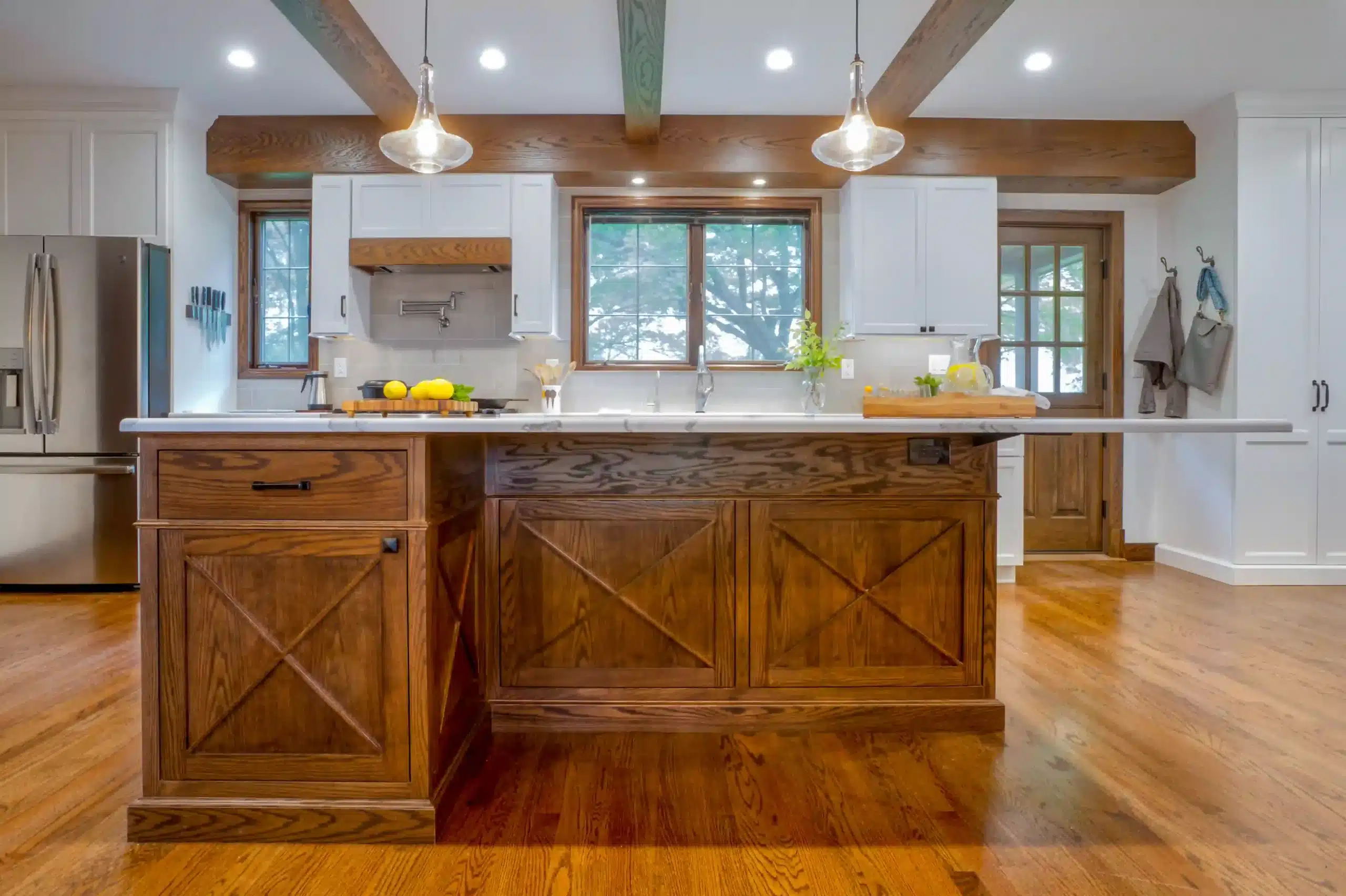
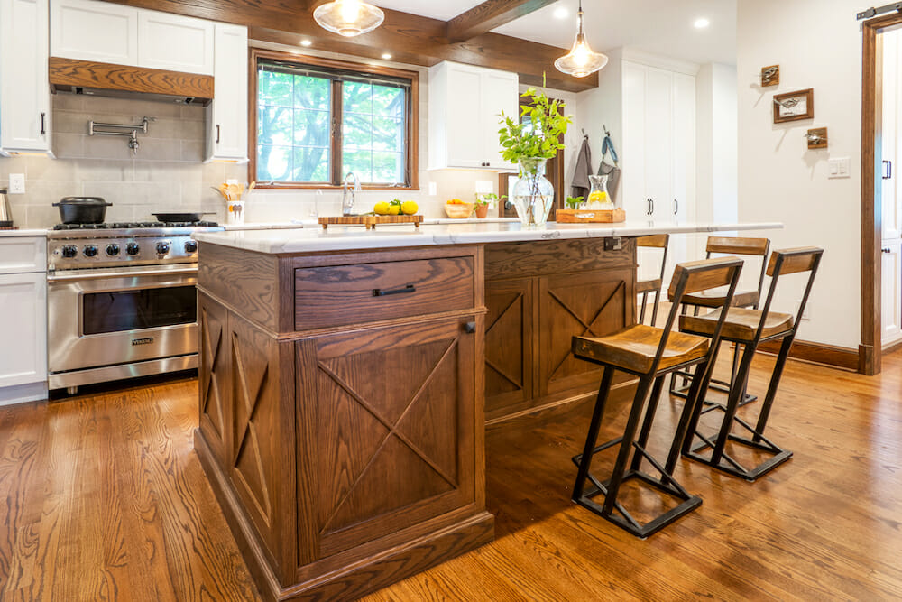
The new open-concept kitchen included a large center island for entertaining. It provided an anchor between the dining space and the cooking area. The counters extend fully over the stools so that “you don’t need to strain over the chairs to get to the island,” explained Sara. Storage features inside the cabinets included dish drawers with peg separators, swiveling corner shelves, and drawers in every cabinet.
Other touches added to the cooking experience: a touch faucet, pot filler, and an appliance cabinet with pull-outs and outlets. They chose a utilitarian quartz marble-look countertop to contrast with the custom wood island stained to match the molding throughout the house. The Dutch back door, off on one side of the kitchen, facilitates indoor-outdoor living for the warm-weather months.
A custom mudroom
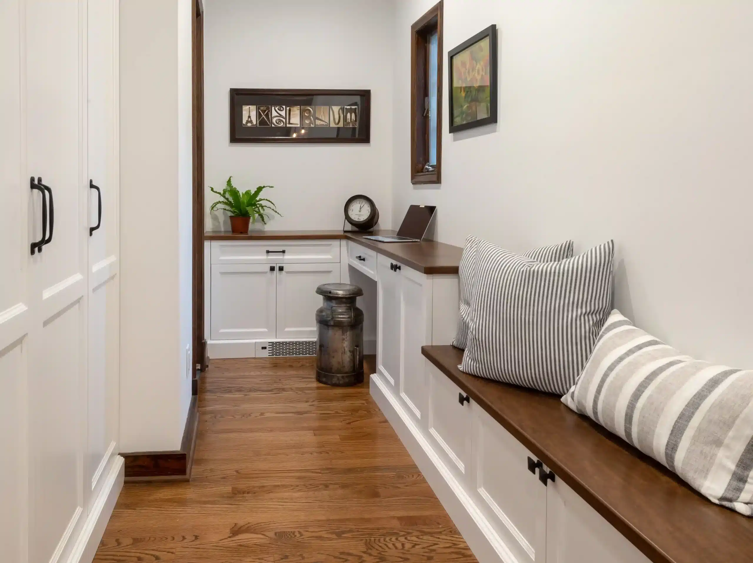
The mudroom, a narrow space adjacent to the kitchen, was also tailored to the needs of the growing family. Crafted in custom millwork, a low bench and four storage cubbies beneath the bench provides storage for each member of the family.
A closet hides messy bags, various gear, and coats, while the built-in desk offers a place underneath for pet bowls.
Turning the full bathroom into a powder room
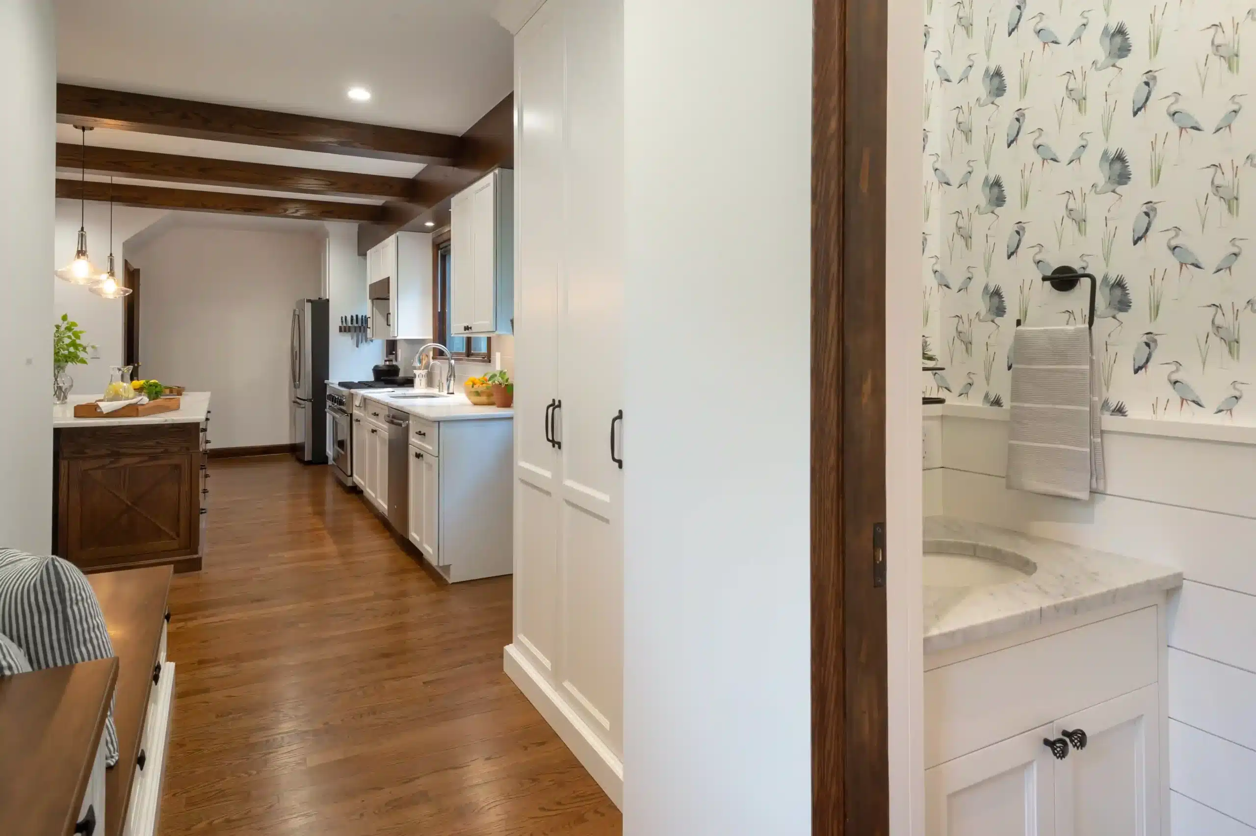
Another major change on this floor was the conversion of the full bath to a powder room. By reconfiguring the layout, the powder room was now located conveniently off the mudroom and the back door entrance. The couple chose to clad the lower walls in beadboard, with a bird-themed wallpaper above.
Not only did the couple have an affinity for birds but Sara has had a love for birds since childhood from her father and grandfather. The Great Blue Heron had become a good luck charm for the couple during the time of their second pregnancy. Sweeten brings homeowners an exceptional renovation experience by personally matching trusted general contractors to your project, while offering expert guidance and support—at no cost to you. Renovate expertly with Sweeten
Extra cabinetry
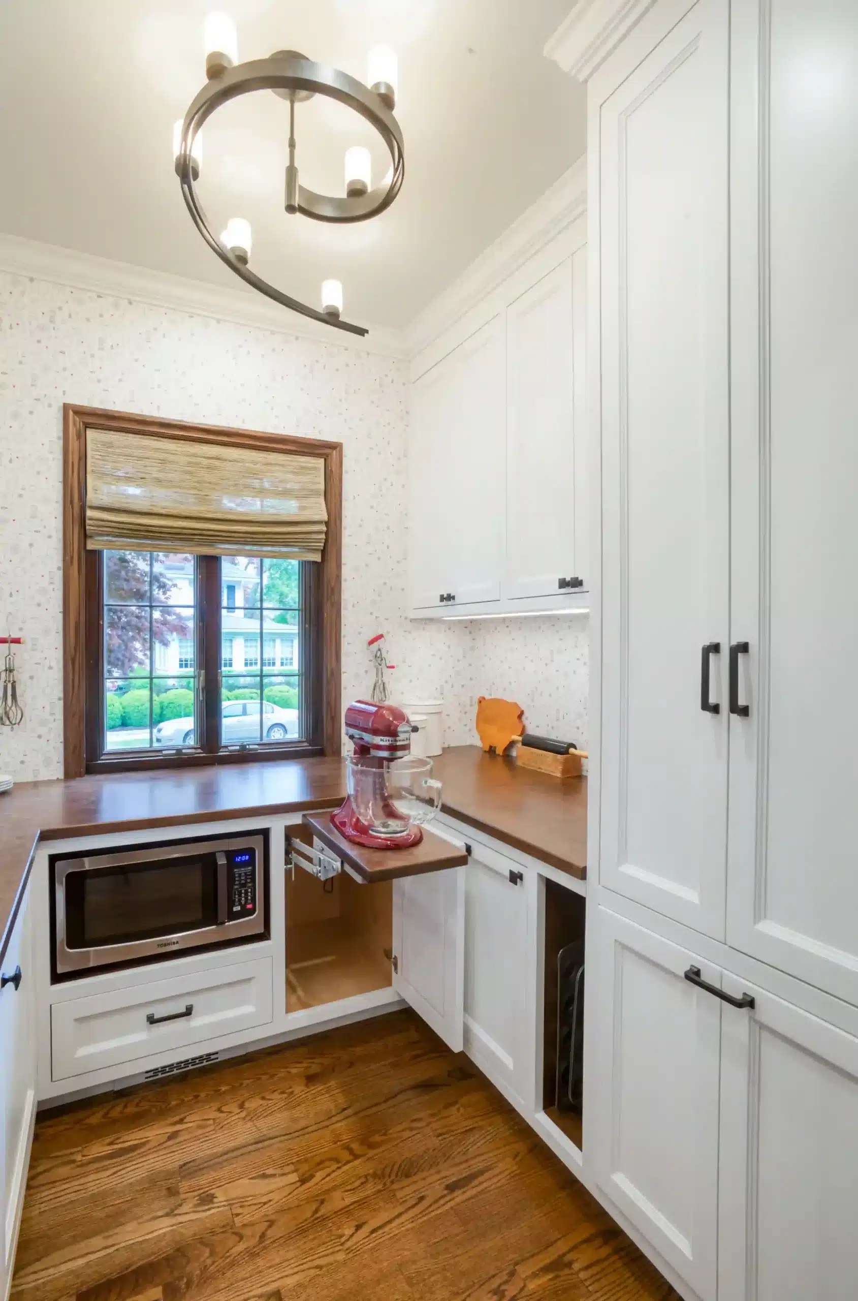
On the wish list for Sara and Mike was a butler’s pantry set up as a baking station. They installed lower-than-typical counters made of butcher block for an optimal height on which to do baking prep. A cabinet with a pop-up interior shelf raises a mixer to counter height when needed. And a bonus for the kids: a designated lower cabinet with pull-out shelves to help themselves to snacks. Sara’s mantra for the renovation: “A place for everything and everything in its place. I wanted to be able to ‘hide’ all the mess when company came over, but without sacrificing the daily utility of the rooms.”
The kitchen and the dining space now open to each other. The wall that once divided them was replaced by a beam. Spanning the length of the room, the beam provides both structural support and an architectural element that echoes the existing woodwork in the century-old home.
Renovating upstairs
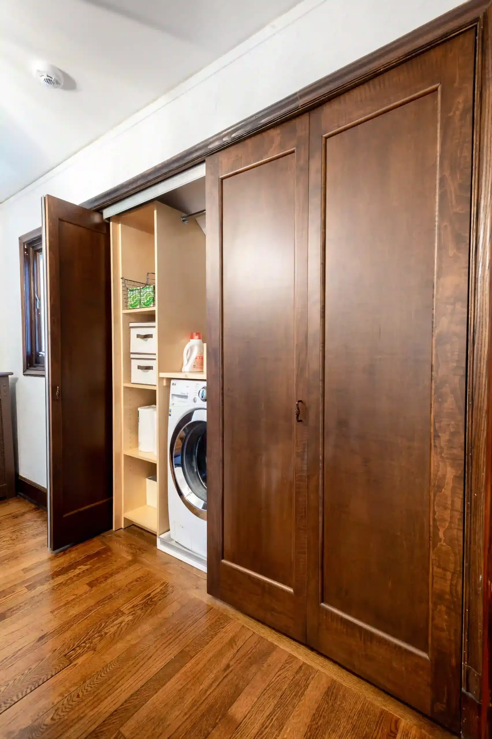
Next, we head upstairs for more updates. The first thing you see is the brand-new washer-dryer closet, formerly two basic hallway closets. Originally in the basement, the laundry was relocated to the same floor as the bedrooms—a lifesaver for families with young children. A bar above one shelf was added for hang-drying, as well as a space for folding. A pocket door meant that they wouldn’t have to worry about clearance in the hallway.
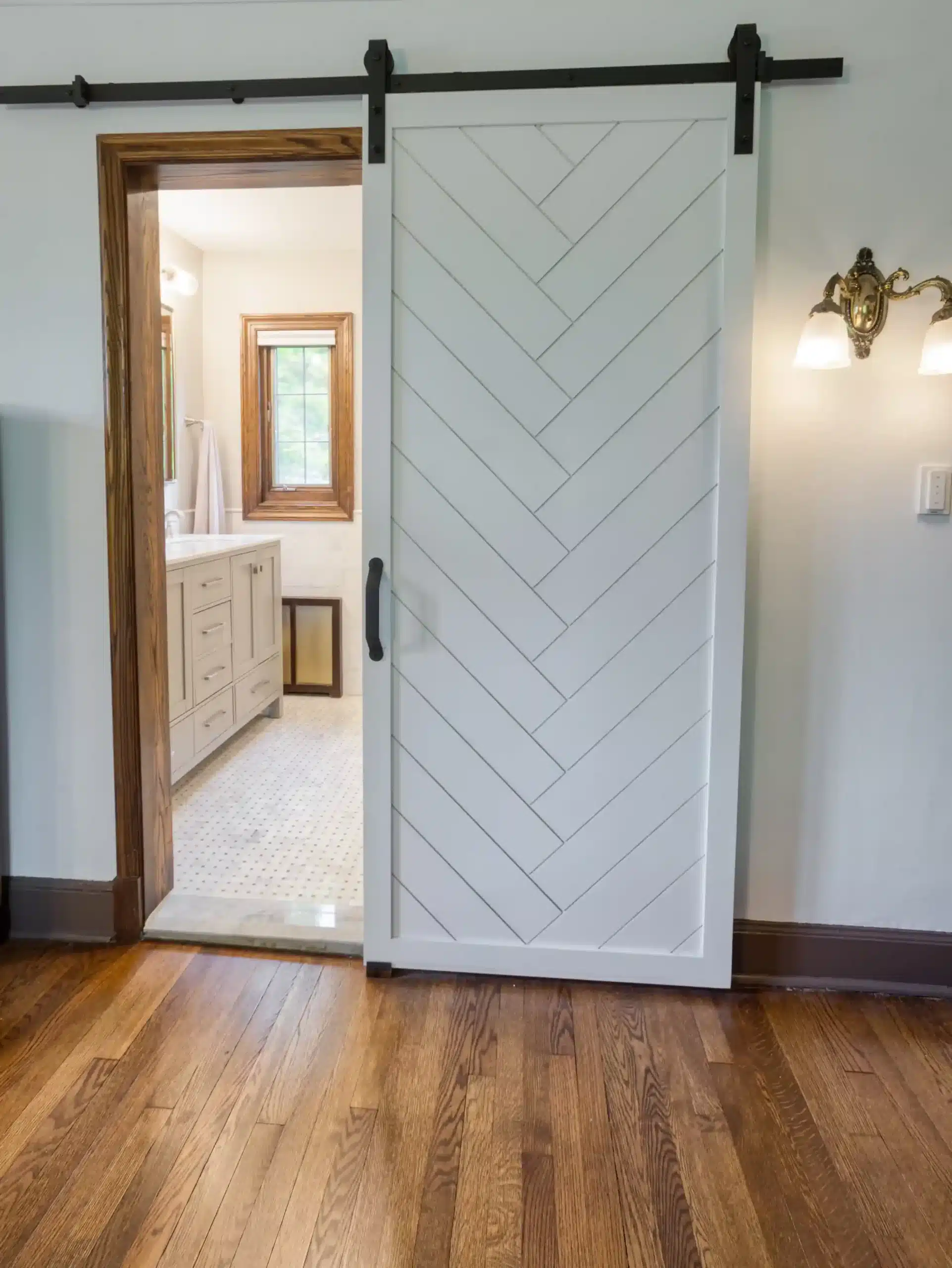
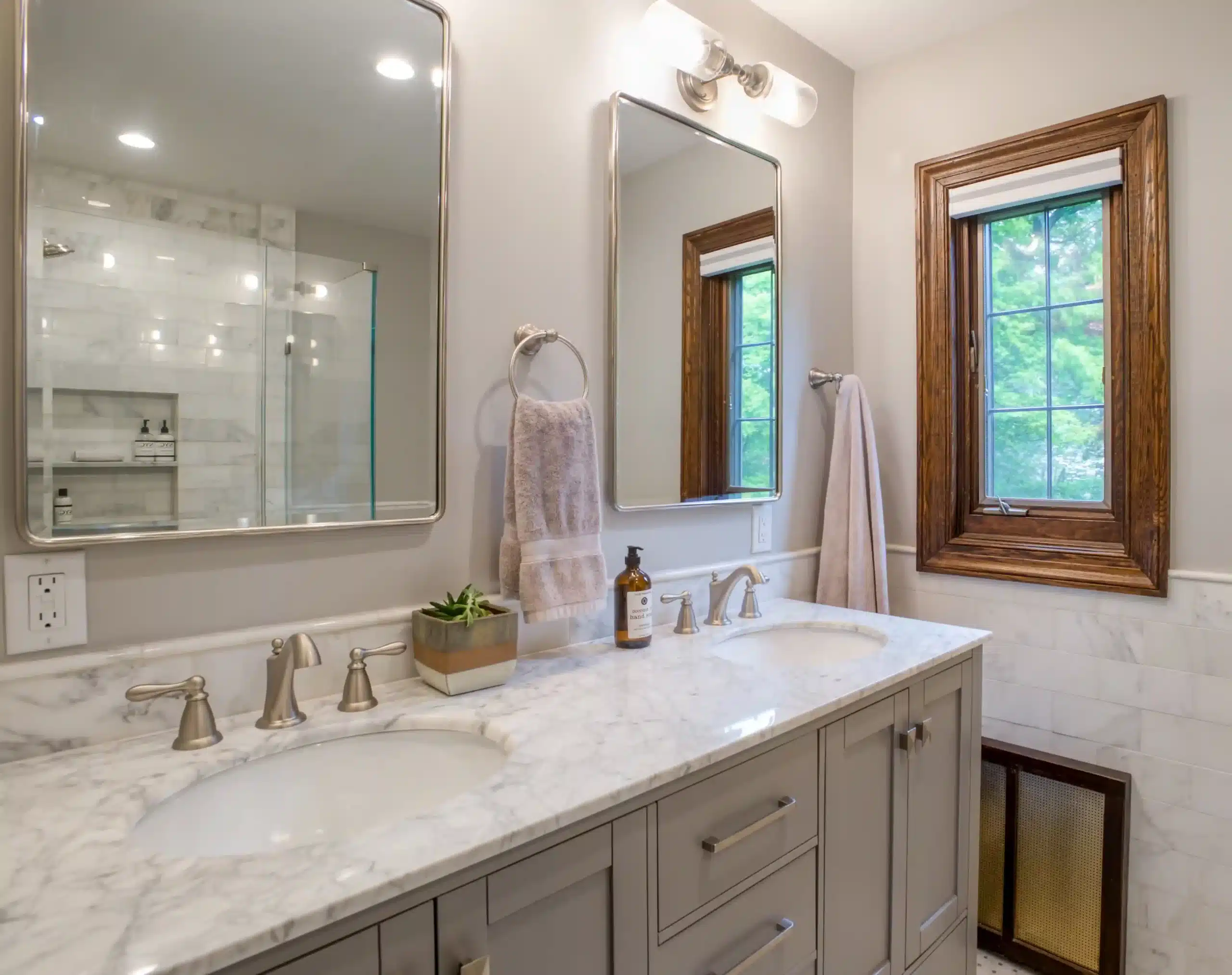
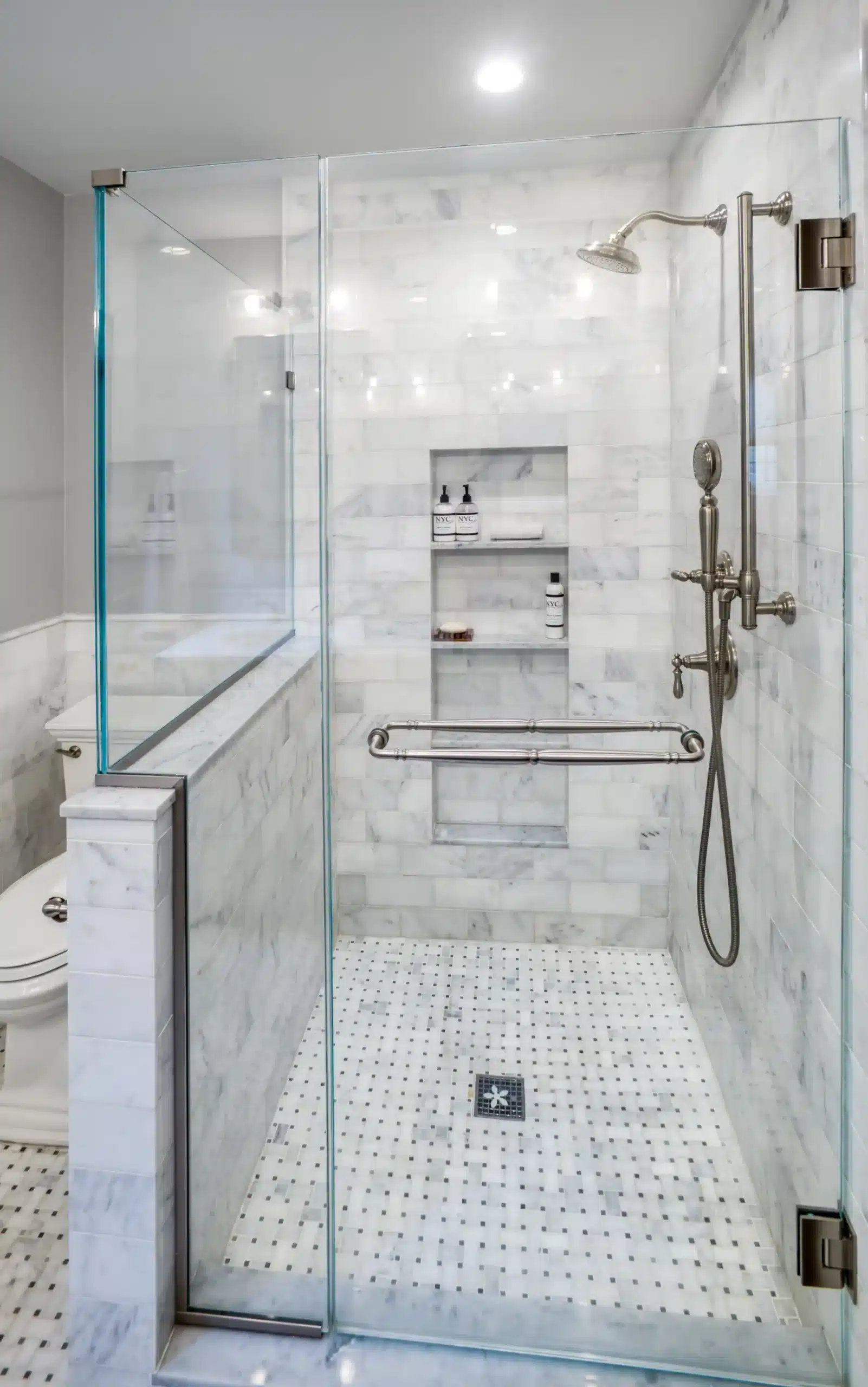
Also on this level, the primary bathroom received an upgrade, with a large walk-in shower, high-end fixtures and tile, and a large niche for holding toiletries. They opted for a sliding barn door in order to allow room for a double sink.
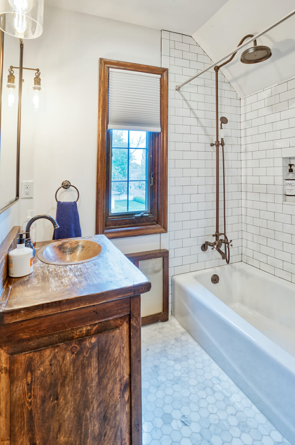
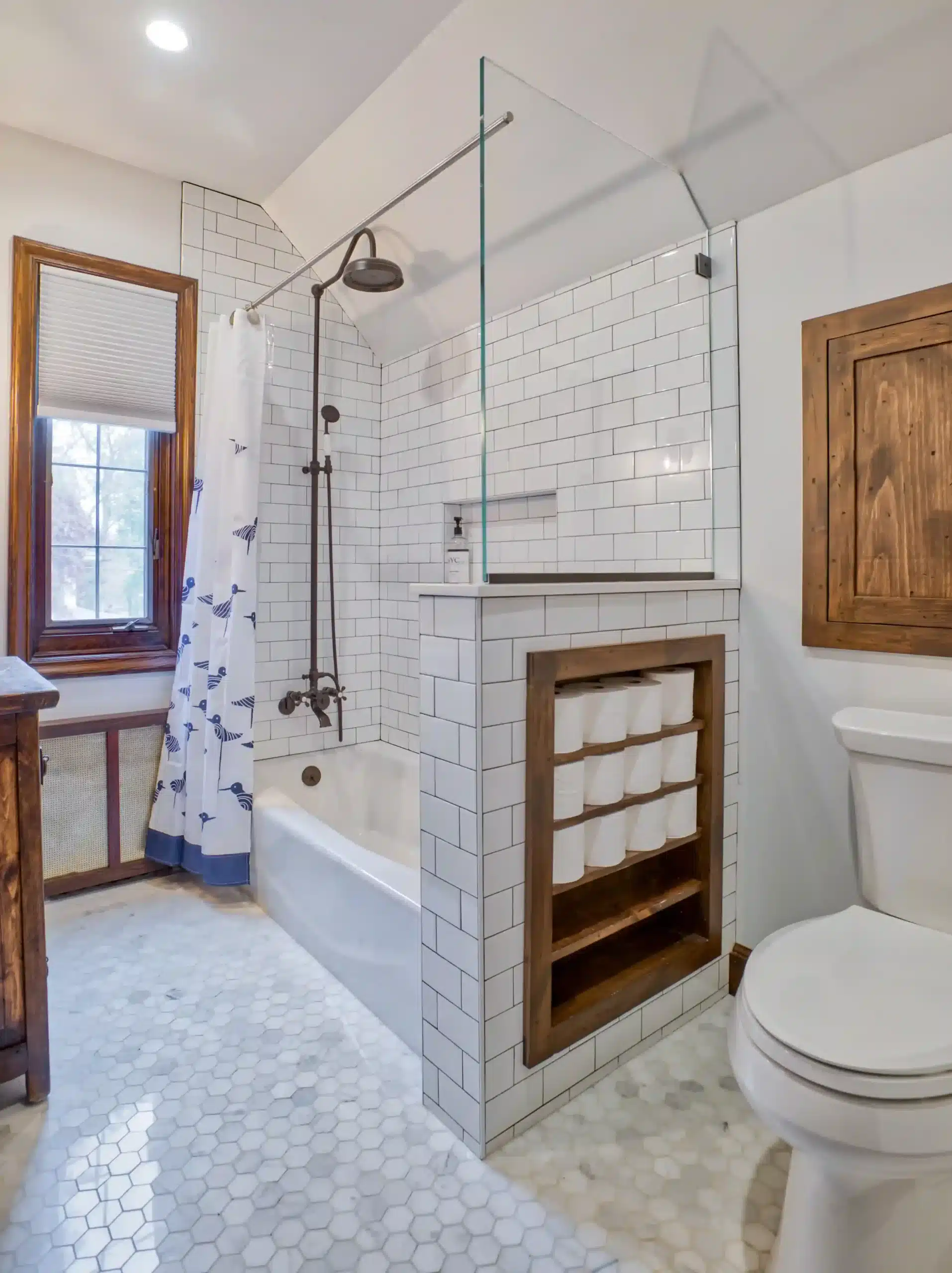
The kids’ bathroom has a more rustic look, with oil-rubbed bronze hardware and a copper sink. A low wall between the tub and the toilet provided the perfect space for a built-in toilet paper shelf. Behind the bathroom, a crawl space was made accessible for more storage.
Keeping the goal in mind
The duo had some renovation experience updating their prior co-op in Riverdale, but this was their first whole-house project. With “the house being nearly 100 years old, there was a surprise around every corner—and behind every wall and floorboard,” noted Sara. “We factored contingencies into the timeline and budget for this and also expanded our scope as we went along. However, there were numerous factors above and beyond what we factored in,” shared the renovators.
Throughout the process, Sara and Mike kept sight of the goal. They recommend that first-time renovators focus on the long term. “It is so easy to get caught up in permits and deliveries being delayed, little problems here and there, budget inflations, or finding out your chimney has collapsed just as you were paying the final bills. But in the end, it all came together. We are absolutely in love with our final space. We are so excited that we get to live here!”
They are also happy with the way that their Sweeten contractor delivered. “By having a contractor and designer in one place (and married!), we were able to coordinate a lot of decisions immediately and there was a lot of synchronization between everyone.” They also appreciated the way that we helped along the process by providing feedback on what were normal problems everyone encounters during renovations, and what should be of concern. As Sara added, “Sweeten helped us understand those differences and put our minds at ease.”
Thank you to Sara and Mike for sharing your new home with us!
Ready to renovate your home?
Post your project on Sweeten today and get matched with our vetted general contractors for free! Find endless home renovation inspiration, detailed guides, and practical cost breakdowns from our blogs.
Renovation materials
Kitchen
- Kitchen Island Cabinetry: Custom by design build firm
- Kitchen Cabinets: Starmark
- Cabinet Hardware: Iron Valley knobs and pulls
- Countertops: Cambria Brittanica Adria Marble and Granite
- Backsplash Tile: Daltile Portfolio 24” x 6” unpolished cement tile
- Kitchen Faucet: Delta Touch
- Lighting: Wrought Studio Dominguez teardrop pendant
- Refrigerator & Dishwasher: GE
- Stove: Viking Range
Dining Room
- Lighting: Wrought Studio Donegan 7 light pendant
- Paint: Benjamin Moore White
Pantry
- Cabinetry: Custom by design build firm
- Wallpaper: Spoonflower Johannak kitchen tools
- Lighting: Hubbardton Forge
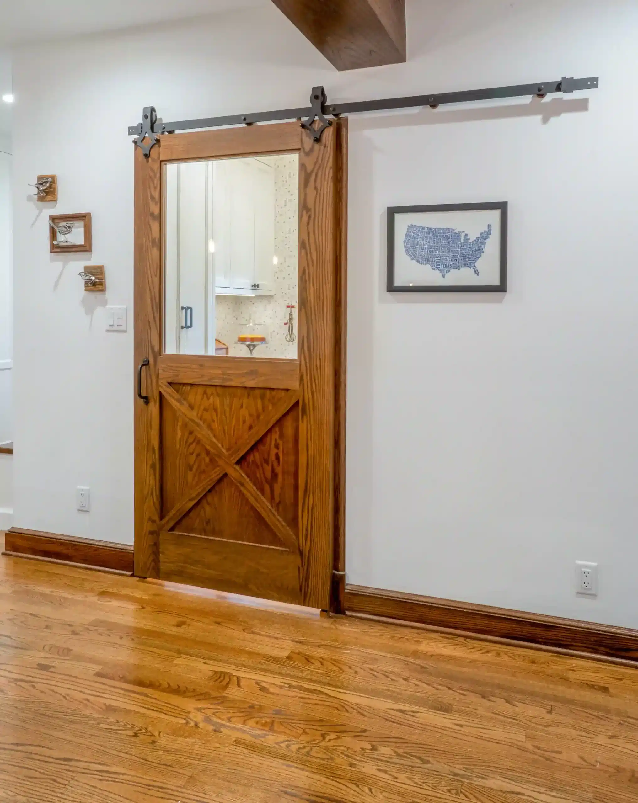
- Barn Door: Custom by design build firm
- Door Track: Woodside Hardware
Powder Room
- Floor Tile: Parvatile Lava Grande 1” x 3” Basalt herringbone
- Wallpaper: Etsy Jumanji #294285655
- Faucet: VIGO Satro single hole #205977764
- Sink/Vanity: Custom by design build firm
- Toilet: Kohler Highline
- Lighting: Hubbardton Forge
- Mirror: Threshold Pharmacy Mirror
Master Bath
- Wall Tile: Home Depot Carrara 4” x 8” subway tile
- Floor Tile: Home Depot Carrara basketweave
- Hardware: Moen
- Shower Fixtures: Kohler Artifacts #CNT19700003
- Vanity: Beachcrest Home 60” double vanity
- Toilet: Kohler Memoirs
- Lighting: Progress Lighting Archives 2 light in Antique Nickel
- Vanity Mirror: Pottery Barn
- Sliding Door: Dogberry white stained herringbone in Knotty Alder and track
- Paint: Benjamin Moore Silver Chain #1472
Kids’ Bath
- Floor Tile: Home Depot 2” Carrara hexagon
- Wall Tile: Home Depot 3” x 6” white subway
- Shower Fixtures: Kingston Brass
- Sink, Faucet & Vanity: Foxden Decor
- Toilet: Kohler Highline #3283830
- Lighting: Cloverly Bronze wall sconce
- Mirror/Medicine Cabinet: Pottery Barn
Frequently asked questions
A Tudor-style home is a residence inspired by medieval English architecture, known for its steep rooflines and half-timbered details. Many homeowners are drawn to this style for its storybook character and the sense of history it brings to everyday living spaces.
Tudor-style homes are popular in cities such as New York, Chicago, and Cleveland, where early 20th-century neighborhoods feature a mix of historic architecture. These areas often highlight the style’s classic appeal, making it a favorite for homeowners drawn to its timeless look.
Some defining features of a Tudor-style home include exposed beams, stone or brick, and leaded-glass windows with warm, textured furnishings. These elements work together to create a cozy, historic aesthetic that blends craftsmanship with architectural character.
Renovating a Tudor-style home can be more expensive than remodeling a house without historic details to maintain. However, many find that the Tudor-style details require less frequent updating and will hold up better over time.
Some materials that you can typically find in a Tudor-inspired kitchen remodel are natural wood and stone tile. These echo traditional Tudor interiors, which often combine prominent wood elements with stone, brick, or clay tile to create a warm, authentic look.
