My Sweeten Story: Creating Space and a Sense of Calm
Homeowners in Brooklyn focus on minimalist designs, with pops of color from art during their entire home renovation.
- Homeowners: These homeowners posted their mid-century co-op remodel project on Sweeten
- Where: Clinton Hill neighborhood in Brooklyn, New York
- Primary renovation: A remodel of their 1,200-square-foot co-op opening the kitchen, creating space, and bringing the electric up to code
- Sweeten general contractor
Written in partnership with the Sweeten homeowner
Our minimalist vision
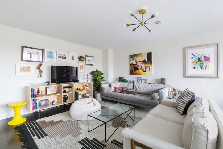
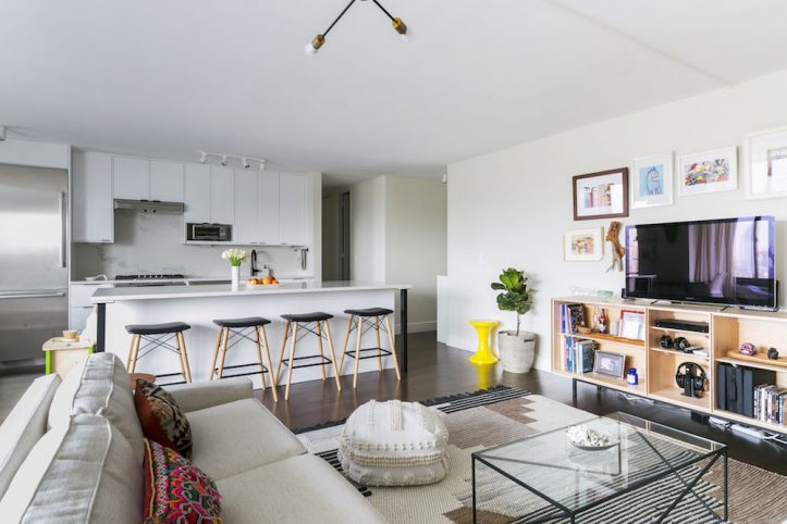
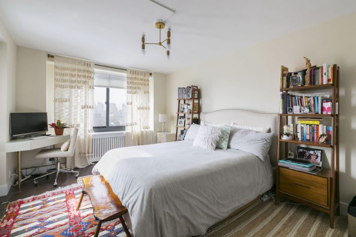
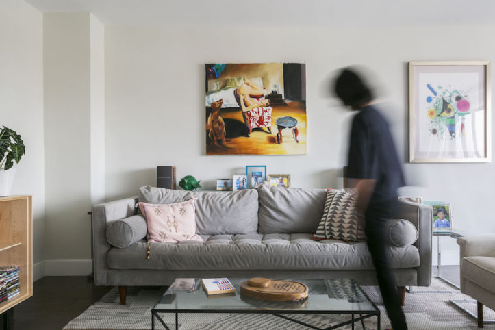
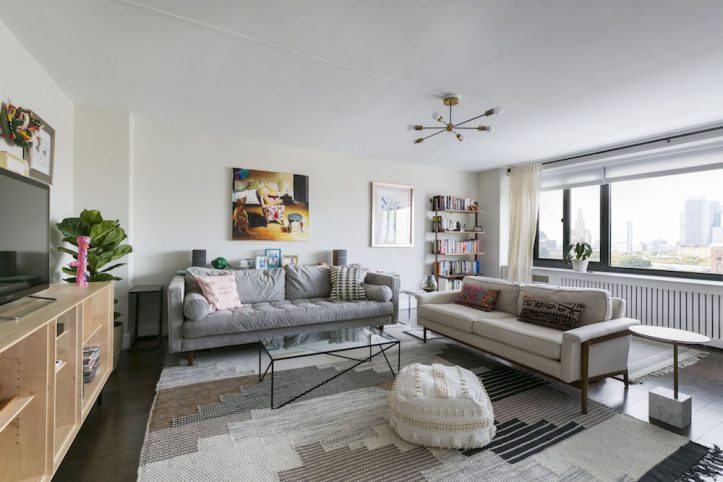
My goal was to turn the apartment into an understated, functional, and cohesive space that wasn’t over-designed—something comfortable and cozy but tidy and calm. I’m tired of the Scandinavian look and of white floors, so I chose dark floors and hardware throughout to contrast with white walls.
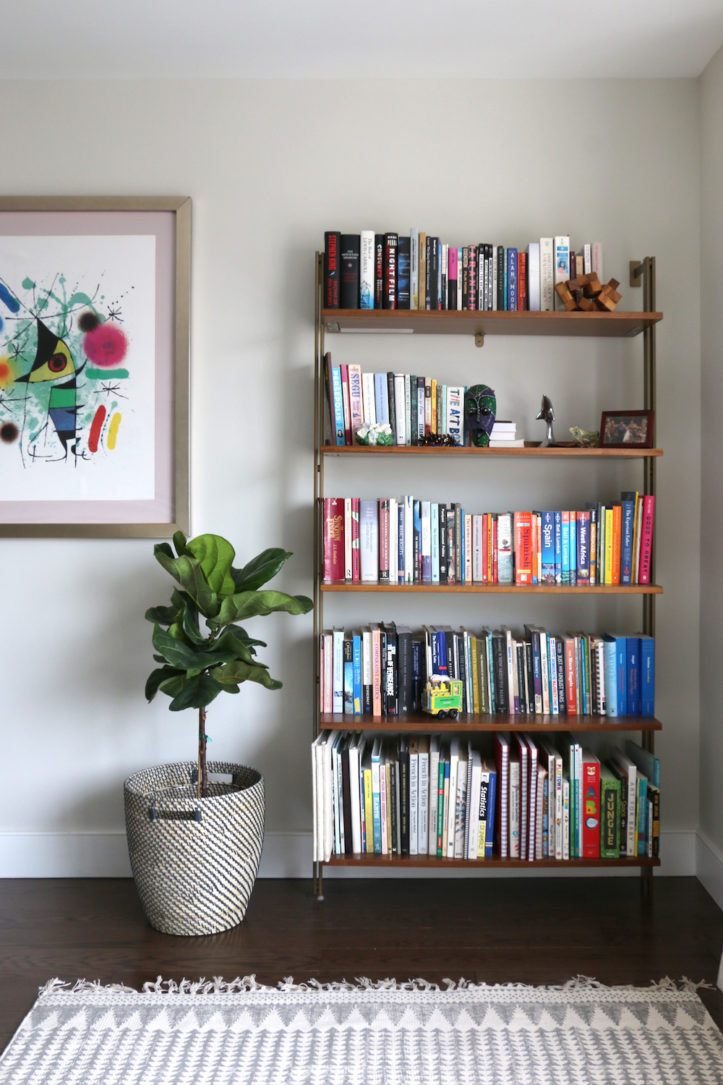
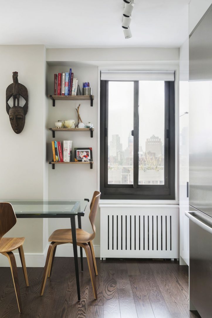
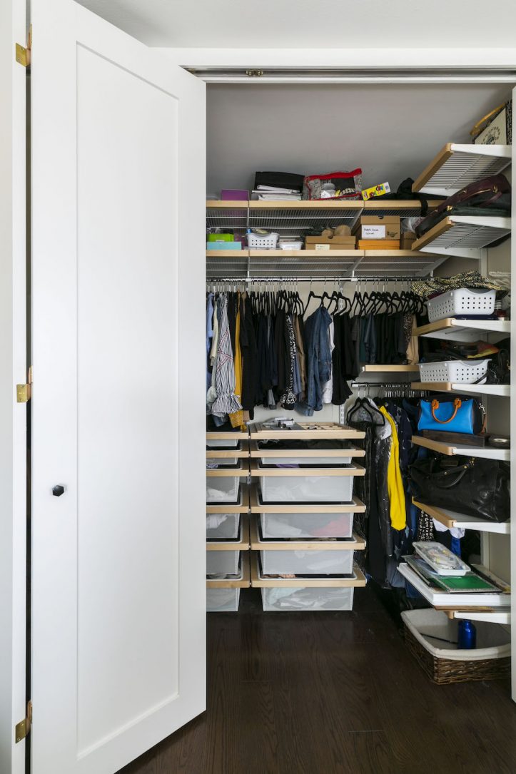
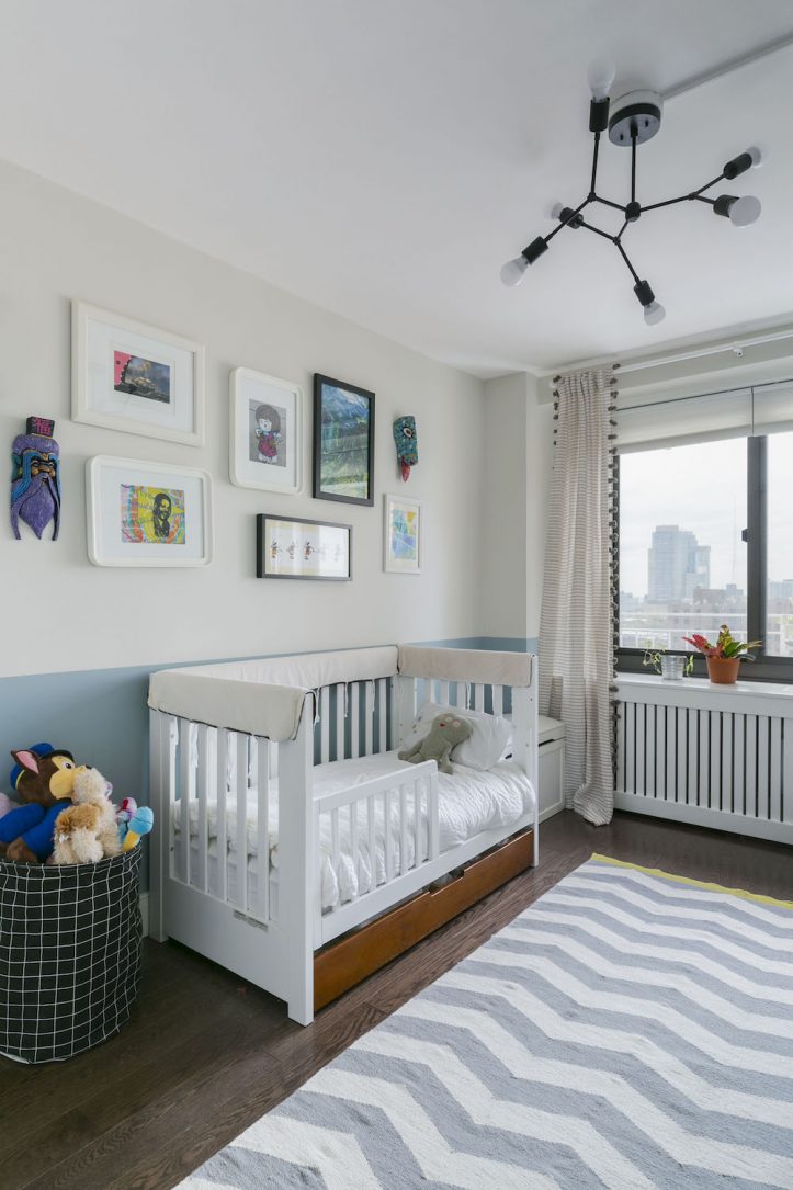
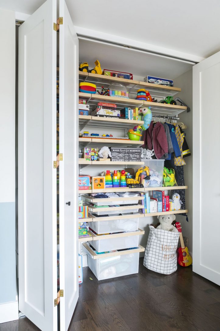
To make things unfussy, bright, and cohesive, I used similar colors, light fixtures, and hardware. The furniture is neutral; color would come from my artwork and our eclectic accessories. Plus, I had to account for my son’s colorful toys, which would end up looking even more disruptive in a visually busy space. Building out the closets was essential to allowing us to settle in properly, and I’m glad we didn’t wait to do this (which was the original plan). We had our radiator covers custom-designed to be very minimalist so that they concealed the support legs and included a removable door that allows us to access the control.
Solutions and revisions
When we purchased the apartment, the wiring wasn’t up to code, so we knew we needed to replace the electrical panel. Tile floors had been covered in synthetic carpeting. There were no closet doors, few overhead lights, and a popcorn ceiling.
We made several changes during the process and added quite a few things to the scope of work, such as new doors, skim coating the living room walls, and installing new closet interiors, creating space and storage. It added several thousand dollars to the job, but we are glad we did them.
Opening up the kitchen
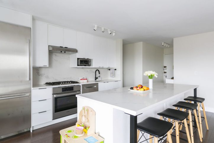
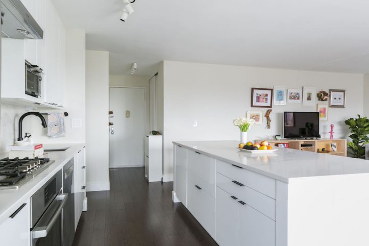
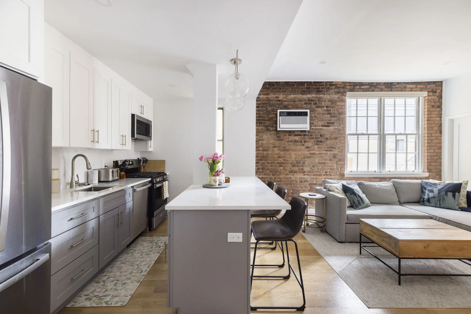
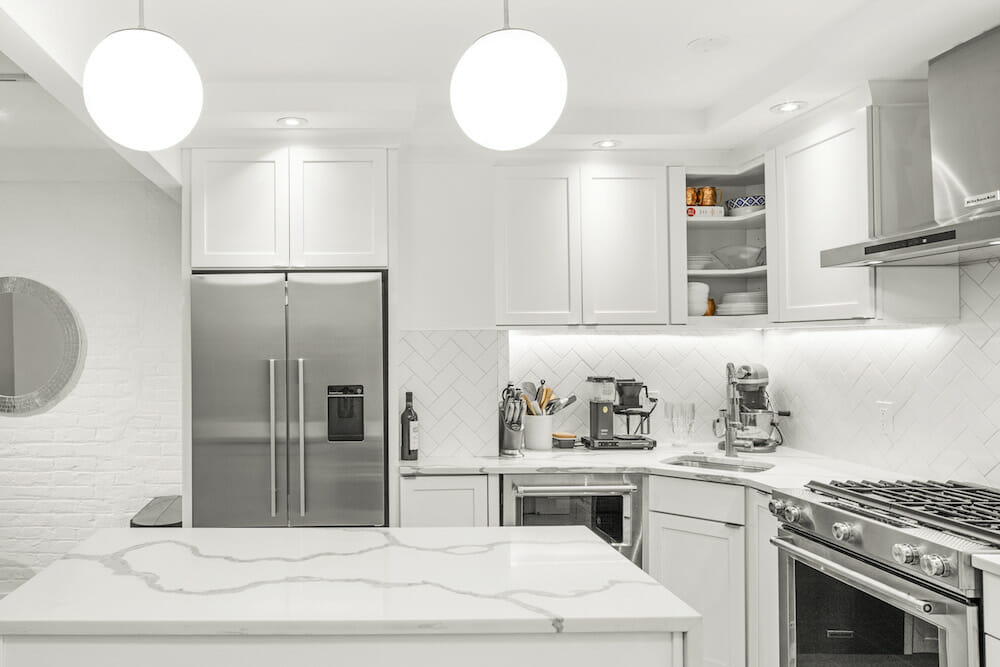
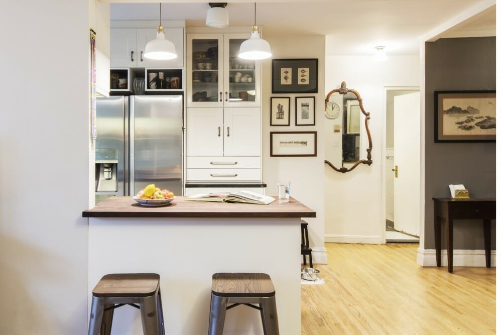
The biggest part of the project was making the kitchen wider and extending it to include more storage. We wanted an open space with a large island for doing art projects and for cooking prep, and so I could see and interact with my family more.
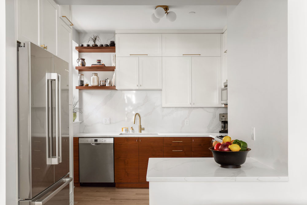
We wanted the kitchen design to be invisible, minimalist, and to reflect the light and view. I spent a lot of time thinking about understated cohesion; I love the stone in the kitchen and find it calming. The stone on the island is one slab and so is the backsplash. I paid extra to have the stone vendor carry the slabs up 17 flights of stairs. It was crazy but having a seamless backsplash and island is worth it.
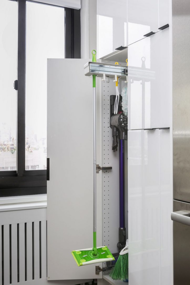
We had custom-designed cabinetry and I especially love our broom closet with a pull-out rack and an integrated outlet. Like I said, I wanted things to be functional!
Renovate expertly with Sweeten
Sweeten brings homeowners an exceptional renovation experience by personally matching trusted general contractors to your project, while offering expert guidance and support—at no cost to you.
Bathrooms inspired by old New York
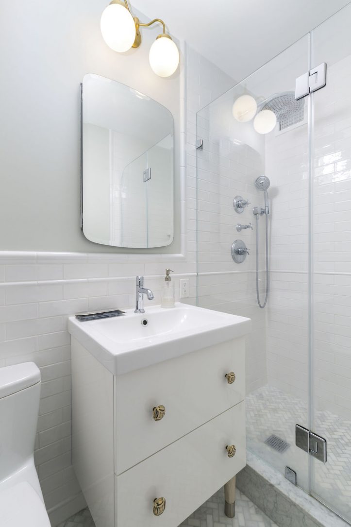
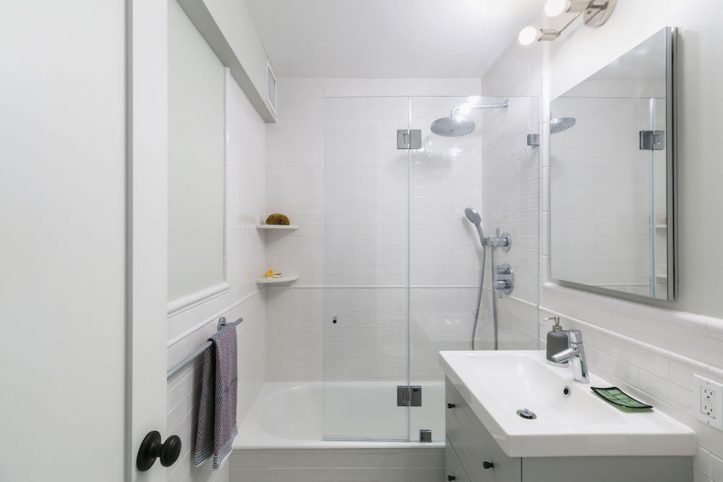
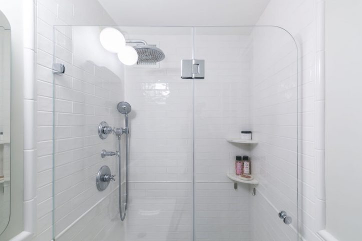
The bathrooms, too, were designed to be functional and safe with lots of drawer storage and thermostatic controls on the shower. It’s a huge improvement from the existing controls where we had to mix the water to find the right temp. New hardware on both vanities was swapped out and added legs to the cabinets. I chose handmade Spanish white subway tiles; each tile is unique and has an interesting shape. I picked classic black-and-white tiles, shaker doors, and molding that are reminiscent of old NYC apartments. The chair rail trim adds texture.
Homeowner tip: Hire an interior designer if you can
The project was stressful on several levels: I designed the space and even though we’d done a renovation in a previous apartment, this job was much larger. I planned every detail and all the materials. We needed to ensure that we had enough material, which involved a tremendous amount of legwork. Additionally, I also coordinated their timely delivery and made sure we got our permits on time by getting on the phone with the expeditors, some of whom were causing unnecessary delays.
All of this was happening while I was working full-time and had a young child. If you can hire a designer whose aesthetic you trust to select all the materials for you, then do it!
An organized general contractor
We were lucky, too, that our Sweeten contractor was on top of things. Aleks created a project timeline, which was helpful. He was careful to check with us on all details before moving forward with work. Additionally, he also suggested a few vendors that we ended up using. The on-site foreman was excellent and communicated well with me.
Now that the dust has settled, though, I love my home and appreciate all the details and hard work that went into it. It’s satisfying to realize a vision and get to enjoy it as a family. We love our view, the open kitchen, the balcony, and, of course, the space is so functional! I really feel like it has everything I need.
Thank you for sharing your renovation story and the beautiful results!
Materials Guide
LIVING ROOM RESOURCES: Ceiling light fixture: Illuminate Vintage. Custom radiator/AC cover: LI Custom Radiator Covers. Artwork: Rashidaabuwala.com.
KITCHEN RESOURCES: Cabinets: Ikea. Cabinet hardware: Build.com. Quartz countertops/backsplash in Statuario Maximus: Caesarstone. Sink/faucet: Brizo. Refrigerator/dishwasher/stove: Bosch. Lighting: Illuminate Vintage. Floors: Preverco.
MASTER BATHROOM RESOURCES: Floor and wall tile: Home Tile Center. Shower fixtures: Hansgrohe. Sink/vanity: Ikea. Vanity knobs and vanity legs: Anthropologie. Toilet: Toto. Lighting: Illuminate Vintage. Medicine cabinet: Kohler.
HALL BATHROOM RESOURCES: Floor and wall tile: Home Tile Center. Shower fixtures: Hansgrohe. Sink/vanity: Ikea. Pulls: Home Depot. Hairpin legs: Etsy. Toilet: Toto. Lighting: Illuminate Vintage. Medicine cabinet: Kohler.
MASTER BEDROOM RESOURCES: Closet system: Elfa. Light fixture: Illuminate Vintage.
NURSERY RESOURCES: Closet system: Elfa.
—
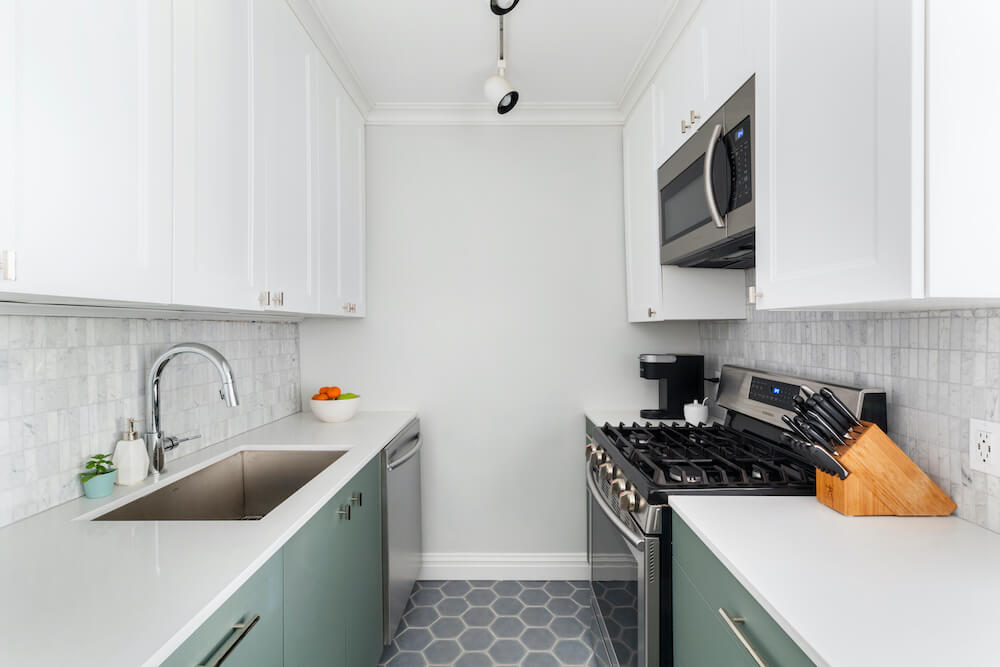
Sunghee and Joseph also renovated their kitchen in the Clinton Hill Co-ops.
Sweeten handpicks the best general contractors to match each project’s location, budget, and scope, helping until project completion. Follow the blog for renovation ideas and inspiration and when you’re ready to renovate, start your renovation on Sweeten.


