A Cozy Loft in a Converted School Building
A former Brooklyn schoolhouse transformed into a cozy, industrial-chic loft. This isn’t just any loft; it’s a testament to thoughtful design and a love for unique spaces. Meet Sue and Alex, the homeowners who breathed new life into their 1980s loft, turning it into a personalized haven that perfectly balances form and function. From the strategic removal of walls to the careful selection of materials, every detail of this renovation tells a story of creativity and practicality.
When working on his Brooklyn loft remodel, this interior designer stayed flexible
At Sweeten, we’re experts in connecting homeowners with top-tier general contractors. We meticulously screen contractors, handpick the best for your project, and collaborate closely with hundreds of them daily.

- Homeowners: Sue and Alex posted their loft remodel on Sweeten
- Where: Cobble Hill, Brooklyn, New York
- Primary renovation: A full-unit Brooklyn loft remodel aiming to add storage and functionality while preserving the apartment’s “80s loft” aesthetic
- Homeowner’s quote: “Our Sweeten contractor proposed great ideas. We had a few conversations before the renovation, and she was very accommodating.”
Elevating the best aspects of home
We have been living in this apartment in Cobble Hill, Brooklyn, since 2015. It was the first place we lived together, and it felt like a real 1980s loft, which Sue and I liked a lot. The previous owner was crafty—he’d installed his own kitchen cabinets, and the spirit of the place was very DIY. Sue works in Fin-tech and I am in interior design. We didn’t do much work when we first moved in, thinking it made sense to let the apartment evolve.
Written in partnership with Sweeten homeowner Alex. “After” photos by Miao Jiaxin for Sweeten.
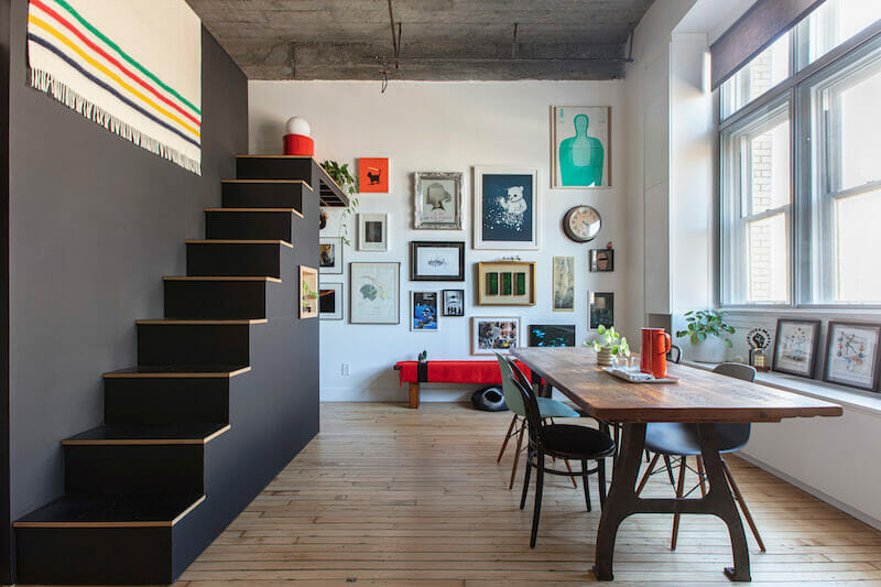
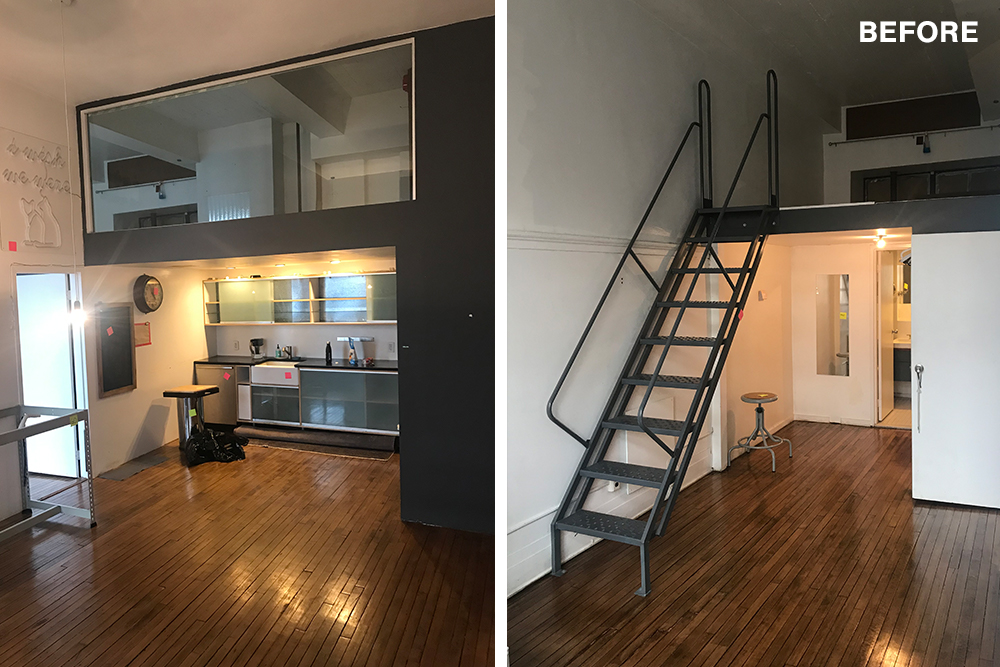
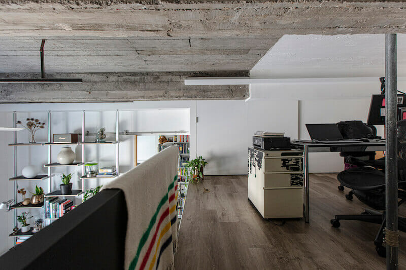
The apartment comprises approximately 900 square feet. It had many vantage points, which our cat, who recently passed, really enjoyed. The neighborhood seems to have a lot of industrial building conversions—a church here, a school there, made into residential apartments. Our building belongs to the latter group, and was converted more than 30 years ago. Visitors are often amazed at how wide the hallways are. That sort of space is not something you often encounter in NYC.
Honing in on the shared lifestyle
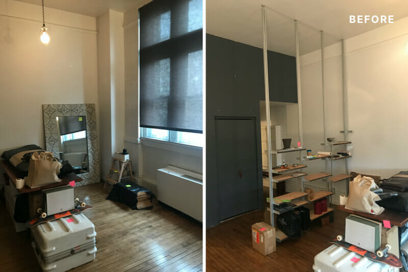
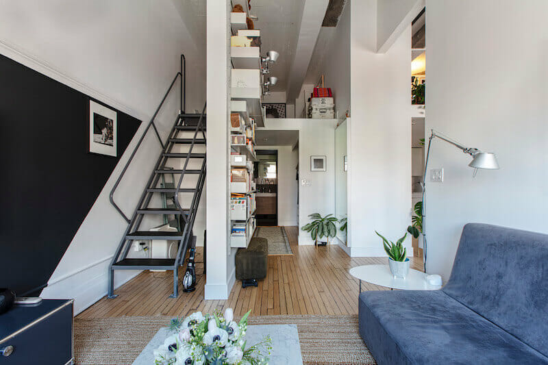
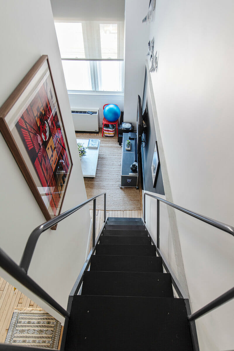
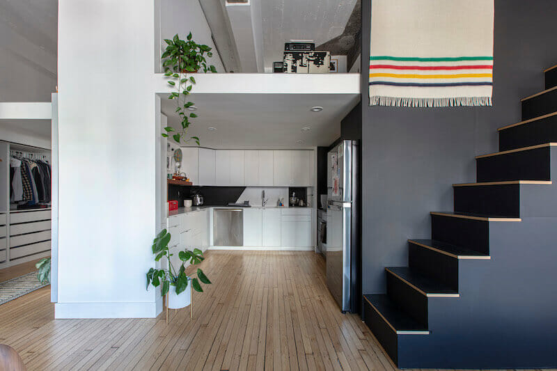
Looking to build on the apartment’s openness, we made a few changes early on. One was removing a spiral staircase and replacing it with an industrial-use stair; it remains in the same location in the current iteration. Another was taking out an idiosyncratic shelving system that the previous owner had installed. We are both utilitarian, and that aspect of our personalities influences our aesthetic.
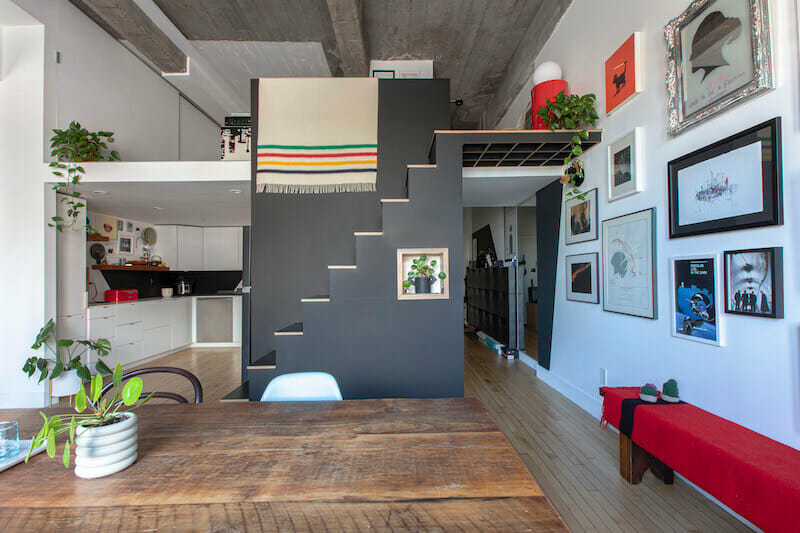
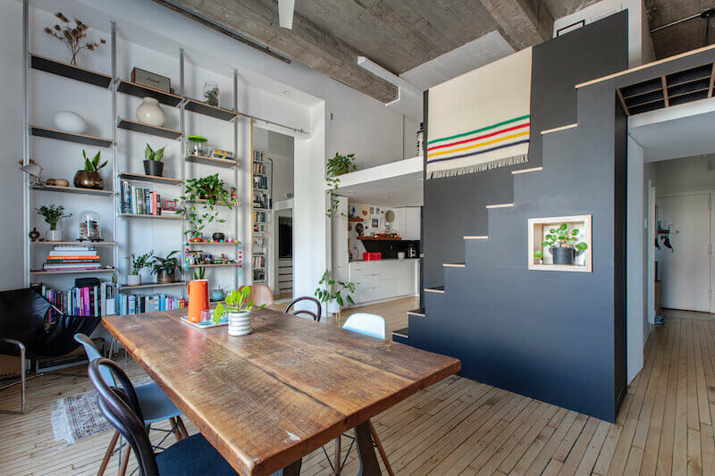
We also like this word that the Dutch have, Gezellig, which translates to something like coziness. It’s not a style, per se, but achieving it was a driving force for our renovation. We didn’t want an overly designed space, but rather one that felt considered.
Practical launch pad to renovate
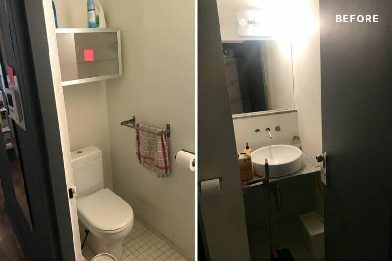
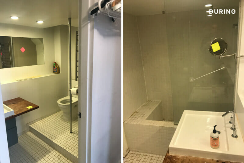
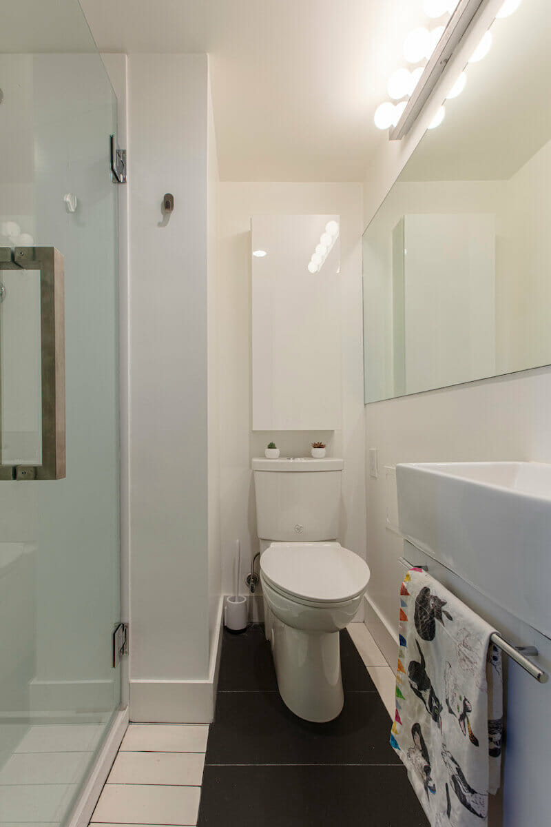
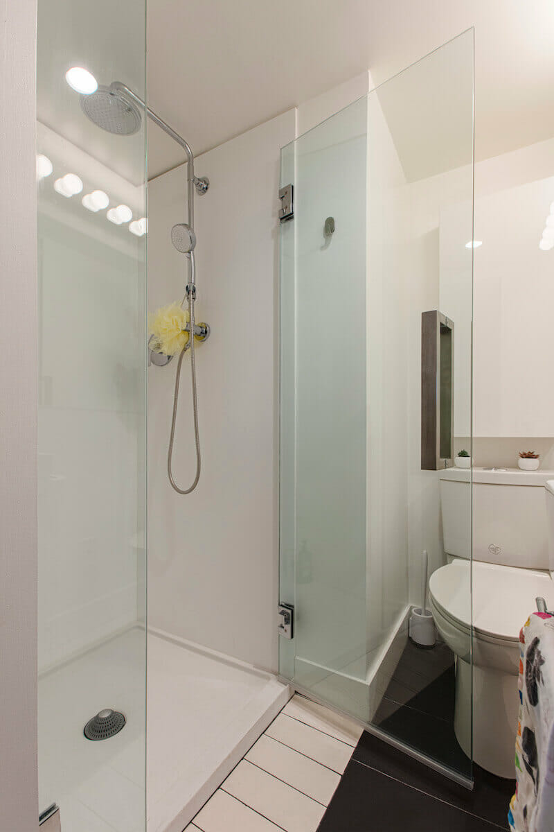
We coordinated our renovation to coincide with the water boiler warranty expiration. Each unit has its own boiler, and you always hear about these things failing shortly after their warranty goes. We figured we would try to avoid becoming a statistic. Another motivation to upgrade was the desperate need for an electrical panel overhaul in the apartment. We wanted to add an in-unit washer and dryer and a shower to our powder room. In addition, the apartment lacked, and desperately needed, built-in storage.
Sweeten brings homeowners an exceptional renovation experience by personally matching trusted general contractors to your project, while offering expert guidance and support—at no cost to you. Renovate expertly with Sweeten
We posted our project, and Sweeten was a great help in providing a list of relevant contractors in Brooklyn. Since I work in this field, I did not utilize other services the company provides. I wanted to complete the renovation within an allotted time frame, and keep within a firm budget. Our Sweeten contractor proposed great ideas. We had a few conversations before the renovation, and she was very accommodating.
Design tricks-of-the-trade
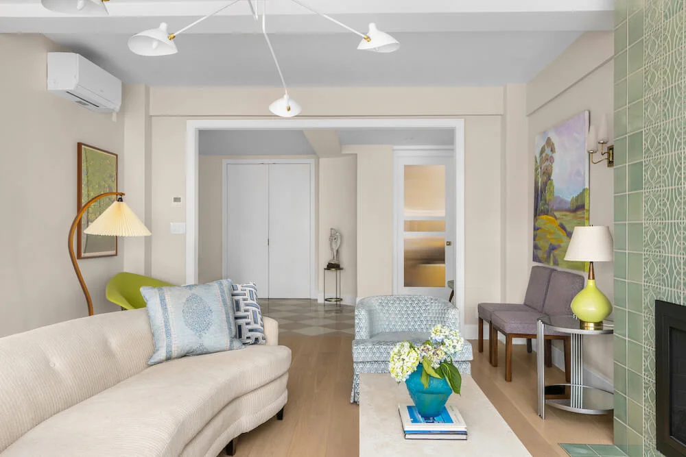
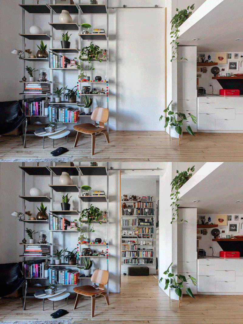
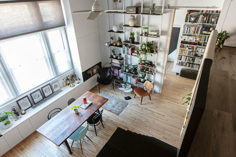
It is always exciting to see a project on paper come to life, but it is especially interesting when you have an experimental client—in this case, ha!, ourselves. Our contractor convinced me that we should open up the entry foyer, which I wasn’t sure of. But in the end I think sacrificing the extra storage was worth it to expand the passageway. We also separated the passthrough between the dining and living space with an oversized barn door, which disappears when retracted.
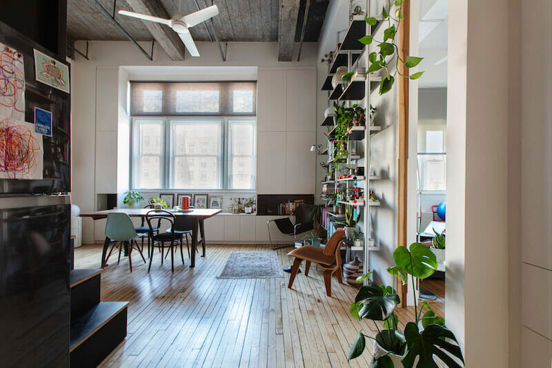
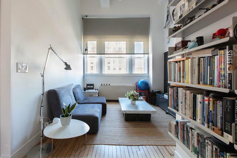
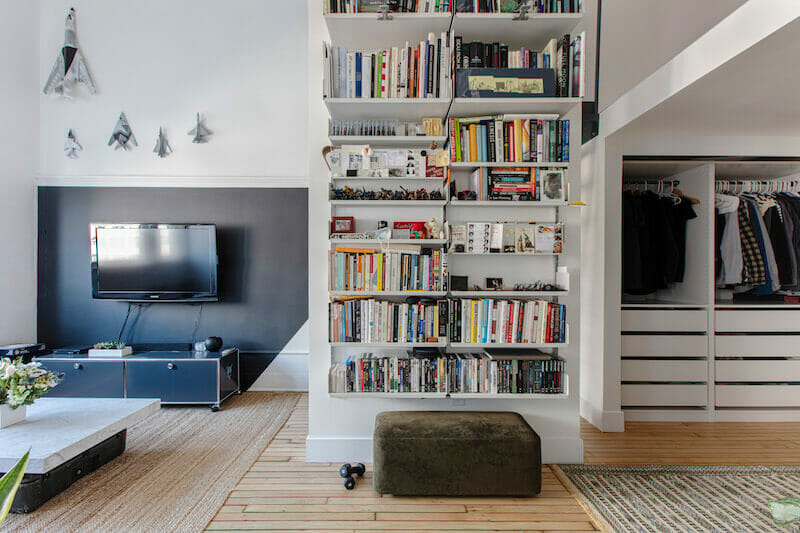
We employed other tricks as well. Take the painting and color scheme, for example. We applied a World War I ship-camouflage technique known as Dazzle—which was a way of masking the volume and shape of military ships using geometric patterns—to try to make walls and objects more or less vanish into the space. We used black behind the TV to have it blend into the space. It is also a nod to the blackboard that would have hung on the wall in this former classroom.
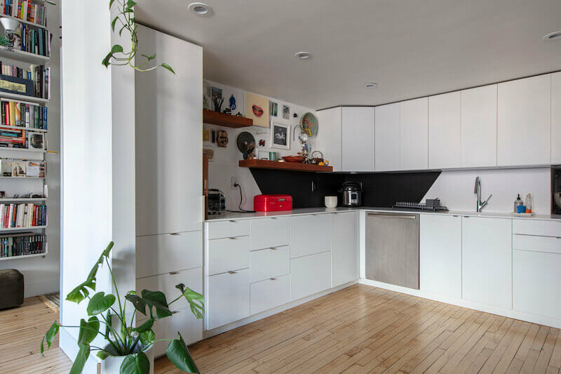
We stayed with a pretty strict material palette just because it is easier to manage and is also a fun challenge to stretch the limit of the material. For example, the black countertop and black backsplash is actually a paper-based product that is extremely durable. I also used it as treads for the stairs.
Being flexible during the process
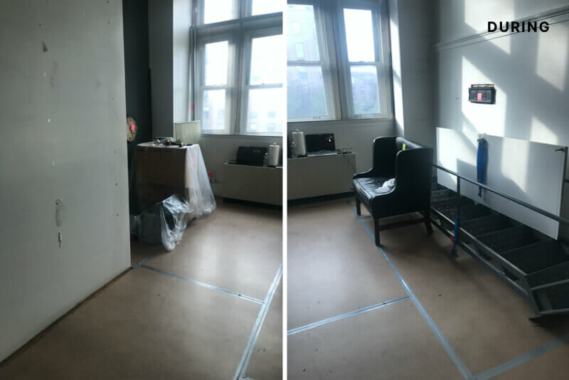
No matter how simple you aim to keep it, in any construction project, there will be challenges to overcome. We moved out of the apartment during the renovation, but I went to the job site every other day to make sure we were moving forward. During one visit, I noticed that the contracting team had framed one of the walls in the wrong location. Instead of losing time having the contractor demolish the framing and restart, however, I decided to redesign that portion of the space. I did it overnight. In the end, we were able to salvage the work and it turned out nicely. It felt serendipitous.
Paying attention to and working with the GC within the process always helps, and given my work, I am familiar with the arc a job follows. Our favorite part of the renovation was the end.
Working from home for the past year, we were able to enjoy the apartment’s ample flow of sunlight throughout the day. It is great to have a space that works so well now and feels not just in sync with the building we live in, but with our entire lifestyle.
Thanks for sharing your Brooklyn loft remodel with us, Sue and Alex!
“Sweeten was a great help in providing a list of relevant contractors in Brooklyn.”
Materials Guide
LIVING AREA RESOURCES: Paint in Simply White and Black Forest Green: Benjamin Moore. Industrial staircase: Grainger.
KITCHEN RESOURCES: Paint in Simply White: Benjamin Moore. Kitchen cabinets and hardware: Ikea. Countertops and backsplash (white material from Krion; black material from Richlite; Elkay sink and AXOR faucet: Porcelanosa. Refrigerator: Samsung. Dishwasher and stove: Bosch.
BATHROOM RESOURCES: Porcelain wall & floor tile; Vanity and sink: Porcelanosa. Shower fixtures and hardware: Hansgrohe. Toilet: American Standard.
Ready to renovate? Start the journey here for free!
Here you can learn more about our services and locations. Alternatively, browse more home renovation inspirations, processes, and cost guides.
