Home / Blog / Before & After / Entire Homes
A Bronx Row House Renovation With a Ground Floor Art Studio
This pre-war Bronx row house renovation gives a work-downstairs space for its artist owner.
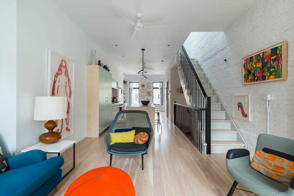
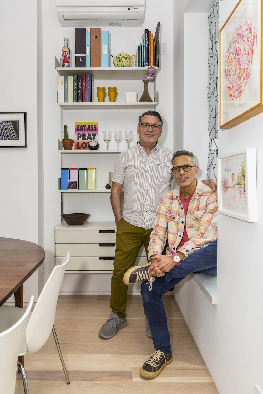
- Homeowners: Steve and Lewis posted their rowhouse remodel project on Sweeten.
- Where: Bronx, New York
- Primary renovation: A whole-house remodel in the Bronx to create an in-home art studio and a feeling of “warm minimalism”
- Homeowner’s quote: “Throughout the job, we enjoyed a collaborative exchange with our contractor and architect. As first-time (and last!) renovators, we’d embarked on possibly the most stressful project of our lives. Luckily, we had chosen the right team carefully.”
Written in partnership with homeowners Steve and Lewis.
Setting goals for a new home
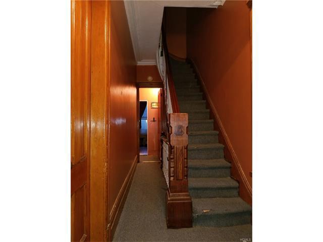
We bought this house with dreams of a live/work space that would reflect our style and offer plenty of room for our art collection. Steve is a painter, so having his studio at home was a life-long dream. We also wanted a place where our friends and large extended family could come together.
We are Steve DeFrank and Lewis Holman. Steve teaches at the School of Visual Arts in Manhattan. Lewis is self-employed as a tax accountant. We sold our loft condo in Williamsburg after living in it for nearly 15 years to purchase a small townhouse in the South Bronx.
From a two-family to a single-family rowhouse
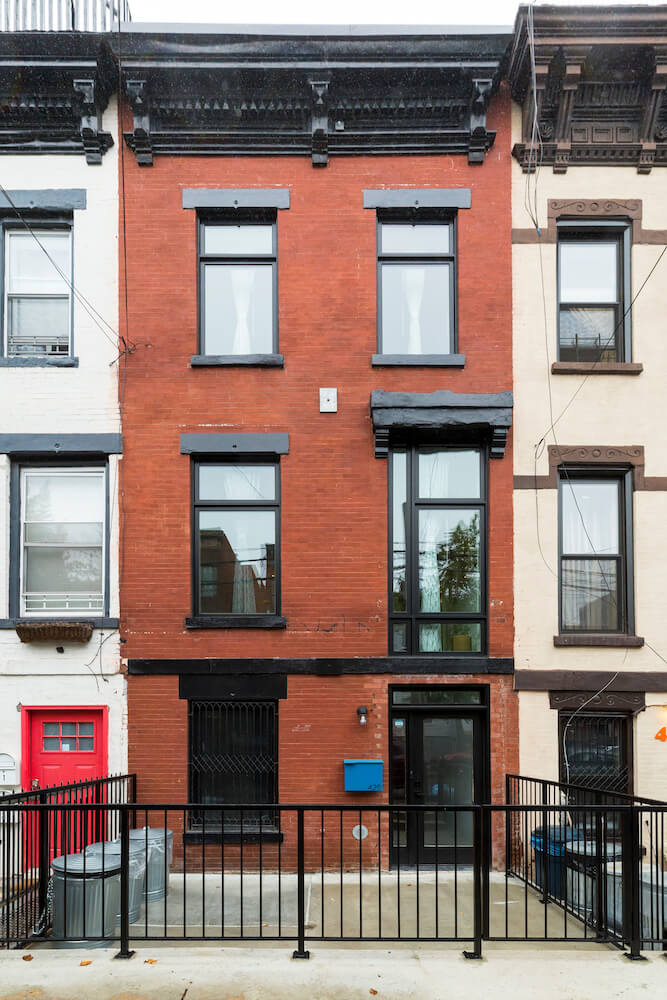
The engineer’s report on our 1882 rowhouse in Mott Haven, the Bronx, looked good, but we still wanted a gut renovation. The structure has three stories comprising roughly 1,500 square feet.
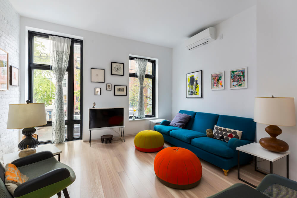
The home had been divided into two apartments and had eight rooms on two of the floors. We wanted to renovate and convert to a single-family home to accommodate a live/work situation.
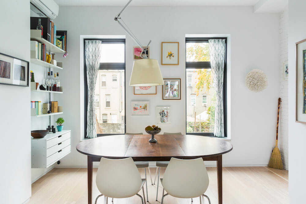
We listed our project on Sweeten and began our search for design-build services in the Bronx. Sweeten’s introduction to our Bronx contractor and architect was a valuable service.
As first-time renovators, our biggest question before starting was how much overhauling the home would cost. The project was about cost. In addition to an in-home studio, we wanted to open up every floor of the building, giving us fewer walls and more windows. We understood that altering the building in this way would be an investment.
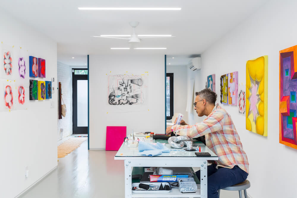
The plan we made with the architect was for the ground floor to be Steve’s studio and a water closet—a bathroom with the sink outside. The middle floor would be the living and dining rooms, plus a customized kitchen and a half bath.
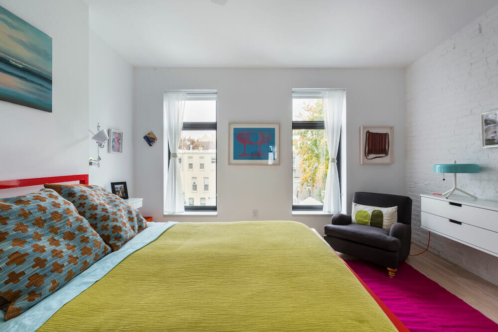
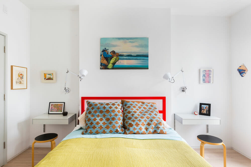
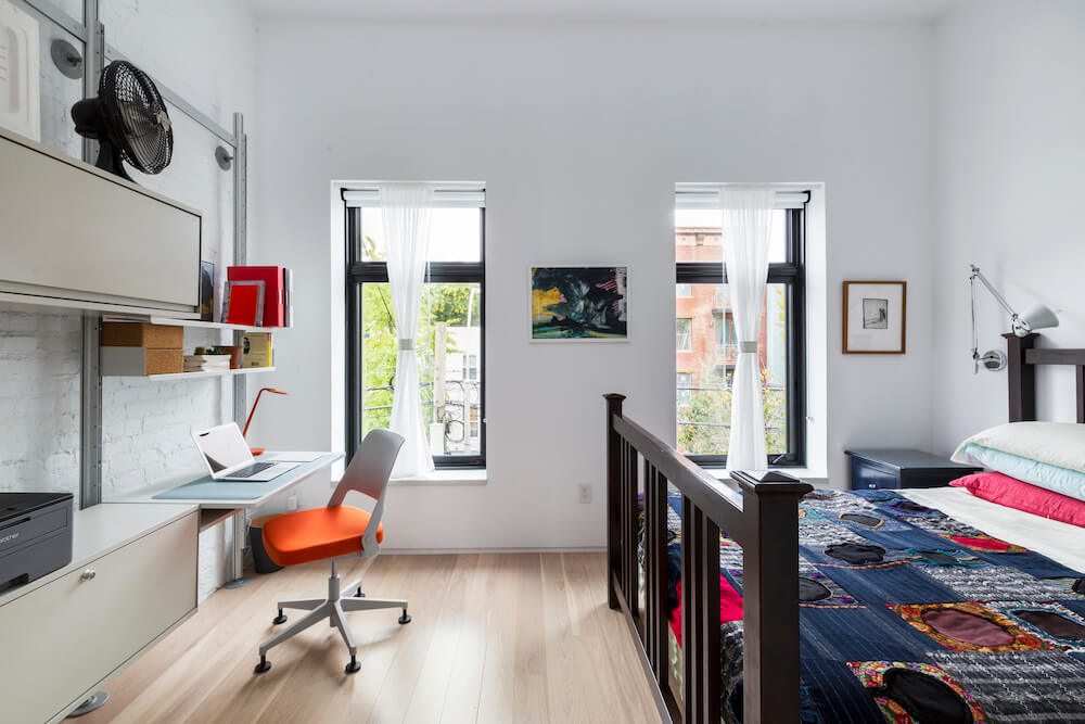
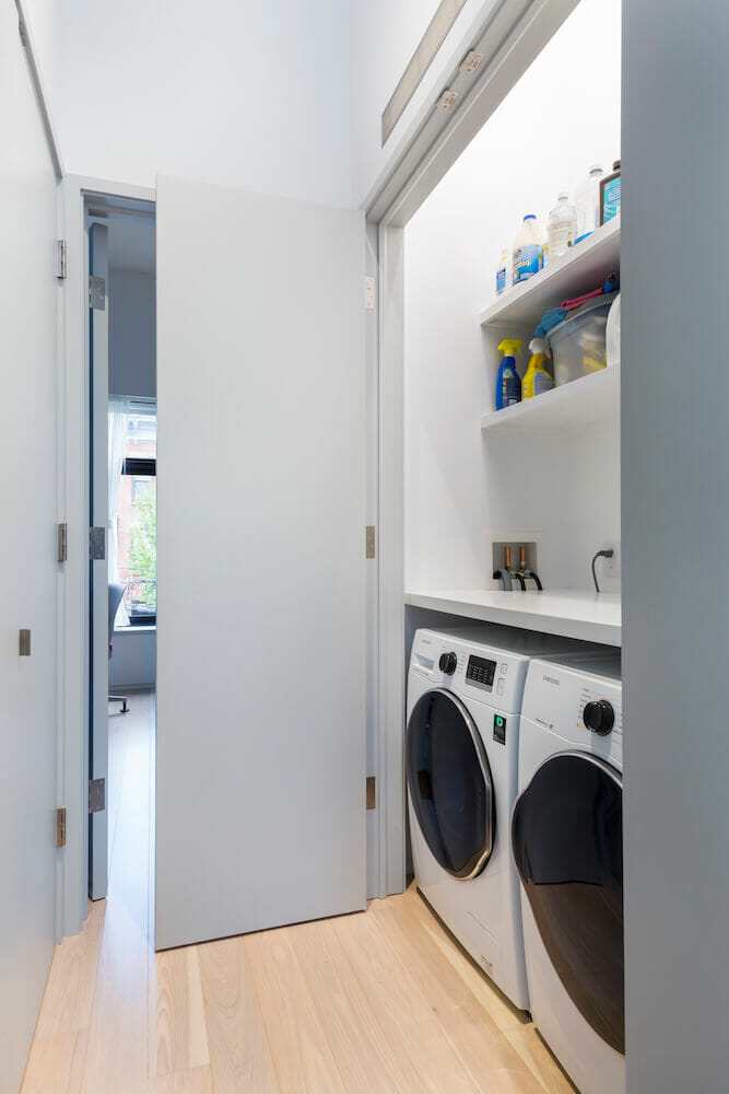
On the top floor would be our bedroom and a home office/guest bedroom, a remodeled full bath, and a laundry closet.
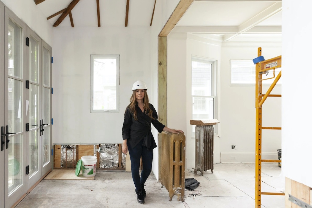
We planned for a true townhouse renovation—nothing was in good enough shape to retain. Our Sweeten contractors demolished down to the bricks and joists, all of which had to be replaced or sistered; this was necessary to allow removal of the central beam, which had to be done to open up the ground- and middle-floor spaces.
Radiant heat and functional stairs
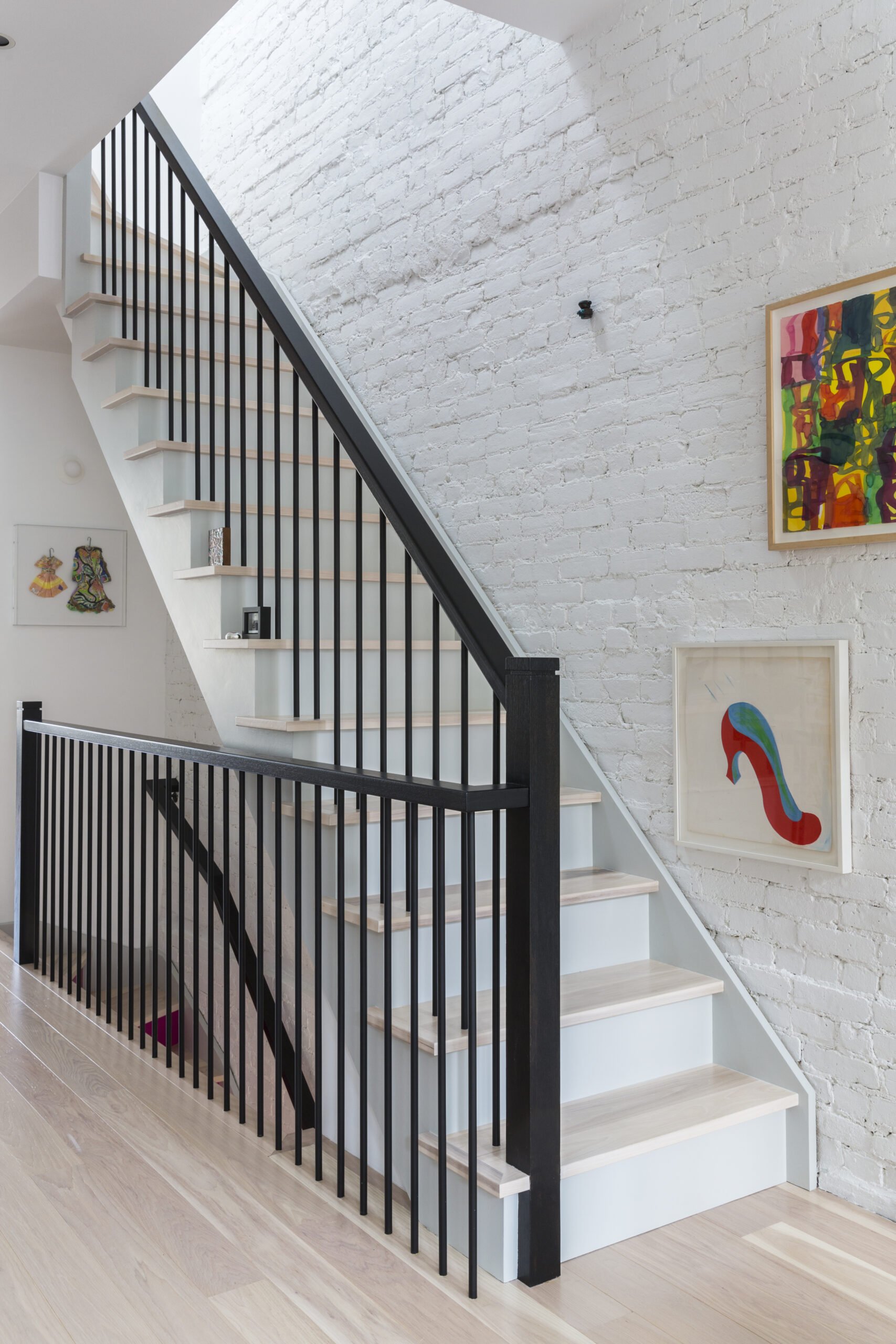
Throughout the home, we aimed for low-maintenance, design-worthy materials to evoke an aesthetic of warm minimalism. We wanted expansive wall space for hanging artwork.
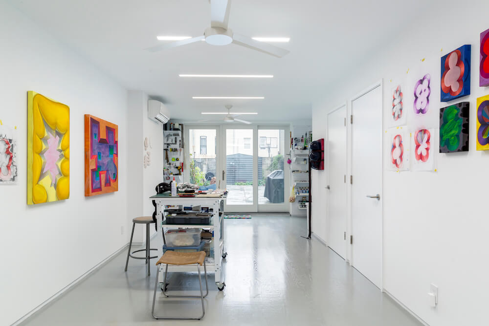
The ground-level studio interior is an open workspace with recessed LED lighting, a lot of artist’s storage, and radiant-heat flooring—which we installed on all levels. To bring as much light as possible to the studio, we opened the rear wall with an 8’ x 9’ three-panel glass sliding door.
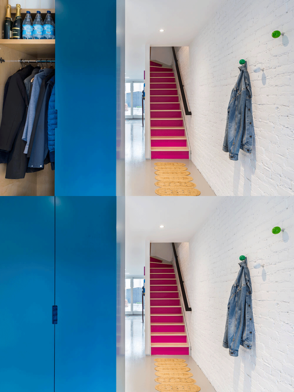
We decided to remove the original front stoop and relocate the house’s entrance to the ground floor, which created some challenges. Our architect Shannon envisioned—and our Sweeten contractor produced—a storage unit that divides the entry area from the studio space. We had hoped to save the original interior staircase and railing, but our Sweeten contractor showed us options that made more sense. Sweeten brings homeowners an exceptional renovation experience by personally matching trusted general contractors to your project, while offering expert guidance and support—at no cost to you. Renovate expertly with Sweeten
Ultimately, we closed the stairs from the ground floor to the first to create more wall space in the studio; we chose a vivid pink hue for the risers, which brightens the whole entrance. On the parlor and top floors, we went with a wood stair-rail that looks simultaneously classic and modern. In the end, we were very happy that we took our contractor’s advice.
Connecting all of the floors
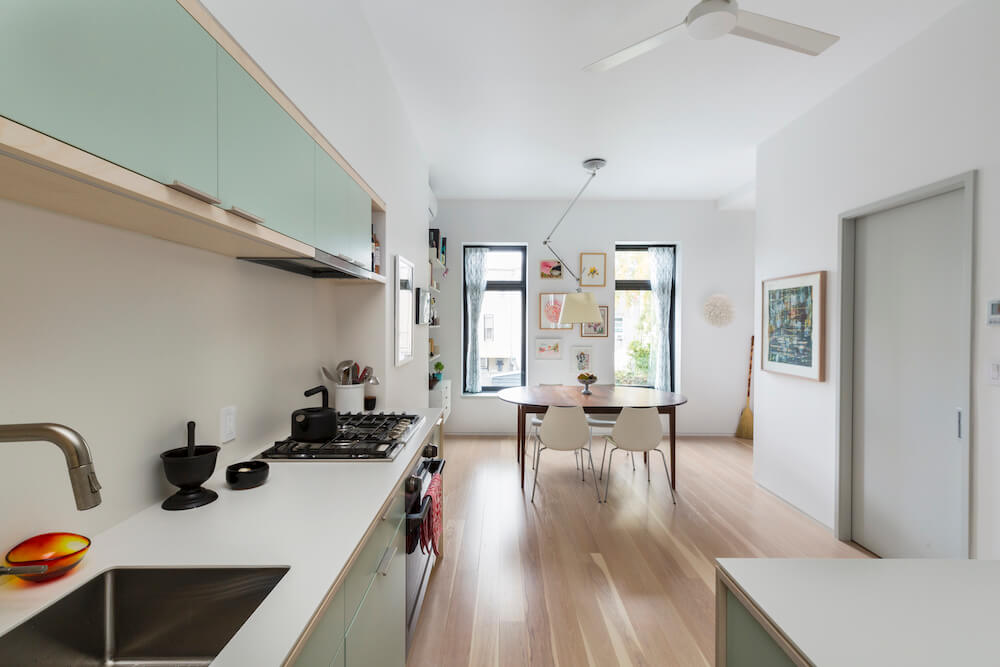
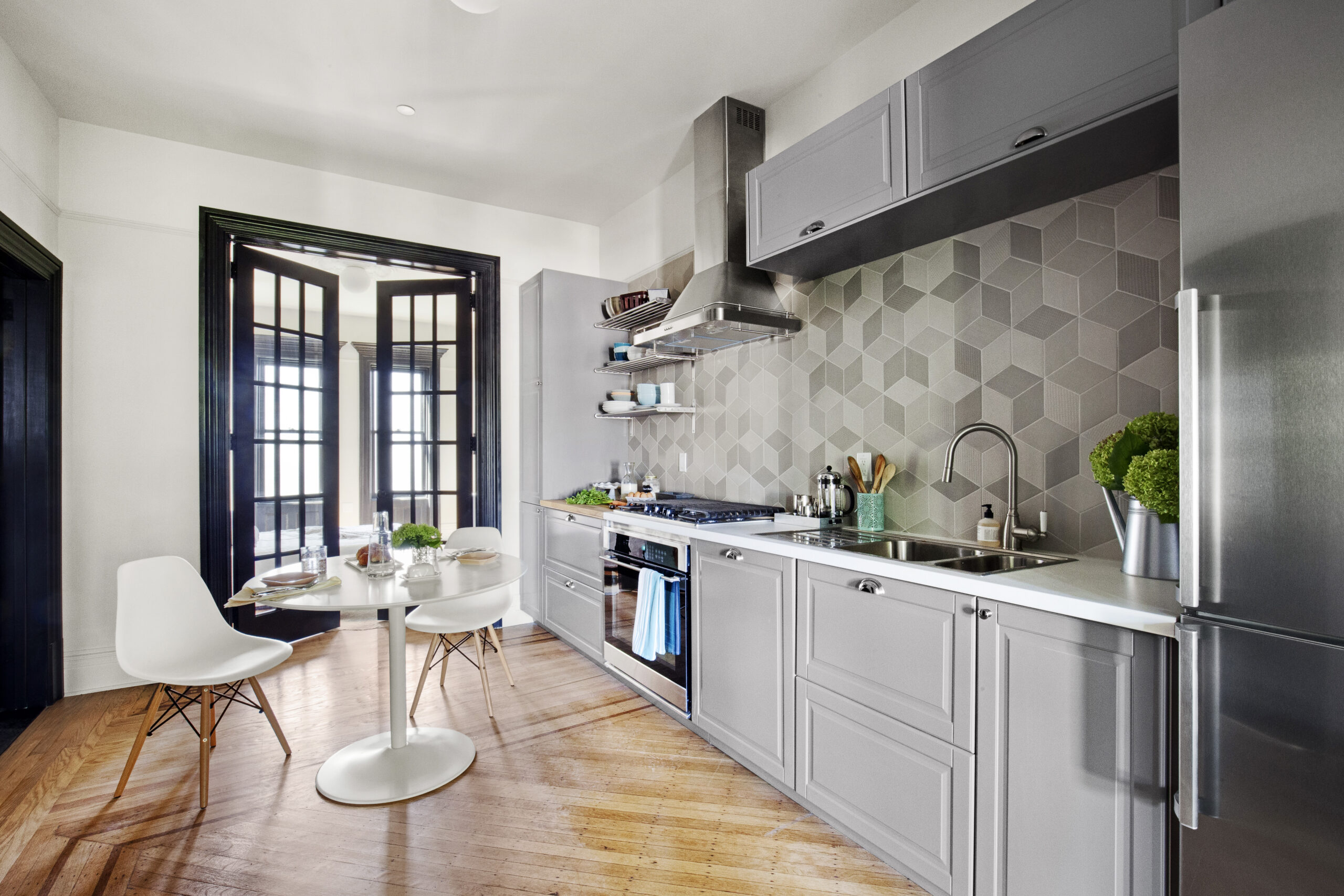
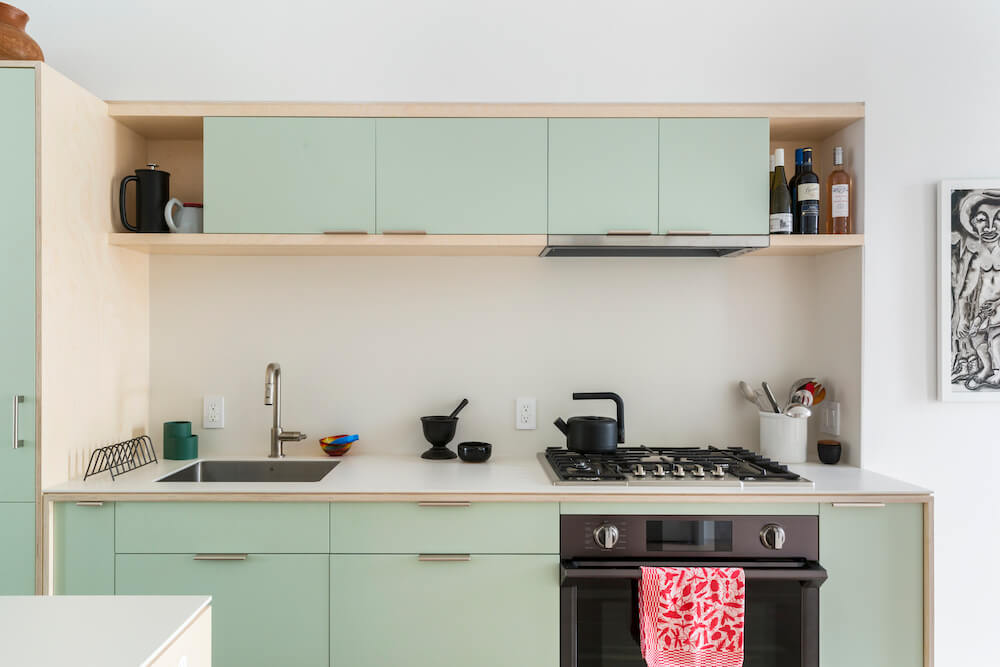
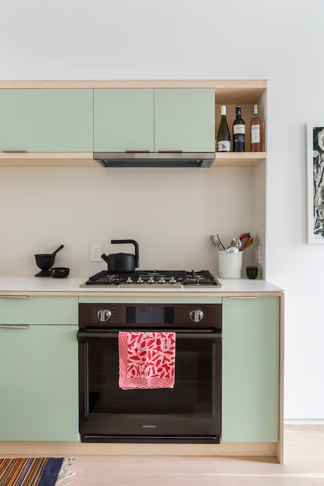
The vision for the kitchen remodel included custom millwork with the front panels painted green evoking the palest verdigris. Our island, which has an angled front, is an homage to artist Donald Judd.
We rented nearby during renovations and observed this living area coming together. Visiting the site at least twice a week, we loved seeing the gradual progress, sometimes glacial and sometimes lightning quick.
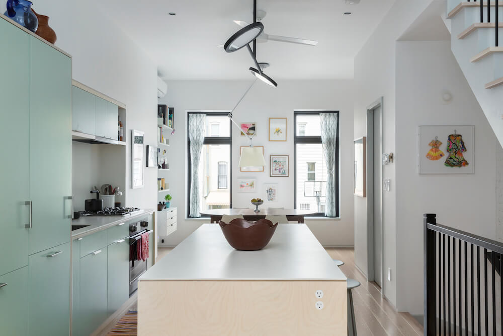
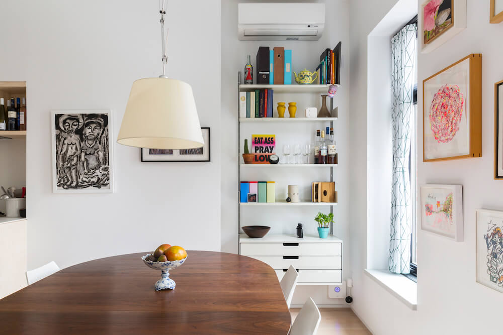
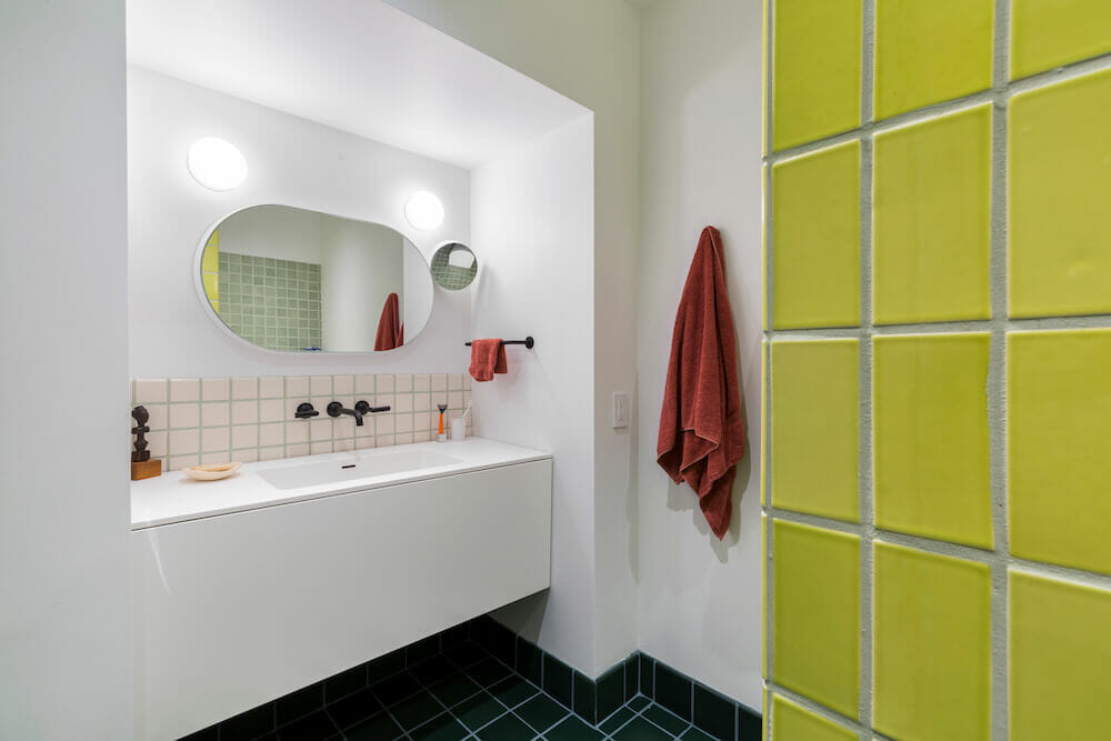
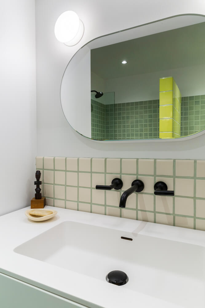
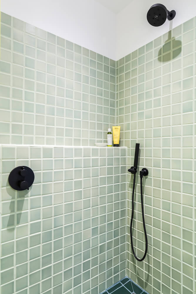
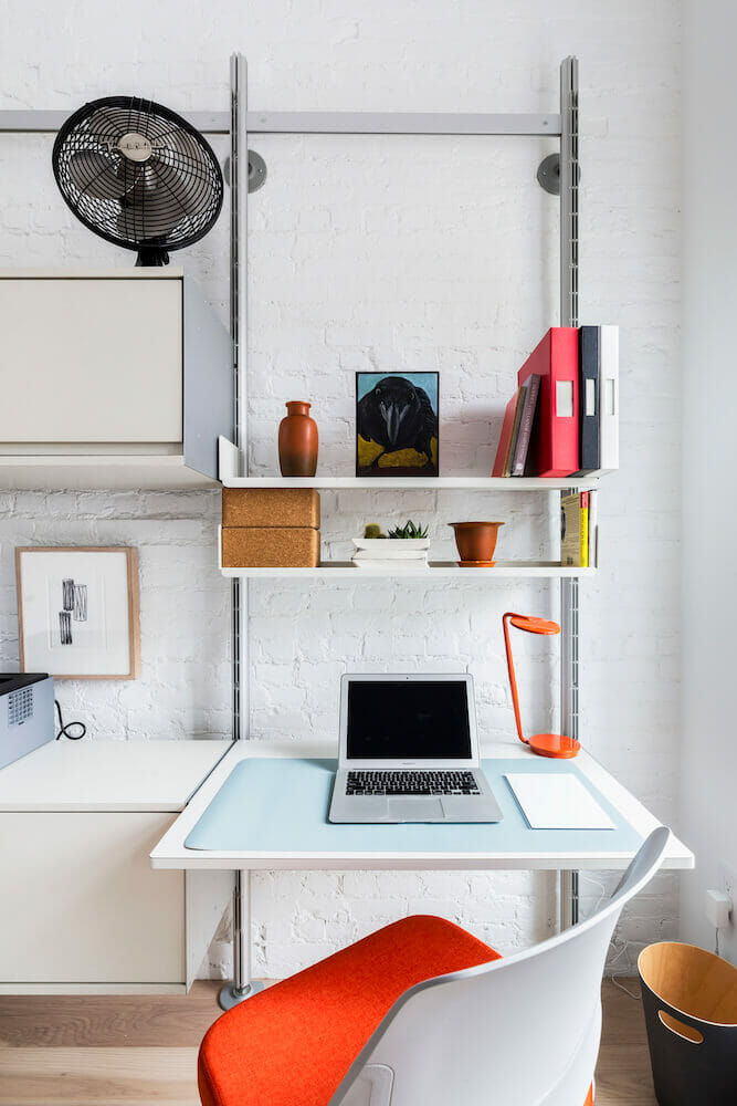
A dining-area drawer and shelving system provides storage and connects these rooms to the top floor, where the main bedroom and home office also employ coordinating storage units. We had fun with tile to remodel the full bath upstairs, where we mixed matte and glossy tile in a range of sizes and colors, including chartreuse, dark green, and gray-green.
A building exterior refresh
The elimination of the parlor-floor entrance led to an anomaly on the front of the house, with regard to the living-room windows. The window occupying the old door frame is much larger than the window next to it.
The architect’s solution—a modular window design, made up of a series of smaller frames, one of which mirrors the smaller window to create a visual connection.
Steve and Lewis’ renovation advice
Throughout the job, we enjoyed a collaborative exchange with our general contractor and architect. As first-time (and last!) renovators, we’d embarked on possibly the most stressful project of our lives.
Luckily, we had chosen the right team carefully. Our contractor and crew kept a sense of humor during a long, arduous process.
Our advice to other homeowners ready for a renovation: Anticipate bad news and delays, and roll with the punches. Be grateful for the opportunity you have, even when you wonder why you ever thought it was a good idea!
And remember, issues that arise and seem monumental during the process get solved, and are forgotten once you move in. Now, when we enter our home, we feel serene.
Thank you for sharing your Bronx remodel story with us, Steve and Lewis!
Ready to renovate? Start here for free!
Here you can learn more about our services and locations. Alternatively, browse more home renovation inspirations, processes, and cost guides.
Renovation materials
WHOLE HOME RESOURCES:
- Wall and ceiling in Super Matte paint; interior doors, trip/castings, window sills, stair risers, and stringers in Cliffside Gray pearl paint: Benjamin Moore.
- Radiant heat flooring: Warmboard, Inc.
- Engineered Hickory Heirloom, ¾” thick, tongue and groove softened edge, 5” face widths, Veiled White satin prefinished wood flooring: Carlisle.
- Mini Orb stairwell lights: Allied Maker.
- Light switches: Lutron.
ARTIST STUDIO RESOURCES:
- Interior doors and door trim in Super White pearl; studio floor and cellar stairs in Platinum Gray glossy floor/porch paint; storage cabinet in Pacific Ocean; stair risers in Hot Lips pearl; stair stringers in Cliffside Gray pearl: Benjamin Moore.
- Continuum 23 series architectural LED linear fixture: Alcon Lighting.
- No. 8 LED, flush mount recessed lighting: Dulanski.
KITCHEN RESOURCES:
- Custom millwork cabinets: Custom by contractor.
- Cabinets in Antique Jade paint: Benjamin Moore.
- Dekton countertops and backsplash in Zenith: TK Quartz and Granite.
- Refrigerator, dishwasher, and cooktop: Bosch.
- Electric oven: Samsung. Discus Pendant 2 light over kitchen island: Mattermade.
DINING AREA RESOURCES:
- Tolomeo variations light over dining table: Artemide.
- Dining area drawer and shelving system: Vitsoe.
FULL BATHROOM RESOURCES:
- Field tile, 6×6 in color P210 (dark green), 6×3 in color R203 (chartreuse), 3×3 tile in color P94 (gray-green), 3×3 in color S1 (off-white, behind sink): Pratt & Larson.
- Blu Bathworks series 1200 wall-mount vanity and matte white #SA1200-01m sink top; Duravit Darling New wall-mounted toilet; matte black single-function shower head; black Del Rp71751.Bl shower arm; black wall-mounted hand shower set: AF New York.
- Gravity mirror: Ex.T. Mini Dome light: Allied Maker.
HALF BATH RESOURCES:
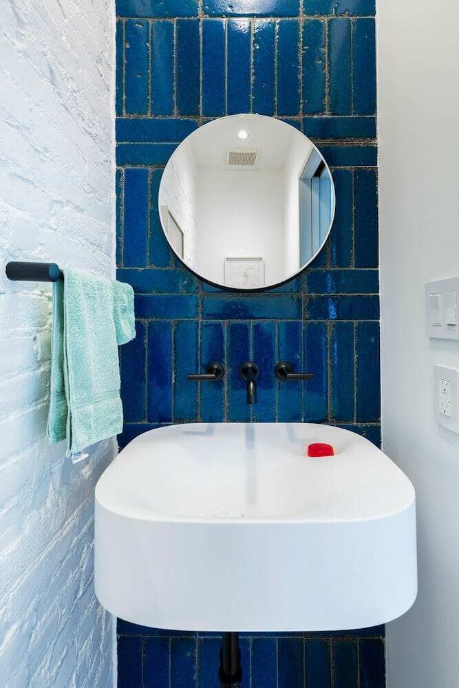
- Adriatic 3×12 lava stone subway tile: Tilebar.
- Jason Wu sink faucets: Brizo.
- Nivis wall-mounted sink: Agape Design.
- Gravity mirror: Ex.T.
- White Darling New wall-mounted toilet: AF New York.
- Endless Dome light: Allied Maker.
- Contempo II black matte towel bar: Manhattan Center for Kitchen and Bath.
BEDROOM RESOURCES:
- Drawer and shelving systems: Vitsoe.
- Tolomeo variations wall-mounted bedside lamps: Artemide.
Frequently asked questions
A pre-war home is a home built before World War II. In the blog, the home dates to 1882. This home has three stories totaling roughly 1,500 square feet. This is a layout typical of the era and often complemented by higher ceilings.
These renovators chose to dedicate one room of their three-floor row house to be an art studio. When you plan the layout around how the studio will be used, an in-home studio can be easy to accommodate. They chose an open workspace with recessed LED lighting, plenty of storage, and choices like radiant-heat flooring and a large glass sliding door to bring in more light.
The benefits of hiring an architect for a gut renovation are a clear plan for how each floor will function and design solutions that fit the home’s existing conditions. In this renovation, the architect designed a live/work layout and detailed elements like a storage unit that separates an entry from a studio area or a modular window design.
Yes, you can mix matte and glossy bathroom tile. In the renovation, they modernized the upstairs bath by mixing matte and glossy tile in a range of sizes and colors, including chartreuse, dark green, and gray-green.
