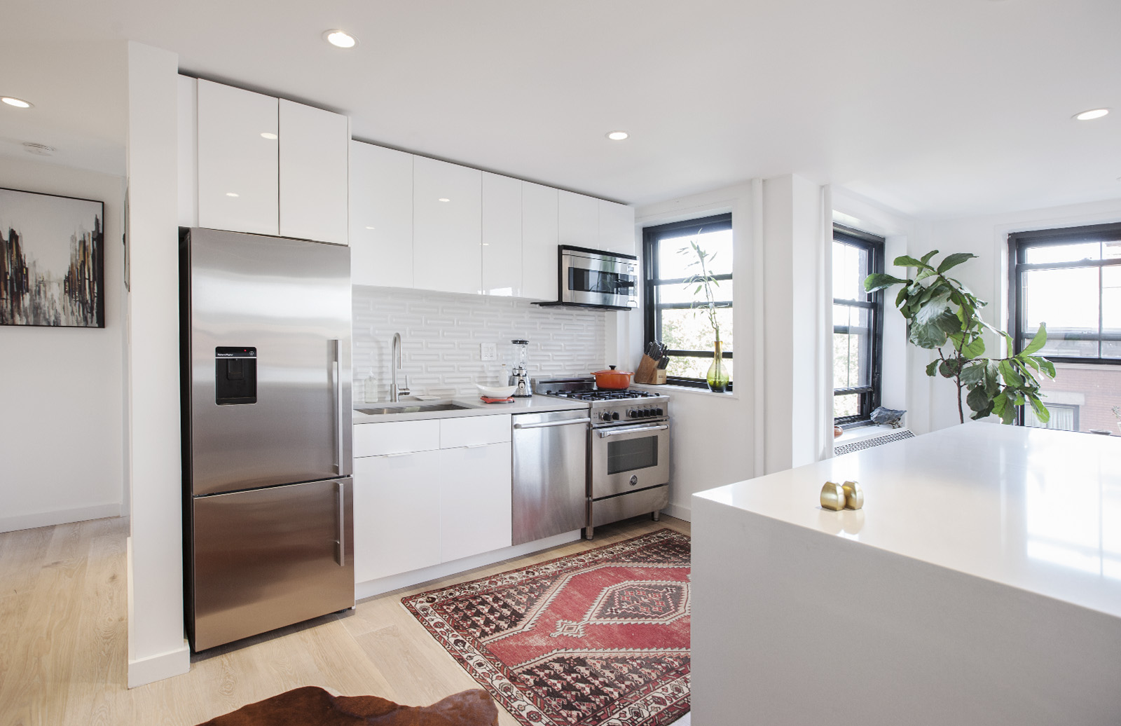
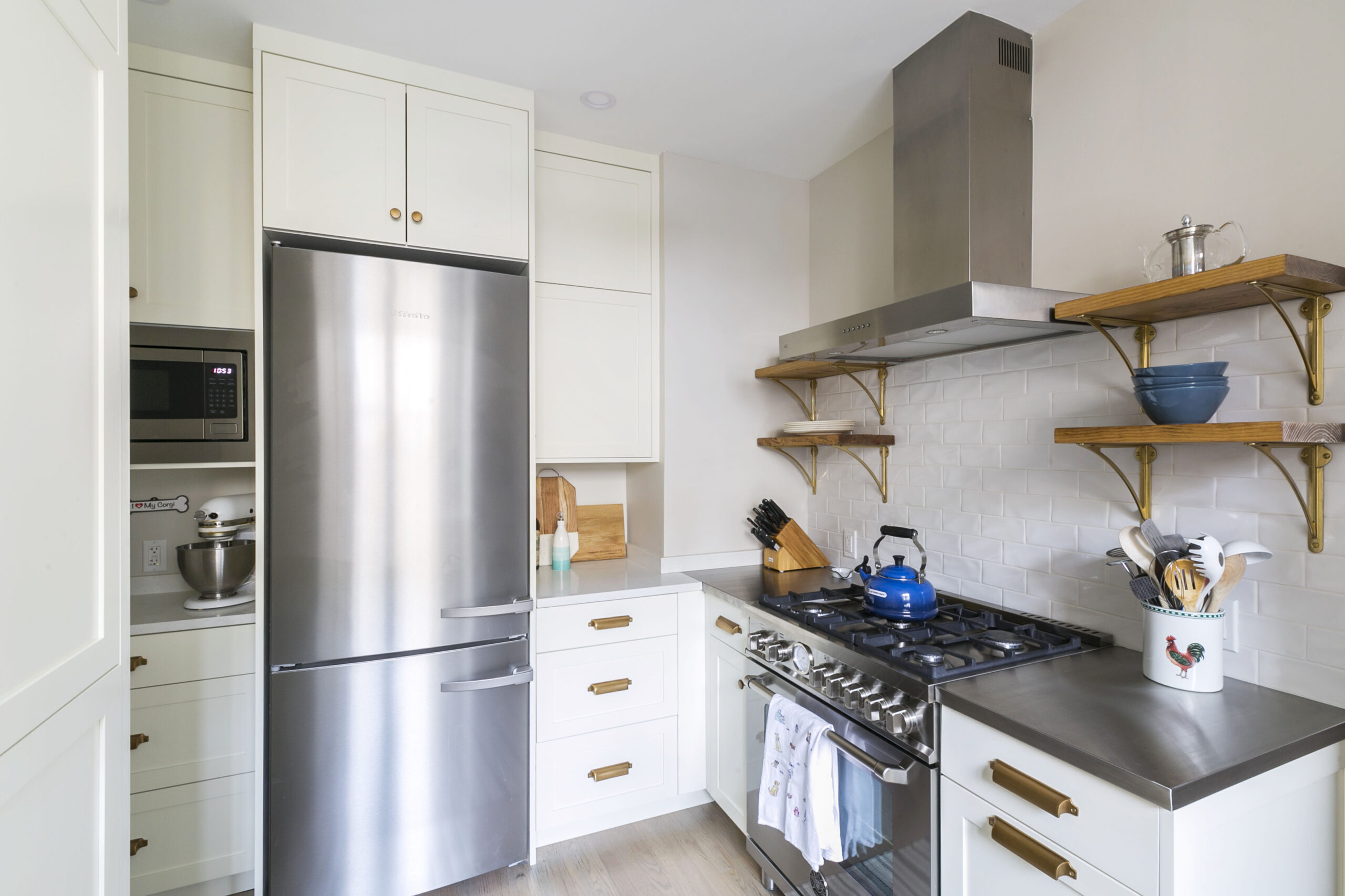
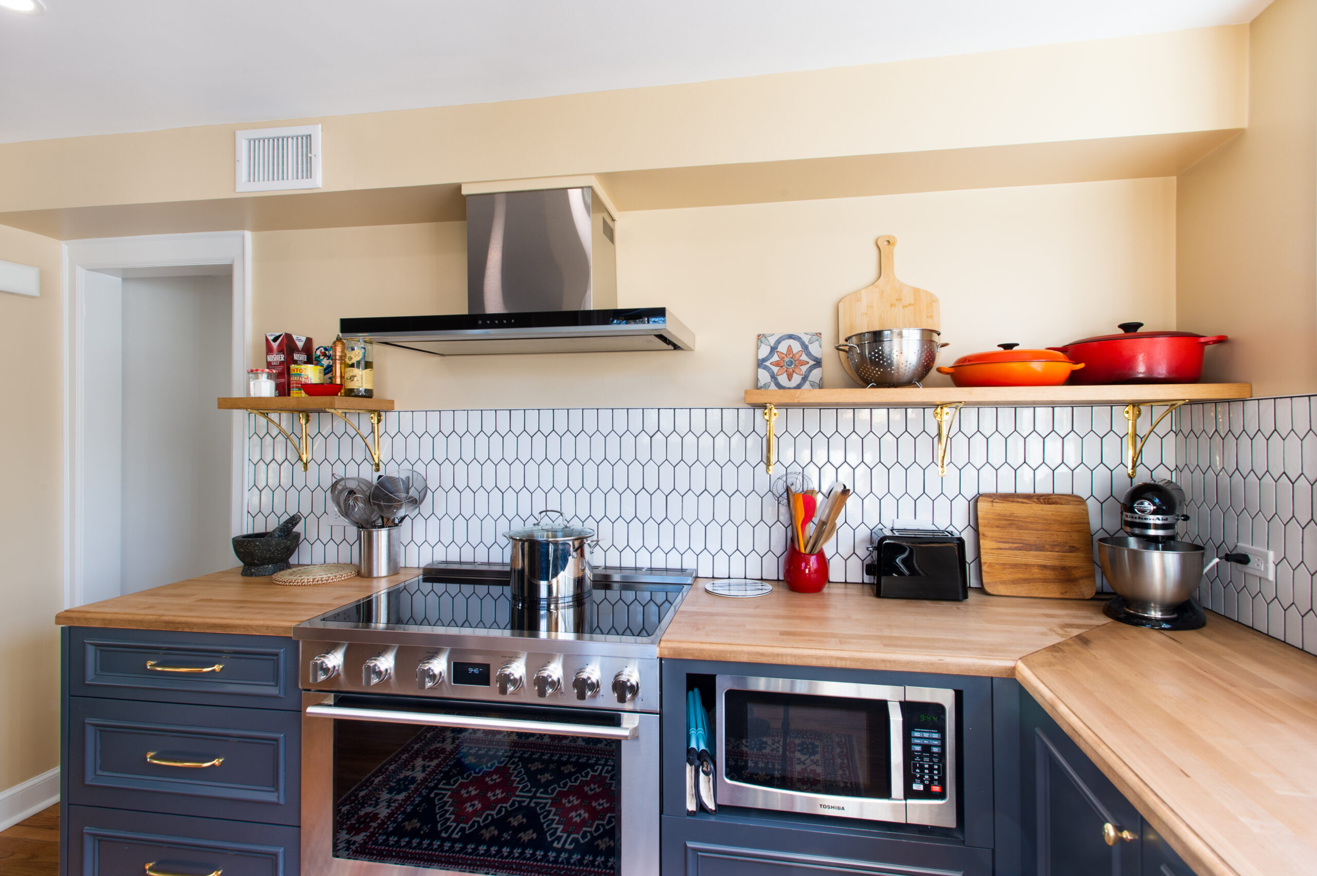
An Odd-shaped Kitchen Leads a Co-op Refresh
Smart upgrades for the kitchen and bathroom solve pesky problems
When Ryan, an editor, and Sophie, a paralegal, envisioned their renovation, they knew they needed to address the problems they inherited from the “quick and dirty reno” completed in 2009, the year Ryan bought the apartment. The advantage of waiting years to renovate? “It was abundantly clear how we utilized the kitchen,” says Ryan, adding “I had 10 years to save up because even a modest renovation like this one isn’t cheap in NYC!” In their 750-square foot, prewar one-bedroom on the Upper West Side, the partners agreed that the odd-shaped kitchen needed rearranging to take advantage of every square inch; and the bathroom required rescuing from a “South Florida Grandma aesthetic.”
To tackle the project, they posted on Sweeten, a free renovation platform that matches homeowners with licensed general contractors and tracks their projects, and chose their contractor.

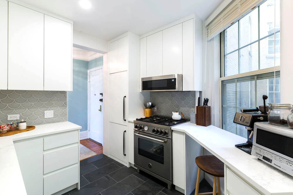
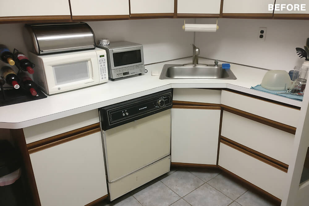
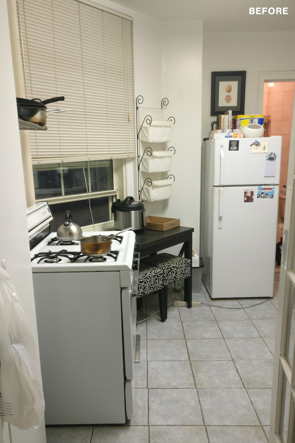
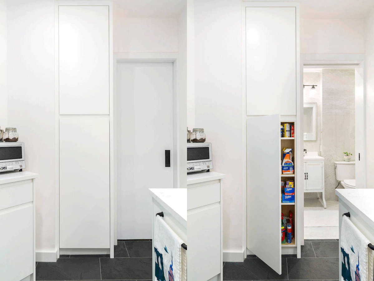
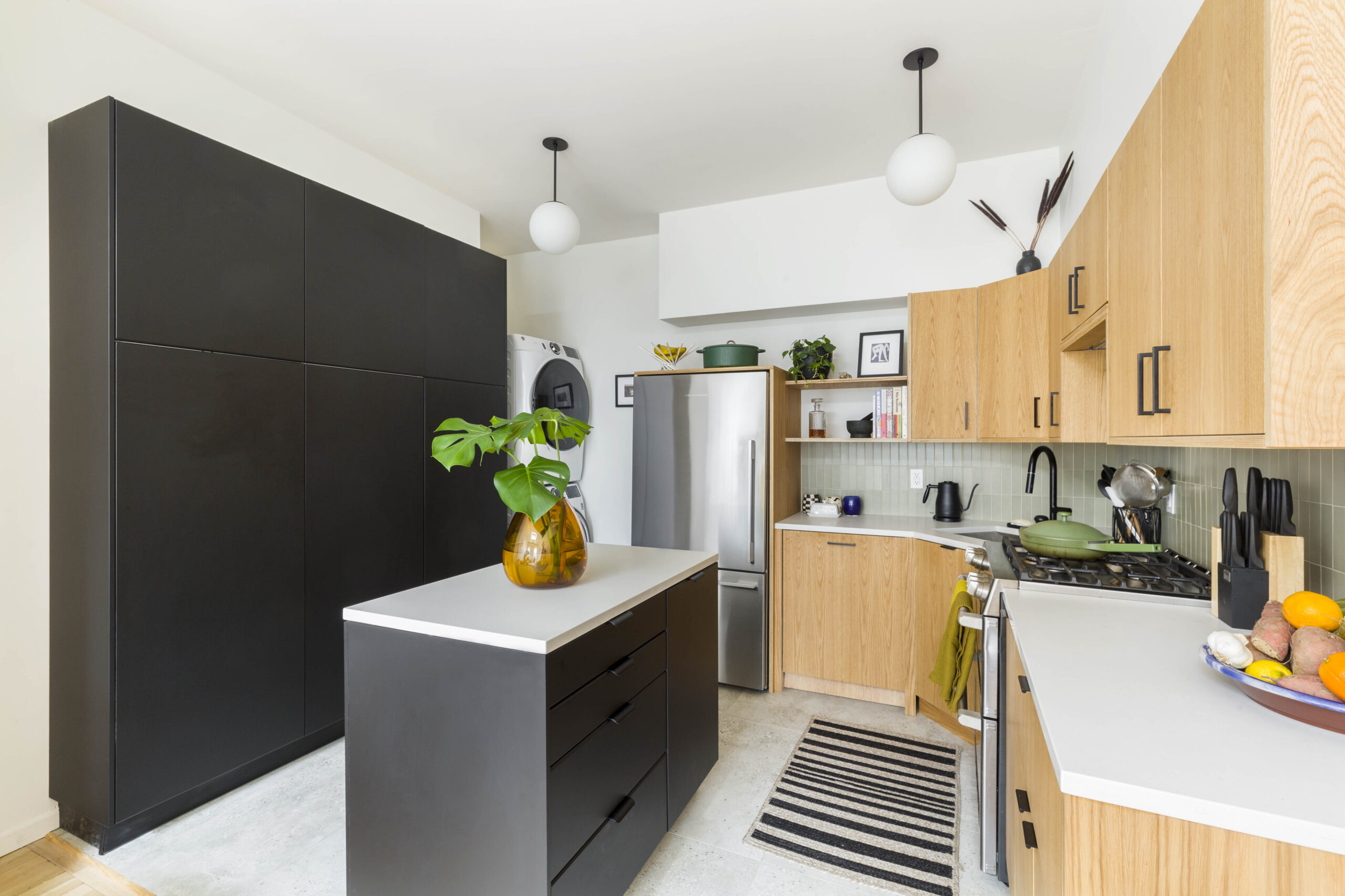
Whoever designed the last renovation really did not think things through. In the kitchen, which is an odd trapezoidal space, the priority was maximizing both storage and counter space, and minimizing clutter. For instance, there was a 24-inch soffit between the top of the cabinets and the ceiling that was just empty space. So we knew we’d need cabinets extending to the ceiling.

The sink was on a diagonal resulting in a large dead space. And the refrigerator was a huge obstruction at the back of the room and the first thing you see when you enter the foyer. Its positioning made the kitchen seem smaller and it just needed to find a new spot. We weren’t sure if that was possible.
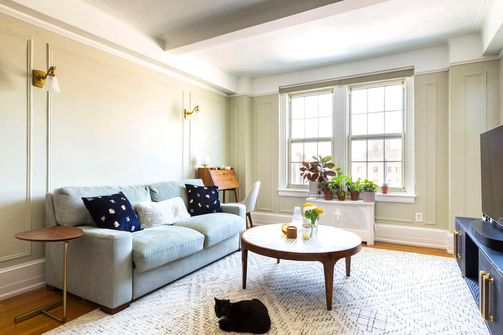
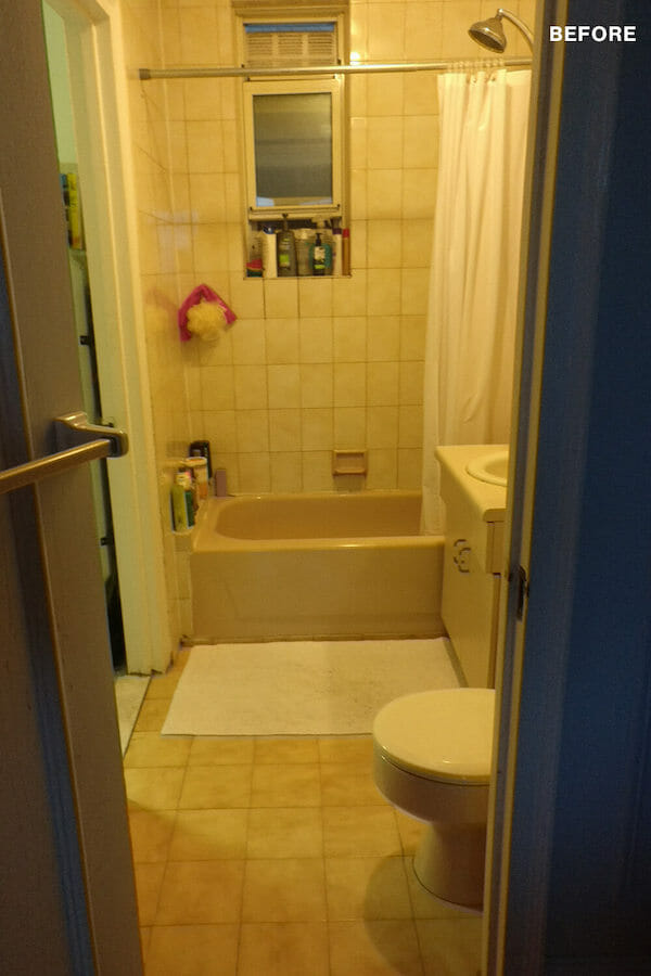
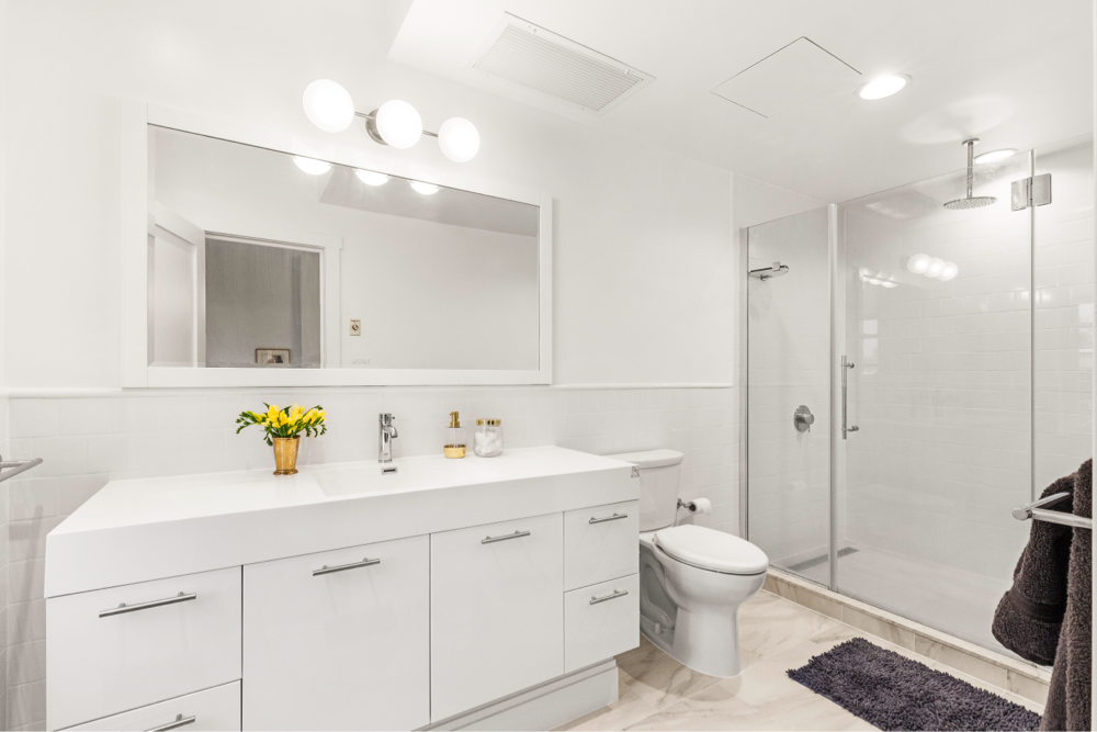
The bathroom was small and dark with very little natural light. The vanity was made of builder-grade particle board that had swollen with moisture, and the medicine cabinet protruded. We were intent on transforming the look and feel of the bathroom—even the toilet was pink! The living room got a refresh with repainted walls, a replastered ceiling, and new sconce lighting.
The contractor’s millworker was about twice the cost of Ikea and Cabinets.com, but still about $5,000 less than the cabinets in the next price tier.
For the kitchen, I commissioned a one-hour consult with an interior designer, Clare of One to One Studio, while still planning everything out. The designer suggested moving the refrigerator to the corner and relocating the doorway to accommodate the fit. That might seem obvious in retrospect, but to me, it was a revelation.
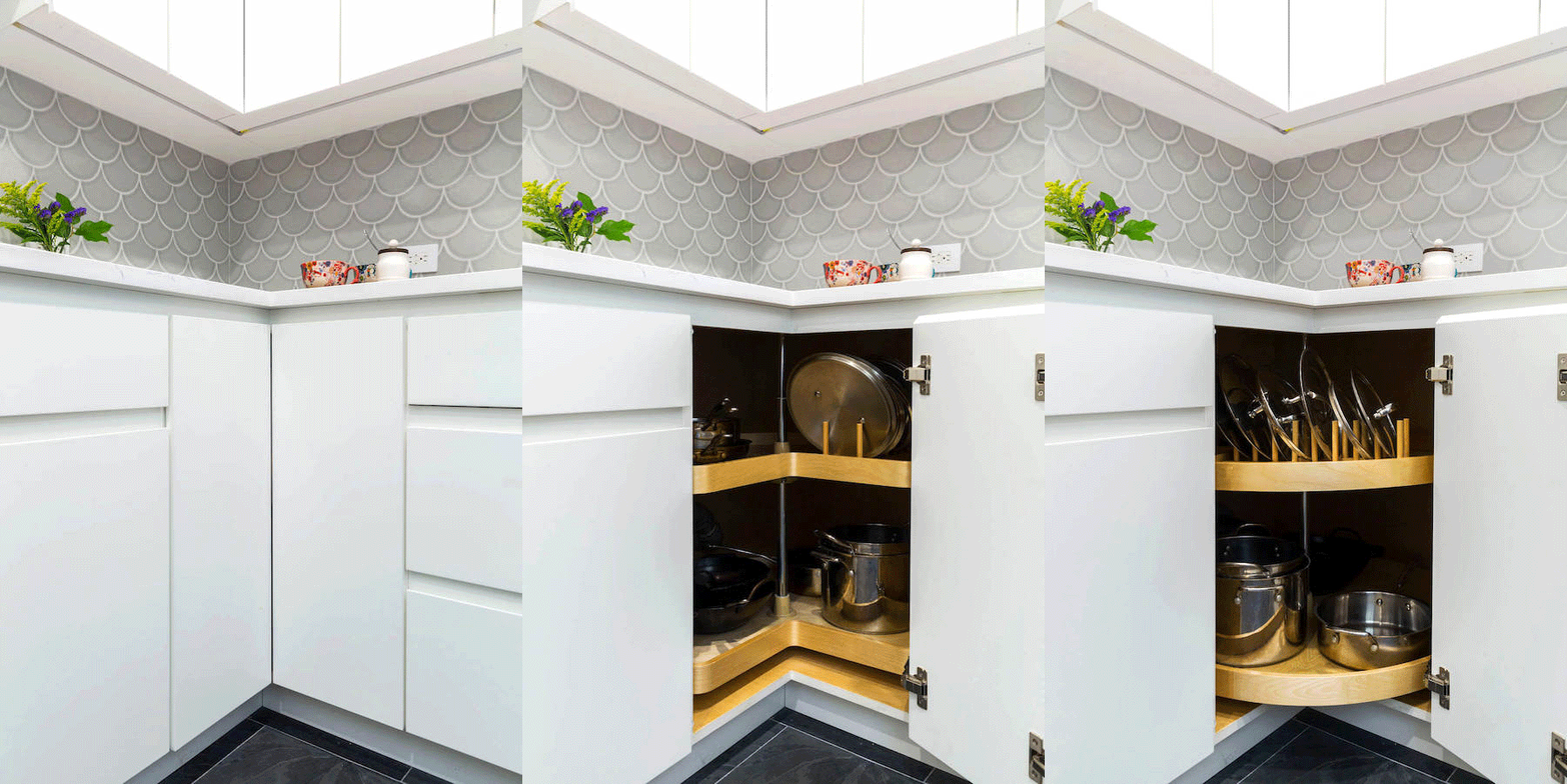
We went with custom cabinets so everything would look integrated. The odd-shaped kitchen space came with difficult angles, pipes, and protrusions. We went to Ikea to experiment with a layout, but couldn’t get their premade boxes to fit in a satisfactory way. I also tried Cabinets.com, which had more options in terms of box sizes, but I worried the boxes wouldn’t be delivered in time.
The contractor’s millworker was about twice the cost of Ikea and Cabinets.com, but still about $5,000 less than the cabinets in the next price tier. He was able to build boxes that accommodated the kitchen’s unusual dimensions.
The kitchen floor tile came from the designer, during our consult. I asked her specifically what I should get since I was stumped by all the options. She recommended black slate tile: durable, attractive, and cheap. Her basic ethos was “make it look expensive without being expensive.” Sweeten brings homeowners an exceptional renovation experience by personally matching trusted general contractors to your project, while offering expert guidance and support—at no cost to you. Renovate expertly with Sweeten
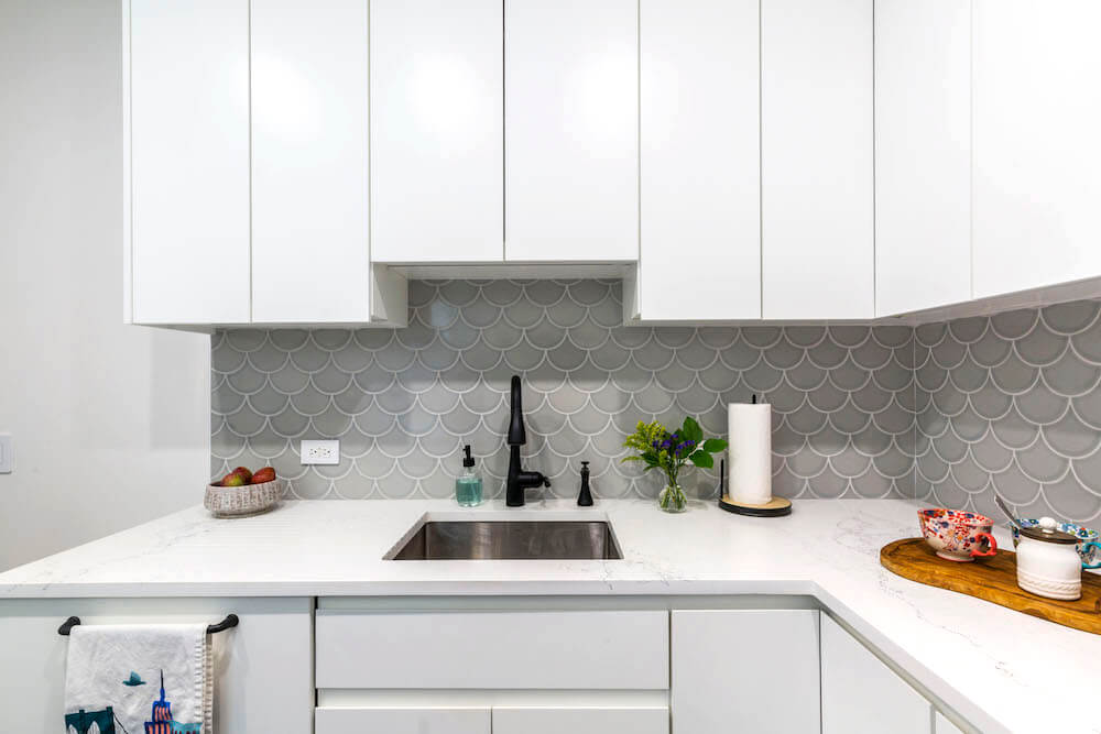
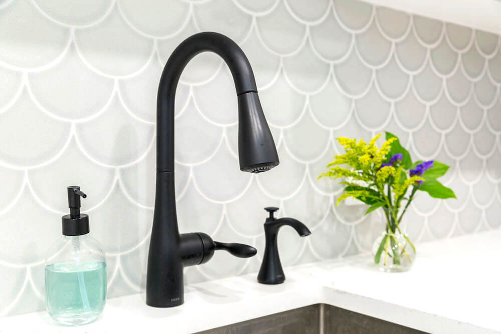
The backsplash, on the other hand, was a splurge. We always wanted scallop tiles. Initially, we envisioned a teal color but we realized it was just too loud. So we went with a scalloped tile in muted but varied gray tones. The countertop was another more expensive finish: Empira White featured veining we really liked that complemented the backsplash.
Sophie wanted slab cabinets without any pulls, and I agreed. By then, I was really suffering from decision fatigue and didn’t have the wherewithal to evaluate the merits of different cabinet hardware!
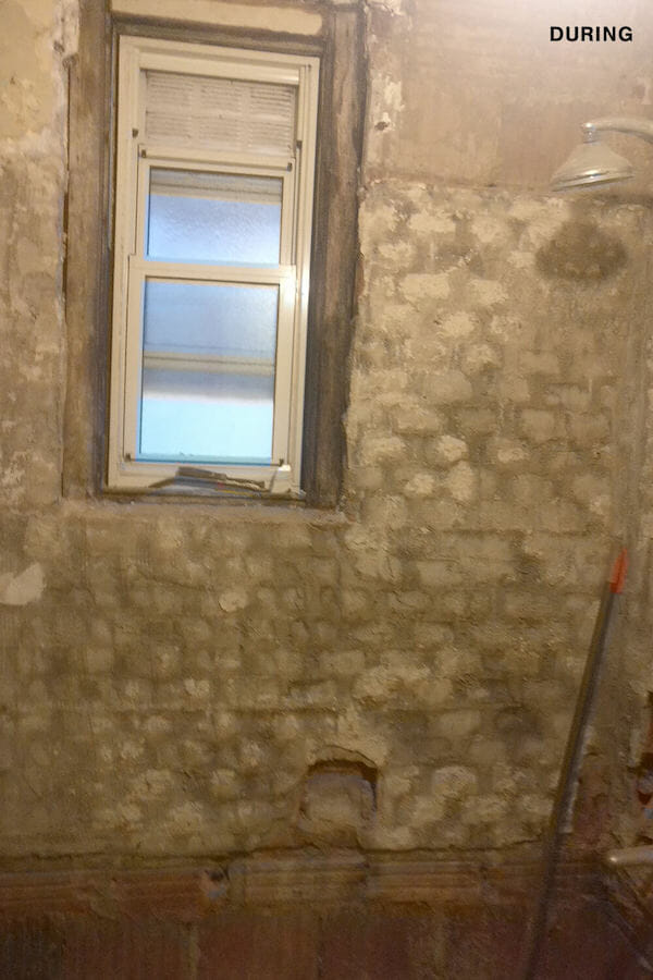
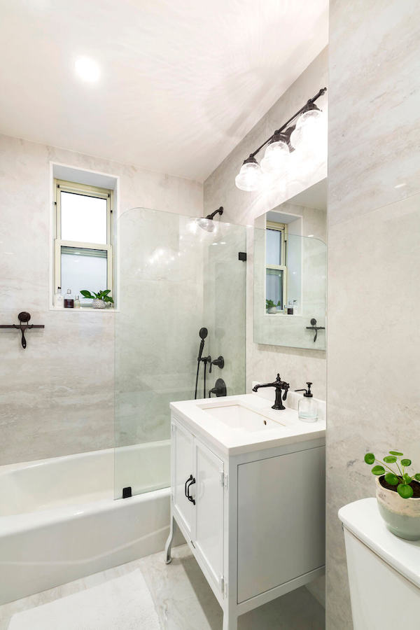
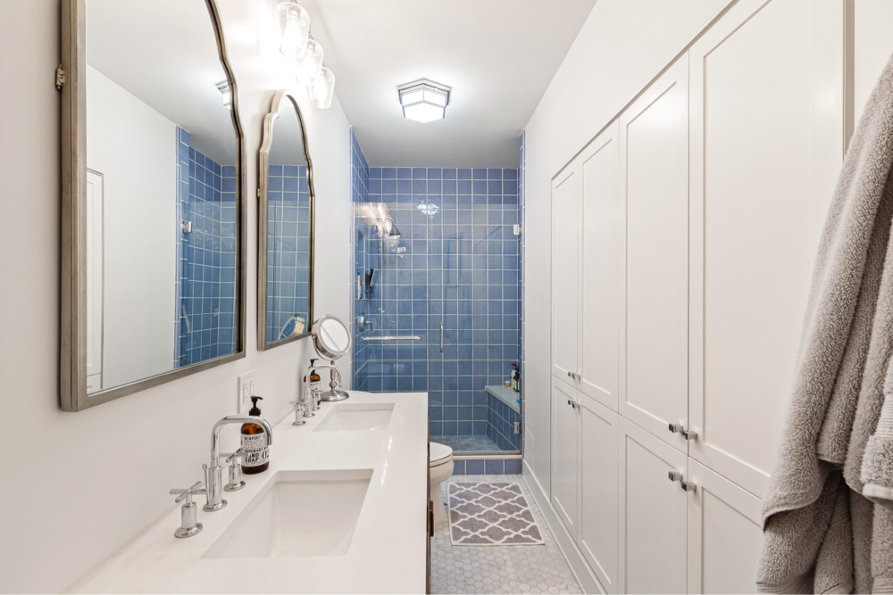
Sophie chose the kitchen to be clean and streamlined, whereas I wanted the bathroom to have quirkier touches. I put together a sort of mood board where we considered a bunch of looks like intricate marble mosaics, but marble stains and needs a lot of upkeep. Plus, our contractor recommended we get large-format tile, due to some peculiarities of the wall.
We ultimately chose 36”x36” glazed porcelain tile that looks like marble at about $4/square foot, which was pretty reasonable, especially since we tiled up to the ceiling. It also worked well on the floor given the bathroom’s size constraints.
The vanity was more of a splurge, but I justified it because I hadn’t seen other vanities quite like it. And it fit. A 25-inch vanity would have been too small, and a 30-inch vanity would have been crammed in. The Goldilocks vanity needed to be between 25 to 30 inches, but powder room vanities sit comfortably within that range. I just had to pay twice what I’d initially budgeted.

The renovation itself mostly went off without a hitch, from getting board approval to designing it to seeing the project through to completion. Our contractor helped a lot with the paperwork. Between the management company and the board, there were A LOT of forms that I needed to put together. Luckily, the contractor had worked in the building before, which is one of the reasons I hired him.
The contractor was really good at keeping me in the loop and letting me know what was happening and when. Managing and communicating expectations is a big part of a successful partnership. Have a plan before you hire a contractor, know what you want and why you want it, so you’ll have a better idea of where to compromise with your decisions and where not to.
During the renovation, my downstairs neighbor was particularly helpful. She winters in Florida, and let us stay in her apartment, meaning we didn’t have to find a place to crash. I work from home most days, so I could stay in the building and check out the renovation throughout the day to make sure we were adhering to the plan. Also, I didn’t have to find a place to board my cat, Titus.
Besides the clean look, I love how our new kitchen is all integrated. From a functionality standpoint, I’m very pleased with its usability. It easily accommodates two people working at the same time, has tons of storage space and counter space, yet still seems open.
Thank you, Sophie and Ryan, for sharing your journey with us!
WATCH VIDEO:
KITCHEN RESOURCES: Cabinetry: Custom by general contractor. Cabinet hardware: Amerock. Countertops in Empira White: Caesarstone. Backsplash in Ogee Drop: Fireclay Tile. Sink: Kraus. Faucet: Moen. Refrigerator: Bosch. Stove: Bertazzoni. Microwave: Whirlpool. Flooring in Montauk Black Slate: MSI.
LIVING ROOM RESOURCES: Paint in Sweet Spring: Benjamin Moore. Light sconces: Restoration Hardware.
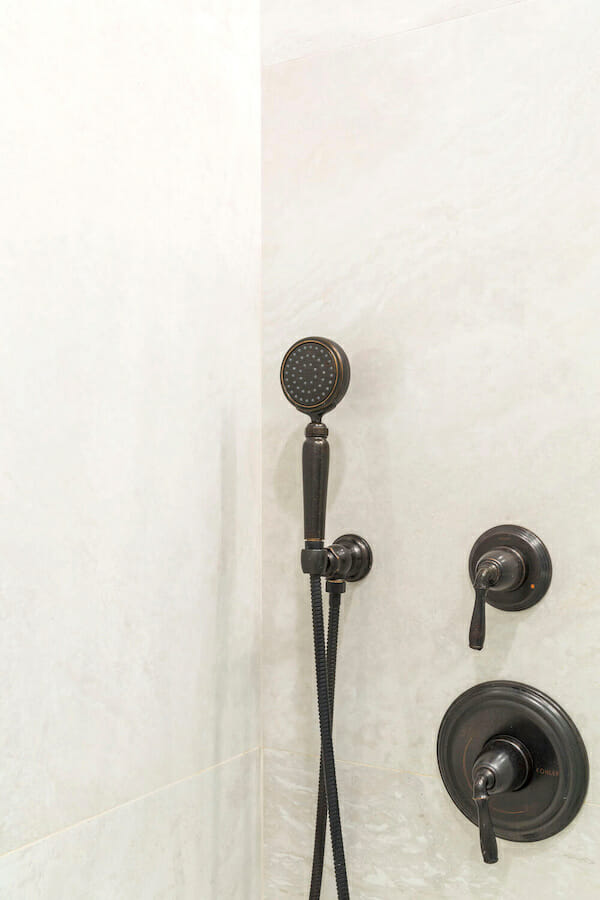
BATHROOM RESOURCES: Wall, floor, and shower tile in Antico Ivory: MSI. Vanity and sink: Restoration Hardware. Faucet, shower fixtures, and medicine cabinet: Kohler. Light fixture: Shades of Light. Toilet: Toto.
—
Sweeten founder and CEO weighs in on what to know before renovating a brownstone.
Sweeten handpicks the best general contractors to match each project’s location, budget, scope, and style. Follow the blog, Sweeten Stories, for renovation ideas and inspiration and when you’re ready to renovate, start your renovation on Sweeten.
