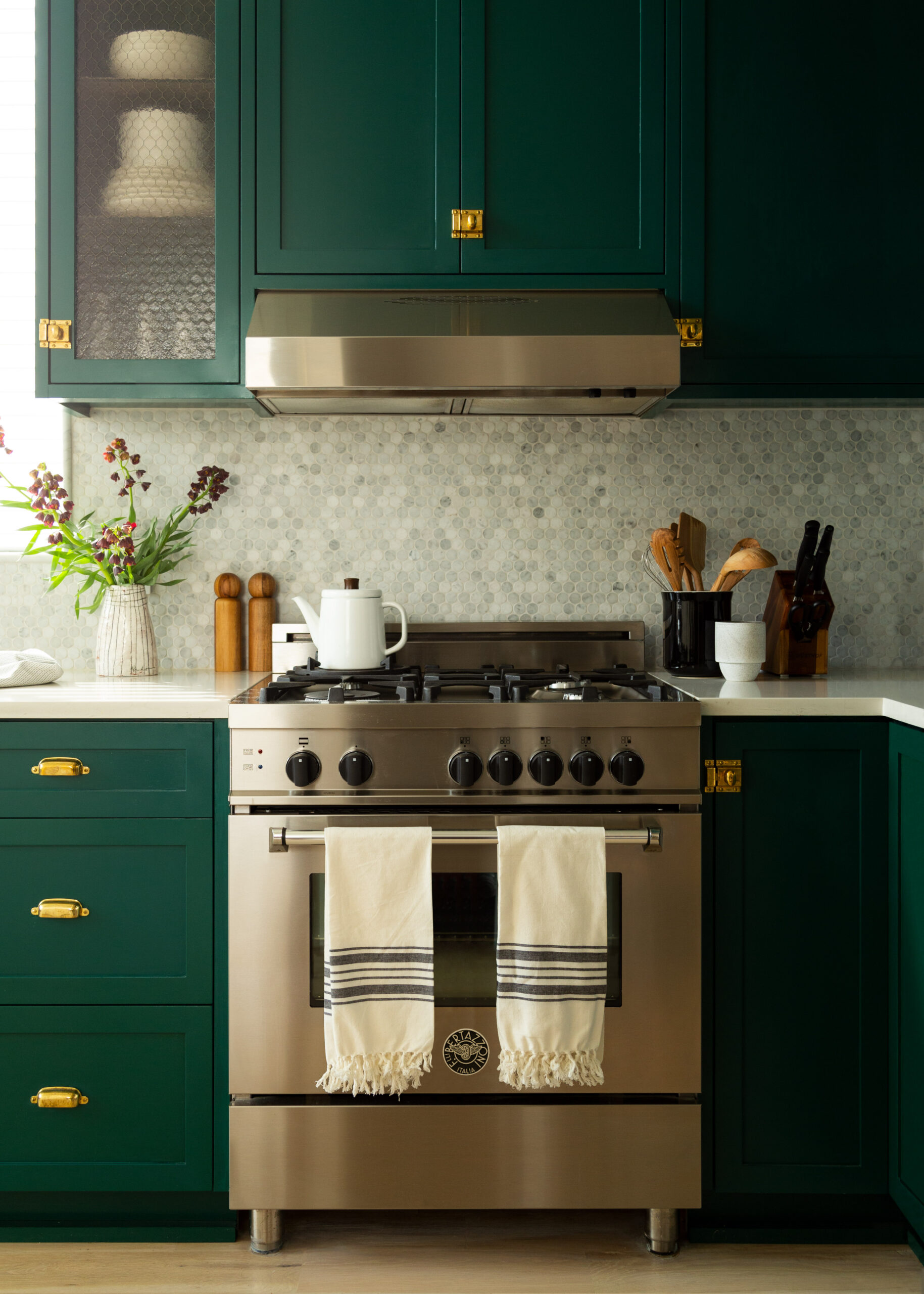
7 Kitchen Cabinet Color Ideas to Consider in 2026

Cabinet color decisions set the tone for every kitchen remodel. Clients who come to Sweeten often choose shades that feel current yet still make a statement.

This guide on kitchen cabinet color ideas showcases the top seven shades for cabinets in 2026 based on trend research and what we see in real homes. Read on to see how each option plays out in Sweeten renovations so you can map those insights to your own plans.

1. Smoky jades and grounded greens

(Above) A client’s newly renovated kitchen featuring green cabinets, a wood-stained island, and hanging plants

Smoky jades and grounded greens bring quiet depth to kitchen cabinets. These tones sit between blue and green with a soft gray cast that keeps them calm rather than loud. Paint brands now treat this group as a new neutral family.

(Above) Keren and Thomas’ Brooklyn kitchen remodel featuring deep green cabinetry, chrome appliances, and quartz countertops

Homeowners who want nature-forward kitchens without dark drama often lean toward these greens for base cabinets or a full suite. The palette fits period homes and modern traditional spaces where a new neutral beyond gray feels right, and shades like Behr Hidden Gem or similar smoky jade colors can sit on the island, the perimeter, or both. For real-life inspiration, see how these kitchens added color to achieve that “wow” factor.

(Above) Hannah and Henry’s remodeled Bronx kitchen with green cabinets, stove, and range hood

Smoky jades and grounded greens pair well with these elements in many kitchens:

  • Light oak floors, panels, or open shelves
  • Creamy stone counters and backsplashes
  • Matte black cabinet hardware and lighting
  • Warm white or soft beige walls near the cabinets

We can help plan your renovation

Find endless home renovation inspiration, detailed guides, and practical cost breakdowns from our blogs. You can also post your project on Sweeten today and get matched with our vetted general contractors and get estimates for free!

2. Warm neutrals and khakis

Warm neutrals and khakis sit in the middle ground between bright white and deeper color, which gives cabinets a softer, more grounded read. This family covers mushroom and taupe, sandy beige, and the new generation of khaki that feels natural rather than flat. Many designers now treat this palette as the new “not-white” for kitchens.

Open-plan homes that connect to living and dining zones, low-light rooms that need warmth without glare, and resale-oriented projects all benefit from a not-white cabinet color that still reads calm. Homeowners can test shades such as the Sherwin-Williams Universal Khaki, softer mushroom or taupe tones, and related mid-range hues to find the point on the spectrum that best supports their layout and lighting. See how an Elmhurst family used warm gray cabinets in a loft-style kitchen renovation for an airy, open-plan result.

Warm neutrals pair well with the following finishes and materials in a kitchen setting:

  • Travertine floors and backsplashes
  • Warm veined quartz counters
  • Unlacquered brass hardware and fixtures
  • Rift-sawn white oak cabinetry, shelving, or accents

3. Indigo and midnight blues

(Above) Mitzie and Jenifer’s kitchen remodel with navy blue kitchen cabinets and a marble island

Indigo and midnight blues give cabinets a tailored, confident presence. This group spans deep navy, inky blue, and almost-black tones that keep a kitchen grounded without feeling heavy. A rich navy blue color can be described as calm, grounding, and quietly luxurious.

(Above) Tina and Fletcher’s remodeled kitchen with navy blue cabinets and drawers

Some homeowners apply these hues in classic or coastal kitchens where color can stand up to strong light and larger footprints. Big or well-lit rooms, or layouts with light uppers and darker bases, gain structure from shades like Benjamin Moore Hale Navy and Farrow and Ball’s Hague Blue. Many designers now treat this range as a refined alternative to black for islands, pantries, or a single wall of tall storage.

(Above) Tracey and Brian’s new kitchen featuring blue cabinetry and drawers with stainless steel appliances

These blues work with the following details in a kitchen:

  • Shaker or slim-profile Shaker cabinet doors
  • Stone counters with cool veining
  • Burnished brass or brushed nickel hardware and fixtures

4. Deep browns, espresso, and burgundies

(Above) Danielle and Michelle’s kitchen renovation in New Jersey featuring deep brown cabinetry and drawers

Renovate expertly with Sweeten

Sweeten brings homeowners an exceptional renovation experience by personally matching trusted general contractors to your project, while offering expert guidance and support—at no cost to you.

Start your renovation

Deep browns, espresso tones, and burgundy shades bring a sense of polish and drama to kitchen cabinetry. This palette moves from espresso brown with charcoal undertones, through brownish gray notes, to aubergine-inspired hues. These colors read layered and luxurious, so a kitchen gains presence without slipping into flat black.

Homeowners seeking moody modern kitchens or a classic English pantry look can turn to these rich, saturated cabinet colors for islands, lower cabinets, or full-height storage. These kitchen cabinet color ideas work well when the room has some natural light or when the upper cabinets stay lighter, since the darker bases ground the plan.

Here are the finishes that work well with this paint color group:

  • Tumbled limestone floors, backsplashes, or hearth-style surrounds
  • Aged bronze hardware, lighting, or cabinet latches
  • Fluted wood panels on islands, appliance walls, or a range hood surround

5. Rich pale creams

(Above) Sandra and Michael’s new kitchen renovation featuring a white tile backsplash, hanging plants, and pale cream cabinets

Rich pale creams fall between bright gallery whites and beige, so cabinets feel light yet relaxed. This family includes warm off-whites, described as an essential white with warmth. Balanced warm white and pale creamy white colors with gentle warmth round out this group and reinforce the idea of a cozy, refined neutral rather than a sharp, cool tone.

Resale-focused updates benefit from this category, since warm creams frequently appear on designers’ shortlists for versatile cabinet colors that pair with many materials. Small or low-light kitchens can also gain a brighter look with these cabinet paint colors, which allow light to reflect without pushing the room into stark, clinical territory.

These cabinet colors tend to work best with the following pairings.

  • Warm wood tones such as oak or walnut for floors, open shelves, or an island base
  • Softly veined marble or quartz counters in taupe or gray families
  • Brass or brushed nickel hardware and lighting that pick up the creamy undertones without competing for attention

6. Butter yellows and ochres

Butter yellows and ochres sit in the warmest corner of the cabinet palette, but modern versions feel soft rather than loud. This family runs from pale buttercream through honeyed golds to deeper mustard shades. Together, these colors give a kitchen a sunlit mood that still feels polished enough for long-term use.

North-facing or low-light rooms often benefit from a buttery or golden cabinet color, including bold yet balanced historic yellows and light golden neutrals that brighten a space without overwhelming it. For cottage or heritage-inspired kitchens and cheerful family hubs, richer mustard tones read playful yet grounded.

These are the finishes that usually flatter butter yellow and ochre cabinets:

  • Cream walls and quiet off-white trim
  • Walnut or oak details, from counters and beams to open shelves or an island base
  • Checkerboard floors in stone or tile
  • Terracotta floors or hex tiles with earthy variation

7. Stained wood

(Above) Mathew’s renovated kitchen showcasing stained wood cabinetry, hanging lights, and peninsula

Stained wood cabinets bring grain, texture, and natural tone forward in a way paint never quite matches. The range spans from light, almost-raw looks that keep oak airy to gentle gray-brown washes and mid-tone browns that evoke a classic walnut feel. Deep-penetration stains and clear hardwax oil finishes sink into the surface rather than form a heavy film, which keeps the pattern visible and gives kitchens a durable, real-material character. If your project uses stock boxes, see our blog on pairing budget cabinets with higher-end finishes.

(Above) Kirsty and David’s newly renovated kitchen with wooden cabinets, white chairs, and quartz island countertop

Open-plan homes that carry cabinetry into dining or living zones benefit from a warm, light stain that adds texture without strong color, and the timber stands up well to daily traffic. Many homeowners updating older oak gravitate to these light and emerging mid-tone stains.

(Above) Griselle’s kitchen remodel featuring stained wood cabinets, an overhead microwave, and quartz countertops

These are the pairings that usually match stained wood in a kitchen:

  • Soft white or pale quartz counters with subtle veining
  • Simple backsplashes in white tile, zellige, or a matching slab extension of the counter
  • Matte black, brushed brass, or dark bronze hardware
  • Clean wall colors, such as warm white or soft taupe

Kitchen cabinet paint colors 2026 snapshot

Recent data from a major cabinet manufacturer points to a quiet changing of the guard in finishes. Light-stained wood now ranks as the most preferred cabinet finish, with off-white in second place and white in third, which signals a greater comfort with natural texture and warmth. These findings set the stage for homeowners to consider different kitchen cabinet colors when planning their styles.

MasterBrand’s survey tracks where color shows up on the run of cabinets, not just on a feature island. Designers report a 15% increase in hue on perimeter cabinetry, with white and off-white now playing supporting roles rather than carrying the whole room.

Major paint companies echo this return to warmth through their 2026 Color of the Year choices. Selections include a balanced khaki neutral, a smoky jade green, a rich espresso brown, and an indigo-centered blue palette, all of which sit within grounded, nature-linked families rather than icy grays or stark whites.

Trend reporting from the National Kitchen & Bath Association (NKBA) reinforces this direction, placing green at the top of kitchen color preferences, with blue and brown close behind. This tells remodelers that these kitchen cabinet paint colors align with where homeowners already plan to go.

Ready to renovate your kitchen?

Post your project on Sweeten today and get matched with our vetted general contractors for free! Find endless home renovation inspiration, detailed guides, and practical cost breakdowns from our blogs.

Frequently asked questions

No, white kitchen cabinets are not out for 2026 because they still feel familiar and work well for many homes. White-colored kitchen cabinets work well when balanced with light-stained wood, warmer off-whites, or a strong color on an island or lower run.

Yes, you can mix stained wood with painted kitchen cabinets to add depth and texture without overwhelming the room. This mix often works best when one type of finish leads and the other plays a supporting role. Our blog on renovations featuring two-tone cabinets shows how Sweeten homeowners make that balance work.

Soft greige and creamy white pair well with warm neutrals. They echo the warmth in the cabinet color and keep the room calm, so stone, metal, and wood details can stand out.

Hardware finishes such as brushed brass and matte black can complement green cabinet colors. Both give a clear contrast on the doors and drawers, and their tones sit comfortably next to earthy or deeper jewel-toned greens.

You may also like

Renovate with Sweeten!

sweeten-magic

We’ll match you with vetted general contractors and offer support until your project is done — at no cost to you!

Start your renovation

Customer review 5.0

sweeten-thumbsup

“Sweeten was really helpful — we wouldn't have found our contractor without them, and the bid-leveling call was absolutely essential for us.”

— Dara R. from New York, NY

Read more reviews —>
Start your renovation
no-cost-blue

Subscribe to our
renovation newsletter