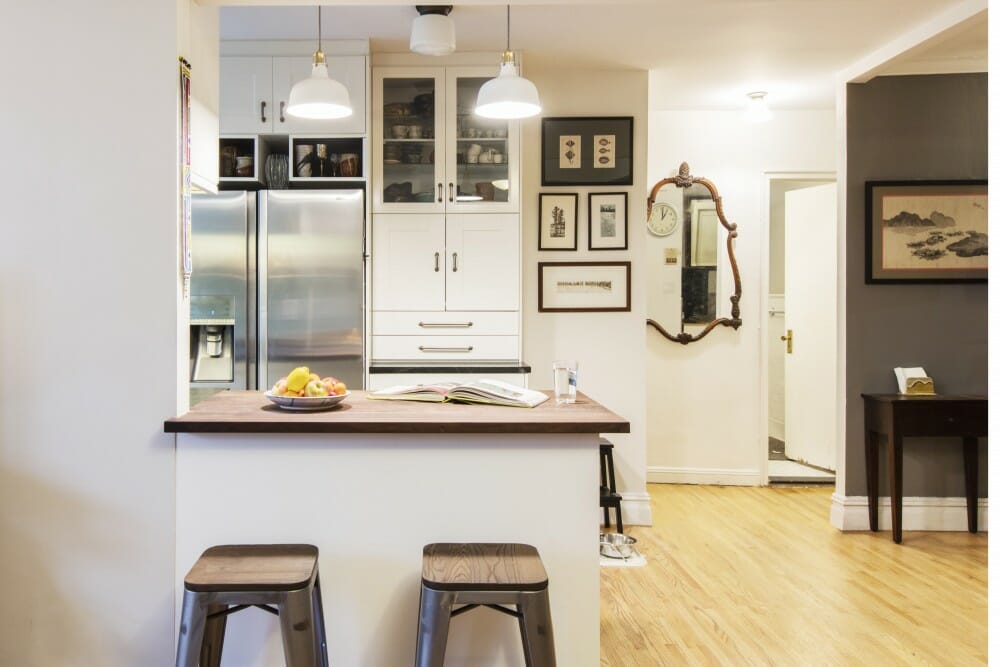
Before & After: Kitchen Edition
Inspiring makeovers of the most popular room in the home
A successful kitchen renovation isn’t measured by the number of walls knocked down or the size of a kitchen island. Instead, it’s the thoughtful details and design elements culled over time from Pinterest and the hours of research on materials coming to life that brings the joy for a lifestyle that finally fits you and your family.
Here we look at 11 kitchens renovated by homeowners who came to Sweeten, a free renovation platform that matches homeowners with licensed general contractors and tracks their projects. Some were major transformations removing walls, creating built-ins, and adding new windows, while others proved that smart improvements in space efficiency, updated materials, and renewed layouts gave them the overall refreshes they wanted.
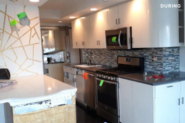
From outdated to classic gray
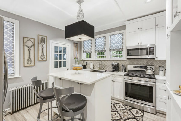
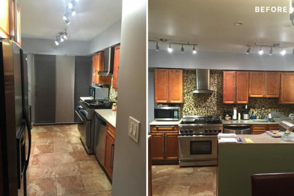
After living on Long Island for many years, Rosalind and Lawrence were ready to downsize and return to their beloved former hometown of Brooklyn. They purchased a 100-year-old home in Cypress Hills and slowly started renovating the outdated spaces. After refreshes of two bathrooms, a staircase, and a walk-in closet were complete, they decided to turn their attention to the kitchen.
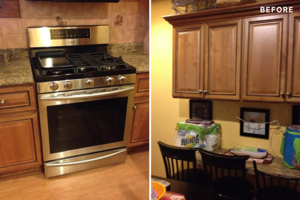
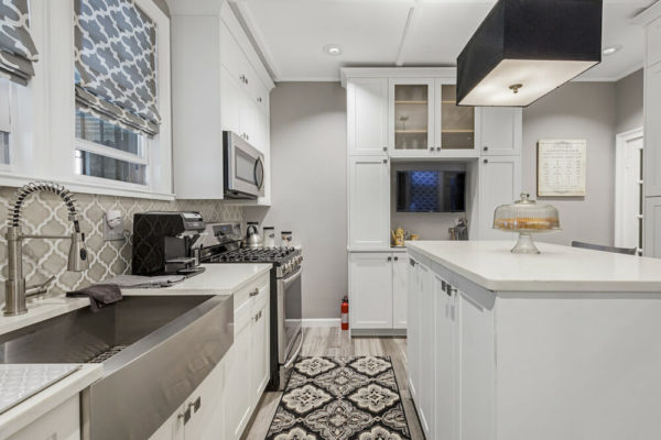
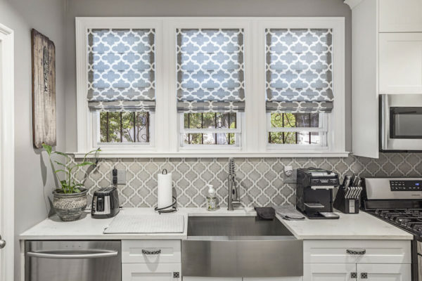
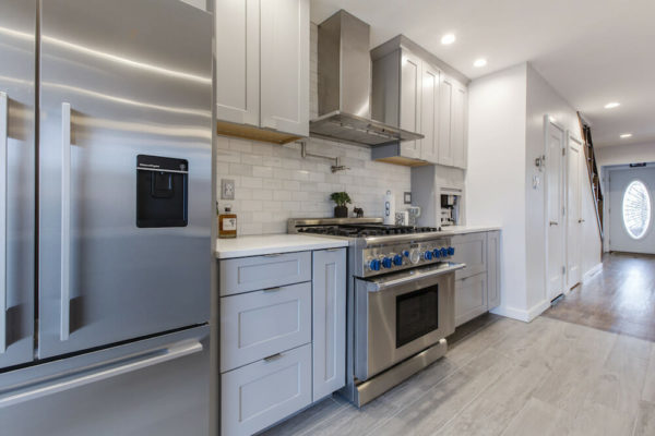
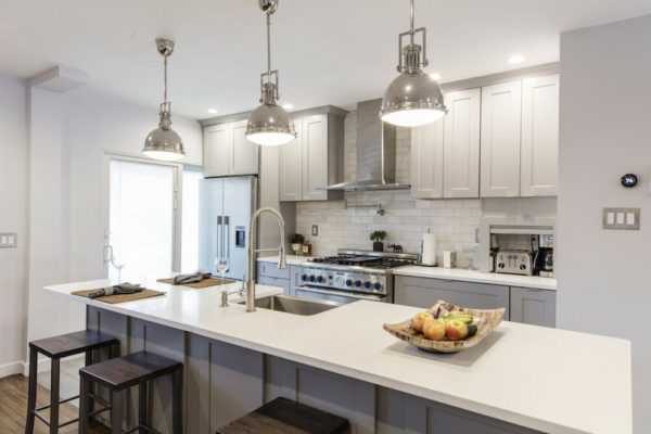
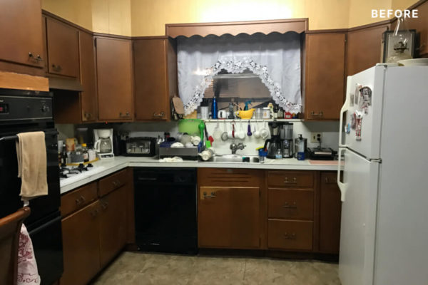
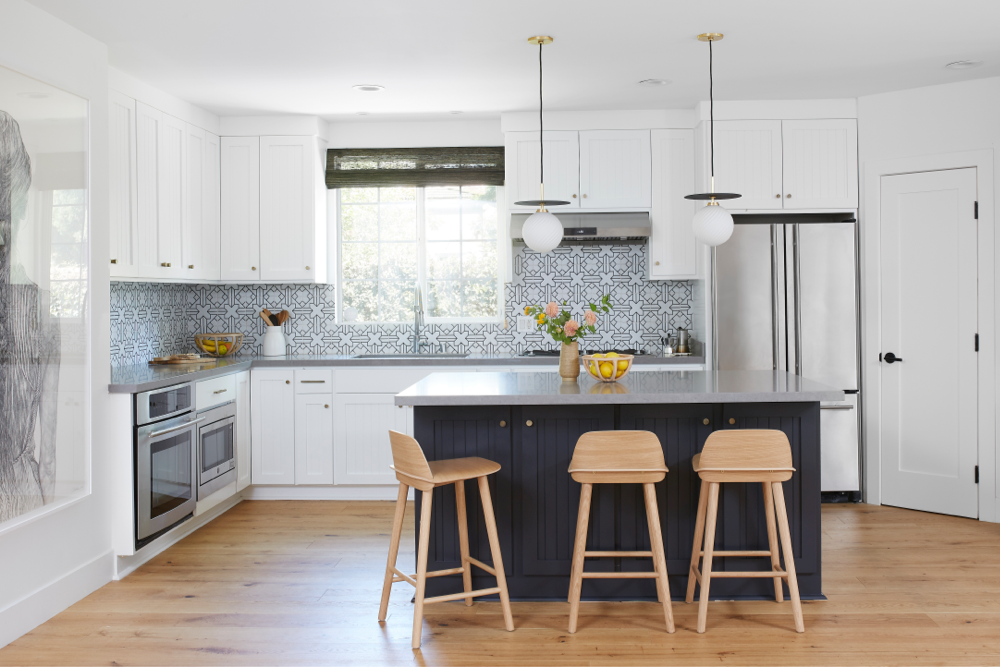
The main problem besides the yellow walls, dated wooden cabinets, and orange-tiled backsplash, was the lack of storage. Rosalind was forced to store her larger appliances like the slow cooker and mixer in the living room. So, with the help of a Sweeten contractor, the couple reimagined their layout and added a kitchen island that doubles as storage as well as a convenient gathering spot. Rosalind chose gray tones throughout and accented them with interesting geometric shapes.
Same layout, more storage
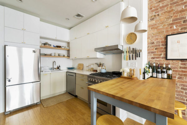
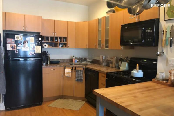
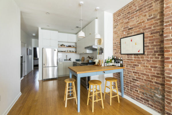
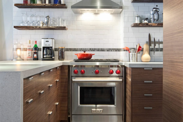
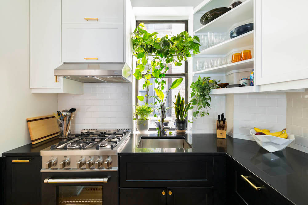
Shoko and Rob really liked their 900-square-foot apartment in Harlem, New York. The only thing that gnawed at them was the “orange-y cabinetry, shiny black appliances, and brown countertop.” So they decided to take the plunge and redo the small kitchen.
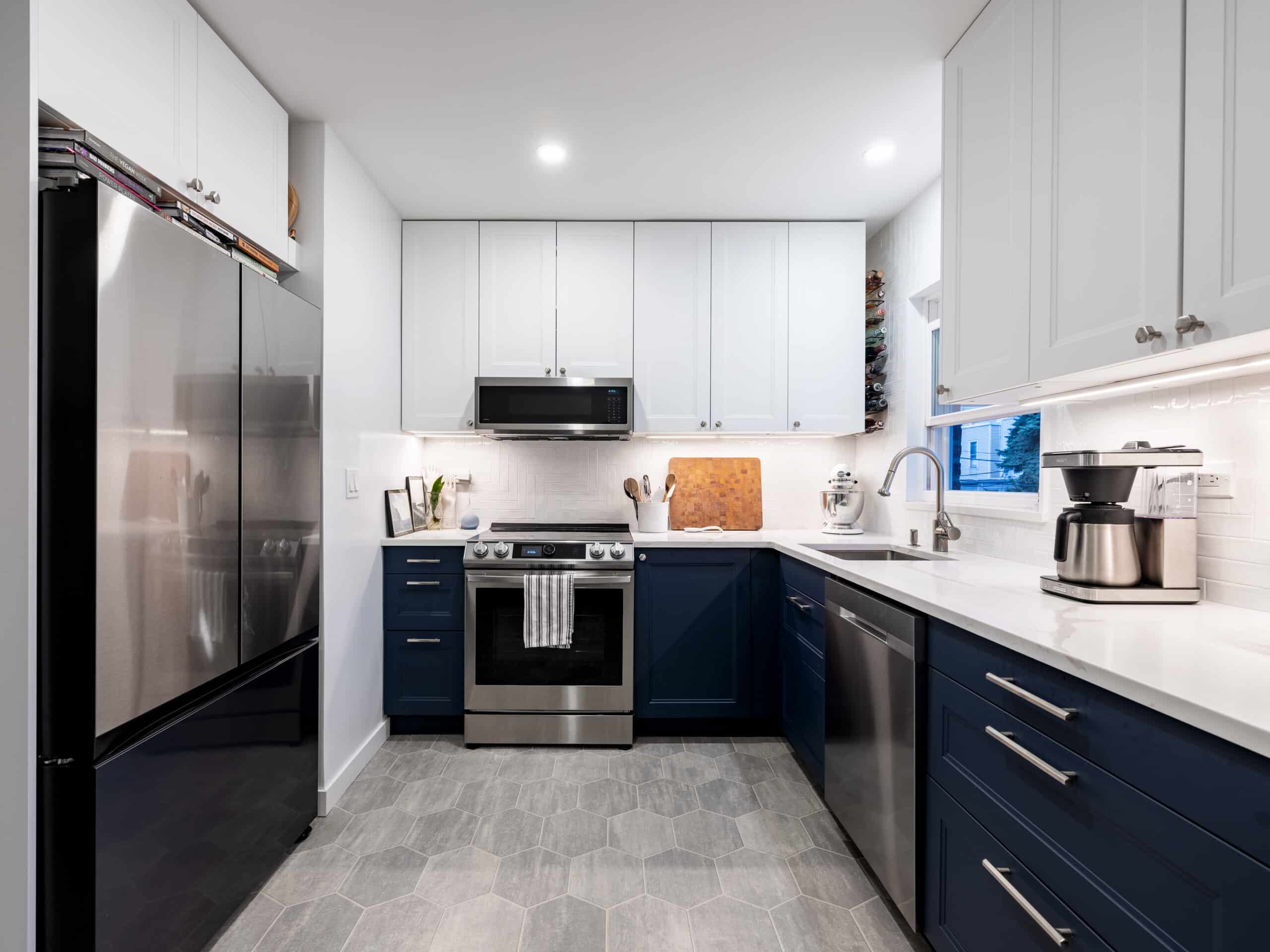
They did their research and found information from designer Keren Richter on how to make the most of their cook space and turned to Sweeten to execute their vision. In addition to overhauling the look of the kitchen, they wanted to improve the flow and functionality with more storage as their top goal. Their original kitchen didn’t take advantage of the ceiling height so they extended the new upper cabinetry to get as close as possible to the ceiling. In all, they were able to create a minimalist style yet warm space to cook in and entertain.
Dark and dated to contemporary chic
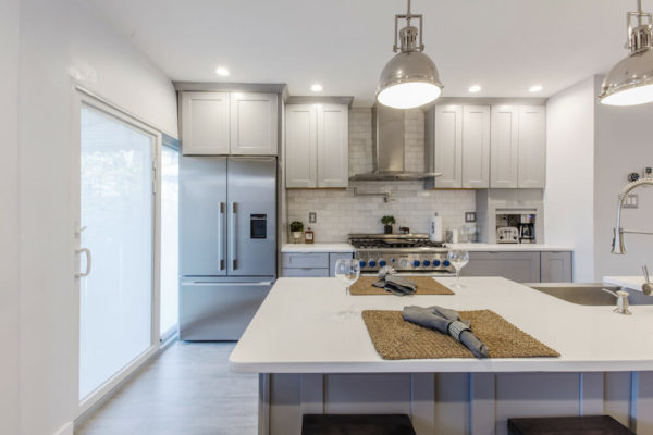
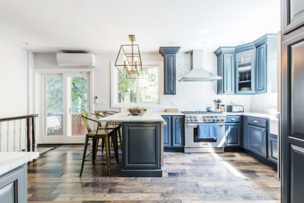
How do you make a house feel more like a loft apartment? First, you open up the layout so that you have an unobstructed sightline across the first floor. For Romuald and his family, this meant tearing down a wall between the kitchen and the main living space. To regain the storage space lost by removing the cabinets on that wall, they decided to do what many do: build an island.
They also added other design touches to fit into their cooking-centric lives. Their Sweeten contractor suggested they install an “appliance garage” to make their countertop less cluttered. Being avid cooks, Romuald and his wife have a lot of small appliances, including a toaster, coffee maker, and mixer, that would be nicely concealed—but yet easily accessible—by this storage solution. They also put in a pot-filler above the stove and a microwave drawer in the island.
The warm gray cabinets complement the white quartz countertop and the classic subway tile of the backsplash. For ease of cleaning and added durability, Romuald installed a porcelain floor that mimics the look of real wood.
Island design
- Jennifer and Joe’s kitchen with subtle gold accents
- A gold-hued chandelier
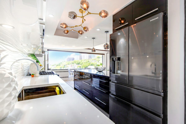
Veteran renovators Jennifer and Joe always knew their New Jersey apartment wouldn’t be complete without a kitchen remodel. They, like many homeowners, wanted an open-concept layout in order to see the amazing views of the Manhattan skyline, Statue of Liberty, and George Washington Bridge that their apartment affords.
They asked their Sweeten contractor to knock down a wall to get better sightlines to the wall of windows in their living room. Unfortunately, the entire wall could not be removed as it was load-bearing. So their contractor took down as much of the wall as possible and utilized the rest of the space to house the refrigerator.
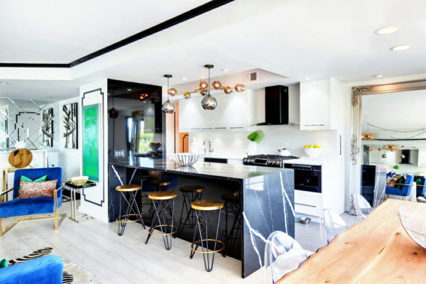
Jennifer and Joe based the design entirely around the marble waterfall island, which features a deep black base with white veins throughout the countertop. The color palette of the entire kitchen plays off the two tones, with glossy black drawers and all-white upper and lower cabinetry as well as a white quartz countertop. Not one detail was spared, from the under-cabinet lighting to the textured backsplash.
Midcentury Scandi meets Italian modern
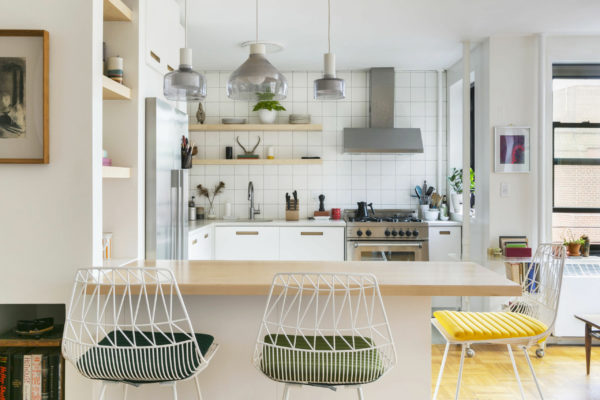
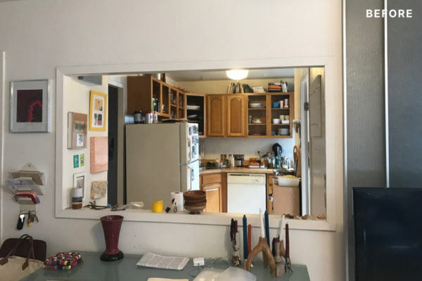
“I wanted midcentury Scandi meets 70s Italian modern,” says Brooklyn Sweeten homeowner Melissa of her design preference for her kitchen. The co-op building itself had a midcentury vibe so she wanted to continue it inside. Sweeten brings homeowners an exceptional renovation experience by personally matching trusted general contractors to your project, while offering expert guidance and support—at no cost to you. Renovate expertly with Sweeten
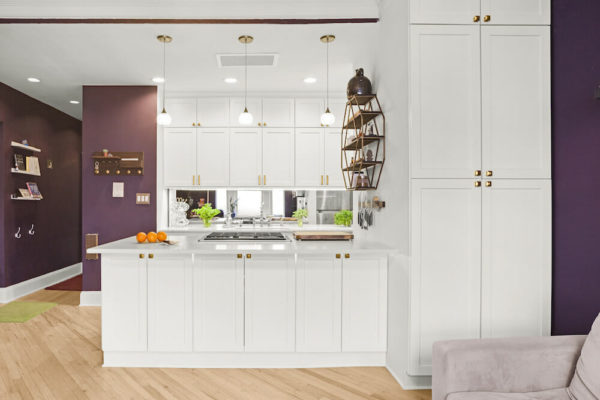
First things first, her Sweeten contractor removed walls that were blocking off the kitchen from the living area. Once that was complete, natural sunlight bathed the entire apartment. She carefully selected a mix of different materials (matte concrete floor and counters) as well as warmer accents in her textile and paint choices. A built-in shelf intersects over a new peninsula for additional seating. She didn’t move the plumbing (which is an added cost) or change the location of the appliances.
From the ’80s to modern industrial
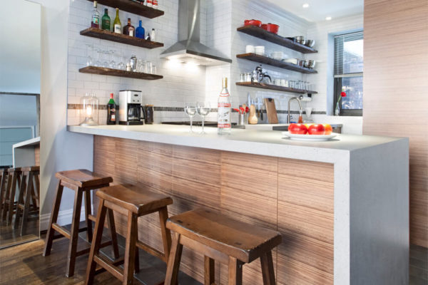
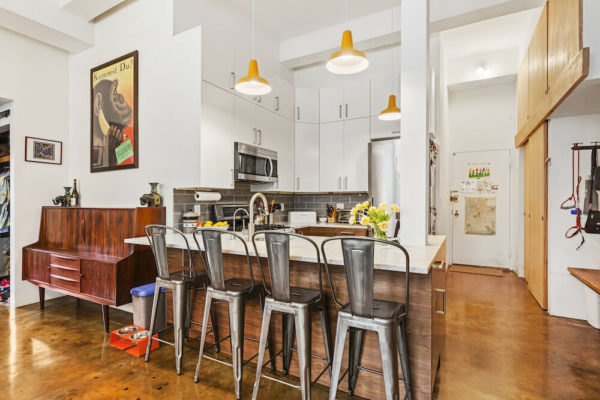
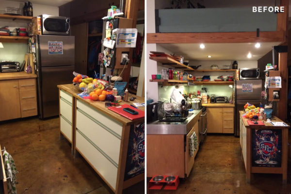
For their one-bedroom co-op in a 19th-century converted warehouse, homeowners Dan and Mike wanted to bring their 1980s kitchen into a new era. While they desired a nod to the industrial roots of the building, they did want the aesthetic to be balanced.
They hired a Sweeten contractor to help redefine the space. To create an open floor plan, a wall was removed as well as the upper cabinets, which were replaced with beautiful open shelves of salvaged Douglas Fir. The base cabinets were updated from laminate to a full set of IKEA cabinets and drawers, customized by Semihandmade. A modern waterfall countertop on the peninsula was used to visually separate the kitchen entry. They also utilized different natural and synthetic wood finishes to maintain a measure of warmth and masculinity.
A dark kitchen sees the (natural) light
Even after tackling other updates to their colonial-style home, Nydia and Jonathan knew that renovating their Brooklyn kitchen was a top priority. The old version had mismatched appliances, dated cabinets, and not enough counter space. The dark space hardly felt welcoming (or functional) for their family of five.
They turned to Sweeten to help with the construction process, hiring a trusted contractor from its carefully vetted network. The project involved rethinking the layout to opening up the stairway to the basement, which is accessed via the kitchen. The renovation helped key kitchen elements find new locations: the refrigerator moved out of the main cooking area, the dishwasher now sits directly across from the sink, and the walls surrounding the basement stairs were taken down. By replacing existing cabinets with ceiling-height ones and adding a peninsula, the space was really transformed.
From functional to fabulous
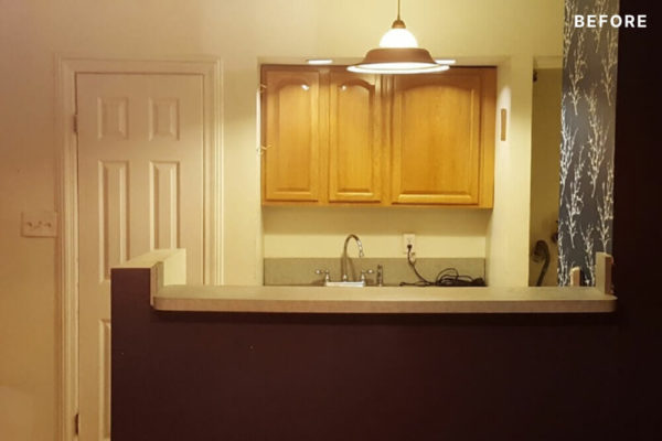
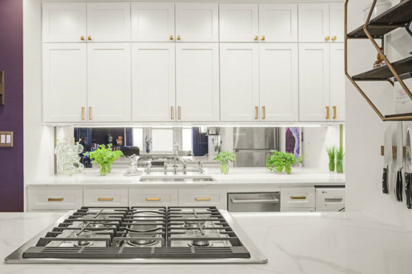
A mutual love of cooking (and of cooking together) ultimately led Marissa and Jeremy to renovate their small kitchen in their Prospect Heights, Brooklyn, co-op. The space was so cramped that it brought about a special house rule: Only one person allowed in the kitchen at a time when cooking in order to keep the peace.
Twenty-four inches of usable counter space was quintupled through the renovation, while other unique elements were added to suit the couple’s preferences and lifestyle. For example, they went non-traditional for the backsplash, using an antique mirror. They also installed a ventless washer/dryer combo unit and removed the space-invading gas dryer vent. “While a gas dryer dries clothes much faster than a ventless dryer, I wanted the extra counter space more than I wanted clothes dried in 20 minutes,” Marissa said. They capped off the gas vent and went long with the back counter. “I am excited about so many parts of our kitchen that I don’t know if I can pick a favorite!” she said.
A modern vision brought to life through an extension
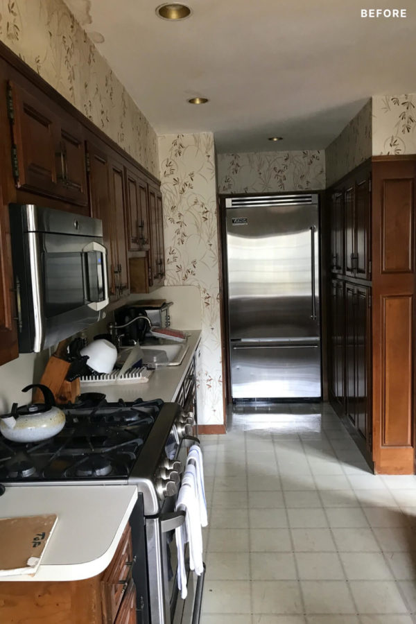
For Laura and Tim, they decided they needed to do something about their kitchen that was “falling apart”—it had water damage from a leaky shower upstairs, the door to the patio was drafty, the cabinets were dark and “grungy,” and it generally just needed some fixing up.
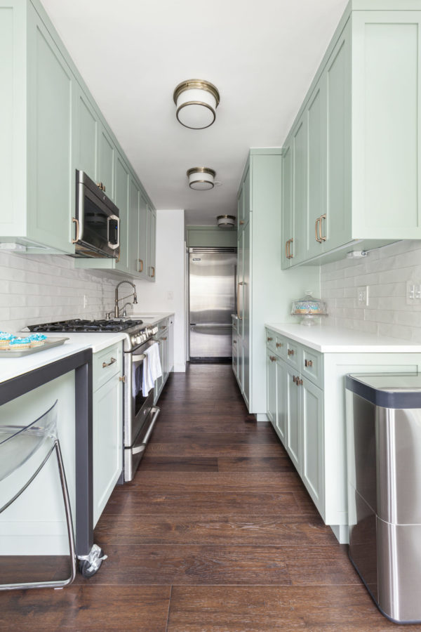
The couple consulted their friend and designer Suzy Leon of Suzy Leon Design, Ltd. and came up with a plan to gut the existing kitchen but also enclose their back patio. The additional interior square footage would connect and provide a better flow between the kitchen, dining room, and outdoor space. The new enclosure would feature skylights to brighten the space.
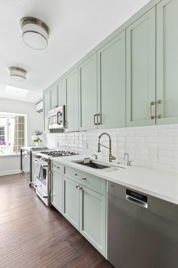
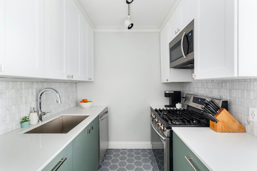
They kept the galley layout but chose a light color palette in the “minty” green shaker cabinets to offset the dark plank wood floors. White quartz countertops were utilized to help make the flow look more open and airy.
Reaching new heights—with less ceiling
With an 18-inch tiny dishwasher, an oven that wasn’t big enough to fit a cookie tray, and a kitchen sitting underneath a loft, a renovation was long overdue for this mom who cooked five nights a week.
One major challenge homeowners Emily and Trey faced was the inability to move the building’s intercom system that was smack in the middle of the kitchen. They hired a Sweeten contractor who came up with a good solution: create an L-shaped peninsula to accommodate the immovable pole—and give them more space and storage at the same time.
In addition to the new peninsula, they were also able to get rid of the loft above, which increased the ceiling height drastically. The result was a well-thought-out new kitchen perfect for the family of four’s busy lifestyle.
First time’s a charm
Jennifer and Jonn couldn’t believe their luck when they found their 2,100-square-foot, three-bedroom duplex in Manhattan’s Upper East Side. It was the perfect location for their family of two kids and a dog. The story goes that the co-op was the result of combining three one-bedroom apartments to create a huge two-level residence with sole access to a sprawling rear garden. Voila! The perfect home…but with one catch: It needed to be renovated.
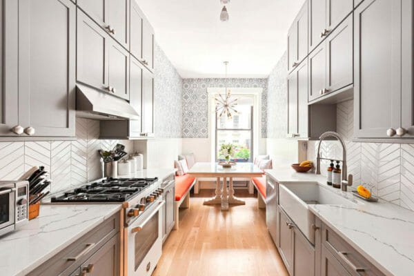
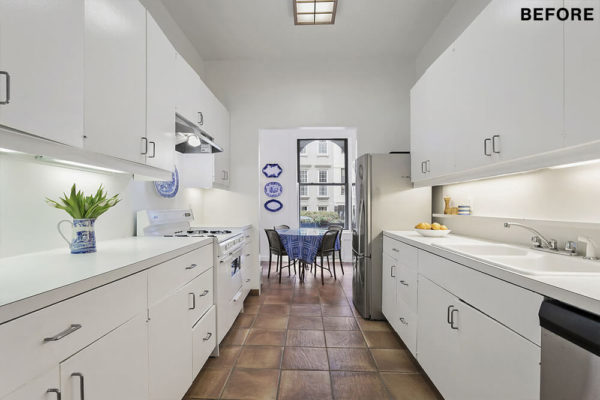
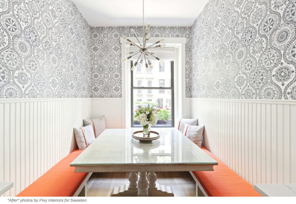
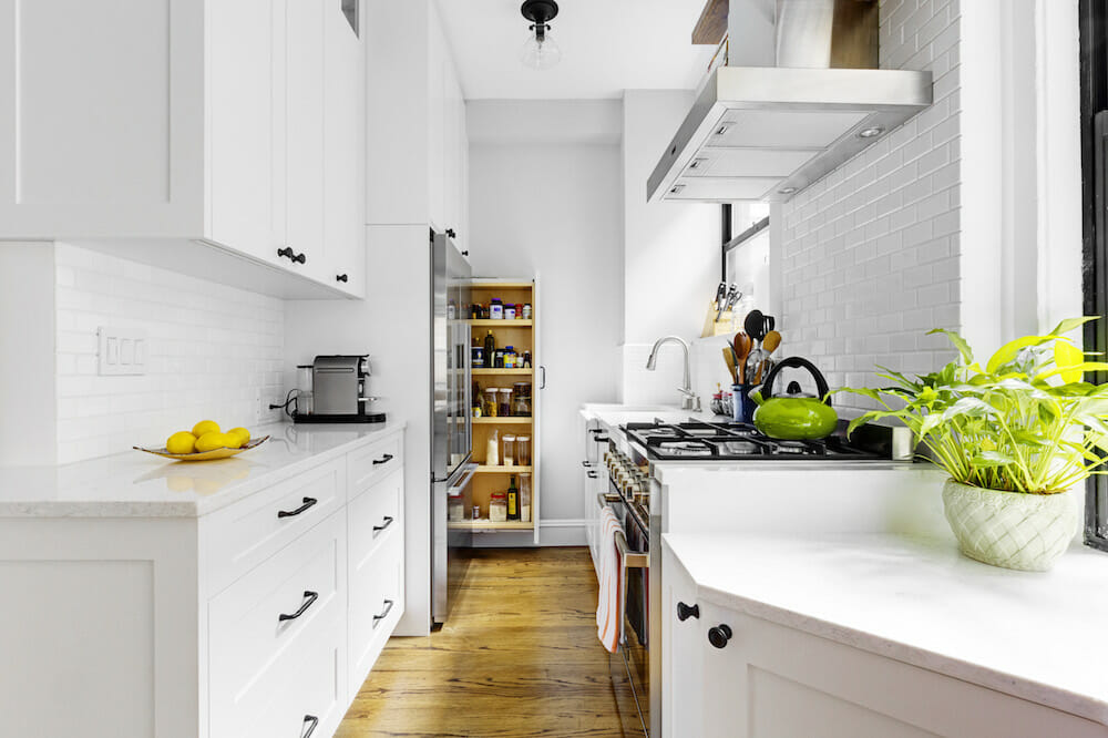
The couple had their work cut out for them with this space that hadn’t been updated since the ’70s. They hired a contractor through Sweeten who was able to transform their white laminate kitchen into a light-filled galley kitchen with an eat-in banquette. They used shaker cabinets and five-panel doors while incorporating metals like brass lights and stainless steel appliances for a modern look.
Kitchens are arguably one of the most pivotal spaces in our homes. From giving us a gathering point to break bread together to providing space to tackle assignments and hobbies; every kitchen should deliver the kind of peace of mind (and organizational flow) that homeowners need.
—
Inspired to renovate your kitchen? Check out Sweeten’s cost guides here.
Sweeten handpicks the best general contractors to match each project’s location, budget, scope, and style. Follow the blog, Sweeten Stories, for renovation ideas and inspiration and when you’re ready to renovate, start your renovation on Sweeten.
