7 Kitchen Trends We’ll See in 2020
Sweeten reveals the hottest design ideas for the modern kitchen in 2020
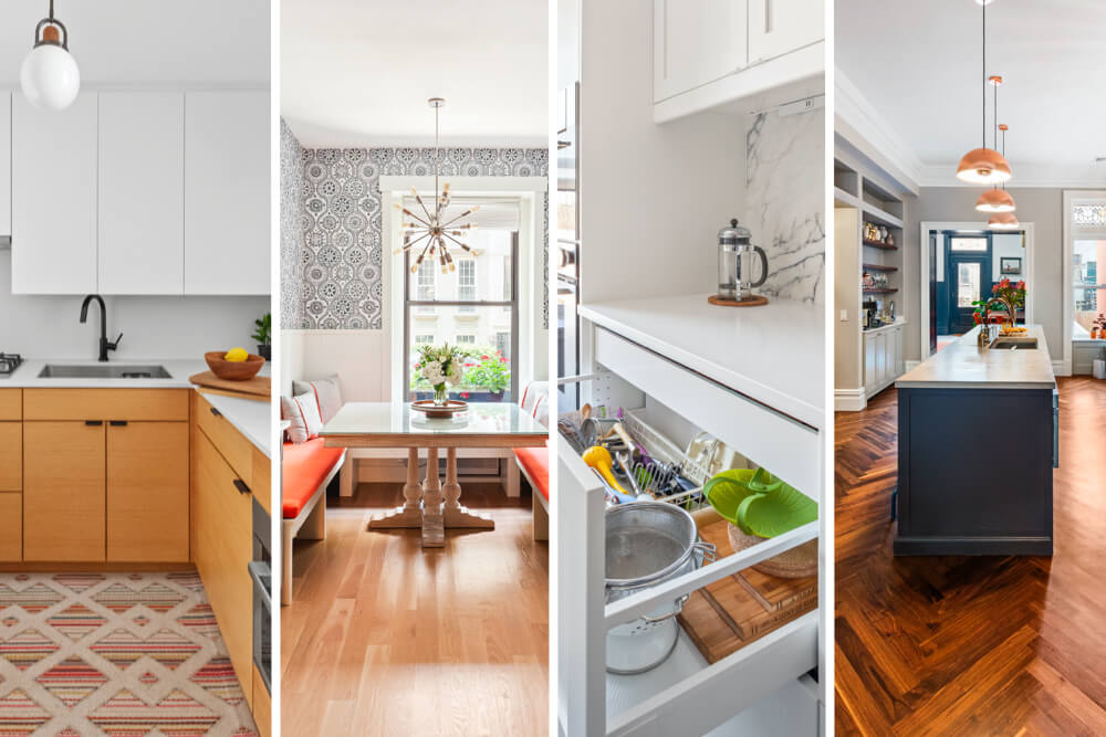
With the New Year approaching, we’ve pored over thousands of renovations completed by Sweeten general contractors over the past few years. Our mission: to take note of design ideas with staying power that could prove to become classics, and identify new styles sprouting up with the potential to transcend the word “trend.”
As a renovation platform that connects homeowners with vetted general contractors every single day, we consider ourselves lucky to help people create a space that reflects their lives. In the kitchen, the trends range from larger-scale concepts (breaking the “triangle” in the kitchen) to details with big design impact (the shine of brass, the cool chic of herringbone).
The classic shade of blue that we noted last year as a trend was recently named by Pantone and Sherwin-Williams as the “Color of the Year” for 2020. It’s turning out to be the new neutral. Learn what renovators are doing to transform their cook space to function better, handle more storage, and look more beautiful. Which of these top seven trends can you see in your own kitchen renovation?
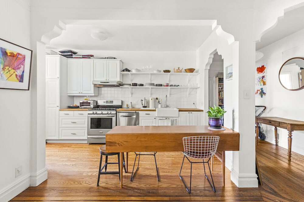
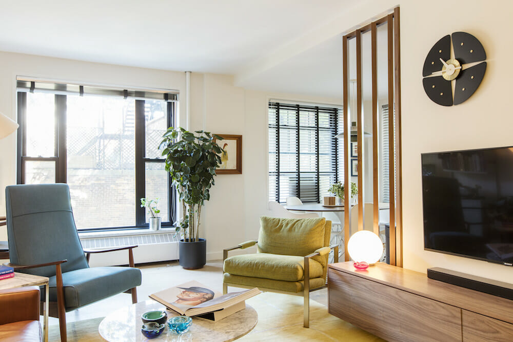
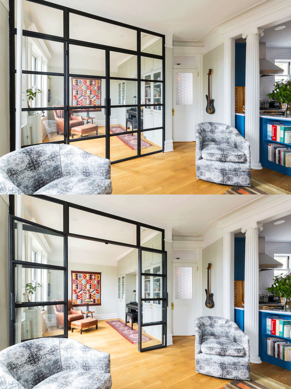
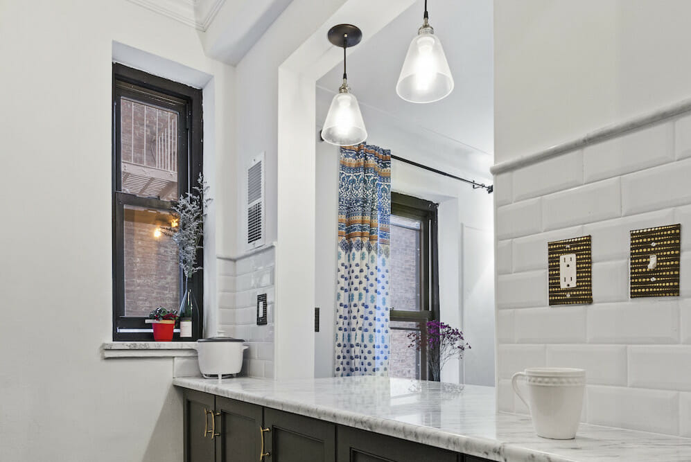
The “semi-open” kitchen concept
- Kitchen arches
- Wood slats between the kitchen and living room
- Glass wall partition
- Through-window in galley kitchen
Yes, you heard right. For years, anything you saw, read, or watched about renovation talked about the idea of knocking down walls to make the living space more open and airy. However, now we are finding that homeowners are deciding that a little division can be a good thing. Instead of tearing down full walls, they are opting to put in archways or installing sliding doors that give rooms a little hint of or a lot of separation.
Thoughts to consider budget-wise: Taking down a wall while leaving parts of it up (in an arch shape) costs less than custom fitting sliding doors.
Scroll through to see kitchen arches, slats made of wood, a glass wall partition, and a through-window demonstrating that there are all levels of open and closed-off spaces.
Goodbye, brushed nickel; hello, warm metallics
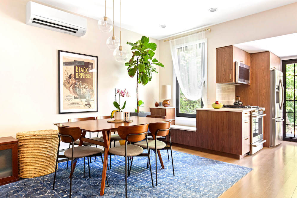
- Pendant in eat-in kitchen
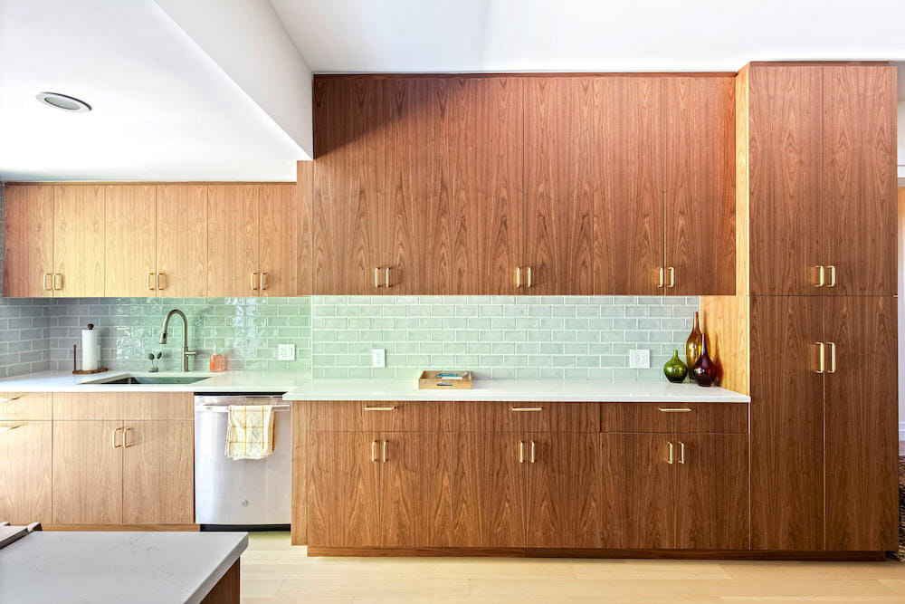
- Hardware in aged brass
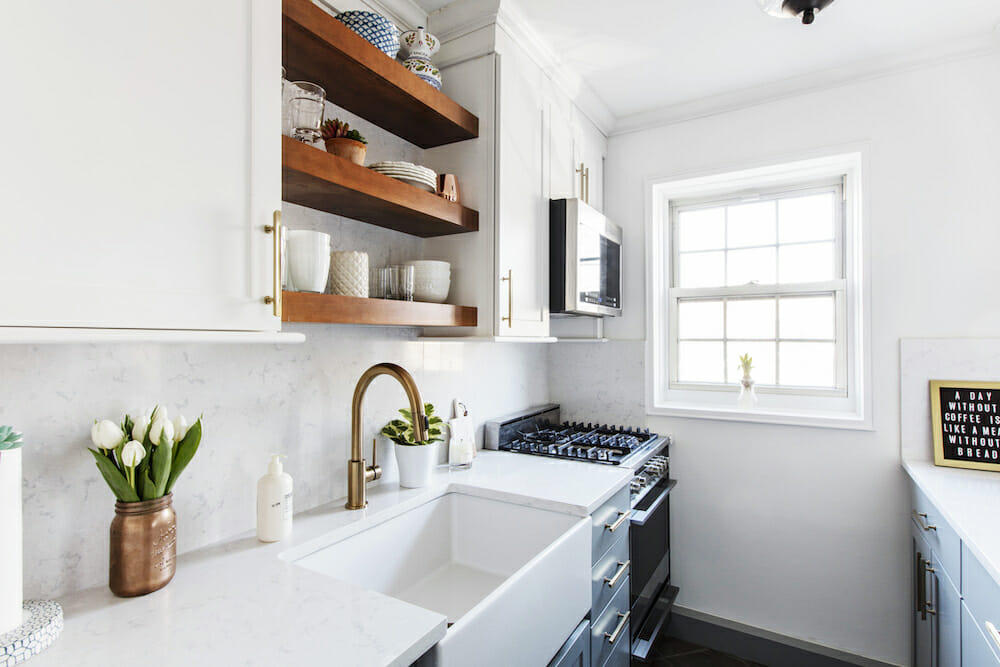
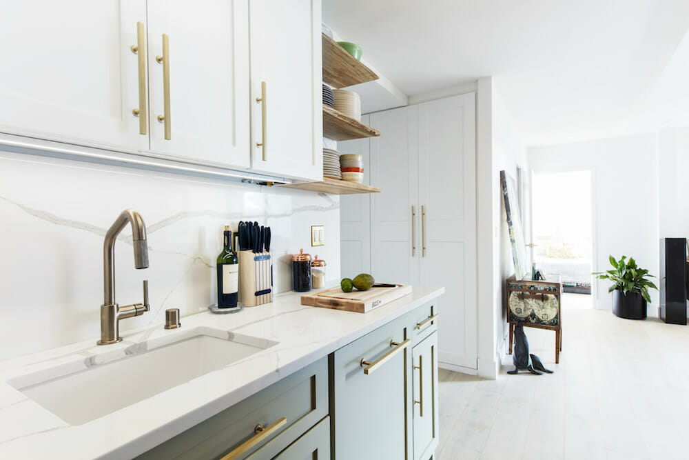
- Kitchen faucet in bronze
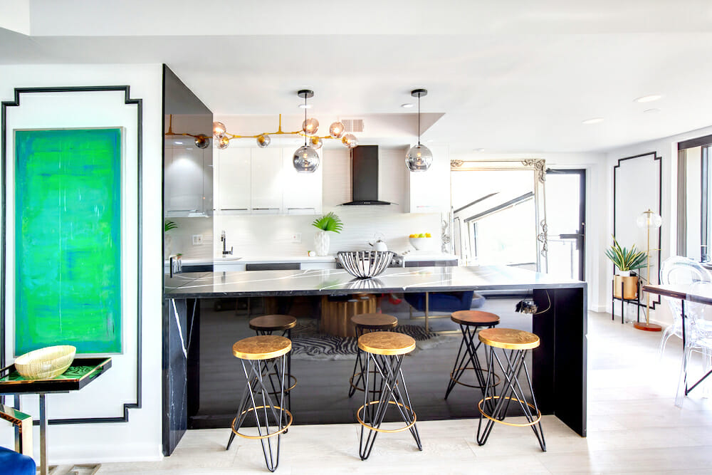
- Gold barstools
- Brass shelf
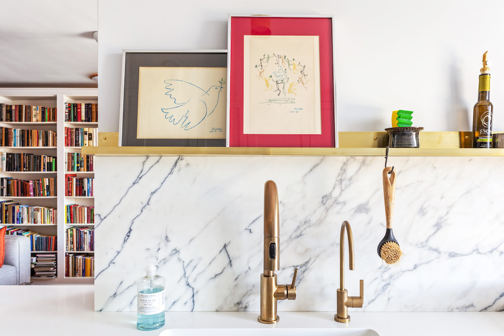
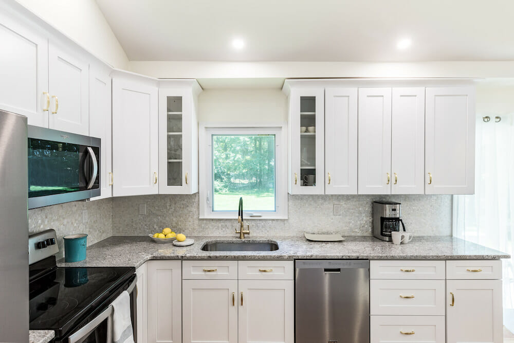
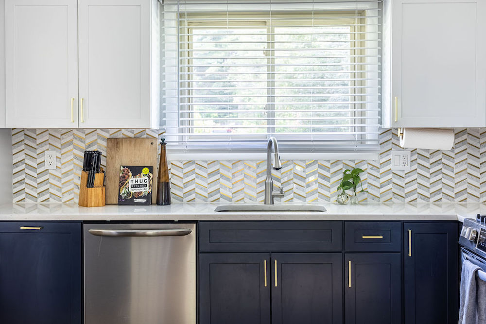
More luxe gold tones like gold and brass are popping up in the kitchen and can either match other warm surfaces (such as wood cabinets) or be in stark contrast for a pop against white. We see Sweeten renovators using these finishes in their lighting choices, cabinet pulls, even barstools. These warm metallic accents don’t cost more than their nickel predecessors.
Scroll through Jill + Cy’s pendant lighting and hardware, a Forest Hill’s faucet under open shelving, Jennifer + Joe’s gold barstools, and Sally + Ross’ brass shelf for inspiration on adding warm accents like these to your abode. Sweeten brings homeowners an exceptional renovation experience by personally matching trusted general contractors to your project, while offering expert guidance and support—at no cost to you. Renovate expertly with Sweeten
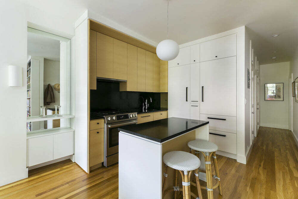
The refrigerator gets “frozen” out of the kitchen with hidden fridges
- Freestanding fridge
- Storage built-in across the hallway
- A fridge in its own zone
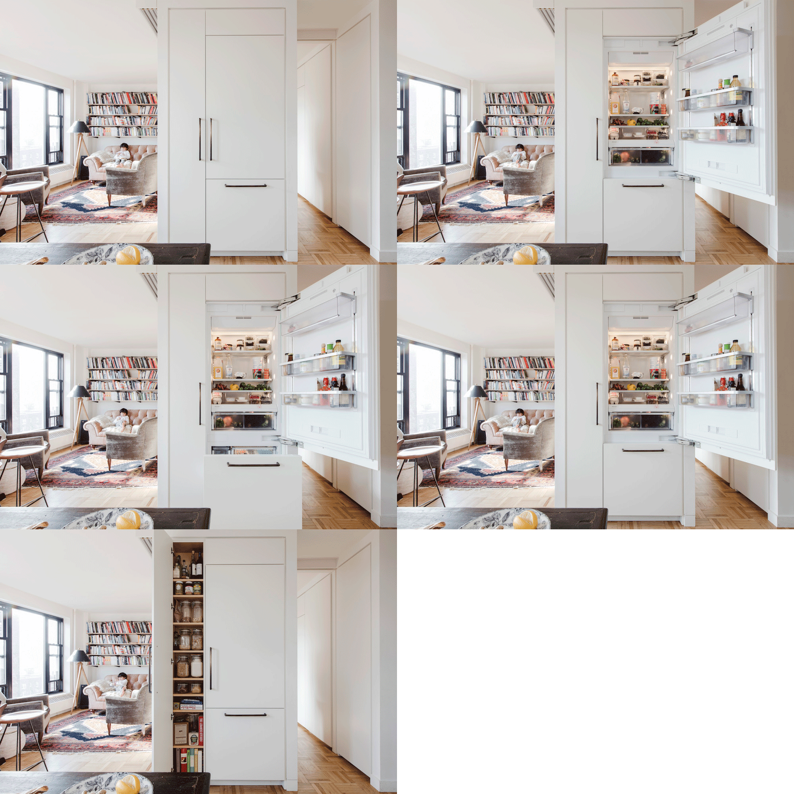
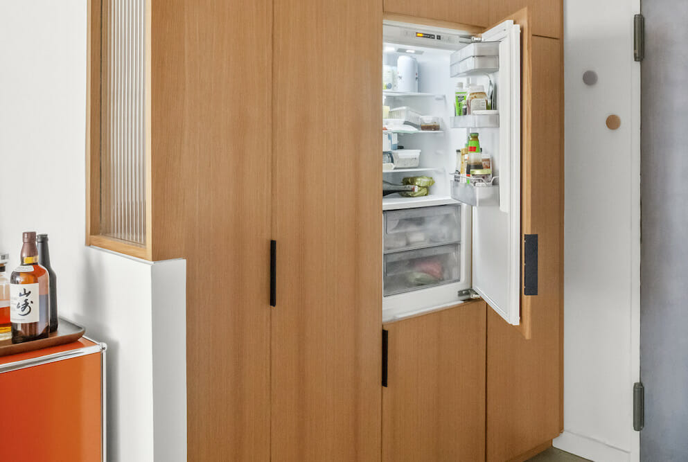
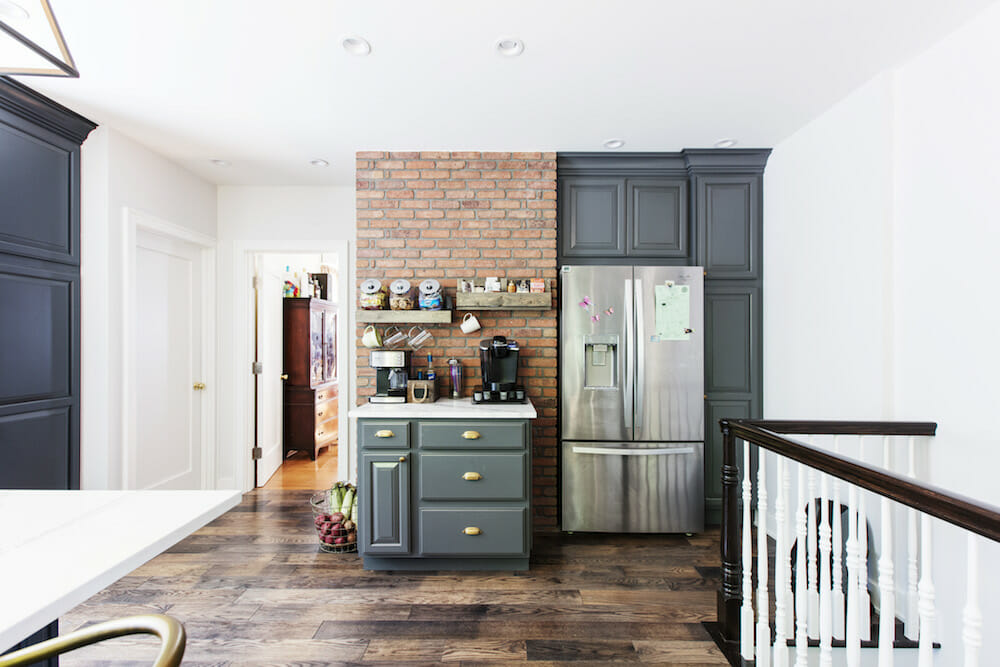
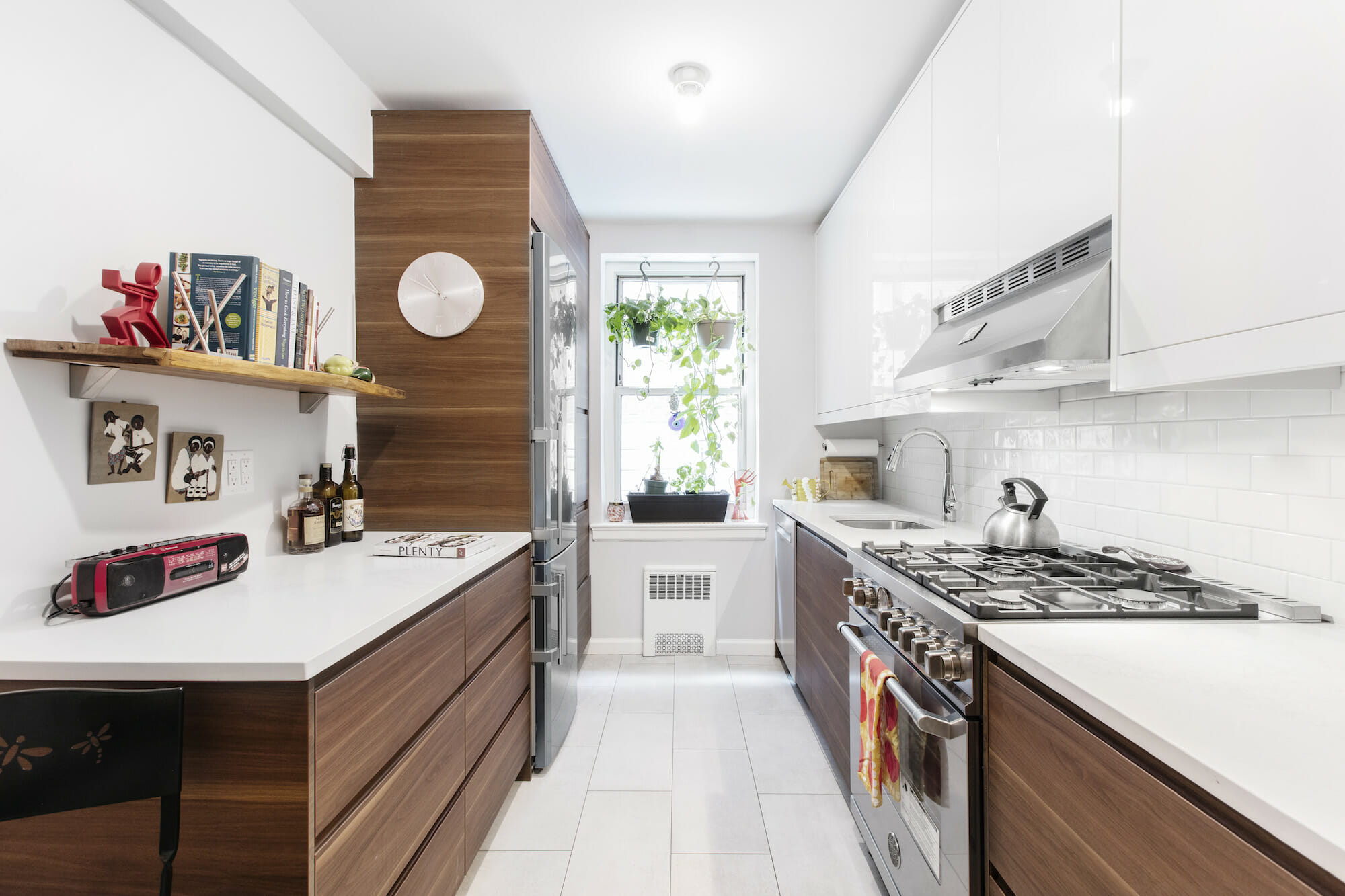
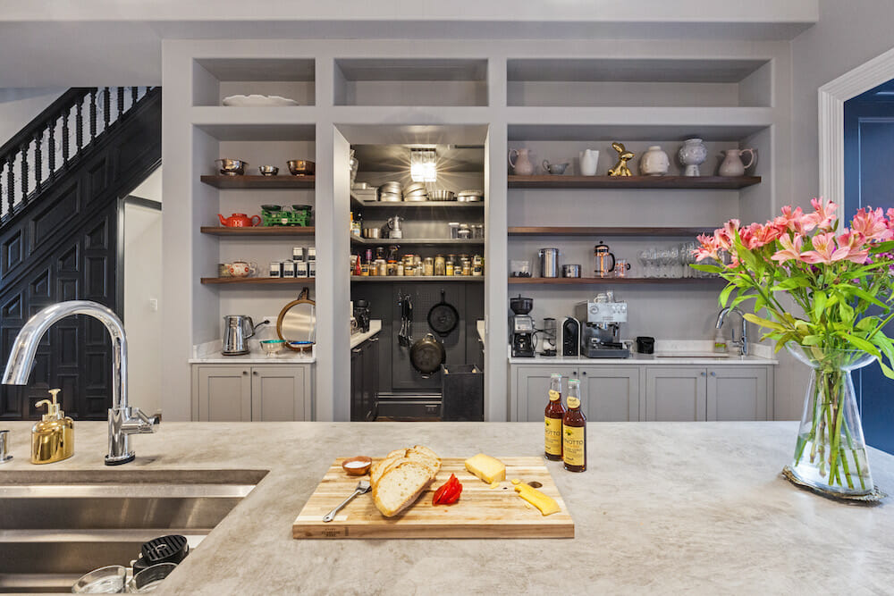
Call it the break-up of the traditional sink-stove-refrigerator triangle. The modern family calls for a more updated design. Unlike in the past, we’re seeing renovators embrace the idea of zones in their kitchens. Those with the right layout and space to fit a refrigerator closer to the main action (sink and stove) are instead choosing to locate the appliance outside the kitchen proper. This allows for a better flow visually and functionally—one homeowner gained 200% of working counter space—and there is generally less bumping into one another when you are cooking together.
Check out these Sweeten renos with refrigerators outside the triangle, freestanding units within a built-in, across the hallway, and one completely in its own zone.
Textured tiles lend a magic touch
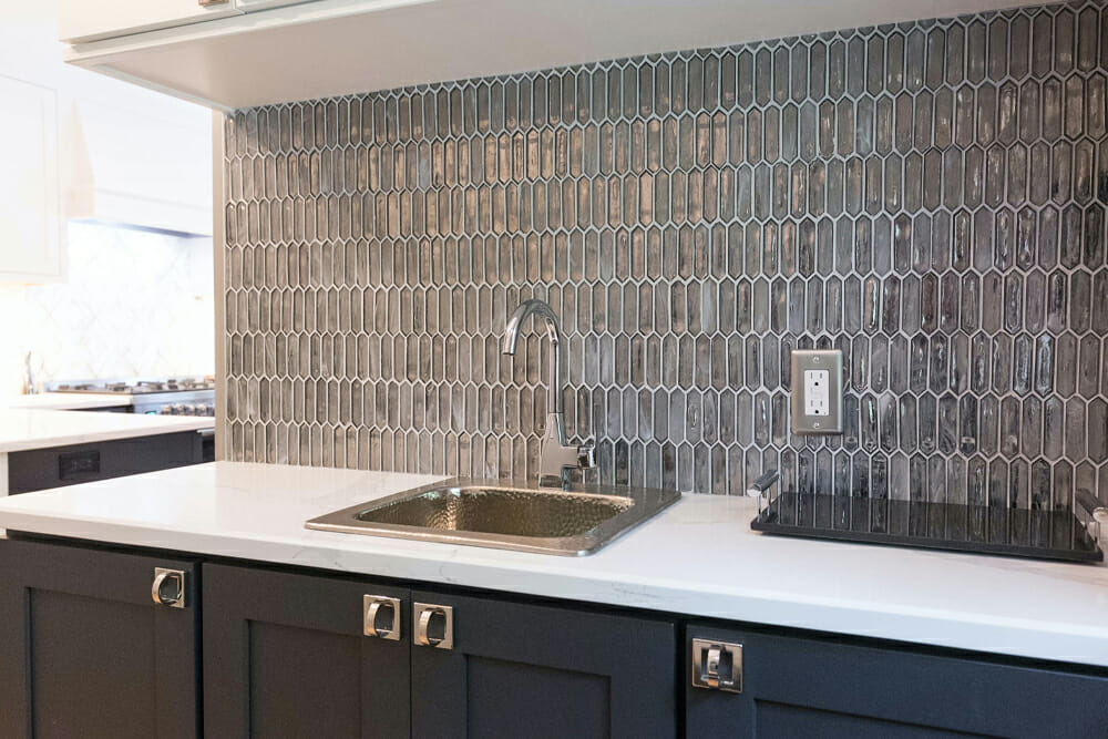
- Bar sink backsplash
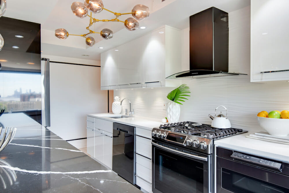
- Wavy surface
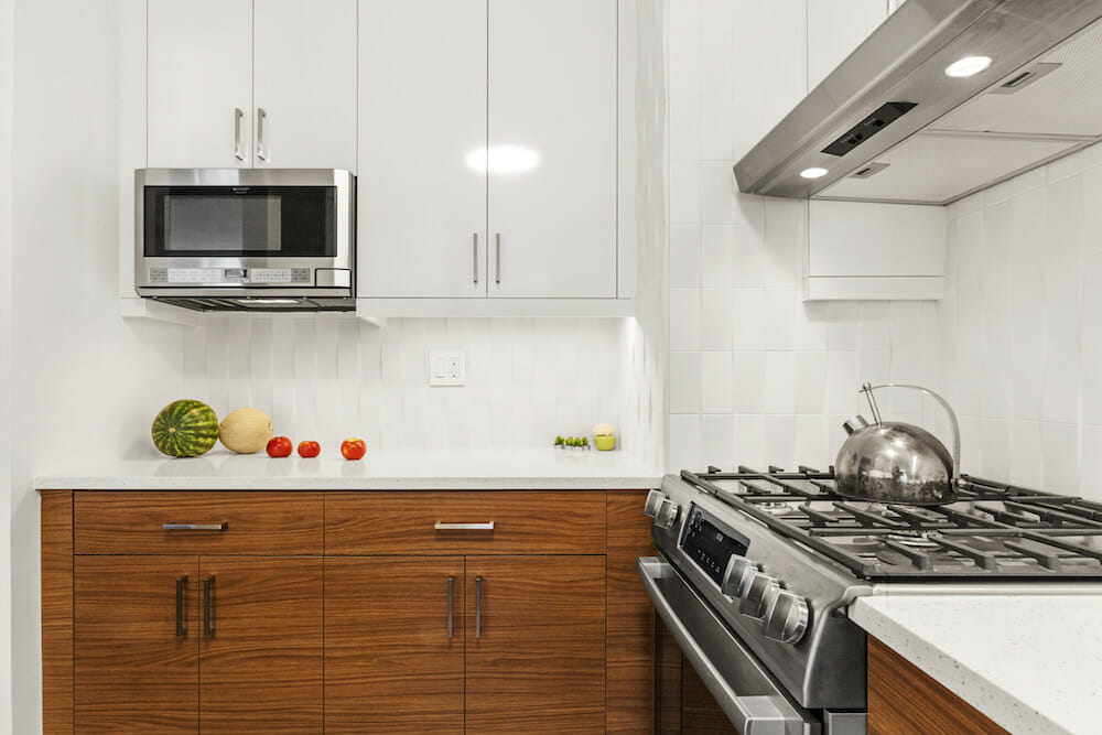
- Rolling backsplash
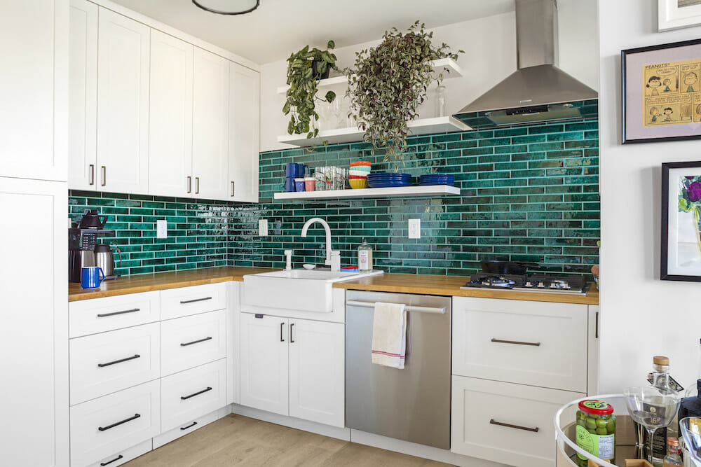
- Glossy green tile
- Mosaic tile
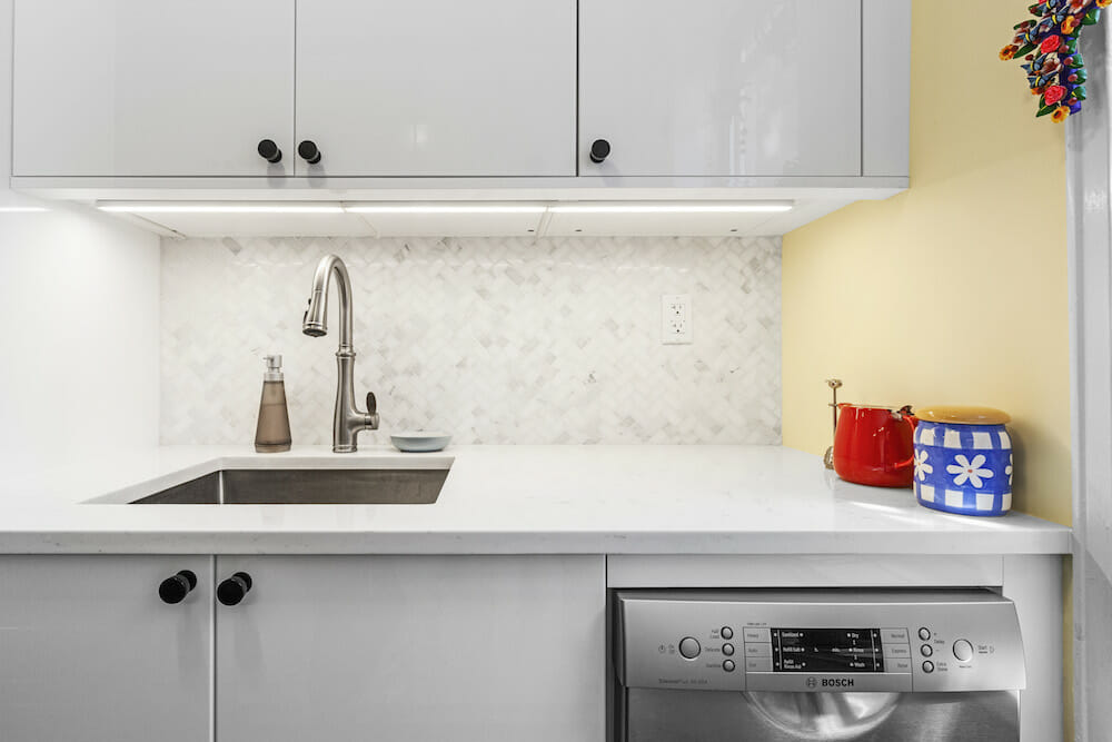
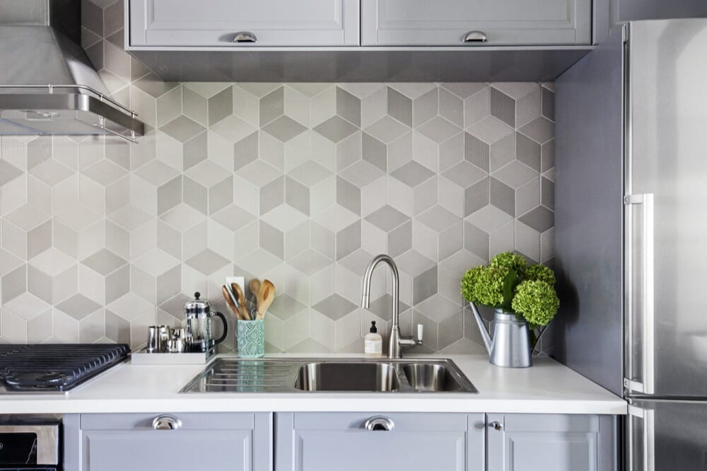
Want even more depth to your design? Think textured tiles, which we see as a lasting “trend.” Used sparingly, they add a special dimension, or you can go all out and cover the entire length of the backsplash. Tiles can be subtle or dramatic, depending on the material used, shape, color, or finish—so they really suit any aesthetic. But remember, unusual shapes or irregular sizes (such as mosaics), which often come along with using textured tile, can add to labor costs.
Here, we reveal some stylish spaces from Sweeten’s renovators, including Nilda + Brian’s bar sink backsplash, Jennifer + Joe’s wavy surface, an Upper West Side’s rolling backsplash, a Brooklyn’s glossy green tile, and Ann’s mosaic tile.
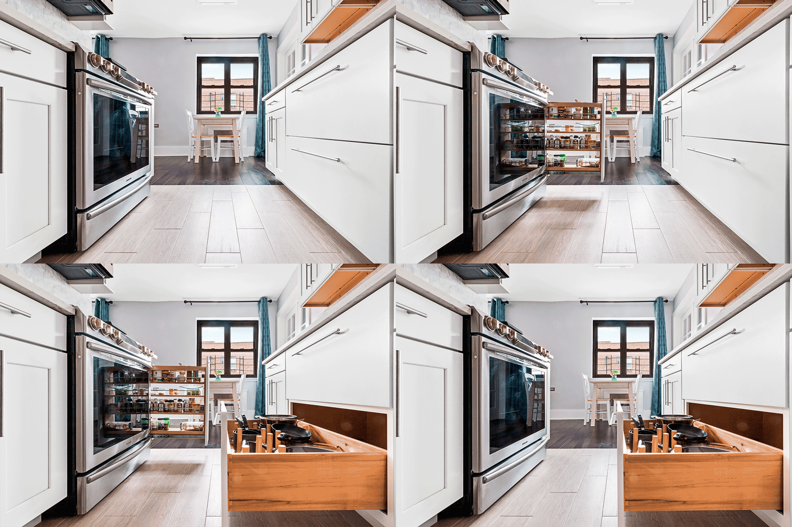
Kitchen drawers open up and add storage
- Warm wood-toned drawers
- Jessica + Jessie’s toe kick kitchen drawers
- Easy access cabinet drawers
- Add dividers for organization
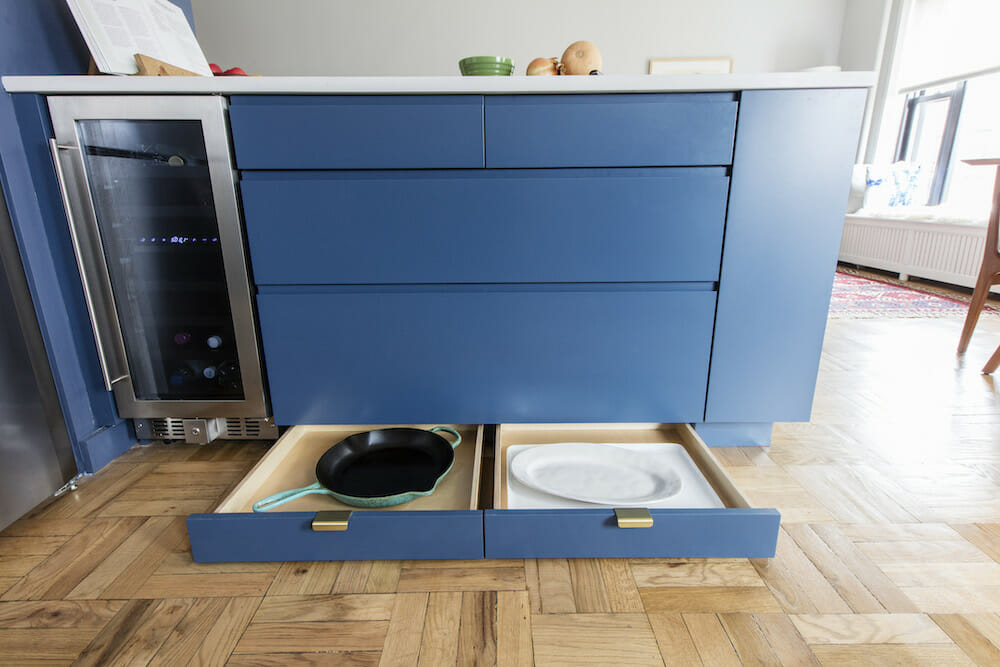
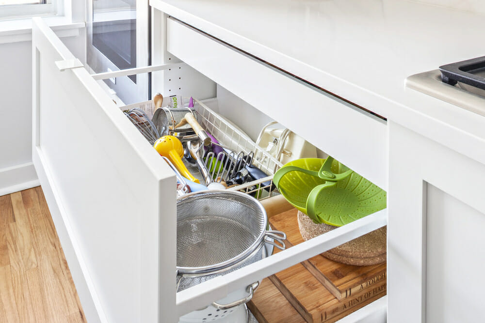
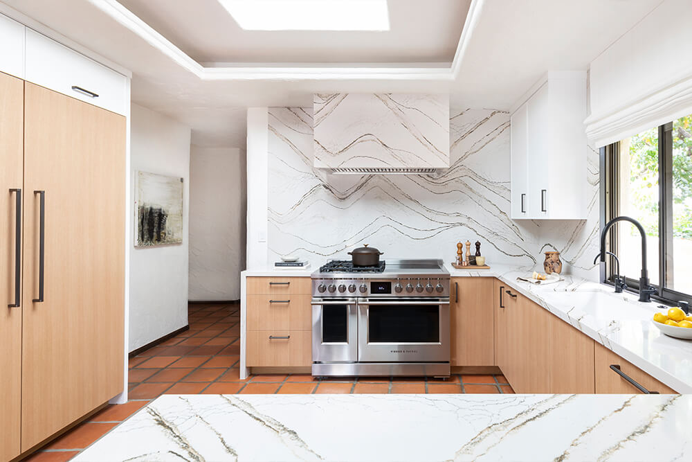
Cabinet drawers make organization easy and efficient. The typical lower cabinet is two feet deep, which means it’s easy for things to get lost in the dark nether regions. With drawers, you don’t have to worry about this, plus, you can easily make sure things stay neat by adding dividers. It’s important to remember that drawers can’t be too wide or they will sag in the middle. Cost-wise, they will be more expensive than cabinets, but in our opinion, they are worth it.
Here, the functionality and design are clear from wood-toned materials, toe-kick pull-outs, deep drawers for easy access, and dividers to keep tidy.
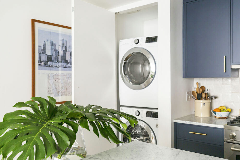
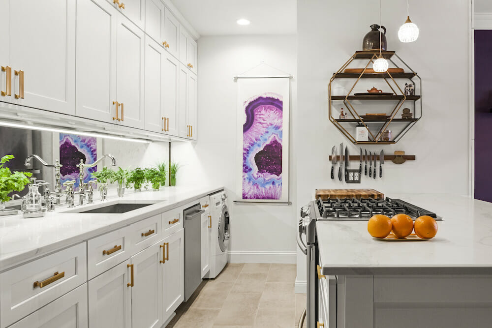
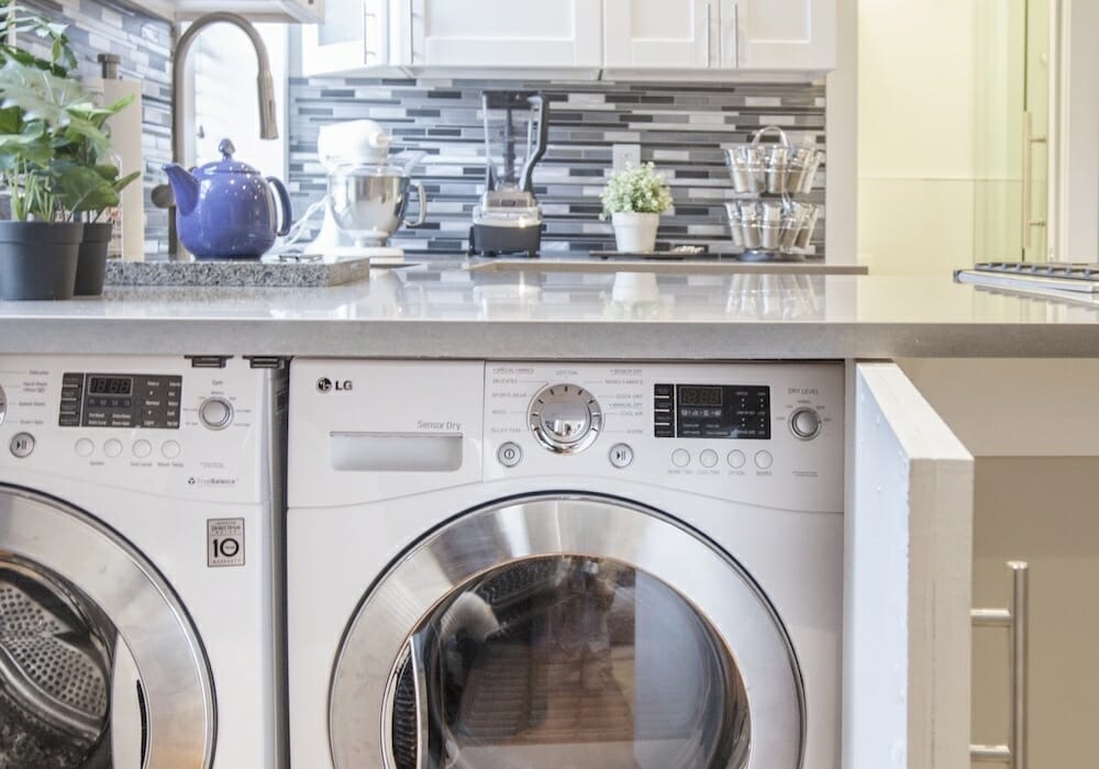
Washer/dryers find new ways to get into the kitchen
- A closet for the units
- A single washing machine
- Hidden behind built-ins
- Washer/dryer under the peninsula
What could be more convenient than having your laundry in the same room as where you spend most of your waking hours at home? Having the units in close proximity is a big convenience, but it’s where they’re seen—or not—that affects the dynamics of your layout. While they typically “live” behind closed doors in a hallway, washers/dryers have moved to the kitchen behind custom closets and ingenious built-ins…even in an island.
Plan for the size (double, two-in-one) and type (stacking, side-by-side), so the unit can be incorporated into the measuring of your kitchen cabinetry, and add $7,000 to $15,000 for installation in an apartment, $3,000 to $5,000 in a house. See cost guide here.
See how Sweeten homeowners integrated a laundry area into their kitchens: a closet in the kitchen, a single washing machine, hidden behind built-ins, and installed under a peninsula.
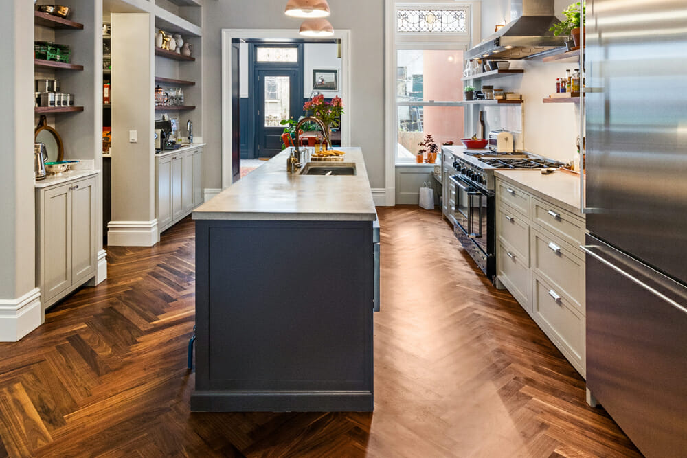
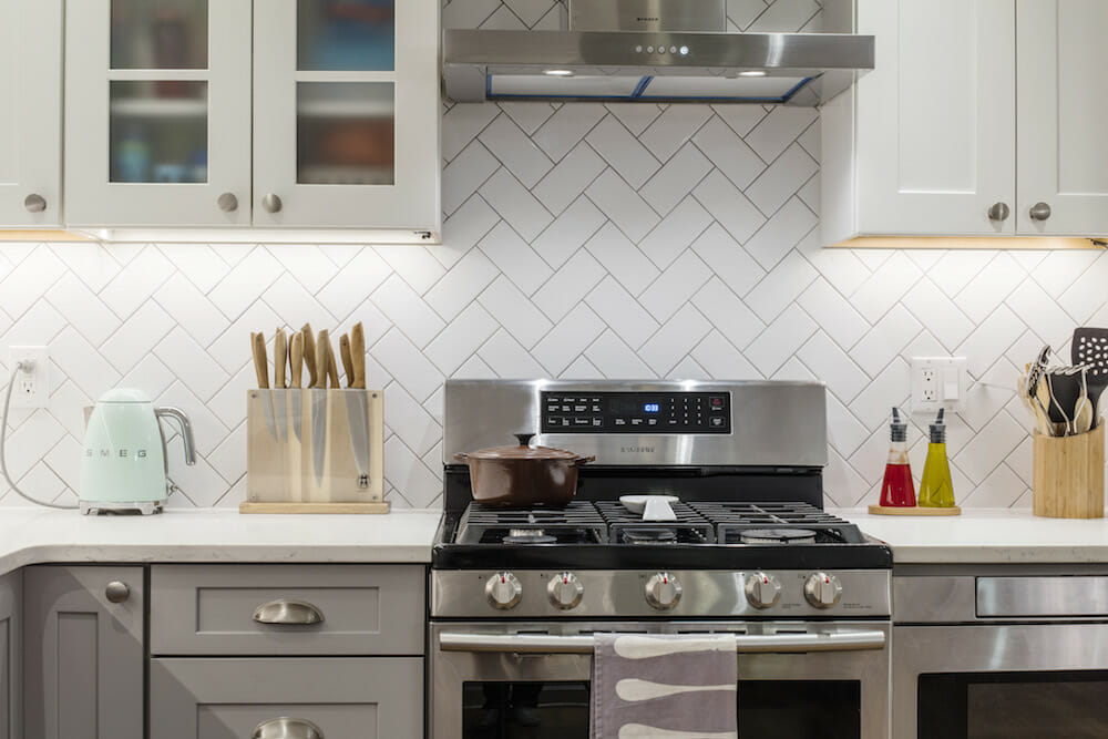
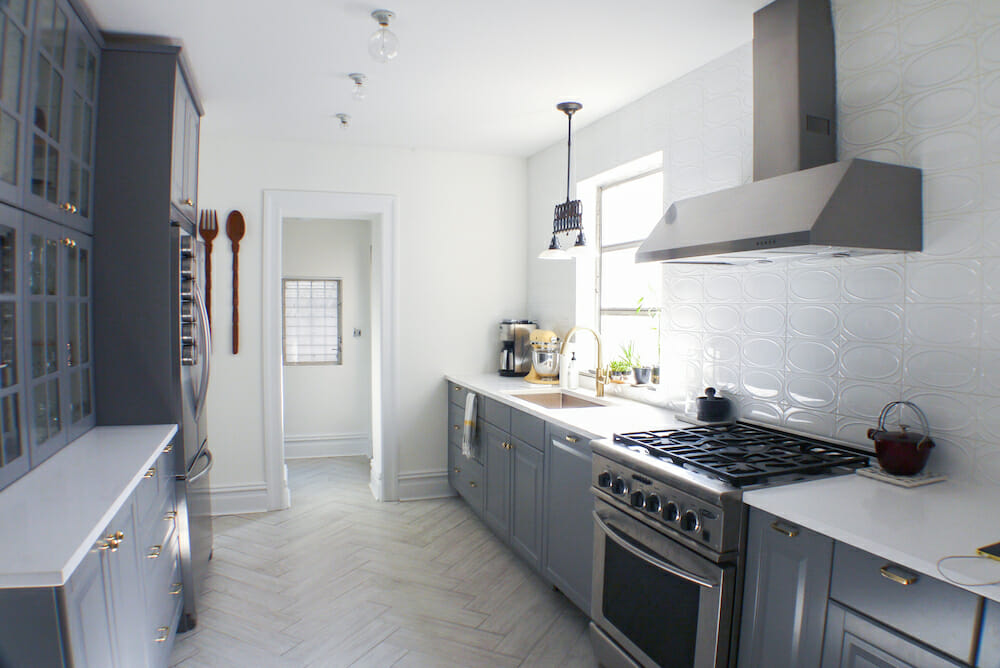
Herringbone tile points the way
- Wood herringbone floor
- Subway tile in a pattern
- Tiled herringbone floor
- Miniature pattern
Deviating from traditional patterns is a chic way to add visual interest to any space. From flooring to tile, we are seeing a rise in the popularity of herringbone. As with most design decisions, each comes with pros and cons. Pro: it’s a cool way to use traditional materials, like subway tiles, in non-traditional ways. Con: it can come with a higher labor cost (herringbone flooring, for example, can cost as much as 30 percent more than regular flooring). So just be sure to budget accordingly as you are sourcing your renovation materials.
Here, some inspiration from Sweeten renovators, including Nazli + Larry’s wood herringbone floor, Kim + Igor’s subway tile as a backsplash, Allison + Jovito’s tiled floor, and Racquel’s miniature pattern.
Ready to remodel your kitchen? These small and larger trends are achievable by our Sweeten contractors, bringing you one step closer to your dream cook space. And, of course, Sweeten monitors your project until it is complete.
—
Sweeten founder and CEO weighs in on what to know before renovating a brownstone.
Sweeten handpicks the best general contractors to match each project’s location, budget, scope, and style. Follow the blog, Sweeten Stories, for renovation ideas and inspiration and when you’re ready to renovate, start your renovation on Sweeten.
