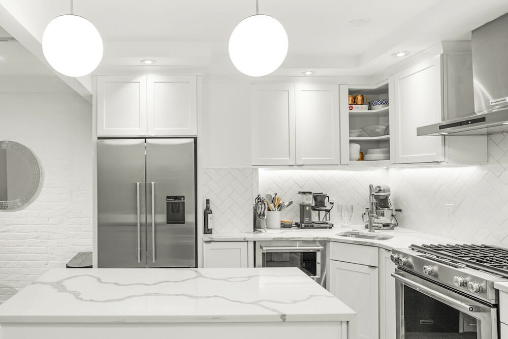
Steve and Lauren’s Sweetened Upper East Side Kitchen – Homeowner Guest Post
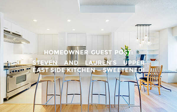
This week’s guest author offers an architect’s eye on an ambitious Upper East Side kitchen renovation. Like fellow architects Brad in Fort Greene and Samina in Union Square, Steve’s industry connections just weren’t quite the right fit for his own smaller-scale residential project. Read on down to hear how this Manhattanite came to Sweeten to find a local general contractor who could open up an enclosed kitchen, seriously expand storage, and bring in modern appliances all around.
Guest post by Steve Townsend, Manhattan architect and homeowner
When I moved in with my girlfriend, Lauren, to our one-bedroom apartment on the Upper East Side, it was clear that the kitchen had suffered from some serious neglect. The apartment has been in her family for decades, with her parents purchasing it several years ago from her grandparents as an investment property. It has been an eternal revolving door of short-term family tenants. I am an architect and she works in television advertising, but it was apparent to both of us that the outdated design needed a remedy. Renovating the apartment was always an end goal, but having an architect in the relationship accelerated those plans, because: free obligated labor!
The design problems with the kitchen were immediately apparent. The building was constructed in the 1970s, and apart from the finishes and appliances not being replaced throughout its lifetime, the layout harkened back to a simpler time – when nobody wanted to see their kitchens and apparently there was never more than one person in the kitchen at a time. It was remarkably small and completely enclosed—an ‘L’ shape configuration with a door at each end—with very limited counter and storage space. The walls ensured that no natural light made its way in.
I am not typically on the client side of construction projects like this – typically the client handles finding and hiring the contractor, and as architects, we then work with whoever is contracted. Moreover, we typically engage in larger scale projects in New York and abroad, so our local network of contractors is limited. Sweeten provided an instant network of screened contractors, who specialize in this scale and scope of project, and lined up a series of contractors who were both interested and qualified.
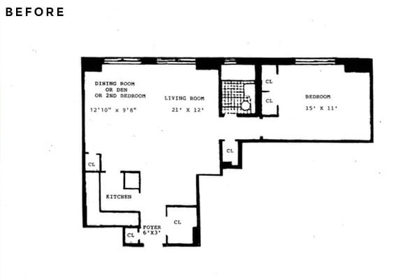
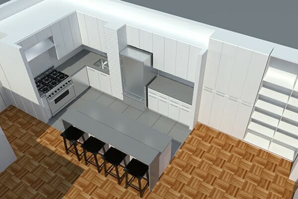
Because the design was finalized (rendering above) when we reached out to prospective contractors, we were very clear with the plan, we just needed someone who would complement our vision and desires. After meeting with Sweeten’s recommendations, we decided to go with Sweeten Expert Kris. His team specializes in renovations like ours, and his aesthetic was remarkably aligned with our own.
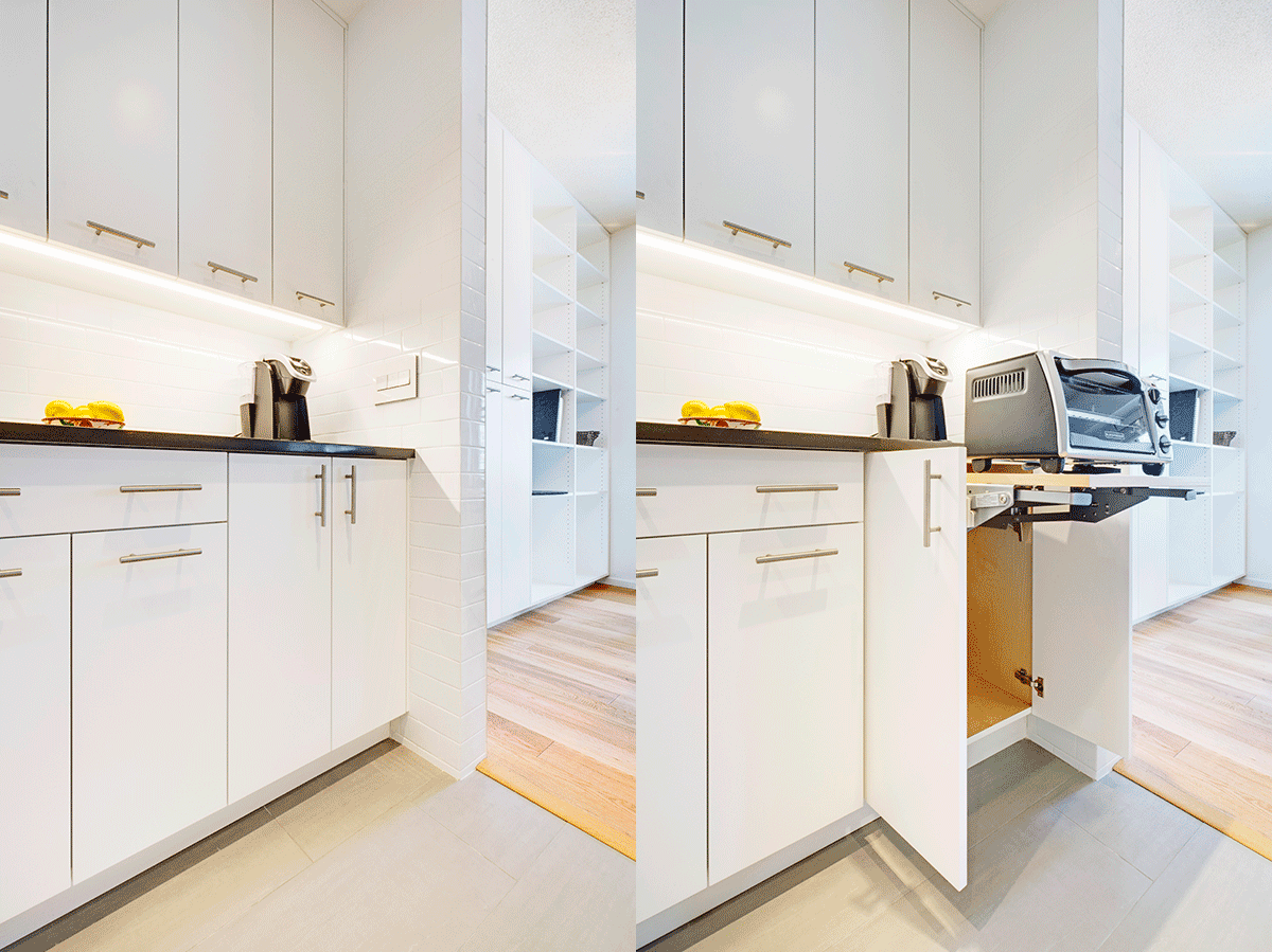
The objectives of the design were simple: open up the whole space, maximize counter space without sacrificing storage, and obviously replace all appliances and cabinets. The new cabinets and finishes needed to be durable and the layout functional for two passionate chefs. The plan became pretty clear: blow out the walls and consolidate the appliances to the back walls. Sweeten brings homeowners an exceptional renovation experience by personally matching trusted general contractors to your project, while offering expert guidance and support—at no cost to you. Renovate expertly with Sweeten
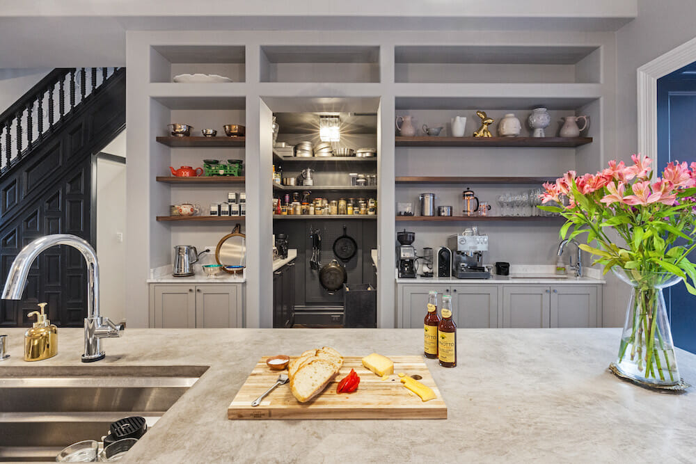
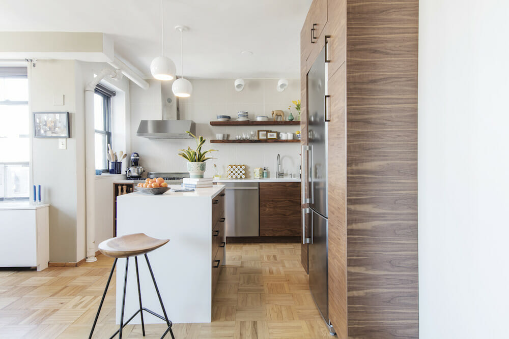
We kept the existing ‘L’ configuration, but enlarged it by demolishing all of the partitions and replacing them with a large island. The island instantly doubled our counter space while adding all the below-counter storage. Because we enjoy hosting dinners and making cooking more of a communal experience, we opted for a two-tiered island with a counter-height side at the kitchen and a bar-height side facing the rest of the apartment. And since we eliminated two closets as part of the demolition, we included full height cabinets and shelves on the wall outside of the kitchen to serve as storage and a pantry closet, without intruding too far into the space.
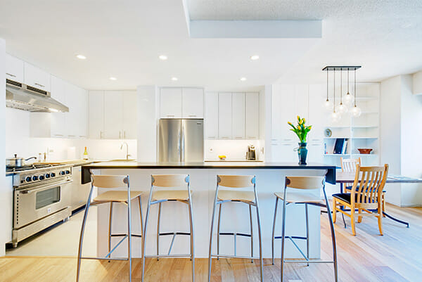
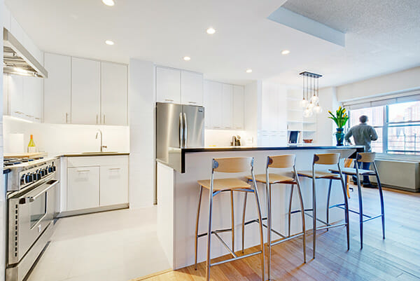
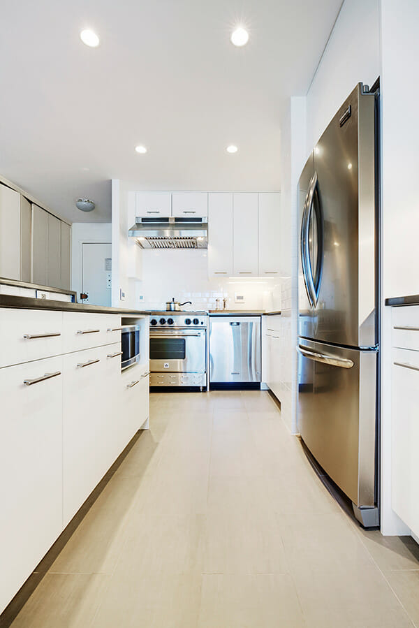
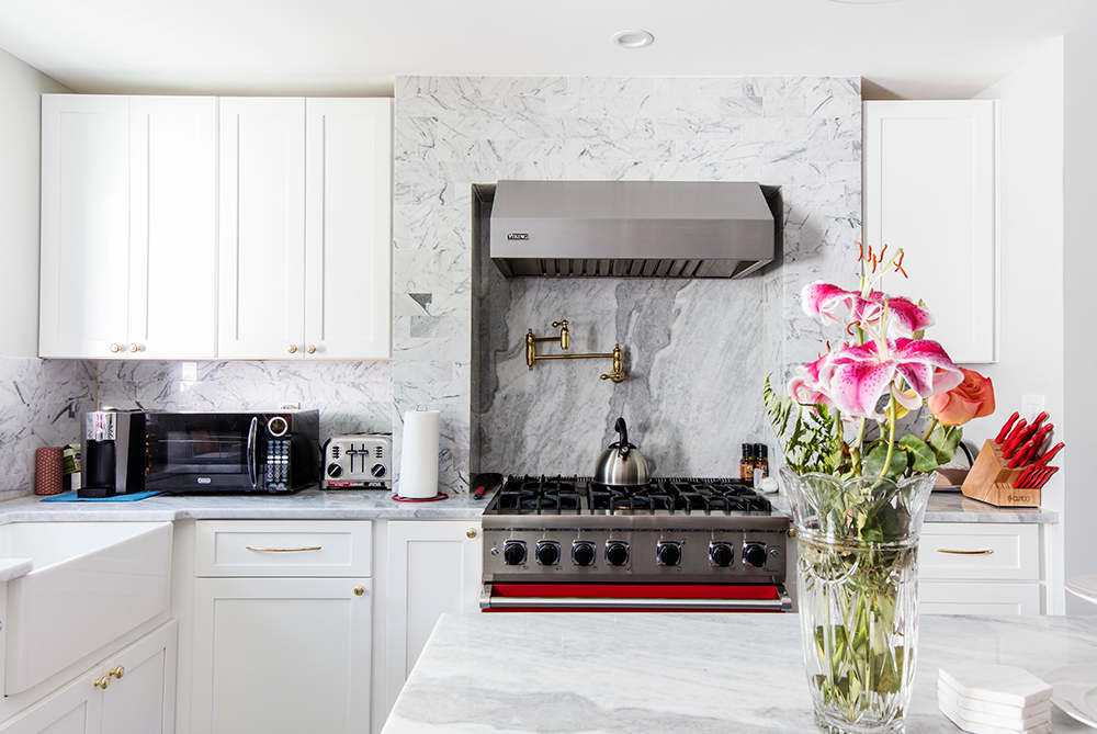
These changes gave us vast spatial improvement to the apartment and made room for a complete update of all the appliances. We knew we wanted professional-grade appliances and we let these choices serve as the foundation of many design decisions. In order to get the feeling of a commercial kitchen, the appliances are stainless steel, which go well with the rest of the space. We opted for a large Bluestar 6-burner range, which is really the centerpiece of the new equipment, as well as a Fridgidaire fridge and a KitchenAid dishwasher.
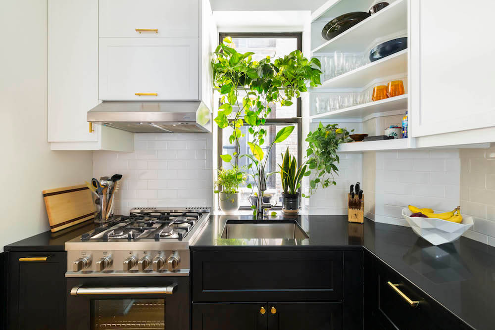
In order to accentuate the openness and lightness of the new design, we decided to go with all-white finishes for all the vertical surfaces – custom white lacquered cabinets and white subway tile for the backsplash and other walls. In order to contrast the white surfaces, we decided on a dark gray Caesarstone counter and a ceramic floor tile in a similar hue.
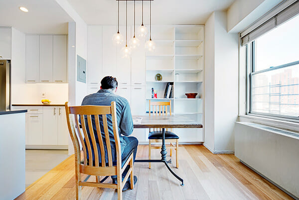
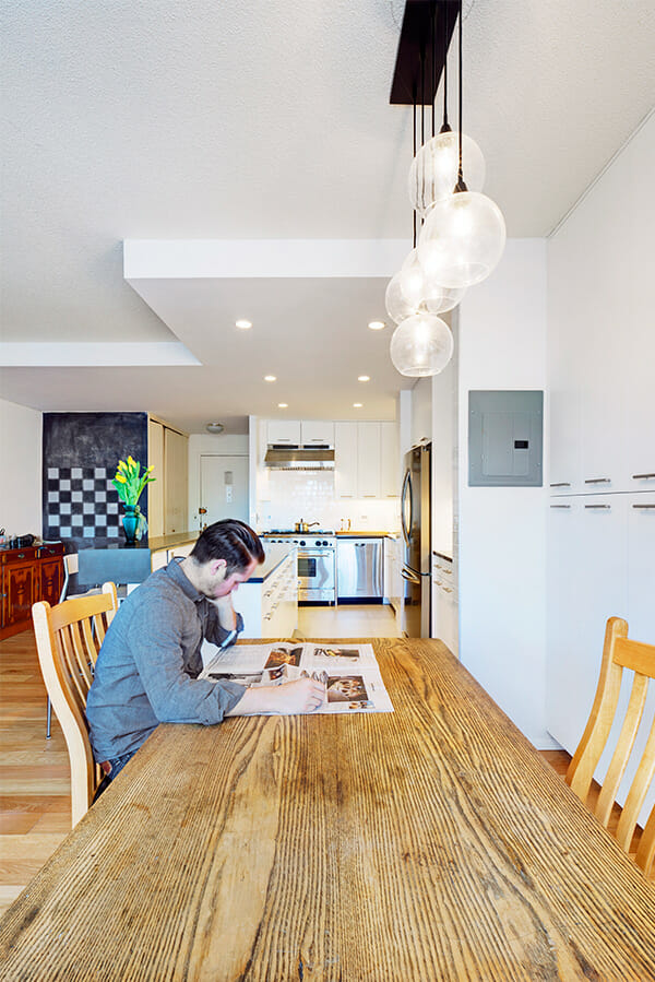
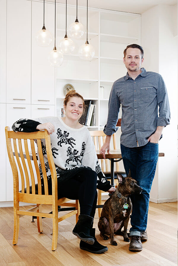
Kris’s experience in this kind of work was invaluable throughout the process, and when minor hiccups occurred – as they invariably do in these types of projects – his creativity and expertise always led to innovative solutions. The end result is a really fantastic change from the original apartment. Aside from now having a better functioning and more practical layout for a kitchen, the whole apartment is brighter and more open.
Kitchen Selects >> floor tile: Monocibec porcelain tiles in Modena Gray / backsplash tile: Daltile white subway tile / cabinets: custom / countertop: Caesarstone / fridge: Fridgidaire / dishwasher: KitchenAid / stove range and hood: Bluestar
—
Sweeten handpicks the best general contractors to match each project’s location, budget, scope, and style. Follow the blog for renovation ideas and inspiration and when you’re ready to renovate, start your renovation on Sweeten.
