A Creative Couple’s Brooklyn Townhouse Transformation
Kavi Ahuja Moltz and David Seth Moltz, the creative duo behind the perfume and cologne company D.S. & Durga, had a dilemma. Their Brooklyn townhouse, brimming with charm and original details, lacked the modern conveniences needed for their entrepreneurial lifestyle. While they adored the rich wood trim and inlaid floors, previous renovations had left the kitchen and bathrooms with a mismatched aesthetic.
Seeking a design and construction solution, the Moltzes turned to Sweeten. By posting their project on Sweeten, they found a skilled contractor to reimagine the space and elevate the feel of their kitchen and two bathrooms.
At Sweeten, we’re experts at all things general contractors — we pre-screen them for our network, carefully select the best ones for your remodeling project, and work closely with hundreds of general contractors every day.
Storage was limited to two strips of base cabinetry and the butcher block counters added a third wood finish to the original floors and architectural details. Updates in the bathroom were similarly out of sync with the home’s original design, and a mix of modern tile, faux wood finishes, and slim storage left this family without a lot of storage options. Sweeten brings homeowners an exceptional renovation experience by personally matching trusted general contractors to your project, while offering expert guidance and support—at no cost to you. Renovate expertly with Sweeten
The contractor set out to preserve the most striking original floor and molding details and also push elements of the home toward a highly inventive and contemporary aesthetic.
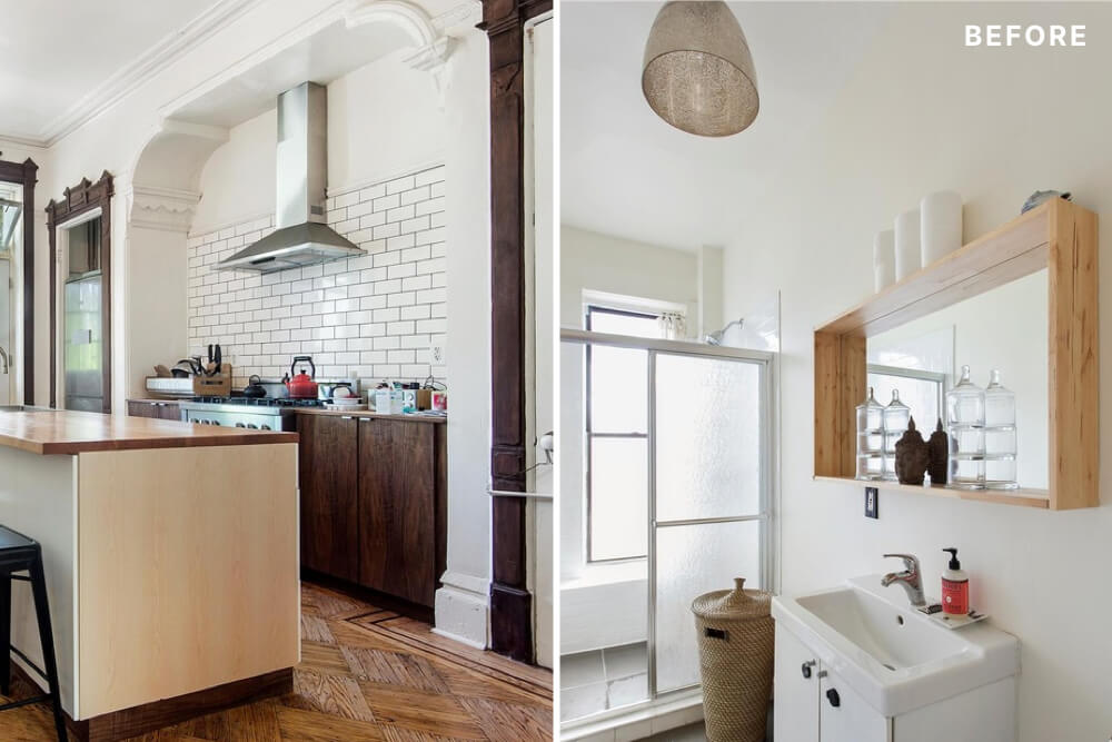
(credit for before photos: Douglas Elliman Real Estate)
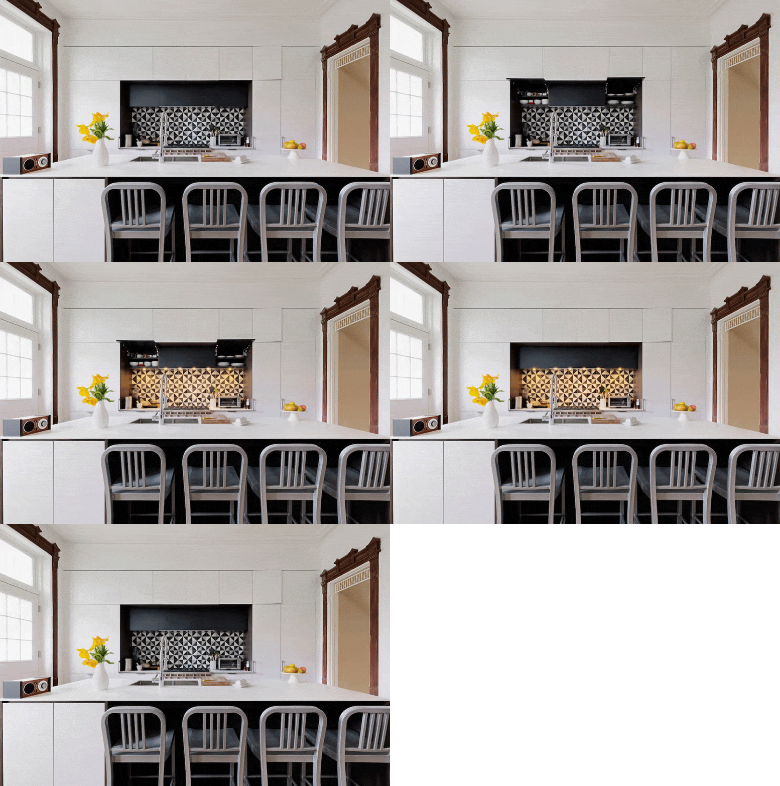
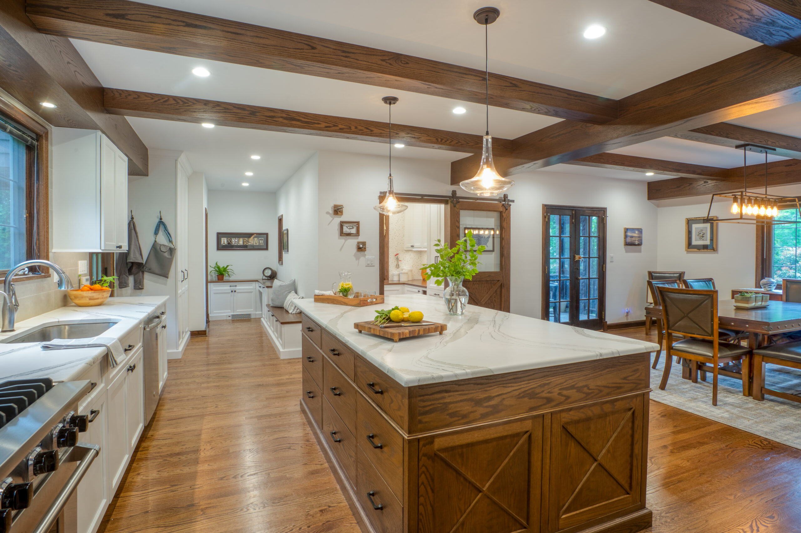
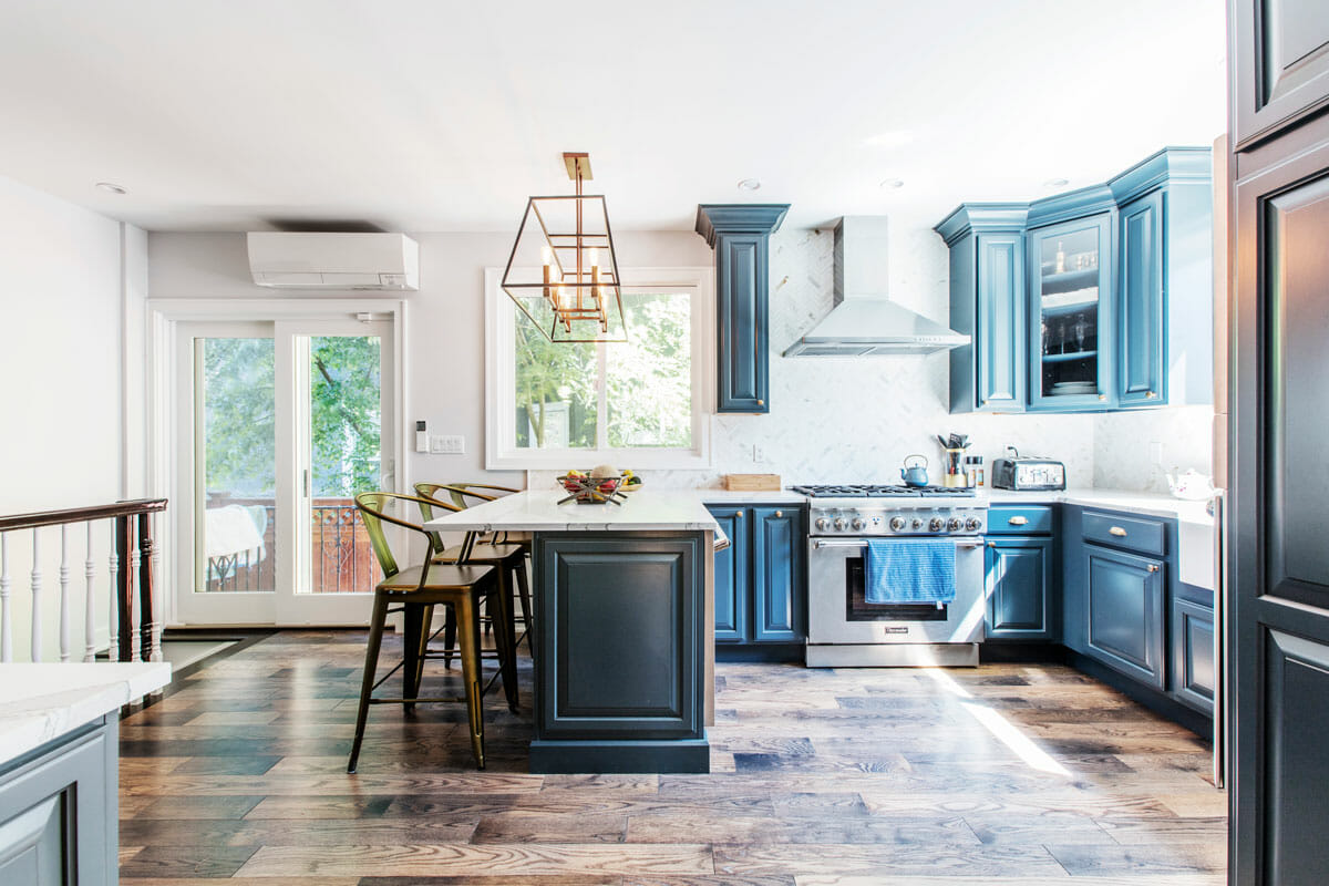
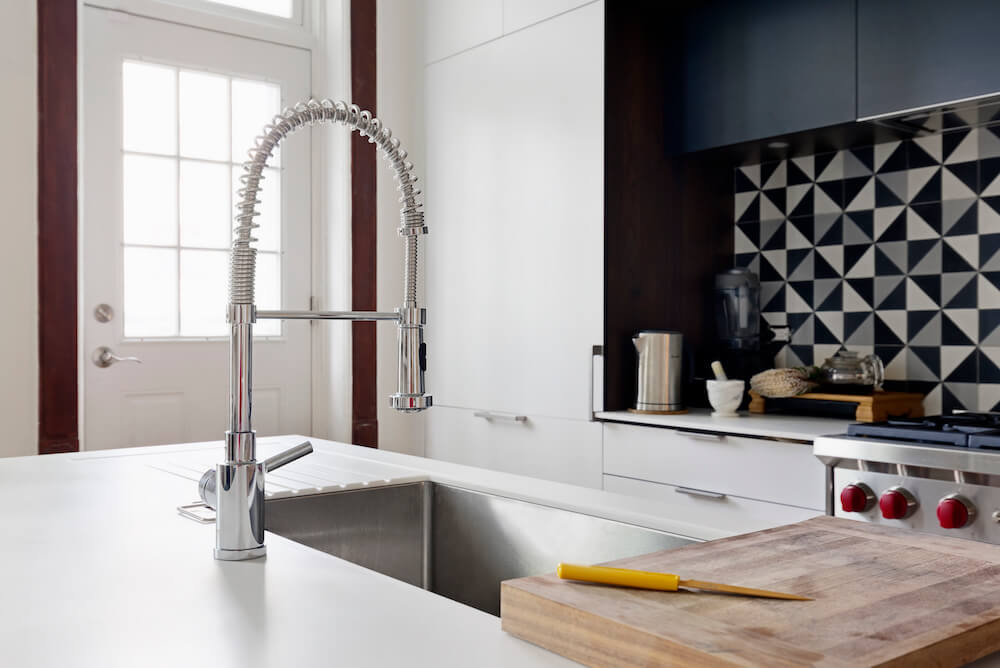
Without destroying any of those gorgeous hardwood floors, he addressed the most pressing of the to-dos first. The base cabinets were completely removed and replaced with a full wall of semi-gloss, flat front, white cabinetry from HenryBuilt with hidden hardware, framing the striking new Wolf stove. While they did lose the original wall pocket trimmed in molding that housed the fridge, the new HenryBuilt cabinets are far better suited for pantry purposes, and the new fridge was re-located to the right of the stove, camouflaged seamlessly with paneling. White stone composite counters replaced the butcher’s block, and a larger island replaced the former, keeping a similar silhouette with a mahogany base and ample knee space for diners. The stainless undermount sink was also enlarged, with a dramatic multi-functional chrome faucet, a standard workhorse behind the scenes in most restaurants.
The backsplash is where the real drama resides. White subway tiles were replaced with a kaleidoscope of black, gray, and white triangular tiles creating quite the abstract pop of modernity to the new kitchen that’s now a contemporary haven trimmed in pre-war luxe.
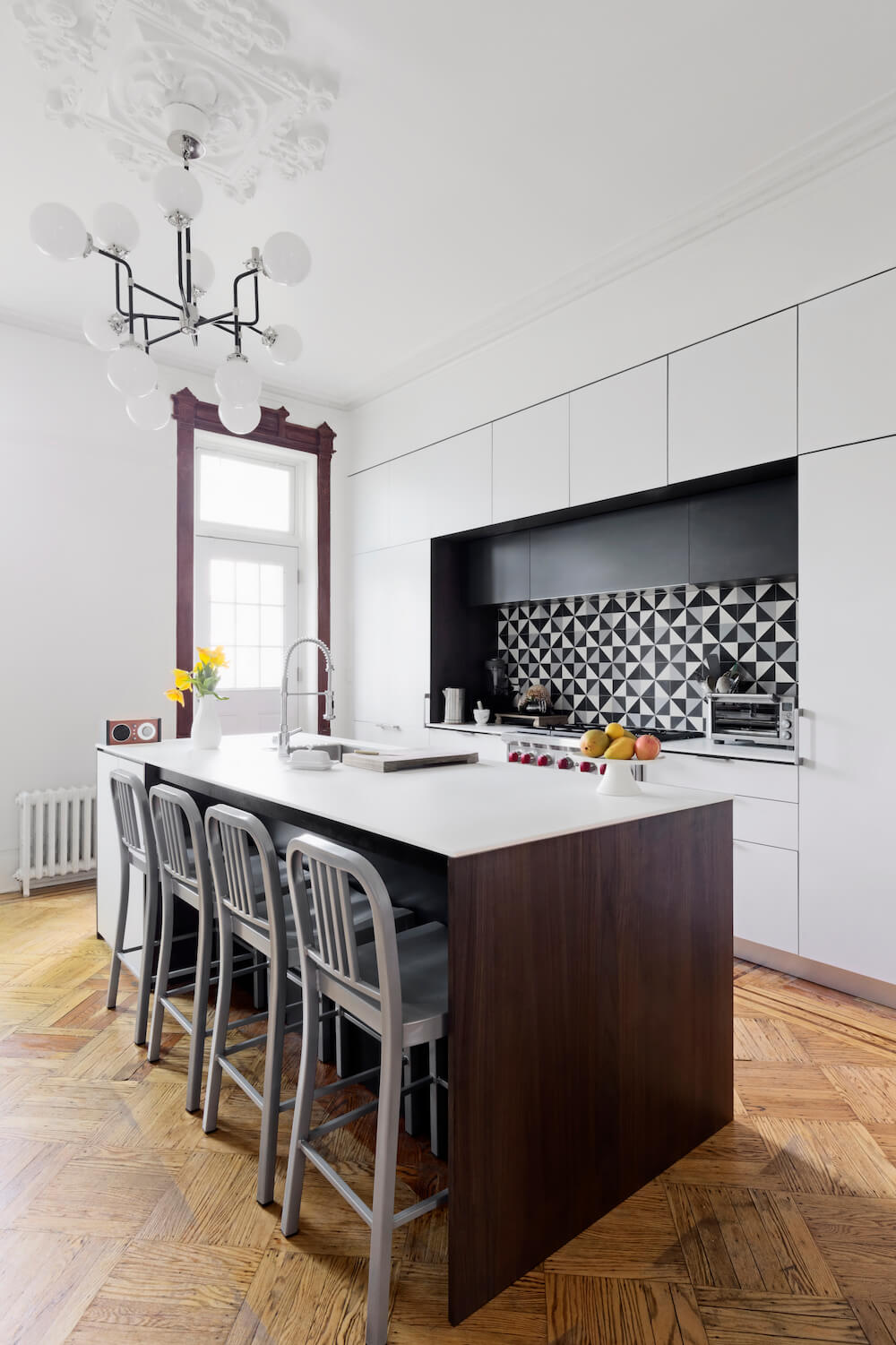
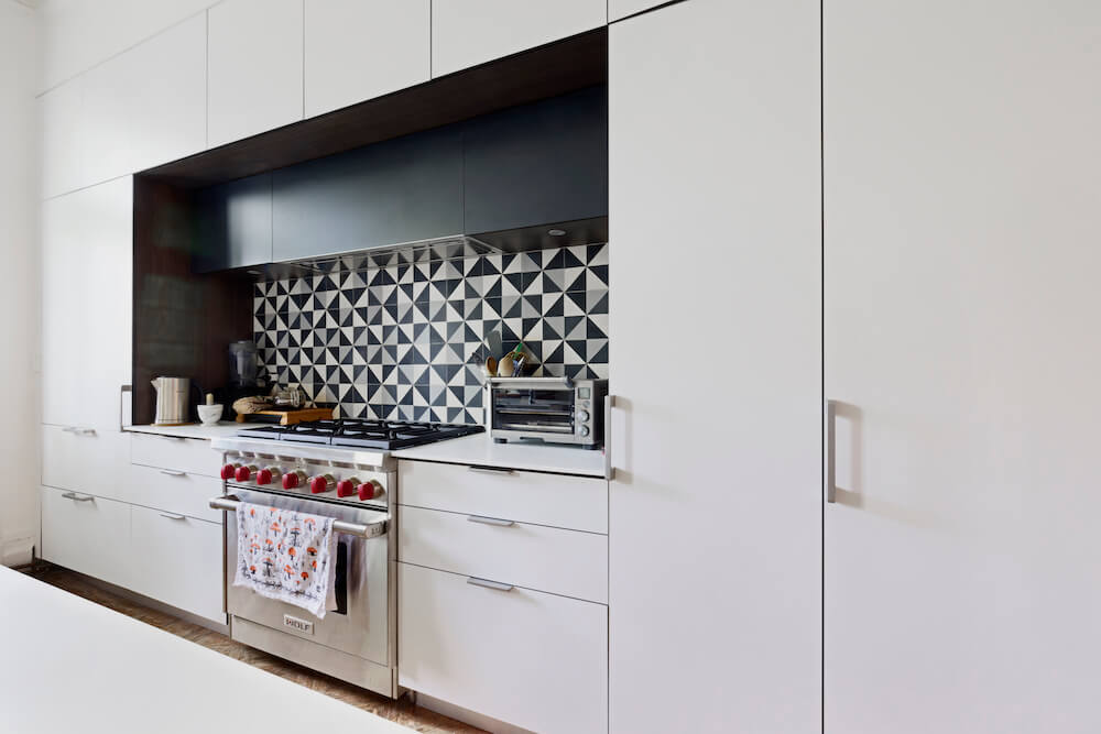

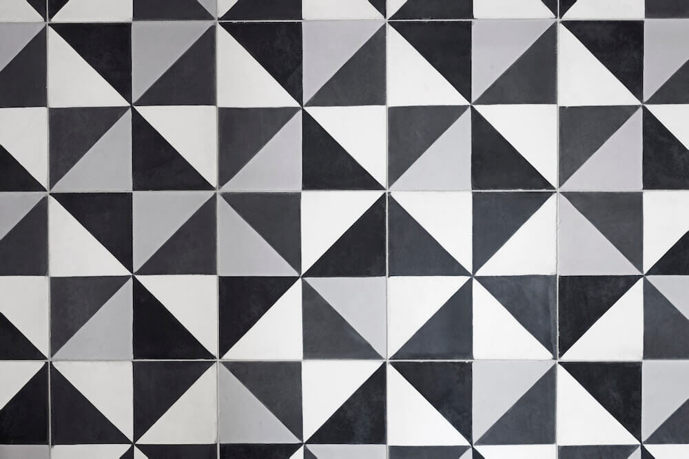
In each of the two bathrooms, the crew took a related design approach to tie in inspiration across eras, addressing the finishes without changing the footprint entirely.
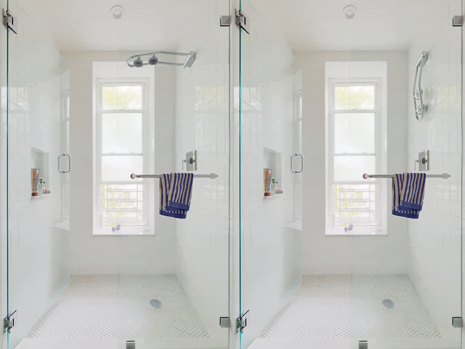
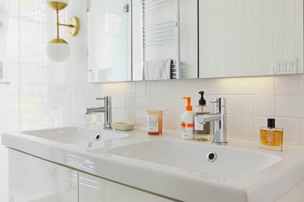
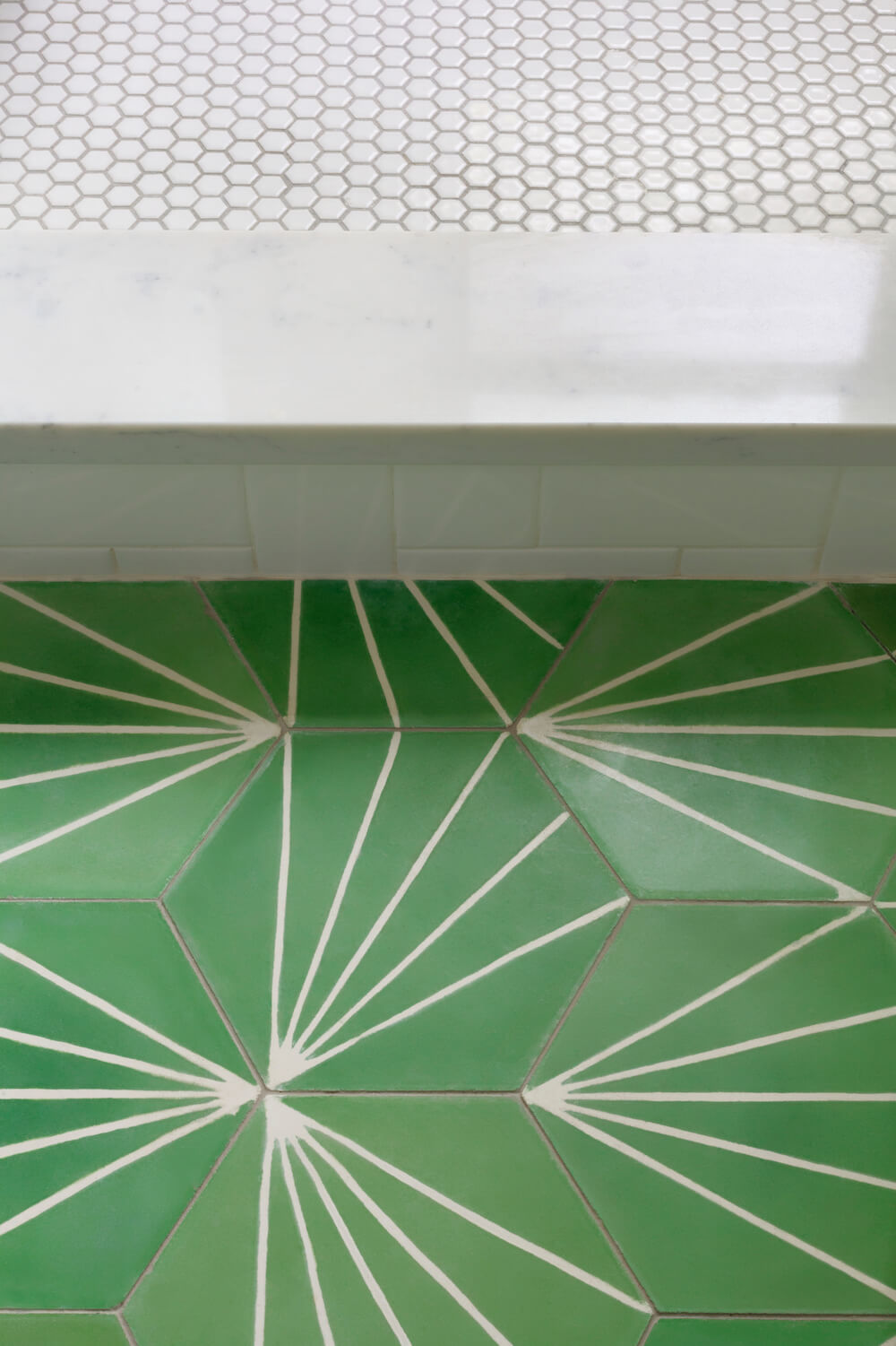
In one full bath, tile again takes center stage with cement Dandelion tile in Lawn/Milk on the floors. These hex tiles with watercolor edges and abstract white lines depicting sunbursts replaced the previous, more subdued flooring. Simple white hex tile grounds the walk-in shower, and classic white subway tile stacked in a herringbone pattern extends up and around the walls. Frameless glass shower doors, a glossy lacquered double vanity with deep drawer storage, and a heated towel rack perfect this stylish high-low mix of materials. And because no detail was overlooked by this stylish couple, they opted for polished brass light fixtures to offset the muted tones and white on white textures.
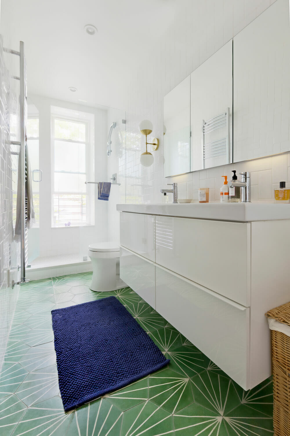
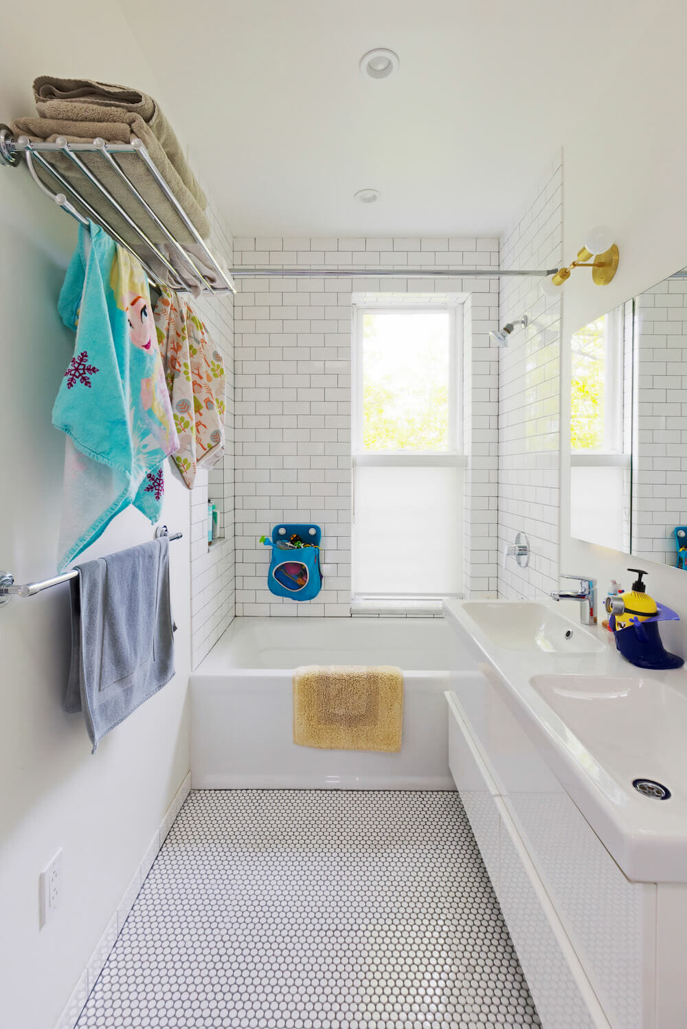
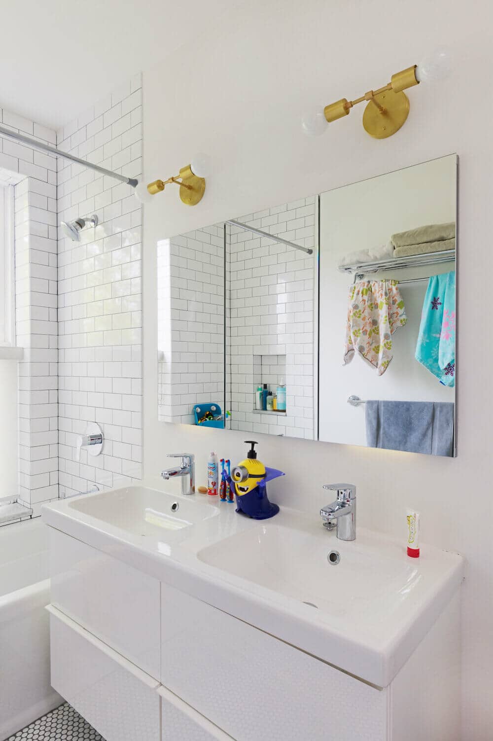
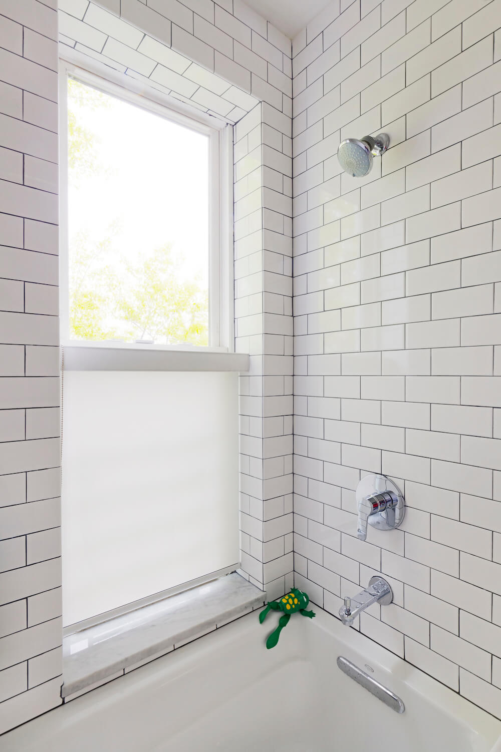
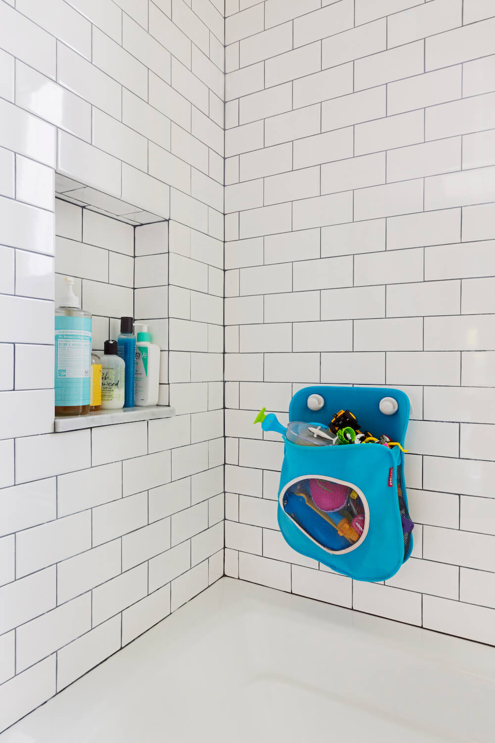
In the kids’ bath, a parallel mix of white and gray shapes work equally simply to create a clean and bright space. White hex floor tile and contrasting gray grout is echoed with industrial white subway wall tile and more contrasting grout. Their Sweeten contractor made room for a new tub and double vanity, and added extra towel bar storage.
We’re so glad to have played a small role in helping this Brooklyn family create a home that works so beautifully, and we’ll for sure be following along as their business grows!
Ready to renovate? Start the journey here for free!
Here you can learn more about our services and locations. Alternatively, browse more home renovation inspirations, processes, and cost guides.
