Home / Blog / Before & After / Entire Homes
A Mid-Century Modern Renovation Refreshes a Brooklyn Co-op
In a Clinton Hill co-op in Brooklyn, this before-and-after shows how a mid-century modern renovation improved flow with a walnut slat partition and a white-and-walnut kitchen with quartz countertops and geometric tile. The bathroom became a walk-in shower with a sliding glass door, and the bedroom added ceiling-height closet doors with automatic lights.
- Homeowners: Couple Tom and Alex posted their apartment remodel on Sweeten
- Where: Clinton Hill, Brooklyn, New York
- Primary renovation: Mid-century decor guided a layout update for better flow and storage, with refreshed surfaces, updated lighting, and electrical. The renovation led to a rebuilt kitchen, a new walk-in shower bathroom, and a bedroom refresh.
- Homeowner’s quote: “His (general contractor) team was brilliant in their execution of Casey and Kumar’s design concept. He was always available when we needed to work something out, and consistently offered the solutions we required. The quality and finish of the work are both top-notch.”
Written in partnership with Sweeten homeowners
West Coast natives find a new home

California natives, Tom and Alex, purchased an 880-square-foot apartment in Brooklyn after renting in Manhattan and Los Angeles. They were drawn to the unique history of the Clinton Hill Co-ops built in 1941 by the U.S. Navy as housing for workers at the then-bustling Navy Yard. They bought a unit on the second floor that hadn’t been renovated since the mid-’80s.
It had the original parquet floors, faux-granite Formica countertops, and a badly-configured floor plan that wasted valuable space. While the non-functional kitchen/dining space was the reason for the project, by the end, every wall, ceiling, and flooring had been either gutted or resurfaced.
Tom, a Brooklyn real estate agent, knew that a more functional, ergonomic space with better flow and storage could be achieved. For their own apartment remodel, the project enlisted Sweeten homeowners and also designers Casey and Kumar of Studio Miller Atre for a conceptual design that matched their lifestyle and design taste. Their Sweeten contractor, along with their architect, David, completed the professional team.
Casey and Kumar established a mix of materials that would include the mid-century decor they loved. Throughout the home, original art from family members, Braniff International Airways collectibles from the ’60s, and textiles from designer Alexander Girard personalized the space.
Living room and kitchen—separate but unified
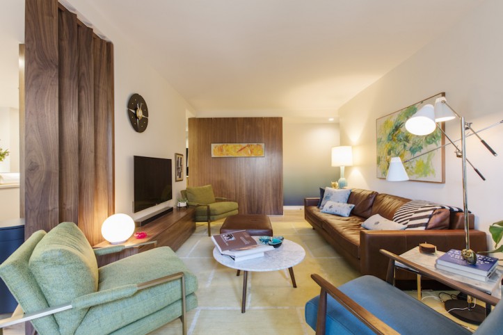
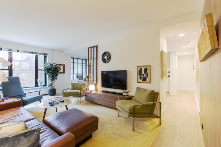
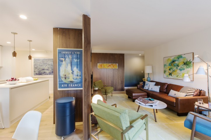
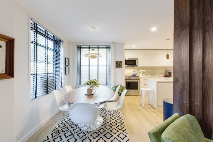
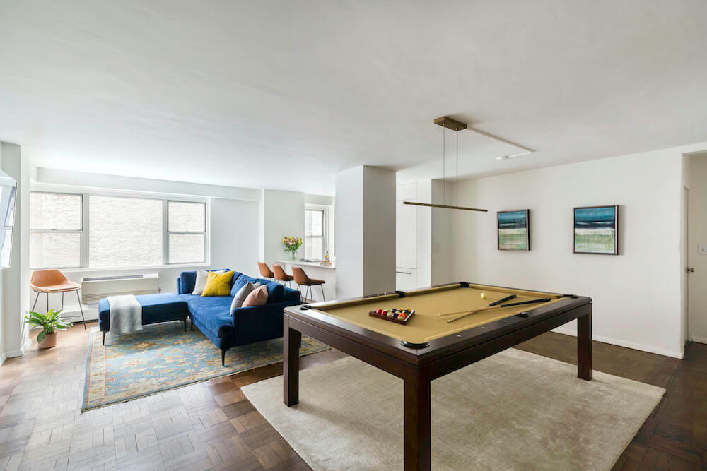
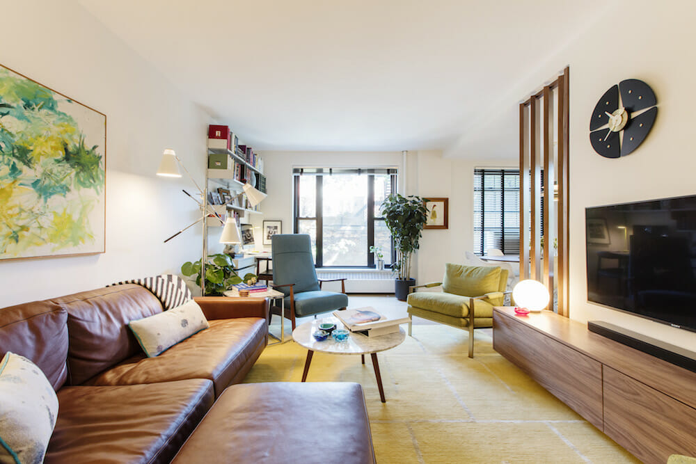
Since the dining/kitchen area opened directly into the living room, a partition was created to allow for visual flow while defining the two spaces. Vertical, floor-to-ceiling walnut slats complemented the surrounding mid-century decor.
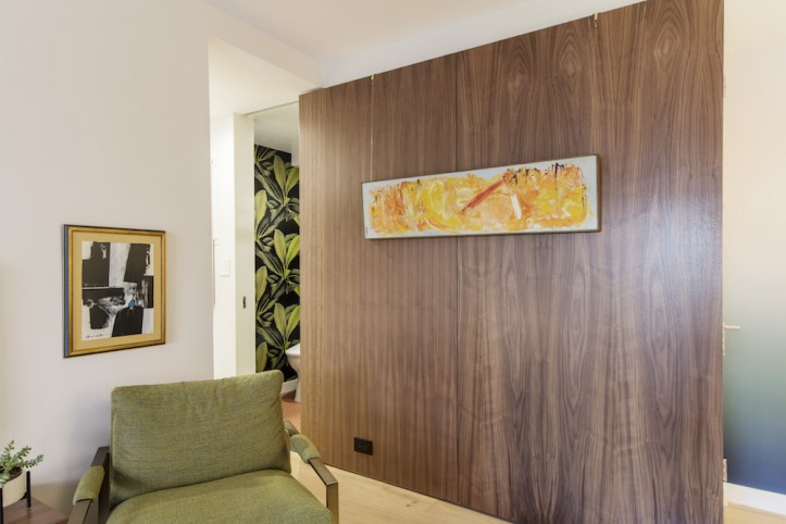
The wood slats would tie the walnut seen in both rooms—the kitchen cabinets and floating walnut decorative wall panel in the living room.
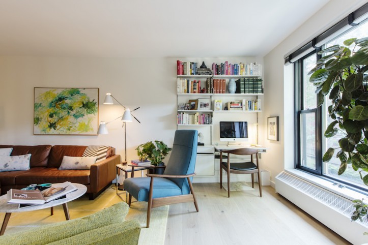
A favorite purchase was a modular Vitsoe 606 unit that became their workspace in the living room. “It was designed by German industrial designer Dieter Rahms, and first produced by Vitsoe in Denmark in 1961,” said Alex. “We were looking for a simple, highly flexible desk/wall unit that also looked really good.”
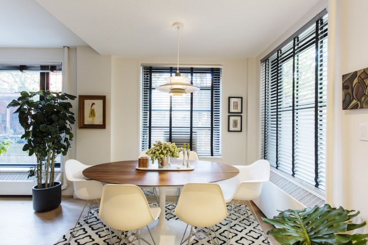
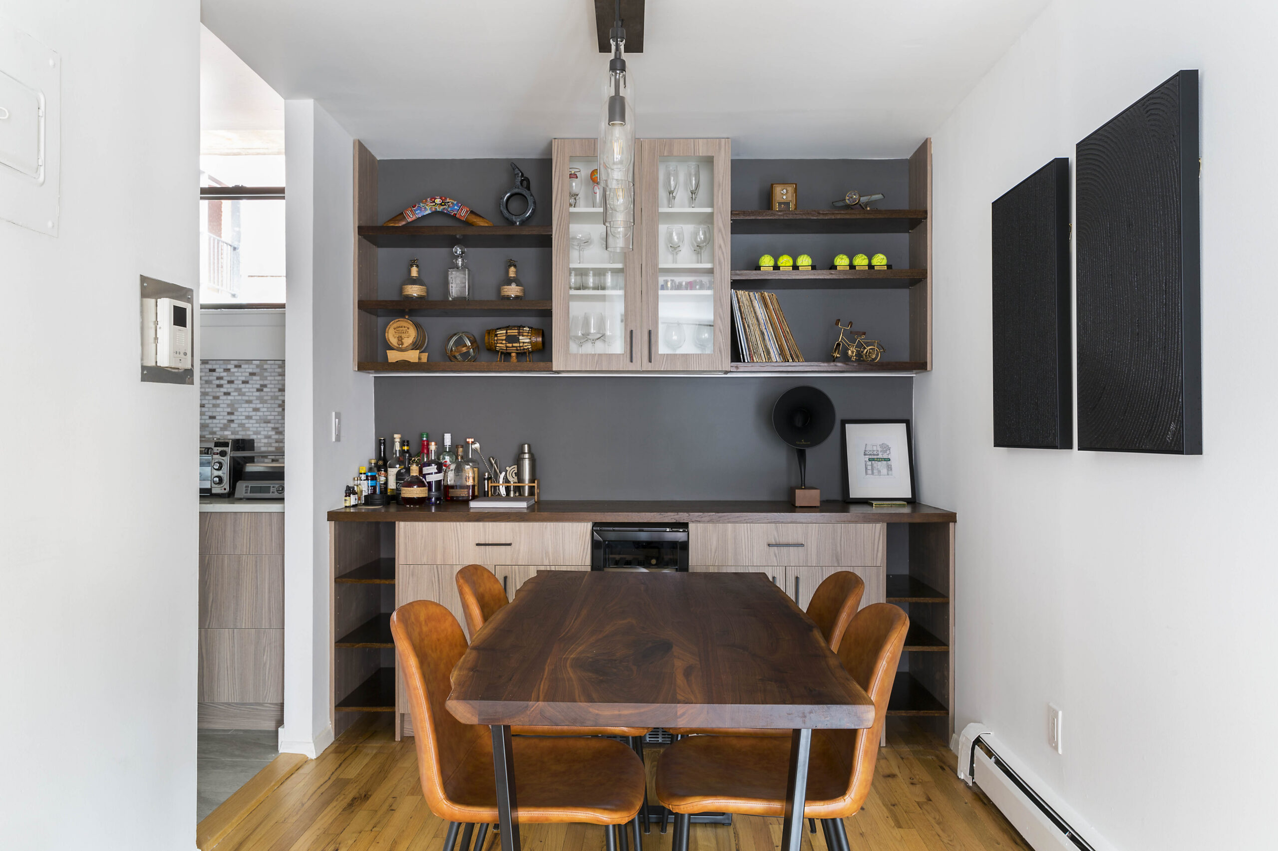
In the dining area, the designers dropped the ceiling by five inches to install wiring for the dining room pendant and a recessed light dimming system. The outdated electrical system was often overloaded by modern-day appliances.
A new electrical panel supported heavier usage. More electrical outlets were added in convenient locations throughout the apartment.
Bringing the kitchen up-to-speed
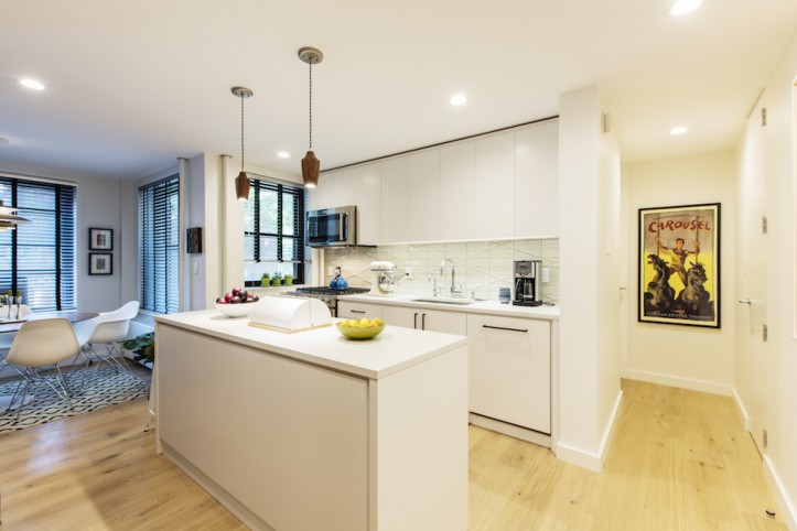
Seen through the walnut slats, the kitchen’s white-and-walnut theme was offset by a geometric tile backsplash and quartz countertops. Matte black hardware provided a simple, linear contrast while wooden pendants added warmth. The dishwasher and sink were moved to more logical locations, while full-height uppers and the wall of cabinets surrounding the refrigerator provide ample storage. Sweeten brings homeowners an exceptional renovation experience by personally matching trusted general contractors to your project, while offering expert guidance and support—at no cost to you. Renovate expertly with Sweeten
In the new island, there are deep pull-out drawers for pots and pans, as well as integrated plastic bins for trash and recycling, making it simple to wipe crumbs and other debris from the kitchen island directly into the trash can. The extra countertop surface allows multiple people to work in the kitchen at the same time.
A multi-textural bathroom
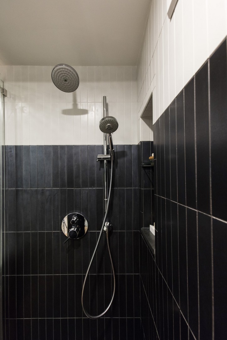
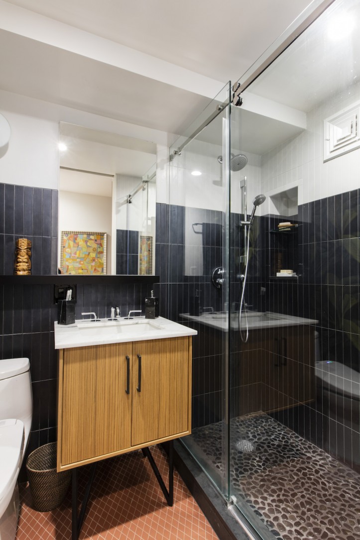
In the bathroom, the bathtub was converted to a walk-in shower with a large, sliding glass door. A pedestal sink replaced a vanity with storage.
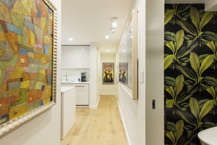
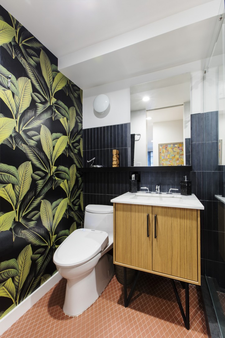
The walnut, white, and black palette anchored by a bold leafy wallpaper along one wall lends a luxurious feel. They also indulged in a washlet toilet, with a heated seat and dryer.
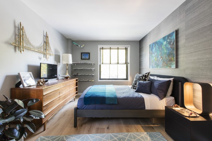
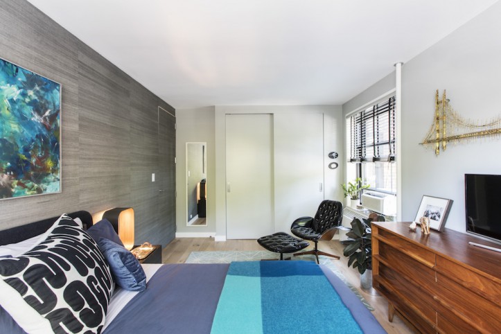
Lastly, the bedroom received a refresh. Closet doors went all the way to the ceiling, powder-coated wire shelving was added, and automatic lights were installed—a “game-changer,” said Tom. Behind the headboard, the couple pulled in a textured grasscloth wallpaper at Casey’s suggestion.
“She brought us countless options for material choices we never would have considered on our own,” said Tom. “Her solid design instincts allowed her to really tune into our personal tastes and preferences.” A Braniff Boeing 707 model, built from a plastic kit, now hangs from the ceiling in the bedroom.
The mid-century modern renovation process
Their Sweeten renovation contractor was the perfect choice for executing their mid-century modern remodel—in personality, budget, and in his attention to detail. “His team was brilliant in their execution of Casey and Kumar’s design concept.
He was always available when we needed to work something out, and consistently offered the solutions we required. The quality and finish of the work are both top-notch,” Alex shared.
Looking back, the homeowners share that the most difficult issue about the renovation was “wrapping our heads around spending bigger sums of money. Neither of us had been through this process before, and there was a certain trepidation even after we had committed to construction.”
They were, however, able to finance the project with equity that they had built since owning the apartment.
And as a real estate agent, Tom knew that the substantial increase in the apartment’s resale value justified the overall cost. “In the end, we reminded ourselves that we are both staunchly home-centric people who place a great deal of value on the comfort and serenity that only a beautiful, functional home can give us,” he said.
“Not only did it feel like 300 square feet was added to the apartment but realized after this project was complete that it was worth every single penny.”
Ready to renovate your home?
Post your project on Sweeten today and get matched with our vetted general contractors for free! Find endless home renovation inspiration, detailed guides, and practical cost breakdowns from our blogs.
Renovation materials
KITCHEN RESOURCES:
- PID Engineered wood flooring: custom.
- Custom cabinets: Interiors Palace.
- Vinci Pulls cabinet hardware: Schaub & Company.
- Fresh Concrete countertops: Caesarstone.
- Geometric tile backsplash: Ann Sacks Tile.
- Sink: Kraus.
- Faucet: Grohe.
- KitchenAid fridge/dishwasher/stove: KitchenAid.
- Lighting: Room & Board.
- Woodcut print: Eve Stockton.
DINING ROOM RESOURCES:
- Lighting, PH5: Louis Poulsen.
- Table: Rove Concepts.
- Dining Chairs: Design Within Reach.
LIVING ROOM RESOURCES:
- Lighting: Design Within Reach, Artemide, Pablo.
- Milo Baughman blue recliner: Design Within Reach.
- Green and bronze frame lounge chairs, Milo Baughman for Thayer Coggin: ABC Carpet & Home.
- Sofa and ottoman: Room & Board.
- Pillows: Martyn Thompson.
- Alexander Girard blanket: Vitra.
- Storage unit: USM Haller.
- Caseta light dimming system: Lutron.
BATH RESOURCES:
- Floor and wall tiles: Ann Sacks Tile.
- Shower fixtures: Grohe.
- Kohler vanity and sink: Kohler.
- Toto toilet: Toto.
- Lighting: Artemide.
- Aurora Bayou wallpaper: Calico.
BEDROOM RESOURCES:
- Bed: BluDot.
- Black George Mulhauser Plycraft lounge chair with ottoman: vintage.
- Reproduced Braniff Airways blanket: Herman Miller.
- Pillow with vintage Alexander Gerard fabric: vintage.
- Lighting: Pablo.
Frequently asked questions
Clean lines, warm wood tones, and functional design are considered mid-century modern. In a mid-century modern home, you will often see simple silhouettes, minimal ornament, and an emphasis on practical, well-planned spaces.
Yes, mid-century modern furniture is considered vintage when it comes from the original mid-20th-century period. Newer pieces can be mid-century modern in style, but they are not vintage unless they are from that era.
The characteristics of a mid-century modern renovation are clean lines and warm wood tones. Many projects also use minimal ornament, built-in storage, and a mix of glass and simple metal accents for a tidy, open feel.
