An East Hampton Beach House Opens and Brightens
An open plan home in the Hamptons, with child-friendly stairs and new baths
- Homeowners: Alex and Jennifer Figueroa, the parents of two young boys, posted their East Hampton renovation project on Sweeten
- Where: Long Island, New York
- Primary renovation: A gut renovation of a 2,500-square-foot, 1979 house to create a family-friendly home (and rental)
- Sweeten general contractor
- Homeowner’s quote: “Our Sweeten contractor was a reliable asset. He found a solution to every snag and never said no to a request.”
- Sweeten’s role: Sweeten matches home renovation projects with vetted general contractors, offering advice, support, and secure payments—for free.
Guest blog post by homeowner Alex. “After” photos by Lena Yaremenko for Sweeten.
A complete redo begins with an East Hampton renovation
We purchased a cedar-shingled house in East Hampton and started renovating immediately. With two young kids, we were anxious to get this dream beach house going. Jennifer, a speech-language pathologist, and I, a banker, also knew it would make an excellent Airbnb.

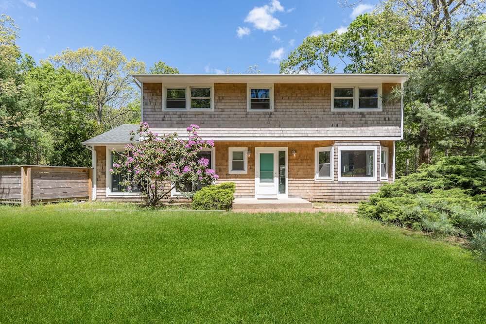
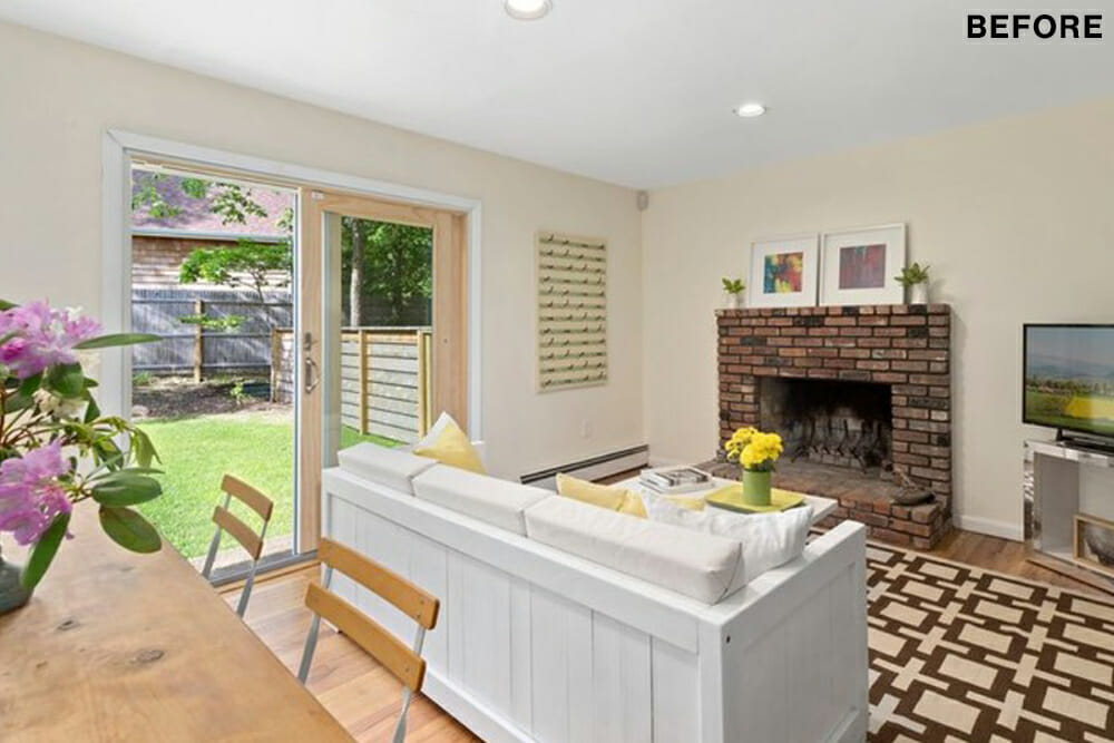
The house, which was built in 1979, had five bedrooms and two-and-a-half bathrooms. It needed a refresh. We wanted to give it an open, modern beach house feel. The first floor would reconfigure to an open-plan concept. This meant not only knocking down a wall but removing essential load-bearing beams.
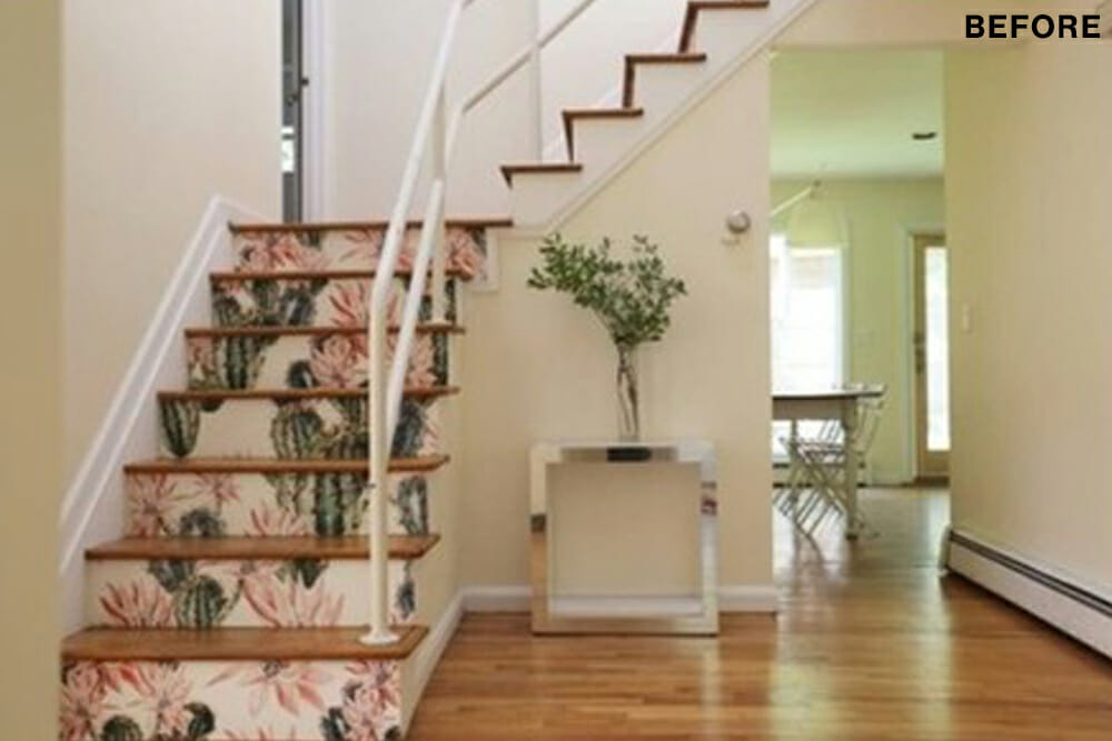
The staircase needed work; it looked dated and was not up to code. It had a railing but was essentially open. So, a kid could literally duck under it and fall through. We also knew that we’d have to gut remodel the kitchen and bathrooms, which had never been renovated.
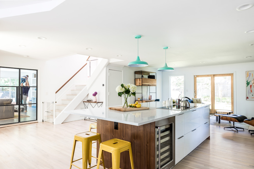
Removing interior walls for an open-concept plan
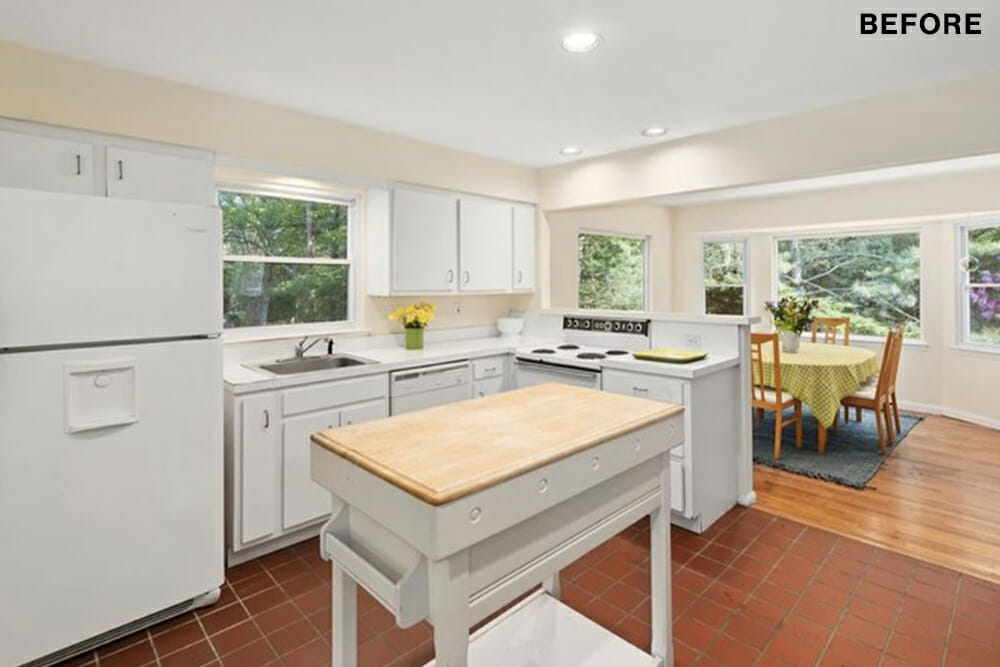
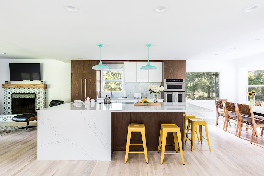
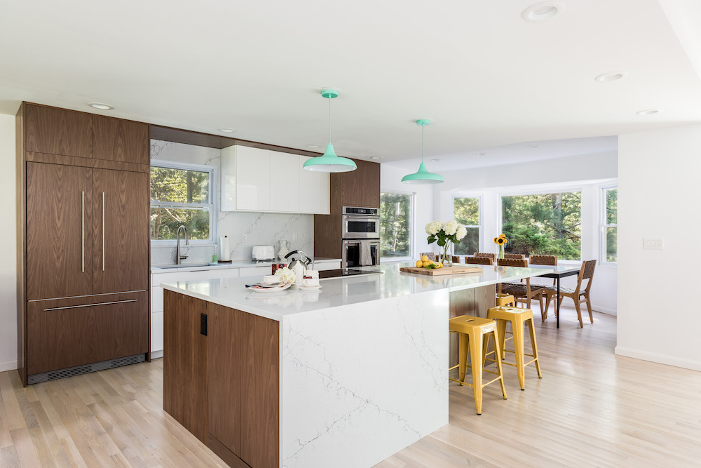
We started on the first floor. Our Sweeten contractor had warned us that revising the floor plan would be the biggest part of the project. And it was. The kitchen, which was nestled in the house’s center, had a wall that contained a support beam. That essential wall, which separated it from the foyer, was the one we wanted to do away with. It took removing multiple load-bearing beams but that wall came down. From our contractor’s suggestion, we lowered the ceiling a few inches to conceal the perimeter beams. As a result, the ceiling was entirely flush and seamless throughout.
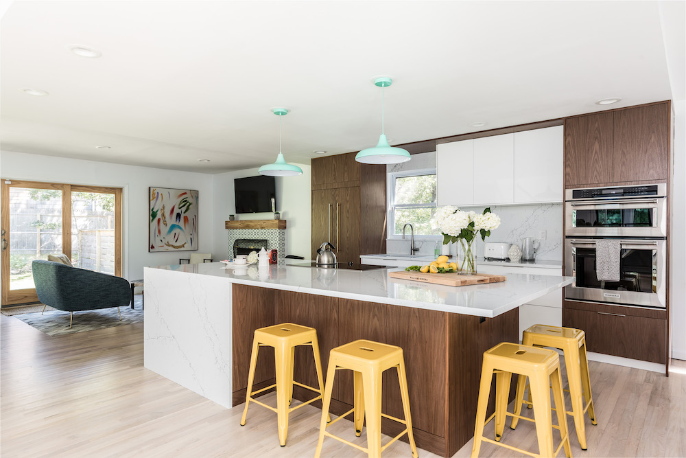
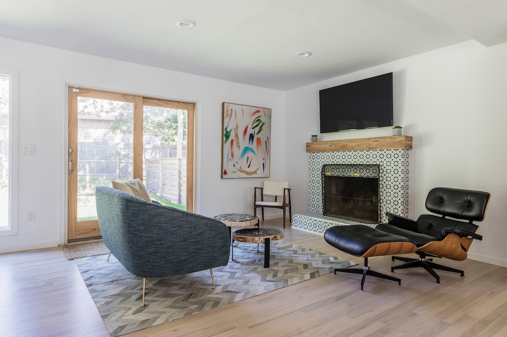
We felt so pleased with the openness that we reinforced the look in other ways. For example, we chose not to replace the dated kitchen floor tile with the large faux-concrete slabs we had purchased. Instead, hardwood flooring was installed on the entire ground floor to unify the entire space. Our contractor urged us to consider this to give the downstairs a cohesive look. We’re glad we listened, as it looks sleek and seamless.
Renovate expertly with Sweeten
Sweeten brings homeowners an exceptional renovation experience by personally matching trusted general contractors to your project, while offering expert guidance and support—at no cost to you.
“Our contractor urged us to consider [continuous hardwood flooring] to give the downstairs a cohesive look. We’re glad we listened, as it looks sleek and seamless.”
A custom look for Ikea kitchen cabinets
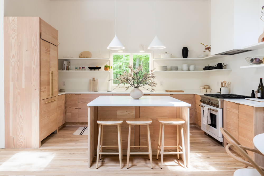
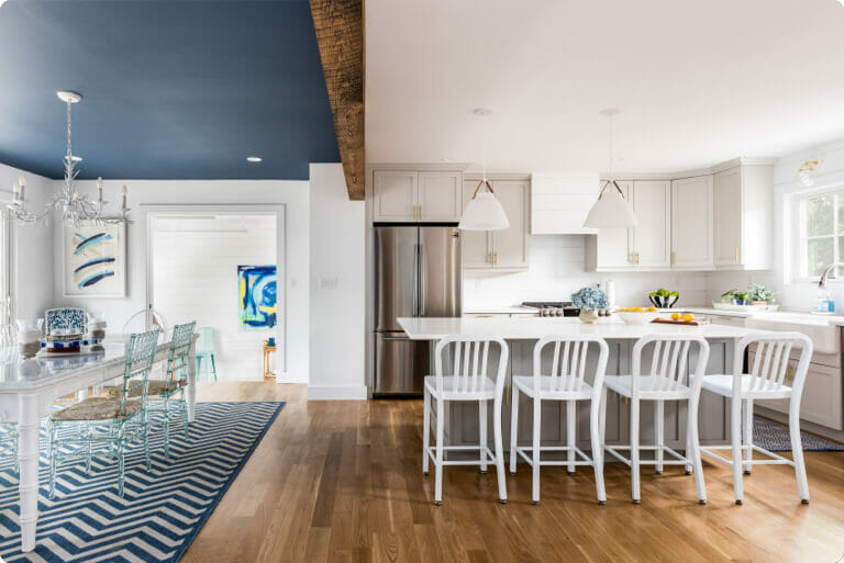
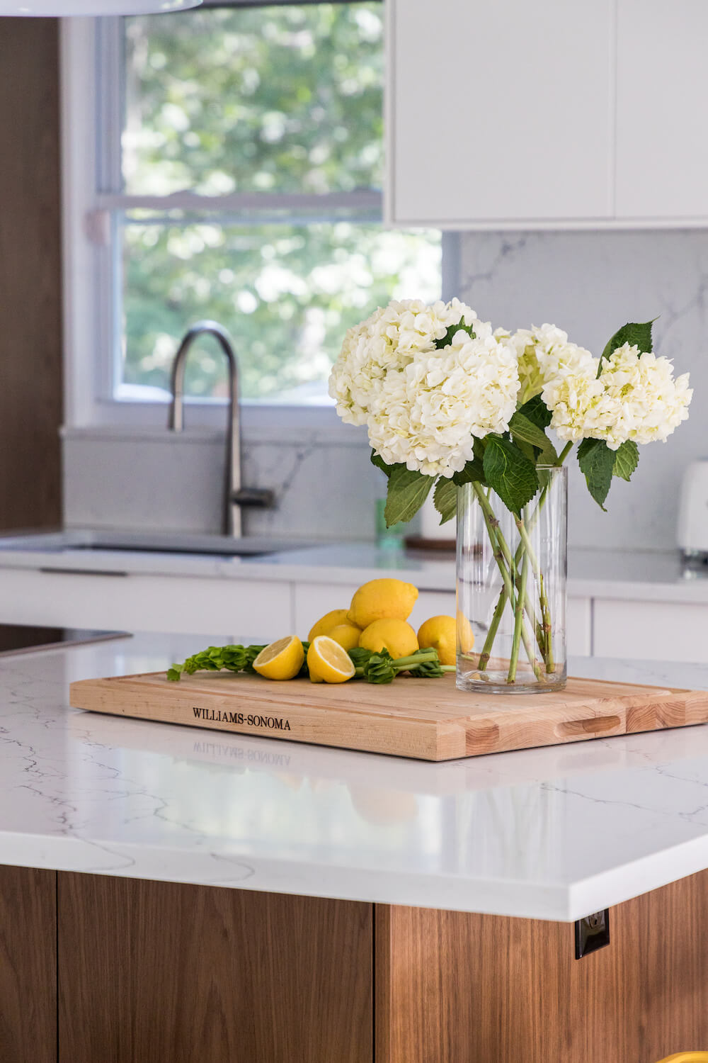
We felt especially excited about the kitchen. Our design included a large island that would be for gathering and favorite activities like cooking and entertaining. In addition, we splurged on a wine fridge, quartz countertops, and an integrated refrigerator.
Our Sweeten contractor customized Ikea cabinets with walnut panel doors. Another panel ran along the ceiling for a more high-end look. The big island was outfitted with counter seating and a five-zone induction cooktop. The install day for that island was really an exciting milestone. Finally, our open plan now had a center!
The successful reconfiguration of the downstairs led us to the next big task: the staircase remodel. We had a good idea of how we wanted to approach it. Safety was the primary concern, but given that the stairs are a focal point as you enter the home, looks also mattered. Therefore, we decided on wood-trimmed glass panels placed vertically to create a transparent enclosure. Stair safety was achieved while staying true to the goal of light and openness.
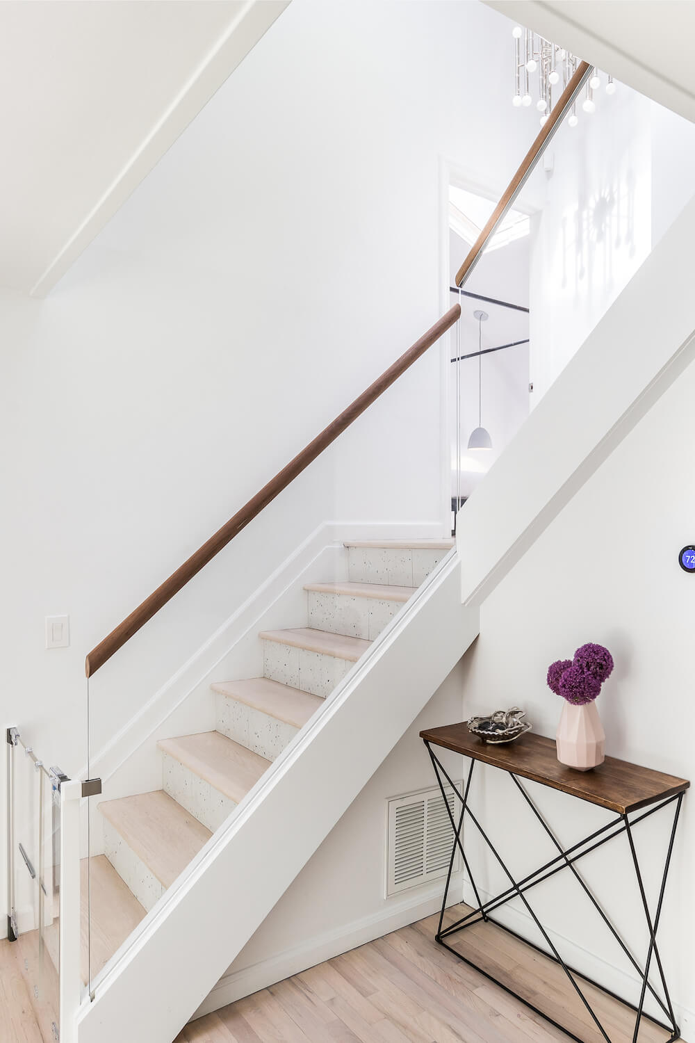
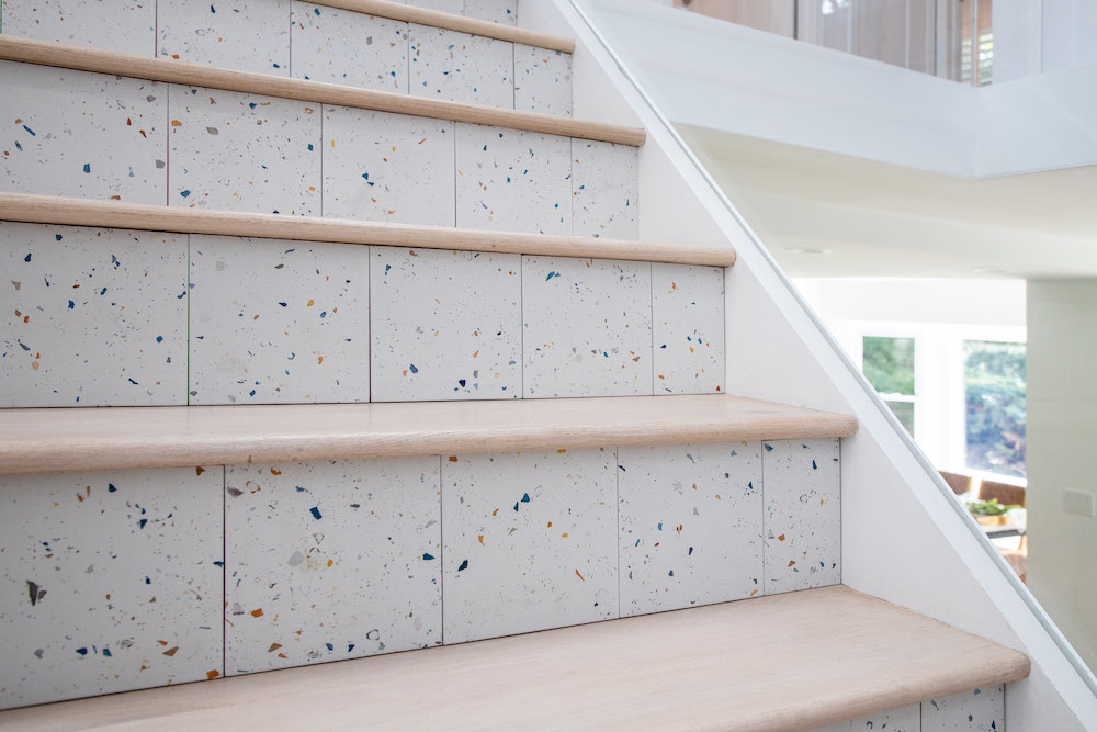
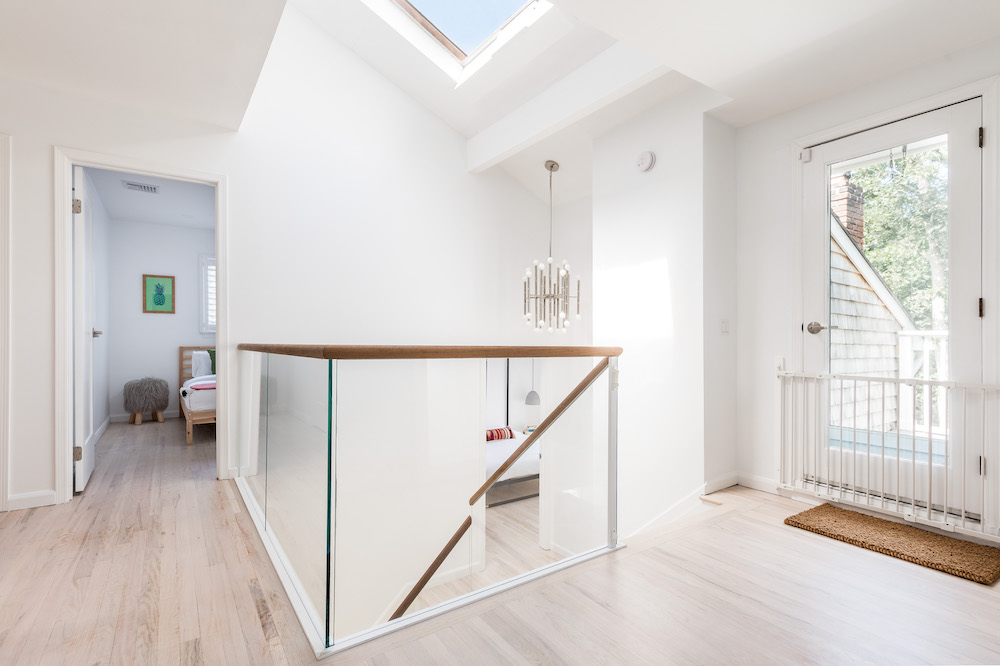
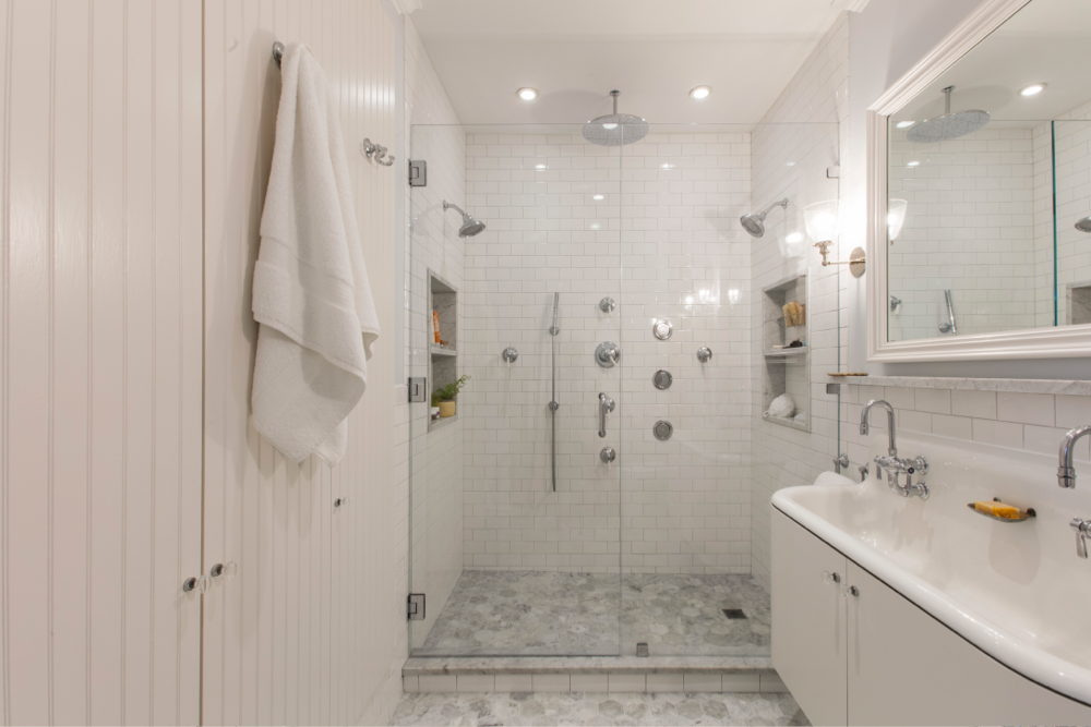
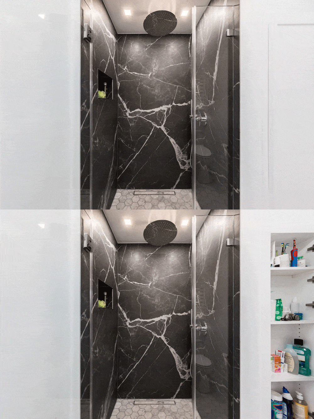
With the stairs under control, we moved on to the bathrooms. All three had a different look: minimal white in the master bath, ocean-blue cabinetry and hex tile in the guest bath, and a white console sink in the first-floor powder room. Black marble was used for contrast. We’re thrilled with the large-format porcelain slabs in the master bath shower. The expansive, smooth surfaces with minimal grout lines give the room a clean look and easy cleaning. We love the result.
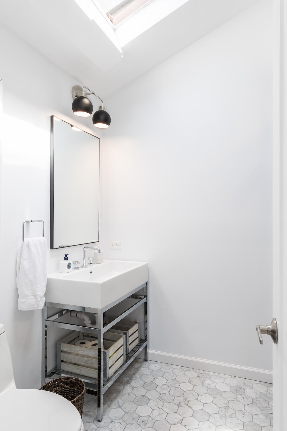
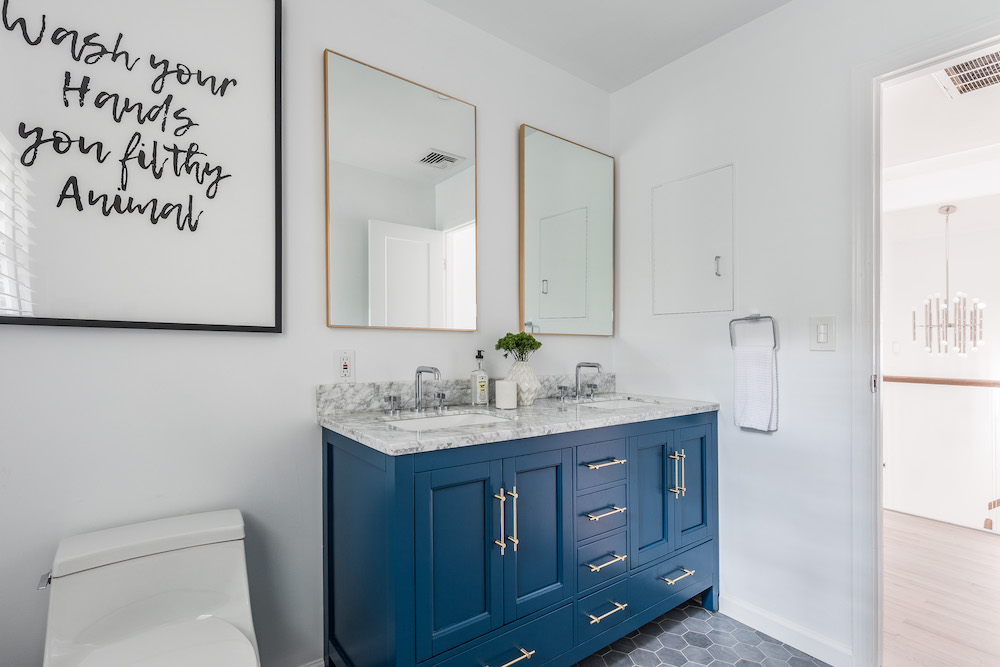
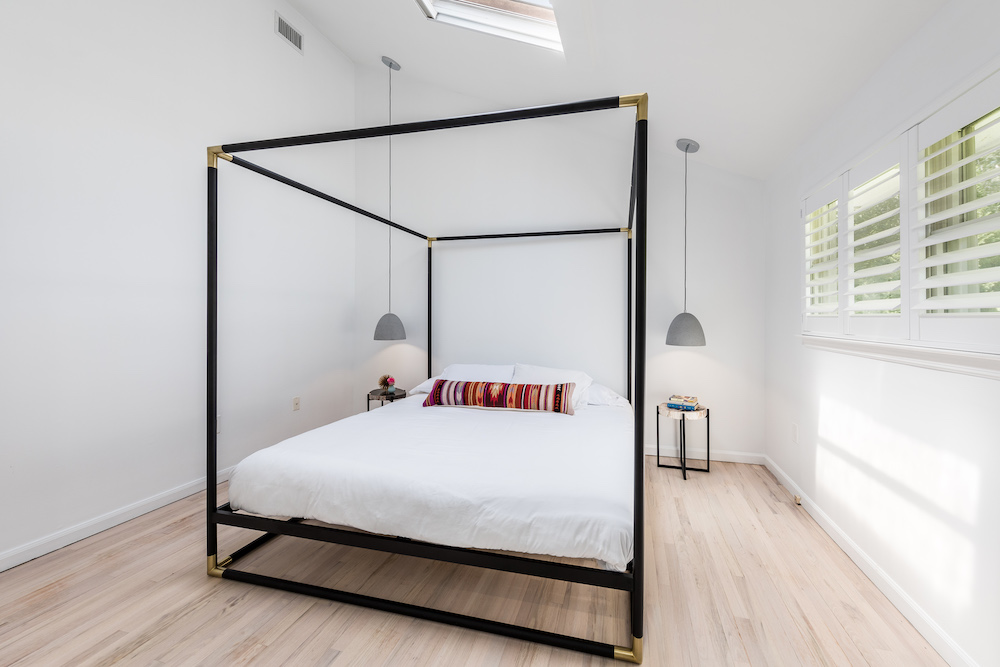
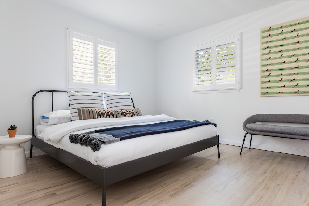
A good partner with an East Hampton general contractor
Fortunately, throughout the renovation process, our Sweeten contractor was a reliable asset and didn’t need Sweeten for help. He found a solution to every snag and never said no to a request. He was always available to answer questions and we felt at every step that his goal was to make us happy.
For us, the biggest challenge was distance. East Hampton is a two-hour drive from our home in Long Island City, so we had to manage our project from afar. On many weekends, we made same-day round-trips to check in on the work. The payoff came when the finishes went in and months of planning materialized. The space came out exactly as we hoped it would and we are happy with the decisions we made.
Thank you, Alex and Jennifer, for sharing your East Hampton renovation with us!
Renovation Materials:
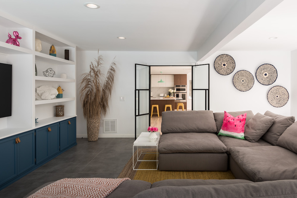
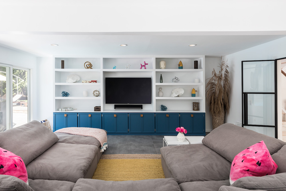
LIVING SPACE RESOURCES: Wall paint in Bakery Box, #BL-W9: Behr. Fireplace mantle tile in Realta II: Cement Tile Shop. Custom glass doors: Crystalia Glass. Living room built-in cabinetry: custom millwork by Sweeten contractor.
ENTRANCE/HALLWAY RESOURCES: Rhye wallpaper in hand foil: Custhom. Montara 28 .5” mirror: Serena & Lily. Console: West Elm. Closet Dove shelves in brushed chrome finish: California Closets.
STAIRCASE RESOURCES: STUDIOC WOW drop tiles on risers: Crossville Studios.
KITCHEN RESOURCES: Cabinets customized by contractor: IKEA. Walnut panels: Semihandmade. Pental quartz countertops and backsplash: Avenza. Fisher & Paykel refrigerator/ freezer: Appliances Connection. KitchenAid wine refrigerator, KitchenAid dishwasher, KitchenAid microwave/oven: Appliances Connection. Samsung induction 5 burner cooktop: Appliances Connection. Meurice Chandelier: Jonathan Adler. Carlisle Metal counter stools: Threshold.
MASTER BATHROOM RESOURCES: 4” Hexagon Fosso marble floor tile: Nemo Tile. Stone Calacatta black smooth porcelain wall tile: Florim. Kallista hardware: Build.com. GrohFlex Essence dual function thermostatic trim shower fixtures with control module: Grohe. Crystalia glass shower doors: Custom by contractor. Mason Apothecary single sink vanity: Pottery Barn. Infinity rectangular wall mirror: CB2.
GUEST BATHROOM RESOURCES: 4” hexagon Griglio Cielo marble floor tiles: Nemo Tile. Stone black smooth porcelain wall tile: Florim. Kallista hardware: Build.com. GrohFlex Essence dual function thermostatic trim shower fixtures with control module: Grohe. 60” Kendall blue bathroom vanity: Houzz. Infinity rectangular wall mirror: CB2.
SECOND FLOOR LANDING RESOURCES: 30-light chandelier: Lumens.
—
When you’re ready to get started on your kitchen or home remodel, work with Sweeten to renovate with the best contractors.
Sweeten handpicks the best general contractors to match each project’s location, budget, scope, and style. Follow the blog, Sweeten Stories, for renovation ideas and inspiration and when you’re ready to renovate, start your renovation on Sweeten.
