A Diamond in the Rough Radiates
A remodel invigorates a tired layout for a Manhattan family
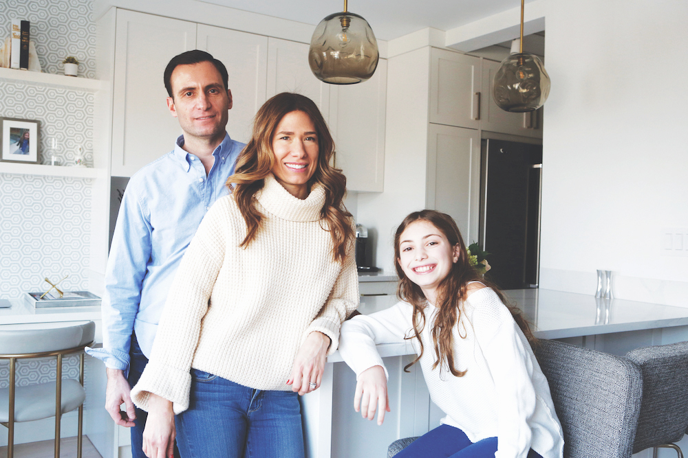
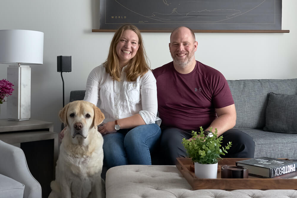
Laura and Randy almost walked away from the Upper East Side co-op that they would live in with their daughter, Morgan, but a second look changed their minds. Everything had felt cramped—the kitchen, the hallways, even the unit’s five closets—but in a fit of inspiration, they discovered that the apartment had potential. They turned to Sweeten, posted their project, and found a general contractor they felt was the right fit for them.
Sweeten matches home renovation projects with vetted general contractors, offering guidance, tools, and support—for free.
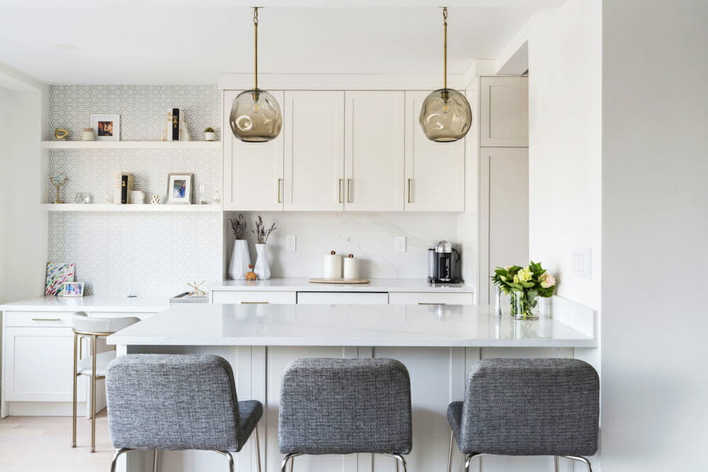
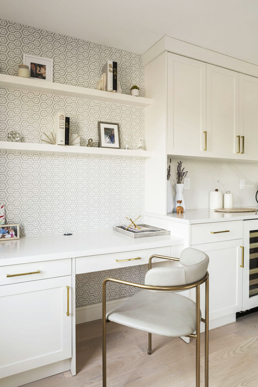
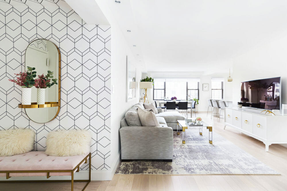
Come see how they opened their kitchen to include a built-in desk niche, created seven closets, and enlarged a foyer with a wallpaper-covered ceiling.
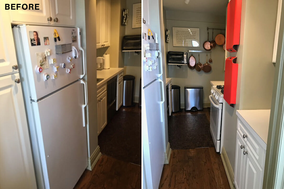
We had been living in a Junior 4 (bedroom, kitchen, living room, convertible dining area) that we rented since our daughter was born. We thought we’d live in the apartment for a few years but ended up staying for 10 years. By that point, we had completely outgrown the space, including the dining room converted into a bedroom for our daughter and a dated and closed-off kitchen. It lacked a second full bathroom and closet space, too. Ultimately, we needed a space that felt like ours.
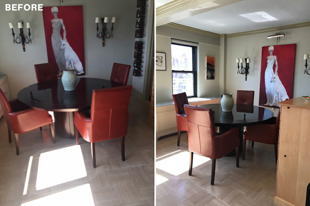
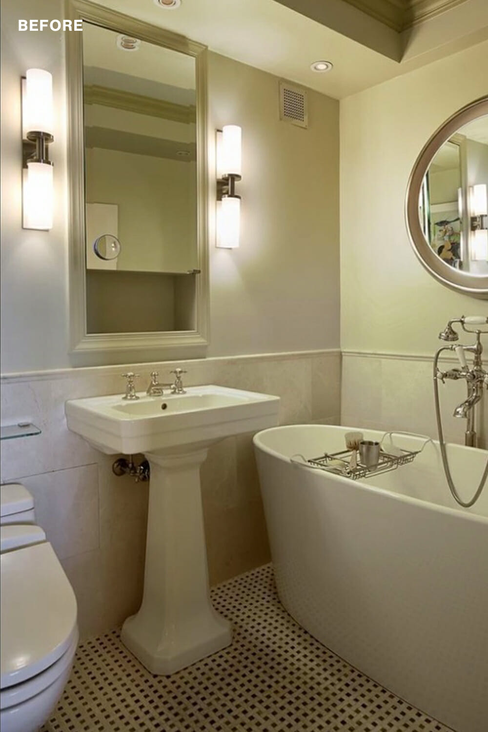
I could understand his point. The previous owner lived in the space by herself and had made the second bedroom a closet. The master bath only had a bathtub, the kitchen was narrow (we wondered if the dishwasher could pull all the way down), and the dining room had large pieces of furniture and built-ins extending from the dining to living room, that made the space feel smaller.
I started to look at other co-op apartments in the building with the same floor plan for inspiration and found one that had just undergone a renovation. Based on its layout, I was able to visualize how we could reconfigure the space to add longer hallways, more closets, and a larger kitchen that utilized more of the space. After showing my husband, and revisiting the space a day later, he agreed and we put in an offer. Another family also put in an offer the same day, but ours ended up getting accepted.
Ahead of our August close, we started to interview contractors to scope out the work based on our budget. We interviewed two contractors from friend and family recommendations and another that my husband found through his online search that led him to Sweeten.
We were matched with a Sweeten contractor who quickly reached out to us. After an on-site meeting with him, we knew this general contractor was the right match for our project. We immediately felt excited about his enthusiasm and ideas and worked together to design a floor plan that made sense to us.
Then we went through the long, dreaded wait for permits and the board approval process. It took us through the month of December to get approved so we could proceed with our renovation. During this time, however, we were able to review countless inspiration photos and decide what and how we wanted the space to look and feel.
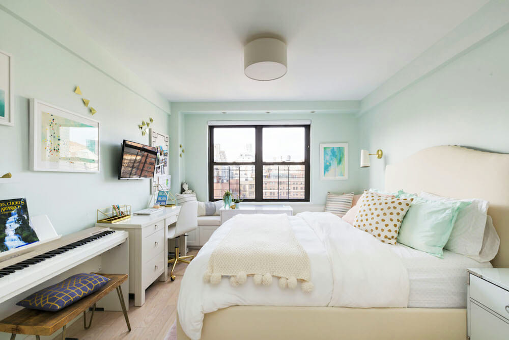
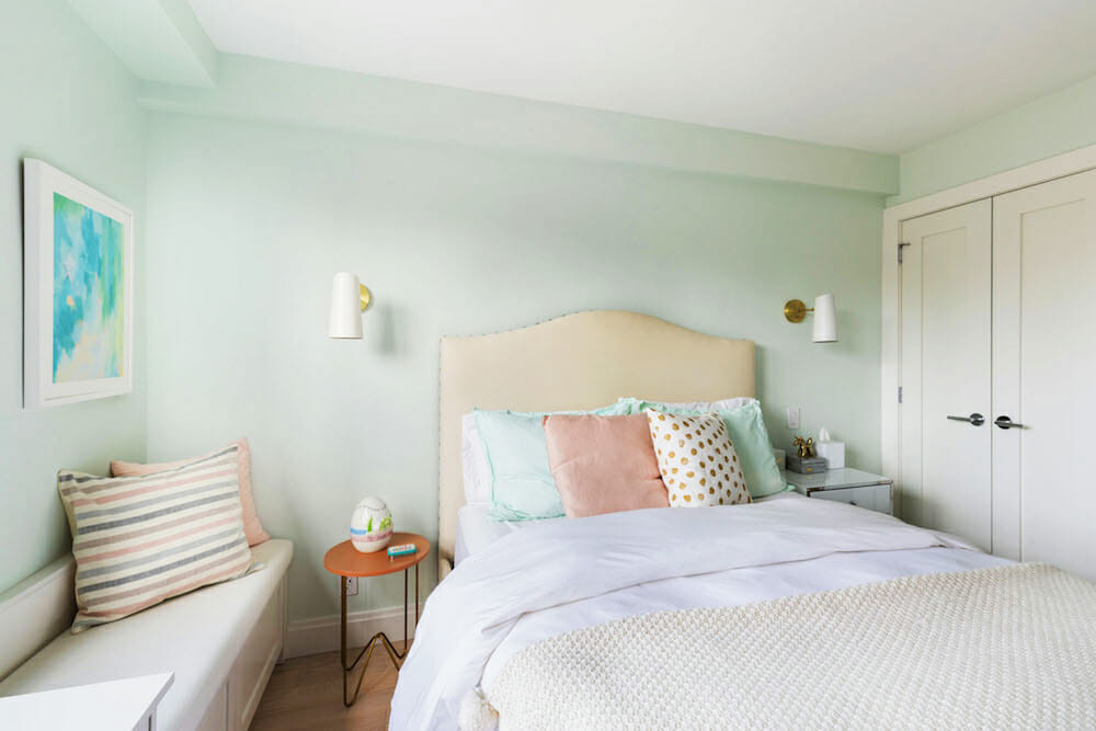
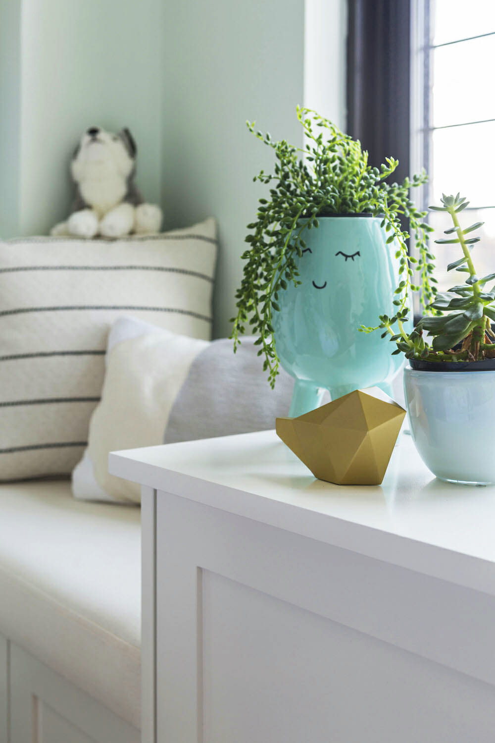
She had her heart set on a window bench where she could sit and read. We were able to add these and create storage opportunities underneath.
Renovate expertly with Sweeten
Sweeten brings homeowners an exceptional renovation experience by personally matching trusted general contractors to your project, while offering expert guidance and support—at no cost to you.
Start your renovation
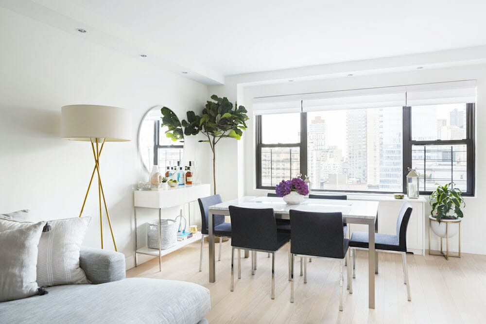
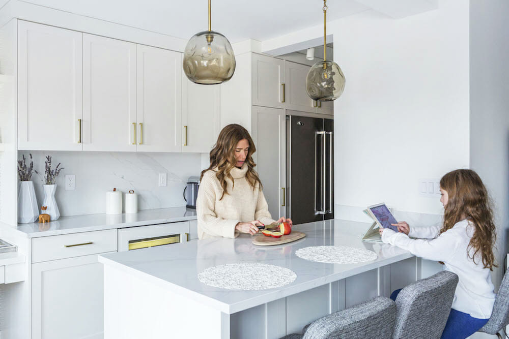
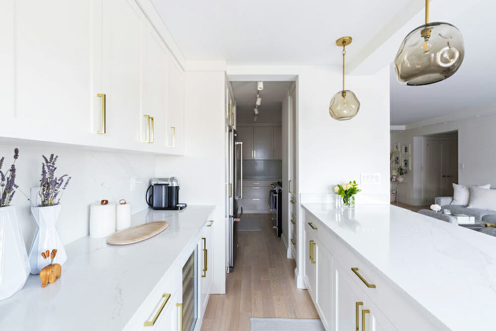
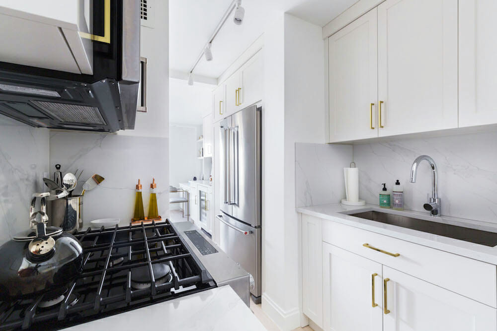
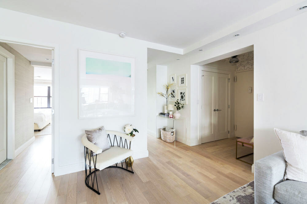
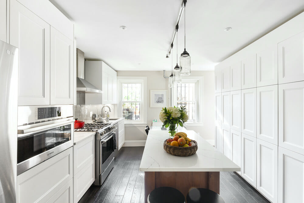
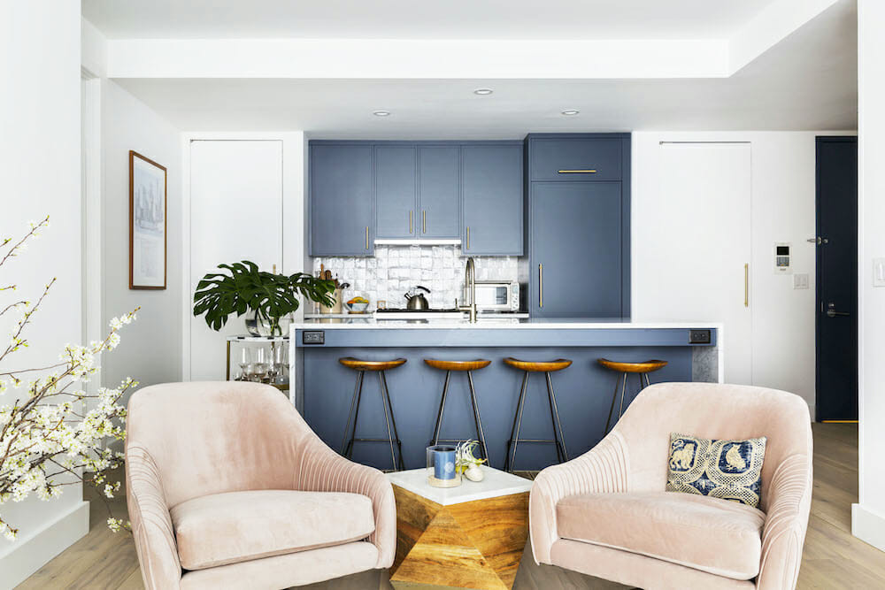
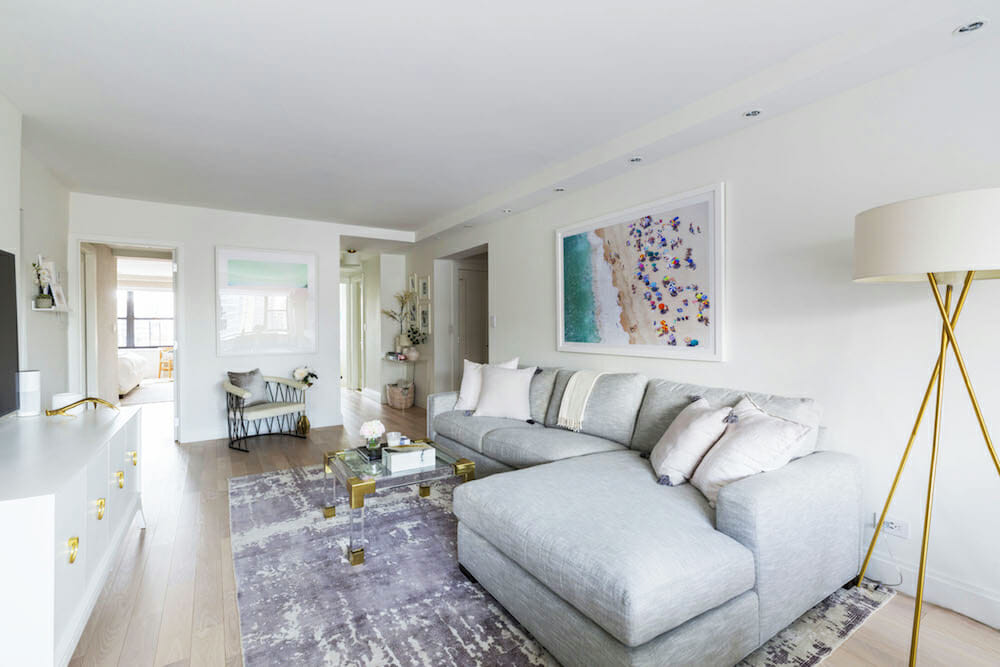
On the day before the demo, we decided to forgo a separate dining room space, extend the kitchen, and add an island and bar stools. We would leverage the living space for both the living and dining rooms and the island would be a focal point tying both rooms together. This would allow an open concept space for meals and entertaining.
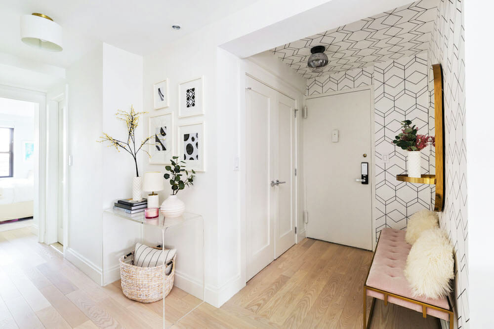
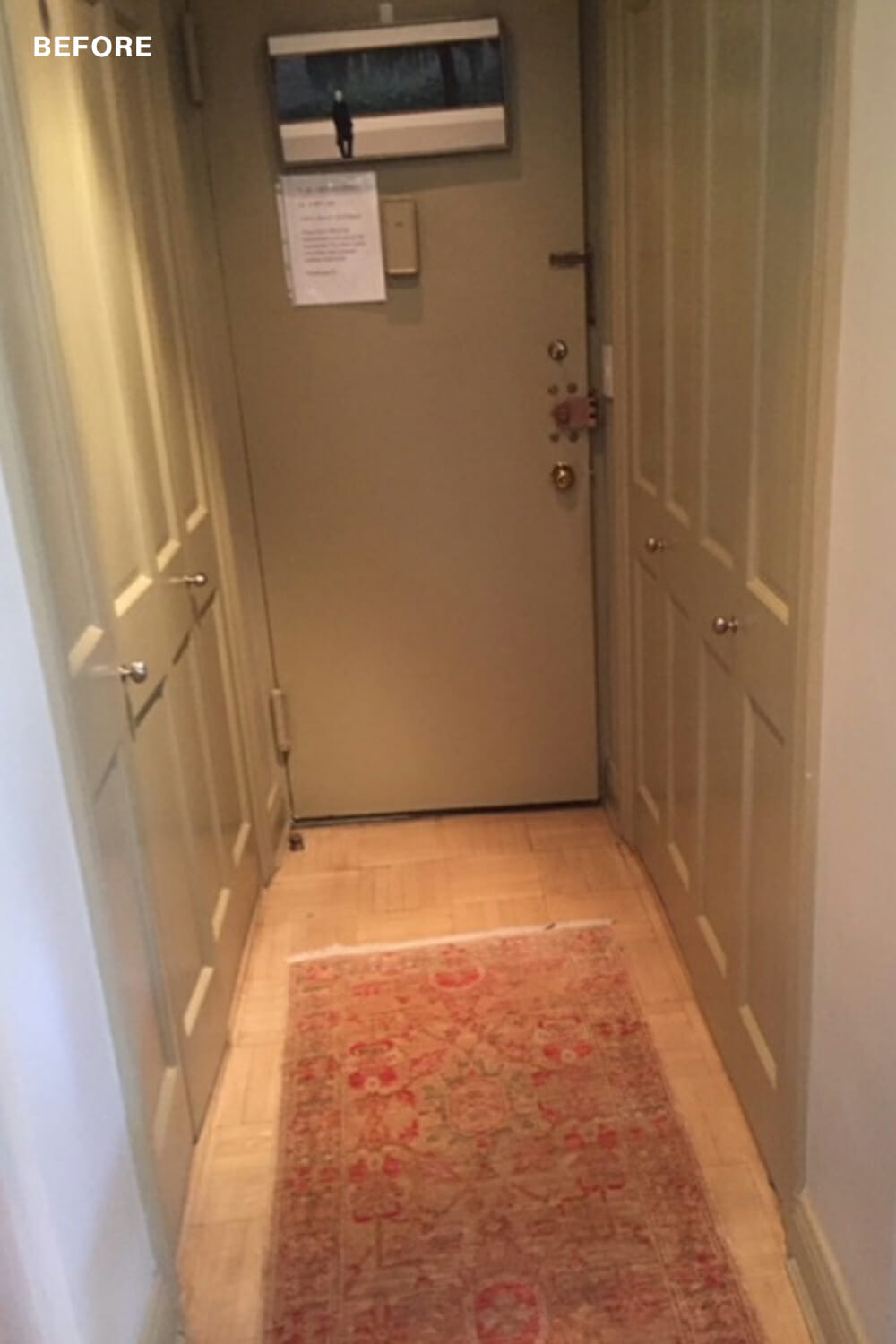
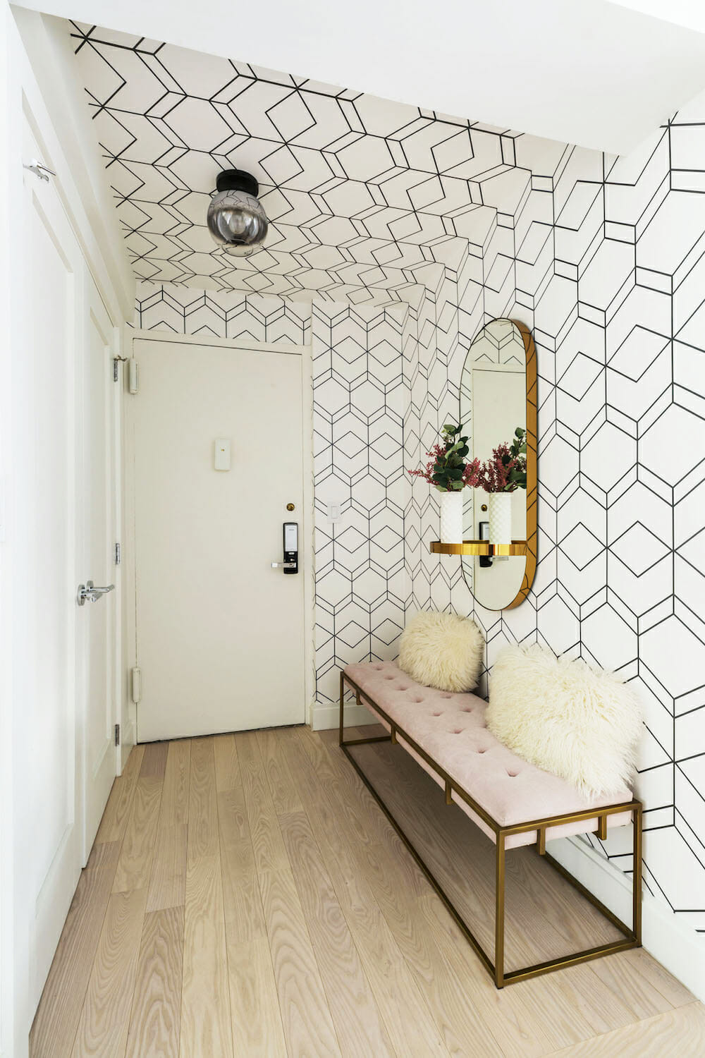
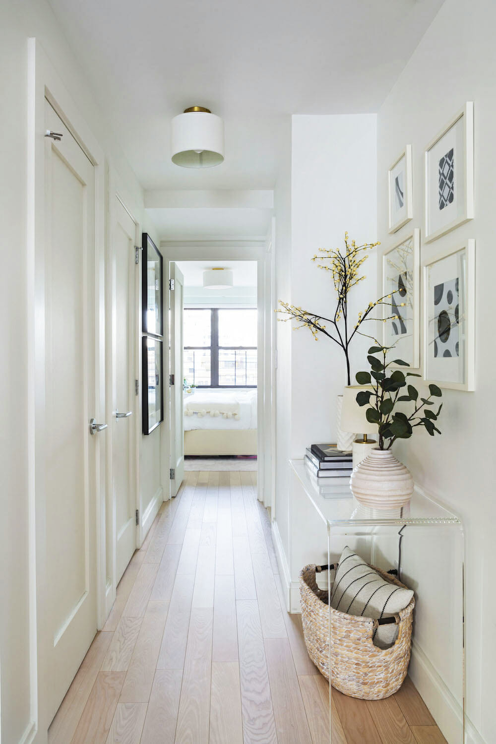
We knew we wanted to extend the entryway as it was incredibly narrow with two closets on either side of the front door. We decided to keep the larger walk-in and remove the smaller one and create a place that was pretty but also functional.
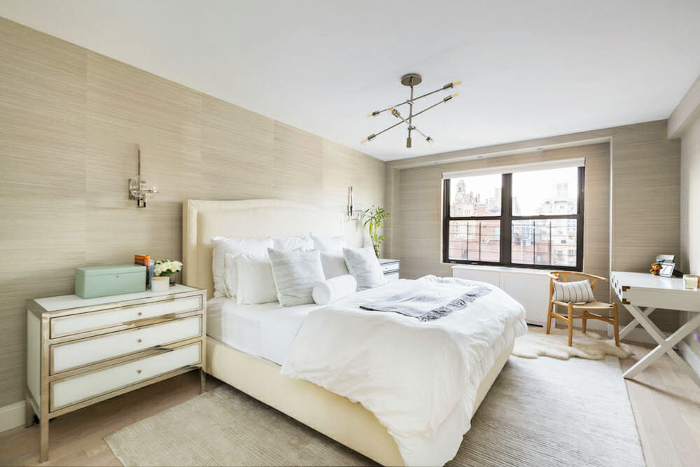
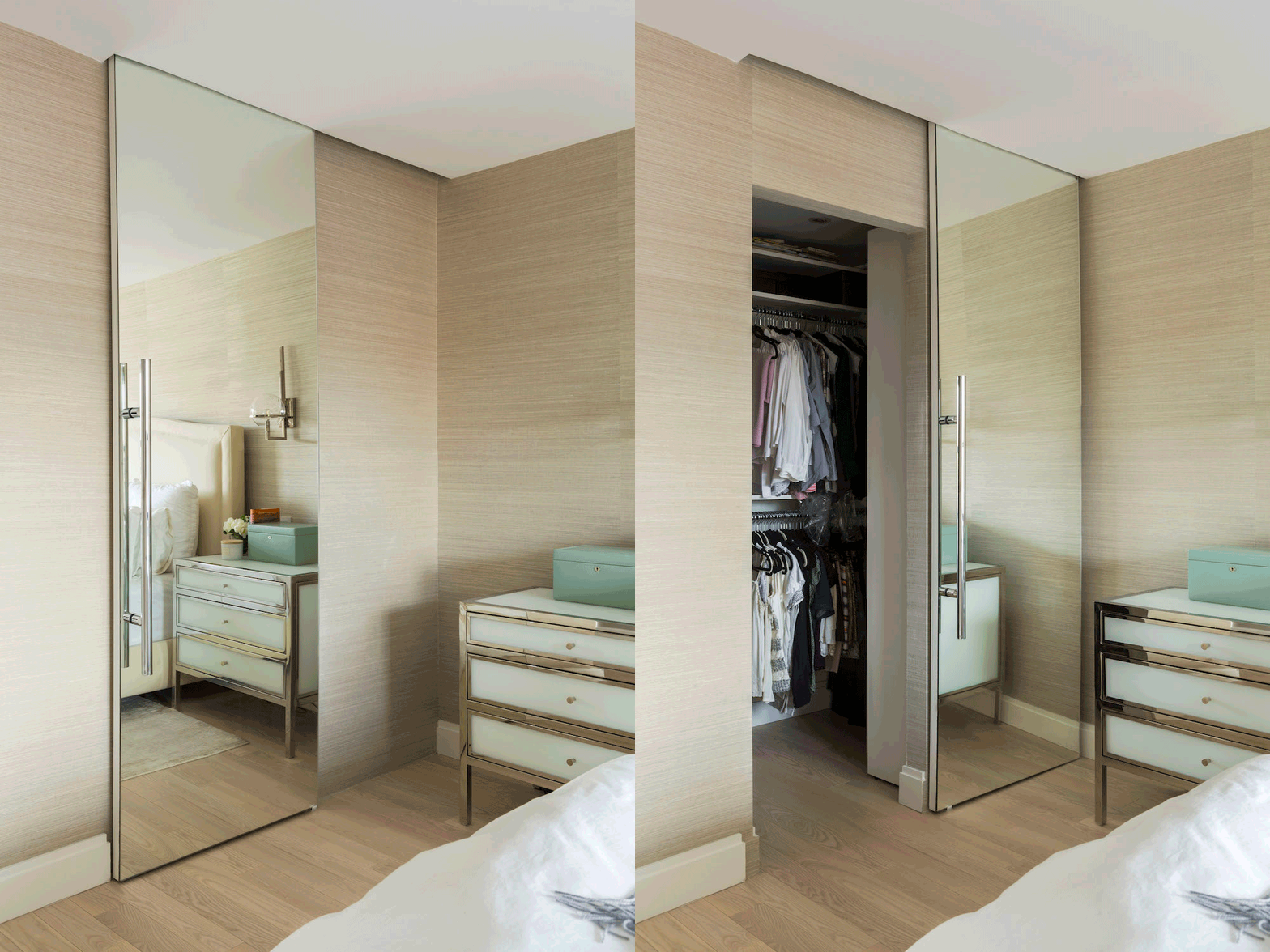
Since we were removing an entry closet that meant we only had four closets; we needed to solve for this. In the master bedroom, we extended our room into the hallway to enlarge the one small closet that was there and then by closing another space (and relocating the master bath door) build a second walk-in closet. A hallway closet that paralleled another closet was extended both of which would hold linens and utility items.
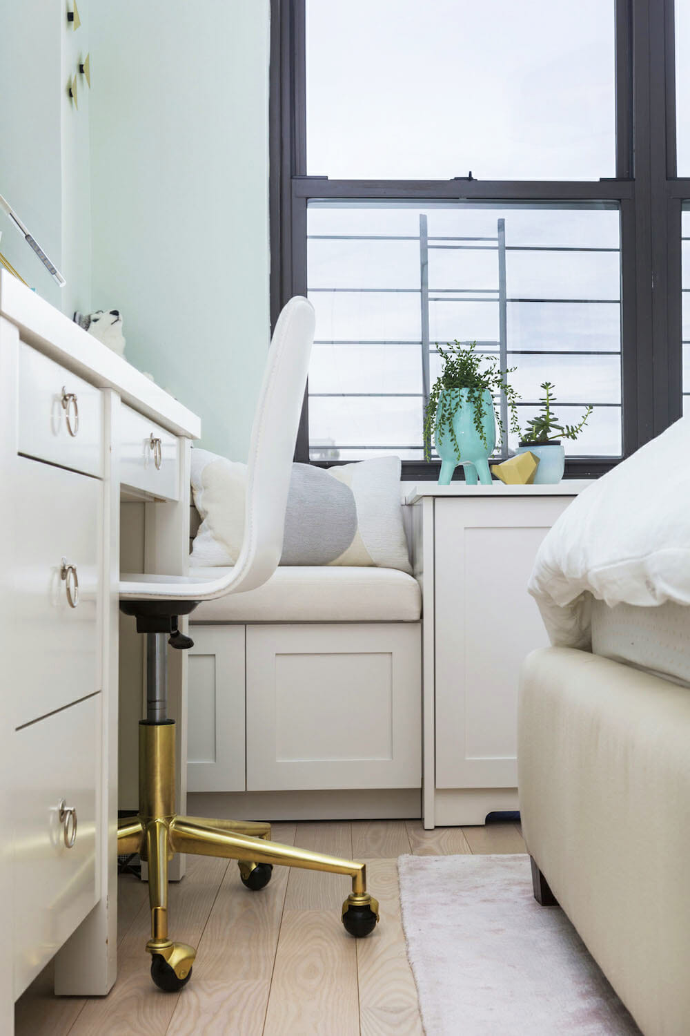
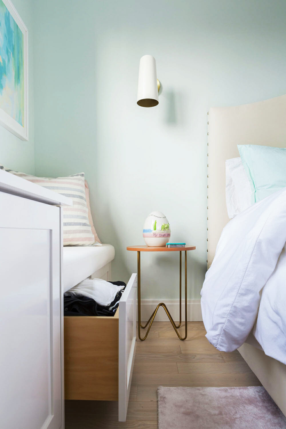
The demo started just after the new year and lasted through mid-April. During the project, we tried to be quick and diligent about making decisions, allowing us to complete the renovation close to on schedule. Working with our Sweeten contractor was great and we were able to add some fun design elements that kept with the style including wallpaper in three places and a mirrored barn door for a master closet door.
Since we’ve moved in, we worked with a decorator on the finishing touches including rugs, lighting, and artwork and have made our new space really feel like home. We’ve now settled in and couldn’t be happier with the outcome!
Thank you, Laura, Morgan, and Randy, for sharing your family home with us!
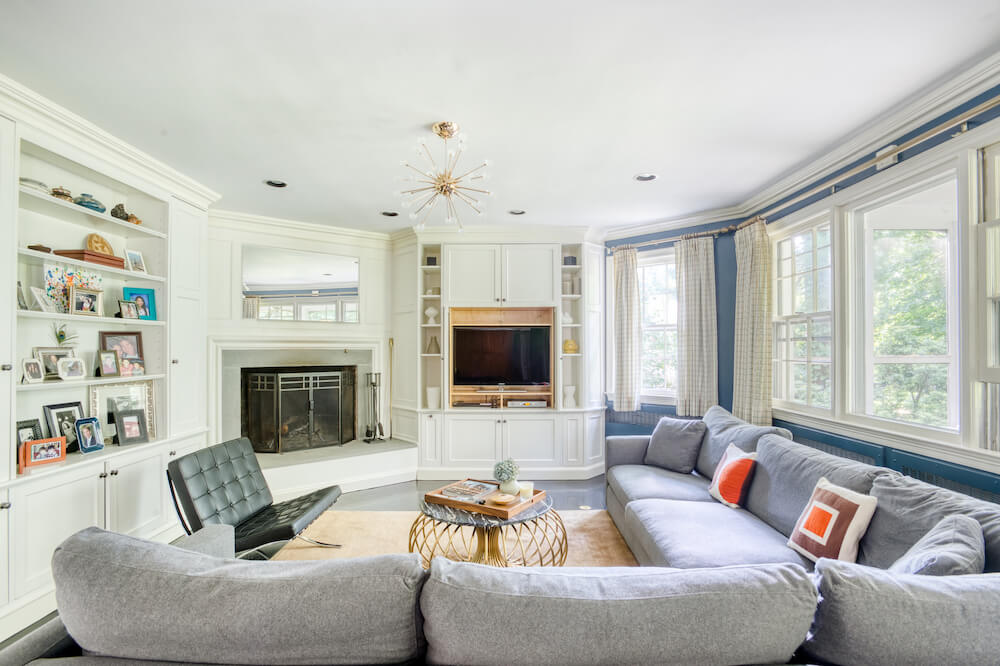
LIVING AREA RESOURCES: Engineered wood floors: PID Floors. Interior decorating: Get Decorated.
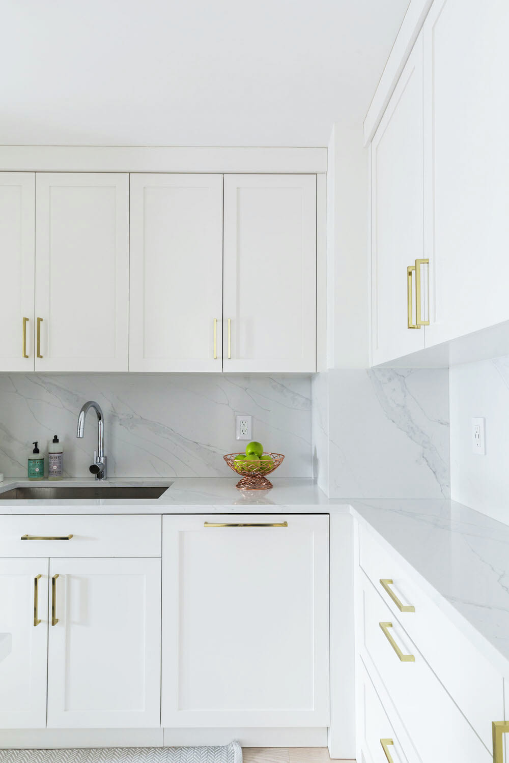
KITCHEN RESOURCES: Shaker-style cabinets: Custom from general contractor. Cabinet hardware: Amazon. Quartz countertops and backsplash: Compac. Sink: Kraus. Faucet: Grohe. Refrigerator, dishwasher, wine cooler, and stove: KitchenAid. Regina Andrew Design pendant lighting: Neiman Marcus. WAC Track lighting by WAC Lighting: Build.com. Paint in White Heron, #OC 57: Benjamin Moore. Bar stools: CB2. Desk niche wallpaper: Seabrook.
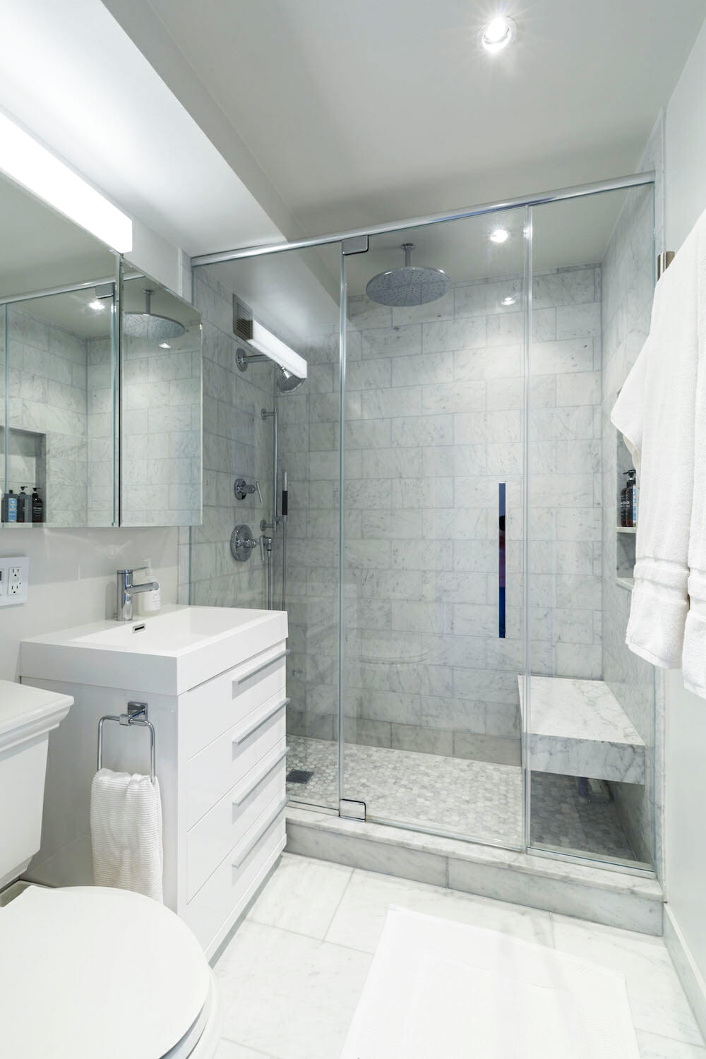
BATHROOM RESOURCES: Carrara marble floor and wall tile: Tiles by Kia, Long Island City, NY. Shower fixtures, toilet, and vanity: Kohler. Sink: Fresca. Medicine cabinet: Jacuzzi. Paint in Paper White, #OC-55: Benjamin Moore.
MASTER BEDROOM RESOURCES: Regina Andrew Design sconce lighting: Neiman Marcus. Chandelier: West Elm. Wallpaper in Bermuda Hemp in Elephant #5260: Phillip Jeffries.
DAUGHTER’S BEDROOM RESOURCES: Sconces: Rejuvenation. Ceiling light fixture: West Elm. Paint in Mint Spritzer, #7005-11: Valspar.
FOYER RESOURCES: Wallpaper by ThinkNoirWallpaper: Etsy. Light fixture: West Elm.
—
A renovation on Central Park West started as an emergency but ended with a happy result.
Sweeten handpicks the best general contractors to match each project’s location, budget, scope, and style. Follow the blog, Sweeten Stories, for renovation ideas and inspiration and when you’re ready to renovate, start your renovation on Sweeten.
