The Joy of an Apartment Combination
Outdated units merge into a family home in Manhattan
Megan and Zack thought a one-bedroom apartment would be sufficient space for them—and maybe a child down the line—when they purchased their home in a 1928 co-op building in Carnegie Hill, Manhattan. A year of living in the space, however, changed their perspective. The good news? Luck was on their side, as a one-bedroom next door became available. They set out to combine the two apartments and posted their project on Sweeten, a free service matching renovators with vetted general contractors. With their contractor by their side, they reimagined a home fit for them and (spoiler alert!) their little one.
When Zack and I came across a one-bedroom in a prewar co-op building in the Carnegie Hill neighborhood of Manhattan, I convinced him we could “Marie Kondo” our lives and one day raise a child in the minimalist 600 square feet. As we went through the process of buying the apartment, sharing our entire financial histories, tax returns, and hopes and dreams for the future with each other (and the bank and co-op board), we began to affectionately call each other tenants-in-common.
The first time we entered our new apartment after closing, Zack proposed in the living room. Months later at City Hall, we discovered that it’s easier to get a marriage license than a mortgage.
A year into living in our new place, it became clear the apartment was in dire need of a renovation, and space would be tight if we ever had a child—even if we committed to the life-changing magic of tidying up. When we discovered the one-bedroom apartment next to ours was available, our “it’s so crazy, it just might work” plan to combine the two units went into action, and we posted our project on Sweeten. Before finding Sweeten, the sketchiness factor of finding a contractor was a bit high for our comfort. In contrast, Sweeten’s process felt legitimate and professional. We were impressed with the three contractors we matched with and chose this general contractor.
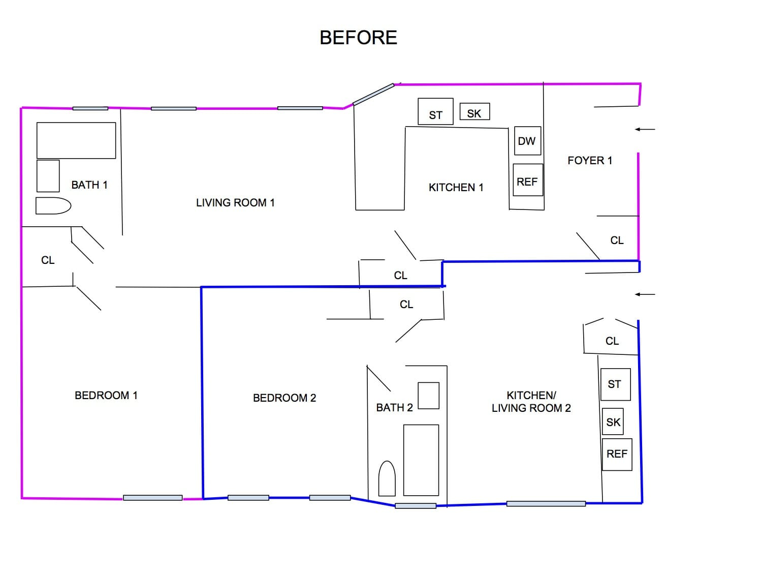
(Above) The pink perimeter outlines the first apartment purchased. Blue is the second apartment.
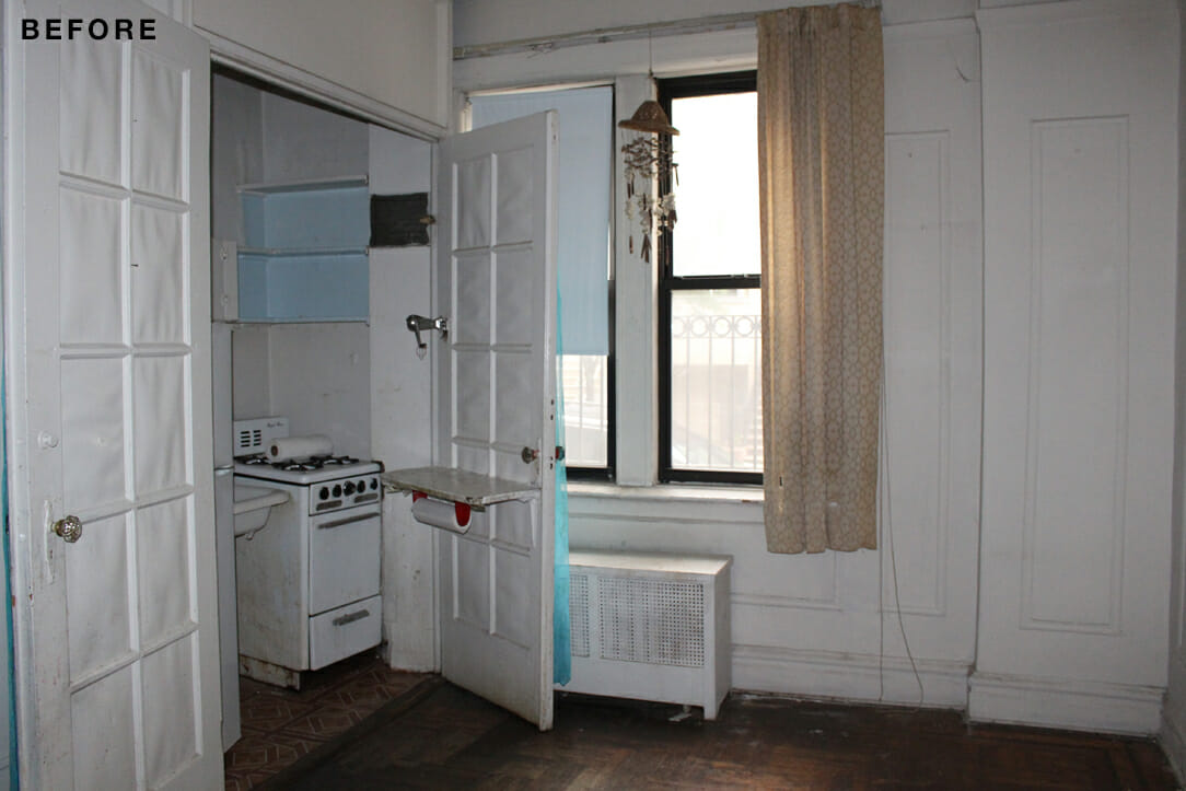
Our original apartment had only one street-facing window, a single light in each room, and was very dark. Plus, it had bold wallpaper and flashy light fixtures that just weren’t our taste. The second one we bought hadn’t been touched in decades. Combining both of them would allow us to rethink the space to suit our needs and lifestyle. The new layout and recessed lighting allowed us to brighten up the space.
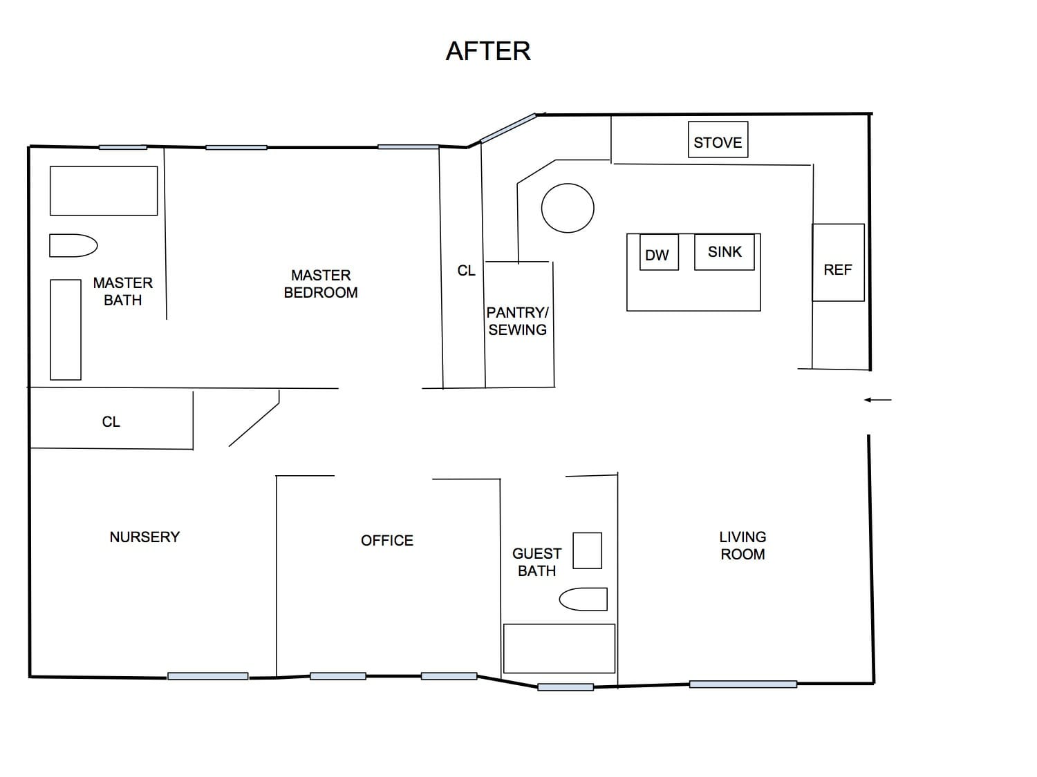
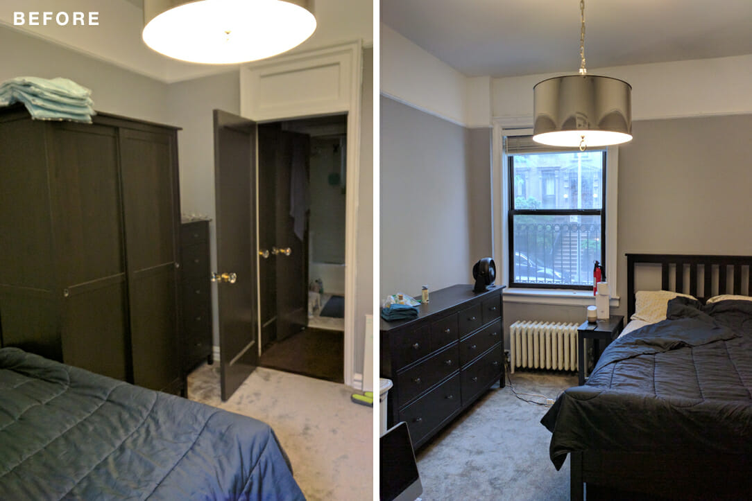
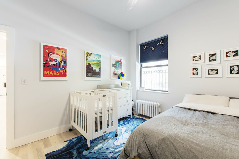
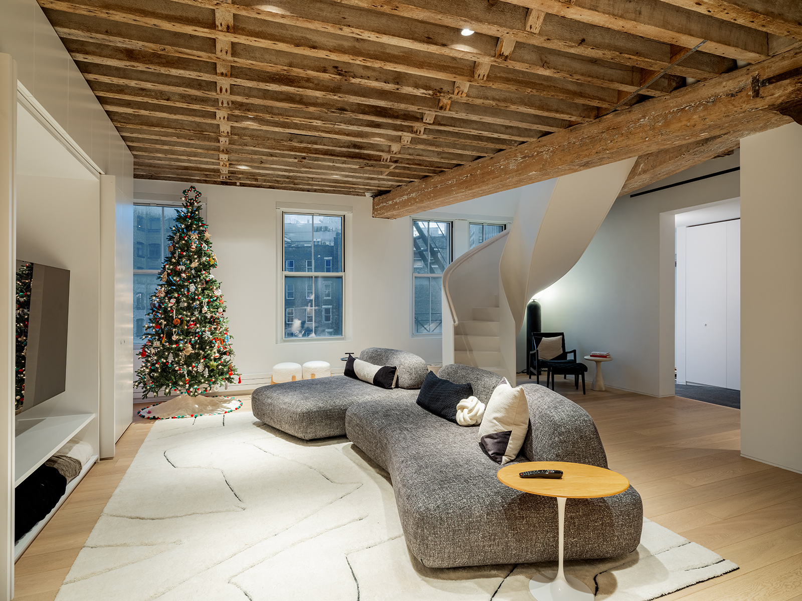
We made one kitchen bigger and eliminated the other to create a living room, and the former living room became our master bedroom. Our old bedroom became a nursery, although we called it a “guest bedroom” for the first few months so future grandparents wouldn’t get their hopes and expectations up. I found out I was pregnant about four months into the renovation.
Ultimately, we wanted a clean, modern, and bright space. I grew up in a house with white walls and dreamed of the day I would have my own place with HGTV-inspired fun accent walls and bold colors. Yet somehow we ended up with white walls, which probably means I’m turning into my parents. The best money we spent was on soundproof windows and soundproof walls. We used to be able to hear everything happening outside on the street, and the lack of noise transformed the space. Now, when we’re eavesdropping on people’s conversations outside, it’s on purpose.
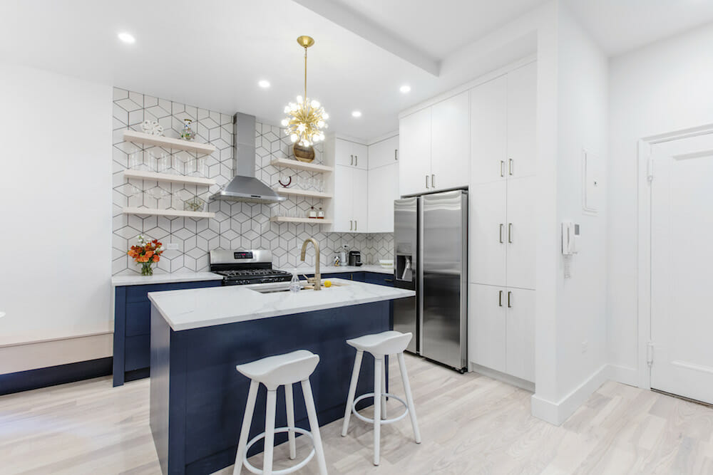
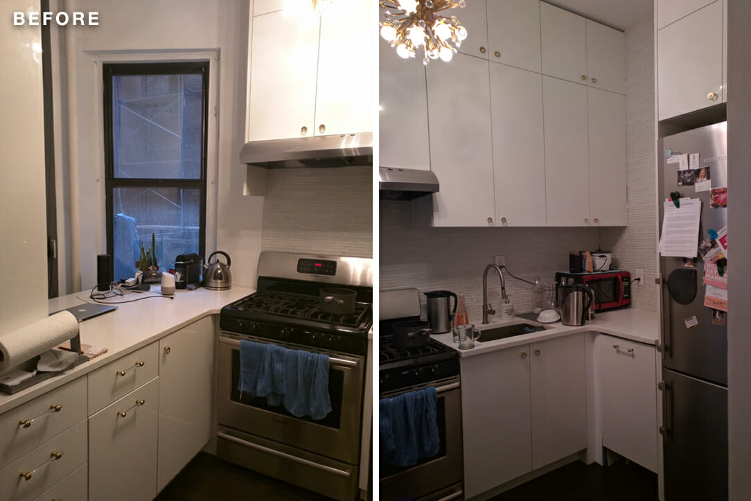
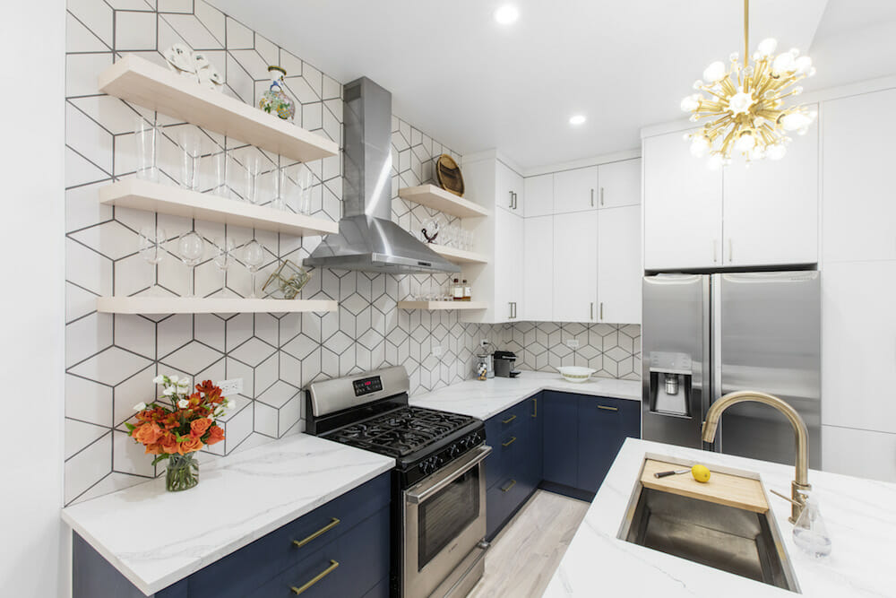
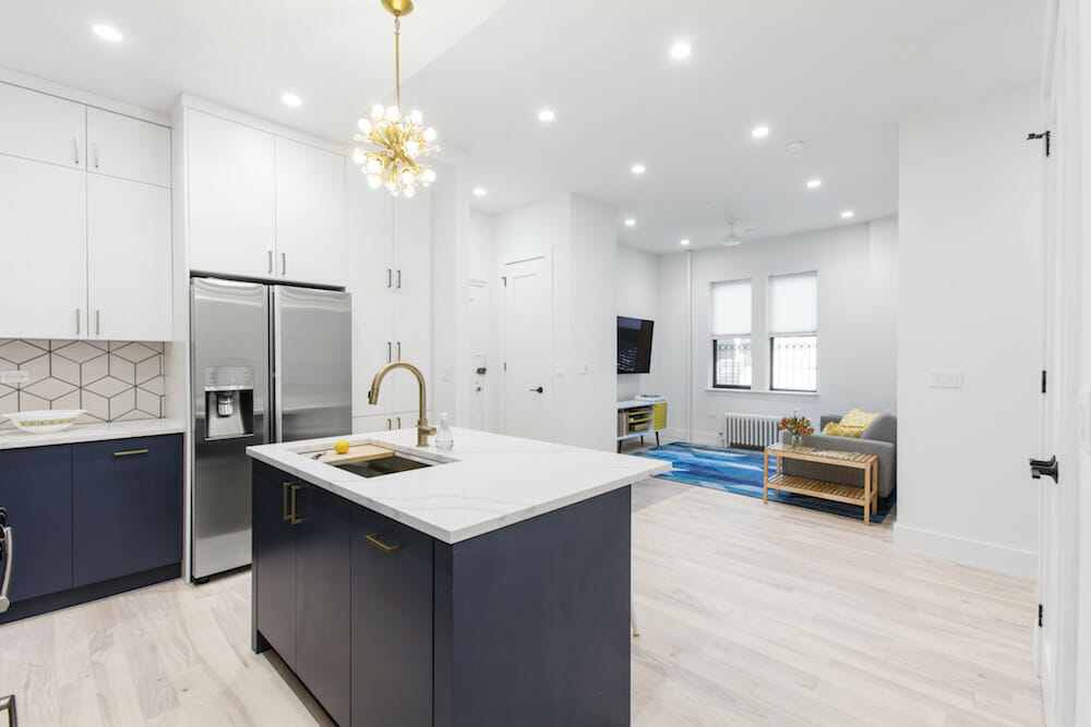
(Above) The kitchen in the apartment purchased first became the new kitchen
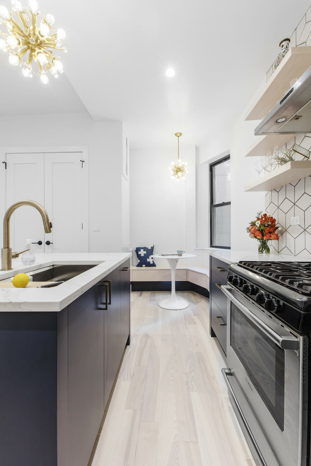
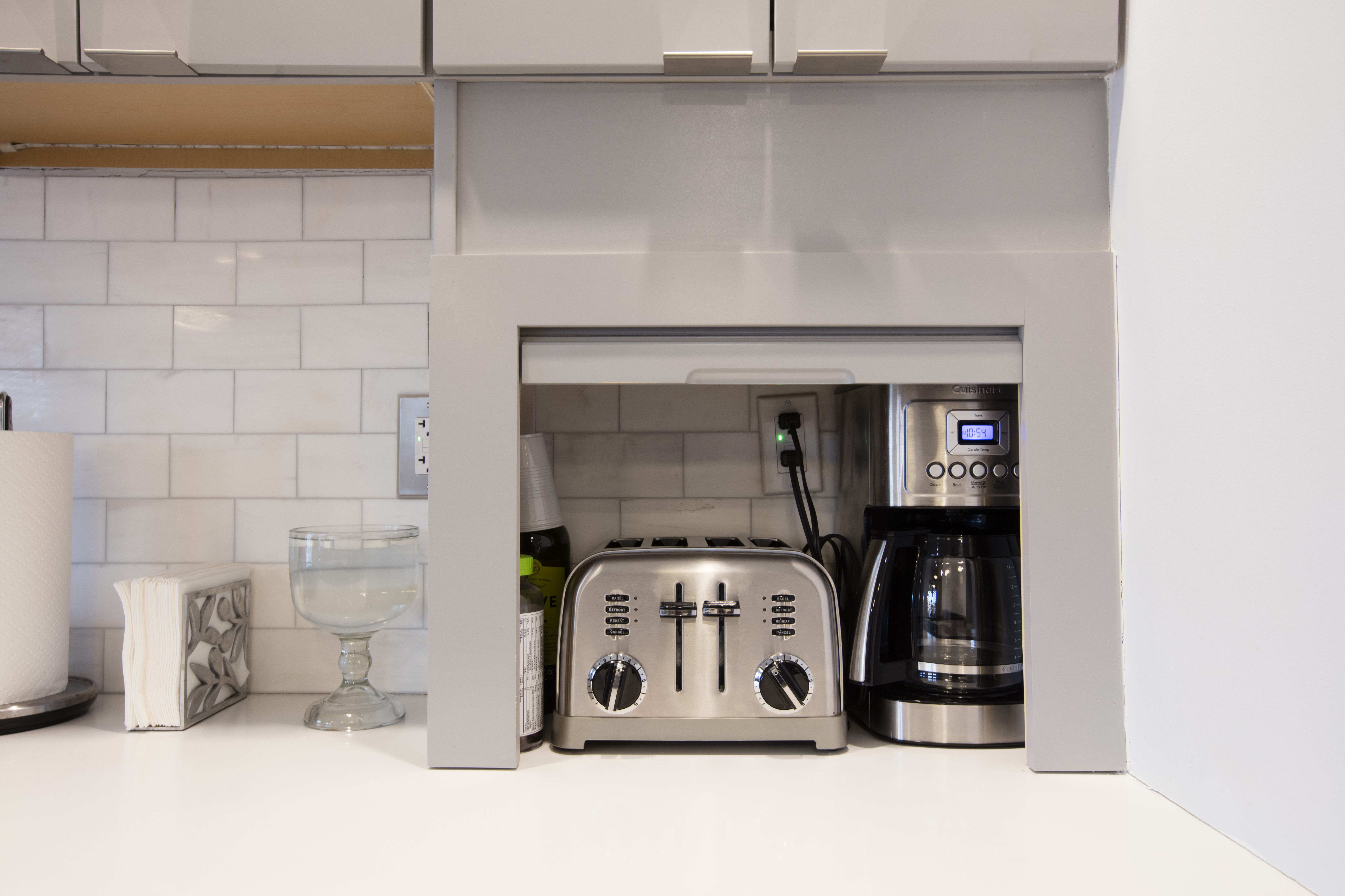
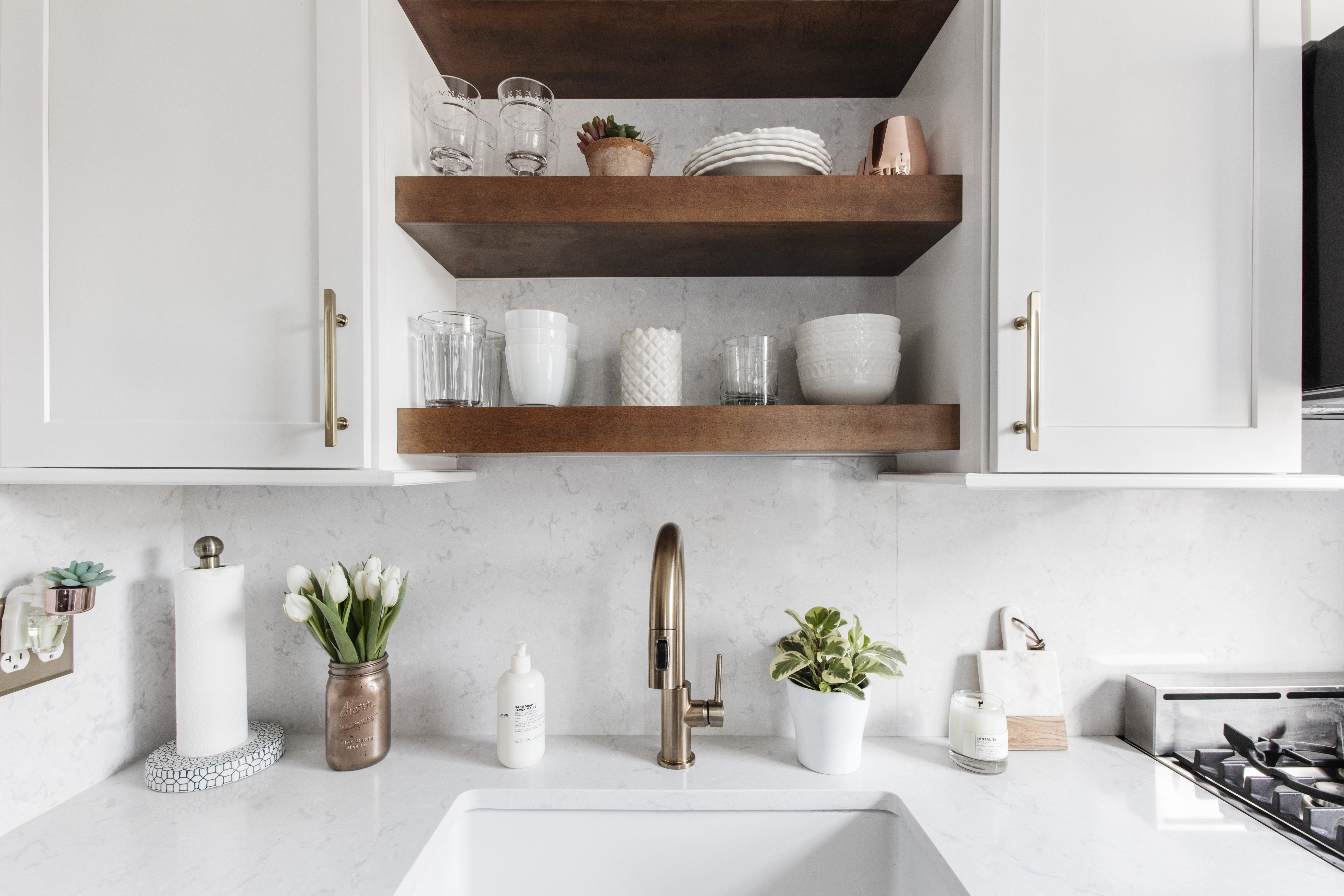
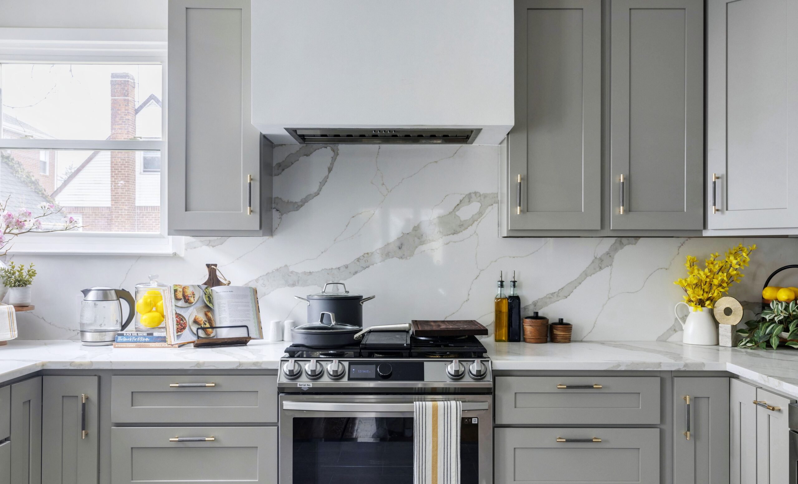
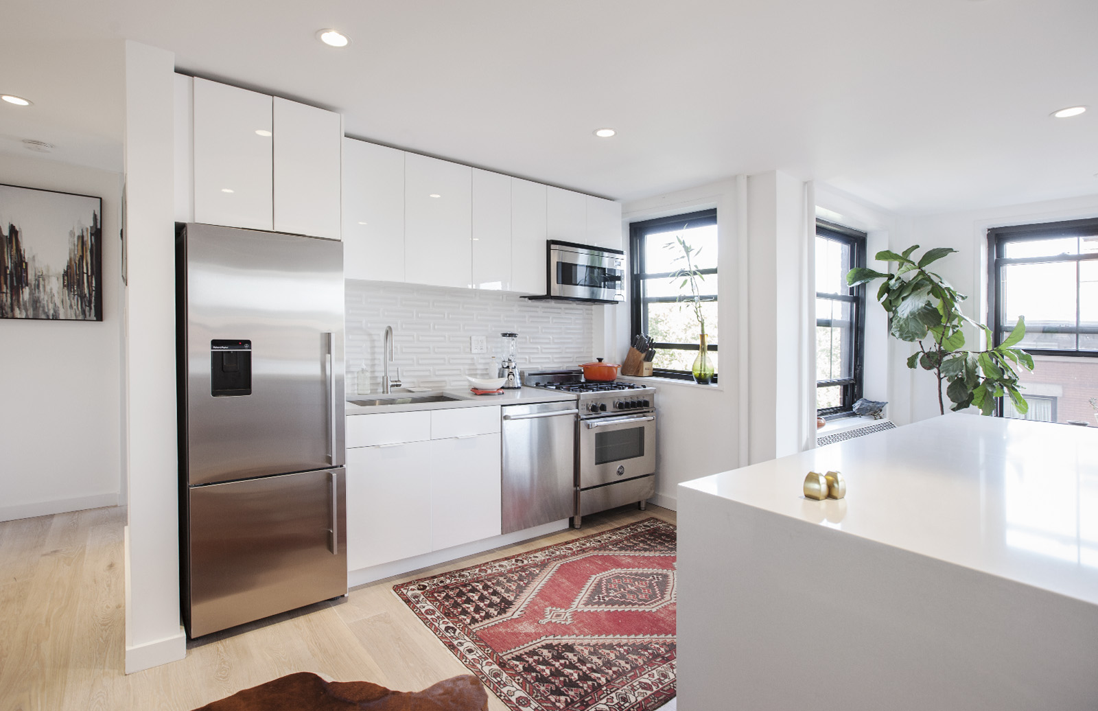
The kitchen is beyond our wildest dreams of anything we ever expected to have in New York City. We wanted it to be completely uncluttered, so we built spaces in the cabinets for the microwave, dishwasher, and trash. The gigantic kitchen sink brings me joy on a daily basis. Originally, we were thinking a medium-sized sink, but our contractor pushed us to consider something bigger, and we’re glad we did. The sink has all sorts of inserts—a cutting board, colander, tub, drying racks, and Murphy bed (just kidding about the last one) so it becomes any type of prep-surface we need.
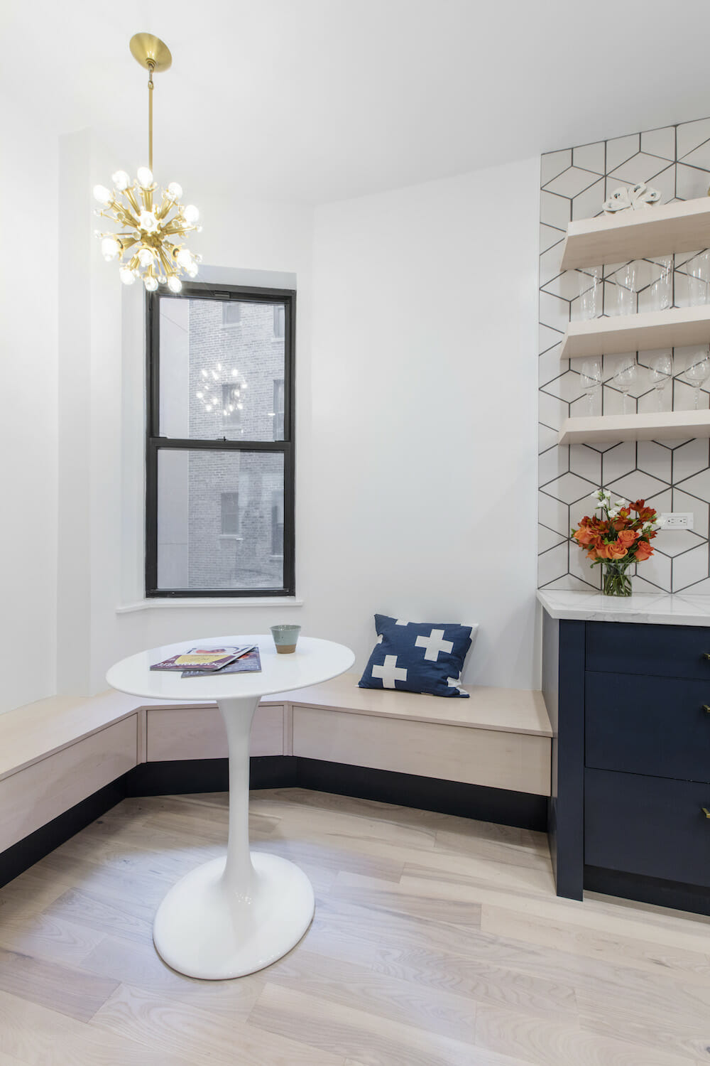
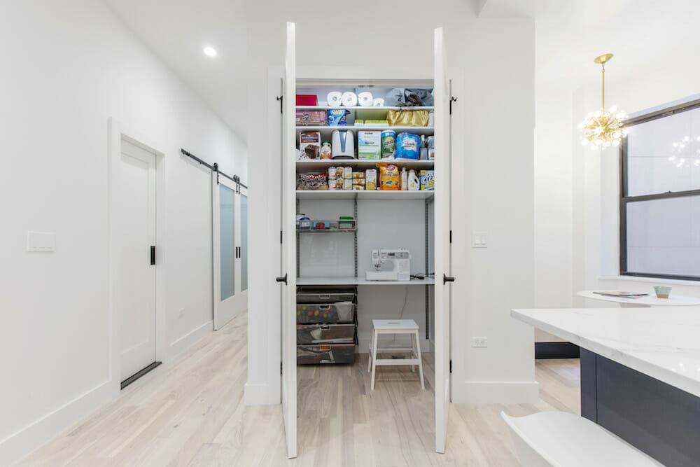
We took advantage of an awkward corner to install a built-in breakfast nook. It’s become our go-to place for eating meals and working. Plus, it’s a natural gathering place and a cozy use of an oddly-shaped space. For the pantry, we used an Elfa system to create a miniature sewing room with a designated desk and outlet in there for my sewing machine.
(Above) The kitchen in the second apartment was removed and became the living room.
Sweeten brings homeowners an exceptional renovation experience by personally matching trusted general contractors to your project, while offering expert guidance and support—at no cost to you. Renovate expertly with Sweeten
The ice and water dispenser on the door of our refrigerator also has an outsized impact on our daily lives. After wasting years of our precious youth waiting for water to drip through a Brita filter, it feels like a miracle to have ice and cold water tumble effortlessly into a glass.
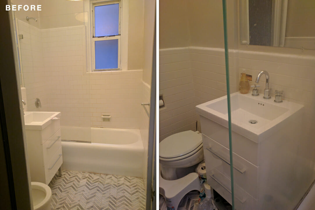
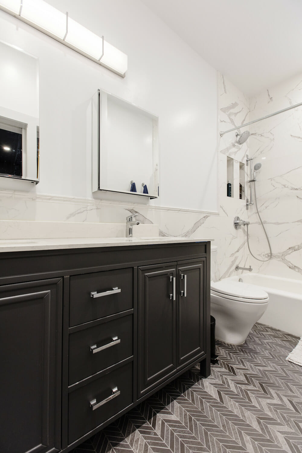
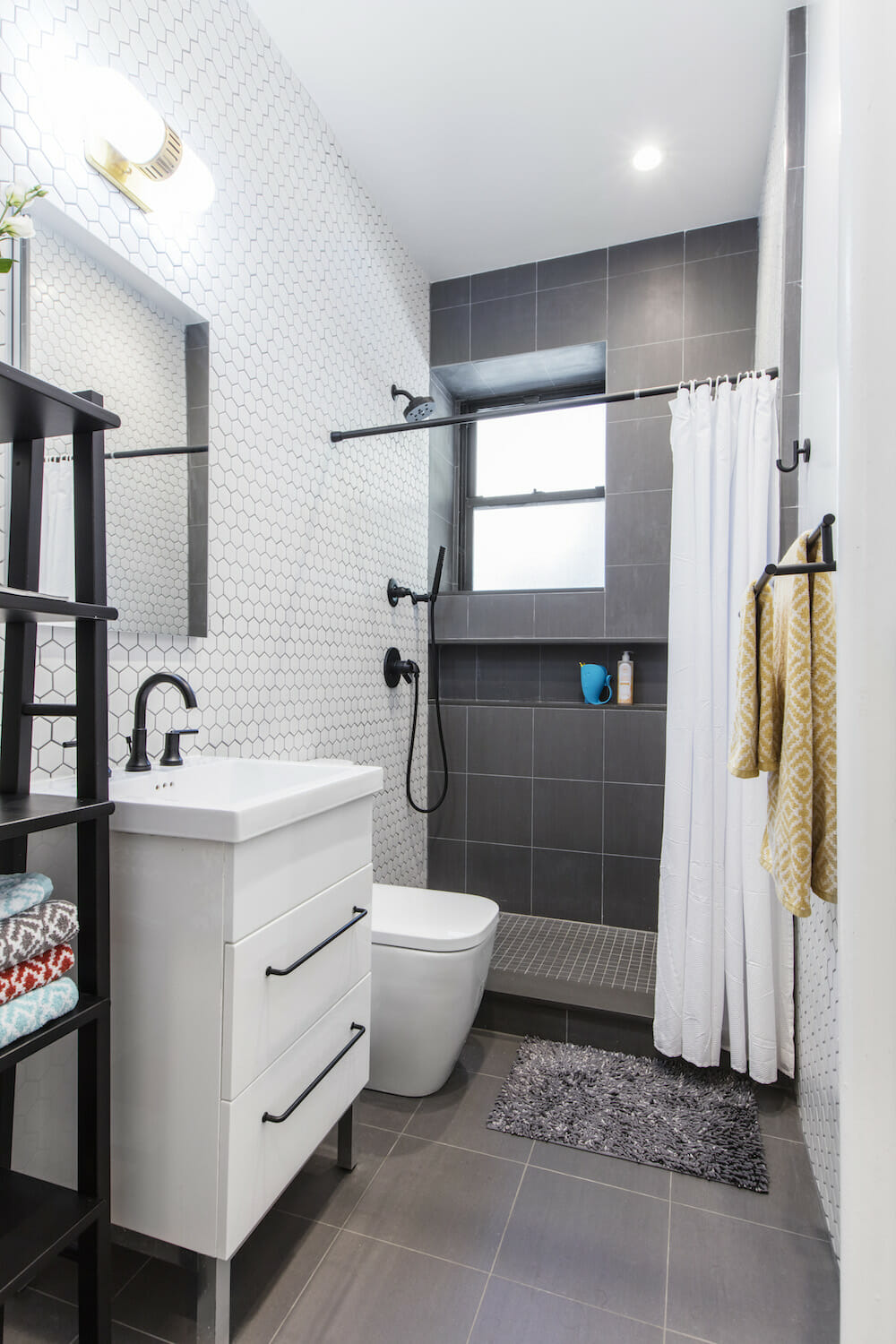
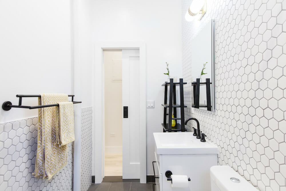
(Above) The bathroom in the original apartment became the new master bathroom.
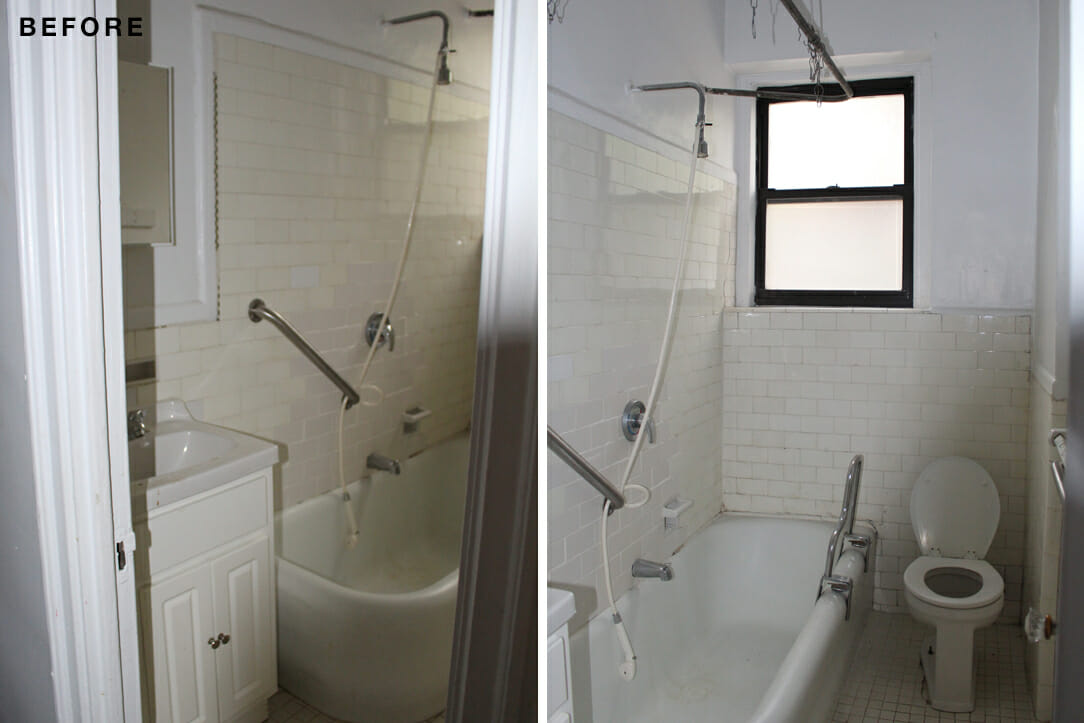
(Above) The bathroom in the newly purchased apartment became the guest bathroom.
Both bathrooms stayed in place, though the one in the original apartment became our master bathroom adjacent to our new bedroom. My parents are updating their own house to be “aging-in-place” so we decided to put a walk-in shower instead of a tub in the guest bath, and used door levers instead of knobs throughout the apartment. We also installed hand showers in both spaces.
An image on Pinterest inspired the walls of hexagon tiles in our guest bathroom. I loved how the classic shape was being used in an unexpected way. As someone who hates to scrub grout, using dark tile and gray grout in the shower seemed like a win-win for laziness and classiness.
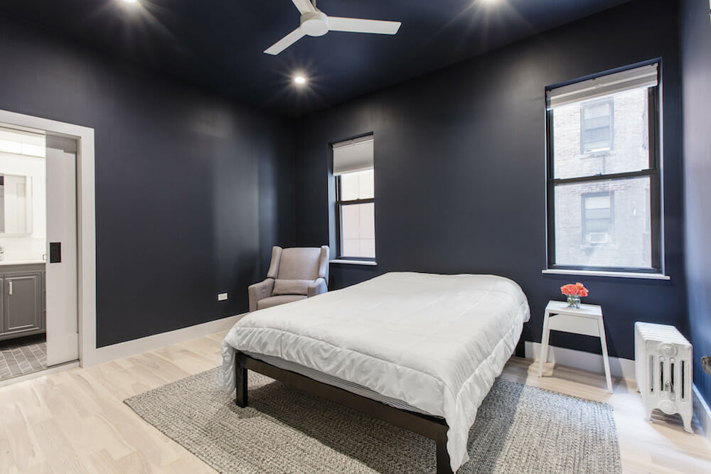
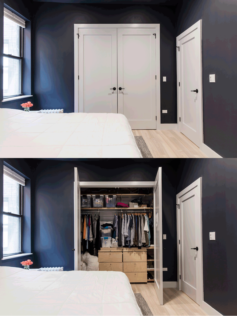
In our new master bedroom (formerly our original living room), we wanted to maximize the minimal natural light. I read that light colors can make a dim room seem smaller, so we decided to paint the walls and ceilings a rich navy. That, combined with the blackout shades, makes for a very cozy sleeping environment. Along with the kitchen lights, the master bedroom lighting is voice-controlled. Having smart lights started out as a novelty, but became so useful once we had a baby to carry around. We may not have a flying car, but lying in bed and telling a robot to turn off the bedroom lights is our version of living in the future.
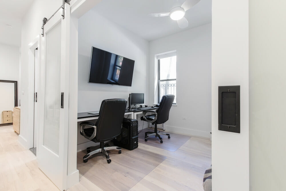
Our former bedroom is now the guest room and nursery. The neutral color palette, mixed with fun prints on the walls, makes it the perfect space for both. An architect friend suggested barn doors for the office to let more natural light into the whole apartment too.
We’ve watched enough home improvement shows to know that the unexpected is to be expected. Sure enough, we discovered pipes in a wall that needed to be re-routed and had to change our plans for the guest bathroom toilet when we found a floor beam in the way of our plumbing. With each surprise, our contractor kept us updated and came up with workable solutions. He was very upfront about what our options were and what the changes to our original scope of work would cost.
Our Sweeten contractor has a really good eye for design, and anytime we were in doubt about a decision, we followed his advice. From the soundproof windows and tile selections to the kitchen counters and a square toilet (surprisingly comfortable!), he never steered us wrong. We also appreciated how our contractor kept us updated; he set up a WhatsApp group chat which allowed us to easily communicate throughout the whole project, and we had weekly meetings face-to-face.
Having started this project as a couple and finishing it with a baby in tow, we can say that it’s faster (and cheaper) to create a human life than to renovate an apartment. That said, keeping our eye on the end goal—creating a home we love for us and our baby—made it all worth it. There is a story and memory behind every material and decision we made. We feel so lucky to live in a space we created for our family.
We hope you love your new home, Megan and Zack!
WHOLE APARTMENT RESOURCES: Milky White wood floors: Pidfloors.com. Schlage door handles: Build.com. Wall paint in Decorator’s White: Benjamin Moore. Elfa closets in entry, pantry, guest and master bedroom closets: The Container Store. Lights: Lutron Caseta. Home Decorators Collection Snow Drift blinds: Home Depot.
KITCHEN RESOURCES: Custom cabinets: Interiors Palace. Upper cabinet paint in Super White and lower cabinet paint in Hale Navy: Benjamin Moore. Atlas Homewares cabinet hardware: Amazon. Countertops: Quartz Master. Merola Rhombus Smooth White tile backsplash: Home Depot. Kohler sink, K-5540-NA and Delta faucet, 9159-CZ-DST: Build.com. Samsung refrigerator: P.C. Richard & Son. Existing dishwasher and stove: Bosch. Existing lighting: Jonathan Adler. Valore Summit hood: Costco.
GUEST BATHROOM RESOURCES: Floor tile and wall tiles: Tiles By Kia. Delta Trinsic hook, 75935-BL and shower fixtures, T17459-BL: Build.com. Duravit toilet: Build.com. Existing lighting: Jonathan Adler.
MASTER BATHROOM RESOURCES: Floor and wall tile: Tiles By Kia. Hansgrohe faucet, Studio Bathe sink and vanity, and Artika vanity lighting: Costco. Delta Trinsic towel hooks, Grohe shower fixtures, Toto toilet, Kohler medicine cabinet, and Emtek sliding door handles: Build.com.
LIVING ROOM RESOURCES: MinkaAire ceiling fan: Build.com
MASTER BEDROOM RESOURCES: Wall paint in Hale Navy: Benjamin Moore.
NURSERY RESOURCES: MinkaAire ceiling fan: Build.com
—
See how Zoe and Arvid combined two apartments in Manhattan.
Sweeten handpicks the best general contractors to match each project’s location, budget, and scope, helping until project completion. Follow the blog for renovation ideas and inspiration and when you’re ready to renovate, start your renovation on Sweeten.
