A Touch of Italy for a New Home
A first-time homeowner mixes sustainability with the comforts of her native country
Giulia renovated her one-bedroom apartment in a 1920s brownstone co-op in Park Slope soon after she purchased it, and before she moved out of her Lower East Side rental. She developed the design herself for the 500-square-foot home and posted her project on Sweeten to find a general contractor. The space desperately needed updating and some major space planning. While Giulia, who is from Italy, was able to bring in lots of color, European style, and ideas from her home country, maximizing storage was her main goal. Here’s how she did it.
Guest blog post by homeowner Giulia in Park Slope
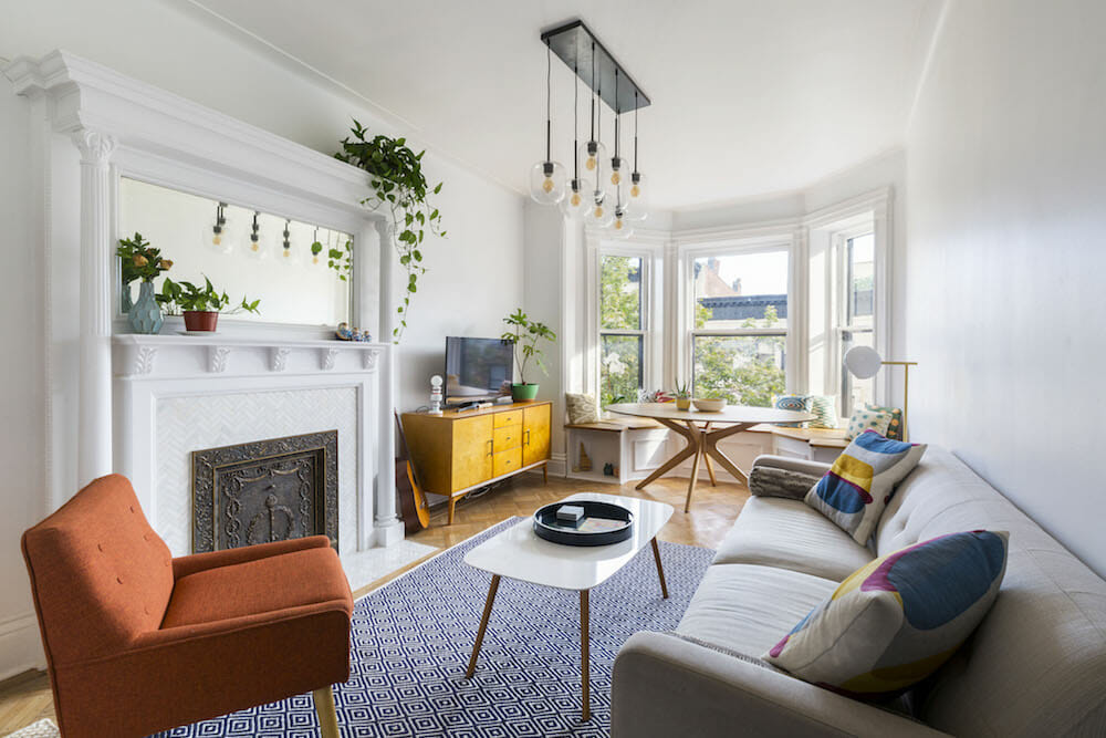
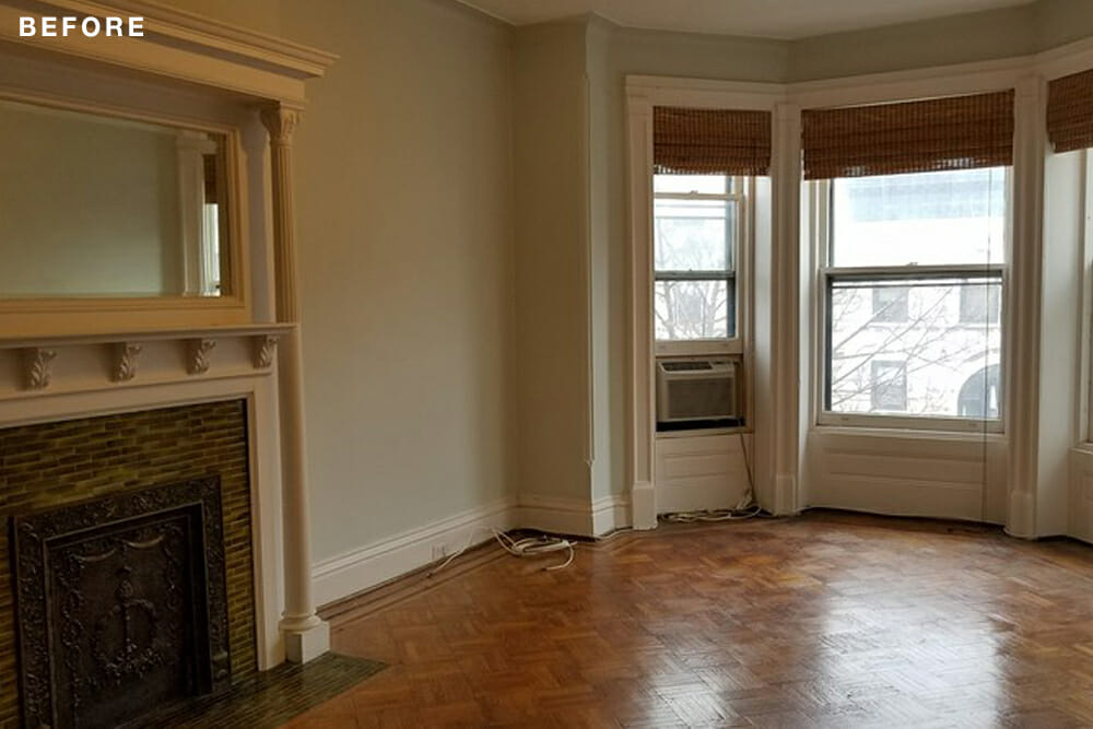
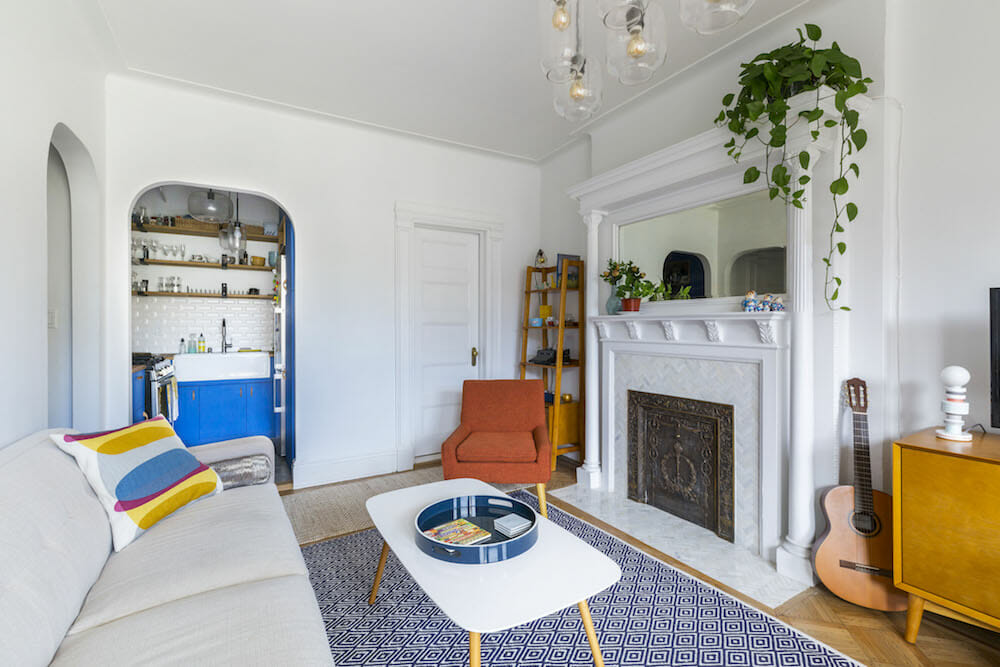
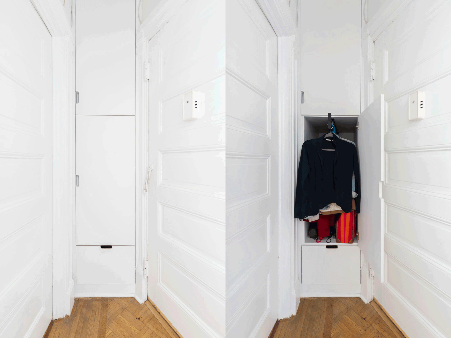
My vision for the space was a large and happy living room, a functional kitchen, and a comfortable bathroom. The whole apartment really needed a lot of updating; the appliances and fixtures were very old in the kitchen and bathroom, and there was so little storage space. I really like mid-century style and lots of color on a white background. The place had big, “old” character in its window and door moldings, fireplace, and wood floor. To find a good balance, I added clean, modern elements like the hexagonal tiles and almost-invisible closet doors.
Given my occupation in researching energy savings in the home and my interest in sustainable buildings, I included a few items that could be considered environmentally green:
- Low-flow plumbing fixtures in the bathroom and kitchen; the toilet is a 0.8 gpf, the lowest flow rate available on the market
- Zero VOC paints for walls and moldings (Natura by Benjamin Moore)
- Low VOC adhesives and sealants throughout
- LED-compatible lighting fixtures and LED bulbs throughout
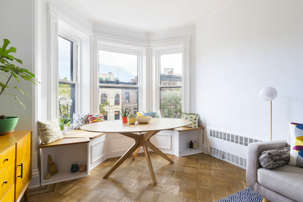
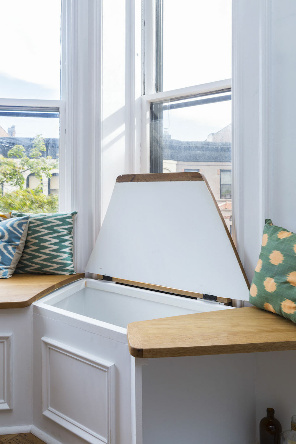
Since storage was a priority, I looked for spaces where I could incorporate cabinetry. Right away, I saw the living room bay windows scream, “Window bench!” I might have seen this kind of design element in a movie when I was growing up. I never thought I would have one for myself; I was so excited. The bay was also a good spot for a big, round dinner table.
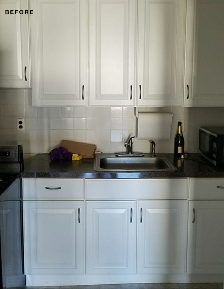
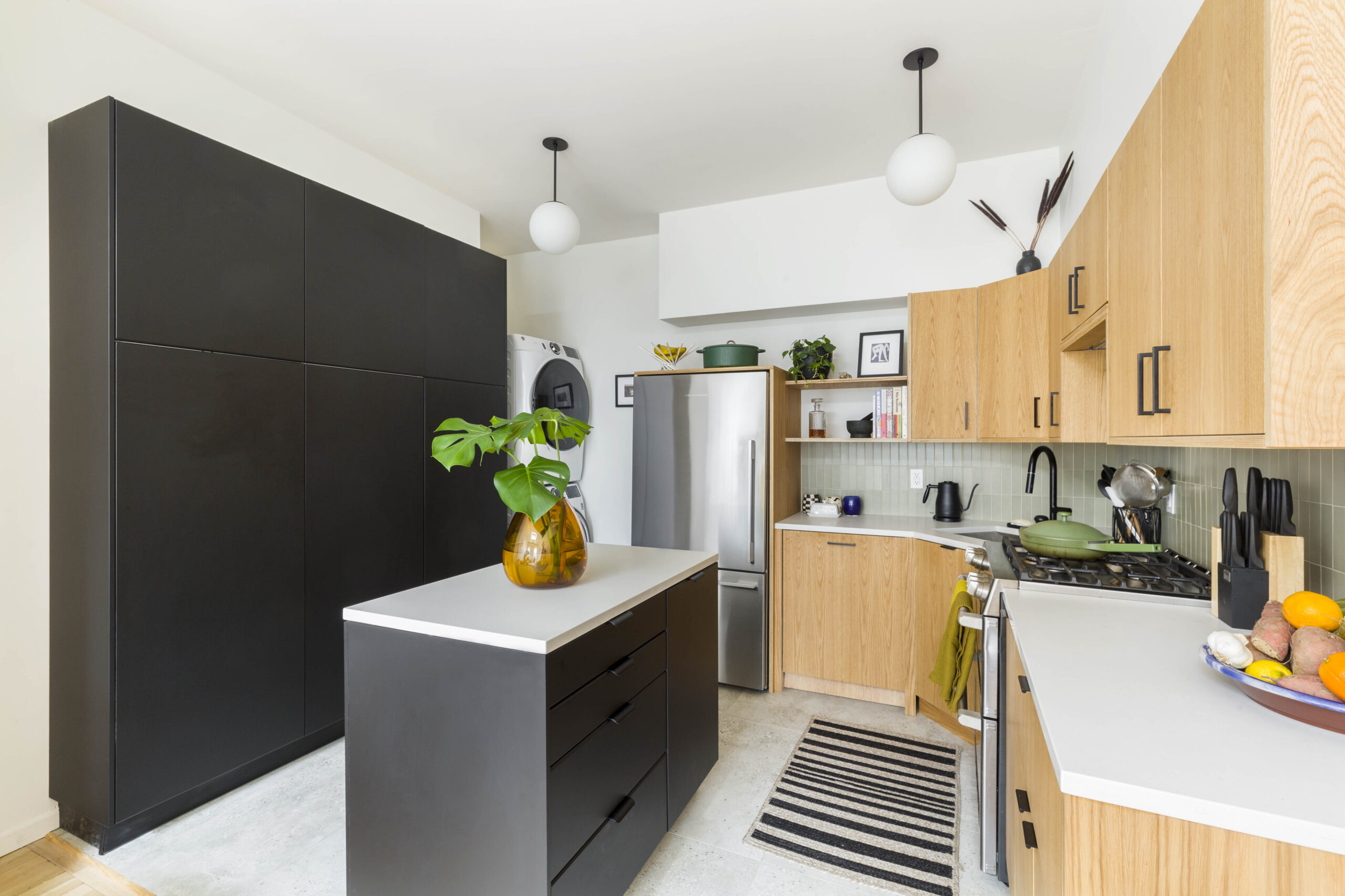
The original kitchen had a lot of unused space: just a tiny stove and a few cabinets, and the uppers didn’t even go to the ceiling. The materials—linoleum flooring, cheap tiles, and low-quality cabinets and countertop—weren’t in good condition.
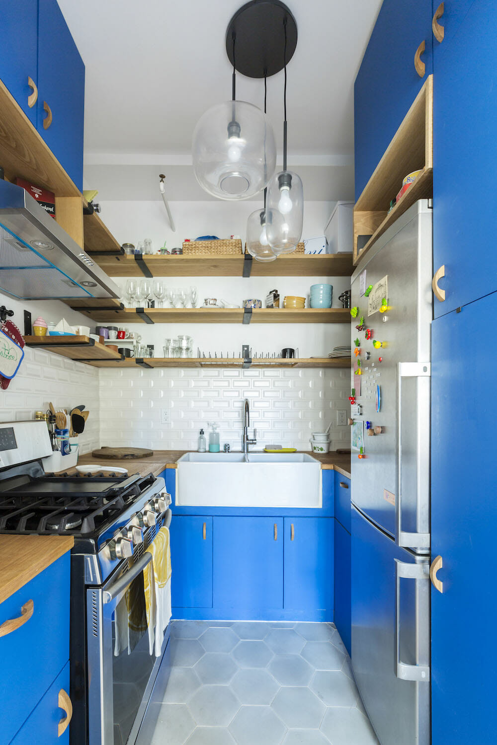
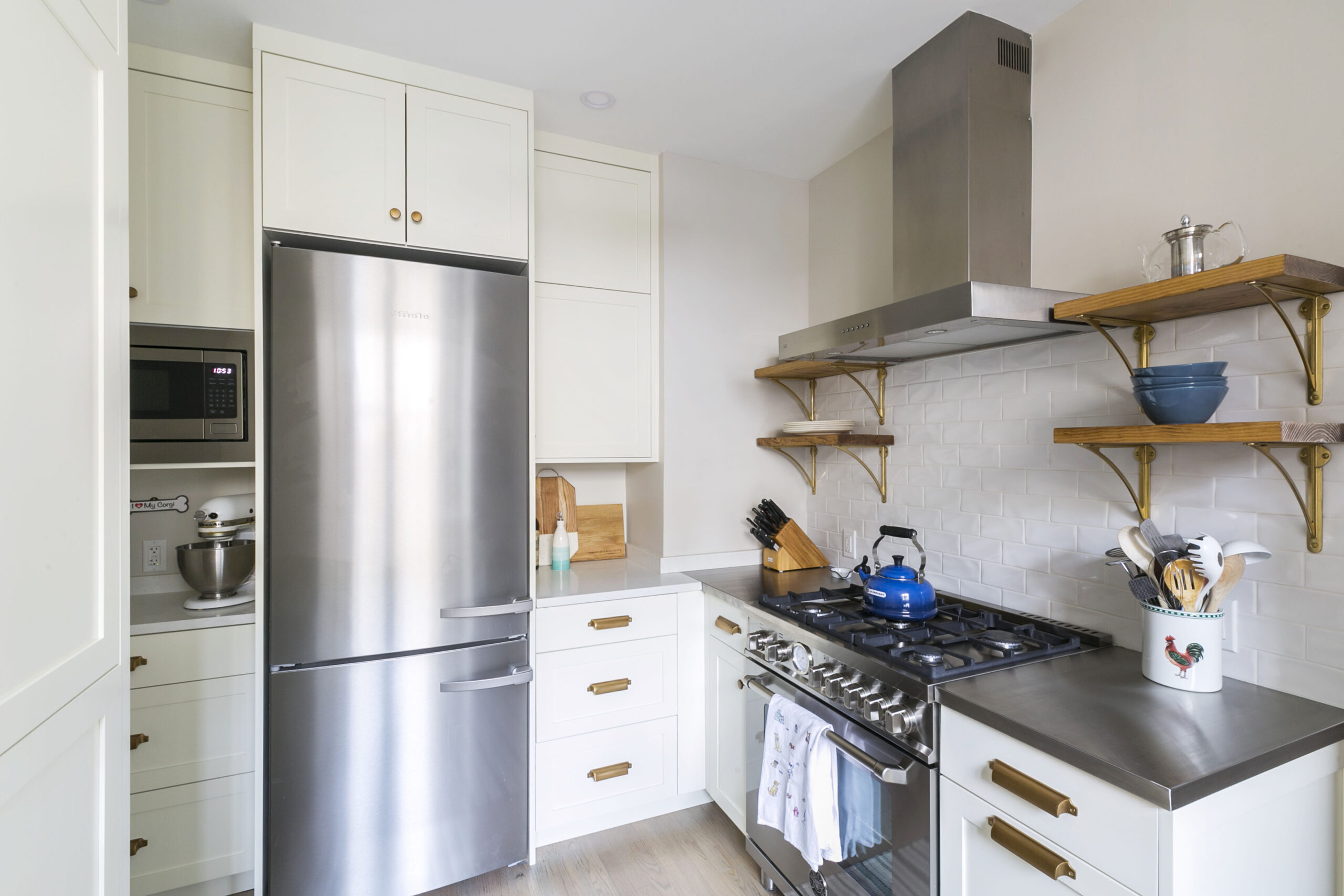
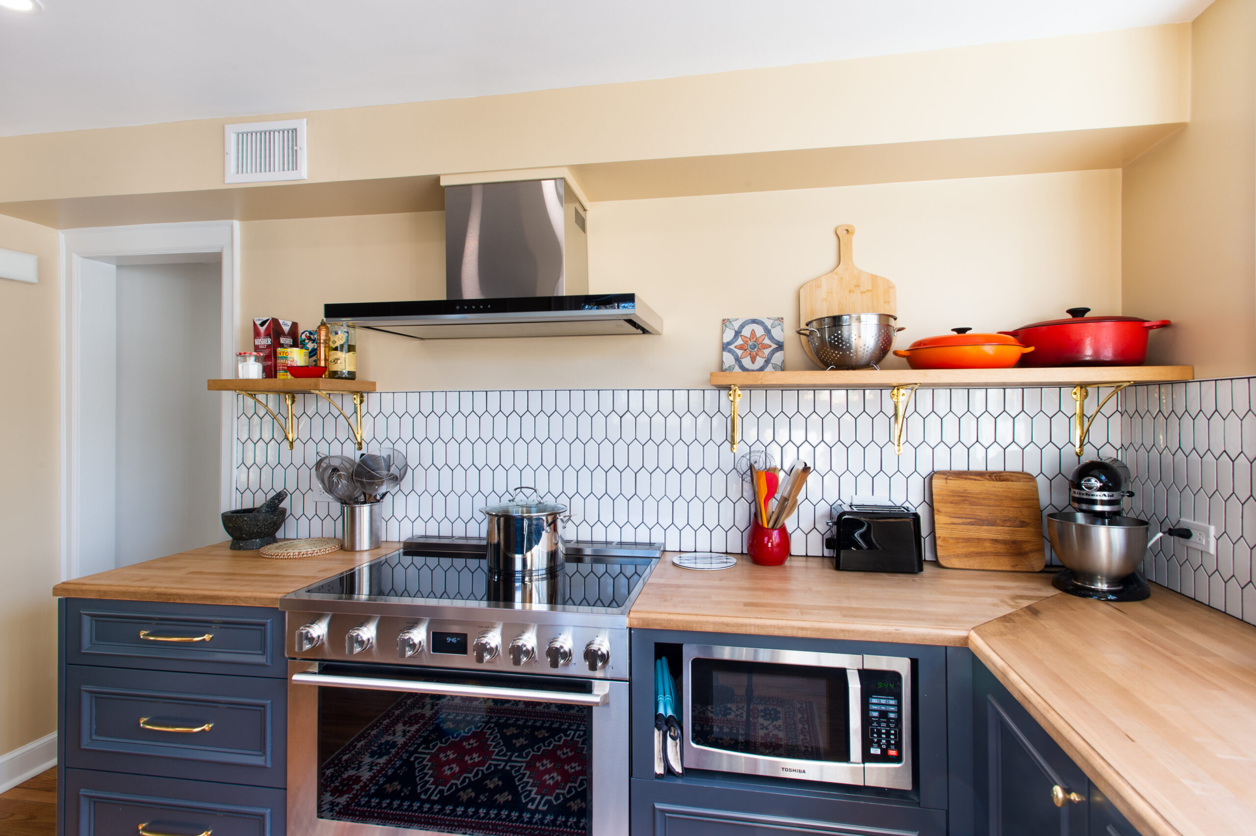
We removed a small soffit to maximize the area. For the upper area, I wanted a mix of open shelves and cabinets. Too many closed cabinets would suffocate the space. Plus, the open shelves “solved” the corner issue and helped avoid weird, L-shaped upper cabinets. I love the contrast of the blue and white oak. I had the same colors in my bedroom in Rome when I was a kid and I think it just reminded me of home. I included two wooden cubbies above the fridge and the hood to break the continuity of the blue and make the design more dynamic. The backsplash is a subway tile in an inverted concave design to add more movement to the space.
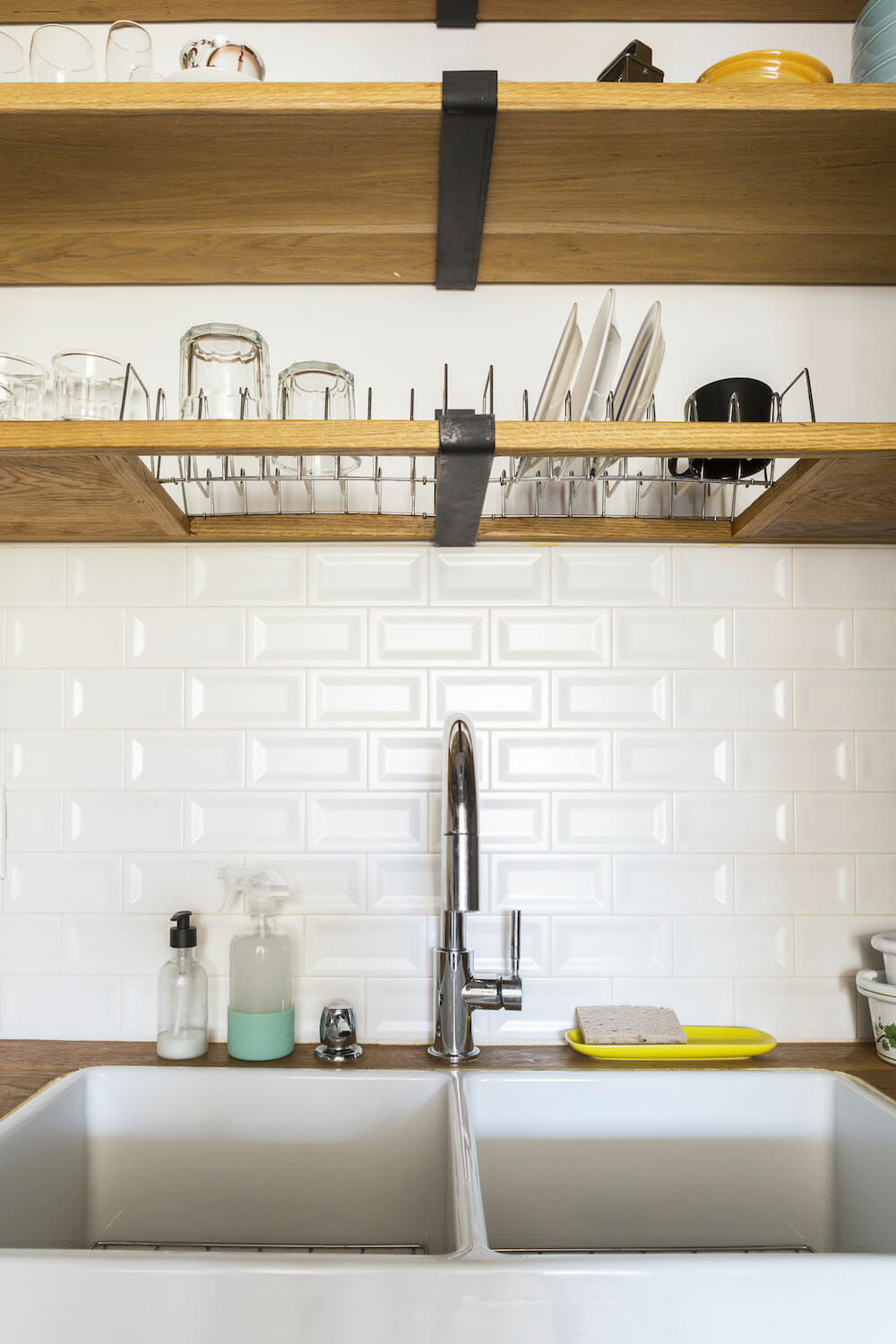
Above the sink is a drying rack shelf, a trick I stole from my home country. Wet dishes drip off directly into the sink, avoiding puddles of standing water on the counter. Also, I don’t need to use any of my limited counter space to dry my dishes. For the lower cabinets, I maximized the space and the corners with “hinged” foldout doors which would allow me to have access to the full space underneath the sink.
I designed a tall closet as part of the kitchen storage for my broom, vacuum, and cleaning supplies. I found it funny as the last thing anyone would want to think about when moving into a new place is, “Where do I put this tall broom?”
Sweeten brings homeowners an exceptional renovation experience by personally matching trusted general contractors to your project, while offering expert guidance and support—at no cost to you.
Renovate expertly with Sweeten
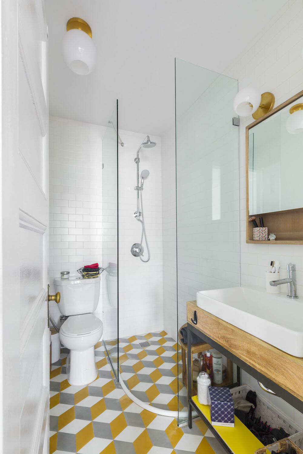
Since the bathroom and the kitchen are next to each other, I pictured their floors similar but not identical. I chose the same material and shape—hexagonal cement tiles—but different colors. In the kitchen, I wanted a more neutral color given the strong character of the blue cabinets, so I went for a light gray. In the bathroom, I got a bit more creative, picking a “3D-look” pattern, with yellow, white and gray.
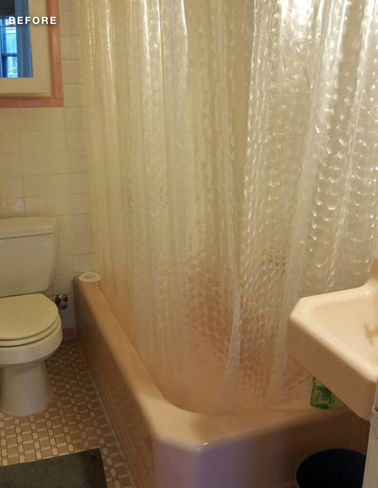
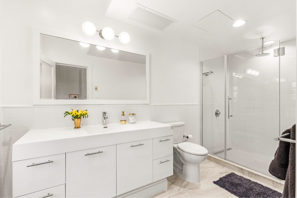
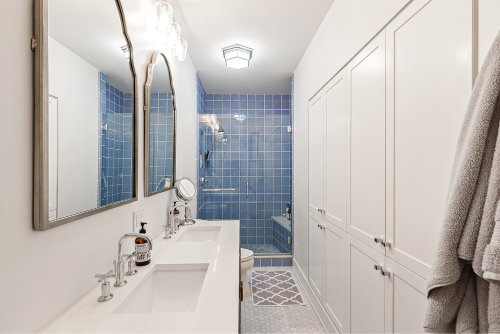
The bathroom had space issues as well: A small tub took up much of the room, preventing me from having a nice, big sink. The pink fixtures had a kind of pretty, “vintage” look, but they needed to be modernized and replaced with something new and more functional.
I don’t love bathtubs, especially if they are small and tight; I would rather have a big and comfortable shower, instead! So I designed a rectangular shower, which would be shorter than the tub—leaving more space for the sink—but still bigger than a traditional shower stall.
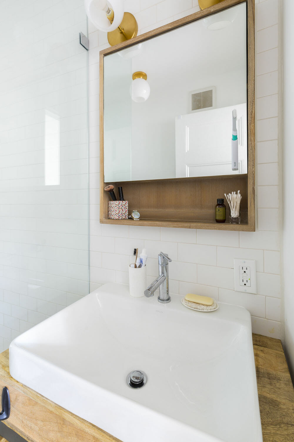
A shower door would have eaten up space, so I opted for a rectangular opening and no door. To keep the water inside the glass walls, I chose a “rain-effect” showerhead. (The rod next to the showerhead is a bracket that holds the glass wall in place.)
My original idea for the floor was to have an “infinite shower” with a sloped floor and no threshold. This wasn’t going to work, so I had to include the white flexible rubber threshold glued to the floor tiles to keep the water in. (Not the best in terms of looks, but it works!) I attached a hand-held bidet to the toilet—another “European” detail of mine. I also repurposed a mini desk from West Elm as a sink vanity.
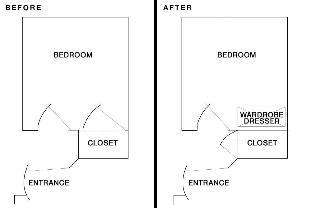
(Above) Floor plan of bedroom and closet
Another storage puzzle was my bedroom closet, the one and only closet in the apartment. It was small and sat next to the bedroom door. That wall was also the only spot where I could put some type of dresser or wardrobe to store my clothes. I decided to close up the closet side in the bedroom and have it open from its short-side located in the hallway instead. I installed a telescopic rod that can be pulled straight out for clothes to be hung on it. For additional storage, there are shelves above the closet and a deep drawer below, where I keep bags.
I left the original wood flooring in the living room and bedroom. I had it laminated and stained with a gray finish to maintain the color and avoid any gold and red shades. We did a lot of testing before finding the perfect balance of gray and wood.
The countertop and shelves in the kitchen and the tops of the bay window bench are all made of white oak. I really like this finish and the way it contrasts with the white of the walls. Also, it’s a pretty resistant material, good for these kinds of applications.
Designing my apartment was fun and exciting but challenging. I had to learn how to make decisions very quickly every day. The six months of renovating were some of the most difficult months of my life; I’m pretty happy it’s over! My friends have been a huge help throughout the entire process; I’m very lucky I have them. Sweeten, too, was helpful as I was wrapping everything up.
I learned so much throughout the process:
- Be prepared for much more time than is estimated
- When possible, choose simple design ideas
- Do the work all at once—don’t split the job into pieces
- Clarify details with the contractor prior to starting the job
- Understand what’s included in your budget and what’s a change order
In the end, I’m so happy living in my newly renovated space, and my friends all like it, too.
Thank you, Giulia. We hope you love your new first home!
KITCHEN RESOURCES: Cabinets: Custom. Cabinet paint in Classic Blue: Behr. Fireclay farmhouse apron double sink from the Cape Collection, #T-FCFS33-DBL: Nantucket Sinks. Gas range, #NX58H5600SS: Samsung. Range hood: #COS-5U30: Cosmo. Faucet, #D224158: Danze. Hardware: Etsy.
BATHROOM RESOURCES: Retro-fit 160 shower system, #26123000: Grohe. Vox Rectangle sink, #K-2660-1: Kohler. Parma faucet, #D224158: Danze. Mango wood industrial storage mini desk as vanity and light fixture: West Elm. 24″ Bastian Teak medicine cabinet: Signature Hardware.
LIVING SPACE: Natura paint: Benjamin Moore. Ceiling light fixture: West Elm.
—
Laura and Walter’s Park Slope renovation is full of clever built-ins and storage solutions.
Sweeten handpicks the best general contractors to match each project’s location, budget, and scope, helping until project completion. Follow the blog for renovation ideas and inspiration and when you’re ready to renovate, start your renovation on Sweeten.
