A Full Co-op Renovation In Kensington Gets Organized & Up-to-Date
A 360-degree co-op renovation in Kensington, Brooklyn transforms a home
Nine years seems like a long time, but some things are worth the wait. That’s the case for Barbra, a television producer, and Sean, who purchased their 1,100-square-foot Kensington, Brooklyn, prewar co-op and only recently renovated. They were used to kitchen cabinets too shallow for dinner plates, broken track lighting, and crumbling baseboards. Despite it all, the couple, along with their sons Jack, 11, and Clint, 8, are glad they lived in the space and really understood what they wanted and needed before remodeling. It made it easier when they posted their Kensington co-op renovation project on Sweeten, a free service matching renovators with vetted general contractors. They chose their contractor, who they say was open to their ideas, gave them great tips on where (and where not) to splurge, and helped them stay within budget.
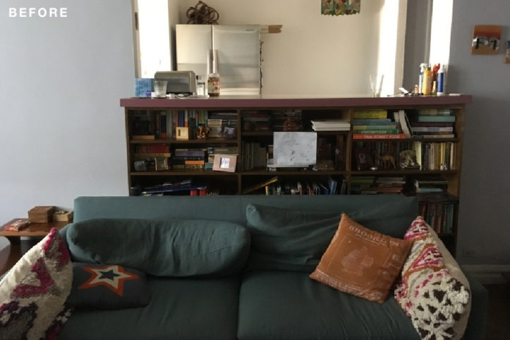
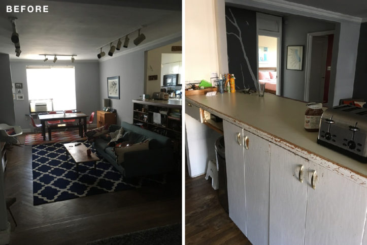
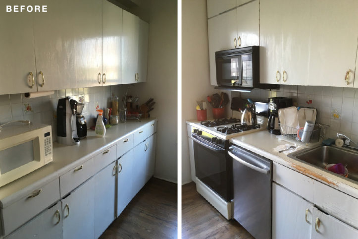
The apartment had a lot of light and great bones, but it was dated and needed a complete overhaul. A slapdash remodel in the 1980s included tile haphazardly layered over older tile in the bathroom and a weird bookshelf installation that covered up a pass-through to the living room—which meant they had to walk around the entire room to get to their dining table. The kitchen area had wrong-height countertops and an unnecessary wall that separated the space.
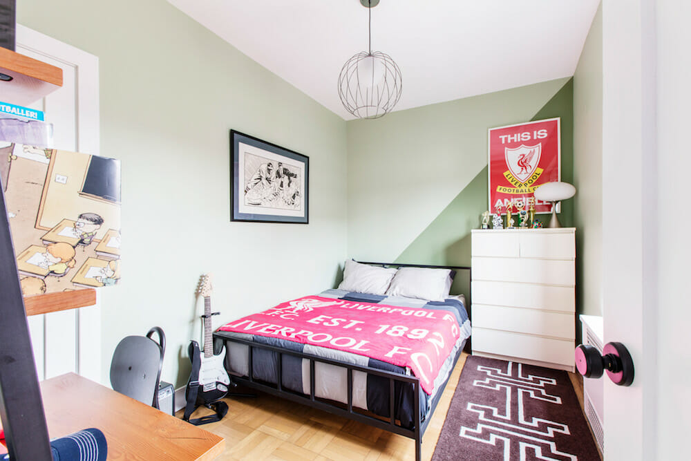
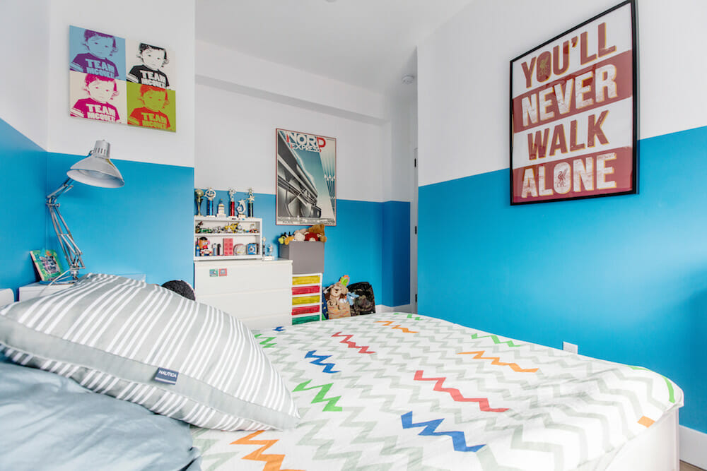
The previous owners had added a third bedroom, but it was too small to fit anything other than a bed. The goal was to even out those bedrooms so their boys could have their own rooms, without one of them being seriously shortchanged on space. Barbra and Sean’s overall vision was for everything to be simple, functional, clean, updated, and bright. The co-op had a lot of natural light and they really wanted the renovation to show that off.
The couple knew their project was going to be a really big job. They’d renovated a much smaller apartment once before, but it was a simple, cosmetic remodel for resale—nothing like this project. Barbra recalls learning early that she had to do all her research on fixtures, materials, appliances, style, and colors before starting the renovation work to save time and money. “I never knew how many different types of doorknobs there were—or even realized I had strong preferences in doorknobs,” she said, “until I actually had to choose one.”
The renovation started with bringing the electric up to code. There were unusable outlets and fixtures, and old electric and phone cable lines littered the apartment. Having those ripped out and new lines installed behind the walls “made my day,” she said.
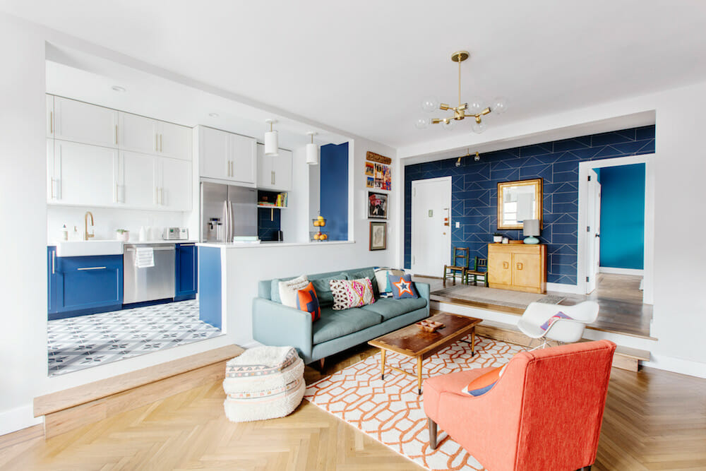
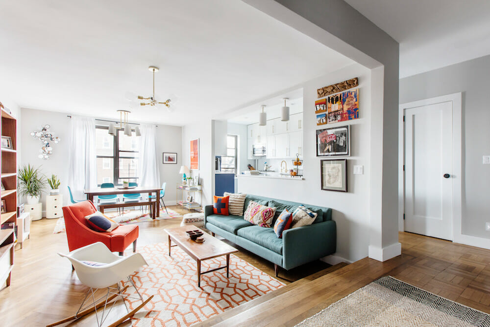
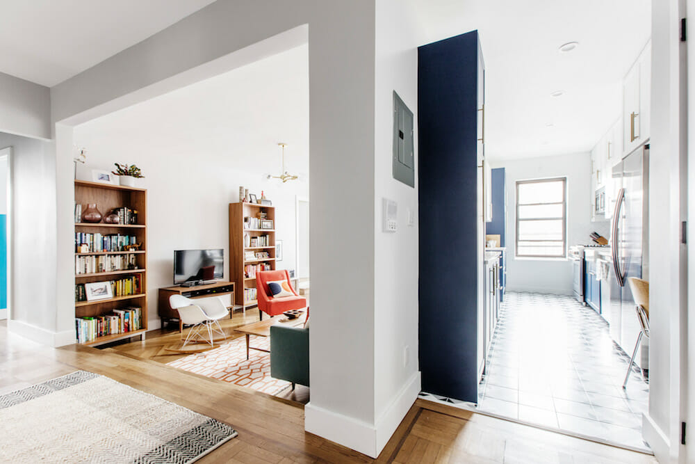
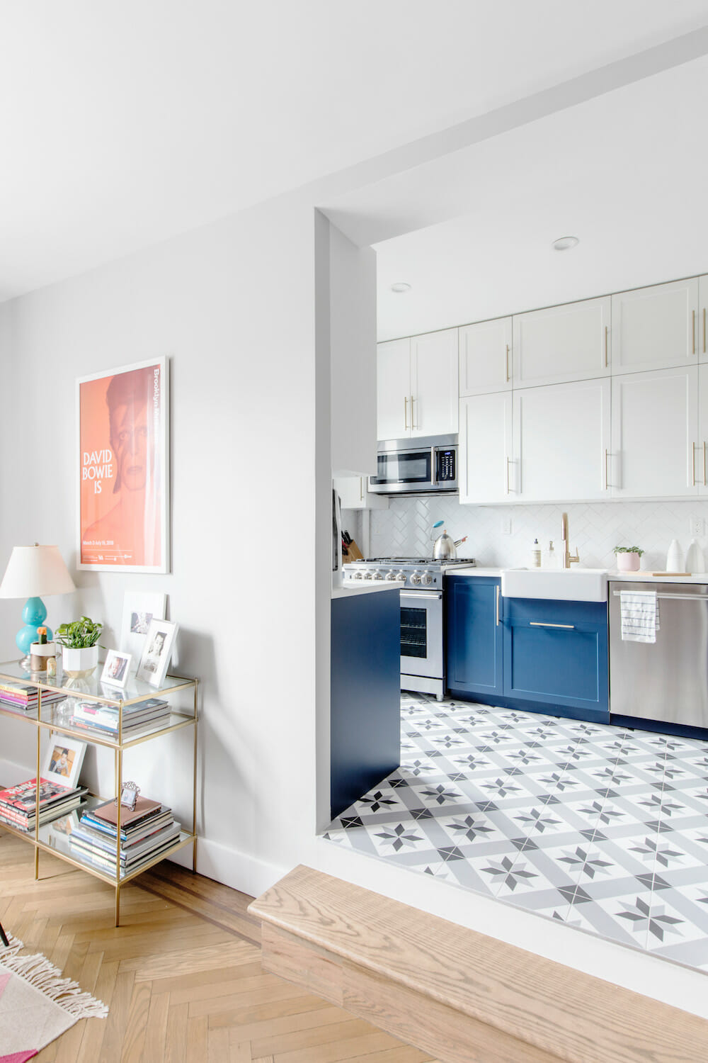
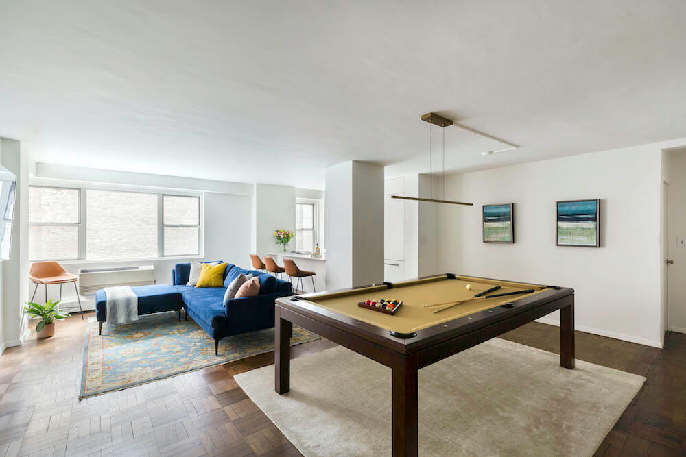
As for the walls themselves, despite having been built in 1935, there really weren’t any remarkable moldings. To keep the space modern but classic, baseboards and doors were kept clean and similar to the originals. To brighten everything up, they installed all new lighting. “Seeing the non-working track lighting get pulled out of the living room was incredibly satisfying,” Barbra said. The floors were refinished, which let the original herringbone pattern stand out. “Refinishing made a bigger difference than I would’ve thought,” Barbra said.
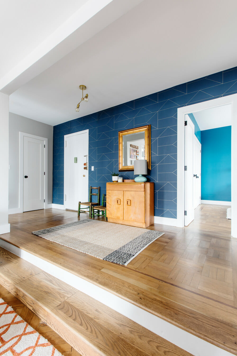
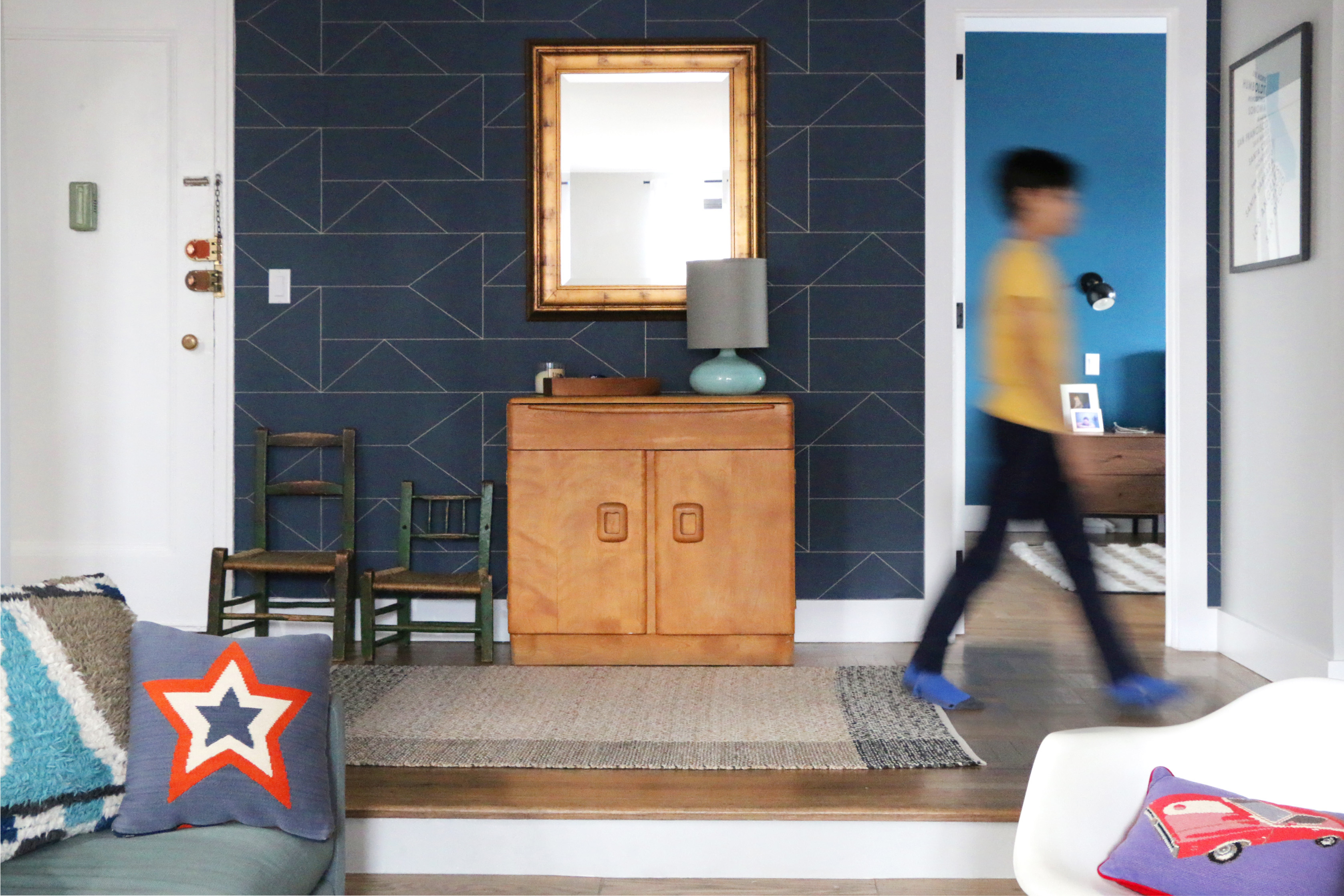
They had a mural on the foyer wall that a friend had painted when they moved in. They were sad to see it go but knew a statement wall would work there. “I love wallpaper but wanted to use it sparingly, so this seemed like the perfect spot for it,” Barbra said.
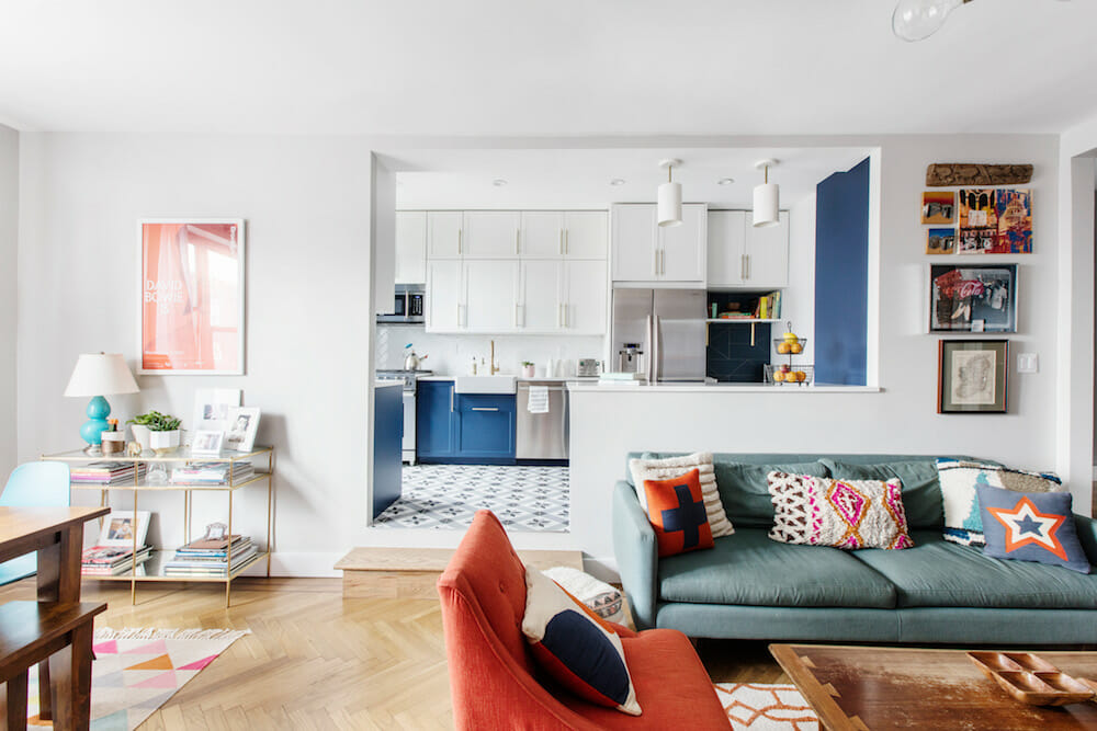
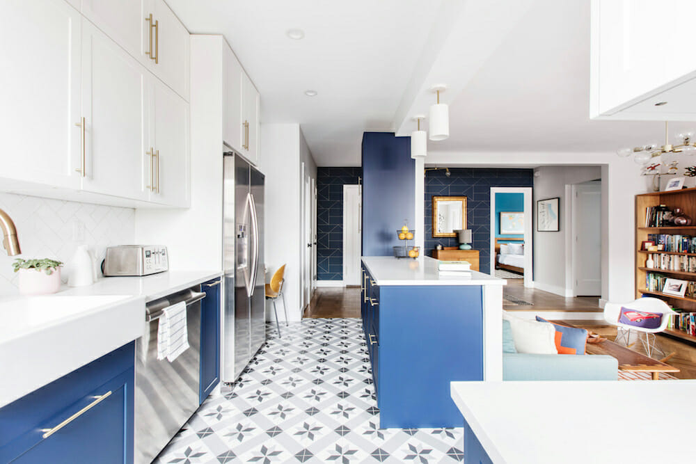
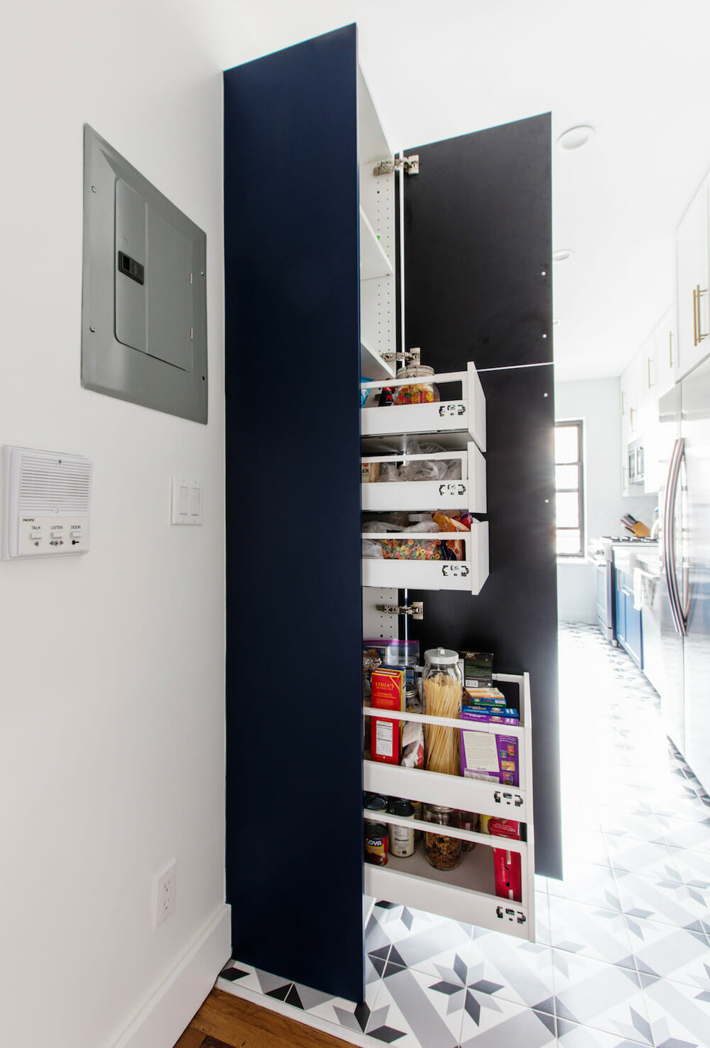
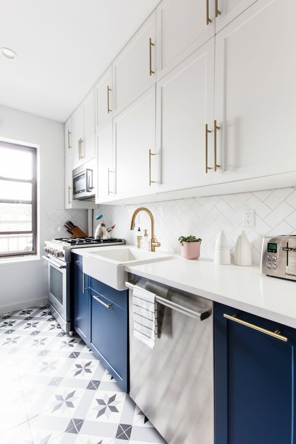
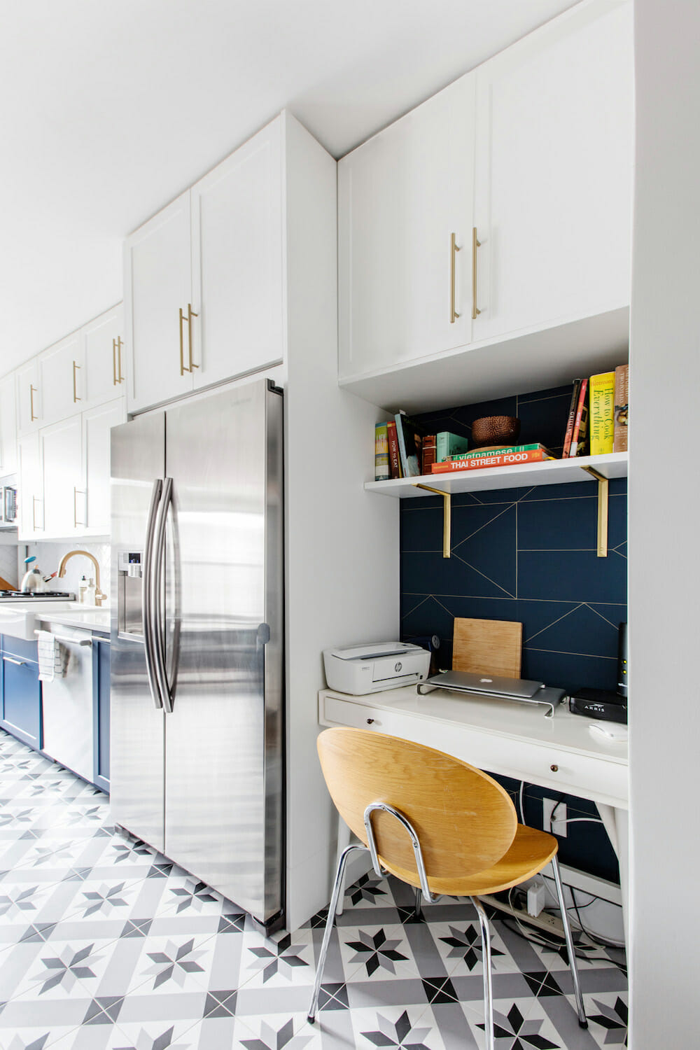
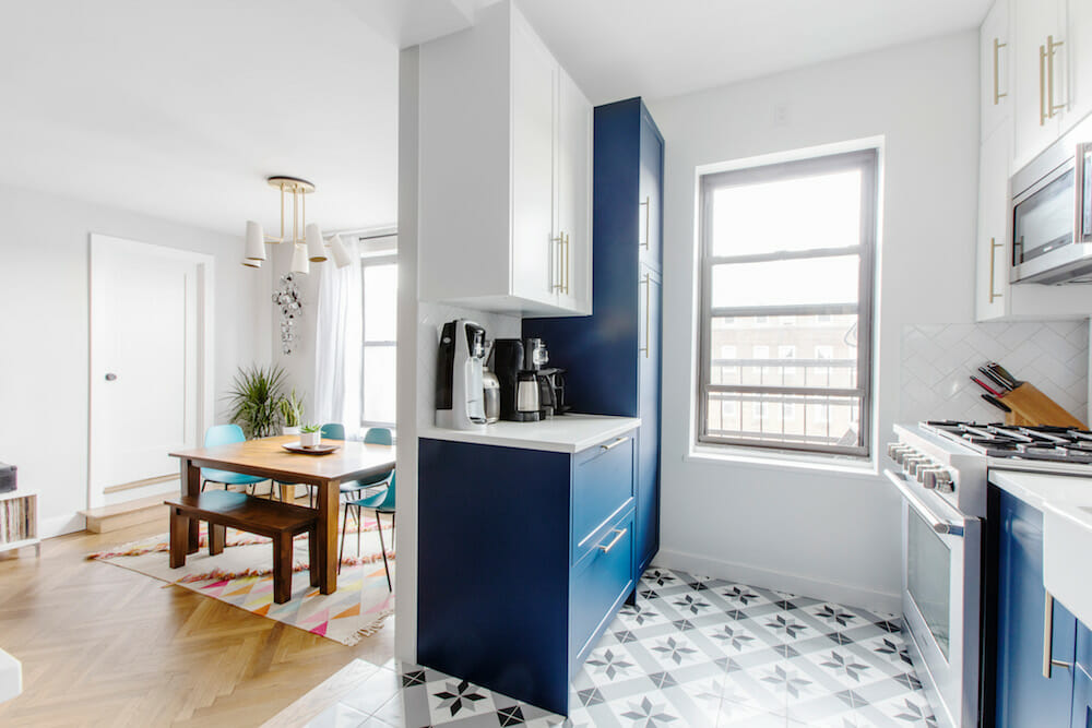
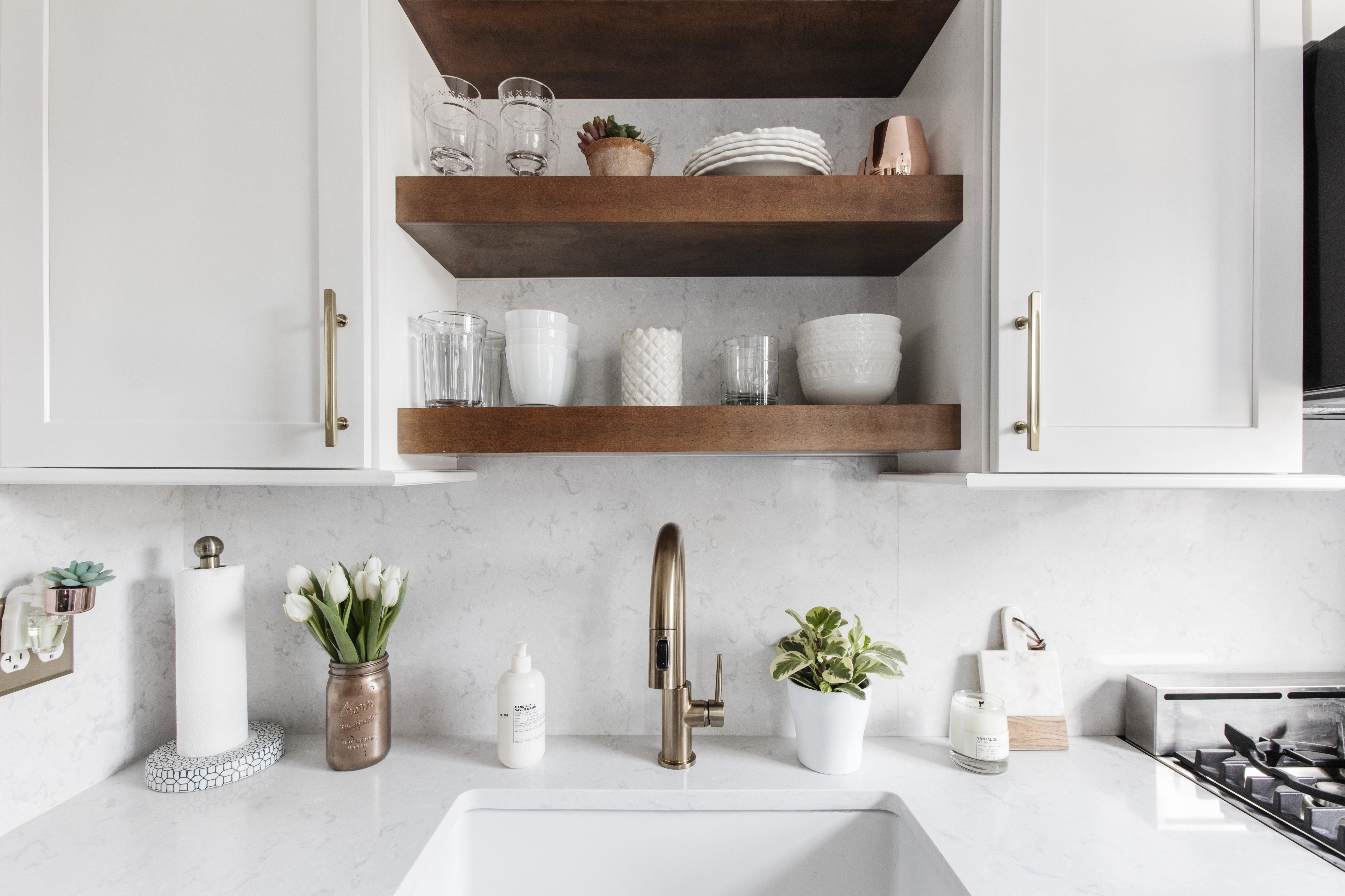
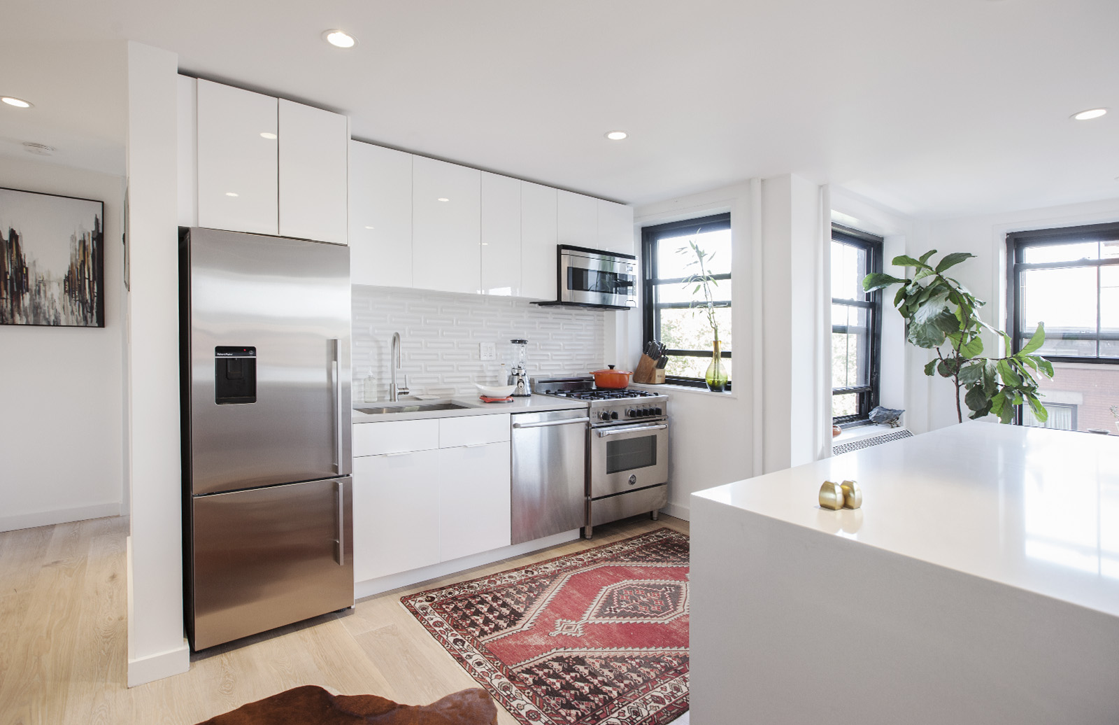
Opening up the kitchen and adding a new pass-through closer to the dining area made a huge difference. Their light-filled apartment was even brighter and sunnier now. In the kitchen, they brought in more storage by adding cabinets that went to the ceiling. They loved patterns and bold colors, but aside from the kitchen floor tile, the couple opted to save the patterns for easily changeable items like the wallpaper, rugs, pillows, and paint. As for choosing the navy shade on their cabinets, they felt the layout was classic enough that they could easily swap the door panels out for a new look, if they want it, in the future.
Their desk area had always existed in the kitchen, so when planning the new layout, it seemed natural to carve out an area specifically for this use. They found a desk that fit the opening perfectly and used wallpaper left over from the foyer to give it a more finished look. Sweeten brings homeowners an exceptional renovation experience by personally matching trusted general contractors to your project, while offering expert guidance and support—at no cost to you. Renovate expertly with Sweeten
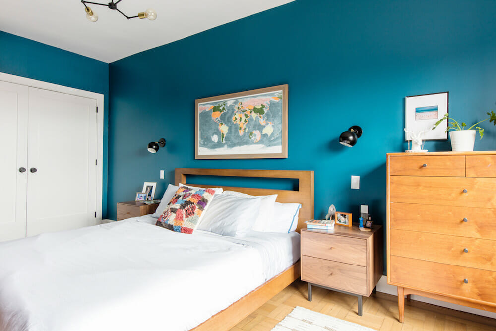
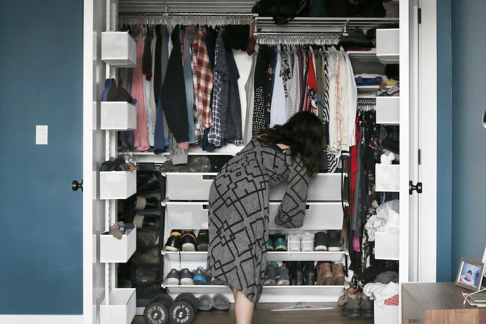
Storage was important in other rooms, as well. In the master bedroom, their Sweeten contractor suggested combining the two existing small closets into one large one with a custom closet system. A closet was added to the third bedroom, which now had space after moving the wall, as well as a custom system to one of the entry closets. “There’s a lot more functional space now,” Barbra said. “I even have some half-way empty dresser drawers. I wish I had done all the closets. Someday!”
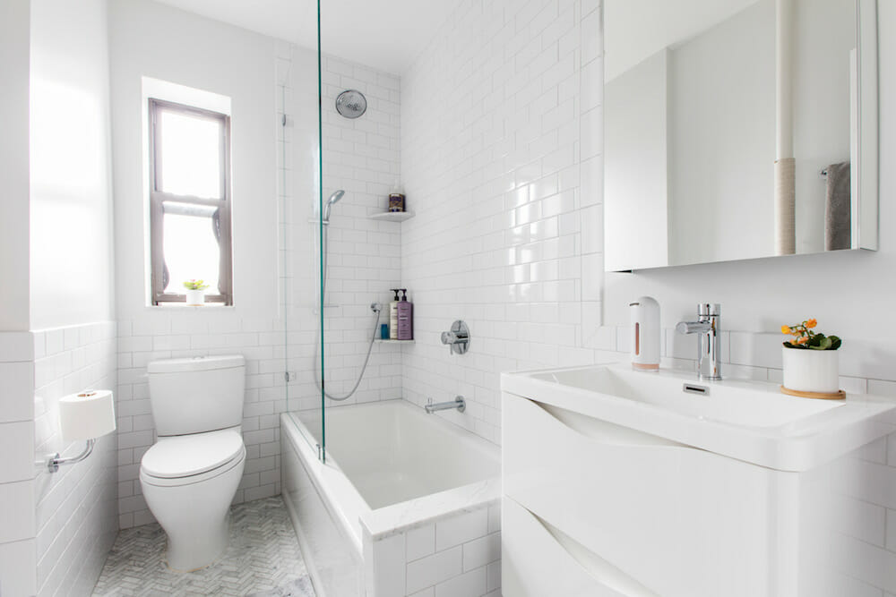
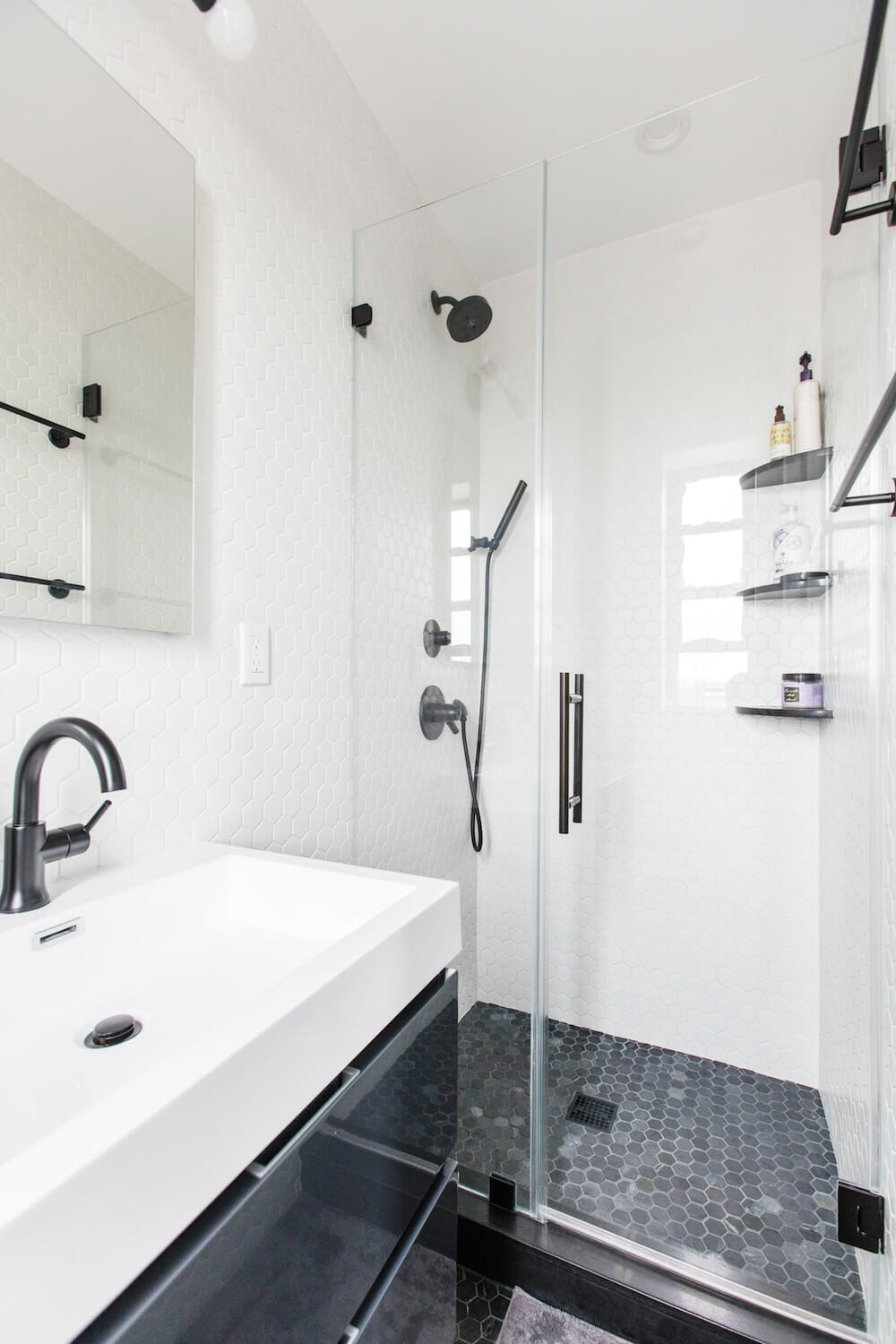
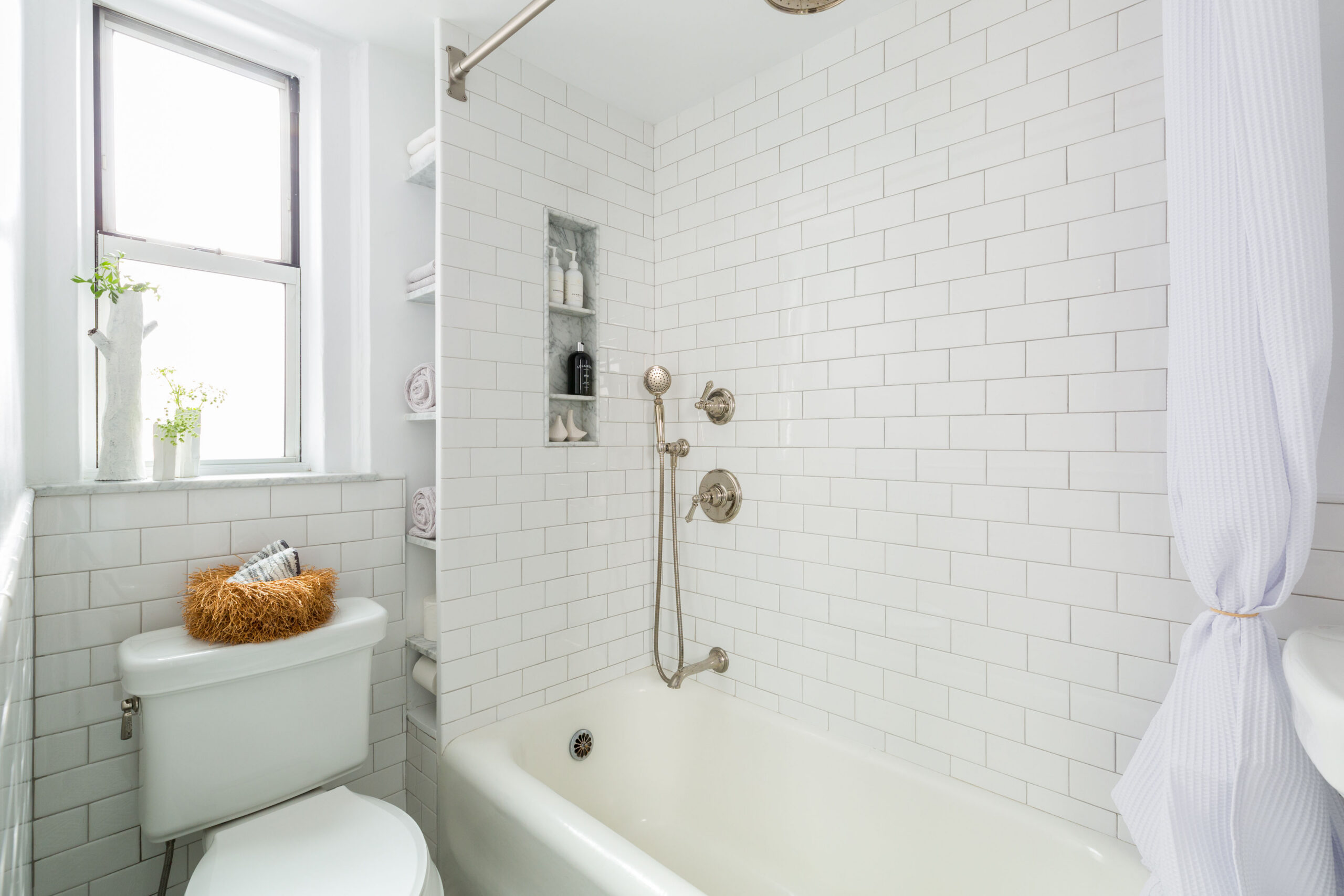
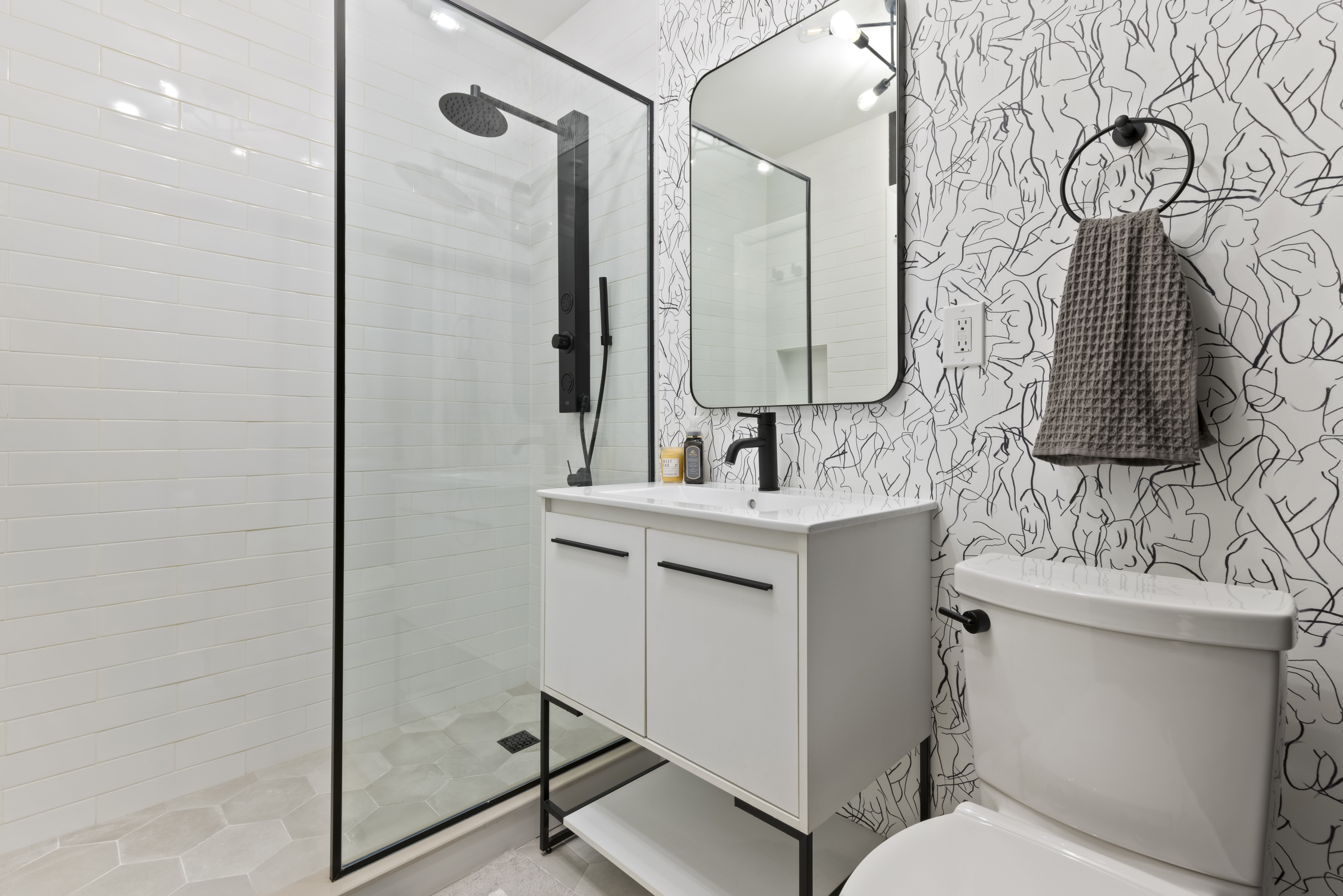
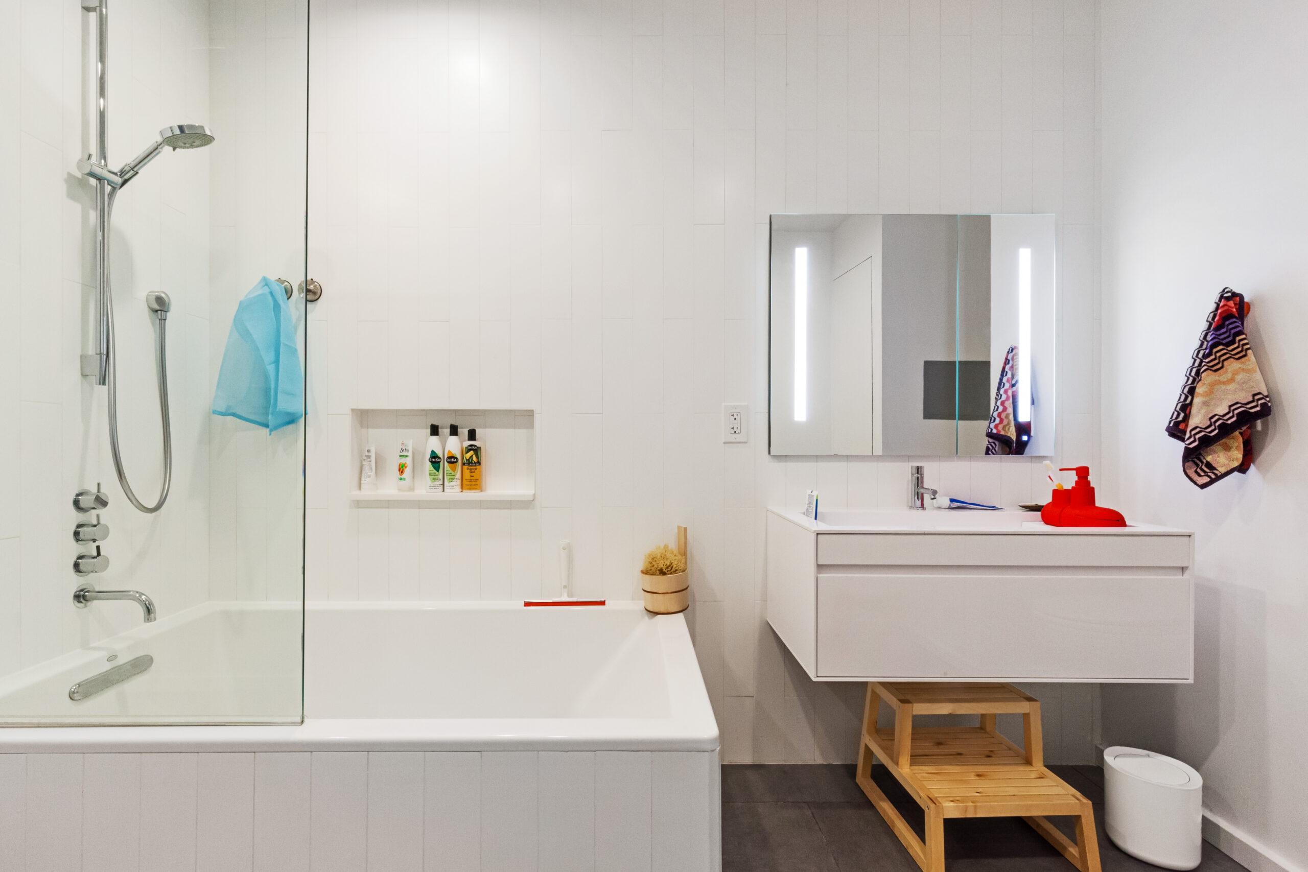
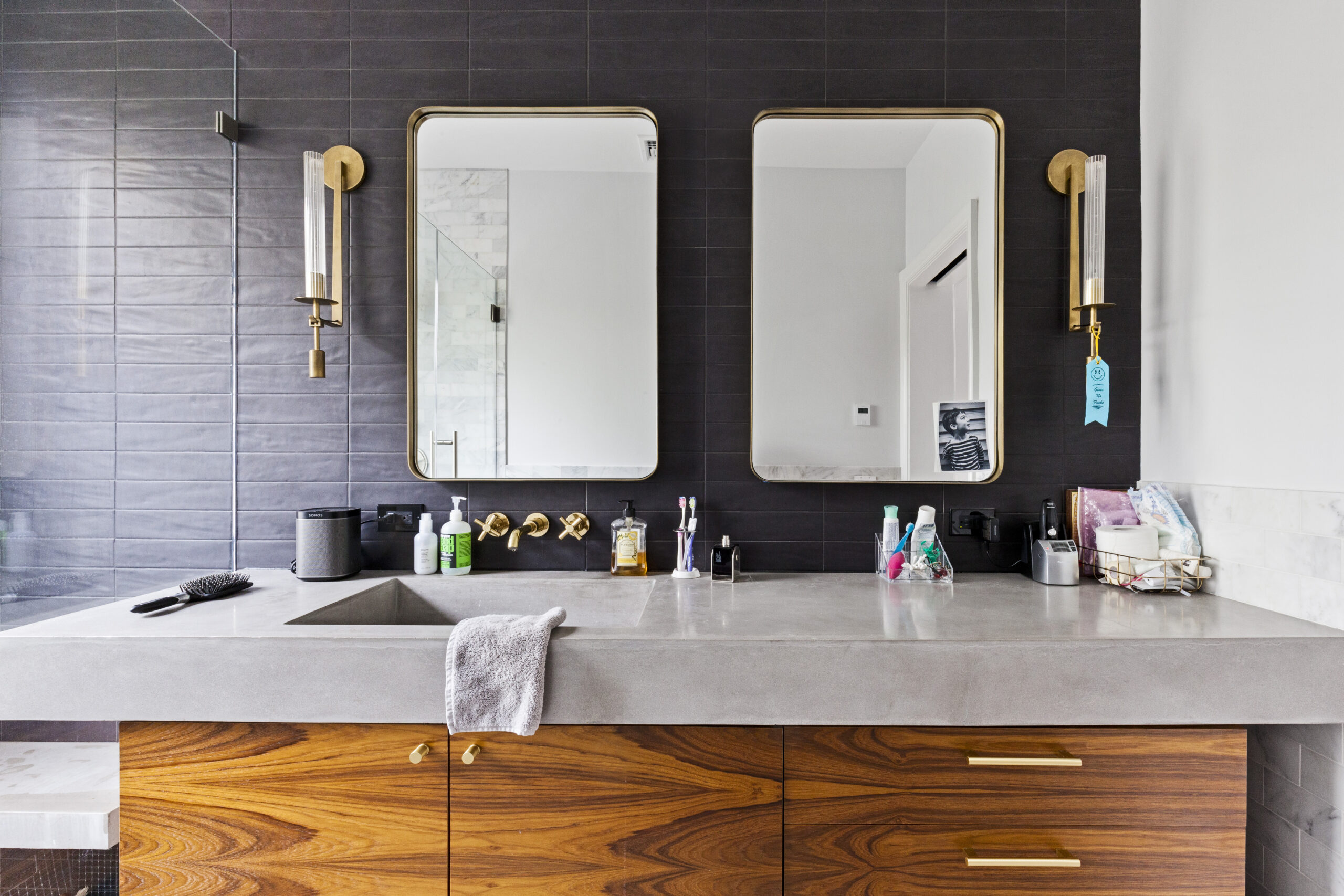
The other spaces that needed serious attention, of course, were the two bathrooms. They were falling apart and together made up one functioning bath: the master bath had a working shower, but the sink was broken and the second bathroom’s shower didn’t work but the sink did. The working shower had mold and a sinking shower pan. In the bathrooms, they focused on clean lines and classic tile in black/white/gray colors.
While researching materials, “Pinterest boards and Instagram were my friends. I started to find patterns with things that I liked and tagged—from tile patterns and blue color tones to exposed bulb fixtures and wood stain colors—which helped me come up with a style (if you can call it that) for the overall space,” she said. “It helped to have a clearer idea of the look I wanted to achieve with inspiration photos to refer to and show my contractor.”
They were also open to ideas from their contractor. They liked that their Sweeten contractor wasn’t a “yes-man” and offered more efficient alternatives to some ideas they presented. He gave them tips on what to splurge on (the custom closets and shower doors, tile) and what not to (custom cabinets) to help them stay within budget.
When they encountered a few bumps in the road, such as waste lines and interior pipes that needed replacement, a delayed vanity cabinet, and a broken dishwasher handle “he communicated with us right away and offered immediate solutions,” she said. “Not only was their work stellar, but they were all incredibly nice guys who gave valuable feedback and advice throughout the process. Every element of our home was done with care and with attention to detail.”
Everything now is clean, airy, and bright; it feels homey, Barbra reports. “I never wanted to invest in furniture and art because everything felt so temporary,” she continued. “Now that the space is renovated, I know we’ll live here for many years and can now take the time to invest in pieces that are right for it.”
Thank you, Barbra, Sean, Jack, and Clint, for sharing your renovation story with us!
LIVING ROOM/DINING ROOM RESOURCES: Salem chandelier in Aged Brass (in living room), Cypress 5-Arm chandelier in Brushed Satin (in dining room): Rejuvenation. Paint in Gray Owl: Benjamin Moore.
ENTRY/FOYER RESOURCES: Odyssey 2 Pendant lighting: Schoolhouse. Lines wallpaper in dark blue by Ferm Living: Burke Decor. Paint in Gray Owl: Benjamin Moore. Elfa custom closet: Container Store.
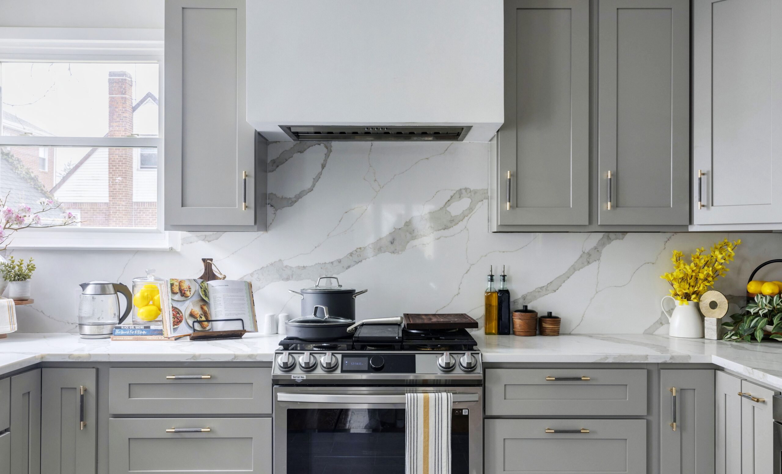
KITCHEN RESOURCES: Modulo 20-floor tile by Kerion, subway backsplash tile: Tiles by Kia, Long Island City, New York. Cabinets: Ikea base with Semihandmade doors. Cabinet hardware, Amerock Bars Pulls collection: Amazon. White quartz countertops: sourced by contractor. Havsen apron front sink: Ikea. Delta Trinsic faucet in Champagne Bronze: Build.com. Refrigerator: Samsung. Bosch 300 Series dishwasher: P.C. Richard & Son. Blomberg 30″Pro Gas Range, 30″ over-the-range microwave oven: AJ Madison. Lighting: Cedar & Moss. Paint in Brilliant White: Benjamin Moore. White lacquer shelves, Blake shelf brackets in aged brass: Rejuvenation. Mid-century mini desk: West Elm.
MASTER BEDROOM RESOURCES: Vega 5 chandelier light, Isaac short arm sconce: Schoolhouse. Paint in Slate Teal: Benjamin Moore. Elfa custom closet: Container Store.
MASTER BATH RESOURCES: Wall and floor tiles: Tiles by Kia, Long Island City, New York. Venus light: Cedar & Moss. Shower: Delta Trinsic via Build.com. Fresca Valencia 24″ wall-hung vanity in dark slate gray: Decor Planet. Toto Aquia toilet: Build.com. Shower door: Custom.
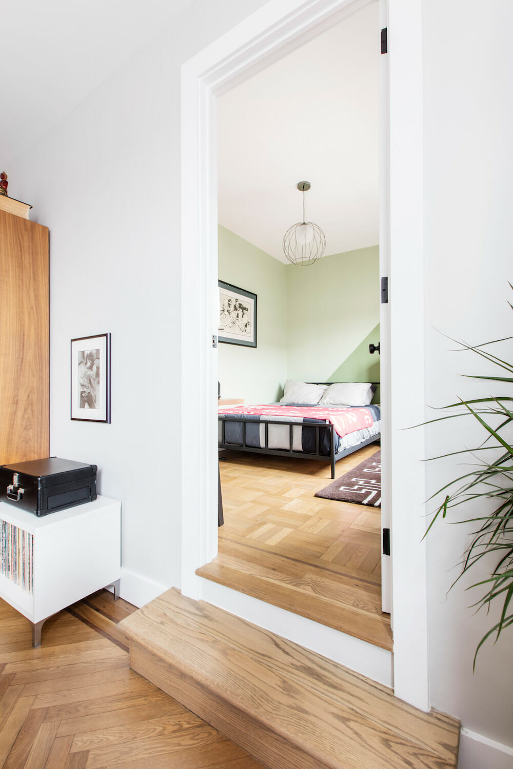
KID’S BEDROOM RESOURCES (GREEN): Cage brass globe pendant light: CB2. Paint in Land of Liberty (triangle) and Spring Valley (walls): Benjamin Moore. Shades: Blinds.com.
KID’S BEDROOM RESOURCES (BLUE/WHITE): Ferris 5 chandelier light: Lucent Lightshop. Paint in Utah Sky and Super White: Benjamin Moore. Shades: Blinds.com.
HALL BATHROOM RESOURCES: Marble herringbone floor tile, subway wall tile: Tiles by Kia, Long Island City, New York. Grohe Europlus shower fixtures, Grohe Essentials Collection hardware, Toto Aquia toilet, 24″ Kohler Verdera medicine cabinet, Kohler Archer soaking tub, Kovacs Saber 2-light fixture: Build.com. Maykke 24” wall-mount Eva vanity sink set: Amazon. Paint in Pure White: Benjamin Moore. Shower door: Custom.
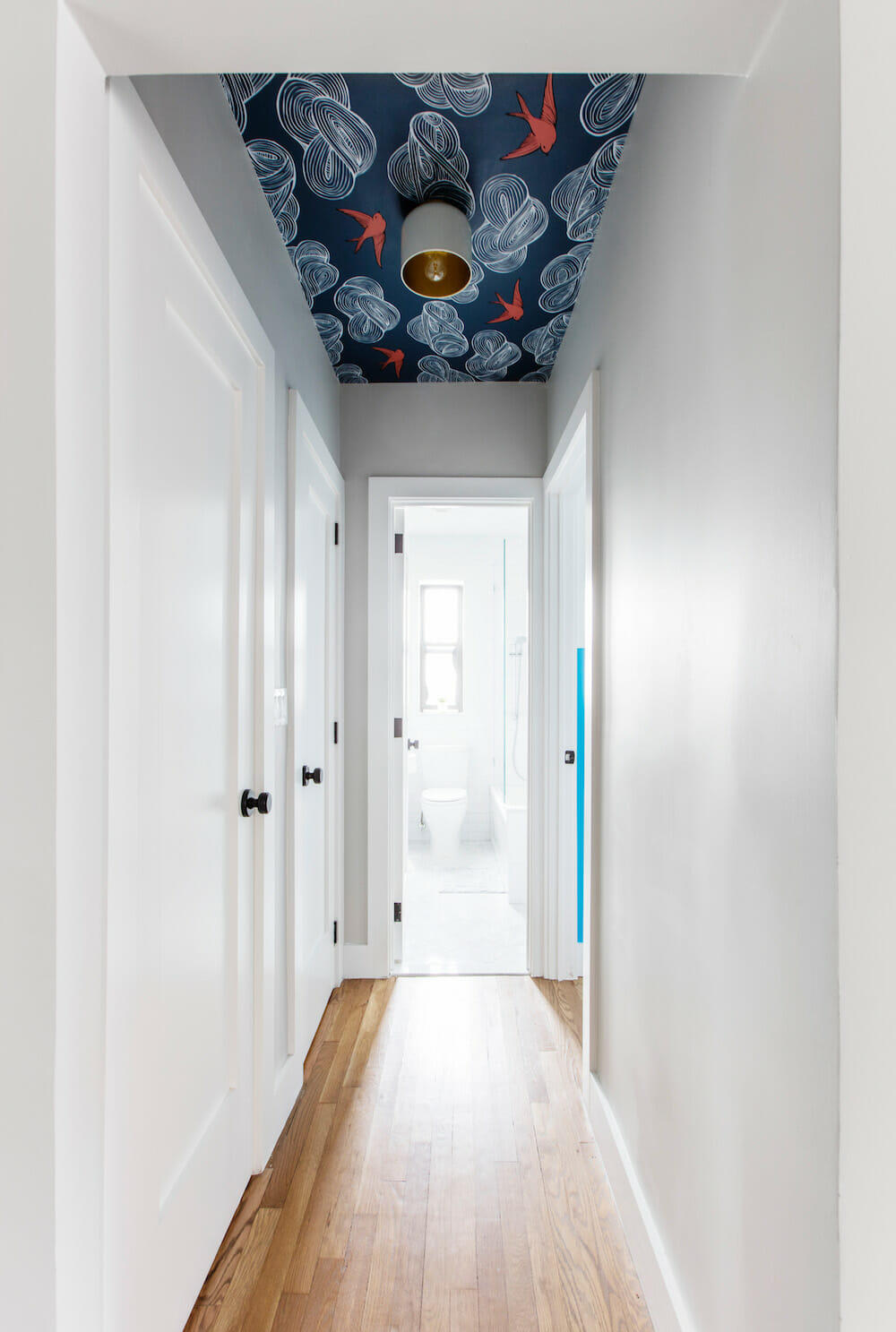
SMALL HALLWAY RESOURCES: Bell white flush-mount light: CB2. Daydream wallpaper in indigo: Hygge & West.
THROUGHOUT APARTMENT RESOURCES: Trim/baseboard/door paint in Super White: Benjamin Moore. Schlage Bowery F Series doorknobs, #F40BWE622 in matte black: Build.com. Floor stain in Weathered Oak: Minwax. Decorative rugs: Rajbespoke.
–
Sweeten helped Marie and John with their “aging-in-place” co-op renovation in Kensington, Brooklyn.
Sweeten handpicks the best general contractors to match each project’s location, budget, and scope, helping until project completion. Follow the blog for renovation ideas and inspiration and when you’re ready to renovate, start your renovation on Sweeten.
