A Work Triangle Sets off a Renovation
A couple’s childhood memories influence a kitchen’s design
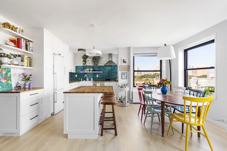
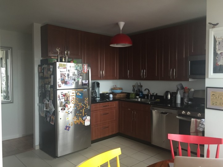
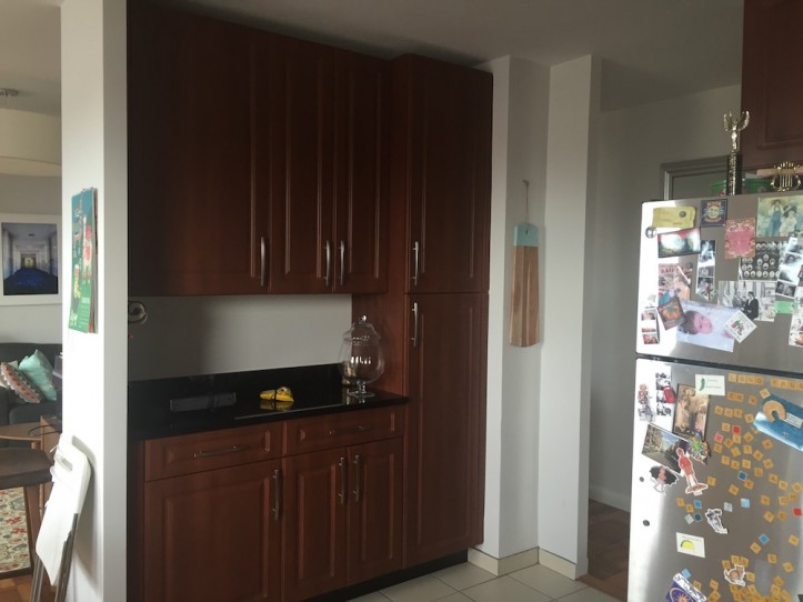
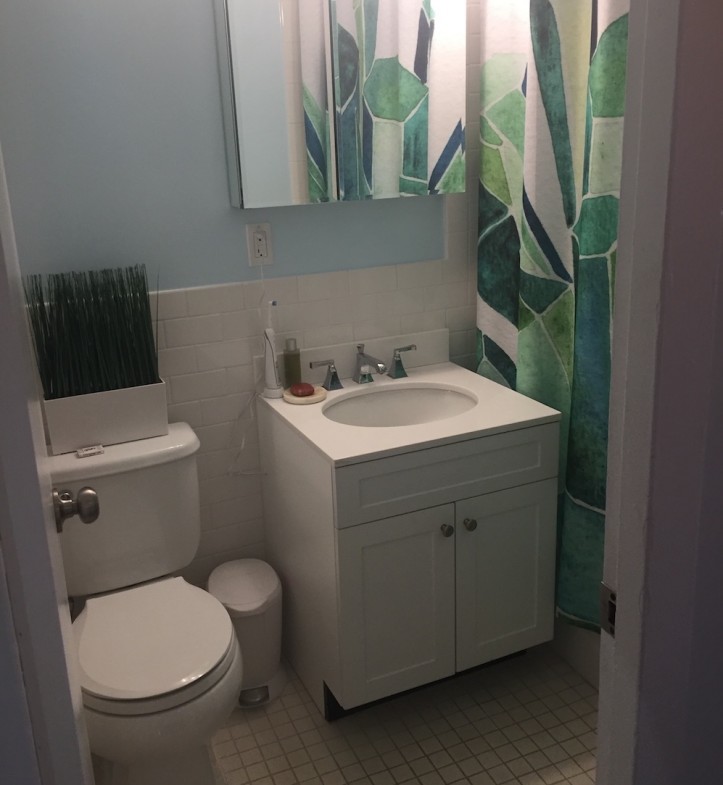
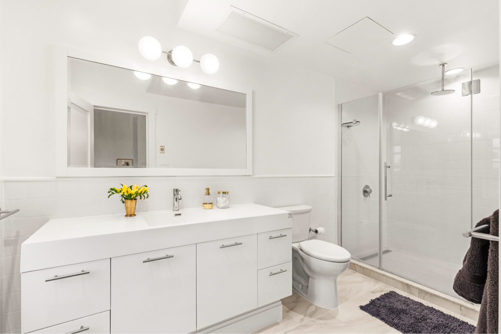
The homeowners bought their 1940s, two-bedroom co-op—their first as a couple—in Brooklyn a year before they set off on their renovation journey. It had lovely natural light from generous windows and the elevation made for spectacular views of the city, but with a dark, dreary decor and inefficient layout, it wasn’t putting its best foot forward. Although 1,100 square feet is a decent amount of space by NYC standards, the apartment didn’t feel very open, in part due to a cabinet area and wall separating the kitchen from the living room. The small bathroom, with dull tiles that clashed with baby blue walls, also needed a makeover.
Throughout that year of feeling out the space, the couple began to dream of the possibilities. They paid special attention to how others in their building had renovated their apartments. Pinterest, Instagram, and the Sweeten blog also provided endless inspiration. When they were ready to jump into the project, they posted on Sweeten, a free service connecting homeowners with vetted general contractors, and landed on a contractor who was able to counsel them through their many options, eventually identifying what mattered most to them in a home. Ultimately, they wanted an open space conducive to both cooking and hanging out in, with extra storage for books.
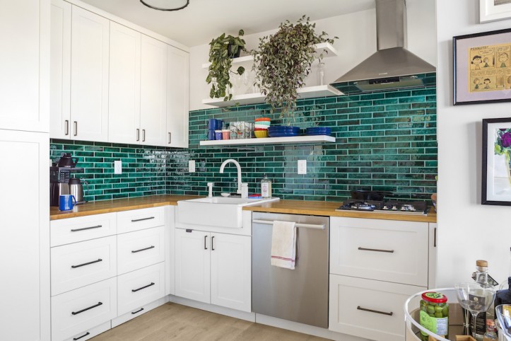
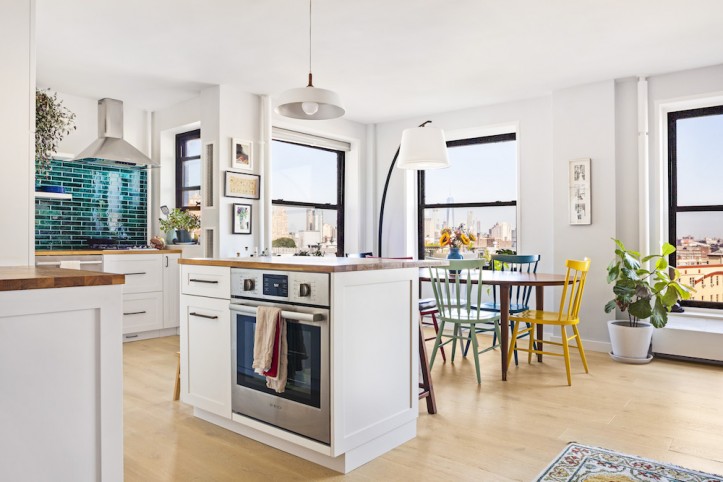
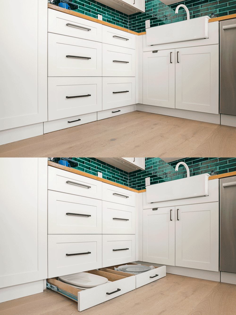
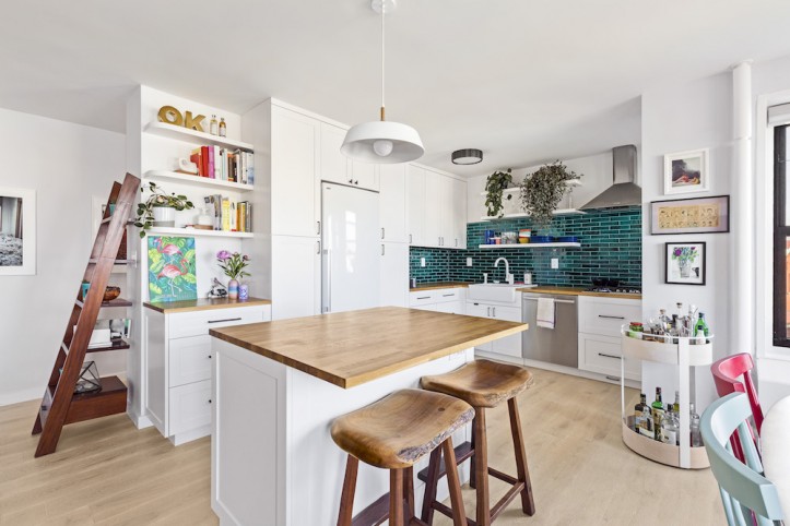
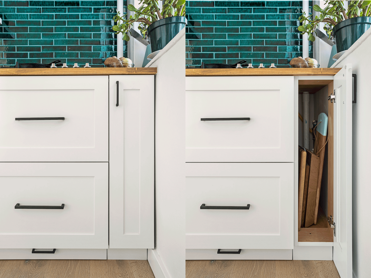
Both of them grew up with a kitchen island and saw it as a design element that people always gravitate toward. “The island makes cooking together more fun. There’s more space for meal prep and now we can admire the city skyline view while we pull dinner together,” she says. Not to be bound by convention, the homeowners decided to separate the range and the oven. The range—replaced by a cooktop—remained in the same place, but an electric oven moved to the island. The new layout created a work triangle of range, sink, and island for a better workflow. The toe kick space-saver idea was inspired by Martha Stewart. “As with most things, it turns out Martha was right!” said the homeowner.
Sweeten brings homeowners an exceptional renovation experience by personally matching trusted general contractors to your project, while offering expert guidance and support—at no cost to you. Renovate expertly with Sweeten
The couple, who both work in the art world, harnessed their creativity for the project. When they spotted the deep green shade of color on a tile website, they were hooked. Once the backsplash tile was paired with Ikea’s butcher block and simple white cabinets, the whole look came together. “The watercolor tile catches the light beautifully and actually feels like it changes color depending on the time of day,” says the homeowner. The open shelves played a big role: they held cooking essentials, making cooking easier; unloading the dishwasher was more convenient; bowls in bright colors and plants were displayed adding to the pop of hue; and what better way to show off the green tile?
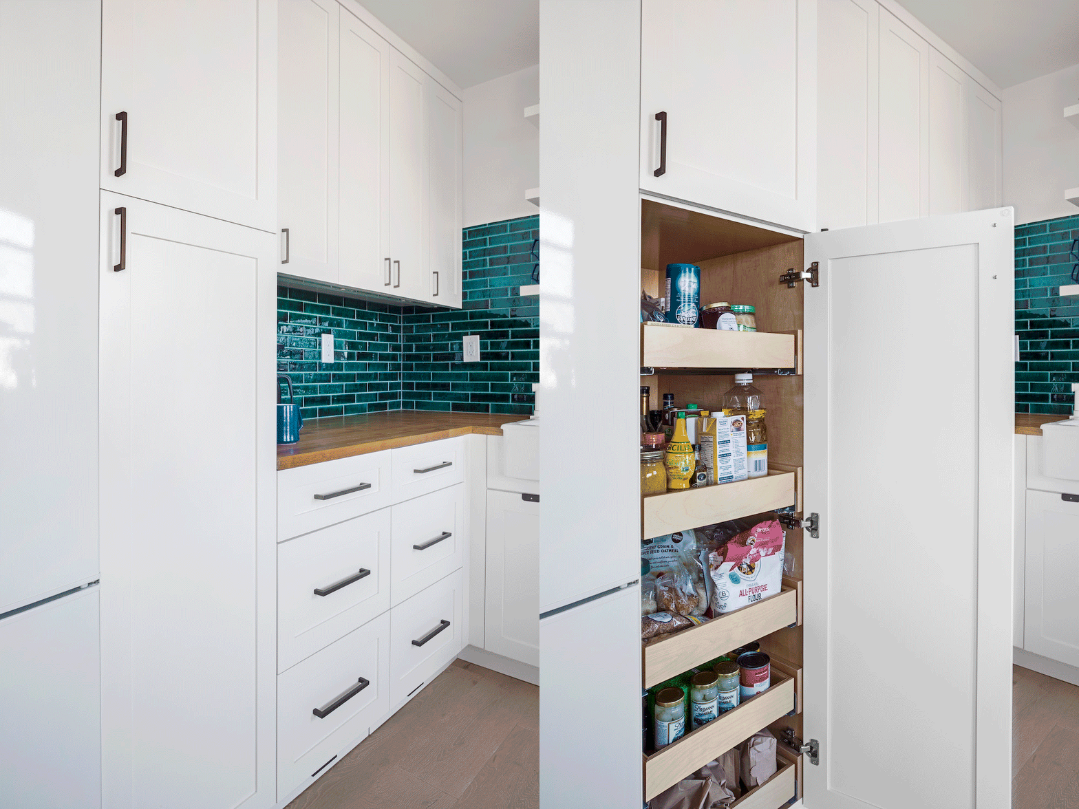
Another bonus was creating drawers under the cooktop to conveniently store pots and pans. Their previous cabinets were shallow at 11.5″, causing the chipping of many plates when shutting the doors. Deep cabinets were a must.
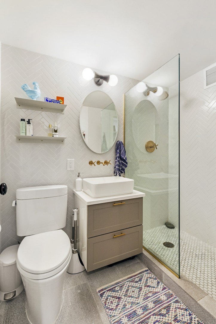
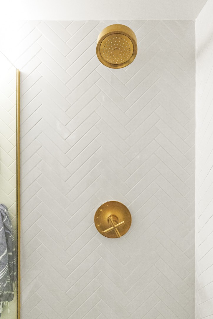
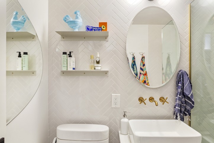
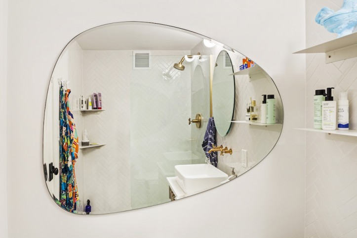
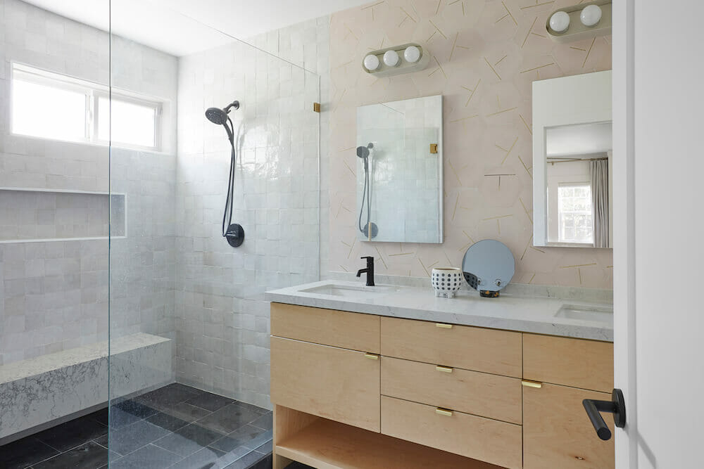
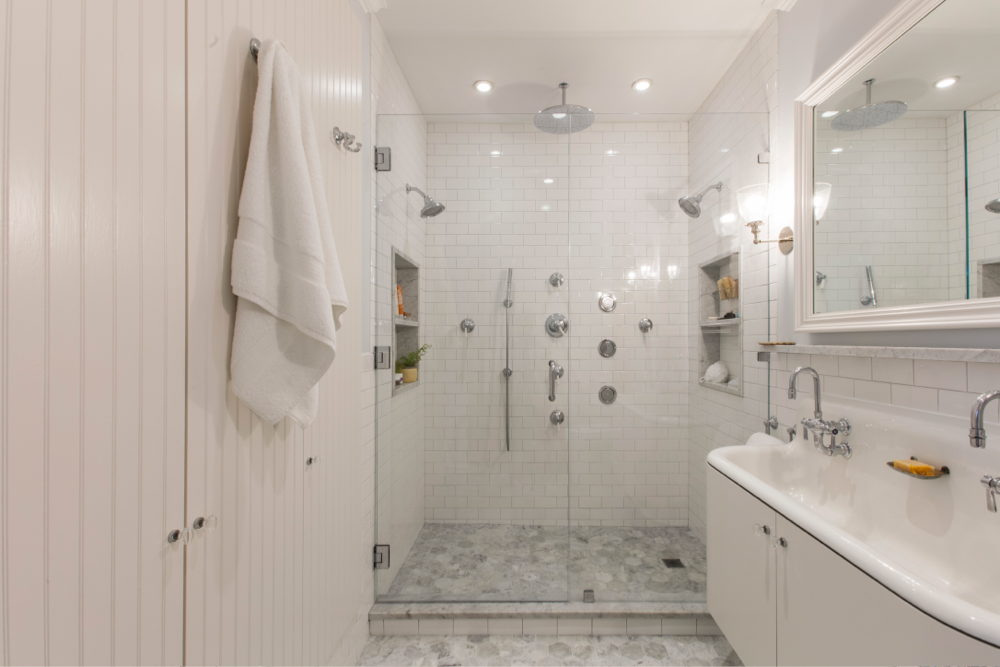
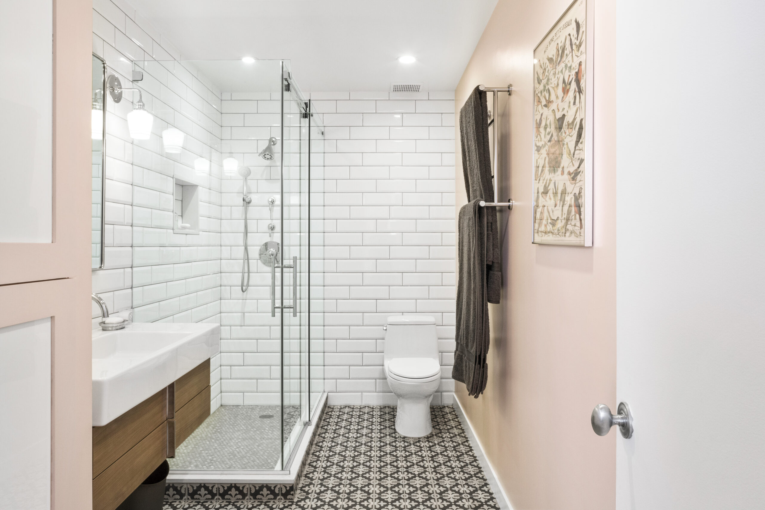
The bathroom was a typical size: small but functional, with a shower/bath combo. There was a debate over whether the tub should stay. Thinking back to previous apartments and realizing neither had ever used the bath was the deciding factor—the tub was out. They used subway tile in a pattern to give the walls some texture. Dramatic gold hardware quickly became a favorite design choice. Their former bathrooms had always had chrome or silver features, but their bold choice of gold paid off.
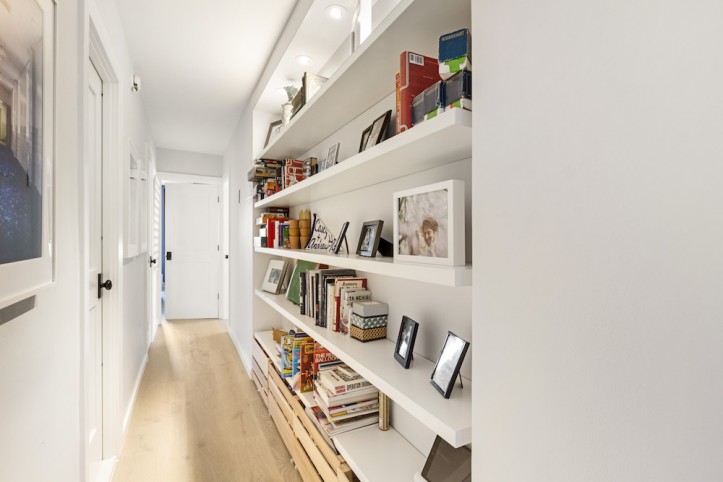
To keep up with an ever-growing collection of books, the couple lined their hallway with built-in bookshelves based on an idea they saw on the Sweeten blog that their own contractor had done. This triggered sacrifices elsewhere; specifically, it meant widening the hallway by about ten inches, which had to come off of the kitchen square footage. The advantage was the hallway also extended past the fridge, giving back a bit more shelf and counter space. With open shelving for the books, the couple installed lights on the top shelf, which more than compensate for the lost light in the hallway from extending the kitchen wall.
The couple was in constant contact with their Sweeten contractor throughout the project, talking several times a week and stopping by often to see the progress. It was a little nerve-racking to be spending so much money on something that wasn’t always 100 percent guaranteed to work, like the green backsplash tiles or the gold features in the bathroom. Other final touches, such as “getting the vent hood in exactly the right spot” and positioning the towel hangers correctly, were stressful. Their patient contractor, however, coached them through the process and deadlines and if something went awry, helped to get the project back on track. They were very happy with how the renovation turned out.
One last piece of advice from the homeowners: “Measure all your cookware, and then use those measurements to design your kitchen cabinets. It made us feel a little OCD to do this, but it really paid off.”
KITCHEN RESOURCES: Kitchen cabinets: Custom-made by their contractor. Cabinet hardware: Schoolhouse. Countertops: Ikea. Backsplash: Artistic Tile. Domsjo sink: Ikea. Faucet: Rubinet. Summit refrigerator: Home Depot. Bosch 500 dishwasher. Bosch 500 electric wall oven: AJ Madison. Verona 24″ gas cooktop: Amazon. Broan vent hood: Home Depot. Lighting over island: Wayfair. Lighting under cabinet: Home Depot. Caden lighting overhead: Restoration Hardware.
BATHROOM RESOURCES: Floor tiles: Artistic Tile. Wall tile: Home Depot. Purist hardware and shower fixtures: Kohler. Vanity mirror: Wayfair. Kraus vessel sink: Build.com. Vanity: Ikea. Vanity door fronts: Semihandmade. Toto toilet: Wayfair. Lighting: Cedar & Moss. Shelves and towel hooks: Schoolhouse. Mirror: CB2.
—
A work triangle improves the flow in any size space, including this food editor’s smart galley kitchen.
Sweeten handpicks the best general contractors to match each project’s location, budget, and scope, helping until project completion. Follow the blog for renovation ideas and inspiration and when you’re ready to renovate, start your renovation on Sweeten.
