A Modern Gut Renovation Goes Scandinavian Chic
First-time renovators, bracing for a nightmare, end up with a heavenly home in Queens
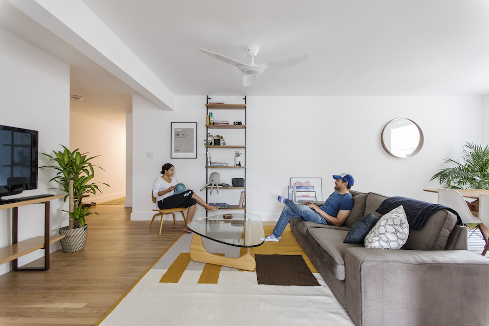
- Homeowners: Homeowners Maria and Eric posted their Queens co-op renovation on Sweeten
- Where: Woodside, Queens, New York City
- Primary renovation: Opening up the kitchen, updating kitchen and bathroom, and refinishing the floors
- Sweeten’s role: Sweeten matches home renovators with vetted general contractors, offering input, support, and up to $50,000 in renovation financial protection—for free.
Brightening up the space
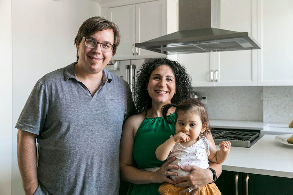
Racing to line up an ambitious renovation before closing on a dated co-op in Woodside, Queens, Maria, a financial reporting director at a major media company, and Eric, the owner and Creative Director at broadcast design studio General Idea, expected “pain and horror” as first-time renovators. They’d linked up with an architectural designer and came to Sweeten to find a general contractor to overhaul all 850 square feet of their new two-bedroom apartment.
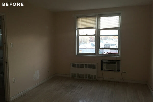
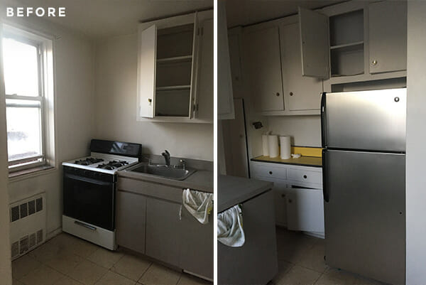
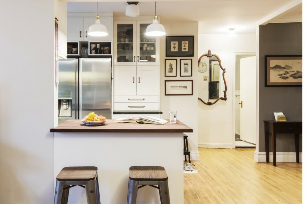
Some of the finishes were just plain uninspired, while other layout and fixture details limited a more holistic use of the space. Laminate counters and discolored floor tiles anchored the kitchen, warped cupboards demanded a good nudge to shut completely, and the small bathroom’s ornate pedestal sink went way overboard on frilly decorative details while way under-delivering on countertop real estate.

Creating a team
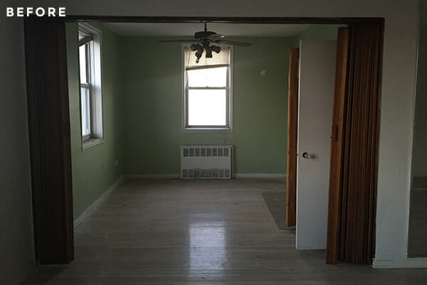
The main goals were pretty straightforward: open up the enclosed kitchen to the living room, update the kitchen and bathroom, and refinish the floors. Still, their designer, Vida, brought three critical points of view to the project. One was technical and practical: to limit work to the existing structural and plumbing layout so that the crew could focus on visible details that mattered most. The second was connectedness: Vida posted the project on Sweeten to find local contractors matched to the project’s budget and scope, freeing her up to focus on design solutions. And the third was creative: clean design details and a minimalist style found in matte finishes, simple profiles, and rich walnut wood warmth. They were matched with their Sweeten contractor for demolition, rebuilding, and craftsmanship detail down to the new doorknobs.
A gallery kitchen
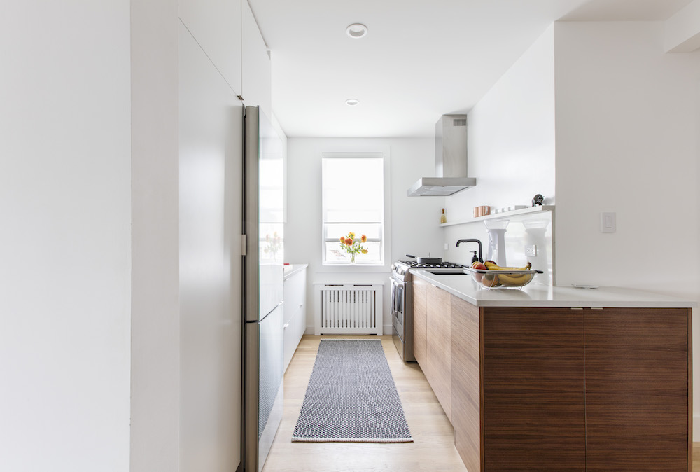
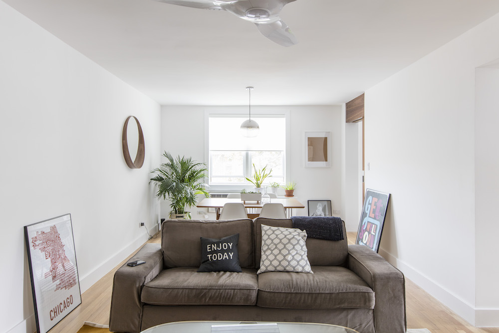
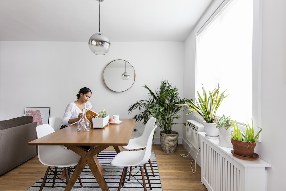
Maria and Eric wanted an open, bright space with clean lines. They had drawn up a 3D model on their own to convey big ideas, and worked closely with Vida to fine-tune, leaning toward Scandinavian sensibilities with some mid-century modern touches.
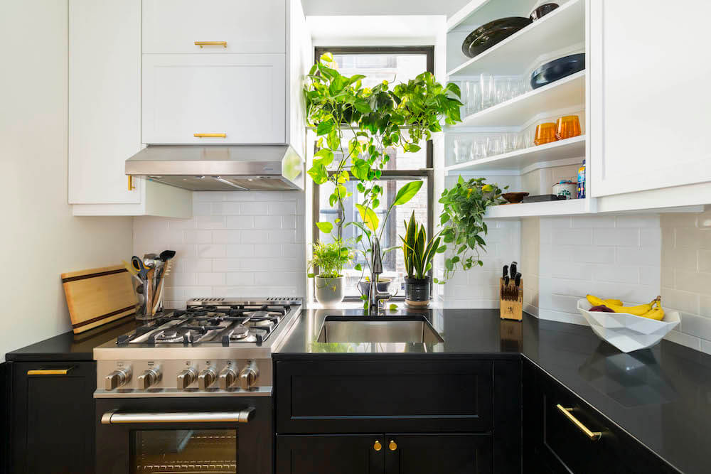
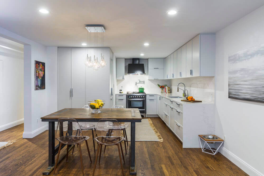
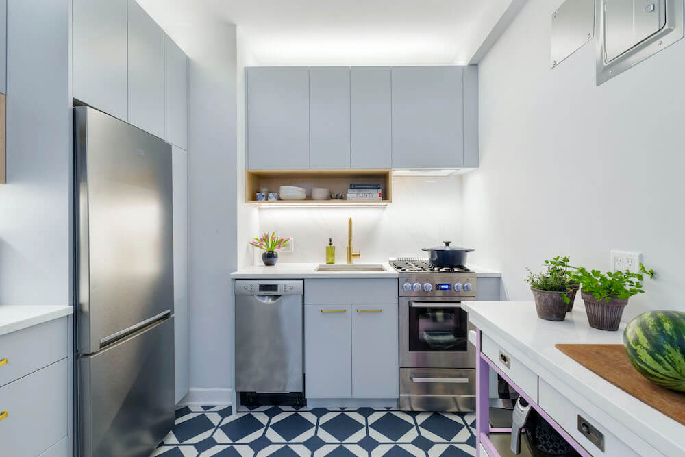
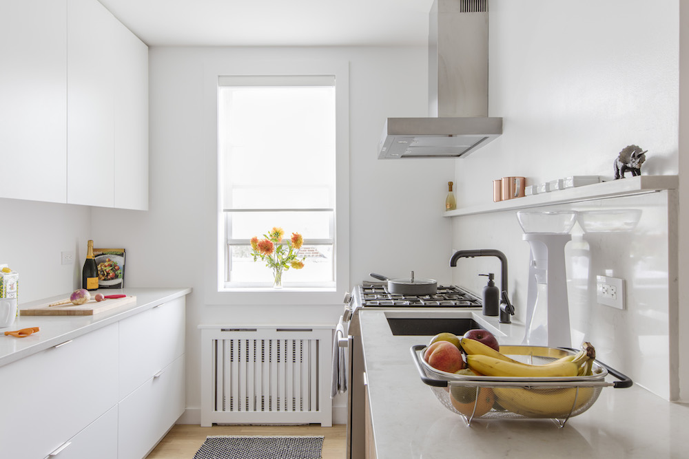
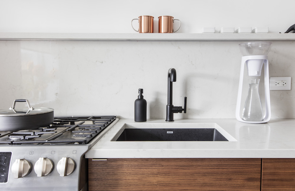
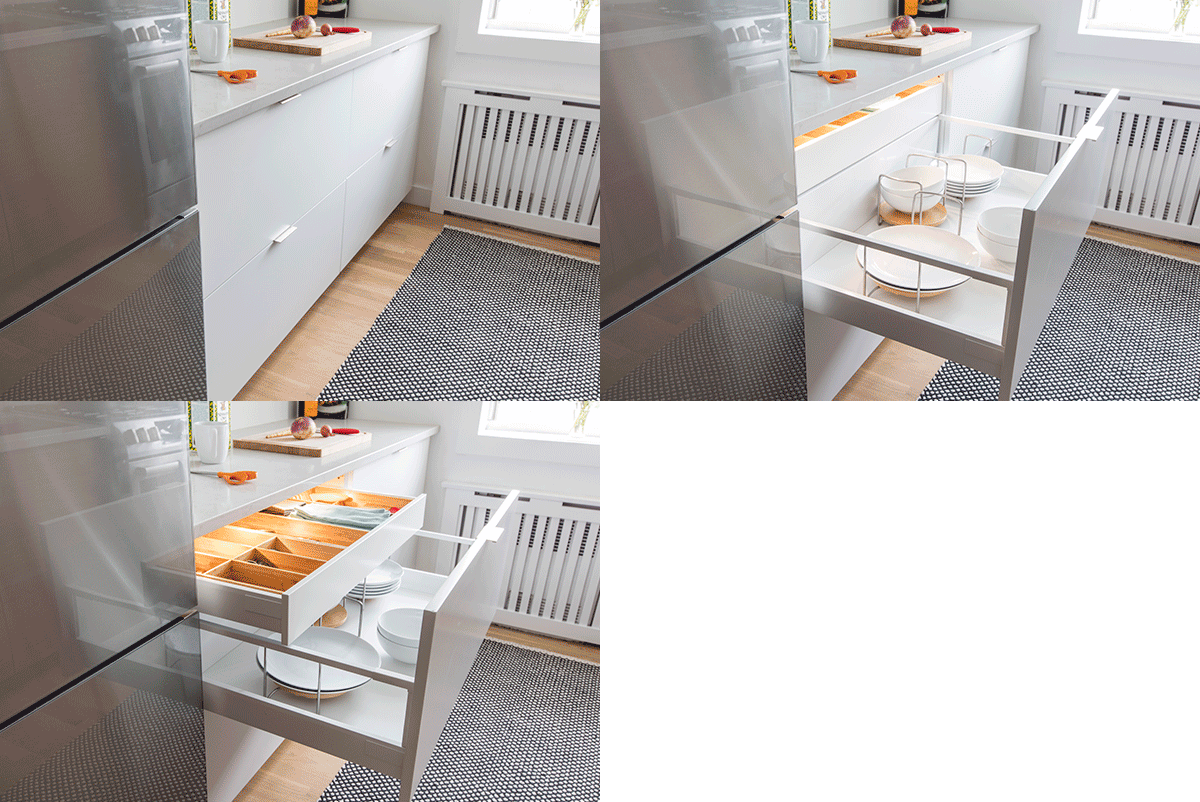
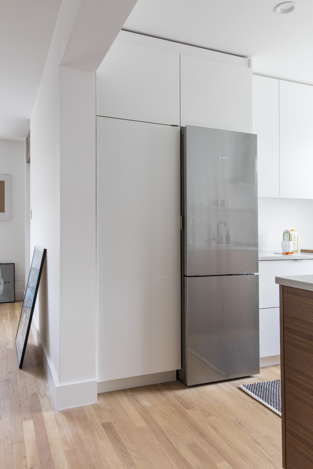
Their contractor’s team took on the kitchen wall, which sectioned the galley kitchen off in its own corner. To give Eric and Maria the open feeling they wanted, the designs called for approaching the two galley walls strategically. On one side, countertop prep space takes the lead, wrapping around the kitchen wall and extending into the living room with low walnut cabinet storage. Skipping the usual line of upper cabinets in this spot helps keep the living room open through to the kitchen’s window. On the opposite wall, full-height cabinets concentrate storage but still keep a low profile with matte white finishes and concealed hardware. The stainless Bosch appliances and a striking black sink and faucet combo star in this otherwise simple space.
Sweeten brings homeowners an exceptional renovation experience by personally matching trusted general contractors to your project, while offering expert guidance and support—at no cost to you. 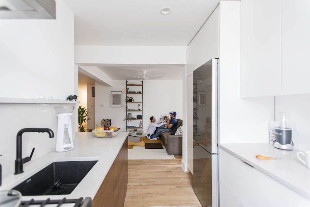
Renovate expertly with Sweeten
Making a space space feel bigger
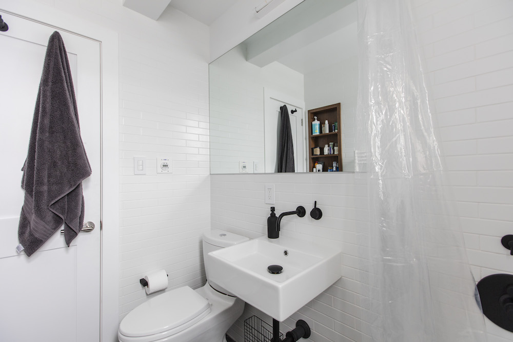
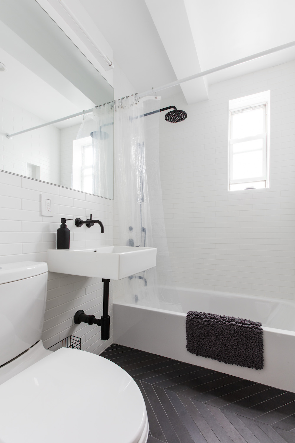
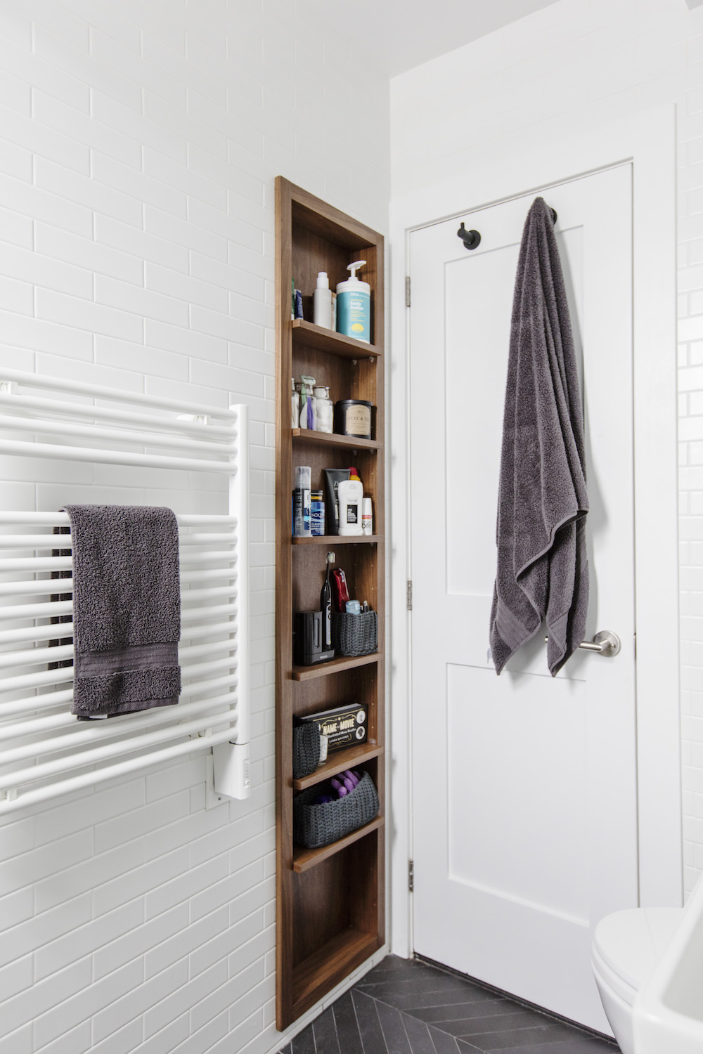
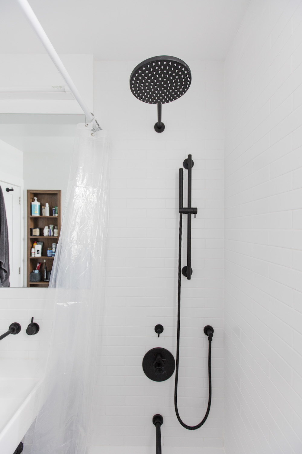
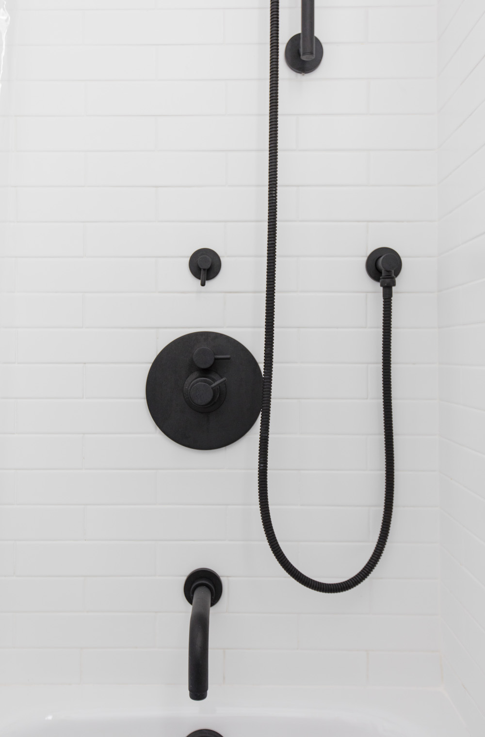
The bathroom’s small footprint led the team to focus on storage solutions and a simple palette. High contrast black and white materials, a frameless mirror, matte black plumbing fixtures (even under the wall mount sink!), and recessed wall storage gave Eric and Maria a bright and uncluttered retreat. The floor tile was admittedly a splurge, but with just a few square feet of coverage needed, it made sense to focus a high-end finish in that small spot.
Updated floors
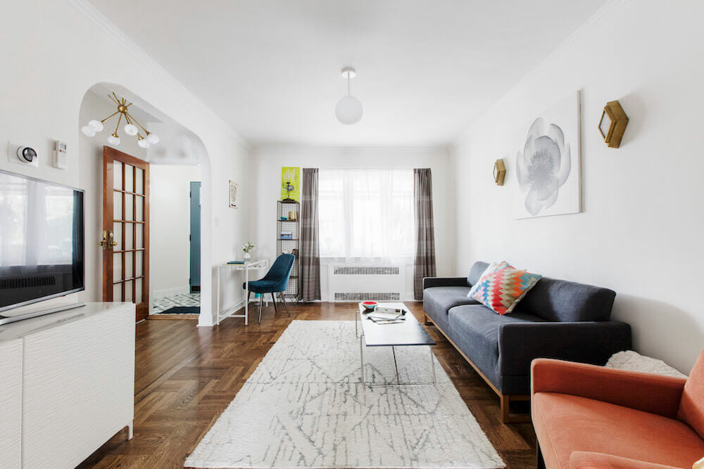
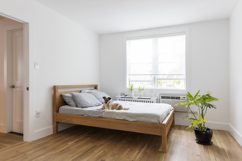
In the living room and bedrooms, the team stripped walls and focused on restoring the existing wood flooring. Getting the floors right was a challenge. Aiming for a serene, matte oiled finish required the team to strip the previous stain and try out a few approaches with a new topcoat. The new finish, a layer of natural sheen, is an updated take on the original material.
Bumps in the road
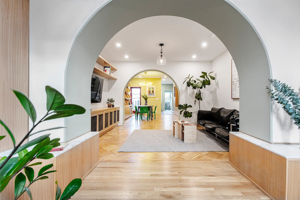
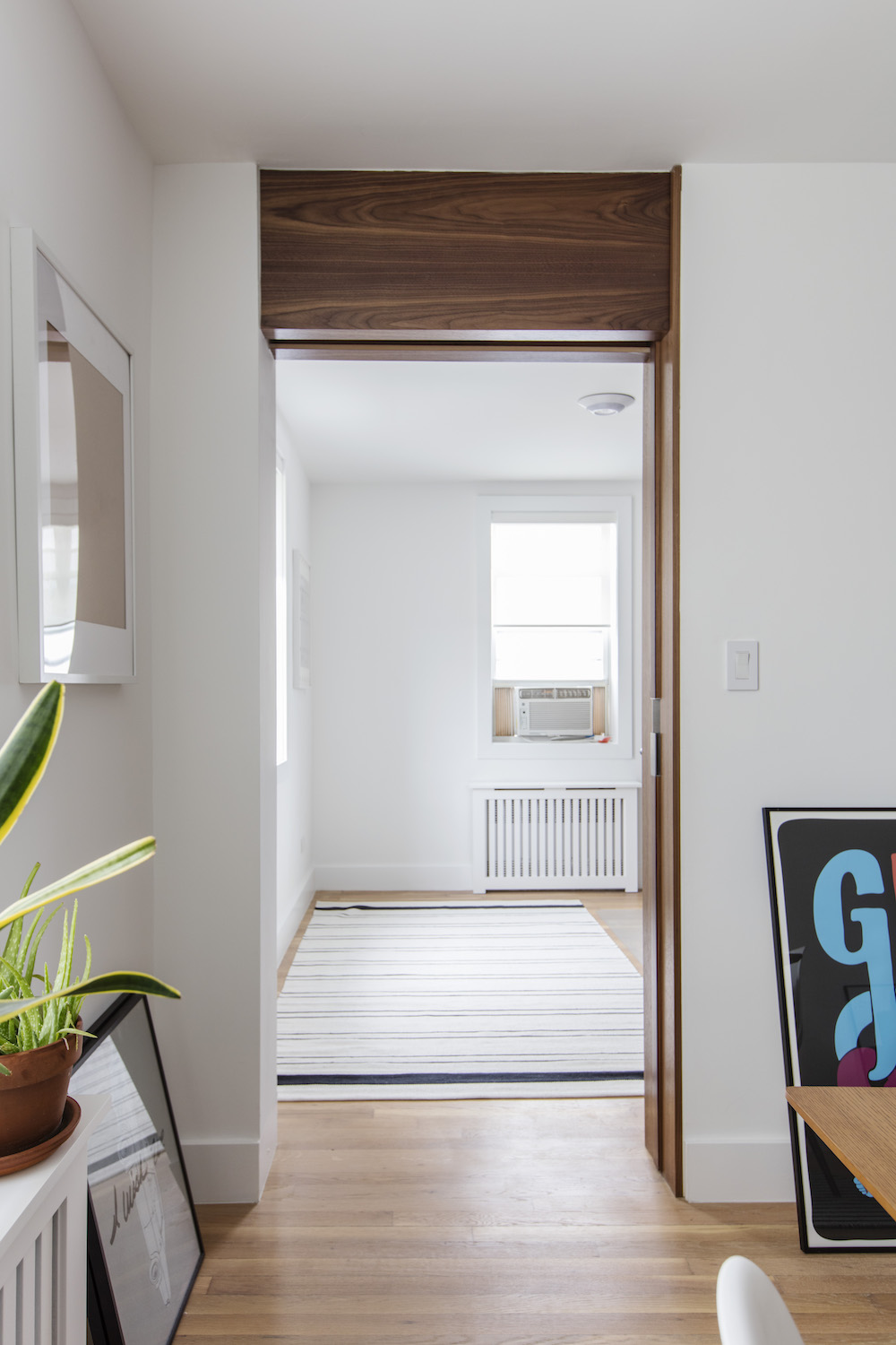
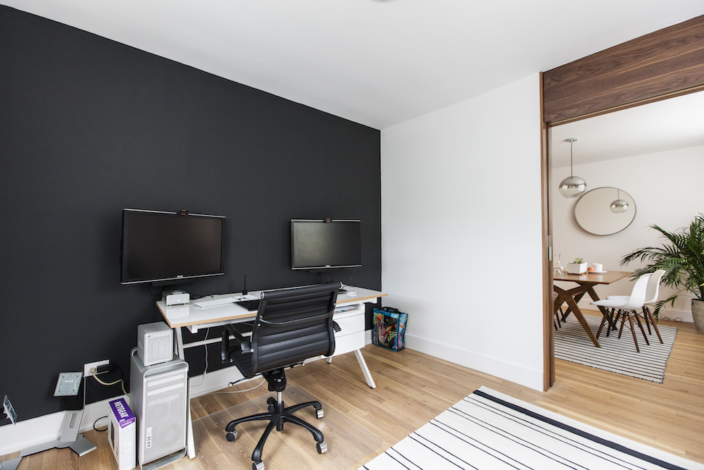
Maria and Eric planned to use the second bedroom as a home office and needed to reframe the entry to open it up to the living room. The custom pocket door is their favorite design detail, a necessary addition after finding an unexpected structural beam which could have prevented the plans for a floor-to-ceiling entry. Vida suggested encasing the beam in walnut, with an asymmetrical line. It’s a beautiful and unique solution that helps tie in design touches from each room.
Behind the scenes
With their expert team in place, Maria and Eric found that communication was key. They had detailed conversations about measurements, finishes, and placement prior to work starting, saving time and headaches. Their contractor’s team helped keep the project on track and were key partners in addressing issues that came up as work progressed. Vida kept balance and prioritization top of mind to negotiate cost, quality, and lead times.
And behind the scenes at Sweeten, we saw in-progress photos of those show-stopping black fixtures when the Sweeten contractor checked in with updates throughout the project (with Queens cheesecake hand-delivered on a visit to our offices!). What a complete treat for us to be able to show off all of this beautiful finished work!
Renovation materials
KITCHEN RESOURCES: Cabinets: IKEA. Cabinet doors: custom walnut. Countertop, backsplash, and open shelf: Caesarstone. Blanco sink: Blanco. Kohler faucet: Kohler. Bosch fridge, dishwasher, stove: Bosch
BATHROOM RESOURCES: Floor tile: Mutina Mews. Chevron wall tile, matte white subway tile, door hardware: Omnia. Stainless steel levers, faucet, and shower fixtures: California Faucets. WS bath white ceramic sink: WS bath: Toto toilet: Toto.
OTHER RESOURCES: Office door: custom pocket door. Flooring: White oak. Flooring finish: Rubio Monocoat
—
Sweeten handpicks the best general contractors to match each project’s location, budget, scope, and style. Follow the blog for renovation ideas and inspiration and when you’re ready to renovate, start your renovation on Sweeten.
