A Greenwich Village Loft Gets a Makeover
A flexible, sunny space makes a happy home—and a good investment
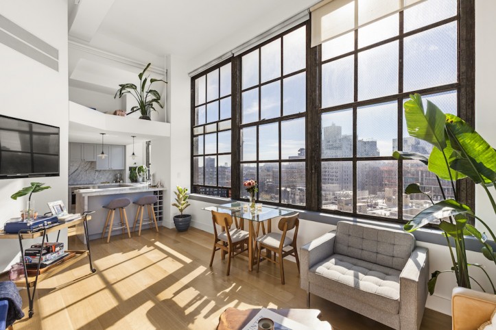
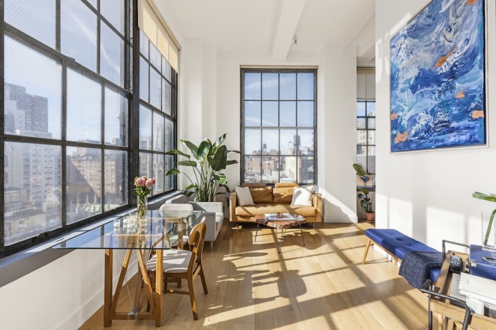
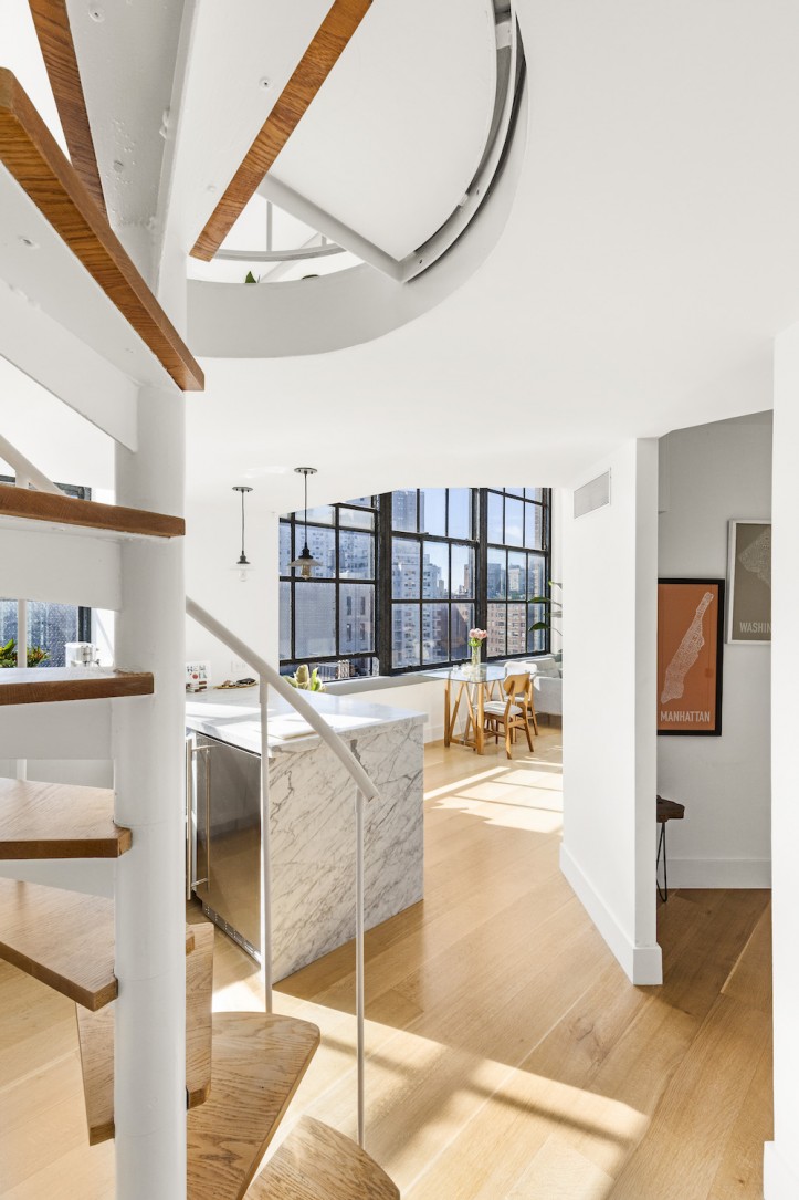
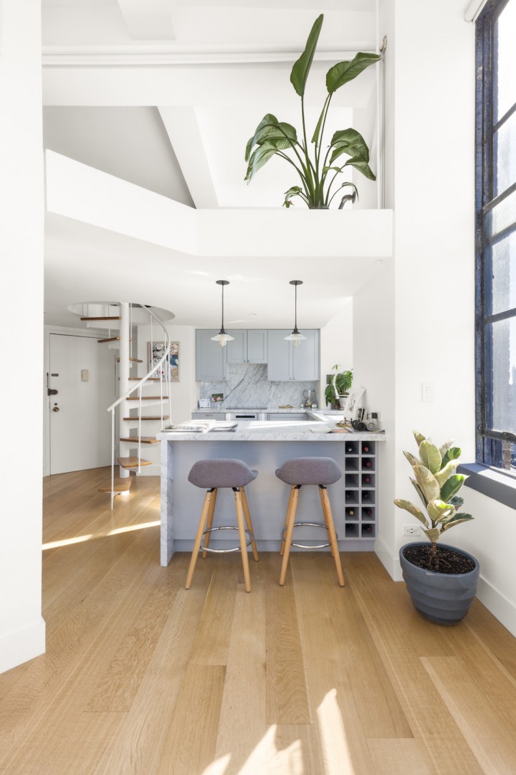
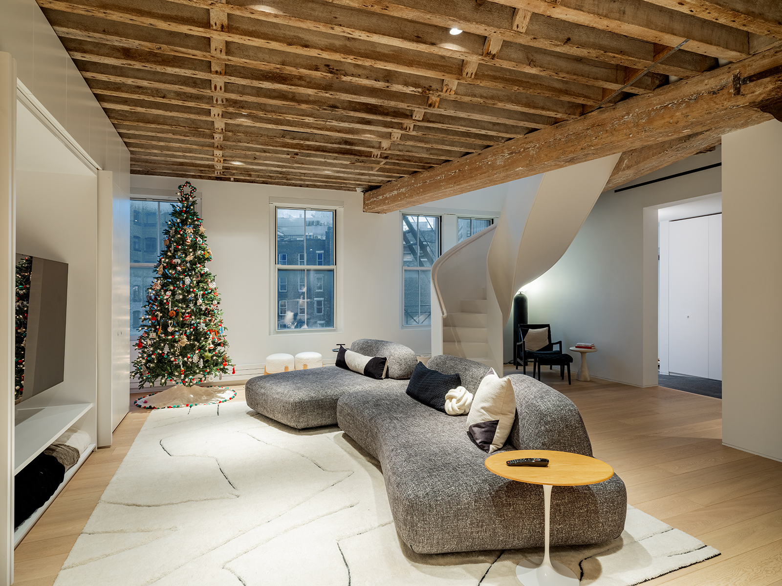
It was brimming with potential: a corner, prewar loft on a main street in Greenwich Village. The apartment took full advantage of its southern and western exposures with oversized, industrial windows that wrapped around two sides of the loft. Much of the space was open-plan with 14-foot-high ceilings; a mezzanine above the kitchen is accessible via a charming spiral staircase and can be used as a guest bedroom or home office.
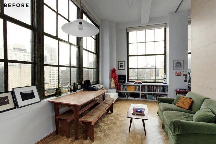
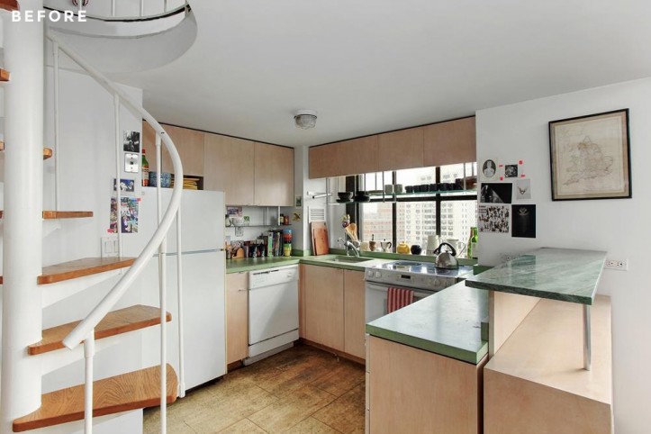
The homeowner saw an opportunity to add value to the apartment by taking advantage of its structural beauty and abundant natural light. The building was converted in the late ’70s from an industrial manufacturing space into residences and the unit had been relatively untouched since. Parquet wood tiles and warped cork would be replaced, and the decades-old kitchen and bath desperately needed a makeover. A few tweaks to the layout would also maximize the space to its full potential as an investment and a primary residence. He decided to go for it.
After purchasing the co-op apartment, the homeowner lived in it for six months before renovating. Modern finishes would be a more suitable backdrop to the gorgeous natural light that poured through the six oversized 10-foot windows. He also decided to use pocket and barn doors for a seamless look and flexible use of spaces. Enter Sweeten, a free service matching homeowners with vetted general contractors. The homeowner posted his project and was matched with a Sweeten design-build firm, and they got to work to fulfill the vision.
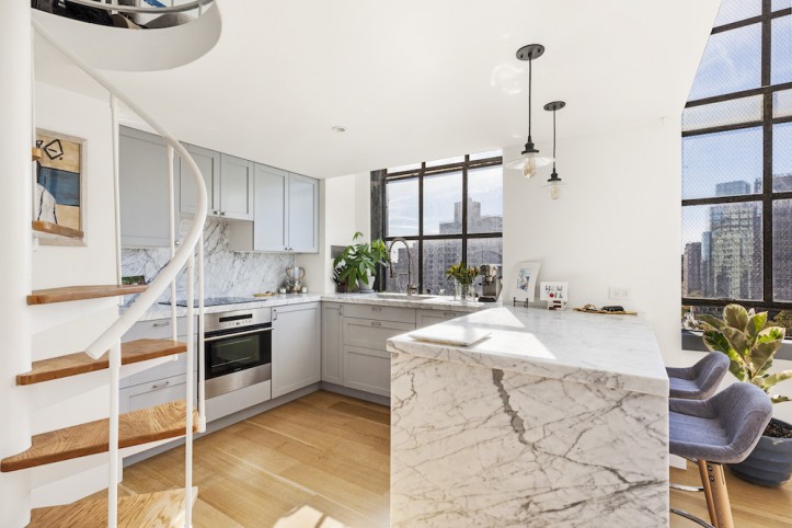
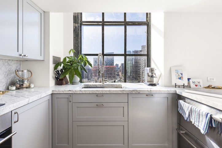
First, they ripped out the kitchen’s outdated Formica counters and ’70s-era cabinets, and completely gutted the old bathroom. The kitchen ceiling was cut away from the windows by about 18 inches to make more of the windows visible. An entryway closet was reduced so that the view from the kitchen window could be seen from the entrance of the apartment.
The floor on the mezzanine was also pulled back from the window and outfitted with a railing along its edge. The hardwood was repainted; the ceiling was scraped and painted, setting the stage for a guest bedroom, office, and additional closet storage.
Sweeten brings homeowners an exceptional renovation experience by personally matching trusted general contractors to your project, while offering expert guidance and support—at no cost to you. Renovate expertly with Sweeten
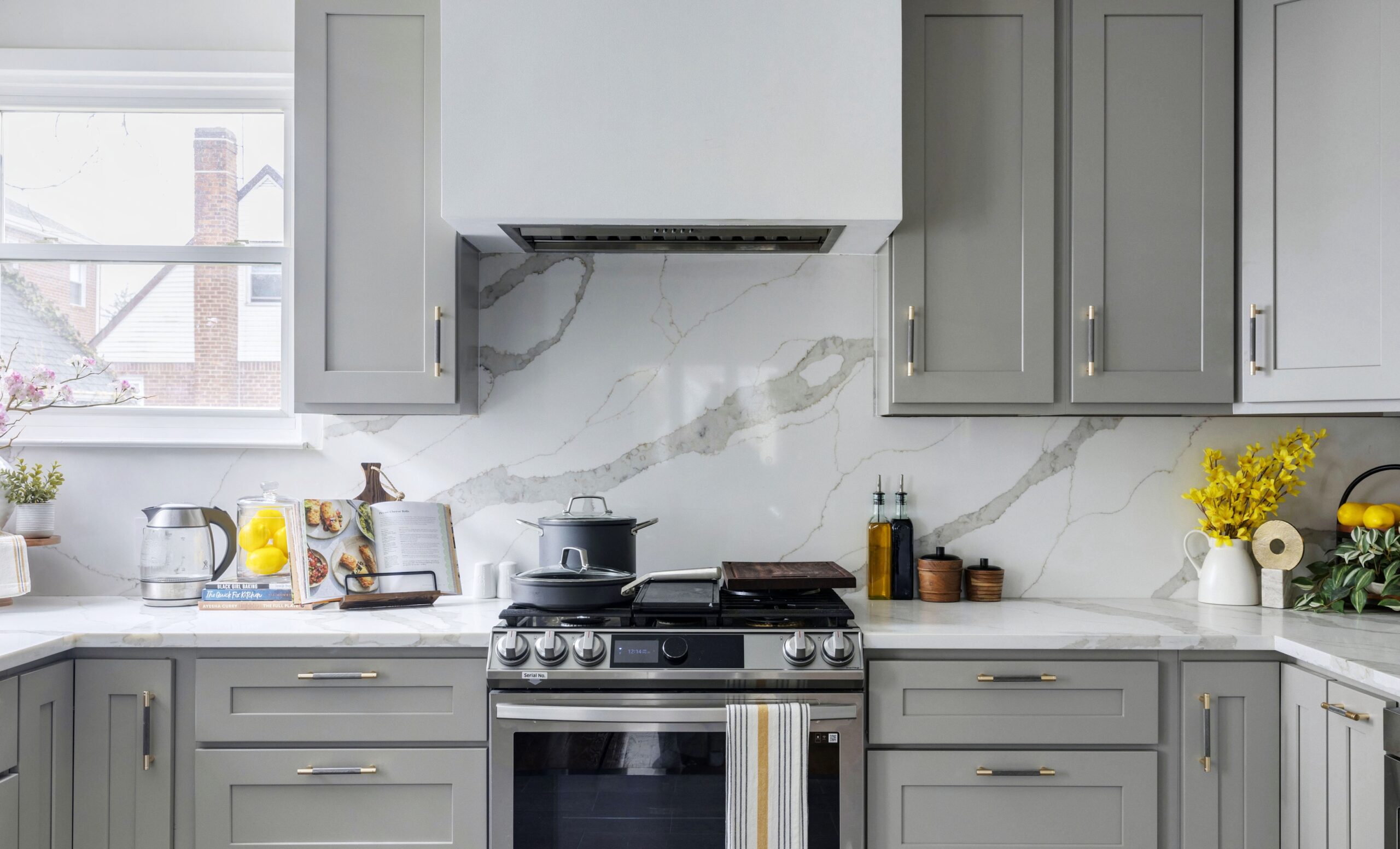
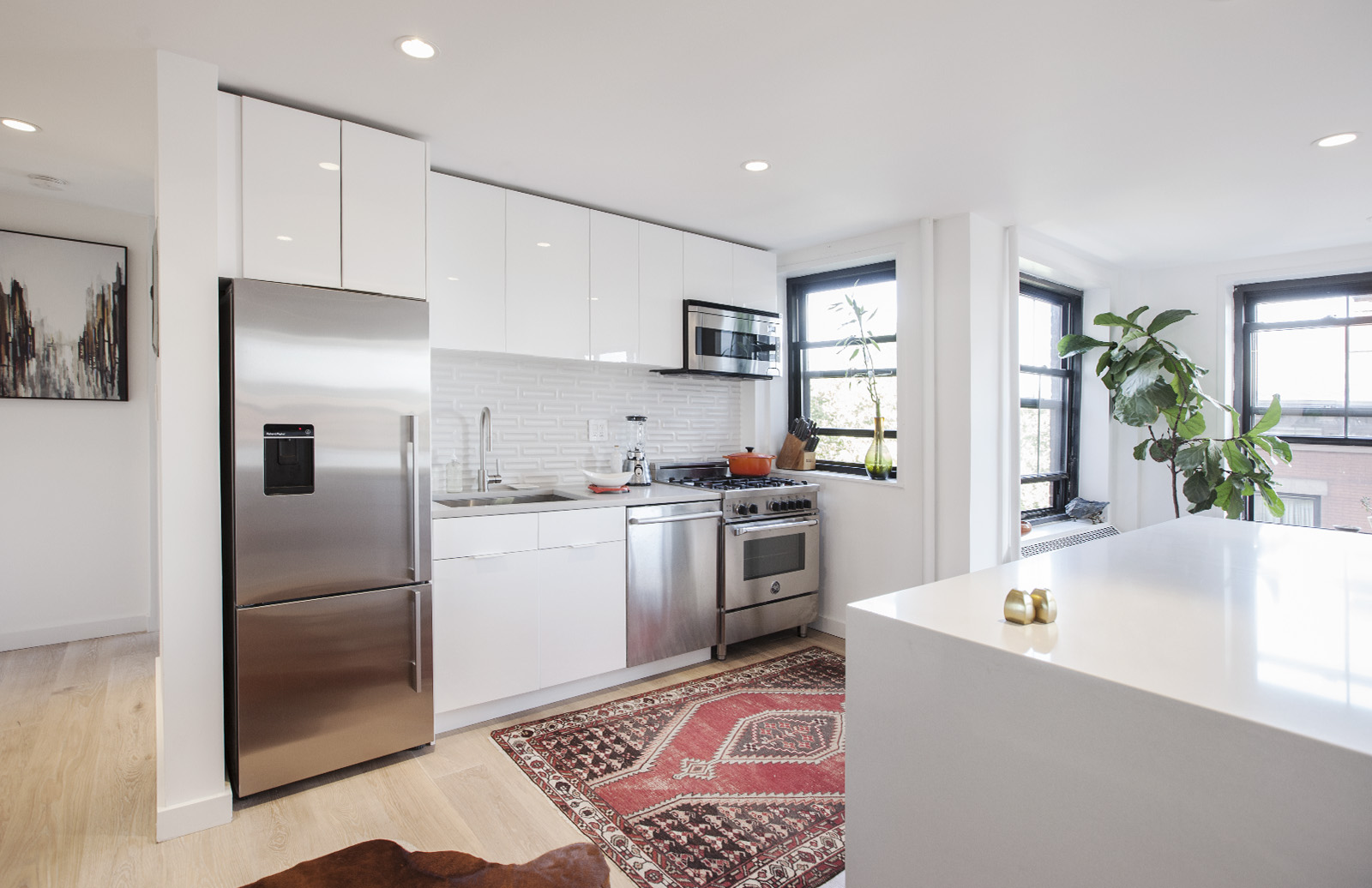
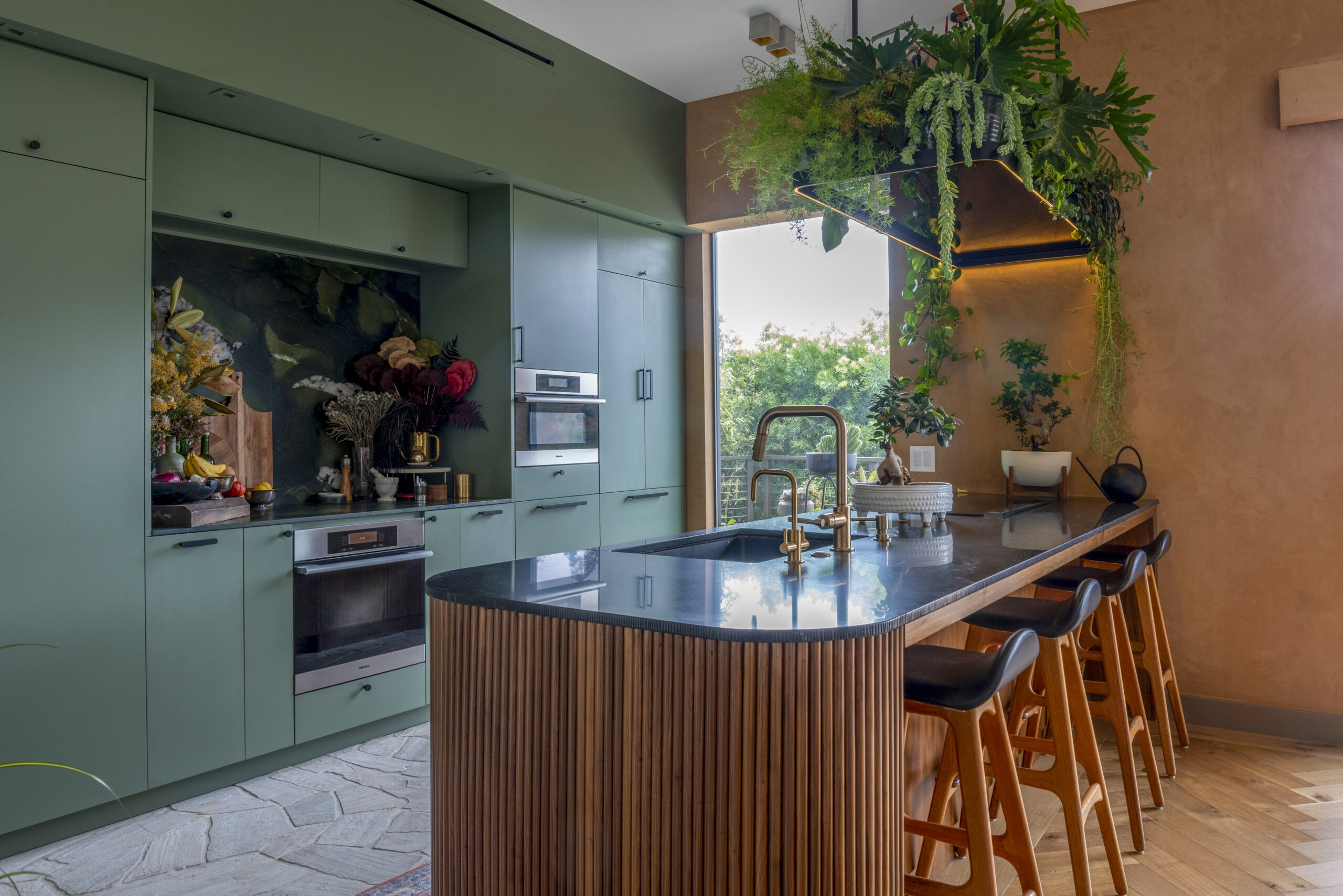
The kitchen’s standout feature is the Carrara marble backsplash and 2-inch-thick countertops with a waterfall edge. Ikea cabinets with blue-gray fronts offset the white marble and are adorned with simple hardware in a satin nickel finish. On the peninsula side of the kitchen’s U-shaped counters, refrigerator and freezer drawers are tucked discreetly underneath to reduce visual clutter and maximize space efficiency. A stainless steel undermount sink is matched to an industrial faucet and sprayer.
On the side of the peninsula that faces the living room, the ledge of the counter was extended to create a space for bar seating with built-in 12-bottle wine storage as well.
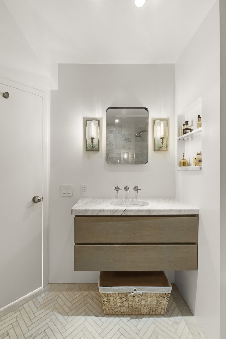
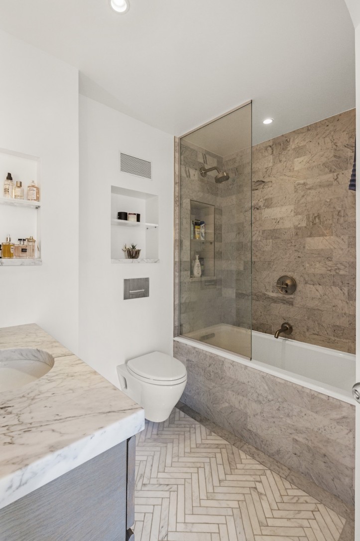
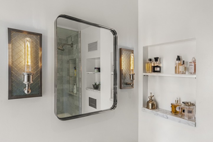
In the bathroom, the homeowner chose to continue the marble theme with herringbone floors, a warm subway tile on the walls, and the same 2-inch-thick Carrara marble from the kitchen as a counter. With a frameless glass divider, the deep soaking tub does double duty for baths and showers. Three well-placed niches, including one inside the tub area, add storage for toiletries and small décor objects.
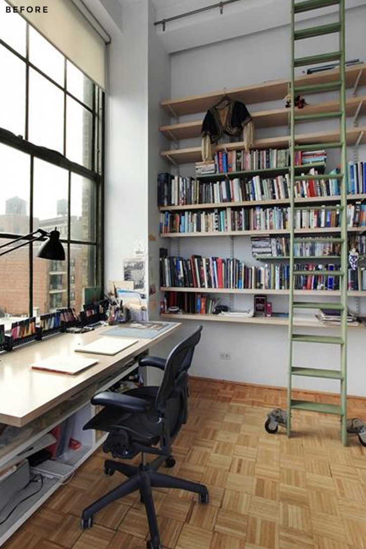
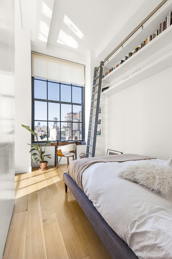
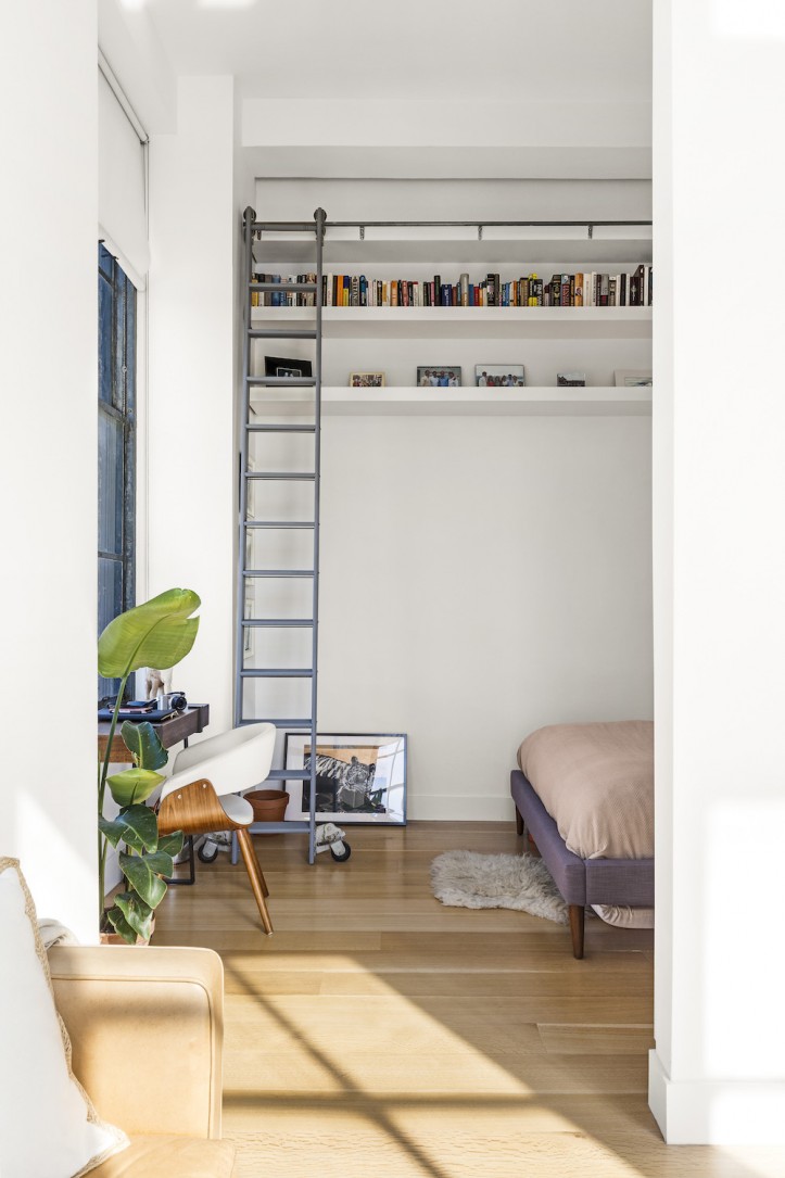
The bedroom, which benefits from one of the apartment’s enormous west-facing windows, was slightly reconfigured. The previous owners had installed floor-to-ceiling shelving with a library ladder, which was a good concept but needed to be scaled back. In its place, the Sweeten contractor built open shelving across the length of the room, keeping it within the overhead space so that it didn’t narrow the feel of the room. When its sliding doors are open, the space feeds into the living room for an open feeling. When the doors are closed, however, there is total privacy in the bedroom.
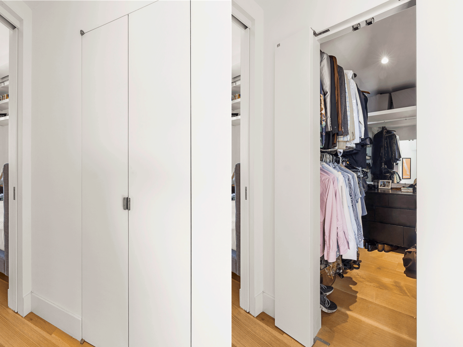
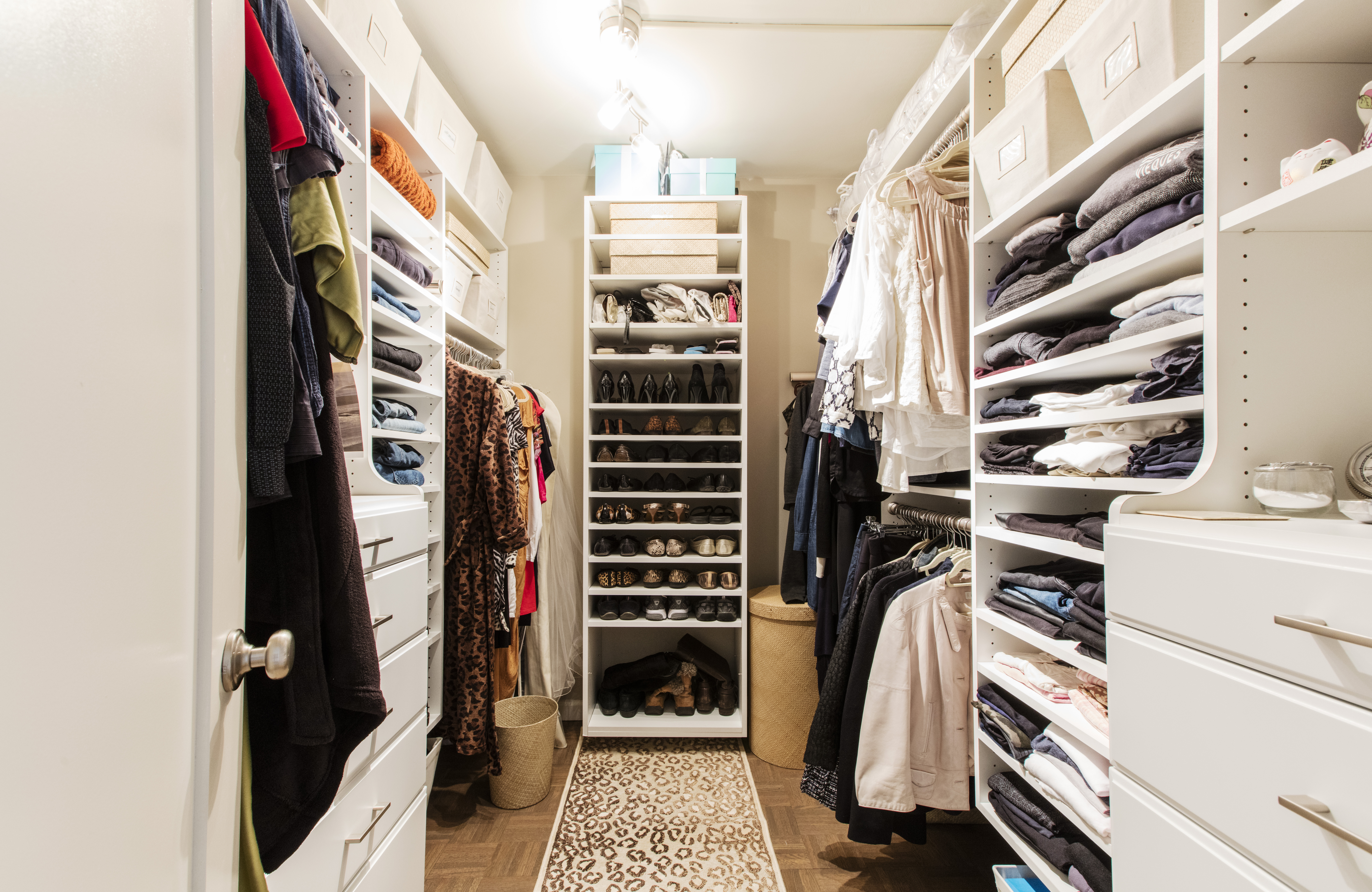
The bedroom closet, which was initially small and located inside the room, was relocated into a newly-created walk-in dressing room between the bedroom and bathroom. The homeowner wanted a closet with plenty of space on three walls for clothing and accessories. The design is perfect for couples, allowing one person to sleep peacefully while the other is getting ready for the day.
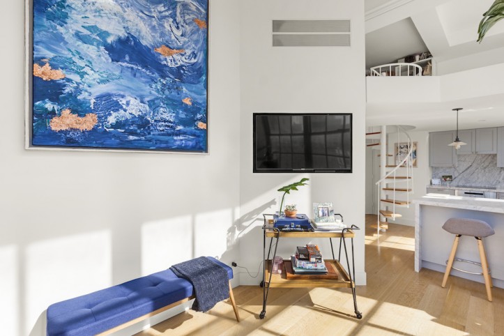
Throughout the apartment, the outdated flooring was replaced with natural white oak in 7-inch-wide planks. Sourced from Vermont, the new floorboards—long rift and quarter-sawn—show a “tigering” striped effect and are perfectly suited to the space, making a stylish first impression.
Mixing luxurious touches with economic ones, the Sweeten team was able to achieve the modern and fresh aesthetic that the homeowner imagined. What did he learn from his renovation experience? “Hire the right contractor and stay very close to the project. I feel like I made every micro decision, but it worked out! The unit looks great and I am a happy customer.”
Thank you for sharing your renewed loft with us!
KITCHEN RESOURCES: Cabinets: Ikea. Refrigerator and freezer drawers: Jennair and GE Monogram. Dishwasher: Bosch. Range: Wolf. Pendant lighting: Restoration Hardware.
BATH RESOURCES: Marble subway wall tile: Home Depot. Shower fixtures and sink: Kohler. Toilet: Toto. Lighting: Restoration Hardware.
—
Tara and Ryan transformed a spacious loft full of charming details to create a home for their family in a former silk warehouse.
Sweeten handpicks the best general contractors to match each project’s location, budget, and scope, helping until project completion. Follow the blog for renovation ideas and inspiration and when you’re ready to renovate, start your renovation on Sweeten.
