An Architect Delivers on Her Duplex Renovation—in Her Third Trimester (Part 1)
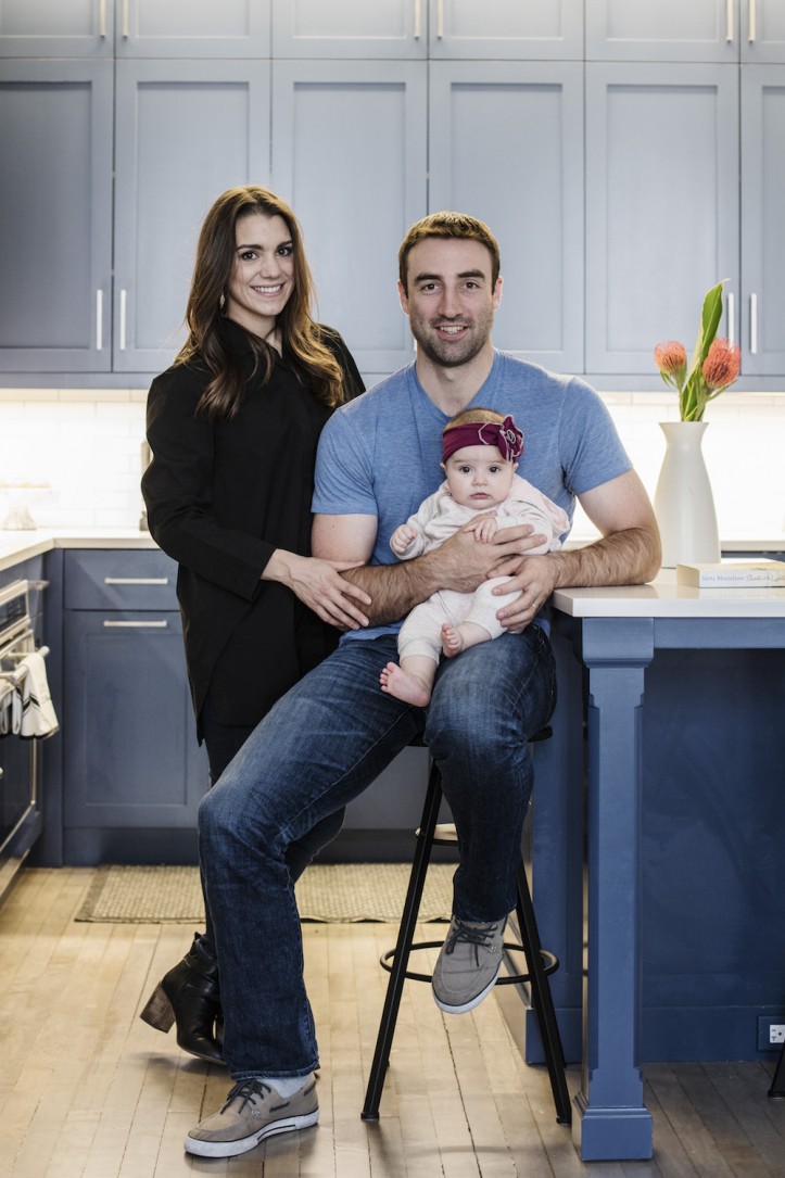
For expecting parents Tina and Fletcher, their Brooklyn duplex renovation provided a new nest for three
A hunt for more space led Tina Ladd and her husband, Fletcher, from a one-bedroom on Manhattan’s Upper West Side to a garden duplex in a Cobble Hill brownstone. As an architect, Tina was thrilled to be able to customize their new home but was up against an urgent deadline: the imminent birth of the couple’s first child.
The transformation was so remarkable, we’re telling the story in two parts, starting with the parlor. Here’s part one of Tina’s vision for the family home—and how she went into labor on moving day!
Guest post by Tina in Cobble Hill, Brooklyn
Coming from a one-bedroom apartment on the Upper West Side, we were eager to upsize to a two-bedroom and create a home for our expanding family. We had been looking at listings up and down Manhattan and in a couple of Brooklyn neighborhoods before we found out we were expecting a baby. Four months into the pregnancy (and into intensifying nesting instincts), we went into contract on a duplex in a historic Brooklyn townhouse.
While we would have been happy with a turn-key apartment, we were both open to renovation work so I could exercise my skill set as an architect and design a more tailored home for our family. With the advantage of a network of design professionals and general construction knowledge, we knew we could take on an appropriately sized project.
As we approached a fixed deadline—the due date—we eliminated any options that would require significant structural, electrical, or plumbing work. This would not only cut down on a construction timeline, but it would also eliminate the lengthy review process of obtaining permits from the Department of Buildings and the Landmark Preservation Commission.
As an architect, I didn’t want a cookie-cutter apartment; luckily, my husband, Fletcher, was supportive in my pursuit of something unique. When we attended the open house for our apartment, we were drawn to the high ceilings and 10-foot windows framing the living room.
The sun-filled living space was located on the entry parlor level of the townhouse (about five feet above street level), with views directly out to the beautiful brownstone street. The bedrooms were located on the garden level, one floor below. While the 1,200 sq. ft, two-bedroom space checked many boxes on our list, we felt a few changes were needed to turn it into the home we were searching for. The living space was in good shape, and some of it was even recently renovated.
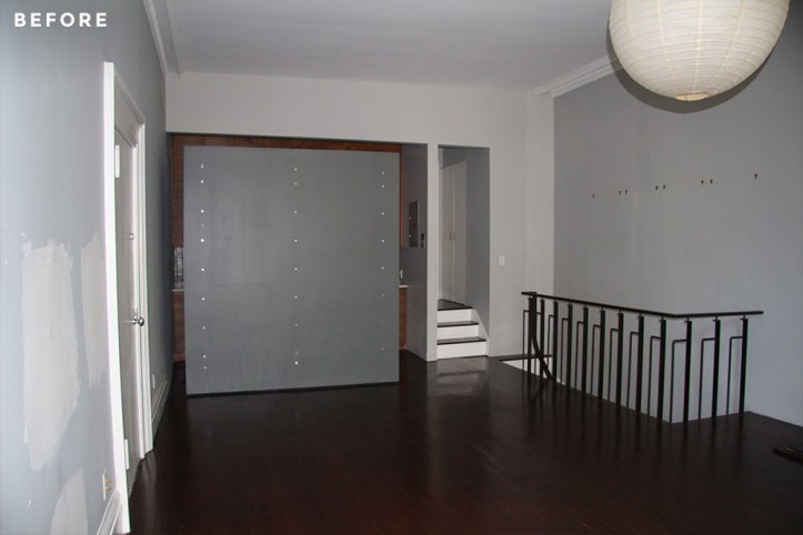
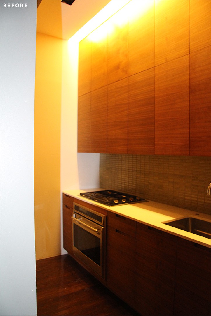
However, the kitchen was small and closed-off. Unlike the parlor floor with tall ceilings, the lower, garden level had very low ceilings and felt like a basement. The previous owners had added some modern touches, and while we both prefer the minimalist aesthetic in certain types of projects, we knew bringing back some familiar character would help make the historic apartment feel more inviting.
Due to the seller’s terms for a closing date, we were in contract for nearly three months, pushing a tighter deadline. In order to be sure we could hit the ground running with construction upon closing, we discussed major design decisions, and I completed drawings for our anticipated work before meeting with contractors, and ahead of our closing date.
At first, we had planned to open the kitchen and re-tile the bathrooms. By the time we were meeting with contractors, our list expanded to include refinishing the floors, adding molding/casing, and replacing all the interior doors. Sweeten brings homeowners an exceptional renovation experience by personally matching trusted general contractors to your project, while offering expert guidance and support—at no cost to you. Renovate expertly with Sweeten
I turned to Sweeten to find a contractor after seeing an ad during Open House NYC, my favorite Sunday morning TV show. We were matched with three general contractors and decided to move forward with the Sweeten contractor who best understood our vision and could help us strategically meet our goals.
He laid out a six-week timeline—a more ambitious schedule than we had anticipated! To meet our budget, we chose to supply the materials and fixtures, taking advantage of my design industry discounts.
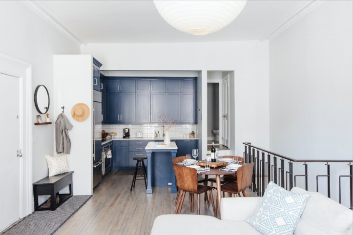
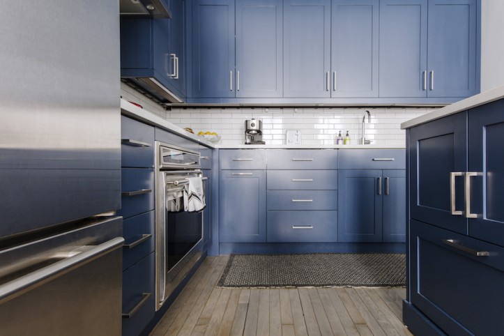
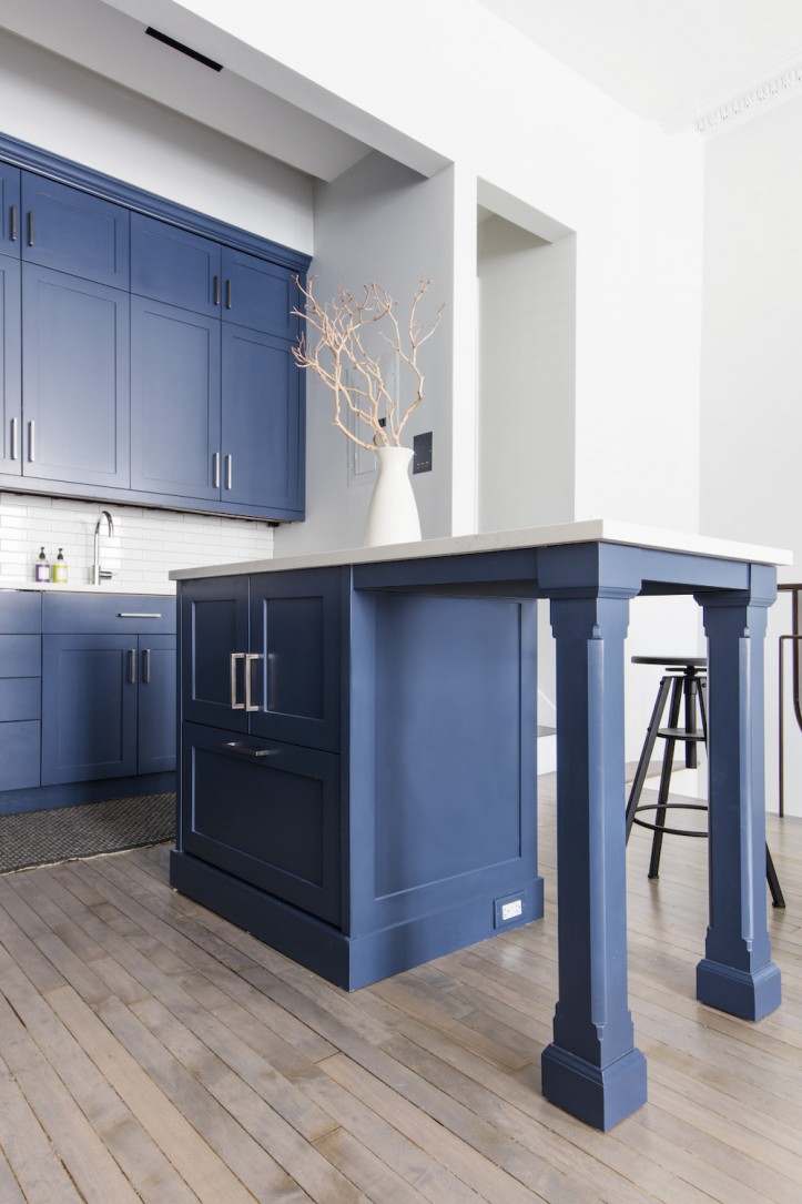
Our first goal with the apartment was to create an open kitchen. The existing kitchen was separated from the living room by a floating, non-structural wall. By removing the wall and turning the corner with new cabinets, we could transform the space from a narrow galley-style kitchen to an open L- shape with an island.
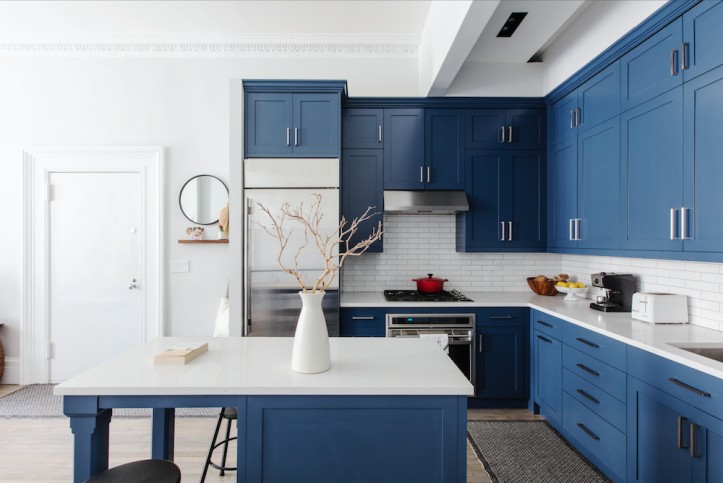
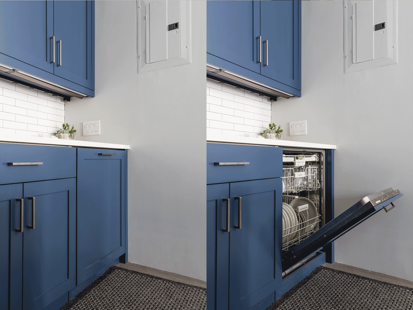
From the first time we saw the space, I envisioned a transitional-style kitchen with navy blue cabinets. I considered both Ikea cabinets with custom fronts, as well as standard semi-custom options.
In my first walk-through with the contractor, he suggested a custom cabinet maker that could execute my vision in a more cost-effective way than semi-custom options from a big-box store. Initially, custom cabinets were not in our budget. We were able to construct a kitchen perfectly fit for the space, maximizing storage vertically. We ended up choosing a shaker-style in Newburyport Blue.
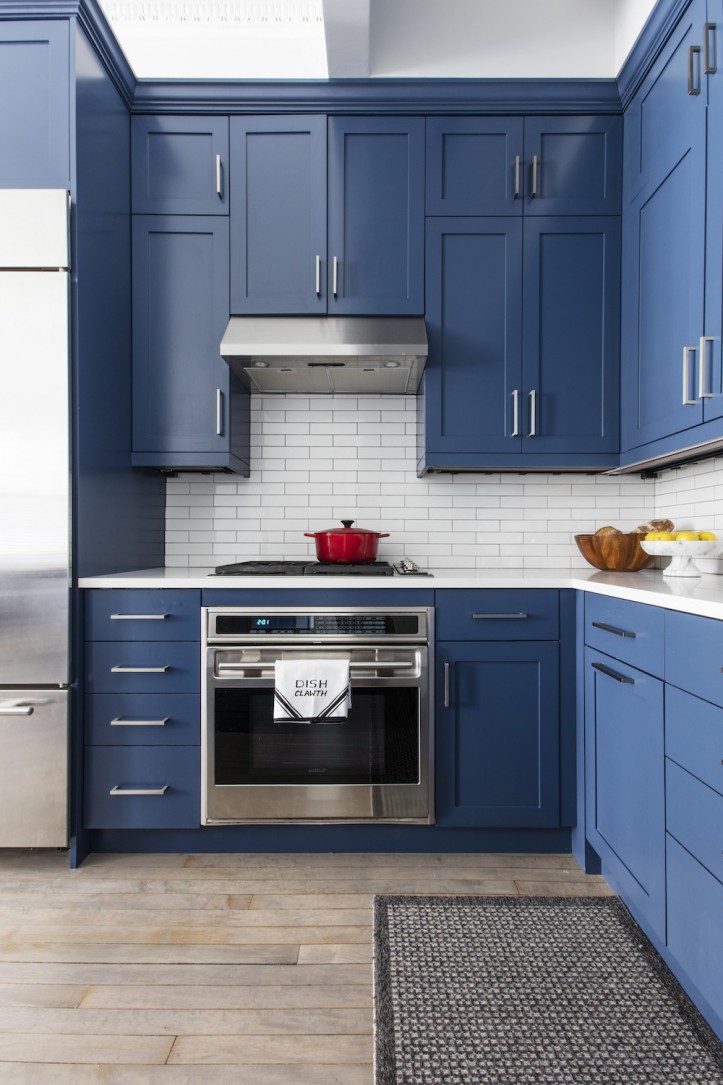
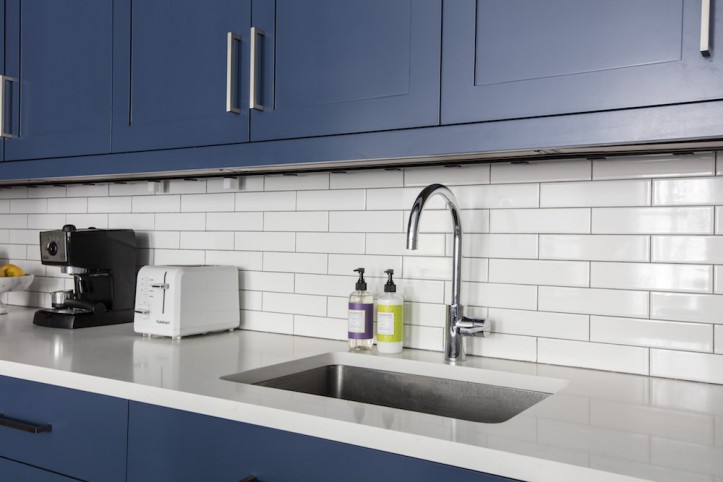
Simple, budget-friendly 2×8 subway tile in white from Nemo Tile and white Frosty Carrina from Caesarstone allowed the color of the cabinets to really pop. We installed under-cabinet outlet strips and lighting, which added a level of sophistication.
The previous owners had installed top-of-the-line appliances—a Sub-Zero refrigerator, Miele dishwasher, Wolf range, and stove. Because we chose to keep the appliances, we designed around them. This was one advantage of a totally custom kitchen.
We wanted a true exhaust hood for the Wolf range with higher CFM (cubic feet per minute – a measure of the volume of air that moves heat, odor, moisture, and smoke per minute while cooking) capabilities than a typical over-the-range microwave venting system. The kitchen design didn’t really allow for an alternate microwave location, so we concealed it behind pocket doors in the island. The Sub-Zero refrigerator also impacted our design.
The refrigerator door opened away from the cook and prep space in our new layout. Since the Sub-Zero design does not accommodate switching the door hinge side, the island footprint was rotated and narrowed from what we had originally planned in order to provide comfortable clearance.
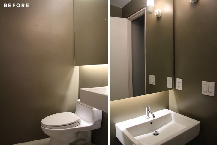
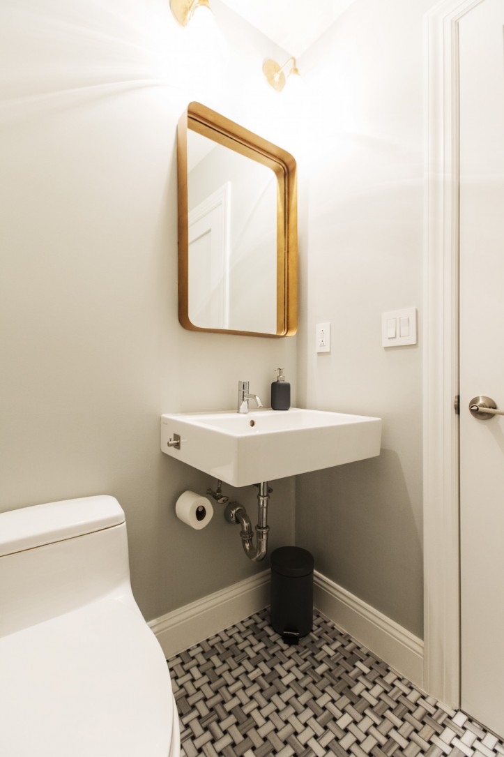
The existing powder room design was very modern. To bring a more transitional feel marrying both traditional and contemporary elements into the bath, we replaced the tile, vanity mirrors and light fixtures for a more classic aesthetic. For the flooring, we chose Nemo’s Fluid basketweave marble mosaic; I love this pattern that was so common in prewar homes.
Next, we got to work on the master bath and bedrooms which are located in the semi-subterranean lower level—and with shorter ceilings. Making the space brighter and restoring historic charm was the goal.
Check out Part 2 when we visit the family’s lower level! Thank you Tina and Fletcher for showing what renovating with grace under pressure looks like.
KITCHEN RESOURCES: White gloss subway 2″ x 8″ wall tile: Nemo Tile. Shaker cabinets: custom. Newburyport Blue cabinet paint: Benjamin Moore. Frosty Carrina quartz countertops: Caesarstone. Brushed satin nickel cabinet hardware: Top Knobs. Bertazzoni KU30PRO1XV vent hood; Samsung microwave: AJ Madison. Gray wood floor finish: Bona.
POWDER ROOM RESOURCES: Fluid Basketweave Mosaic marble floor tile: Nemo Tile. Wall sconces: Schoolhouse Electric. Farris mirror: Dwell Studio.
—
We’re loving the smart and sophisticated look of navy blue cabinets—which reminds us of another kitchen renovation that was outfitted with a custom set in a similar shade of blue with a more rustic sensibility.
Sweeten handpicks the best general contractors to match each project’s location, budget, scope, and style. Follow the blog for renovation ideas and inspiration and when you’re ready to renovate, start your renovation on Sweeten.
