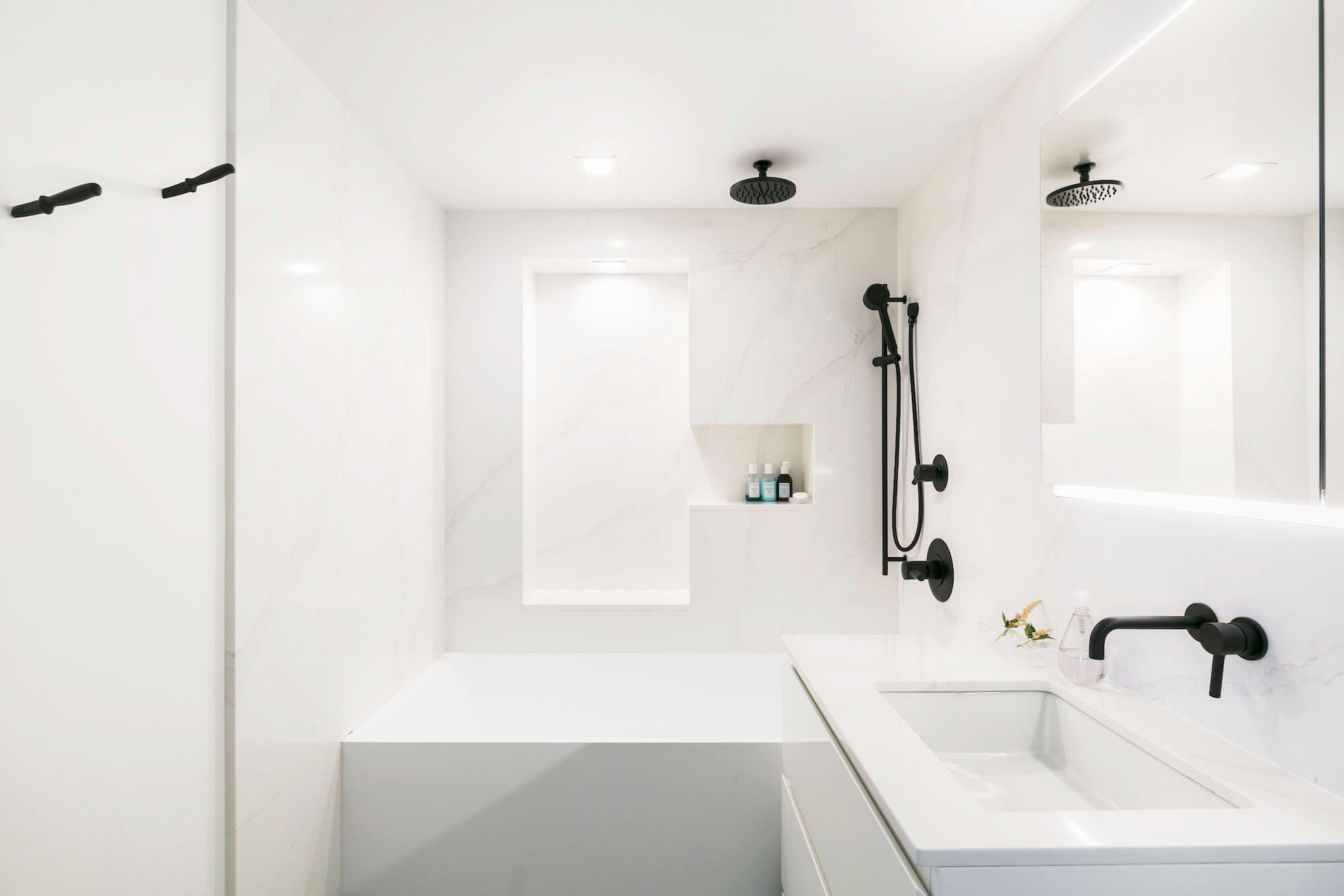
Carrie and Jack’s Sweetened Murray Hill Bathroom
Carrie and Jack moved into their pre-war co-op in Murray Hill back in 2003 – a lifetime ago in New York City real estate! Carrie, a budding theater producer, and Jack, who works in online marketing for Clinique, took on a kitchen renovation after moving in, but a decade passed before they were ready for their Manhattan bathroom renovation. The original pre-war bath felt very….original and pre-war. In the intervening years, in an attempt to update a few prominent features with minimal time and money, the couple swapped in a new medicine cabinet and lighting fixture, but no amount of scrubbing or cosmetic work could address the aging, bulky tiles and tub that rounded the room. Ready for an overhaul, Carrie posted her project on Sweeten and brought on Sweeten Expert Aleks to create, in her words, a clean, modern, sanctuary.
“I can’t say enough good things about Sweeten Expert Aleks. It was a joy to talk about the work with him and he followed through on every commitment. Just soup to nuts a great experience.”
–Carrie R., Manhattan homeowner
What New Yorker hasn’t walked into an apartment at some point and seen these tiles? Here, they wound their way around the walls, unnecessary and overdone, stealing inches of elbow room from the vanity. Replacement tiles aged at different speeds from original tiles, creating a pockmarked effect. The shower rod hung unconvincingly from the ceiling, and oddly shaped built-in vanity niches and the pedestal sink made for very limited storage options. Even the newer medicine cabinet needed help…never quitemade it all the way into the wall during its initial installation. Still, Carrie and Jack were smart to buy an apartment with good bones: hidden underneath all of that thick tile was a 5’ x 8’ bathroom – windowed (!) and roomy enough for a full-size tub.
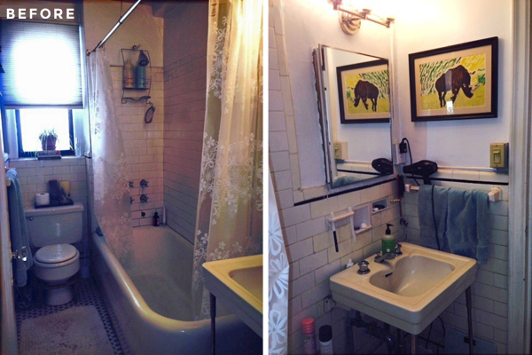
Carrie didn’t have to contend with space or lay-out constraints but struggled mightily with a nagging sense that the couple should preserve and maintain pre-war features where they could. We’ve seen this same debate play out at other properties with deep historical ties (in Chelsea’s London Terrace co-op and in this Park Slope home). Carrie originally felt adamant about honoring the building’s past, but the kitchen renovation had opened the door to more modern finishes and cleaner lines. The simple and streamlined approach they took with the kitchen really worked, and the couple began to shift their thinking from pre-war flair to modern minimalism. The kitchen renovation experience also gave Carrie and Jack a head start on material selections, and they found themselves selecting bathroom upgrades that were in line with the kitchen floor and wall tiles they had chosen years earlier. Sweeten brings homeowners an exceptional renovation experience by personally matching trusted general contractors to your project, while offering expert guidance and support—at no cost to you. Renovate to live, Sweeten to thrive!
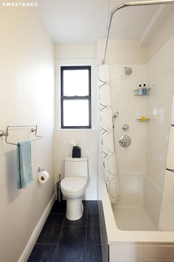
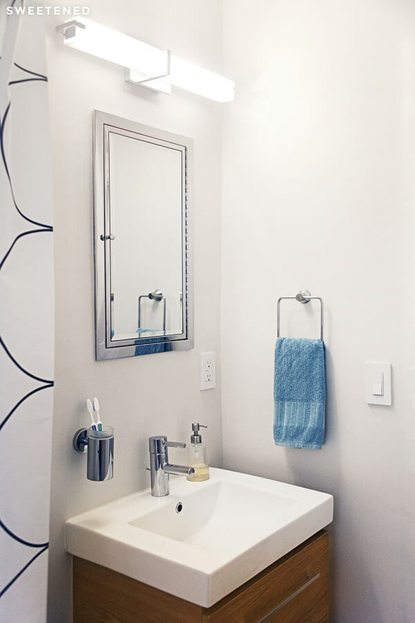
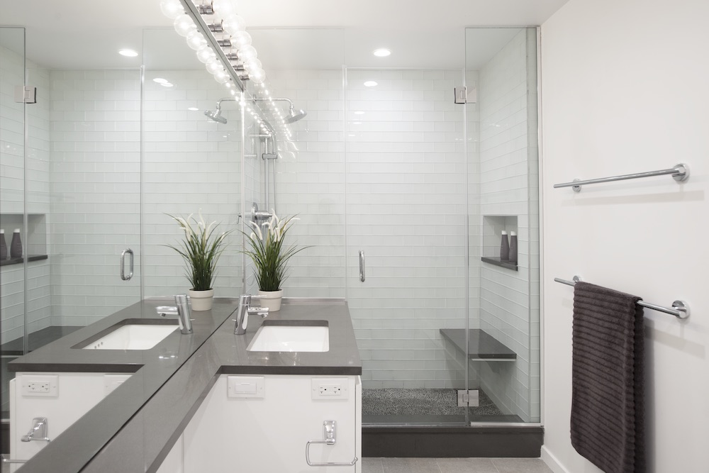
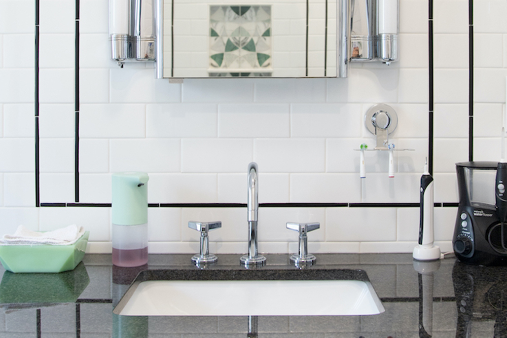
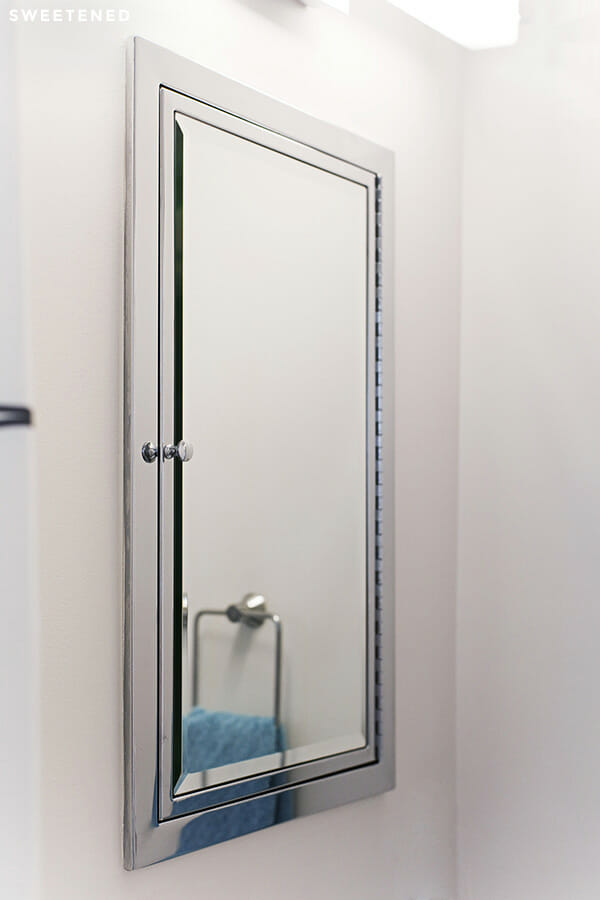
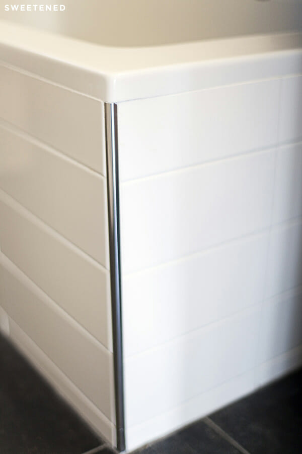
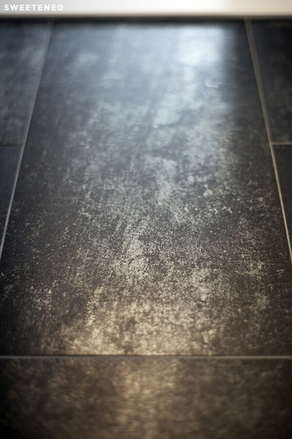
The couple went with 4” x 13” white ceramic wall tiles from Nemo, stacked in a straight grid (rather than the staggered, subway style we saw in Saskia and Ben’s Downtown Brooklyn renovation, among others). They chose 12” x 24” porcelain floor tiles with a striated, gunmetal gray effect, which are reflective and easy to clean without being overly glossy. Carrie chose a new medicine cabinet from Restoration Hardware to replace the prior cabinet that never actually sat flush with the wall; the new cabinet is fully built in and has a smaller profile overall.
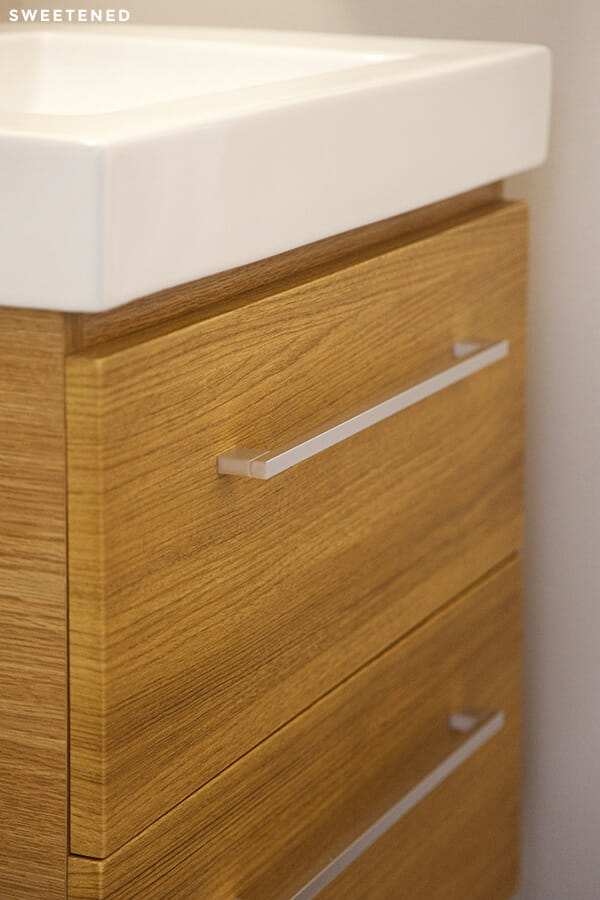
Carrie and Jack chose a sink and cabinet with a small footprint but with added storage drawers so that they could keep the sink counter completely clear. Sweeten Expert Aleks cleaned up all of the details around the sink: the awkward niches, bulky towel rack, yellowed light switch and overhanging outlet have all found new lives as sleeker and more minimalist white and silver versions of themselves.
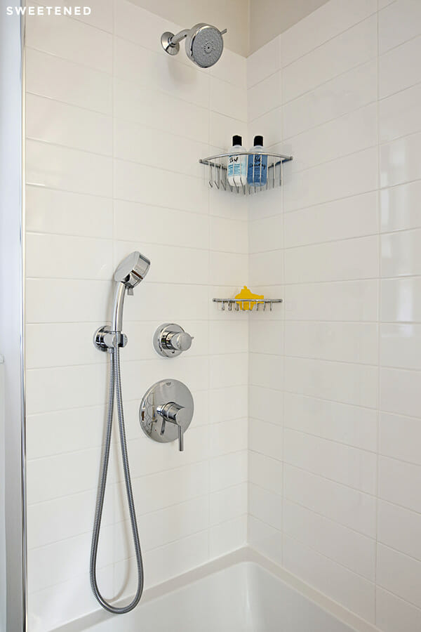
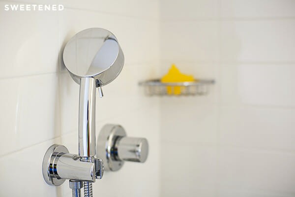
Carrie and Jack went with sink and shower faucets from Grohe and selected an American Standard toilet for its space-saving, modern profile. Carrie originally envisioned a new tub that would be finished on its two exposed sides, but ended up finding that a drop-in tub was much less costly. They worked with Aleks to accentuate a square profile for their deeper-than-standard new tub, a local find from Fine Fixtures in Brooklyn. Carrie’s transformation from pre-war preservationist to modern minimalist seemed official when she fell for a new vanity lighting fixture, inspired by Danish mid-century modern design. In just under three weeks, Carrie, Jack, and their exceedingly charming dog, Samson, were back in their home and enjoying the room that spent ten years on the back burner!
Carrie was especially gracious about crediting Sweeten Expert Aleks and his team, noting that they were “unbelievably accessible, helpful, and willing to remedy” anything that came up, and that this was “hands down the best experience” they have had with a general contractor. We are flattered but not surprised that this was a great match. Thank you, Carrie and Jack, for opening your home to us!
—
Inspired by Carrie and Jack’s three-week bathroom turnaround? Post your project on Sweeten and we will introduce you to contractors to help you create a space you love.
