A Well-Loved Kitchen Begins a New Chapter
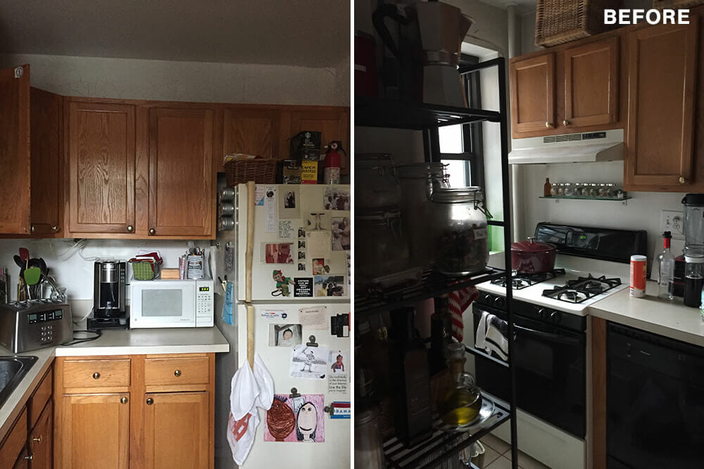
Ever feel like your kitchen is just not big enough? Erica and Joshua did. Their cramped Clinton Hill kitchen was more of a solitary confinement zone than the heart of their home. But they had a vision: a bright, open space where they could finally cook together. Their 800-square-foot apartment held so much potential, if only they could break down a few walls (literally and figuratively).
Discover how this couple transformed their tiny kitchen into a light-filled haven, the challenges they faced, and the surprising design choices that made all the difference.
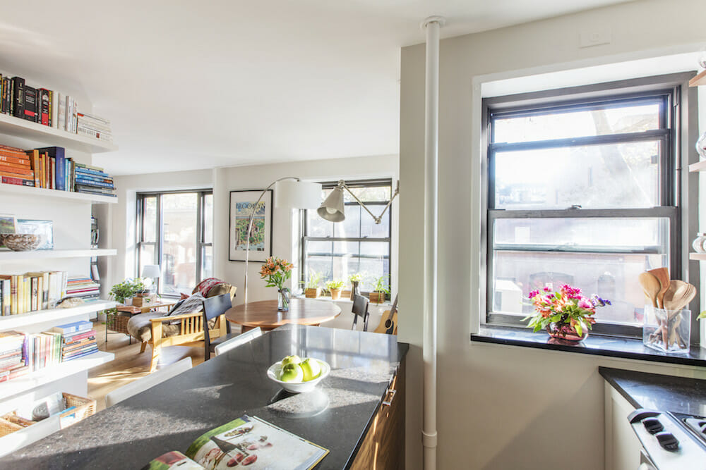
Removing walls while renovating brought light into one couple’s new kitchen
- Homeowners: Erica and Joshua posted their project on Sweeten
- Where: Clinton Hill, Brooklyn, New York
- Primary renovation: Renovating a cramped kitchen to fit more than one person comfortably
- Homeowner quote: The builders and carpenters of our design-build firm are true craftspeople. The care with which they handled each task was notable.
Guest blog post by Sweeten homeowner Erica
It’s amazing what taking down a single wall can do. Our cramped, one-person kitchen in our 800-square-foot Clinton Hill apartment suddenly became the heart of our home. When Joshua, my then-fiancé, moved in, we knew it was time to renovate and reimagine the space we loved.
Even before Joshua joined me, I imagined what would happen if the wall between the living room and kitchen came down. Now that it was two of us, changes seemed necessary. Along with the wall, Joshua also dreamed of replacing the parquet floors with hardwood. (I much preferred parquet so those conversations often ended in agreeing to disagree.)
Our apartment and all its quirks and beauties were familiar. We knew how we used the space, and which areas needed to become a better fit. We had a budget for the kitchen and vision. But who could we trust to help us move forward with our ideas? Just choosing the right paint color felt overwhelming, so finding the right designer was a challenge.
Just choosing the right paint color felt overwhelming, so finding the right designer was a challenge.
I posted our project on Sweeten.com, and selected a firm with design/build services. The general contractor was familiar with the Clinton Hill Co-ops and the complexities that exist in these apartments, which were originally constructed in the early 1940s.
Post your project on Sweeten for free and make your dream renovation a reality. Sweeten simplifies home renovation by connecting homeowners with top-rated general contractors, handling the vetting process and project management. To learn more about how we can help, check out our home renovation services.
On that first warm fall evening, she sat in our living room and listened carefully as we described what we hoped our home would be. We knew we wanted to remove a wall, upgrade the contractor-grade cabinetry, replace the appliances, and install under-cabinet lighting. But we were unsure of the process and the things we could not see. After talking, she immediately popped up and put her superhero design tools to work—her x-ray vision which saw through walls, and her tape measure.
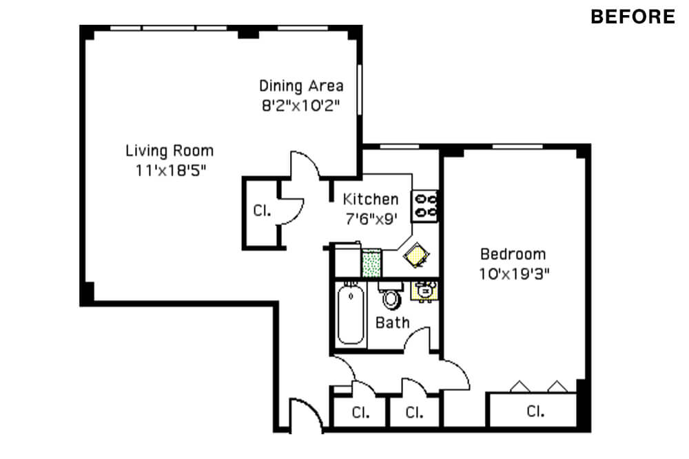
Initial sketches removed the wall between the kitchen and the dining area completely, as well as part of the wall between the kitchen and the living room. We were seeking to strike a balance between Joshua’s partiality to completely open spaces and my desire to keep some visual privacy. Receptive to our decision to keep the entire wall between the living room and kitchen intact, the plan removed only the wall between the kitchen and the dining area. Sweeten brings homeowners an exceptional renovation experience by personally matching trusted general contractors to your project, while offering expert guidance and support—at no cost to you. Renovate expertly with Sweeten
Our contractor’s keen eye helped us ask so many more questions about the space. I never noticed that the sightlines of our parquet floors were uneven and misaligned. (Joshua was right. We needed to replace the floors.)
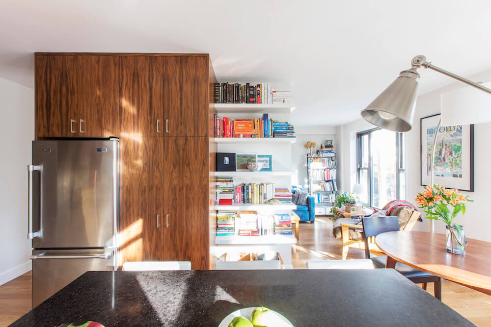
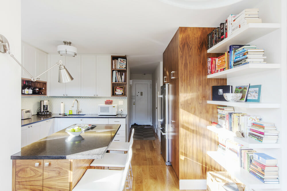
I realized that the space would be transformed in ways I was not expecting the moment she began to speak of light from the kitchen window spilling into the back corner of the living room. With the wall down, of course, the kitchen window would be visible as you enter the apartment. The decision to move the refrigerator out of the original kitchen footprint into what was once a hallway closet provided more options on where the sink and dishwasher could be.
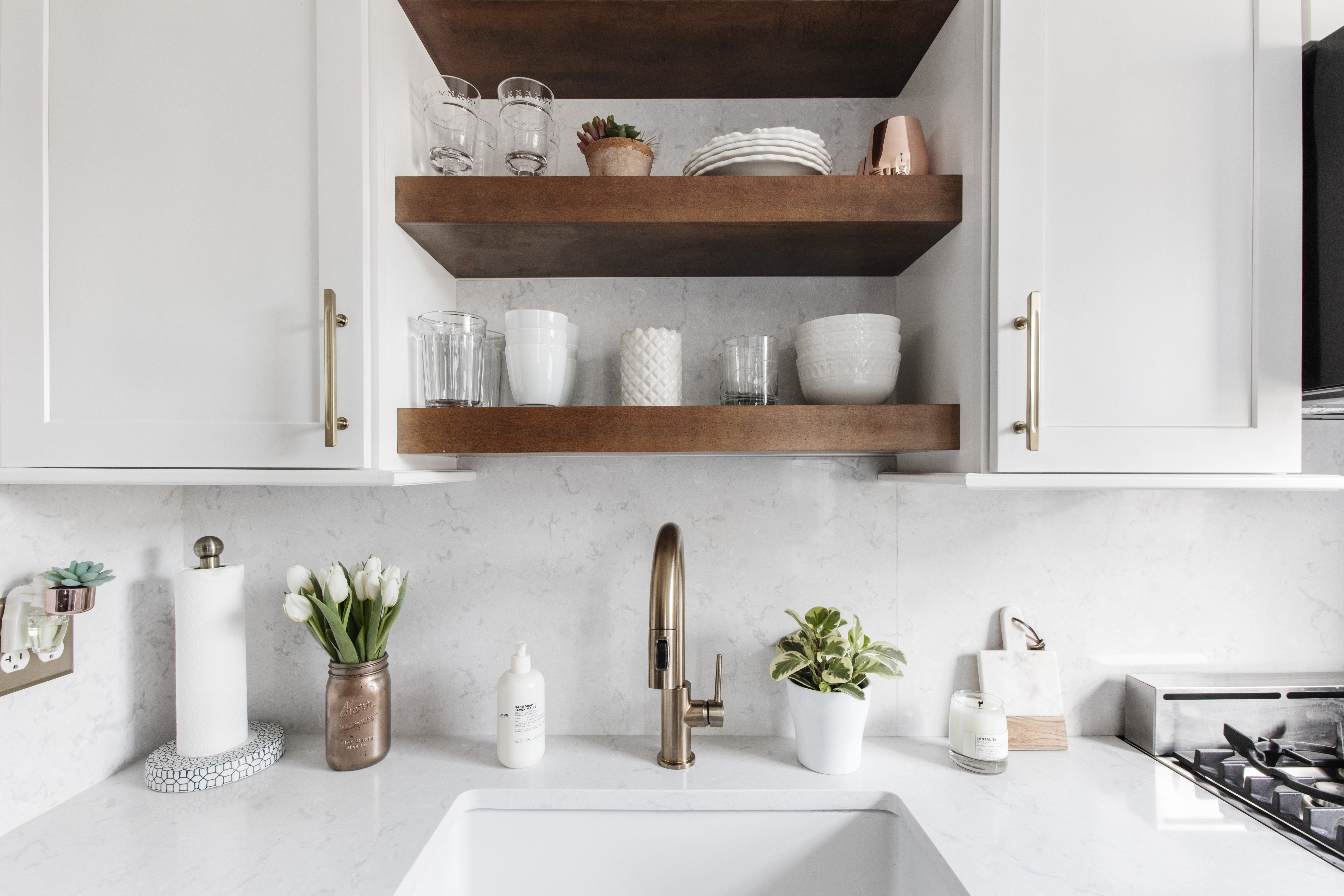
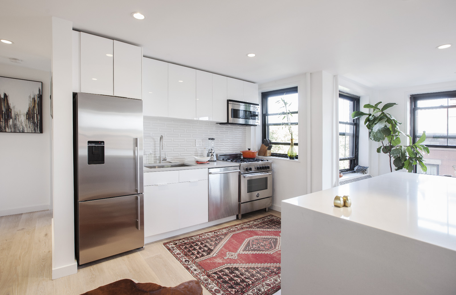
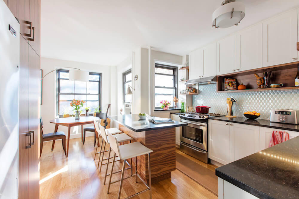
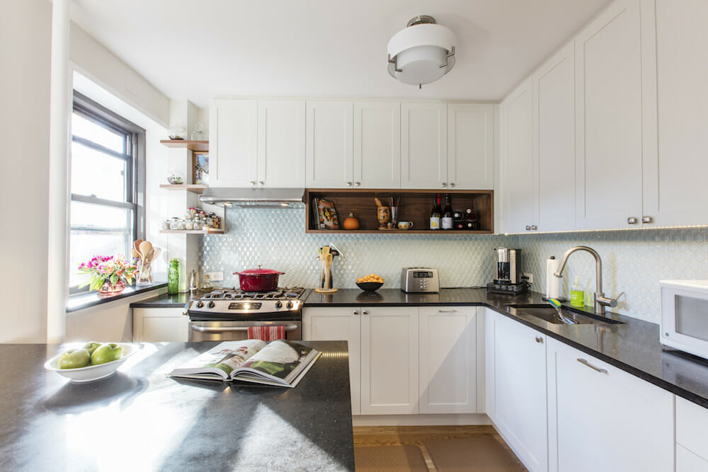
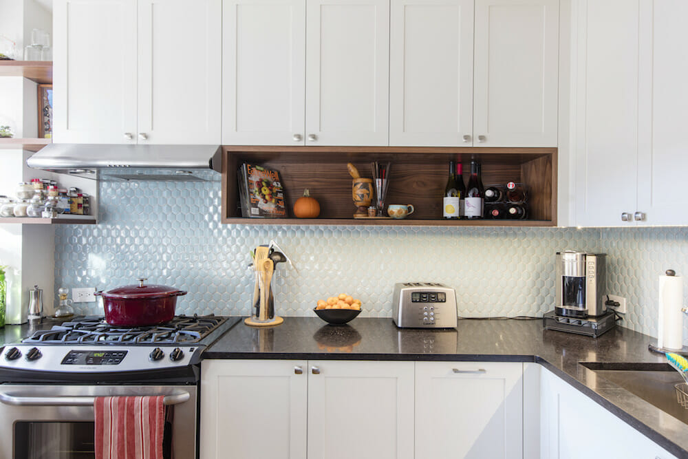
I knew that our Sweeten contractor had expertise in millwork. Our kitchen, filled with unexpected nooks and crannies, was a design dilemma that custom cabinetry could solve. I envisioned white cabinetry to brighten up the kitchen, and we trusted our contractor’s desire to include natural wood via open shelving and some cabinetry with a walnut finish. The shelving she created is the perfect platform for us to display our spices, cookbooks, vases, and the all-important pilon for grinding plantains.
The weekend before demolition day, our contractor came by to finalize things. “I’m so nervous,” I admitted.
As a designer, she not only considered ways to bring more storage and surface area into the kitchen, but also a new hue. One afternoon we perused our choices at their warehouse in Queens.
Every tile seemed to fall short—wrong tint, incorrect size, too dominating, etc. But then Joshua’s eye caught a simple hexagonal tile of soft turquoise blue. This 3D recycled glass tilecomplemented the cabinetry color, the wood finish, and it was the right size. The result is a beautiful canvas that pulls the white cabinetry and quartz countertops together. Last, but certainly not least, it serves as a surprising showcase for my favorite red cast iron Dutch oven.
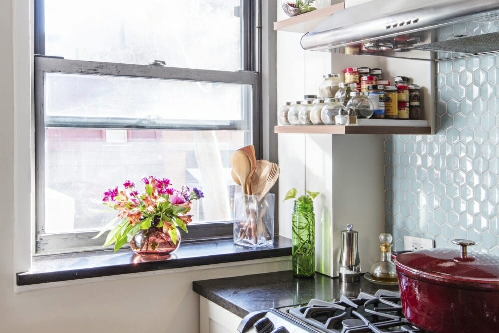
Making decisions was easy. Rather than ask us to look at every iteration of countertop or knob, our contractor presented us with a few options, and the design sensibility connected across the space. The nickel handles on the cabinet doors pick up the subtle specks of silver accents in the quartz countertops coordinating well with the steel appliances. I only noticed it once the kitchen was complete.
We had to come up with secondary plans for overhead lighting since the ceiling was made of concrete. The floor lamp now illuminates our favorite round dining table. The gooseneck sconce creates the perfect corner for working on a laptop at our kitchen peninsula, which can now accommodate someone cooking at the same time. The peninsula also has generous storage on two sides—four very deep drawers and a small cabinet.
Now, when you walk into our apartment, three things jump out at you: the welcoming natural light that flows in from the windows, rich wood elements on the cabinetry and shelving, and the turquoise tile of the backsplash.

The builders and carpenters of our design-build firm are true craftspeople. The care with which they handled each task was notable. They produced perfectly mitered corners, laid the floor with precision, and cleaned up at the end of each day. We felt like we were in good hands the entire way through. I’d notice an imperfection, and before I could say anything, they had fixed it. Truly top-notch workmanship. They were so thoughtful about the space that it made our decision to stay in the apartment throughout the renovation easy. “Just think of it like camping,” Joshua said one night as we dined in our bedroom.
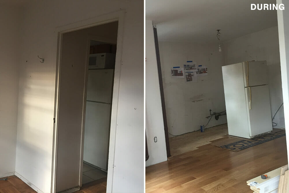
The weekend before demolition day, our contractor came by to finalize things. “I’m so nervous,” I admitted. “Don’t worry,” she warmly replied. “You’re gonna love it.” Debris and concrete walls filled much of the living area after the first demolition day, but we felt the homeyness of the space. The light from the newly visible window greeted us as we entered in a way we never expected. I looked at Joshua and said, “I didn’t realize how much of me was in this place. Now we get to create this space together.” We couldn’t relish it more!
Thank you, Erica and Joshua, for sharing your renovation journey with us!
Ready to renovate your home?
Post your project on Sweeten today and get matched with our vetted general contractors for free! Find endless home renovation inspiration, detailed guides, and practical cost breakdowns from our blogs.
Materials
Engineered White Oak 5” floor planks: Somerset Floors. Cabinets: custom. Open shelving: custom. Contemporary Metal Pull 8160 cabinet hardware: Richelieu. Jefferey Alexander Satin Nickel Sonoma Square cabinet knob, #431SN: Pulls Direct. Brooklyn CT 4403 Quartz countertops: CitiQuartz. Recycled glass tile backsplash: TileBar. 23” Single Basin Undermount sink: Vigo Industries. Pull-down spray faucet: Hansgrohe. 30” gas range: Frigidaire. Refrigerator: Maytag. 24” Bar-handle dishwasher: Bosch. Morland wall sconce: Savoy House. George Kovacs fabric wall sconce: Lumens. Phoenix barstools, floor lamp, #271806: CB2.
If you’re looking to contribute sweat equity to your renovation, here’s what to DIY and what to leave to the pros.
