A Shabby to Chic Renovation
A year-long search results in a new home and neighborhood
- Homeowner: Tijesh posted his full apartment remodel on Sweeten
- Where: Upper West Side in Manhattan
- Primary renovation: Complete update of his entire co-op in a 1940s building
- With: Sweeten general contractor
- Homeowner’s quote: “From project start to finish, my Sweeten contractor was on top of it. We had some unexpected hiccups and delays, but he kept the job moving.”
Guest blog post by homeowner Tejesh
After more than a decade of living in the heart of Chelsea, a block away from the charms of the Meatpacking District and the phenomenal Chelsea Market, I knew that finding my next place was going to require faith and flexibility. When my previous apartment sold and I hadn’t yet found my next home, those things were more necessary than ever.

Then I checked out the neighborhood. The place is a block from Riverside Drive and another short walk to the Hudson River’s edge; a block in the other direction is the subway and Broadway shopping. It’s a 5-minute walk to Central Park, and an easy stroll to Hell’s Kitchen, the area where I spend a lot of my after-work hours hitting the gym and meeting friends at restaurants.
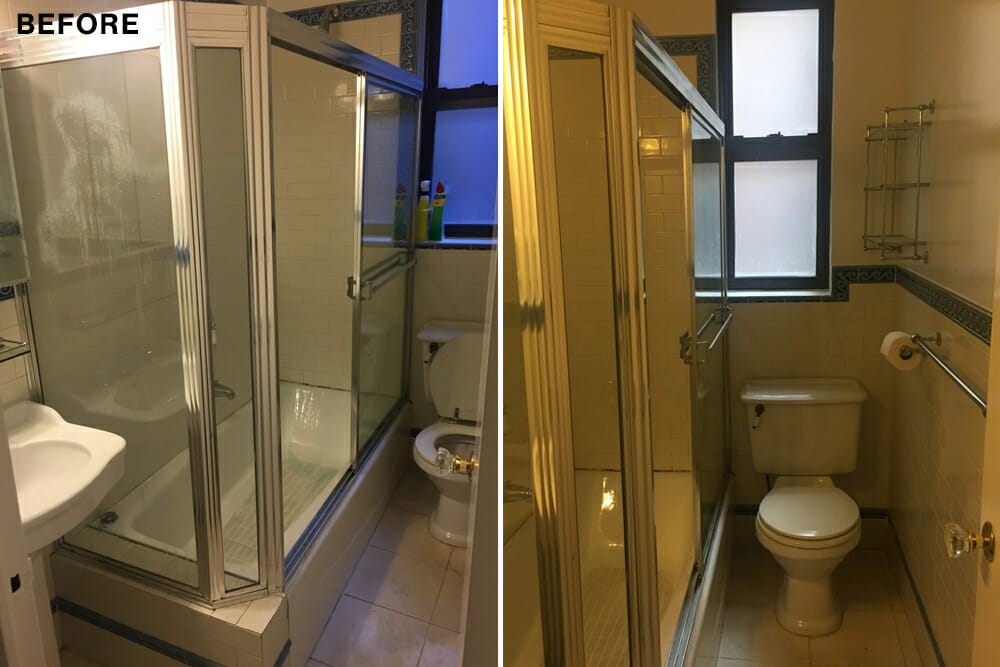
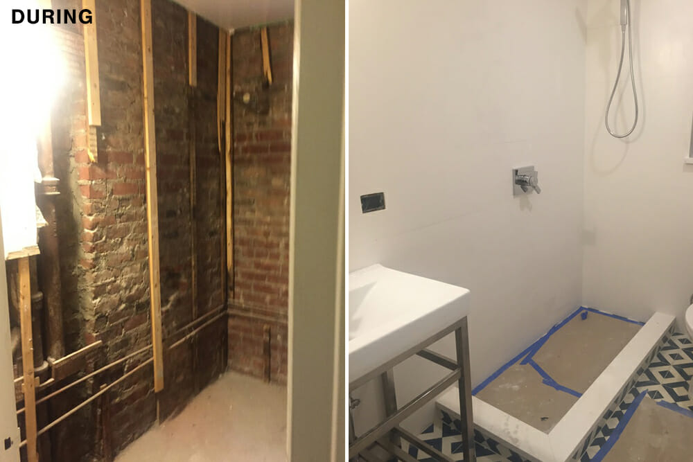
I had ideas for moving the toilet and the shower drain, but in the end, my contractor put the bathroom back together as it was, with streamlined fixtures and a glass-walled shower.
I wasn’t a renovating newbie. I’d bought the old Chelsea studio in 2003, and remodeled twice before selling it as a junior one-bedroom. I quickly figured out the specifics of the renovation of the new place, then posted the job on Sweeten and waited for contractors to bid.
Sweeten brings homeowners an exceptional renovation experience by personally matching trusted general contractors to your project, while offering expert guidance and support—at no cost to you. 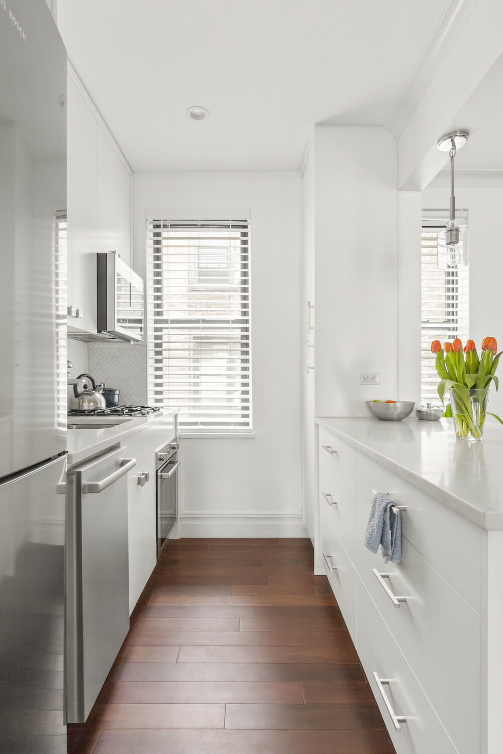
Renovate expertly with Sweeten
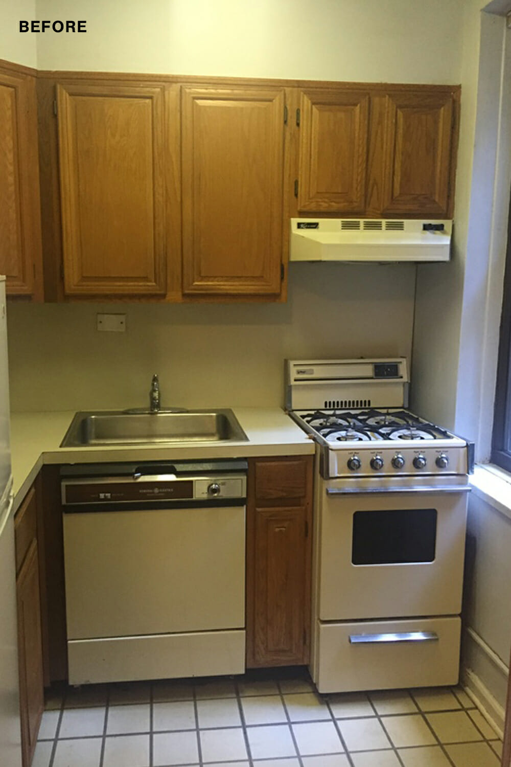
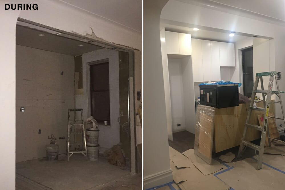
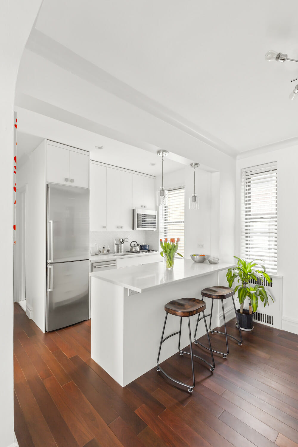
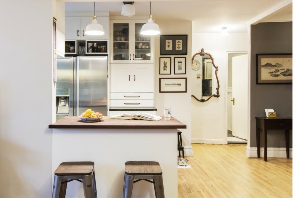
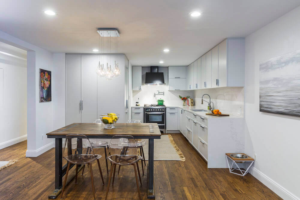
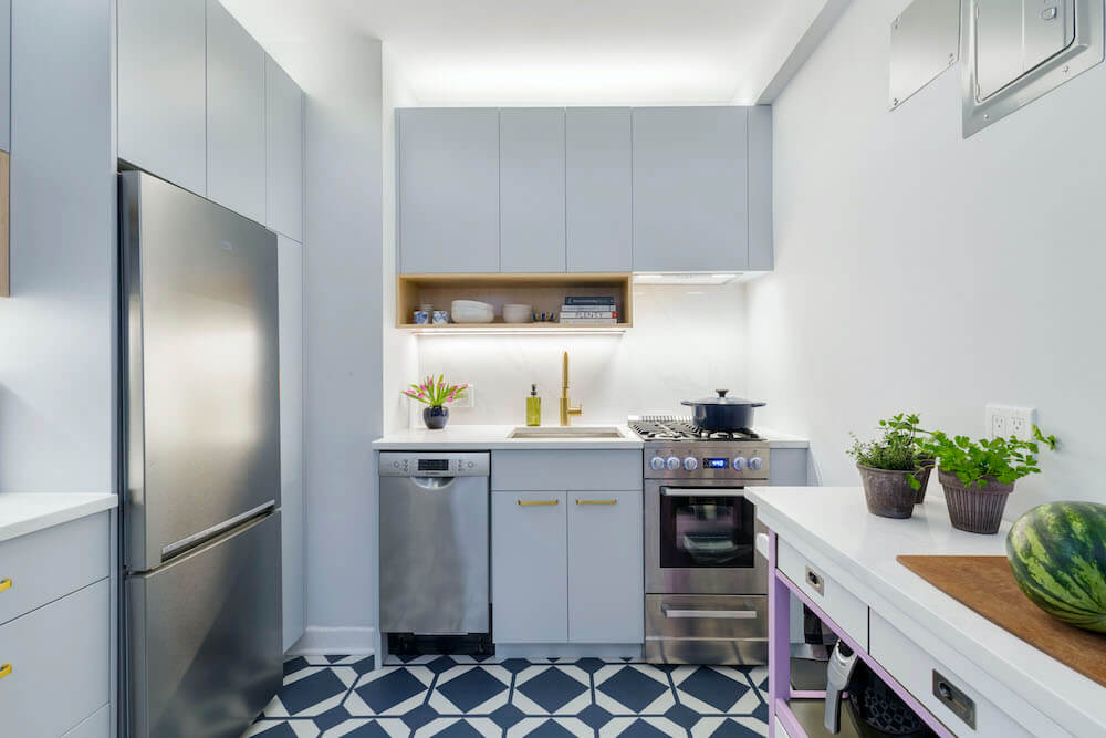
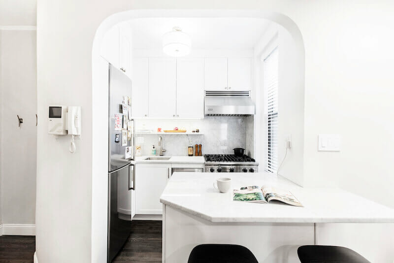
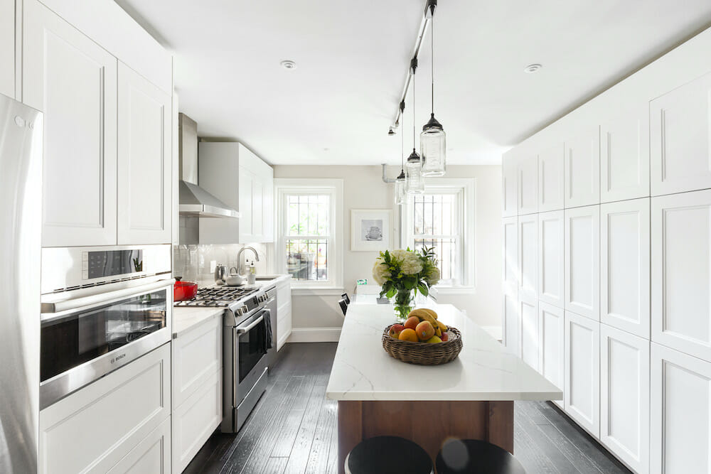
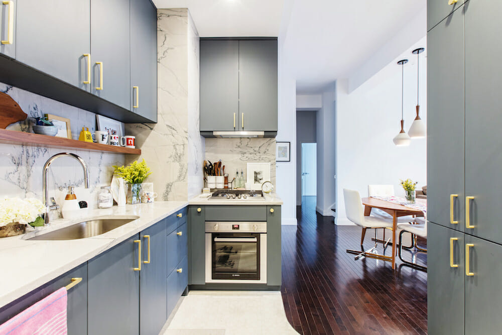
I didn’t go crazy on the cabinetry; it’s custom-designed but basic, built by a Brooklyn company to make use of all available wall space. A floor-to-ceiling pantry occupies a former dead space blocked off by an immovable hot water riser. We installed quartz countertops and a marble backsplash which topped the white cabinets.

Meanwhile, I moved on to bathroom tile design, which also proved difficult to choose. Wanting something striking, I flopped from $250-a-square-foot marble mosaic to hand-painted Italian tiles, then settled on a geometric design made of cement tile, which I paired with luxe wall tiles.
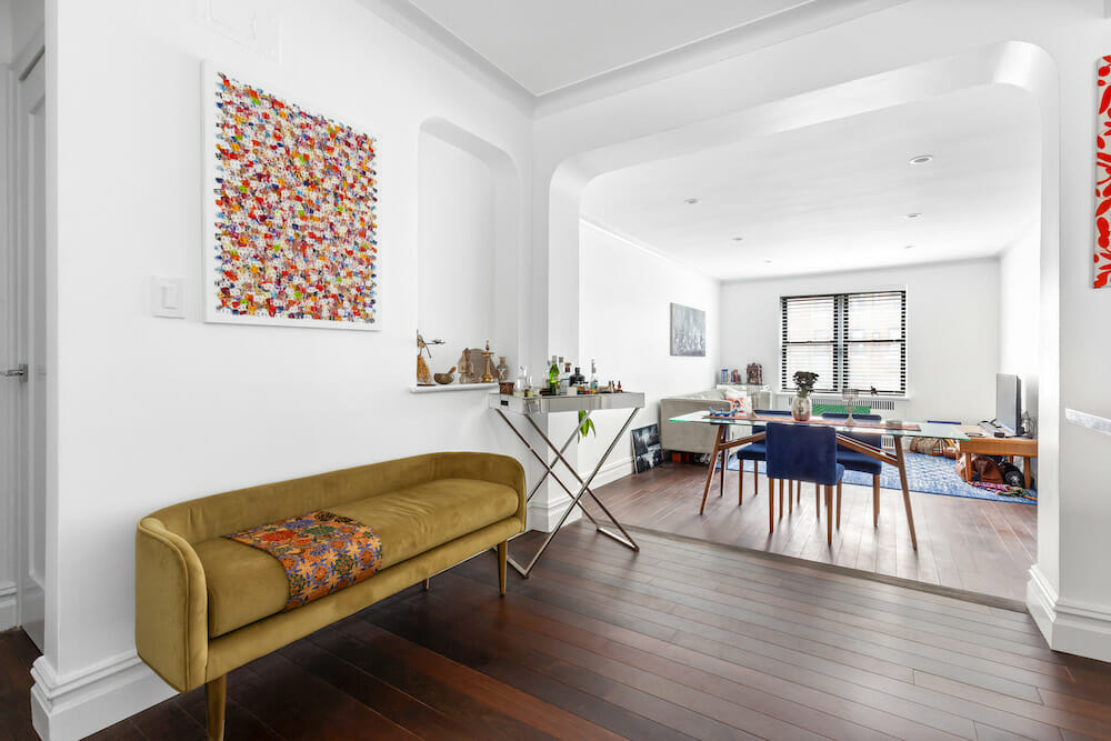
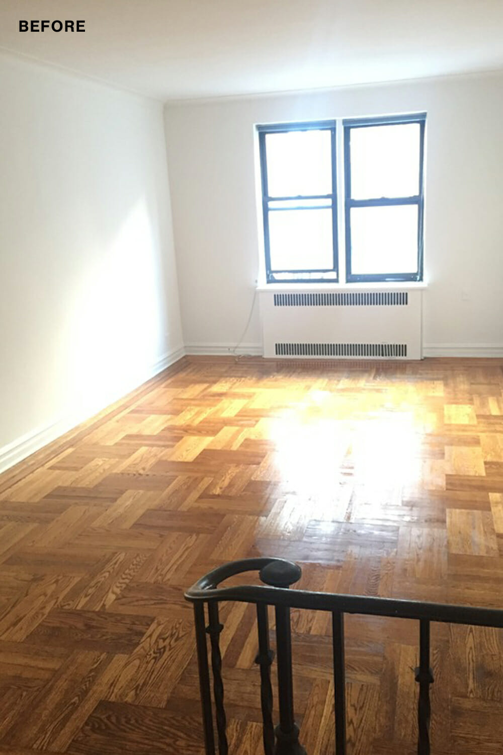
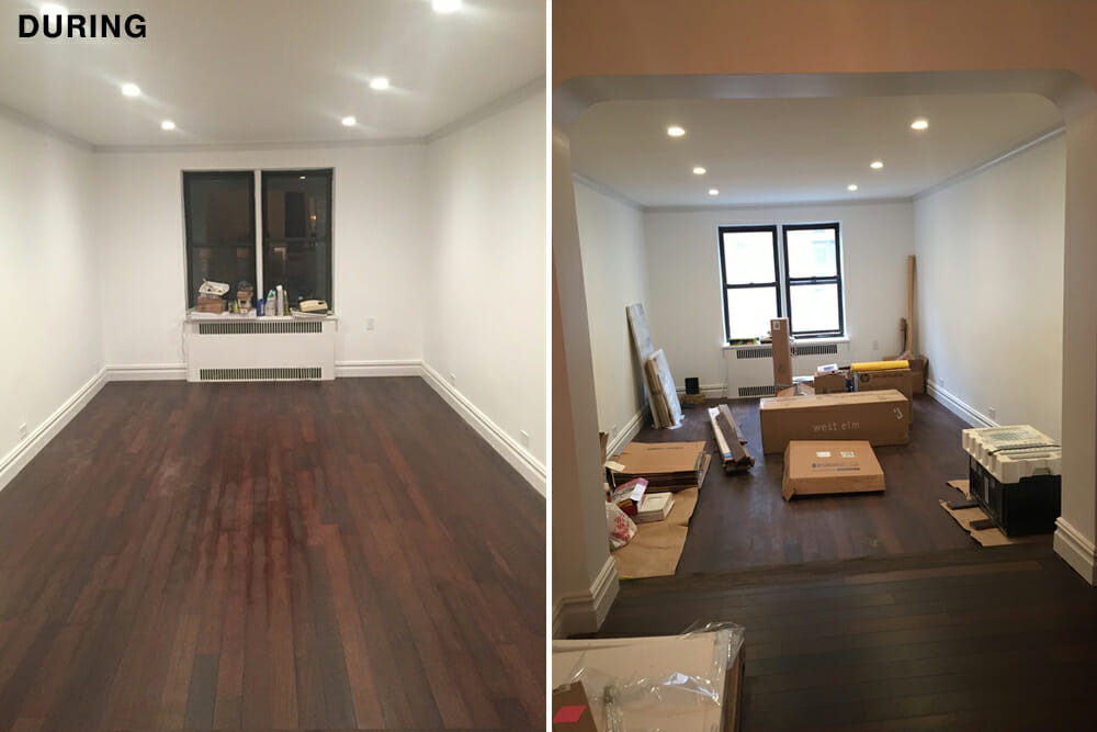
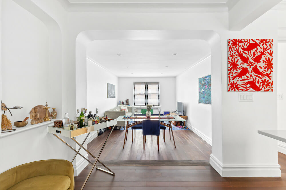
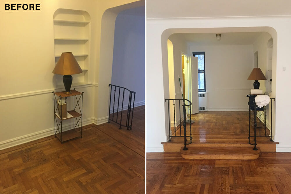
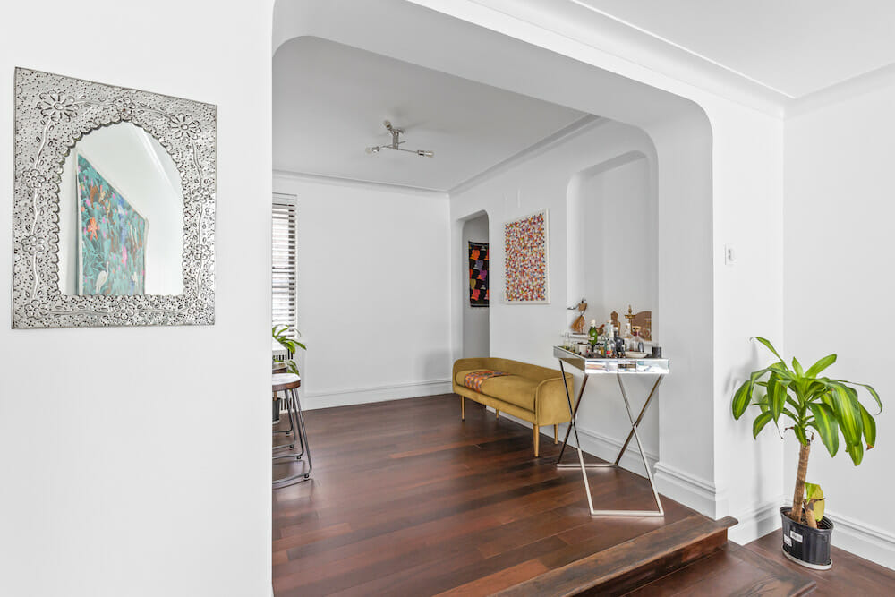
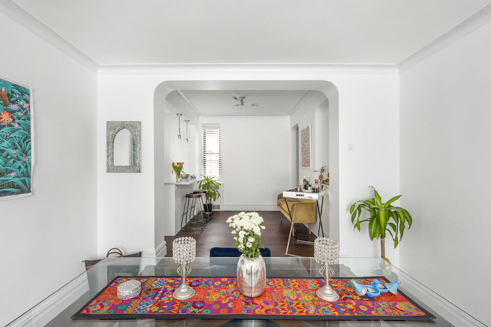
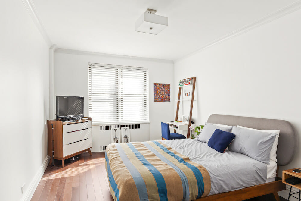
Throughout the apartment, the original hardwood flooring was in bad shape and could not be refinished. I decided to install new Brazilian hardwood floors spanning the living room, dining room, kitchen, and bedroom. The wood is dark, but with the contrast of white walls, blinds, and the all-white kitchen, the apartment feels bright and light. We also updated the electric panel, added outlets, and incorporated new light fixtures in every room.
From project start to finish, my Sweeten contractor was on top of it. We had some unexpected hiccups and delays, but he kept the job moving. During my earlier reno projects, I’d learned a thing or two about how to work with a general contractor. Remember that your contractor’s communication with you is essential. If you expect to be included in every decision, make sure the contractor knows it.
My contractor FaceTimed me from the apartment while I was at work asking for my approval on things as he installed. It felt great to have that level of involvement, but I also needed to be constantly available. He even sent progress photos when I went out of town. He was a no-nonsense, great guy, and I’d trust him to renovate for me again.
Despite occasional glitches, the renovation went great. The best part was sleeping on my new bed in my apartment for the first time! It felt great to wake up in this beautiful space. I still have a lot of art to hang and need more rugs to soften up the hardwood floors, but I love it.
Thank you, Tejesh, for sharing your story and your new home!
ENTRY RESOURCES: Brazilian walnut wood flooring throughout apartment: Floor & Decor. Three Light ceiling light: Lumens.
KITCHEN RESOURCES: Custom kitchen cabinets: E-Wood Flooring and Cabinetry. Chrome pull hardware and Behr: Home Depot. Quartz countertops and hexagon backsplash: Floor and Decor. Undercounter sink: Elkay. Faucet: Delta. Refrigerator, dishwasher, and oven: Bosch. Cooktop: Bertazonni. Pendant lighting: Lumens. Bar stools: Wayfair.
BEDROOM RESOURCES: Basic square light fixtures: Lumens. Behr paint: Home Depot.
BATHROOM RESOURCES: Pacific Contemporary Collection Berlin IV cement floor tile: Cement Tile Shop. Large-format white wall tile: Porcelanosa. Faucet, hanging mirror, and shower head with built-in shower wand: Delta Faucet. Eviva vanity: Overstock. Toilet: American Standard. Light bar: Lumens.
—
This 440-square-foot apartment on the Upper West Side is all about small-space style.
Sweeten handpicks the best general contractors to match each project’s location, budget, and scope, helping until project completion. Follow the blog, Sweeten Stories, for renovation ideas and inspiration and when you’re ready to renovate, start your renovation on Sweeten.
