Peeling Back The Layers In Park Slope
Decades after its last reno, a prewar condo takes on a new life
Finding the perfect apartment for one can be a challenge in New York City, let alone for a growing family that includes a 2.5-year-old, a 2-month-old, and pet, Maggie. Sometimes it takes pure luck to hit the real estate jackpot, other times, as in the case of lawyers Katherine and Chris, it takes vision. The couple’s dream home—a three-bedroom apartment in Park Slope—didn’t turn up fully renovated and as reasonably priced as they’d hoped. Instead, they landed on a two-bedroom, formerly rent-controlled unit and got creative with the design. To help see their vision through, Katherine and Chris called on Sweeten, a free service matching renovators with vetted general contractors, eventually hiring a design-build firm to turn the apartment’s existing kitchen into a master bedroom, gut renovate the bath, and create the family home they’d been looking for.
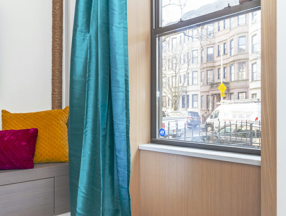
A 1.5-bedroom walk-up on the Upper East Side has its charms no doubt, but before the birth of our second child, the need for more space (and fewer stairs!) loomed. We had been looking in the Park Slope neighborhood of Brooklyn because one of the zoned elementary schools in the area is excellent. Chris’ parents also live in south Brooklyn and are very helpful with the kids, which was added incentive for our search. The problem is that when you’re searching in a desirable neighborhood with a desirable elementary school, good, fully-renovated three-bedroom apartments are hard to come by. And when they do crop up, they’re pretty expensive.
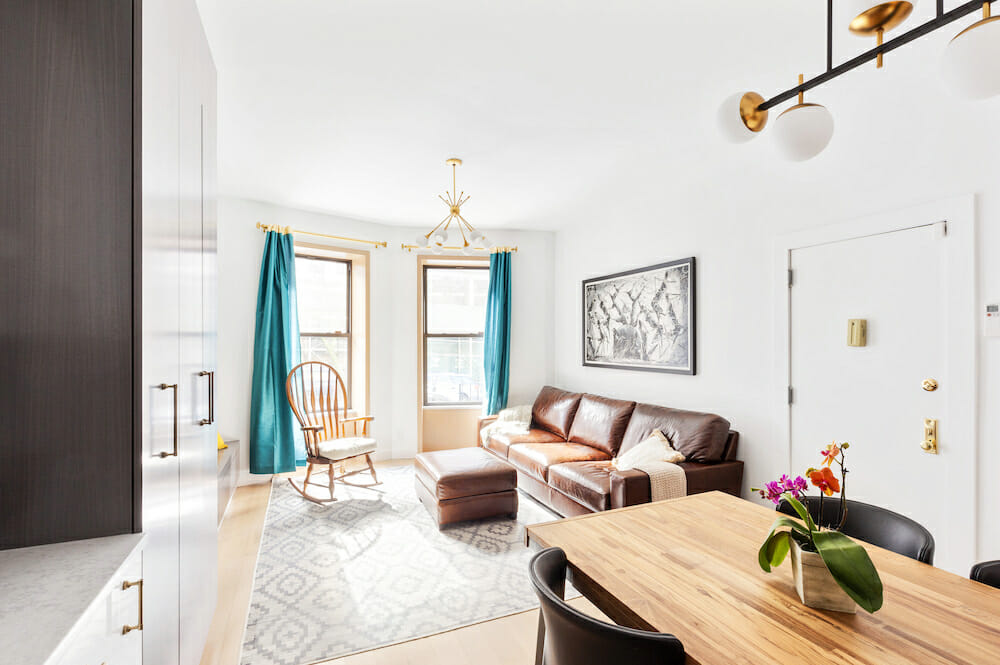
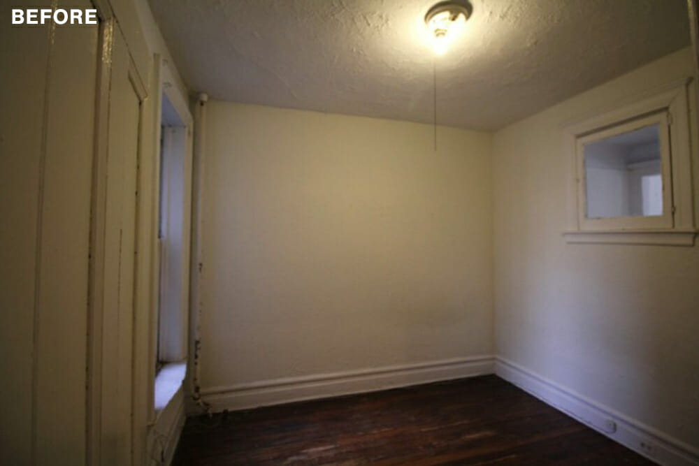
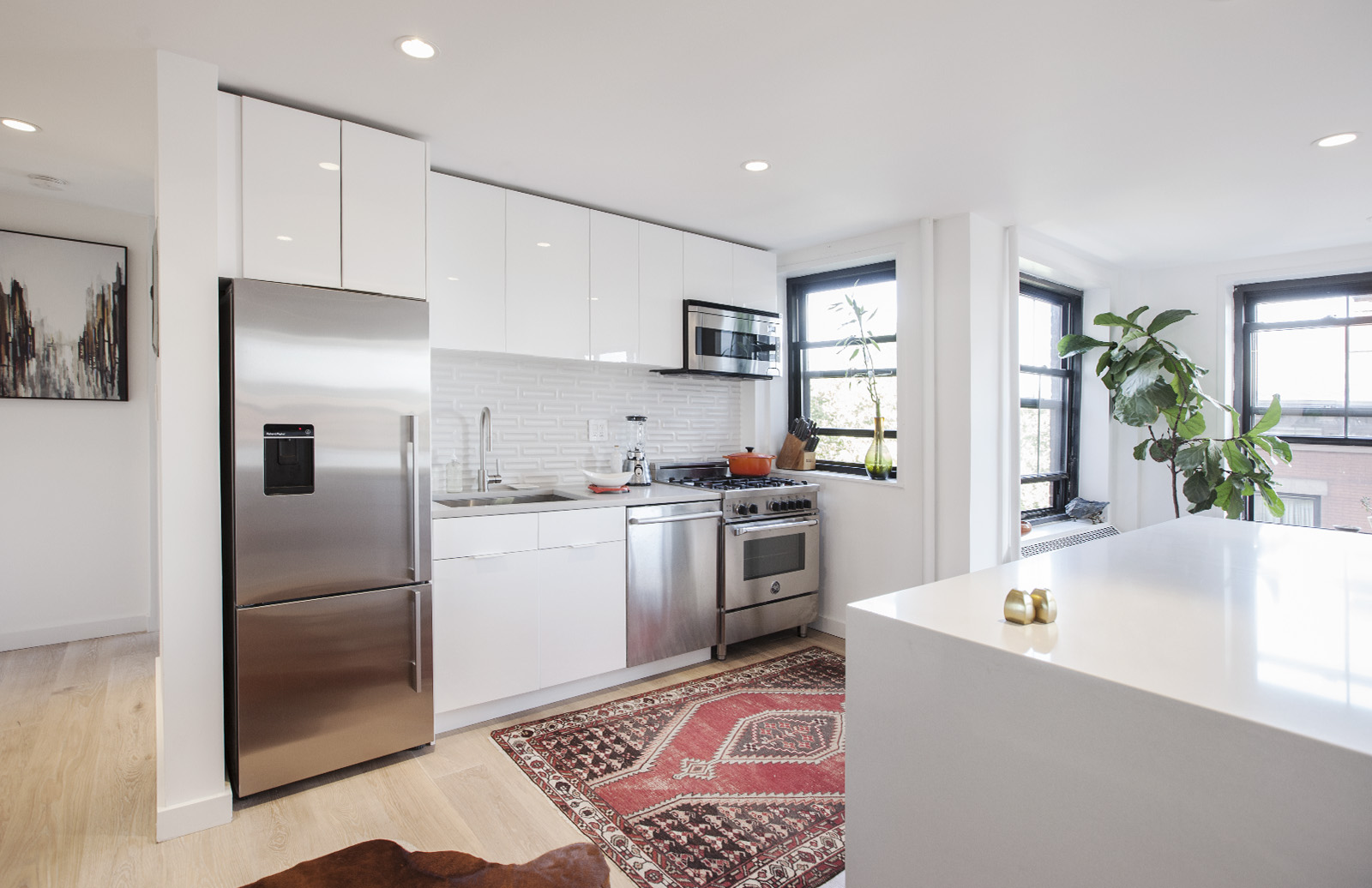
When we checked it out, we learned that since the apartment is on the first floor and it wouldn’t disturb the upper units, we could likely move the kitchen plumbing from the back of the apartment to the front, creating an open living room-kitchen space up front and converting the former kitchen into our master bedroom. Plus, our estimated construction costs seemed doable.
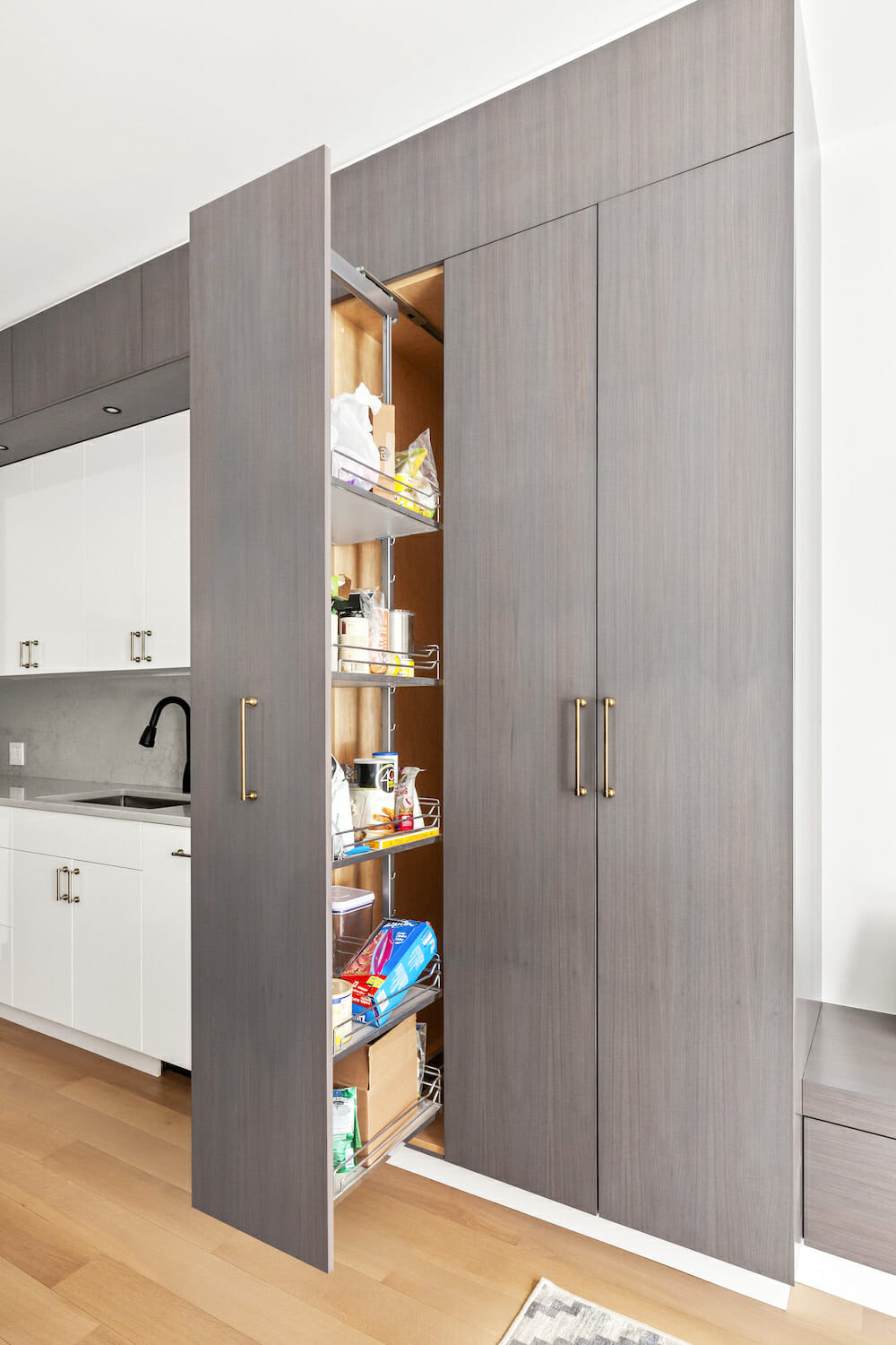
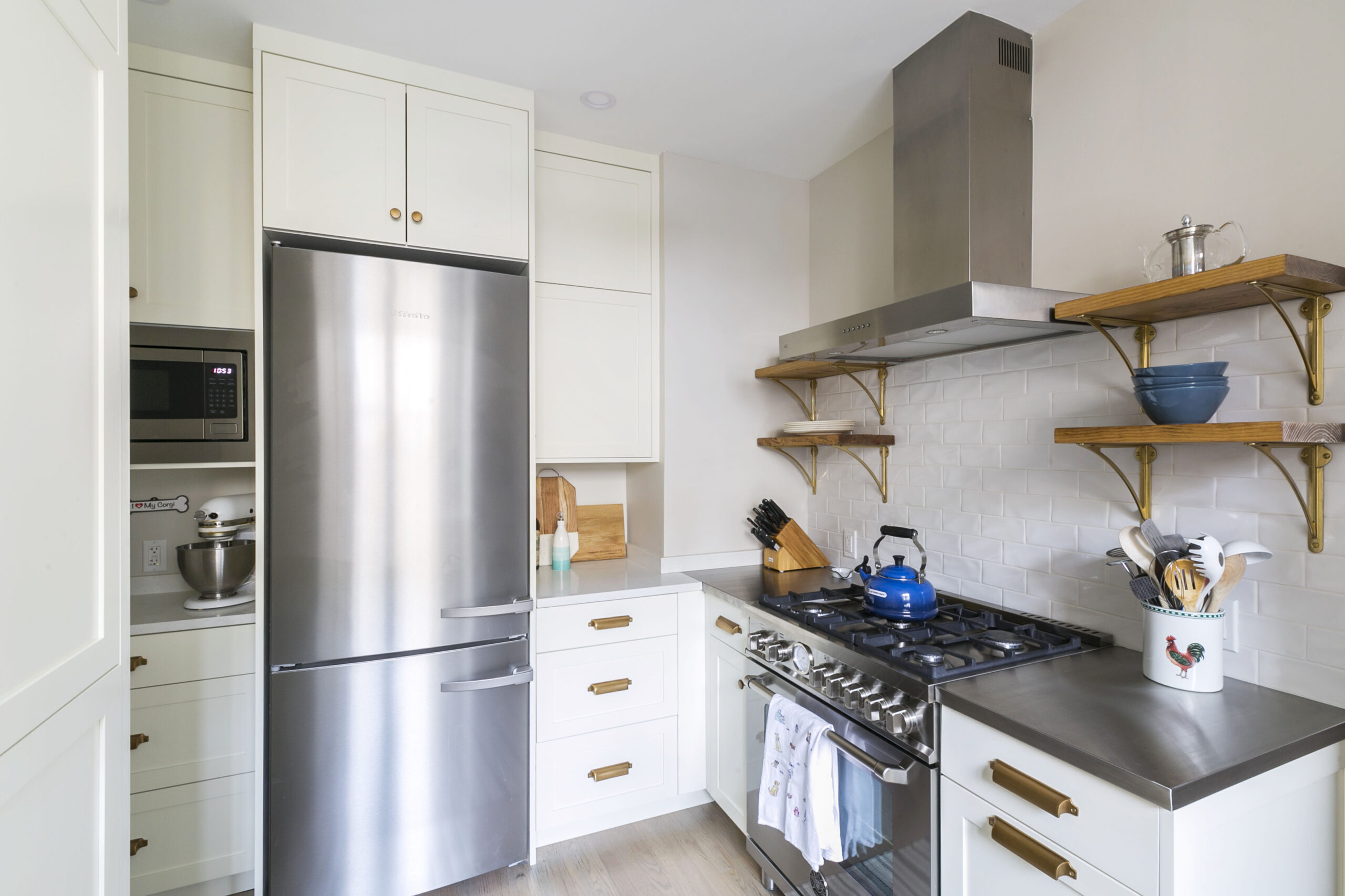
The pantry was also our contractor’s idea; I didn’t even know that pull-out pantries existed and wasn’t sure we’d have space. But it works perfectly…
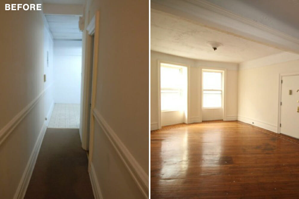
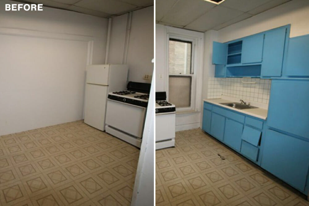
The layout of the apartment was one thing, but there was a lot more work to be done beyond that. The apartment hadn’t been renovated in at least 30 years. The floors were warped from water damage, the hallway flooring was covered in industrial carpeting, and the kitchen floors were old linoleum. The kitchen had a lowered ceiling with crumbling tile and stains from an old flood. The walls had dozens of coats of paint layered on and there were popcorn ceilings throughout the apartment.
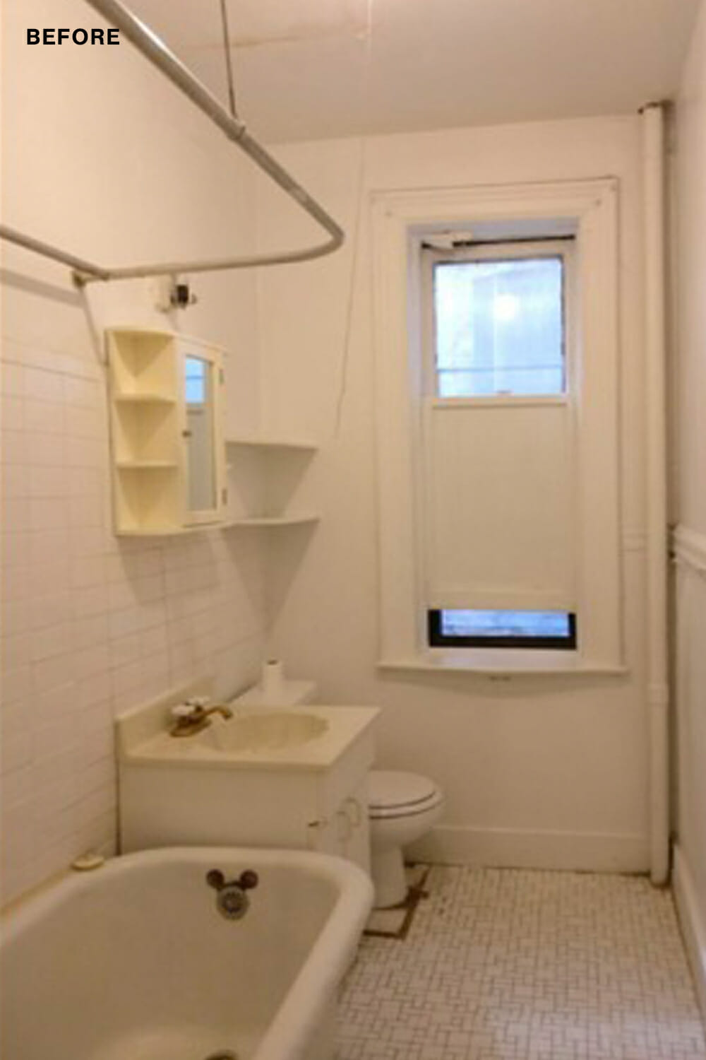
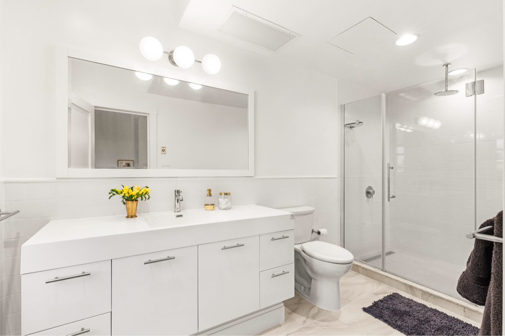
In the bathroom, fixtures were rusted, and the clawfoot tub was set up with the shower on the long wall of the tub rather than the short end. The closets and wiring also needed to be updated. Overall, we were looking for a bright, modern aesthetic but wanted to make sure that it didn’t feel cold or inconsistent with the prewar building style. Sweeten brings homeowners an exceptional renovation experience by personally matching trusted general contractors to your project, while offering expert guidance and support—at no cost to you. Renovate expertly with Sweeten
Additionally, when negotiating the price and scope of the project, our contractor was very upfront with us. When we suggested certain measures that could cut costs, for example, they would tell us if they thought we would be displeased with the result, but would then suggest another area to cut costs that would be less noticeable in the finished project.
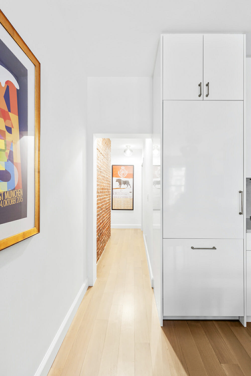
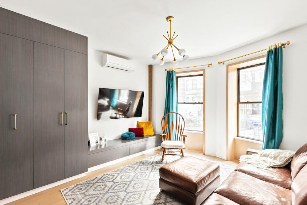
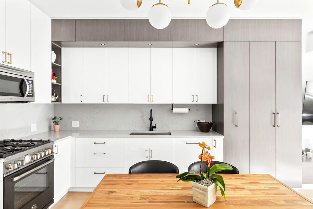
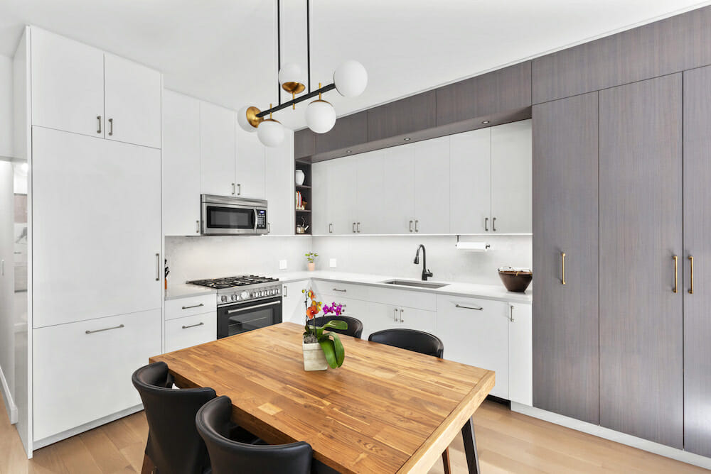
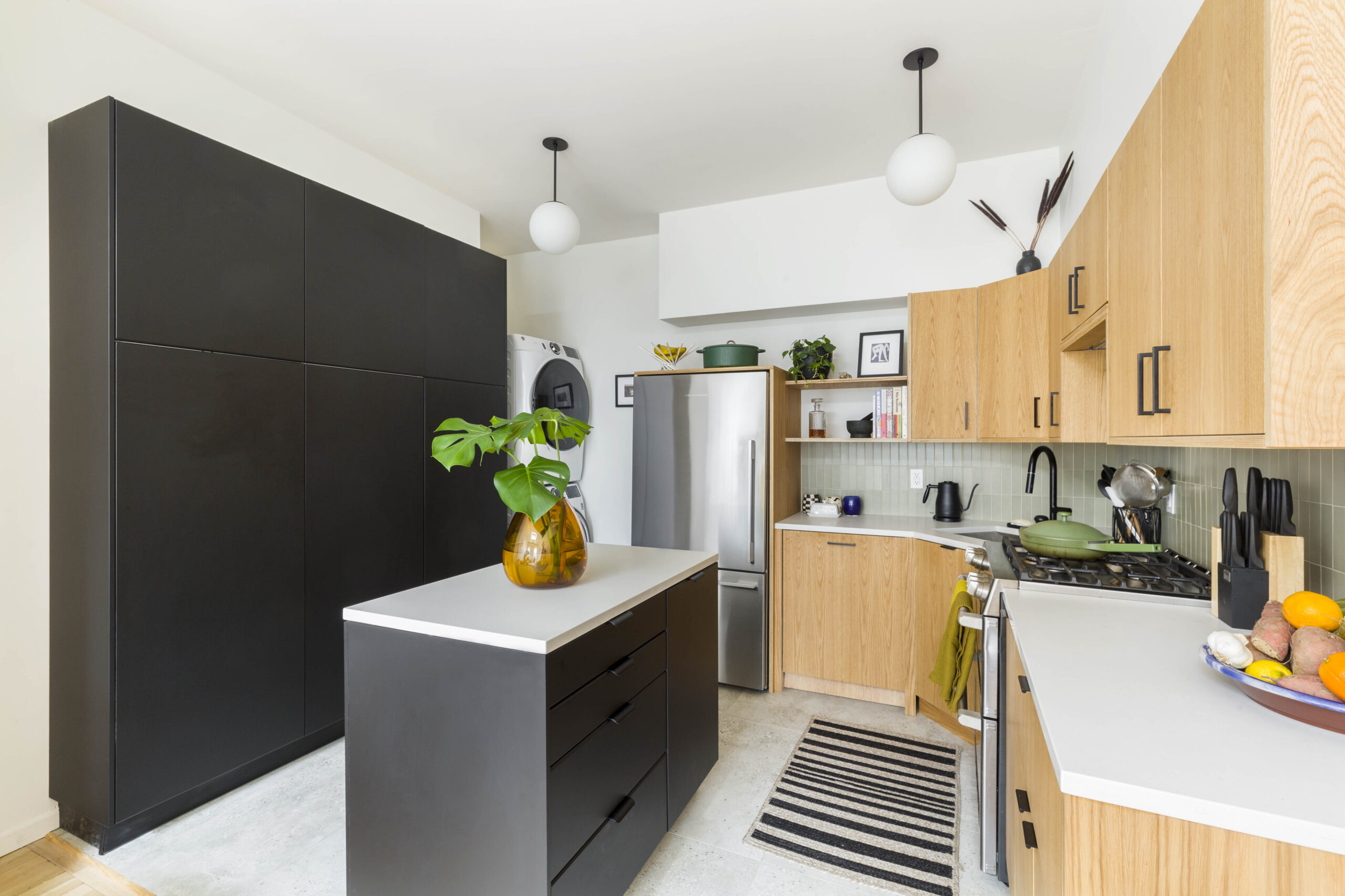
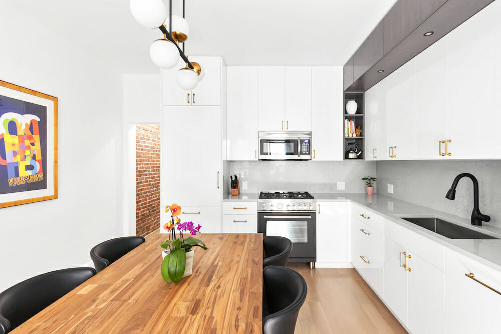
I felt strongly that we needed a coat closet in the living room to corral entryway clutter. Originally, I had large media units with built-in storage in mind, but our Sweeten contracting team suggested extending the kitchen cabinets instead, integrating the closet that way, which looks much better than a separate media unit. The pantry was also their idea; I didn’t even know that pull-out pantries existed and wasn’t sure we’d have space. But it works perfectly and allowed use of every inch of floor-to-ceiling space in the design. Now we can put things we don’t use much up top, as well as extra supplies.
In the end, they delivered a more beautiful apartment than we ever could have dreamed up ourselves. And on top of it, they got it done very quickly and were lovely to work with. I’d highly recommend them.
Thank you, Katherine and Chris. We loved seeing how your vision came to life!
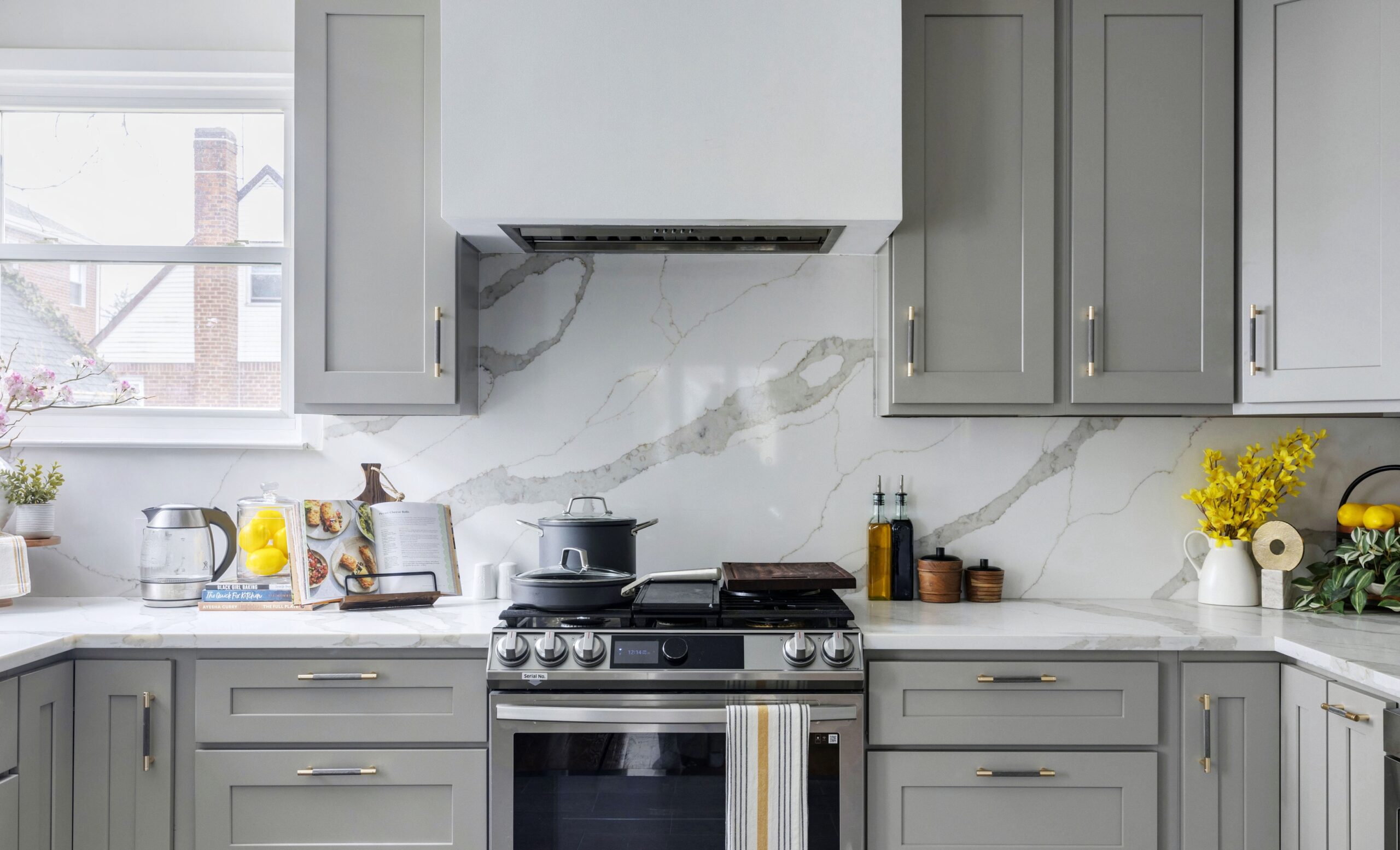
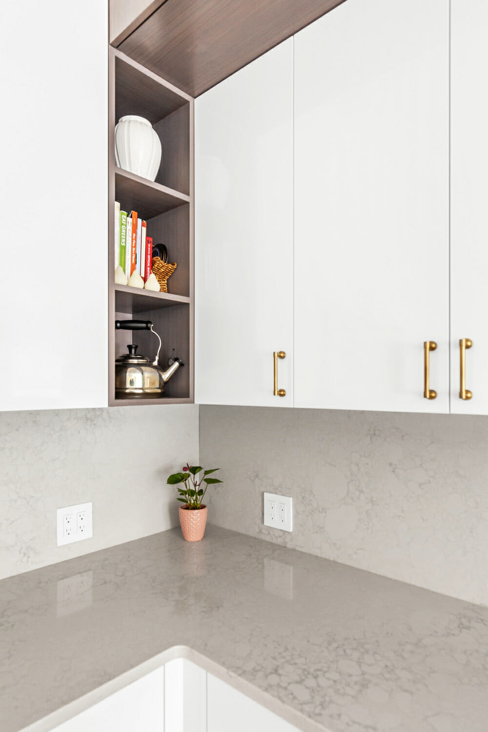
KITCHEN RESOURCES: Rift and quarter-sawn white oak flooring in a birch stain, satin lacquer finish: Bona. Quartered walnut cabinets in high gloss Super White enamel and custom stain finish: Custom from general contractor. Asbury pull cabinet hardware: Restoration Hardware. Countertops and backsplash in Stella: LG Viatera. Standard pro 30″ undermount sink, #KHU100-30: Kraus. Graham pull-down faucet, #VG02014: Vigo. Refrigerator: Blomberg. Dishwasher: Bosch. Stove: Bertazzoni. George Kovacs Alluria 5-light island lighting, #P1355-618: Minka Group. Counter lighting: PUK. Wall paint in Super White, #OC-152: Benjamin Moore.
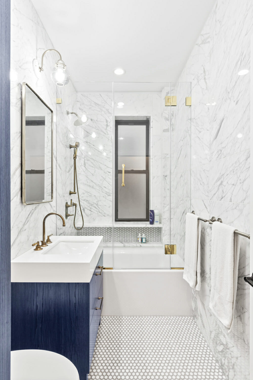
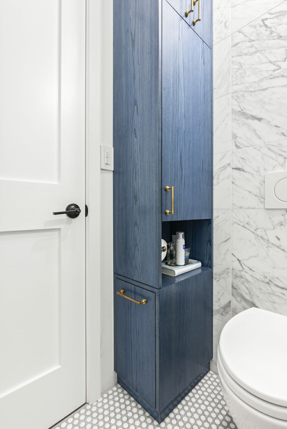
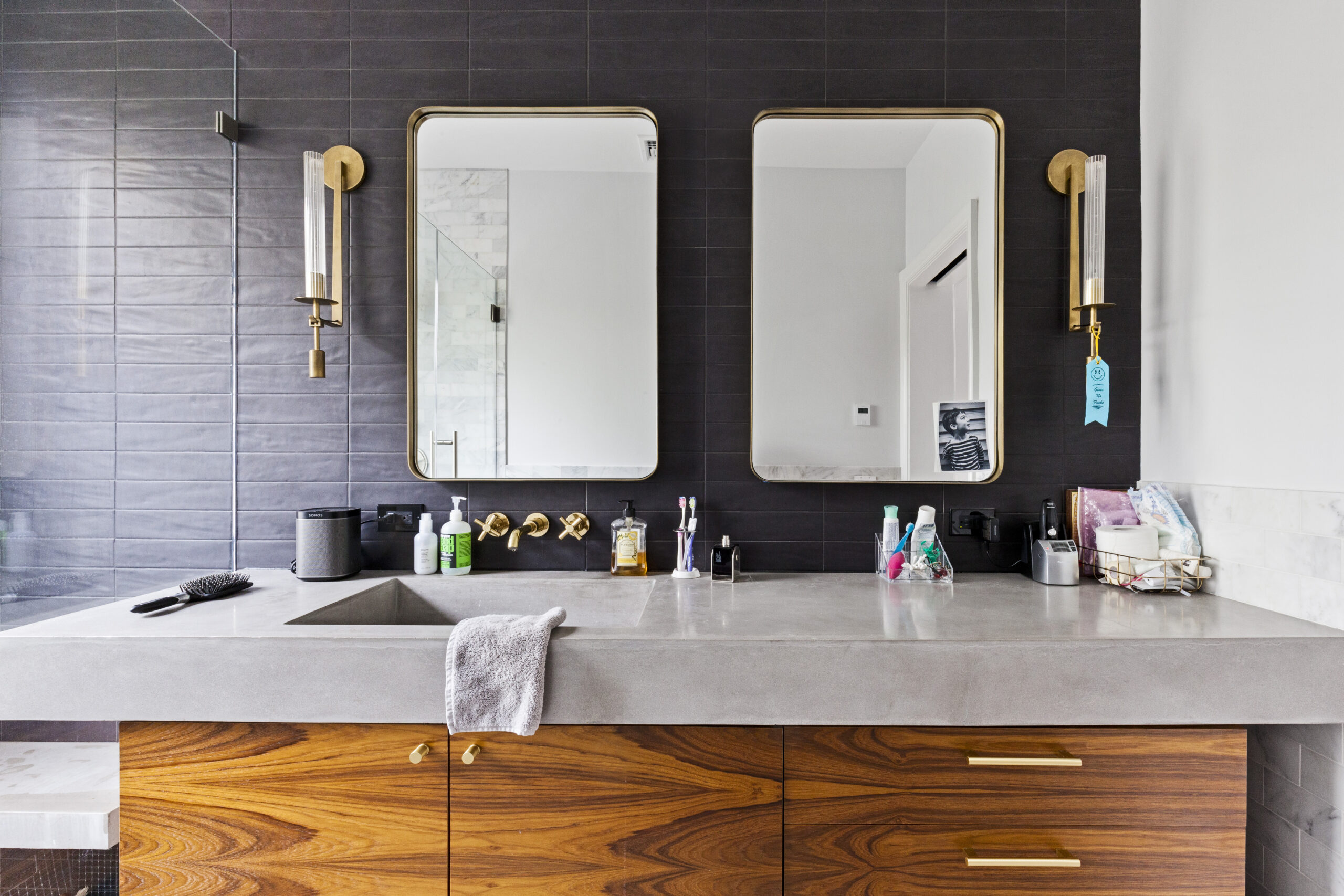
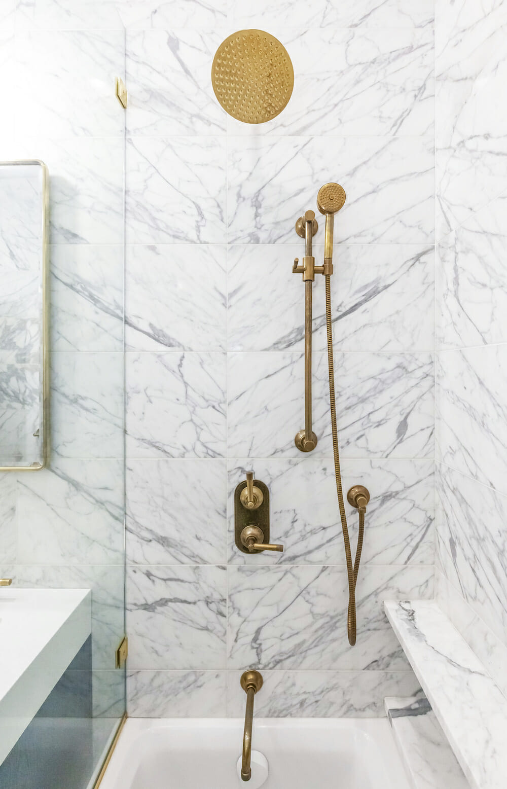
BATHROOM RESOURCES: Nirvana Snow rimmed 1″ circle ceramics tile: Tilebar. Statuary Marble honed 12″X 24″ X 3/8″ Stone Field wall tile: Artistic Tile. Asbury pull cabinet hardware: Restoration Hardware. Graceline shower and sink fixtures in French Brass: Rohl. Sink: Kohler. Ash wood vanity in blue stain with quartz countertop: Custom. Aquia wall-hung toilet: Toto. Ford’s Mill swing arm sconce lighting: Rejuvenation. Vintage recessed vanity mirror/medicine cabinet in brass: Pottery Barn. Bathtub: Duravit.
LIVING ROOM RESOURCES: George Kovacs Pontil 6-light chandelier: Minka Group. Paint in Super White, #OC-152: Benjamin Moore.
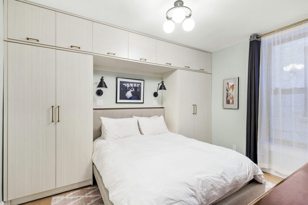
MASTER BEDROOM RESOURCES: Built-in closets: Smart Closet Solutions. Morocco wall bed sconces, #IWF582A01BK: Canarm. George Kovacs Alluria 3-light semi flush ceiling fixture: Minka Group. Paint in Wickham Gray, #HC-171: Benjamin Moore.
—
Katie and Marcus renovated an apartment in Park Slope, Brooklyn.
Sweeten handpicks the best general contractors to match each project’s location, budget, and scope, helping until project completion. Follow the blog, Sweeten Stories, for renovation ideas and inspiration and when you’re ready to renovate, start your renovation on Sweeten.
