Good Design Elevates a Sunny Co-op
Millwork and fireplaces set a modern outlook
The search for a home to fit Melissa and Russ’ growing family was becoming imperative. They loved their Park Slope neighborhood and sunny apartment but had already rearranged their space to fit their first child and then a second. When they found their new two-bedroom co-op in a historic brownstone, it had a great layout but needed updating. The couple looked on Sweeten, a free service matching homeowners with vetted general contractors, and discovered a renovation they loved on the site’s blog. They hired the designers of that project, Casey and Kumar of Studio Miller Atre and posted their project. Coincidently, it was the designers’ own Sweeten home renovation. Melissa and Russ even hired the same Sweeten contractor!
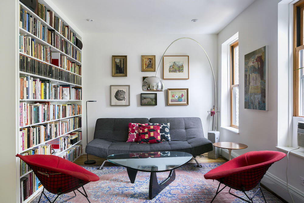
Four years ago, when our son was only a few months old, we got serious about looking for a two-bedroom apartment. We had gotten married and moved in together only a year before, so when our son arrived, we knew we needed more space. We focused our search mainly on Park Slope and nearby areas because we loved the neighborhood, but as the months wore on, we realized how scarce nice two-bedrooms with a practical layout in our neighborhood really were.
Large multi-dwelling buildings had good layouts, but there were very few on the market. Most of the brownstone apartments had living rooms smaller and darker than ours, which was sunny and overlooked treetops and a church belfry across the street.
A year later, our daughter was born, and our quest for the perfect two-bedroom became more urgent. Still, it was hard to find something we liked. In the meantime, we had configured our apartment bedroom to accommodate one child, then reconfigured it to accommodate two, and while we were happy in our space, we were excited to find something more reasonable for the four of us.
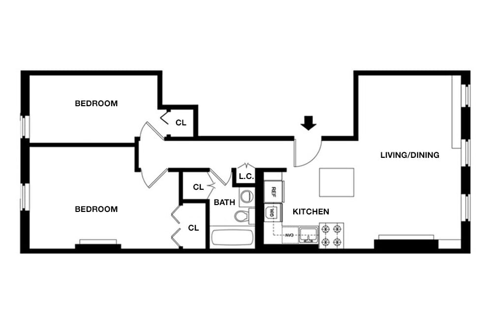
When we finally found our current apartment, three full years later, we were thrilled. Situated on the third floor of a 19th-century brownstone in the Park Slope Historic District, the apartment had a great layout but was a bit run-down. The first thing we noticed was the living room, which spanned the full width of the building and had three windows overlooking a tree-filled courtyard in back. Even in March, when the branches were bare, we could sense how peaceful it was. The bedrooms faced the tree-lined street in front.
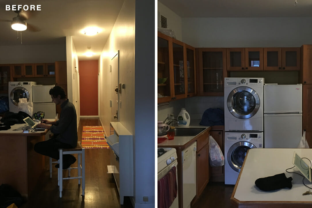
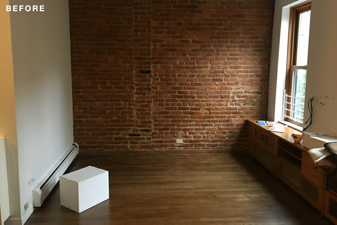
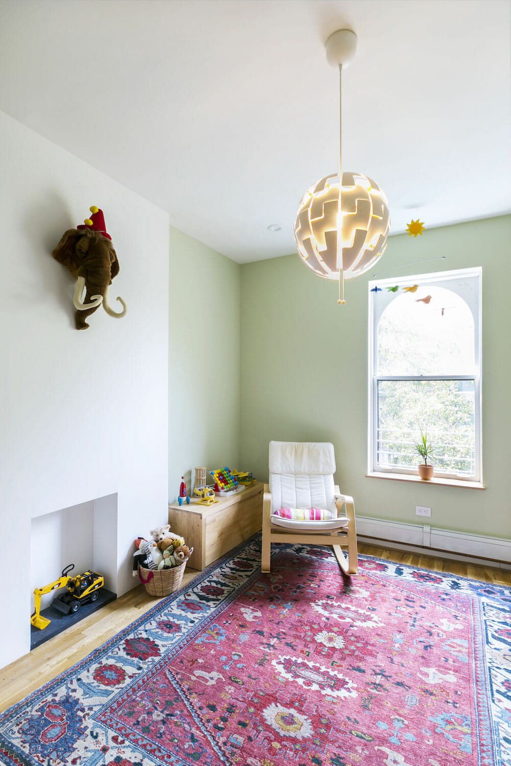
The unit hadn’t been updated since the building was converted to a co-op in the 1980s. We were eager to design it from scratch to make the apartment look simple and elegant. We intended to give the master bedroom to the kids and convert it into a giant playroom and keep the second bedroom for our own bed and home office. The exposed brick walls in the living room and bedroom were cold and dark, so we planned to cover them with sheetrock and paint the walls white. We also knew a custom kitchen would be our best bet.
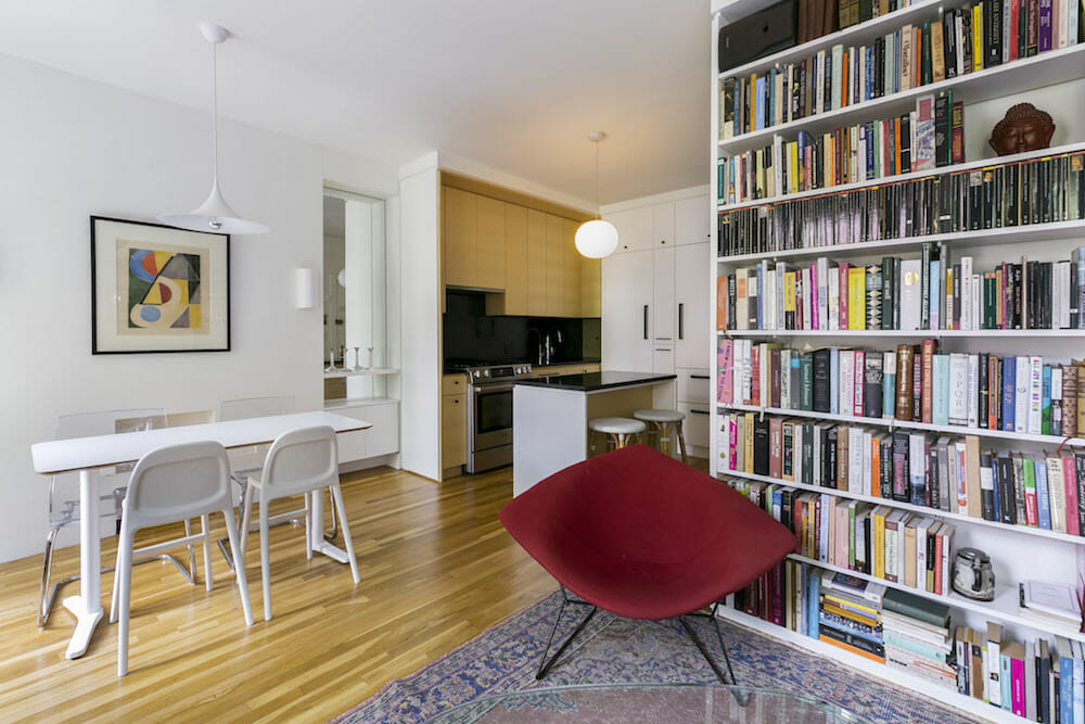
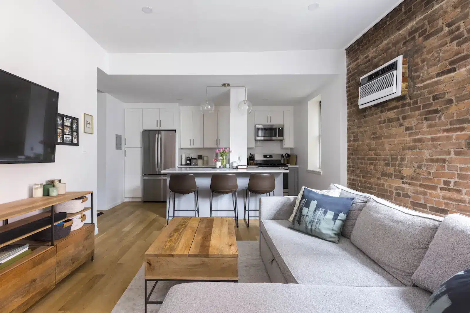
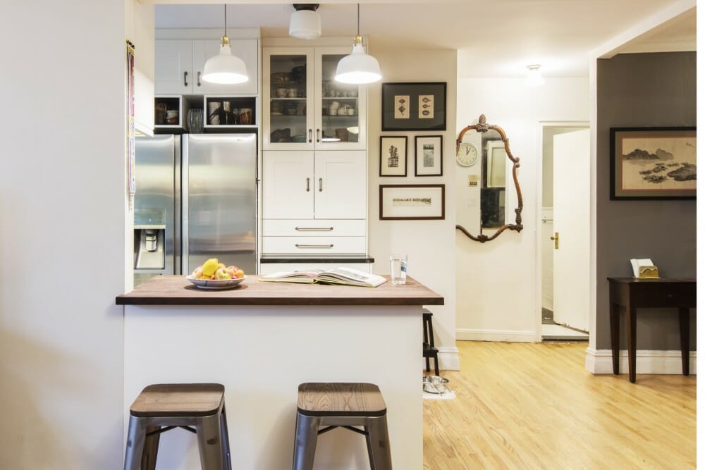
Because it was an open kitchen/dining/living area, we wanted to design the space in a way that wouldn’t make us feel like we were always in the kitchen. Casey and Kumar immediately understood what we were looking for and proposed a few designs that would make the kitchen space feel separate, which included building a partial wall that would eventually align with the built-in bookshelf we needed to accommodate our books. After our discussions, Kumar sent us a drawing of the proposed kitchen and bookshelf and our Sweeten contractor did an amazing job executing his vision.
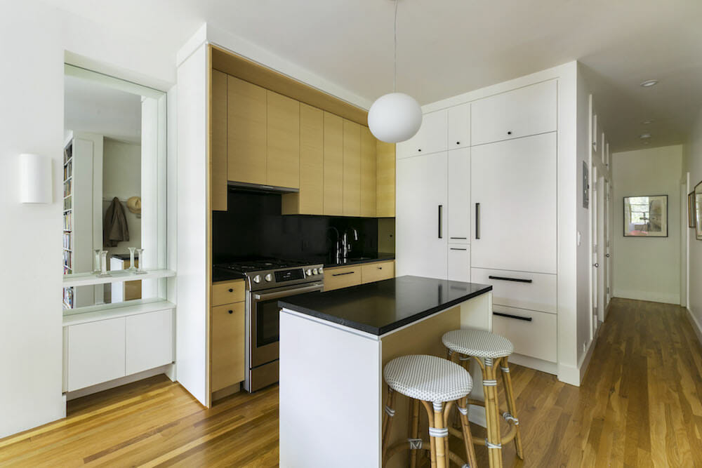
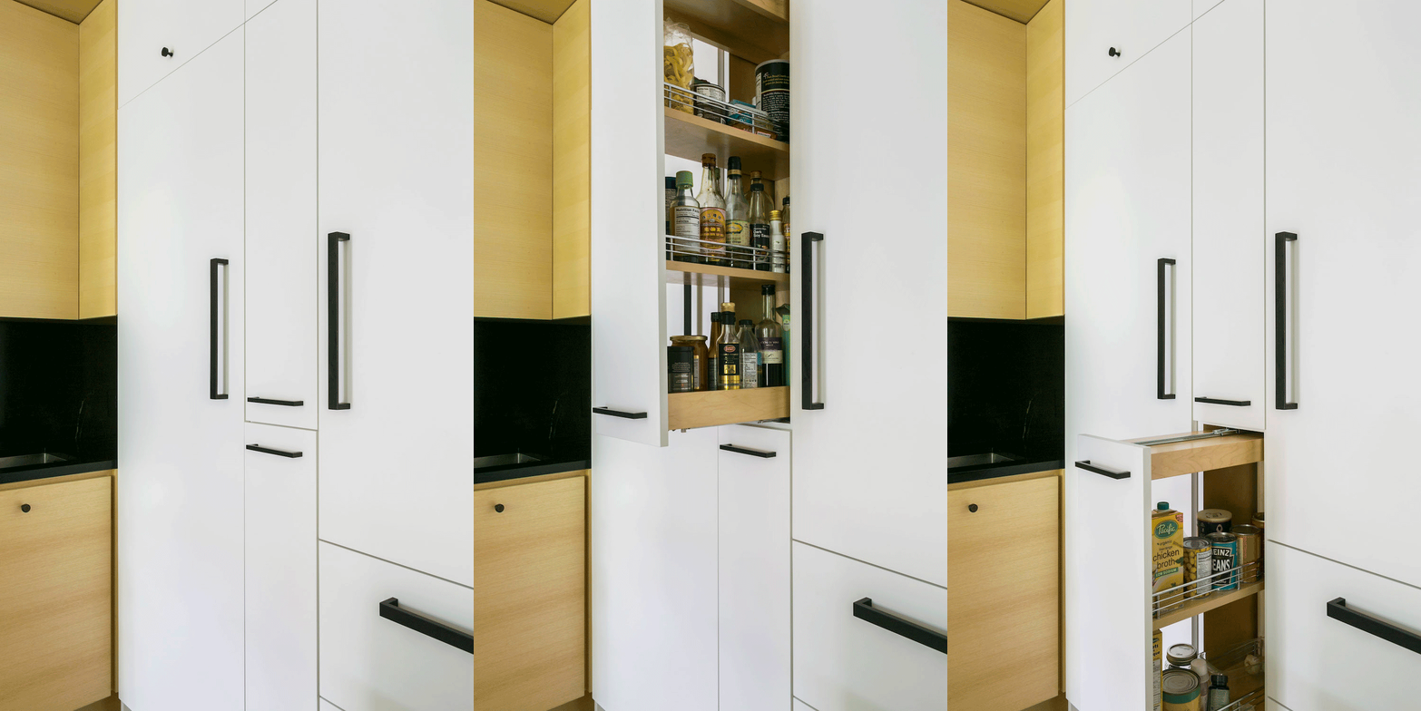
We decided to keep the layout as it was and carve out more storage space, with floor-to-ceiling cabinets in white lacquer hiding the washer/dryer and refrigerator. In the narrow space between these two appliances, our contractor built a custom pull-out pantry.
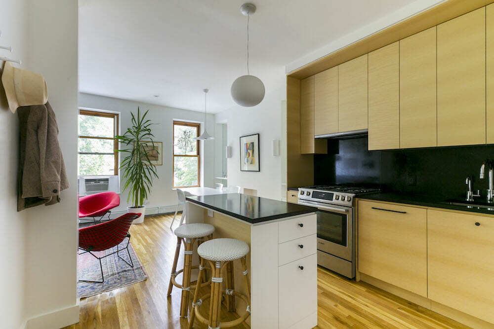
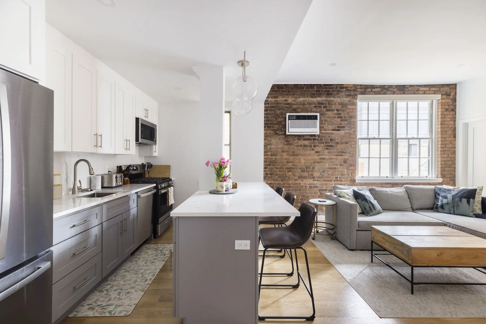
On the perpendicular wall sat an exposed workspace with sink, dishwasher, and stove and ash wood veneer cabinets. We got rid of the old island, and Casey and Kumar designed an elegant new one with plenty of storage space.
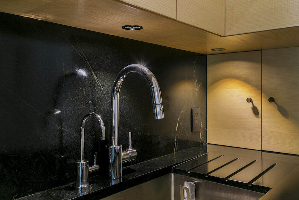
For our countertop and backsplash, we chose soapstone, and are very happy with the result. To maintain an uncluttered countertop we had a drain board carved directly into the soapstone. My husband picked out the hardware with Casey. The kitchen is a dream.
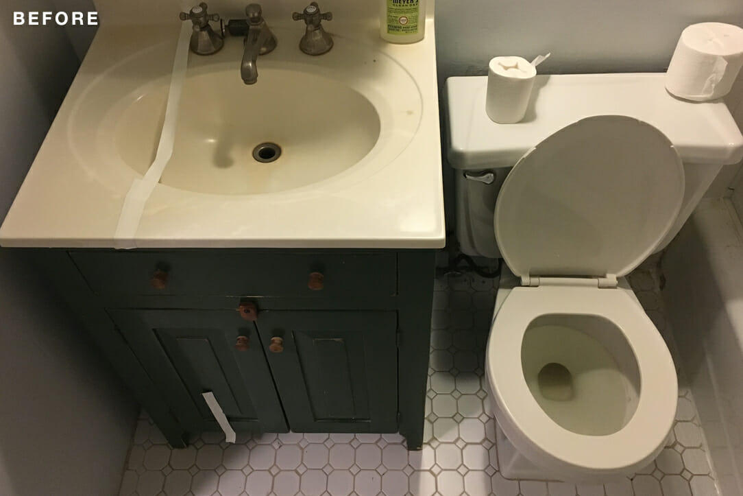
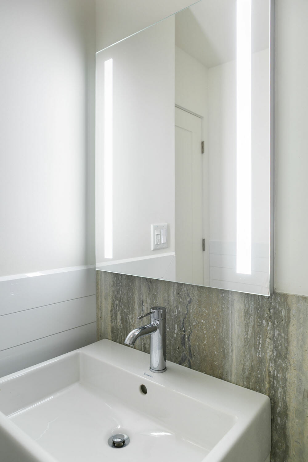
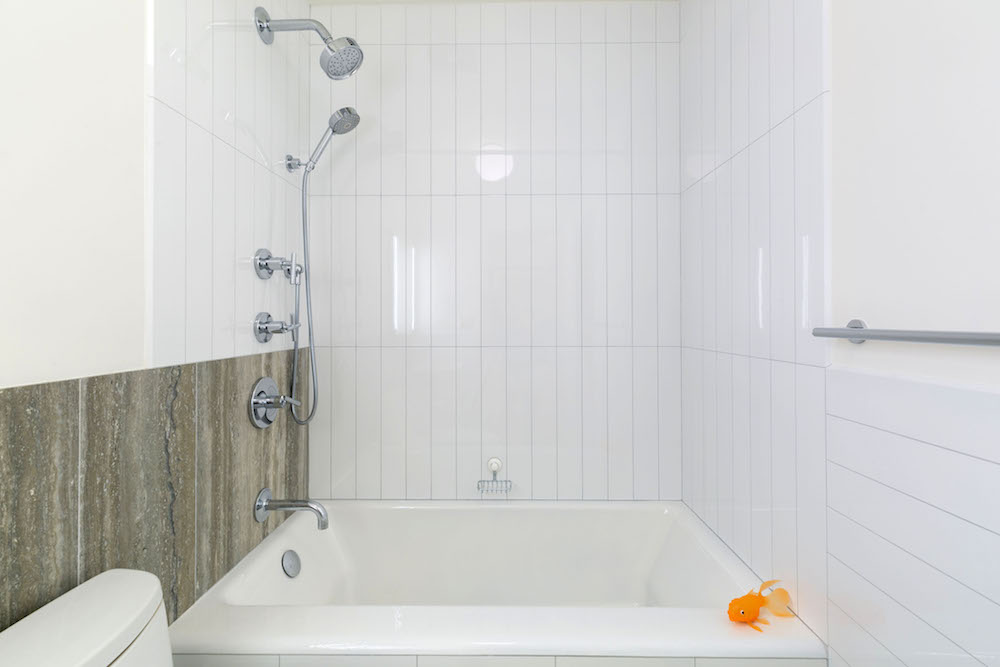
…we planned white subway tile and black porcelain tiles [for the bathroom] but it evolved into something more ornate under Casey’s direction.
Sweeten brings homeowners an exceptional renovation experience by personally matching trusted general contractors to your project, while offering expert guidance and support—at no cost to you. Renovate expertly with Sweeten
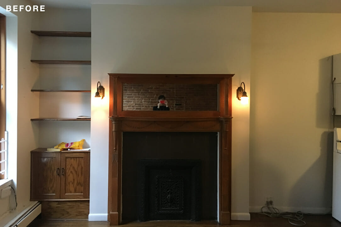
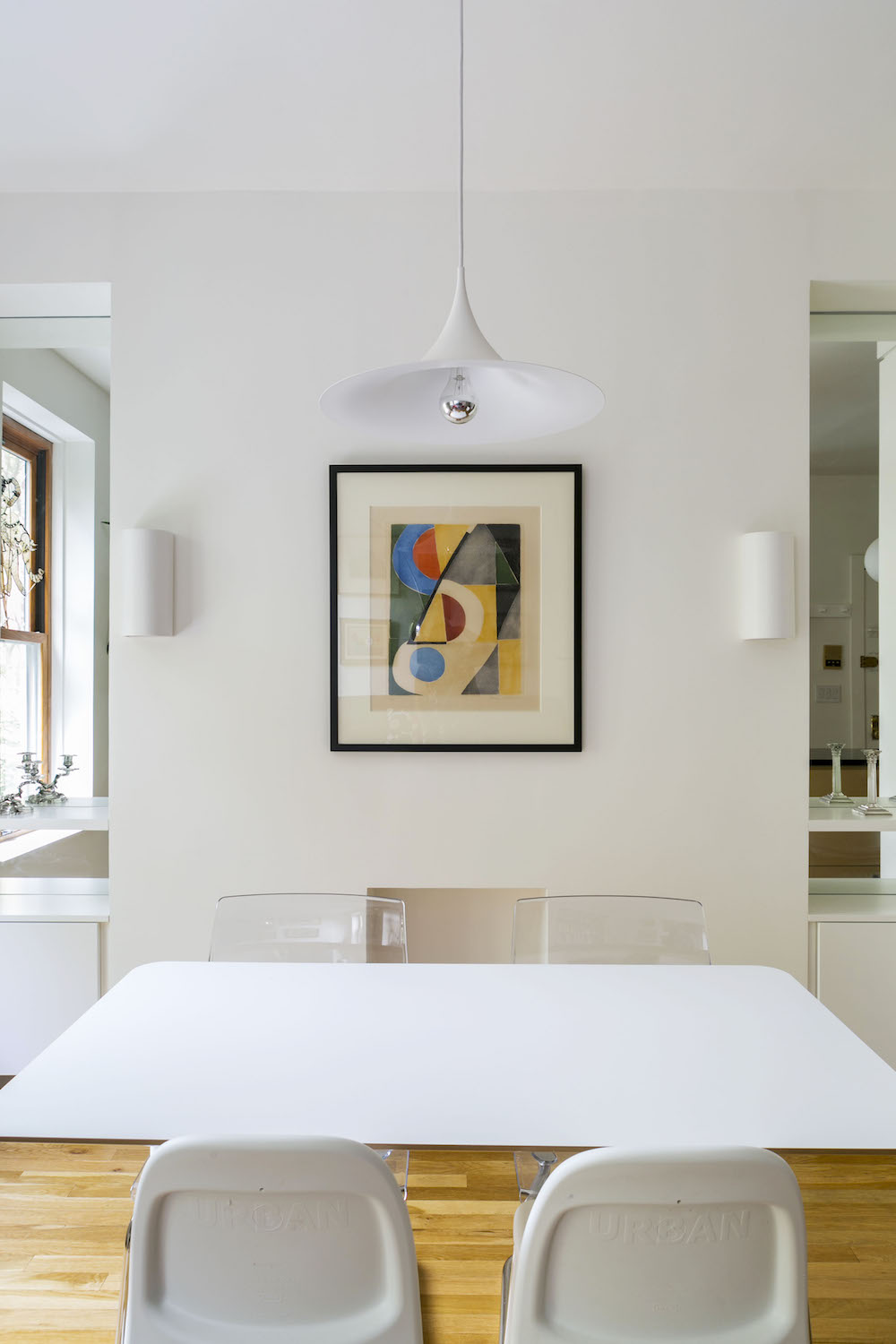
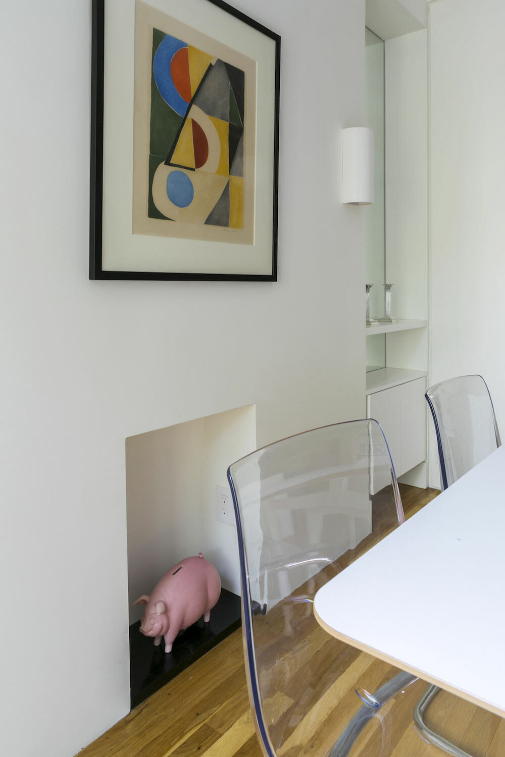
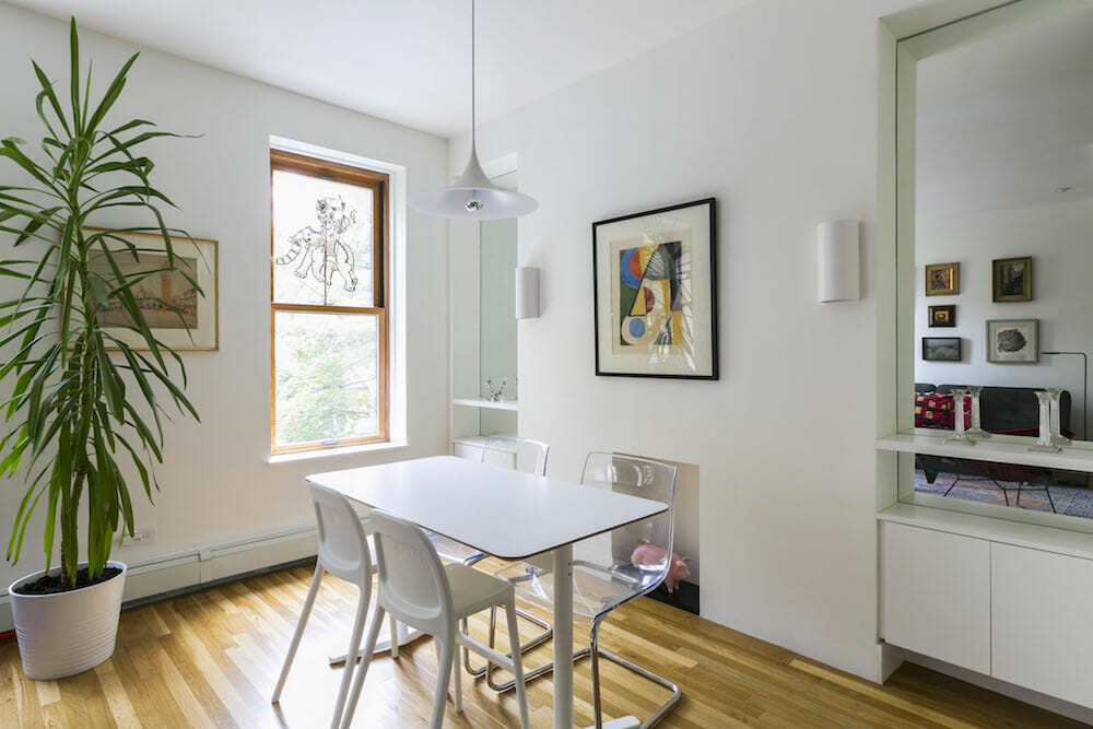
When Kumar proposed adding mirrors matching the height of the windows on either side of what had been the fireplace, along with cabinets below, we really felt our space was coming together. The mirrors added depth and dimension, along with light being reflected. For years, we had lived in a corner apartment with plenty of windows and the addition of mirrors in our new apartment really opened the space up.
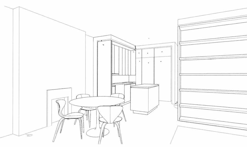
(Above) Kumar’s sketch
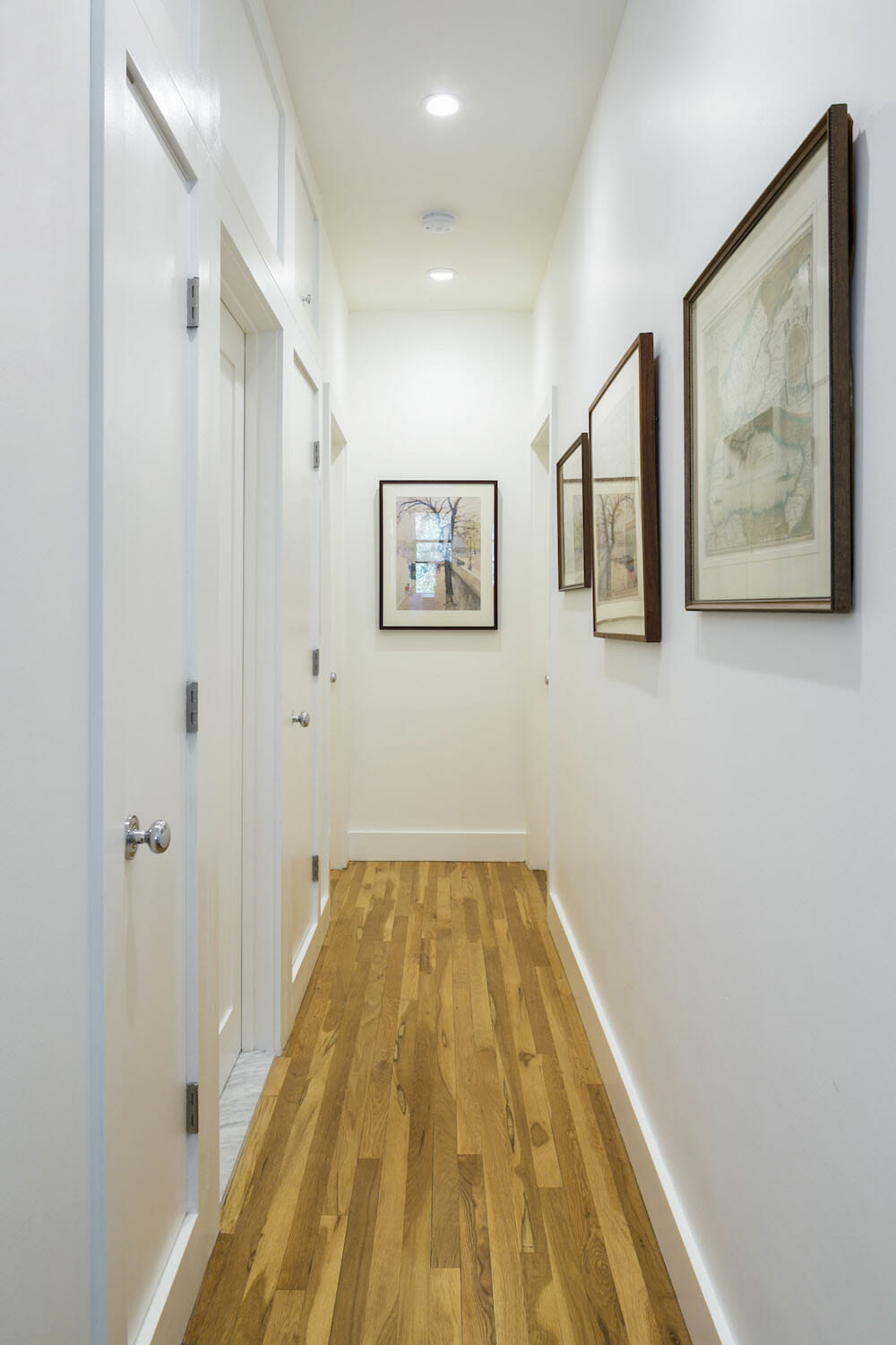
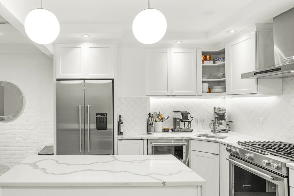
Aside from one overhead light in the kitchen and one in the bathroom, the entire apartment was devoid of light fixtures. We added a pendant lamp above the dining room table and a globe lamp over the kitchen island, along with recessed lights in the living room, hallway, and bedrooms. The lights under the kitchen cabinets are especially practical and elegant. Our contractor finished the underside of the cabinets with the same ash veneer as the fronts.
All in all, we are tremendously happy with our space. Casey and Kumar’s vision, combined with our Sweeten general contractor’s excellent craftsmanship, resulted in a space that feels modern and civilized. The toys are contained in the children’s space, and when we manage to put everything away, our living and dining area can be free of clutter.
Our apartment is perfect. It’s functional and beautiful, and we love it more every day.
Thank you, Melissa and Russ, for sharing your new family home with us!
DESIGN NOTES FROM STUDIO MILLER ATRE:
The kitchen is anchored by a wall of full-height millwork into which all appliances and storage are neatly organized; one large millwork features a pull-out panel. The dining area is centered on the hearth and flanked by a pair of full-height mirrors which match the dimensions of the existing windows to make what would otherwise appear a solid wall a source of light and spatial depth. The living space is nestled into a wall of books, which extends out into the main hallway to give the sitting area a bit of seclusion. Each of these elements is distinct in its function and feeling, but as a group, they form a common visual language.
LIVING SPACE RESOURCES: Paint in Simply White: Benjamin Moore. Wood floors refinished in Bona Traffic in satin finish: Bona. Recessed Lighting, Cooper Halo 4″ LED Adjustable Gimbal lights and 4″ LED downlights with compatible Cooper dimmers (DLC03P): Polar-Ray. Baldwin Estate knobs in polished chrome door and closet hardware: Simon’s.
KITCHEN RESOURCES: Countertop and backsplash: Garden State Soapstone. Cabinets and island: Custom by general contractor. Riverwood knobs and Edgecliff pulls cabinet hardware: Schoolhouse. Bosch stove, Miele dishwasher, and washer/dryer: AJ Madison. Sub-Zero refrigerator: P.C. Richard & Son. Sink: Kraus. Concetto faucet: Grohe. Talis S beverage faucet: Hansgrohe. Puck LED under-cabinet lights: Pure Edge Lighting. Jasper Morrison Glo-Ball S island pendant lamp: FLOS. Riviera island stools: Serena & Lily.
BATHROOM RESOURCES: Highbridge tub, Verdera lighted medicine cabinet, Purist Series shower fixtures, hand shower from Awaken Series, Stillness towel bar: Kohler. Carlyle II toilet: Toto. T12 toilet paper holder: Vola. Vero Air sink: Duravit. Essence sink faucet: Grohe. Vanity: Custom by general contractors. Dioscuri ceiling light fixture: Artemide. Kanso 4″ x 24″ wall tile in Winter White gloss: Ann Sacks. Honed 12″ x 24″ Stormy Gray travertine wall tile: Stone Source. Black matte Alta 12″ x 24″ porcelain floor tile: Nemo Tile. Chrome shower curtain rod: Signature Hardware.
DINING ROOM RESOURCES: Ceiling pendant: Gubi. Sconces: Chios wall sconce 214 in satin white: A19.
LIVING ROOM RESOURCES: Elfa bookshelf system: The Container Store.
CHILDREN’S BEDROOM: Paint in Hancock Green: Benjamin Moore. PS 2014 ceiling pendant: Ikea.
—
A homeowner revamped her kitchen and living area in Park Slope, Brooklyn.
Sweeten handpicks the best general contractors to match each project’s location, budget, and scope, helping until project completion. Follow the blog for renovation ideas and inspiration and when you’re ready to renovate, start your renovation on Sweeten.
