A Clinton Hill Apartment Renovation that Smooths Out Traffic Flow
A Clinton Hill, Brooklyn family decided to overhaul their cramped, cluttered apartment. By opening up the kitchen, maximizing storage, and rethinking the layout, they transformed their home from a traffic-choked gridlock into a serene oasis.
A full apartment renovation in Clinton Hill prioritizes comfort and storage
- Homeowners: Dara + Mauricio posted their project on Sweeten
- Where: Clinton Hill, Brooklyn, New York City
- Primary renovation: An 1,800-square-foot full apartment renovation to increase function and storage
- Notable: Giving the kitchen more space and flow by moving the refrigerator out of the space
- Result: A larger kitchen and better flow throughout
At Sweeten, we’re experts at all things general contractors — we pre-screen them for our network, carefully select the best ones for your remodeling project, and work closely with hundreds of general contractors every day.
Guest blog post by Sweeten homeowner Dara
Figuring out the best layout for the apartment
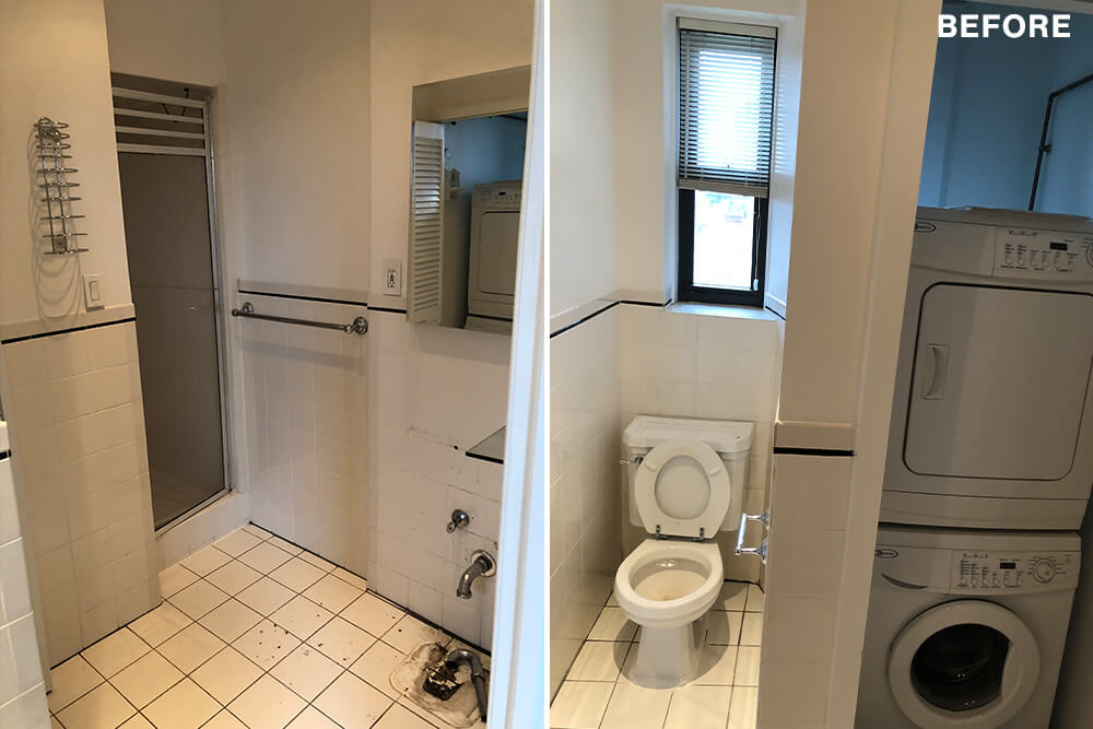
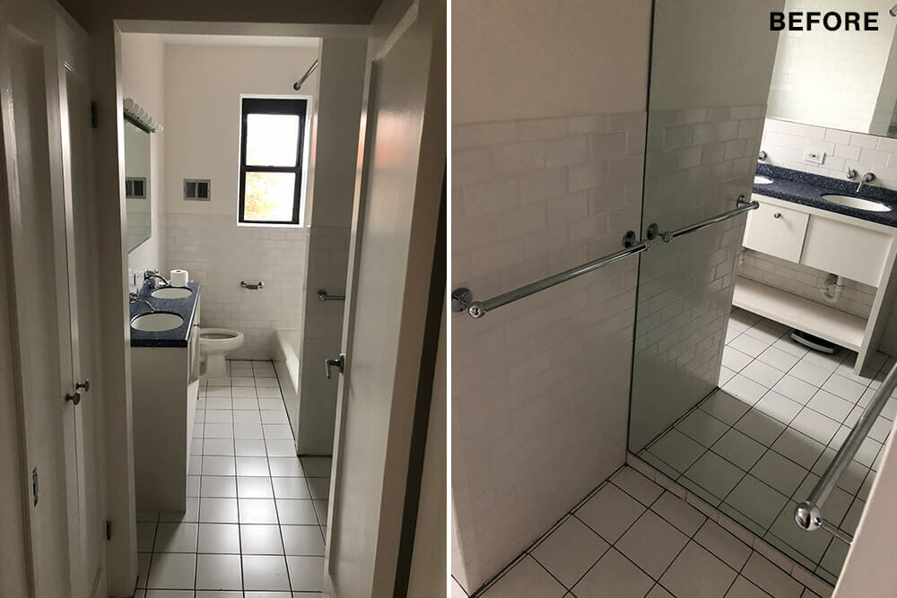
Our building was originally constructed in 1930, possibly for officers of the Navy Yard located several blocks north. Like many buildings in NYC, it turned into a co-op in the ’80s. The overall layout of the apartment was great, with a lot of natural light, but the configuration of the space in both bathrooms, as well as the kitchen, was awkward.
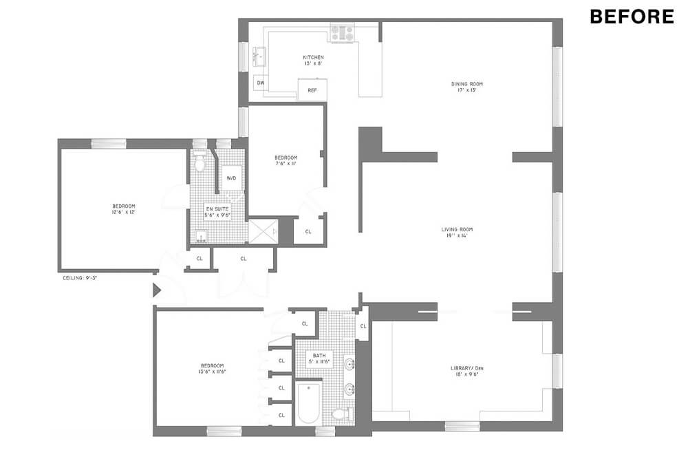
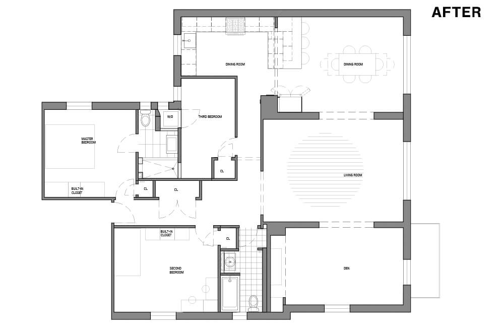
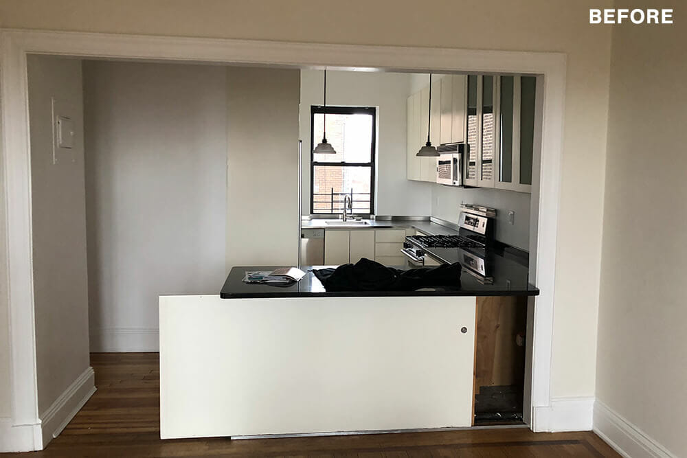
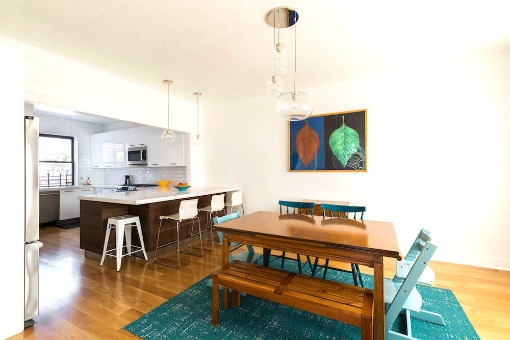
Mauricio, an architect, and I wanted to open up the kitchen so that all four of us, including our 5-year-old twins, could move around it comfortably while adding counter space and enlarging the existing island. But solving that problem was really challenging. We must have gone through at least ten different layouts.
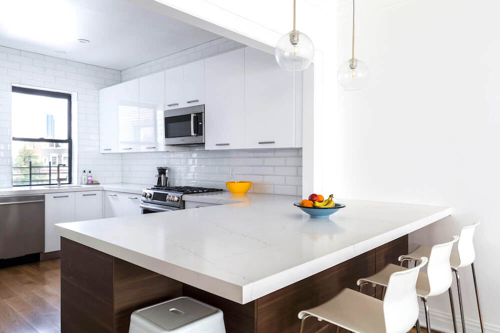
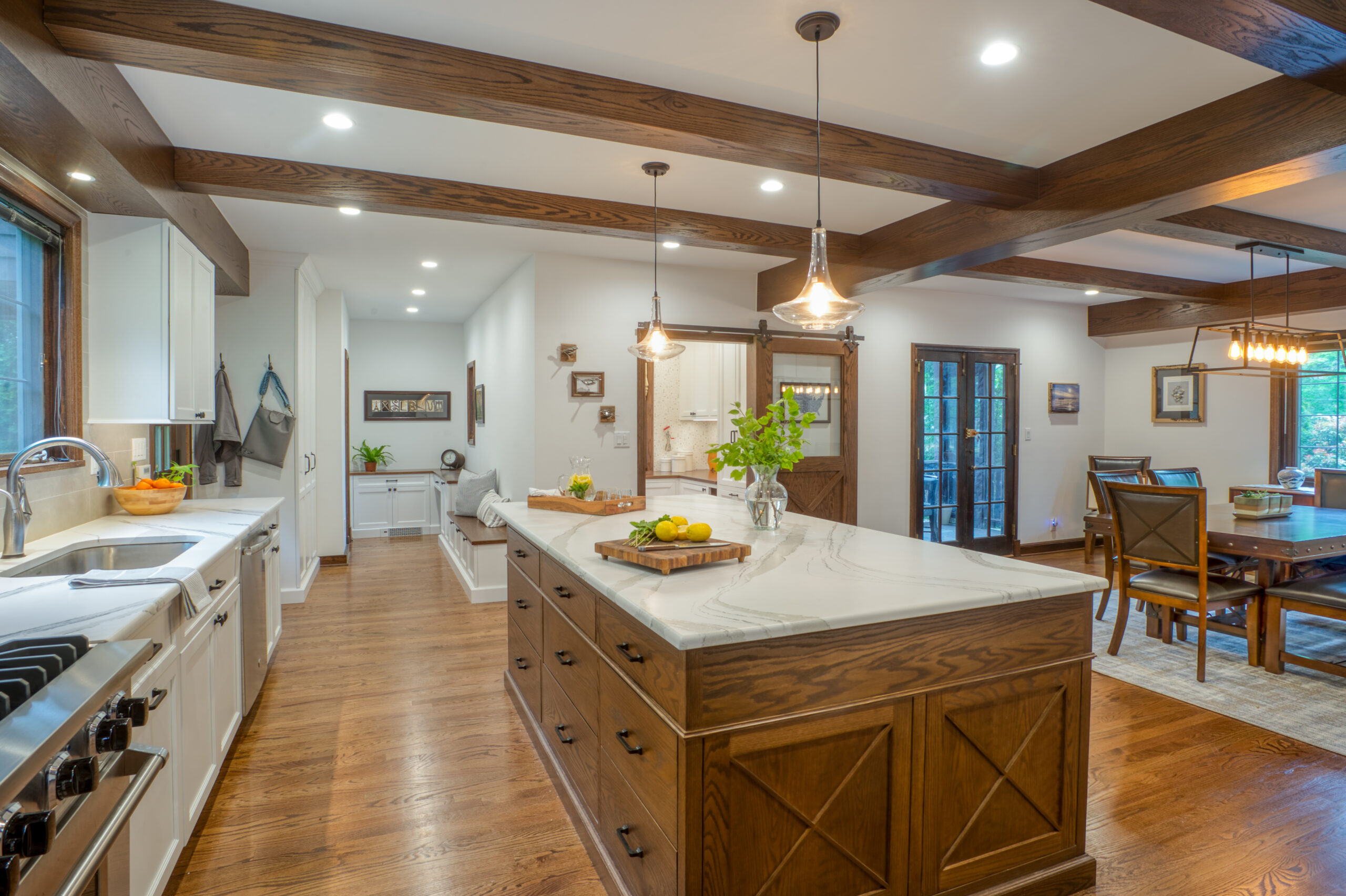
We discussed everything from a standard galley kitchen layout, to relocating the gas line and stove, but nothing felt quite right. Then we said, “What if we extend the kitchen by taking a bit of space away from the adjacent dining room?” Ultimately, we realized that by moving the fridge and aligning it with an enlarged island, we could seamlessly expand the kitchen without sacrificing room for our dining table.
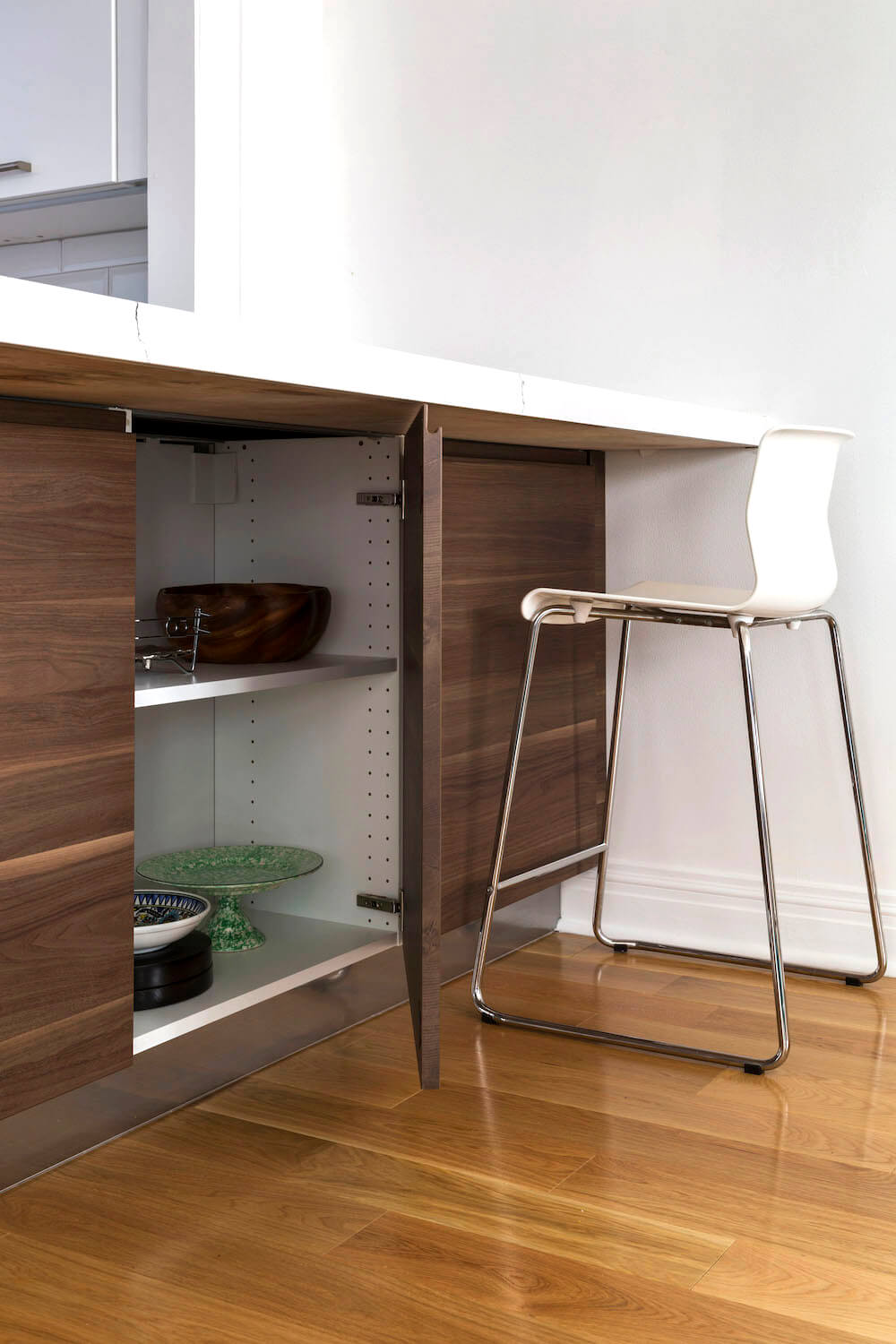
The kitchen remodel worked, and now we have a much bigger kitchen with a lot more storage and prep space. We even have huge cabinets underneath our island. Most importantly, our dining room is still perfectly roomy. Sweeten brings homeowners an exceptional renovation experience by personally matching trusted general contractors to your project, while offering expert guidance and support—at no cost to you. Renovate expertly with Sweeten
Renovation tip to help save time
We planned for minimal construction and maximum impact. The access point to the washer and dryer was moved from the master bedroom to the third bedroom by easily rotating it in its existing space, rather than relocating it. That way, you don’t need to walk through the master to do a load of laundry. It also allowed us a larger shower.
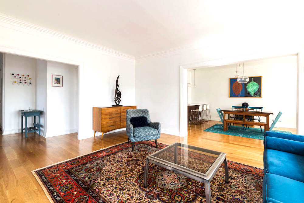
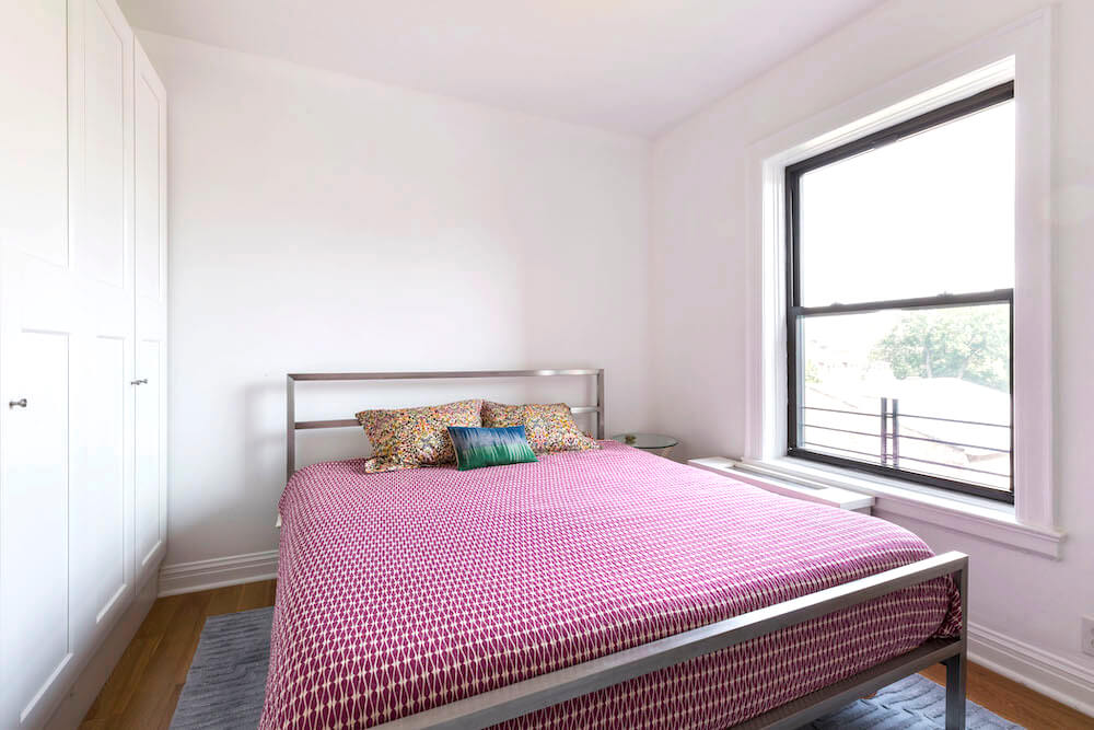
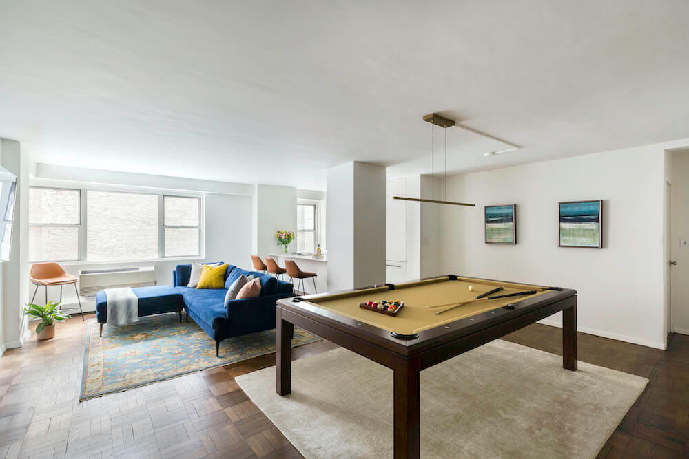
We opened up the “den” off the living room by removing built-ins along three walls to create a more flexible space as a TV room and an office. We saved money and time tailoring modular closets to our needs rather than building out new closets. Non-layout items we needed to address included fixing the electric panel and installing new hardwood floors since the original wood was as thin as the veneer.
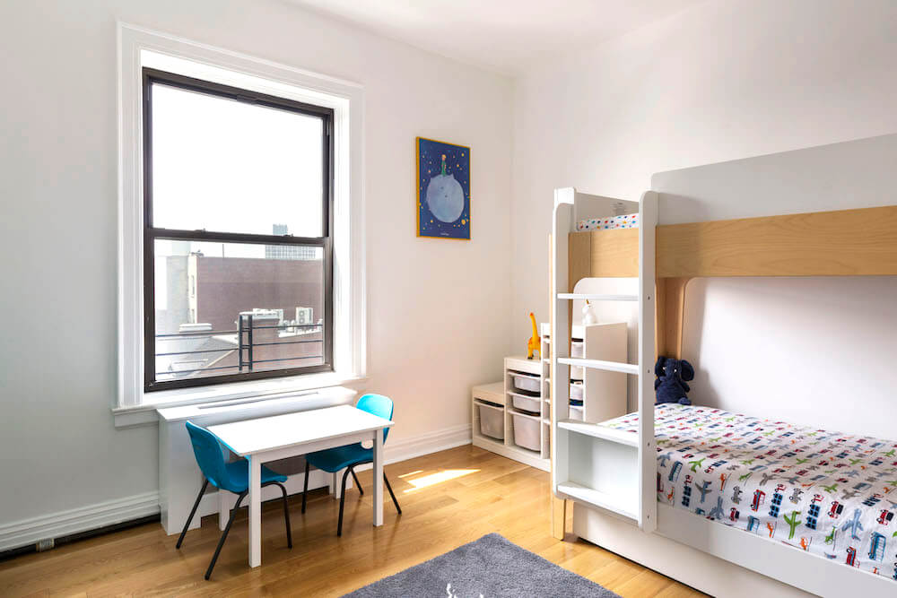
Throughout the process, we kept in mind our 3 R’s mantra: Things needed to be easily repairable, replaceable, or recyclable. Most of our purchases were made from local stores that had minimum to no lead time. We chose not to do anything custom until our kids stopped sharing a bedroom when they get older; we might need to rethink some of the spaces.
Compromising on style
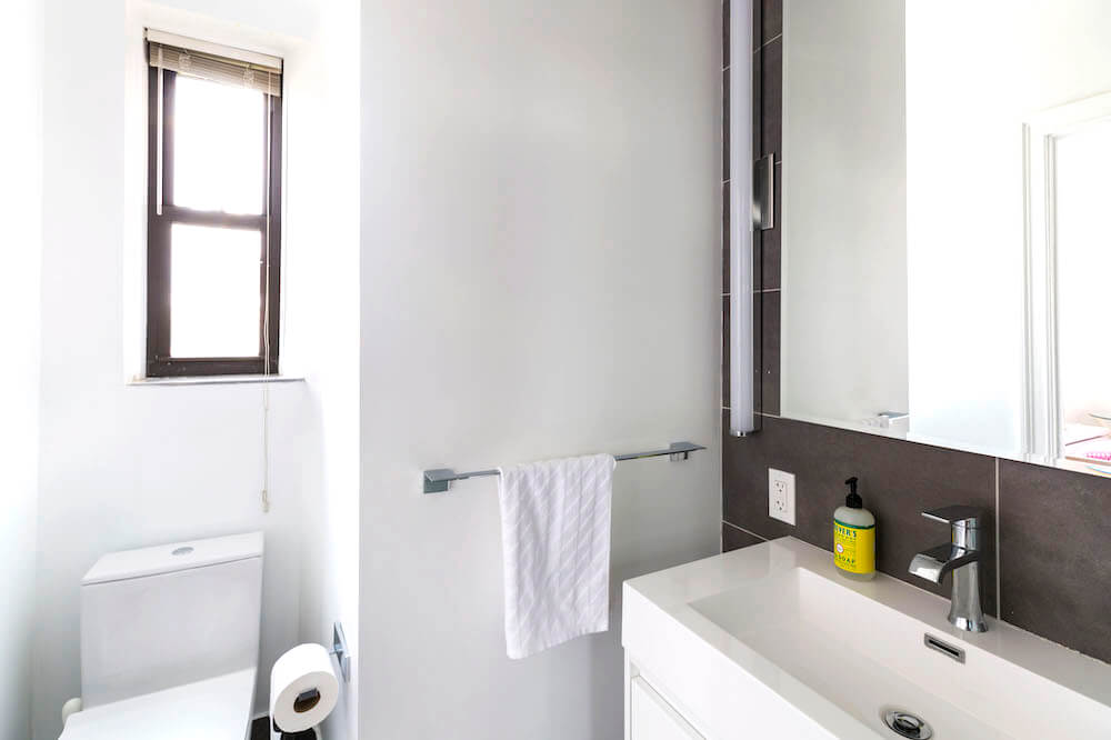
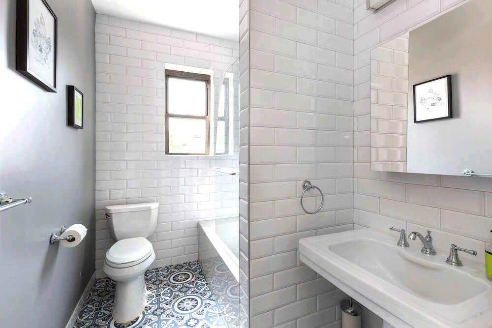
In terms of style, we tried to reach a middle ground between our preferences. I chose a more eclectic style in the second bathroom: gray-and-blue patterned tiles on the floor and shower wall mixed with large white subway tiles. In the master bathroom, Mauricio preferred a more streamlined and minimalist look with grays and whites with a floating white glossy vanity.
We had a lot of opinions and ideas, and we were thankful that our contractor took the time to talk things through.
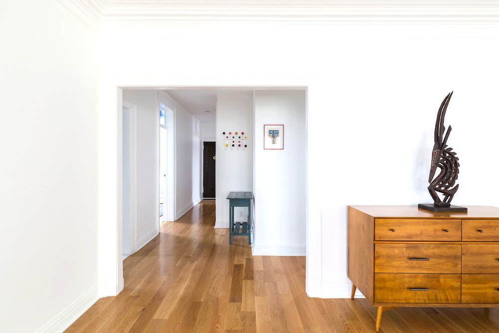
For the kitchen cabinets, we went with Ikea, that we could upgrade to semi-custom later on. We wanted solid hardwood that was reminiscent in the color of the original floor, but more modern looking. We chose a white oak in wide planks.
A good-working Sweeten reno team
Our Sweeten contractor and his dad made a great team. He was very easy to talk to, and his dad was quite resourceful, with many solutions for various problems we encountered along the way. We had a lot of opinions and ideas, and we were thankful that our contractor took the time to talk things through. We could debate different ideas with him, but he was never pushy or non-communicative.
Avoiding subcontractor issues
One thing we would do differently is to put all of the renovation items (except finishes) under the contractor umbrella. We bought our countertop slabs from a local store, which encouraged us to use their fabricator rather than using our contractor to oversee the subcontractors. At installation, there were problems with sizing and fit. The fabricator blamed the contractor for moving the kitchen cabinets. Meanwhile, the contractor blamed the fabricator for cutting a countertop that didn’t fit. If the fabricator had been a subcontractor of our contractor, and under his supervision, that would have all been avoided.
Finally, we’re extremely happy with our home. After the full renovation of our apartment, all four of us can have breakfast at the kitchen island with room to spare. Plus, with all of the closets plus the kitchen storage, we finally have enough space to store everything. It all makes us happy on a daily basis. Now we are gearing up for renovating our rooftop, to create an outdoor space for our family that rivals the interior.
Thank you, Dara + Mauricio, for sharing your full apartment renovation with us!
Ready to renovate? Start the journey here for free!
Here you can learn more about our services and locations. Alternatively, browse more home renovation inspirations, processes, and cost guides.
Materials
KITCHEN: Cabinets and hardware: Ikea. Countertops: Quartzmaster. Sink: Kohler. Faucet: Grohe. Fridge, dishwasher, and stove: Bosch. Lighting: West Elm. Paint in Decorator White (eggshell finish on walls and semi-gloss doors): Benjamin Moore.
MASTER BATHROOM: Medicine cabinets: Wyndham Collection. Toilet and sink: Duravit. Accessories: Delta. Slate floor and wall tiles: Galactic Tiles. Paint in Ultra White: Benjamin Moore.
SECOND BATHROOM: Medicine cabinets: Kohler. Toilet and bathtub: Duravit. Accessories: Delta. Faucet: Kohler. Floor tiles: Vintage and purchased locally. Paint in Ultra White: Benjamin Moore.
LIVING SPACES: Prefinished white oak flooring and base molding: Lumber Liquidators. Shaker-style doors throughout: Brooklyn Windows & Doors. Paint and Plaster in Ultra White: Benjamin Moore.
